










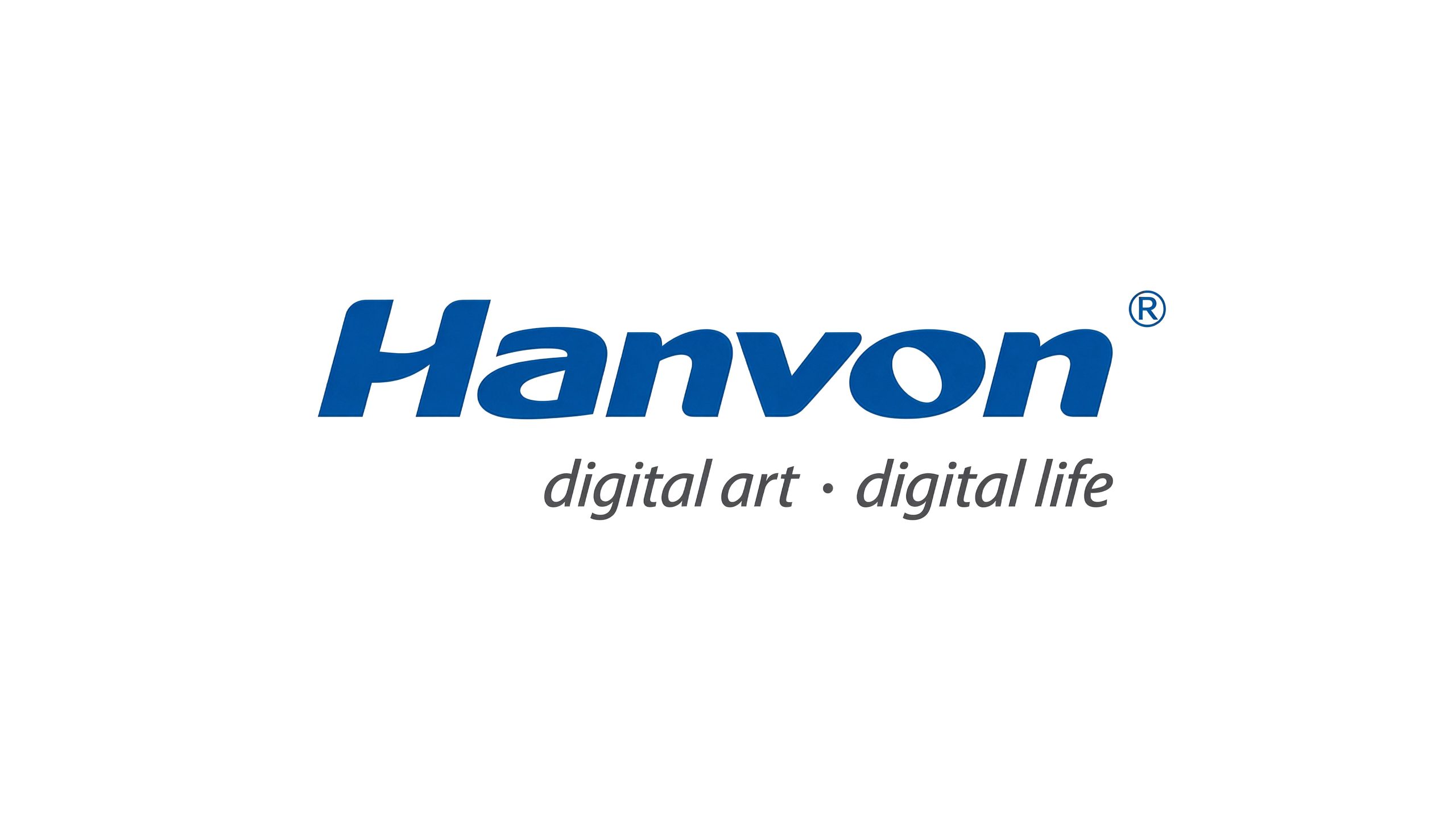
Hanvon (Hanvon Technology) is one of China's pioneering brands in digital handwriting, intelligent recognition and AI-powered input devices.
Guided by its core philosophy, “Digital Art · Digital Life,” the company integrates technological innovation with human creativity, delivering intelligent solutions for human-computer interaction and digital experiences.
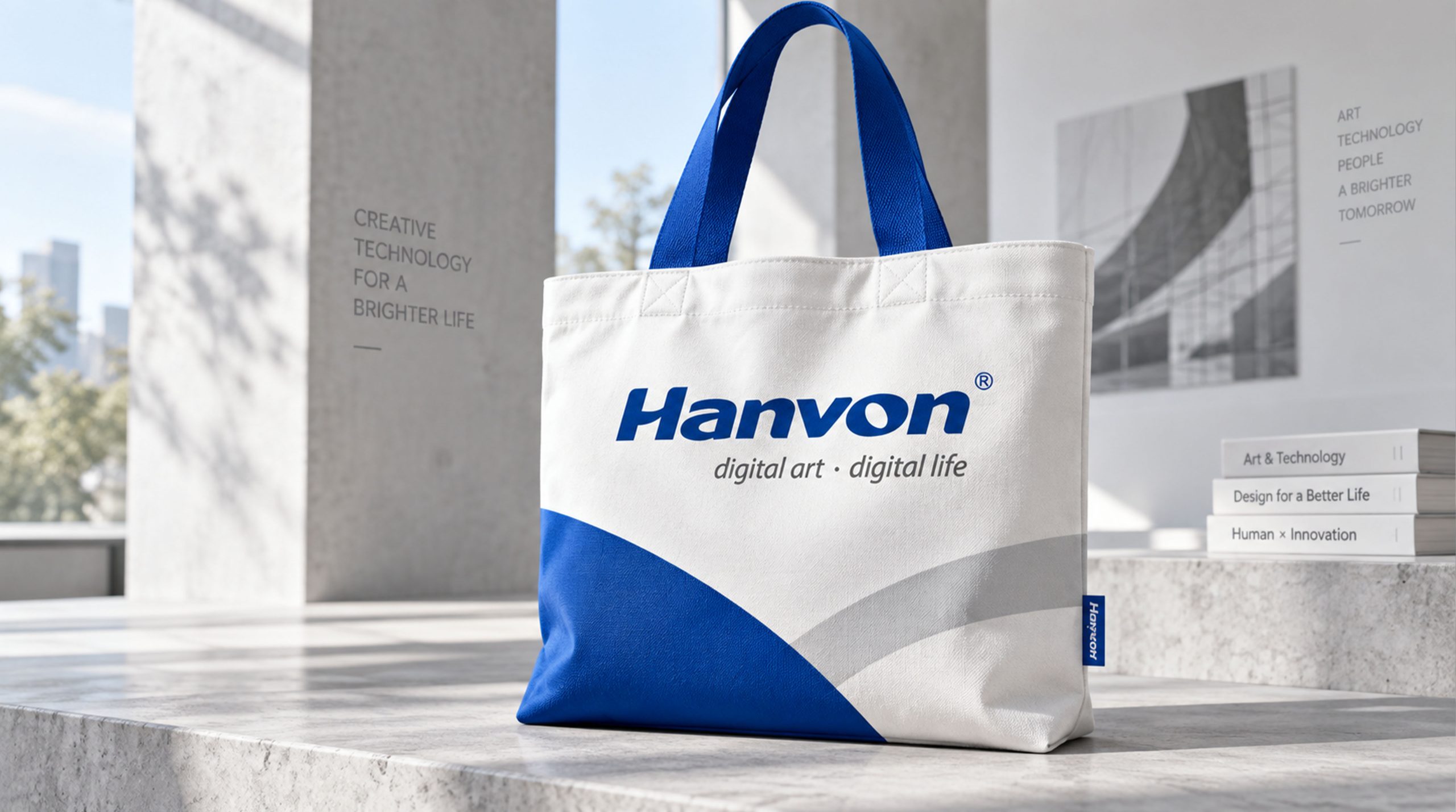
design concept
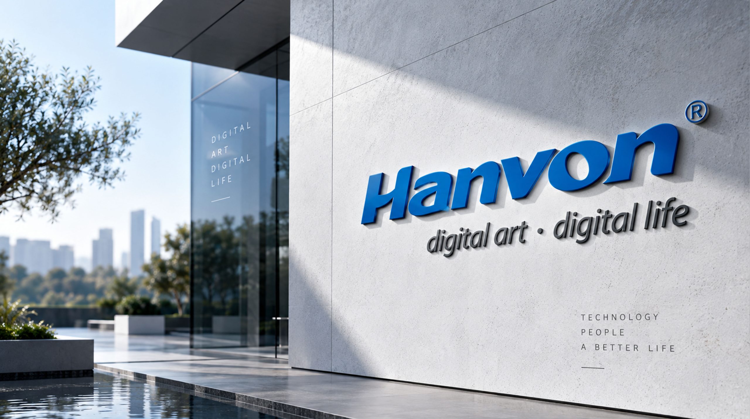
The mark's core visual concept is “technology × flow × speed.” The “Hanvon” wordmark is drawn with streamlined strokes that express the brand's “intelligent handwriting” DNA, while its forward slant conveys the momentum and innovative spirit of a technology company. The tagline “digital art · digital life,” set in a minimal typeface, echoes the brand vision and its philosophy: technology transforms art, and art enriches life.
graphic language
Letterforms: the forward slant conveys technological speed and the brand's drive for continuous innovation. Curved strokes: inspired by the flow of handwriting, reflecting digital writing and human-computer interaction. Structural balance: the initial “H” rises slightly above the other letters, creating a visual anchor and strengthening recognition. Interpunct: the dot in “digital art · digital life” symbolizes the link between technology and the humanities.
Fonts and composition
The primary wordmark uses a custom streamlined sans serif that emphasizes speed and fluid strokes. Tight overall spacing reflects the professionalism and cohesion of an electronics brand. The tagline uses a lightweight geometric typeface in gray or soft black for clarity and hierarchy. The two-tier layout pairs primary brand identification with communication of the brand philosophy.
color system
Primary Black #000000: technological strength and brand authority. Secondary Silver Gray #8E8E8E: the rationality and futurism of digital technology. White space: highlights the recognizability and purity of the brand name. The black-and-white system expresses a modern tech brand with cross-media legibility, suited to hardware, interfaces and packaging.
Application and extension
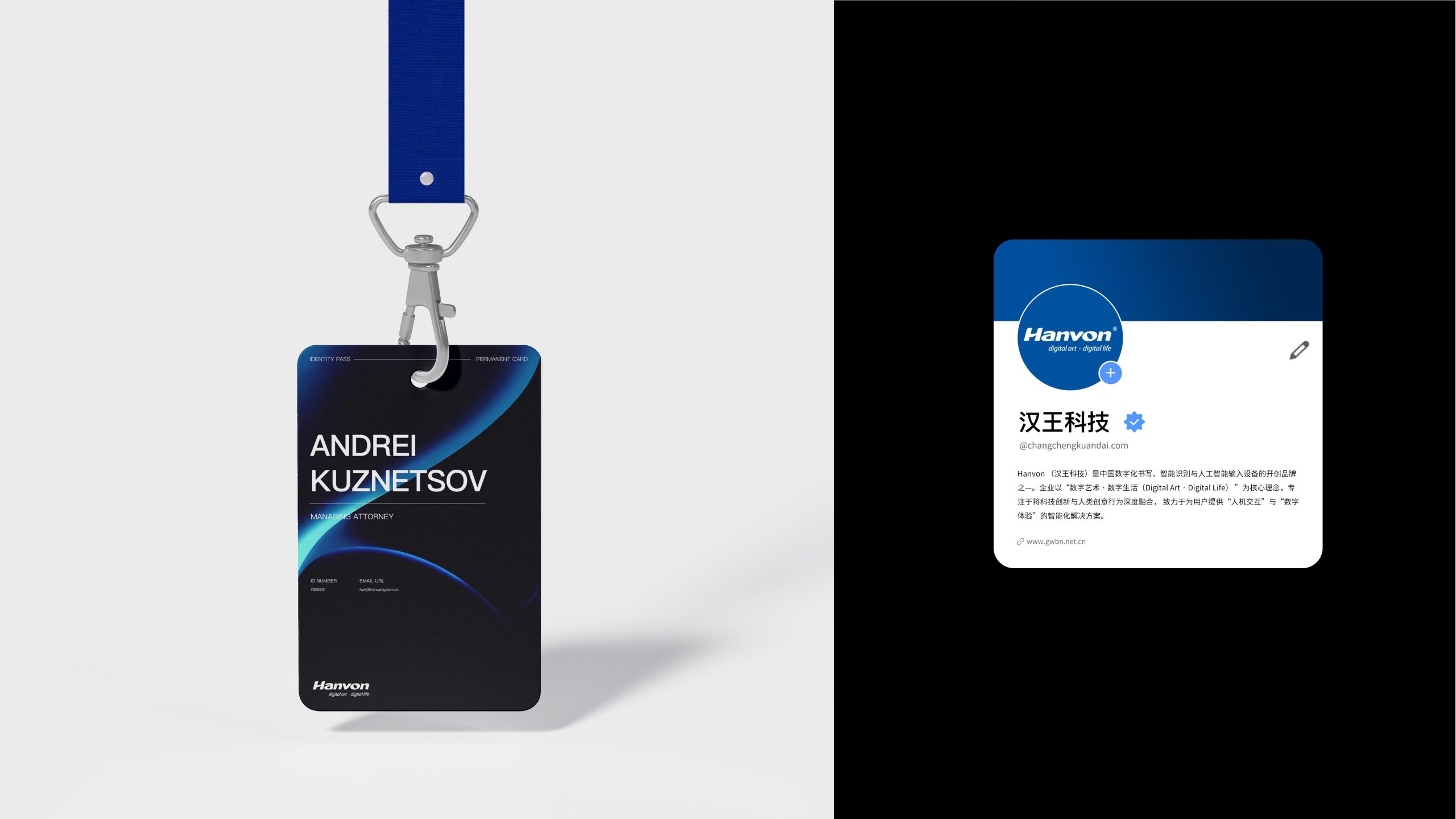
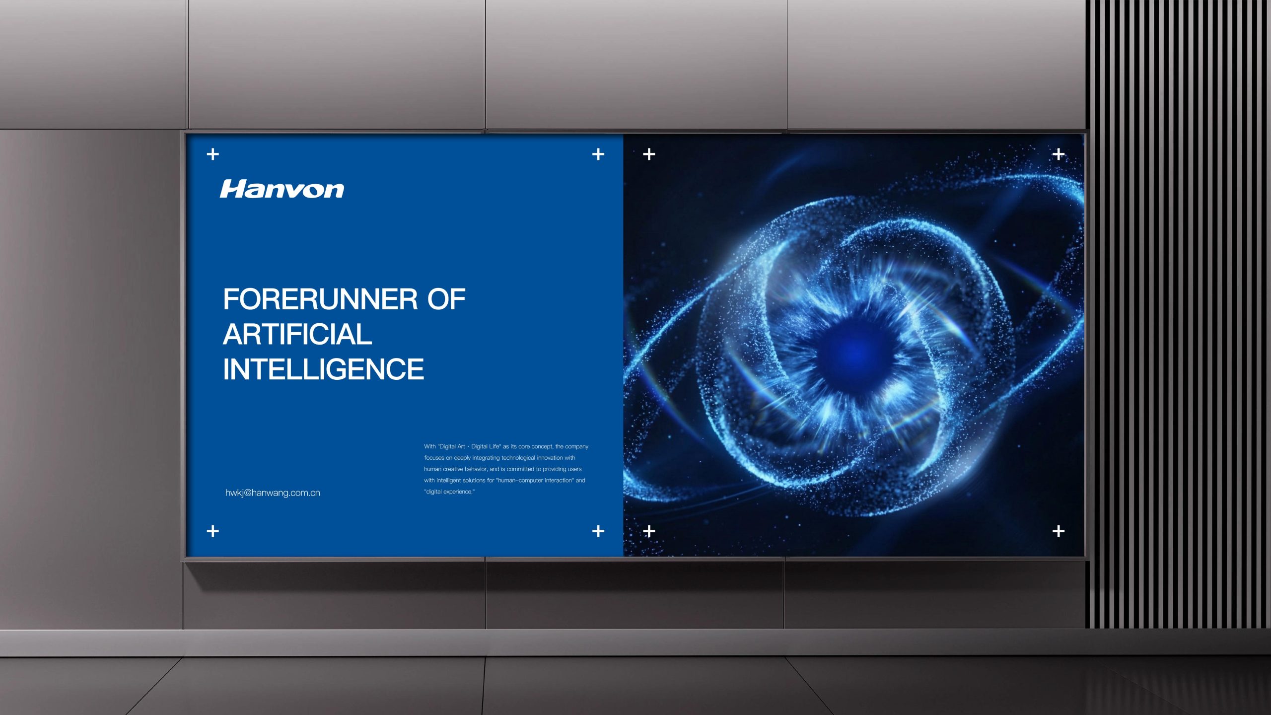
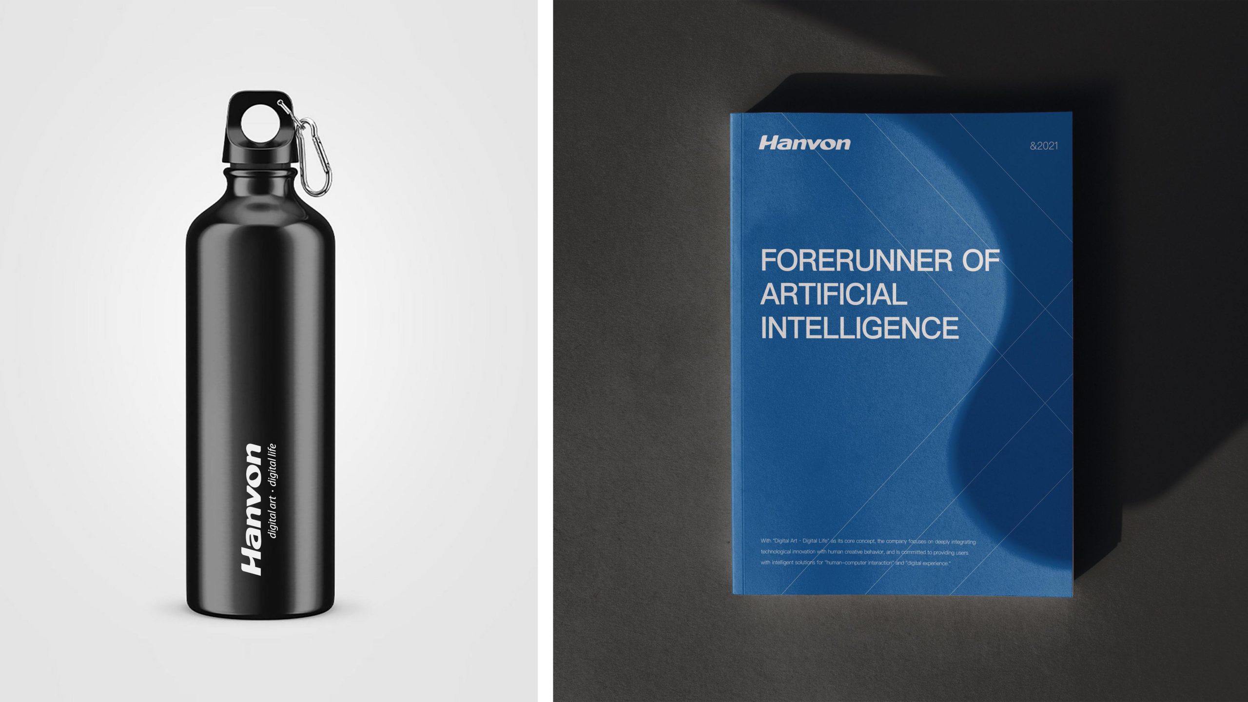
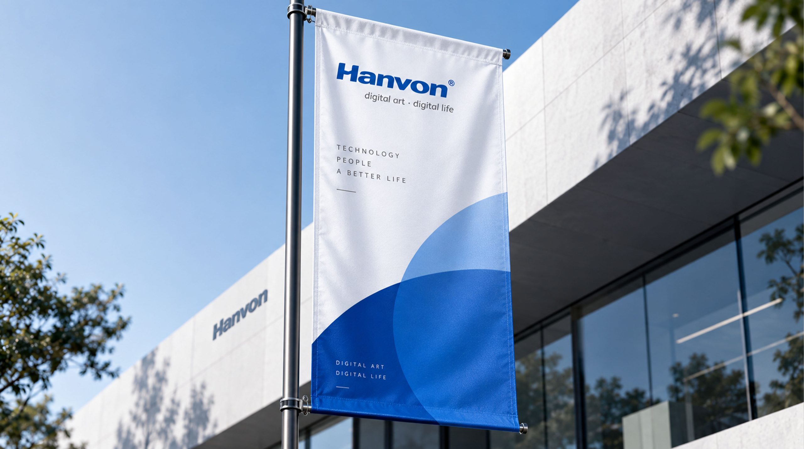
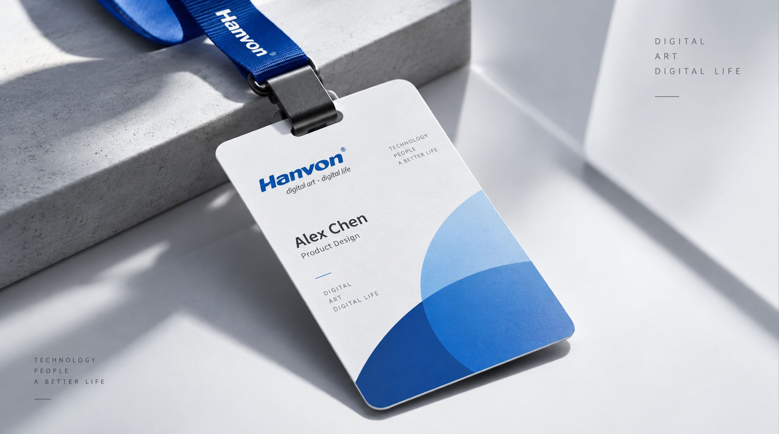
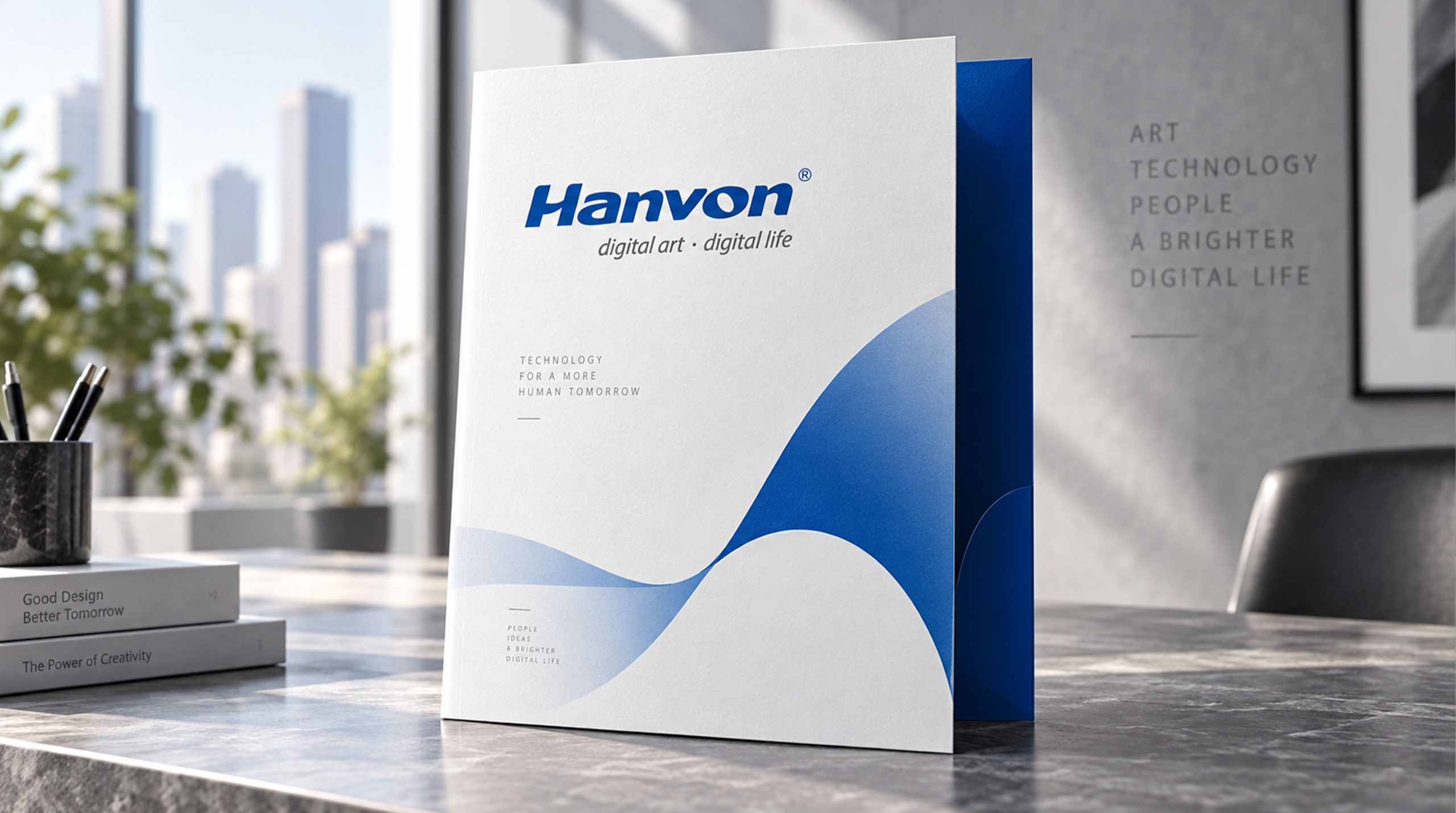
The Hanvon logo is highly adaptable and built for international reach. Product: applied to nameplates on e-signature devices, handwriting tablets, scanners and AI input systems. Communications: used consistently across trade shows, packaging, advertising and the website, building a highly recognizable brand asset. Digital: displayed in reversed black-and-white within operating systems and app interfaces to ensure clear legibility. The tagline “digital art · digital life” extends the brand from hardware into a broader ecosystem.
brand meaning
The Hanvon logo is more than a visual mark. It captures the spirit of an era. Digital Art: the brand empowers human creativity with technology. Digital Life: technology woven into everyday life, reshaping how people interact with machines. Flowing letterforms: the meeting point of technology and humanity. The logo expresses Hanvon’s core belief: technology and art in symbiosis, with innovation as a part of daily life.
Improper Usage (Protection Specification)
Do not alter the italic angle or letter spacing. Do not use highly saturated colors or gradient fills. Do not add shadows, outlines or perspective distortion. Recommended minimum width: 40mm.
design results
Since its launch, the Hanvon logo has become an emblem of Chinese smart handwriting technology. Its streamlined bold sans-serif structure has been widely used at technology exhibitions, in international marketing and on device packaging. Combining technological rigor with cultural resonance, the logo is regarded as one of the early benchmarks for the international visual identity of Chinese digital technology brands. The project reflects Qingmei Future’s research at the intersection of smart technology, digital art and industrial visual language, establishing a visual standard for brands that unite technology and the humanities.