










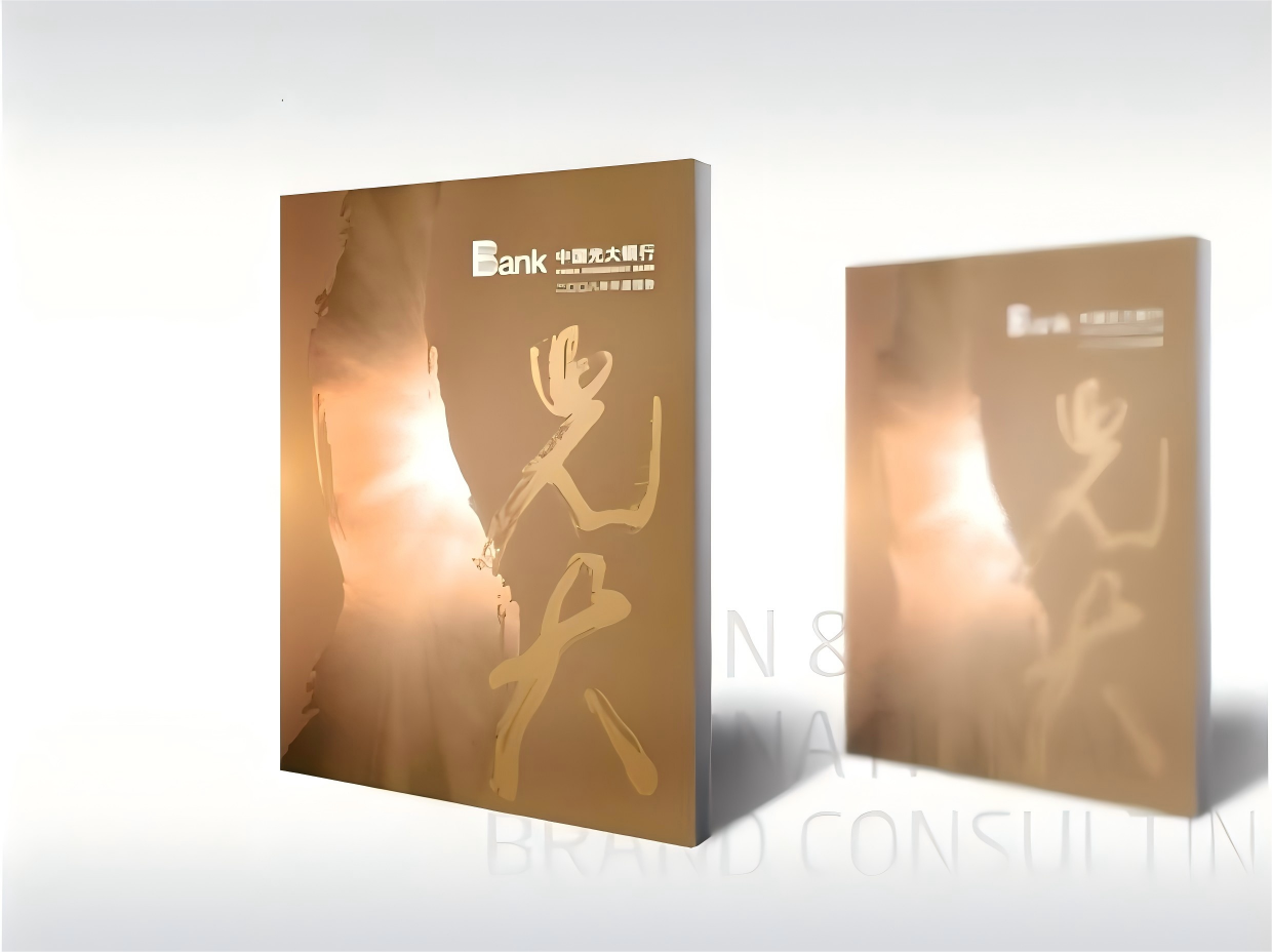
A systematic design of China Everbright Bank's annual report. While ensuring compliance and full disclosure, the goal was to present Everbright's distinctive culture and taste through a purple-and-gold sensibility and modern typography, aligned with international financial publishing standards (bilingual architecture, infographic system, readability and layout order).
The annual report is both a disclosure document and an outward expression of Everbright's brand character as a “wealth management bank.”
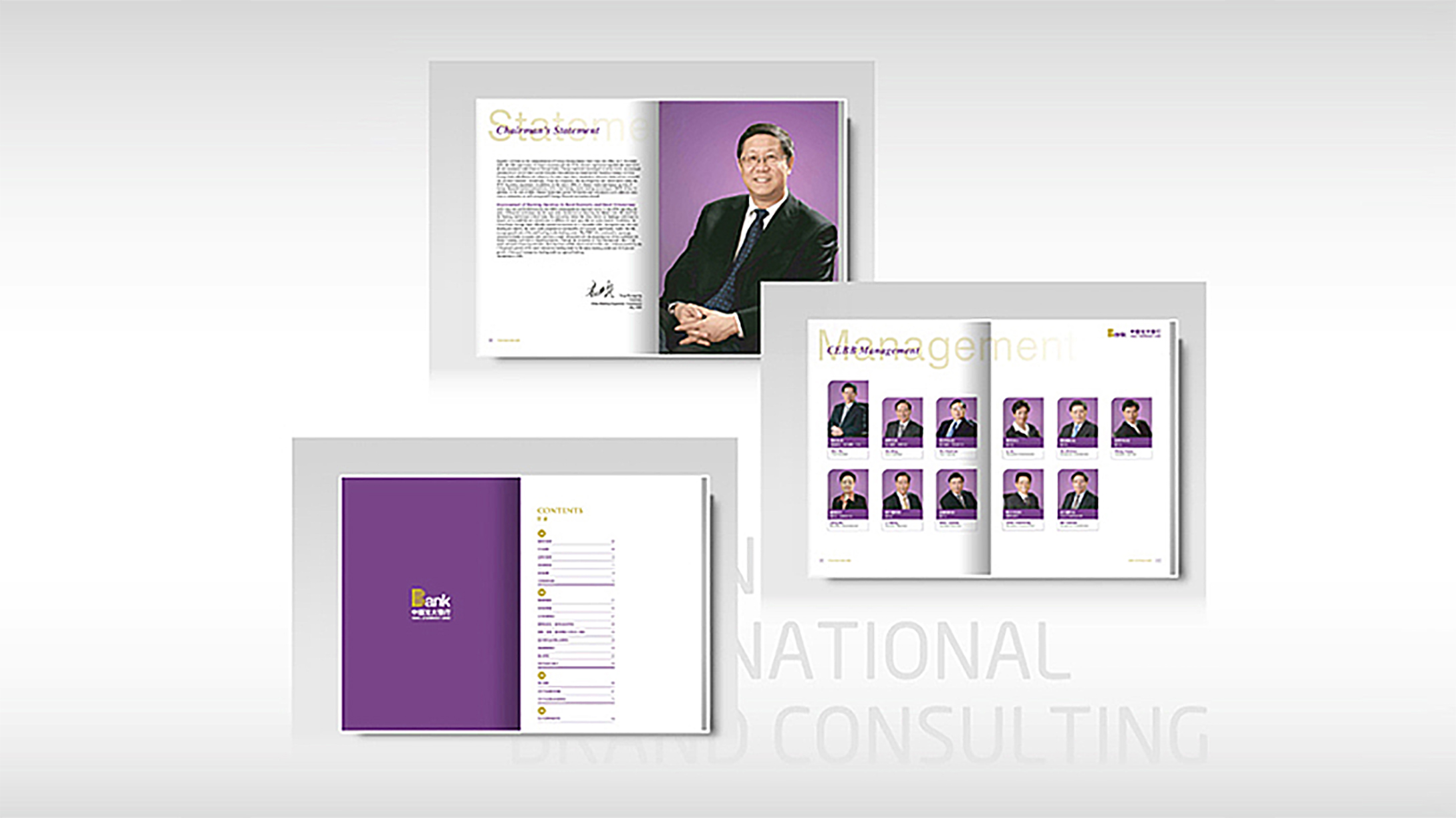
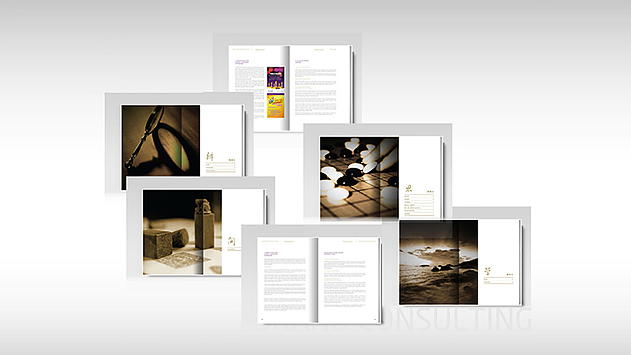
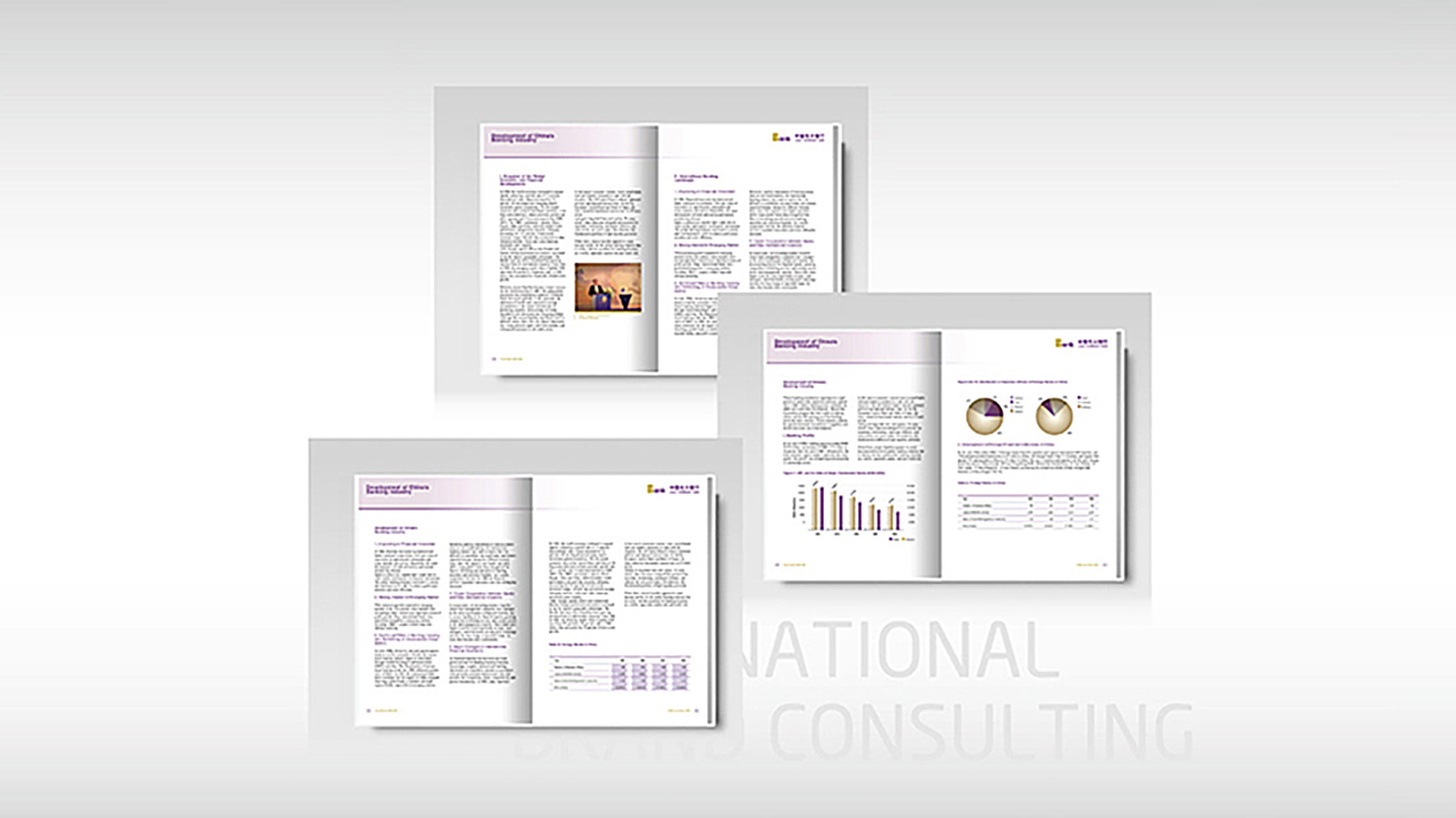
design challenge
High information density: financial statements, MD&A, risk and compliance, and ESG content required clear hierarchy and cross-referencing; Culture and taste: conveying Everbright's character (steady, trustworthy, modern) within rational financial text, without resorting to decoration; International readers: serving domestic and overseas investors and analysts required bilingual consistency, unified terminology and a cross-cultural reading rhythm.
Strategy and philosophy
Theme: Order as Taste.
Color and brand: purple × gold as the core identity (purple for reason and aesthetics; gold for value and stability), echoing Everbright's recent brand character and forming clear color-coded navigation throughout the report.
Structure and grid: a modular 12-column layout system with four unified templates—chapter openers, overview pages, chart pages and body pages—enabling quick navigation and visual memory across a long document.
Information visualization: a consistent chart language (proportion rings, range bars, bridge charts, flow charts/maps) with unified line weights, labels and colors across modules such as asset structure, provisioning, risk exposure, business lines and customer segments, regional distribution and ESG metrics.
Bilingual and terminology: a Chinese–English glossary and reusable components (notes, footnotes, table captions), synchronized with table-of-contents and page anchors for easy reference by international readers.
Visual tone: restrained white space, fine dividing rules and low-saturation background textures create a financial publication that feels “steady but not heavy.”
Design presentation
Cover: a subtly lustrous purple-and-gold ground (fine matte lamination) with metallic foil-stamped logo and year; the inside cover introduces an abstract “light beam/polyline” motif, symbolizing the reach of “managing wealth and serving people's livelihoods.”
Chapter structure: I. Year in Review. II. Management Discussion and Analysis. III. Corporate Governance and Risk Management. IV. Business and Clients (Retail / Corporate / Interbank / Investment Banking / Sci-Tech Innovation). V. Financial Statements and Notes. VI. ESG / Sustainability (covering governance, environmental performance and social contribution highlights). Each chapter uses purple/gold column rulers and a top index bar to indicate the current chapter and page range.
Chart pages: standardized legends, axes, tick marks and label positions; bridge and range charts highlight structural shifts in financial trends; risk and compliance are shown as matrices and heat maps for readability. Accessibility: body text size and leading follow readability standards; tables support collapsible and paginated digital formats; the PDF includes bookmarks, TOC anchors and alt text for accessibility and searchability. Production: fine matte lamination with spot UV on the cover; heavyweight matte coated stock inside for faithful purple-gold reproduction and crisp fine-line charts; saddle-stitched or section-sewn perfect binding depending on page count. Benchmark: Everbright’s recent public disclosures and annual report conventions, aligning structure and tone with investor relations and regulatory requirements.
Achievements and Impact
The new annual report delivers marked improvements in clarity, navigability and brand consistency: investors access key metrics more efficiently, and media and analysts can cite standardized charts directly. The ESG and governance sections are presented as verifiable metric dashboards, in step with emerging sustainability disclosure trends. The purple-gold identity runs through the entire report and its digital materials, unifying the visual signature of “Everbright’s culture and taste.” (Aligned with Everbright’s brand goal of “building a first-class wealth management bank” and its communication tone.)