










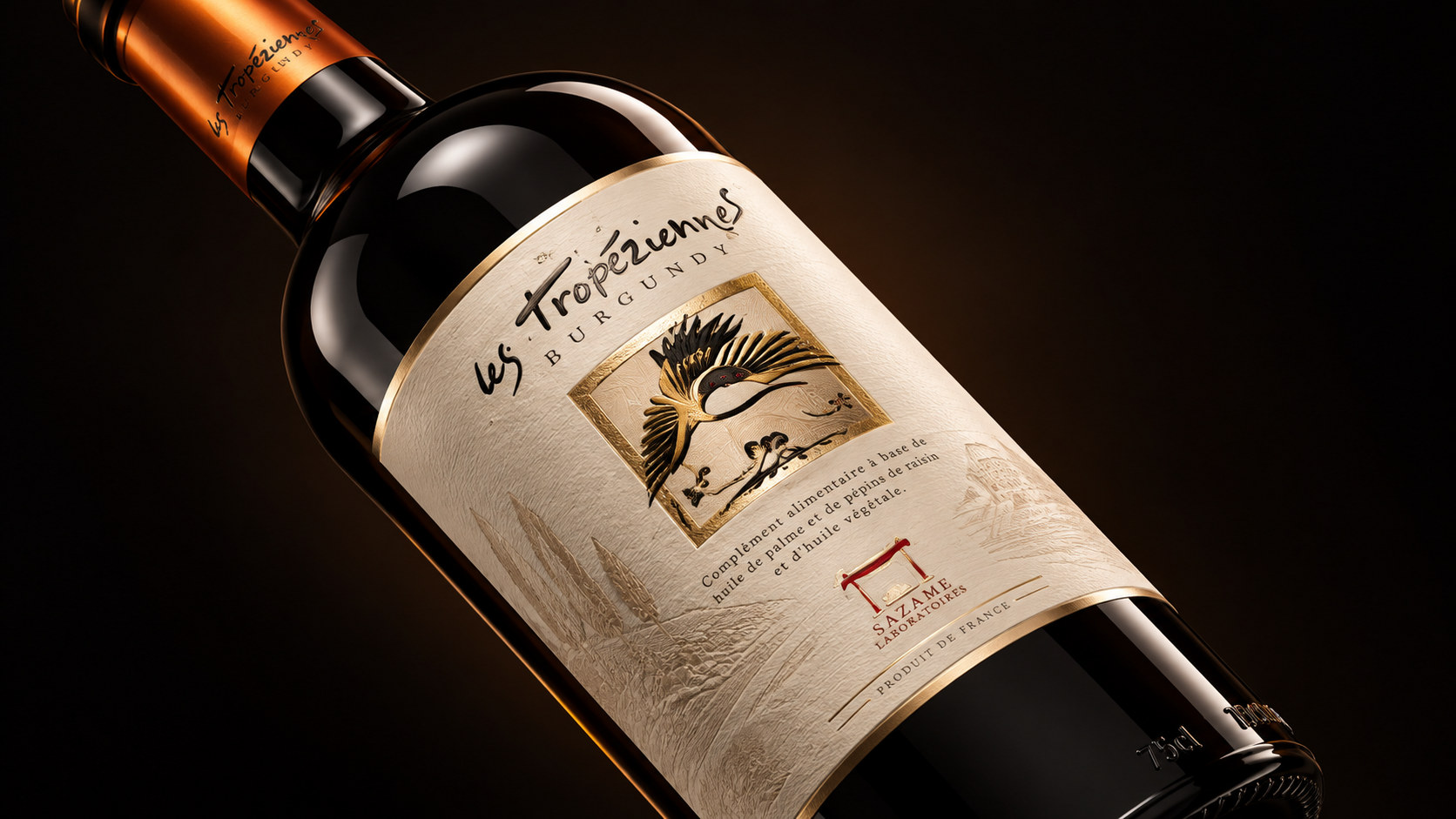
Les Tropéziennes is a boutique wine brand centered on European wine culture, origin terroir and natural lifestyle. The brand starts from the relationship between land, grapes, sunshine and time, and regards wine as the result of the interaction of natural environment, brewing skills and daily emotions. The dark liquor, traditional bottle shape, hand-textured labels and artistic illustrations together form a calm, authentic and story-telling visual impression of the brand, making the product not only a bottle of wine, but also an important medium for consumers to experience the origin culture and slow lifestyle.
Faced with the continuous upgrading of global wine consumption aesthetics and consumers' increasing attention to production areas, craftsmanship, environmental protection and cultural content, brands are gradually transforming from traditional wine products into boutique wine brands that integrate origin narratives, artistic expressions and modern life aesthetics. The new packaging design no longer pursues excessive gorgeousness and commercial decoration, but relies on natural paper, low-saturated colors, hand-drawn graphics and restrained typography to establish a more authentic, warm and international brand image.
The new packaging is an important symbol of brand value upgrade. While retaining the traditional European wine culture and craftsmanship spirit, it responds to contemporary consumers' needs for quality, culture and sustainable life with a more concise and natural design language, allowing the brand to establish a clear and long-lasting identity in the modern market.
Brand spirit
The brand spirit of Les Tropéziennes is deeply rooted in the natural terroir, traditional brewing methods and European life culture of the wine producing area. Its core spirit includes:
Nature × Time × Sincerity
Terroir × Handicraft × Emotional Temperature
These keywords clearly depict the unique spiritual core of the brand. Nature represents the wine’s respect for the land, climate, sunlight and plant growth patterns; time reflects the patience required for grape maturation, fermentation, aging and flavor formation; sincerity represents the brand’s true expression of the source of raw materials, brewing quality and product information.
Terroir gives each bottle of wine an unreplicable regional personality, and handcrafting reflects the brand's continuous polishing of the brewing process, label details, and packaging tactility, while emotional temperature allows wine to transcend its simple drinking function and become an emotional carrier for gatherings, solitude, celebrations, gift-giving, and communication. These values together create a quiet, mature and vital alcohol brand.
Brand concept
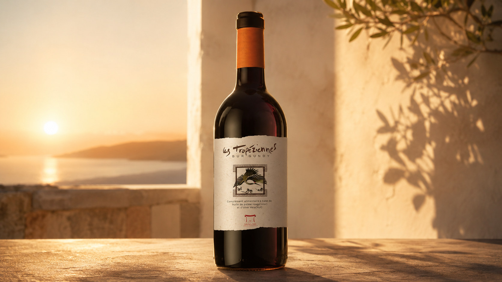
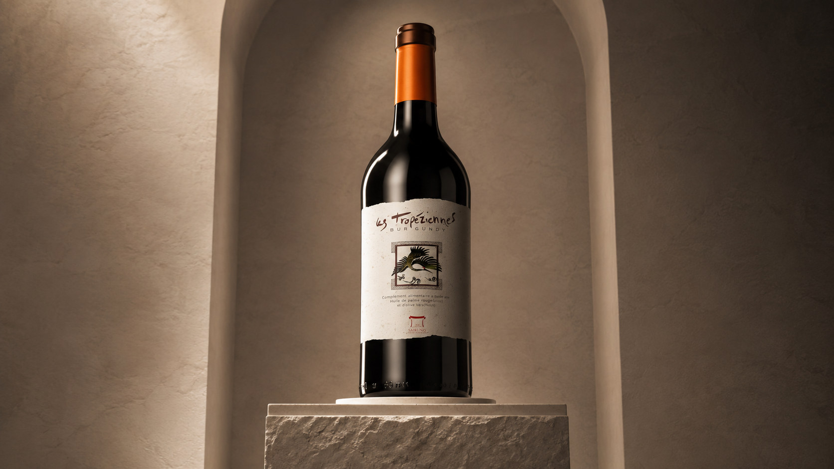
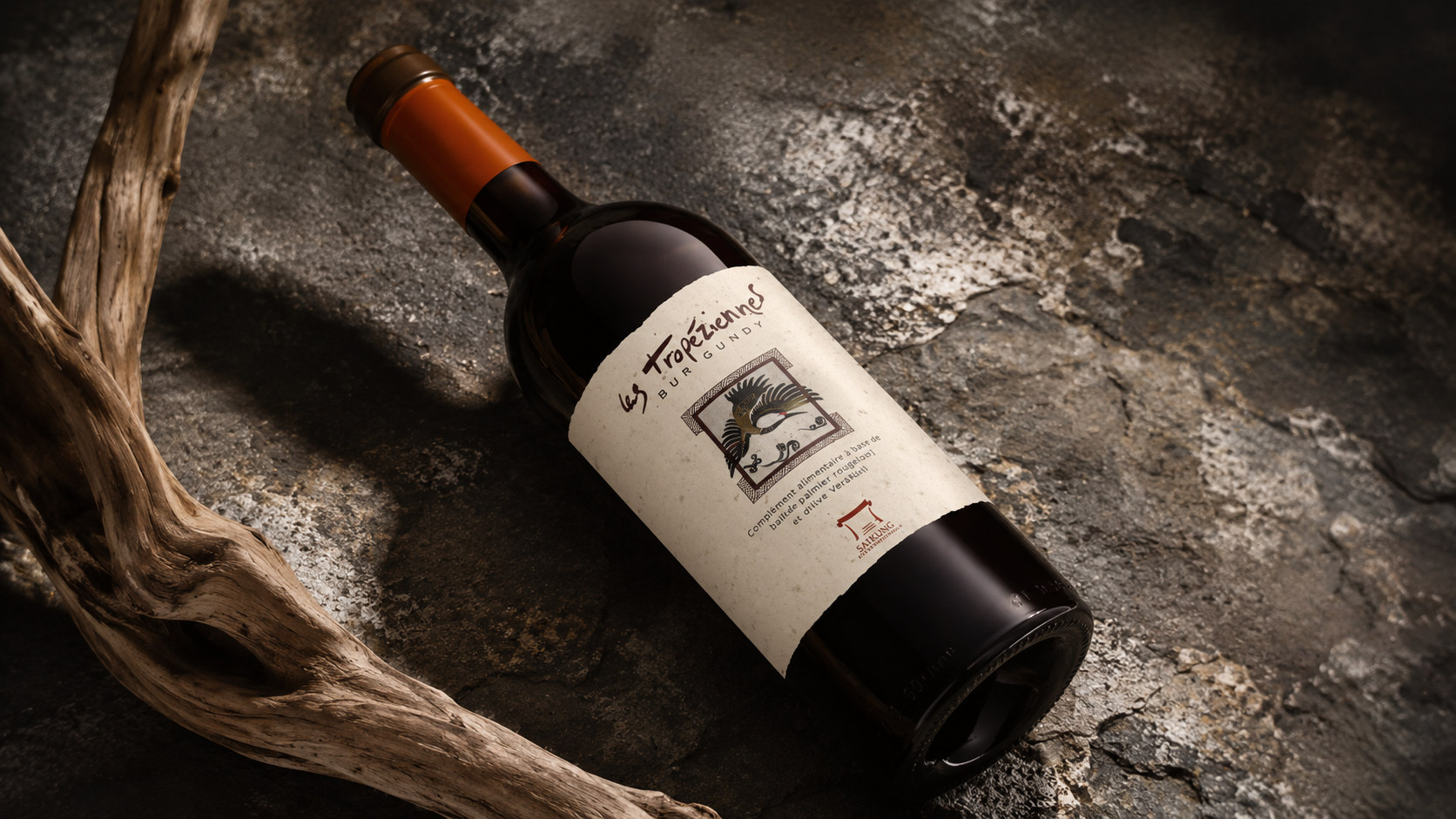
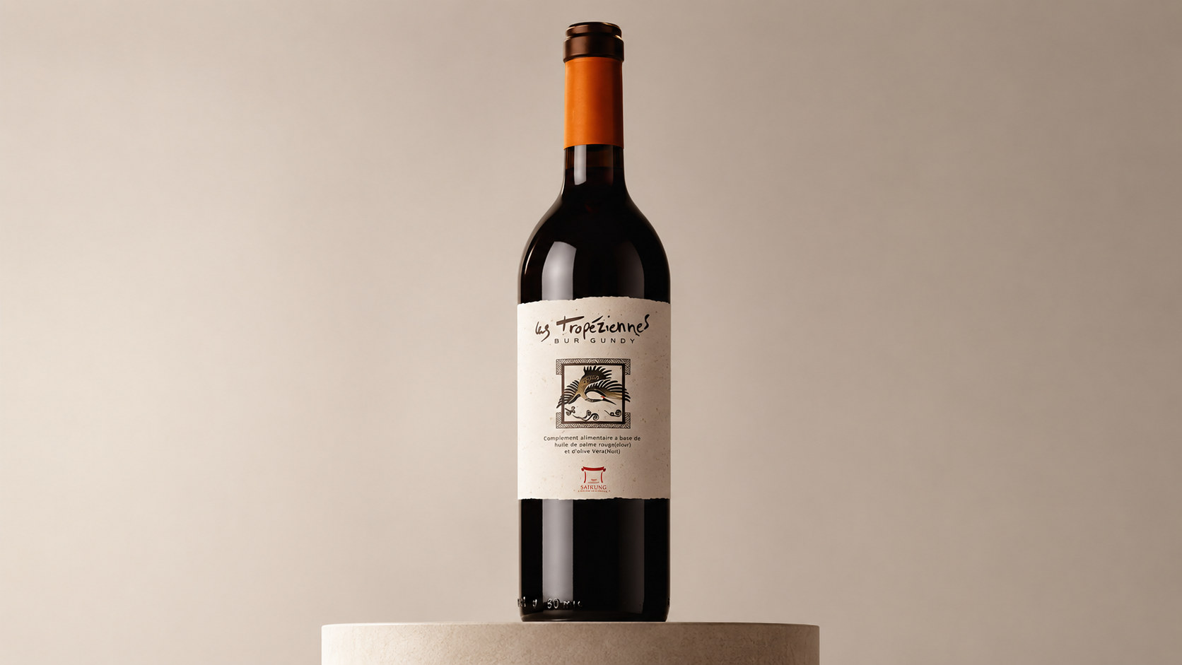
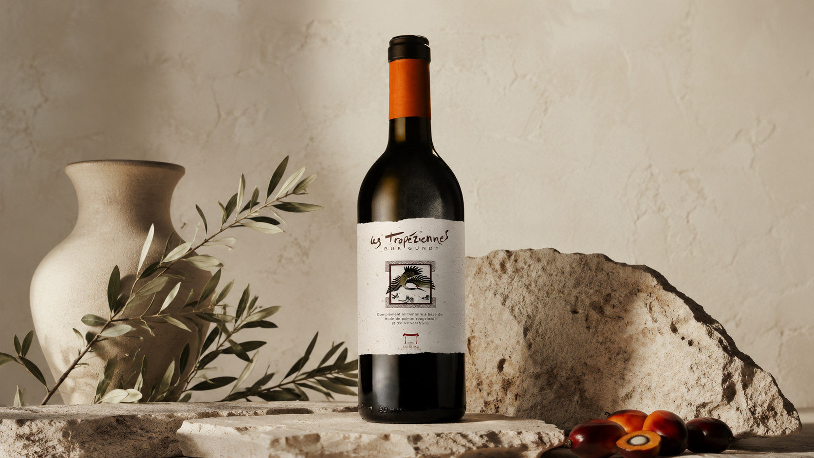
The brand concept of Les Tropéziennes emphasizes the design core of "natural order × humanistic expression". The new packaging image uses a stable and restrained layout structure to present the professional attributes of wine. Through natural materials, hand-painted illustrations and colors rich in time traces, it conveys the true temperature of the land, plants and the brewing process.
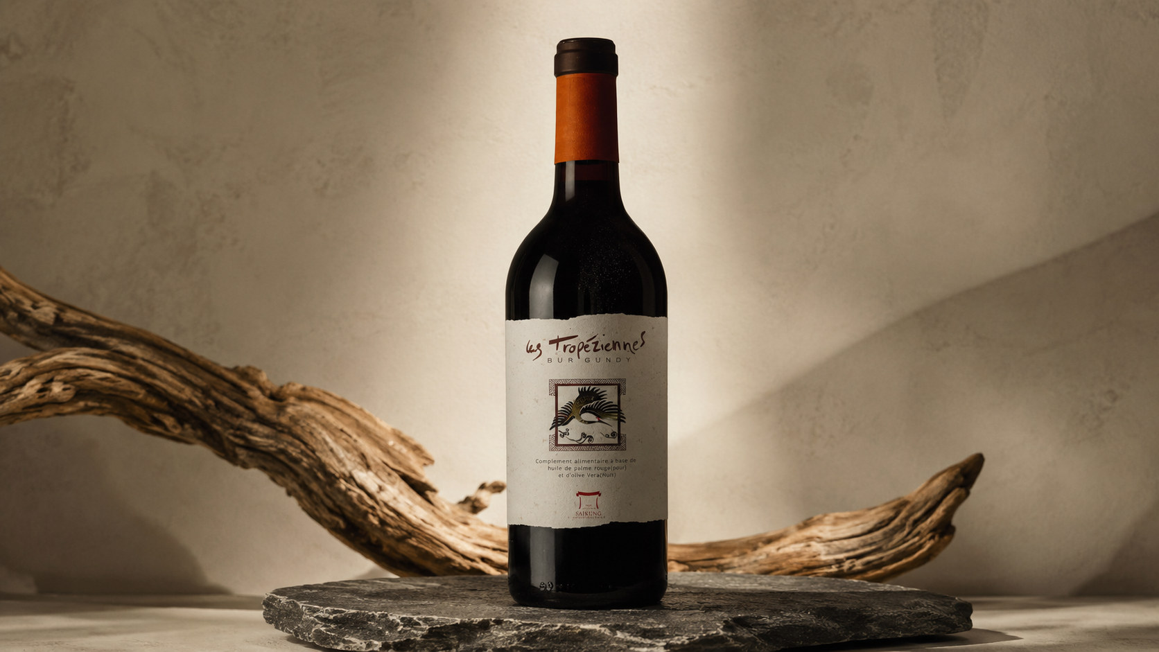
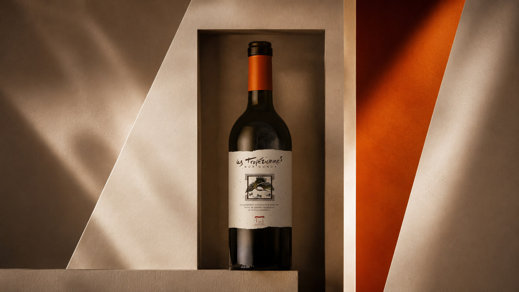
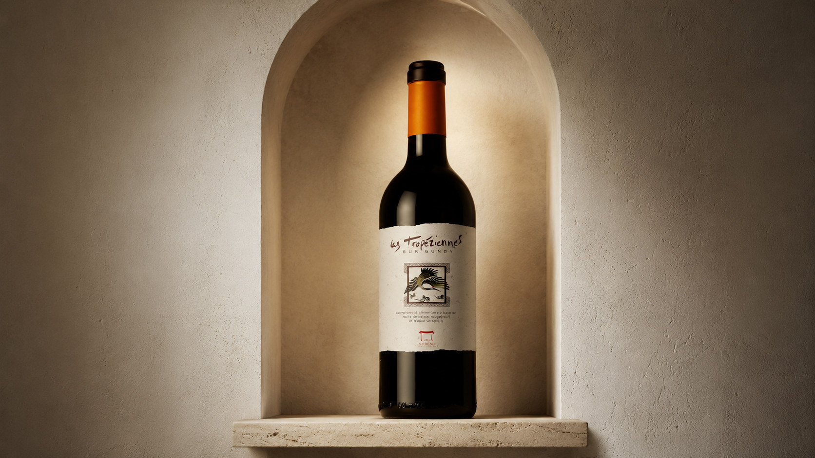
Under the guidance of this concept, packaging not only focuses on recognition and quality on the shelf, but also pays attention to the emotional experience that consumers have when picking up the bottle, touching the label, reading the origin information and opening the product. The label uses a large area of warm white natural paper as the visual main body, reducing complex decoration and maintaining a clear relationship between the brand name, product information and illustrations. The central figure is like a miniature work of art, condensing natural life, land memory and local culture into a limited picture.
Through the reshaping of the visual system, the brand establishes a balance between traditional brewing and modern aesthetics, so that professionalism does not appear cold, culture does not become retro, and each bottle of wine retains a rich enough story in a quiet and restrained expression.
visual language
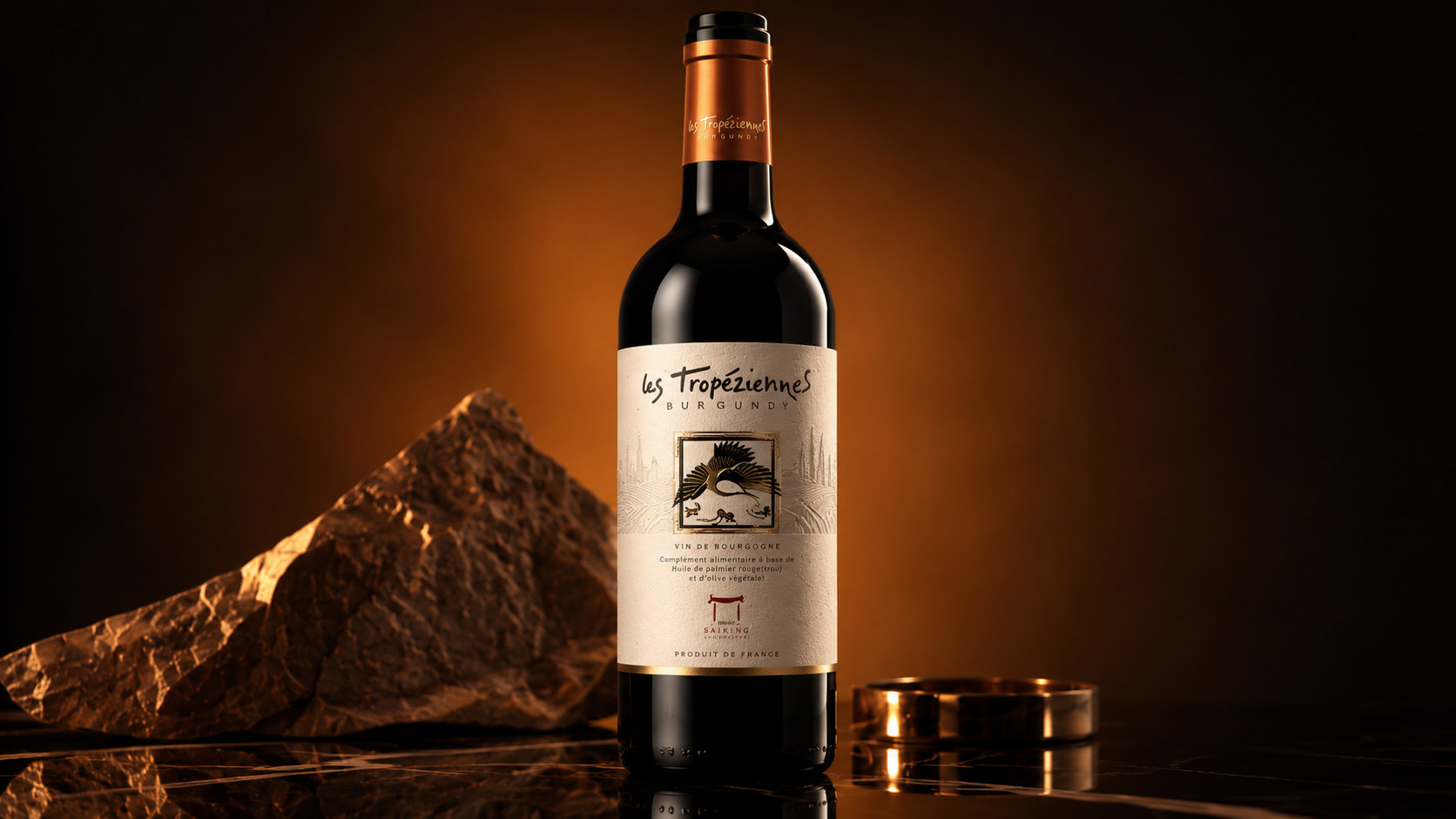
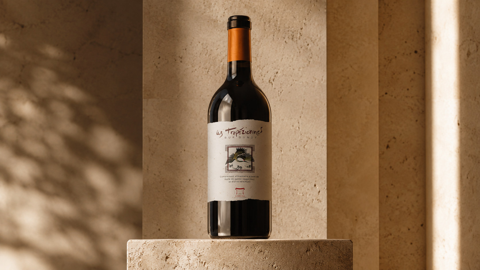
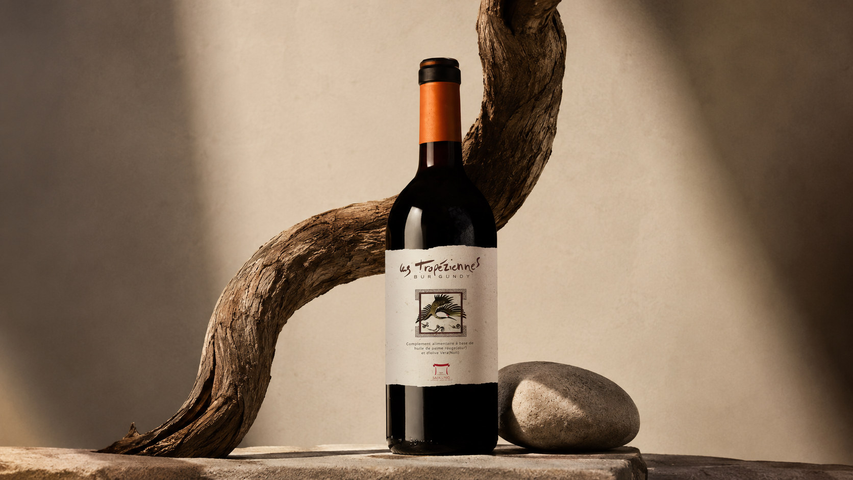
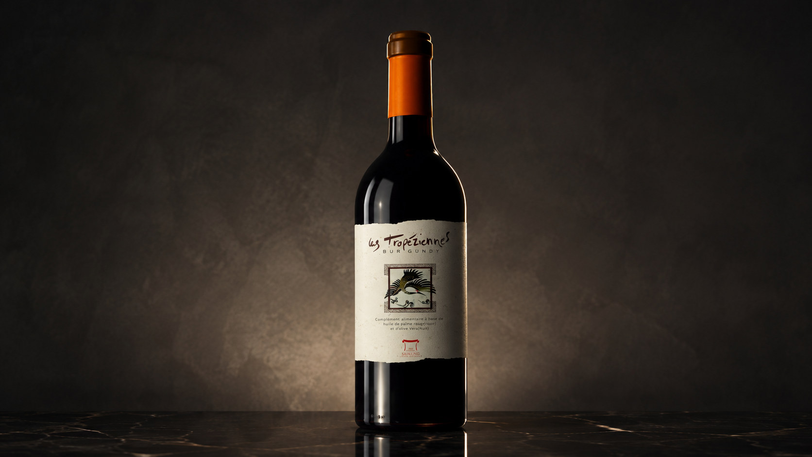
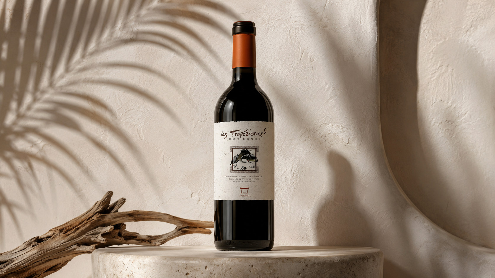
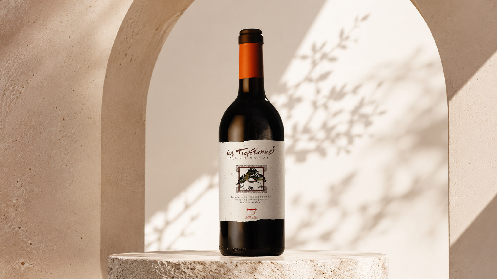
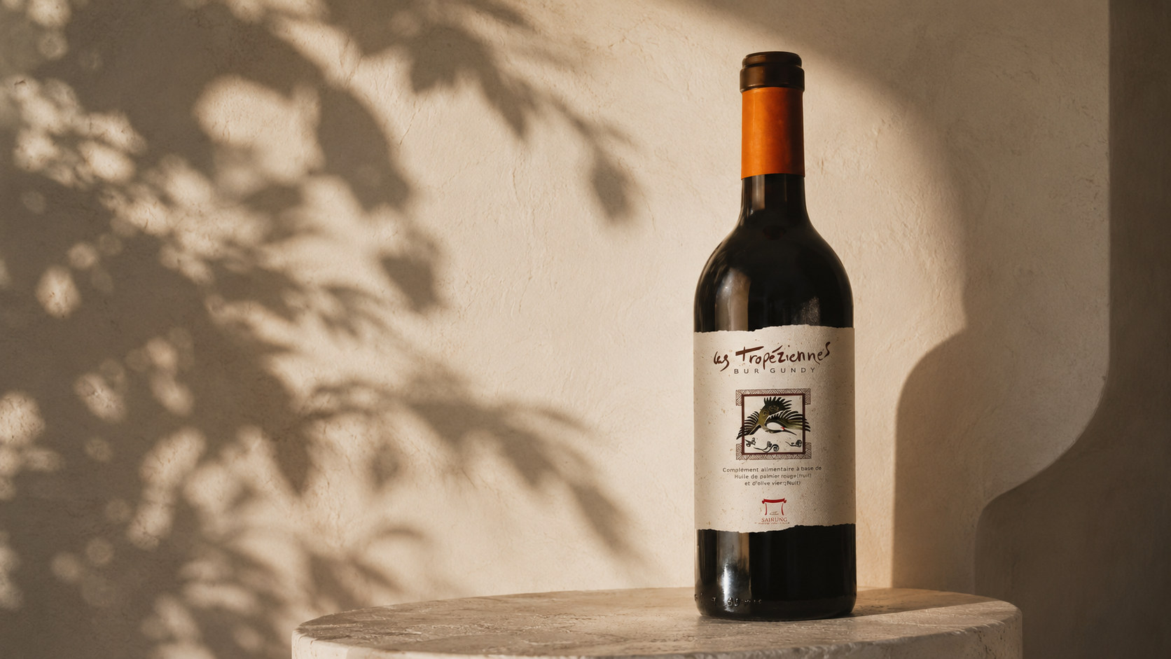
The packaging design of Les Tropéziennes is based on naturalism and modern handmade aesthetics, integrating dark brown glass, warm white labels, terracotta orange and low-saturated red to form a simple, mature and culturally rich visual language.
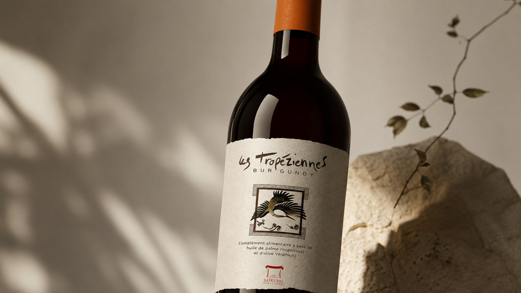
Color and structure: Dark brown wine bottles serve as the visual basis of packaging, giving the product a stable, mellow and mature temperament, and at the same time reducing the impact of light on the wine. The warm white label comes from the natural paper tones that have not been heavily bleached, bringing the packaging closer to the authentic feel of the earth, fibers and handmade paper. Terracotta orange, burgundy and dark brown are used as local accents, echoing the natural colors of ripe grapes, oak barrels, earth and aging liquor. The overall structure adopts vertical central axis typesetting, which enables the brand name, illustrations, product descriptions and origin information to form a clear and stable visual hierarchy.
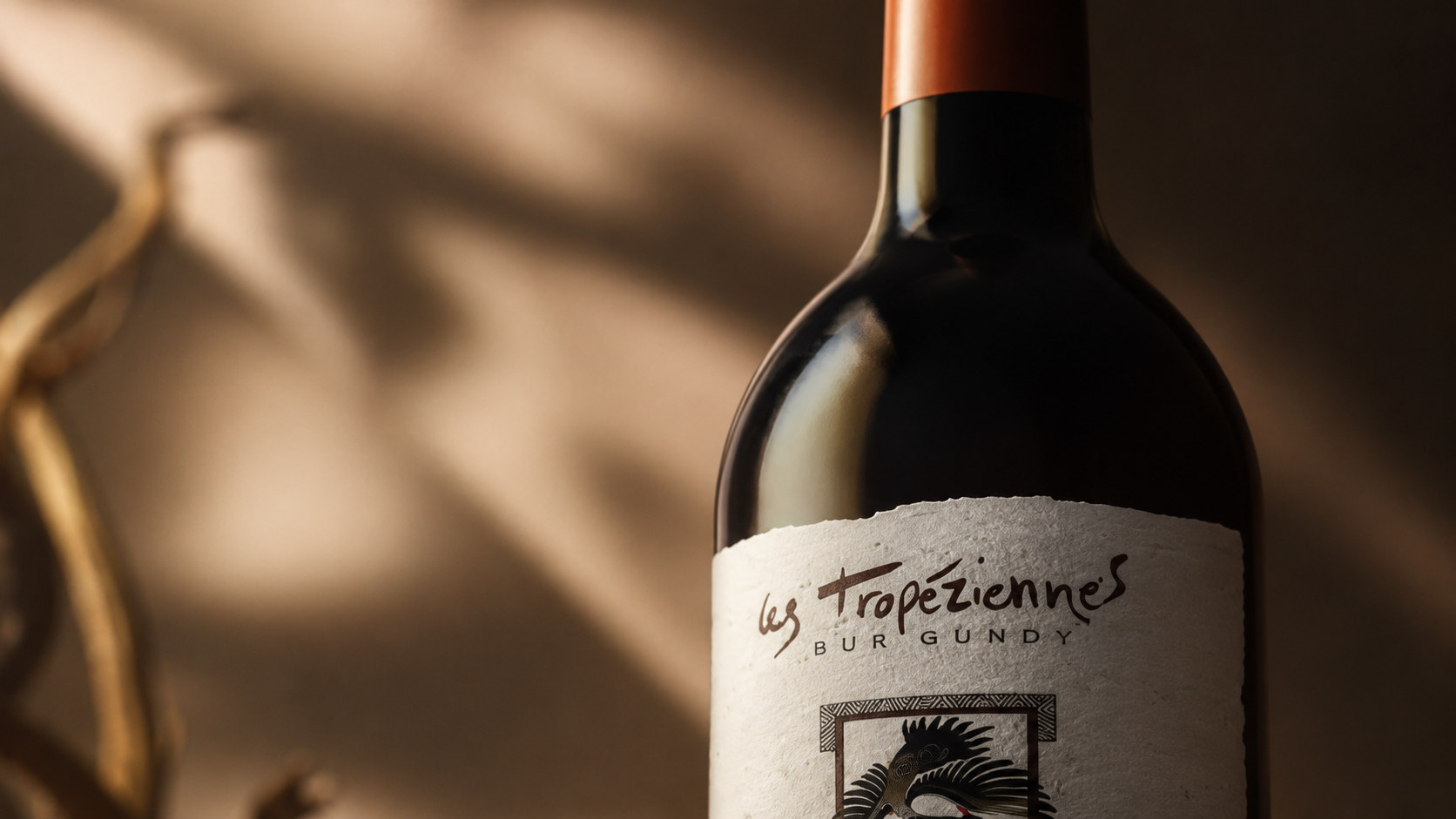
Graphics and symbols: The central illustration is the most emotional visual symbol of the packaging. The graphics are composed of animals, plants, land textures and local cultural images, showing a texture similar to prints, folk art or hand-drawn totems. It can not only represent the ecology of the place of origin, but also symbolize the values of symbiosis between the brand and nature. The border around the graphic enhances the sense of the work, making the label resemble a stamp, an old print, or a preserved memory of local customs.
Material and texture: The label uses natural paper with obvious fibers, grains and irregular edges, conveying handwork and authenticity through an unrefined texture. Printing can use low saturation spot colors, slight color registration deviation, debossing or partial hot browning process, so that the packaging retains a moderate sense of imperfection. The surface of the bottle uses a low-key gloss to show the depth of the wine, and the bottle mouth is unified by an orange-brown envelope and a dark bottle cap, creating a rich and restrained material contrast between glass, paper and metal.
Font and typography: The brand name adopts a font with a handwriting feel and free rhythm, conveying an independent, natural and humanistic brand character. Product information and origin descriptions use clearer and more stable serifs or simple printed fonts to ensure reading efficiency. The hierarchical relationship of "emotional title × rational information" is formed between different fonts, which makes the packaging both artistic and maintain the professionalism and credibility required for alcoholic products.
language and tone
The brand language of Les Tropéziennes emphasizes natural, sincere and pictorial expression. Echoing the visual temperament of the packaging, the brand text does not excessively pursue luxurious rhetoric, nor does it deliberately create distance. Instead, it revolves around the relationship between land, climate, grapes, time and people, telling the origin of a bottle of wine in a calm, delicate and true way. Each paragraph of copy should maintain clarity and restraint, provide accurate information when introducing the origin, grape varieties, brewing methods and flavor characteristics, and at the same time, through moderate emotional description, remind consumers of wood, rocks, fruits, sunlight and seasonal changes. Brands can express poetry, but should not become empty; they can emphasize tradition, but should not appear stale; they can convey quality, but do not need to prove value through exaggerated language. Whether it is bottle text, brand story, product description, or communication content on digital platforms, the overall tone should be like a slow and sincere conversation, allowing consumers to feel the brand's respect for nature, craftsmanship, and time while reading.
Brand Experience
The brand experience of Les Tropéziennes starts from the first moment consumers see the dark bottle and natural paper label, and runs through every touch point of selection, purchase, opening, tasting and sharing.
Product experience: Natural paper, hand-painted illustrations and dark glass together create a warm visual and tactile experience. When consumers pick up the wine bottle, they can feel the real texture brought by the contrast between the label fiber, bottle body weight and material. The clear information structure helps consumers understand the production area, product type and flavor characteristics, while the restrained packaging allows the wine bottle to naturally integrate into the dining table, wine cabinet and private collection space.
Drinking experience: The brand establishes a continuous experience through packaging, aroma, wine body and drinking scene. The process of uncorking the bottle, pouring into the glass and waiting for the aroma to unfold becomes part of the experience of time and terroir. The products are suitable for formal dining and sharing at festivals, as well as for drinking alone in a quiet environment, making wine an important way to slow down and experience life.
Digital experience: The brand continues the visual system of natural paper, dark brown, terracotta orange and hand-painted illustrations on its official website, e-commerce platforms and social media. Digital content can help consumers understand the cultural and professional information behind the product through images of origin, vineyard records, brewing processes and food pairings. The overall page is kept simple and quiet to avoid excessive commercial visual interference.
Spatial experience: Whether in a boutique winery, restaurant, wine shop or brand exhibition space, Les Tropéziennes can establish a unified atmosphere through natural wood, rough stone, warm lighting and low-saturated colors. The packaging and space echo each other, allowing consumers to experience a stable, natural and regional cultural brand experience from product display to actual drinking.
brand statement
It starts with land and becomes wine with time.
By reintegrating natural terroir, traditional brewing and modern design language, Les Tropéziennes not only creates a more authentic, restrained and culturally identifiable packaging image, but also allows consumers to clearly perceive the land, season and humanistic stories behind the wine. From a grape to a bottle of wine, from a natural paper label to a quiet drink, the brand is based on nature, time as craftsmanship, and sincerity as expression, making every opening an encounter with the place of origin, and allowing every sip of wine to retain the character of the land, the traces of time, and the emotions between people that deserve to be treasured.