










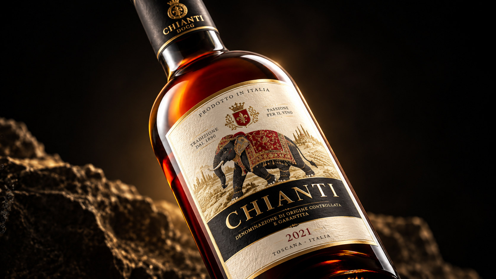
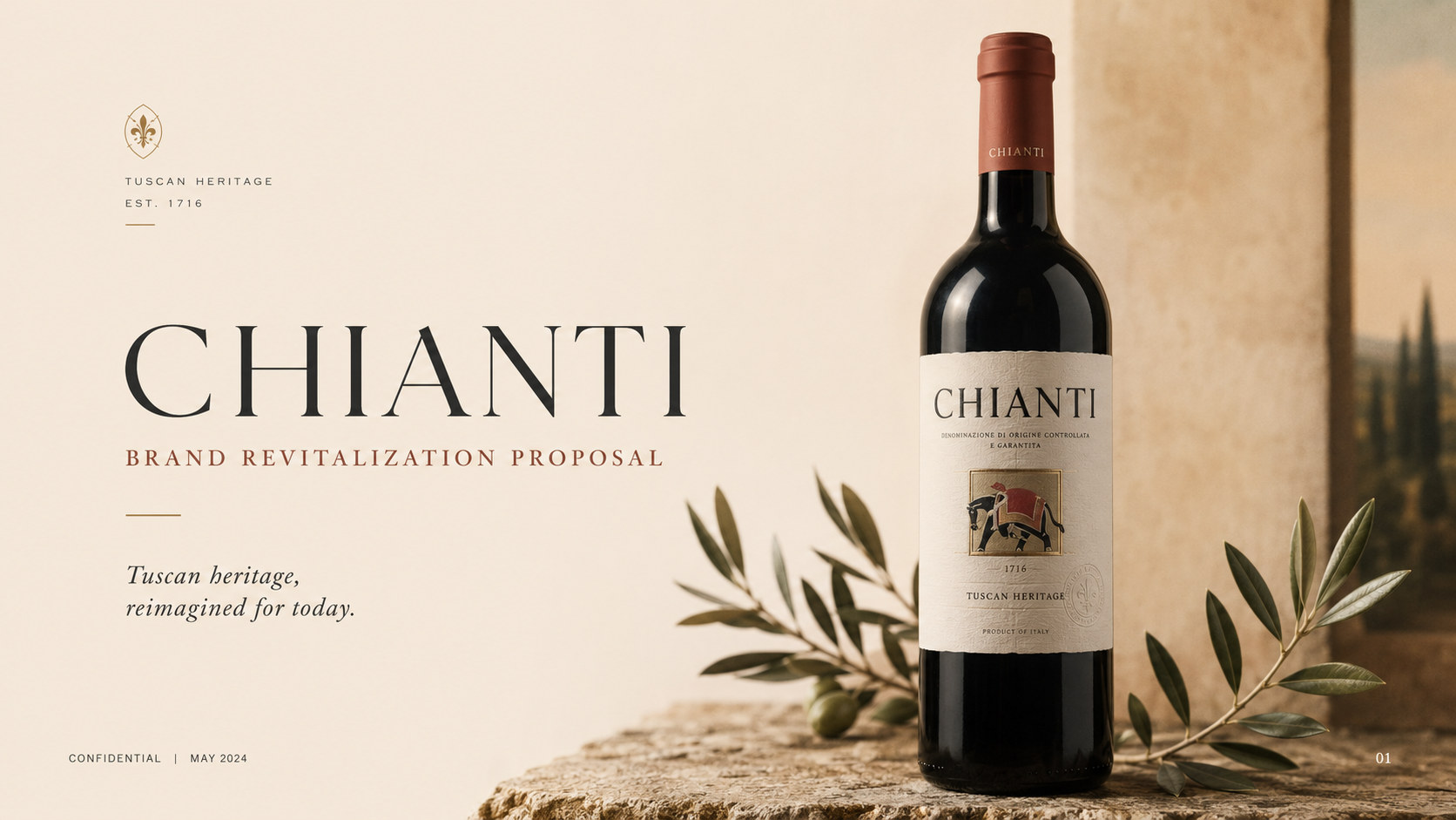
CHIANTI, as a boutique wine brand centered on European wine culture, origin and artistic expression, is committed to providing consumers with wine products with a sense of quality, culture and collection value through high-quality raw materials, traditional brewing methods and modern packaging design. Starting from the relationship between land, fruit, time and people, the brand regards a bottle of wine as a work completed by natural terroir and brewing skills. It also transforms drinking into a way to experience regional culture, life rhythm and emotional communication.
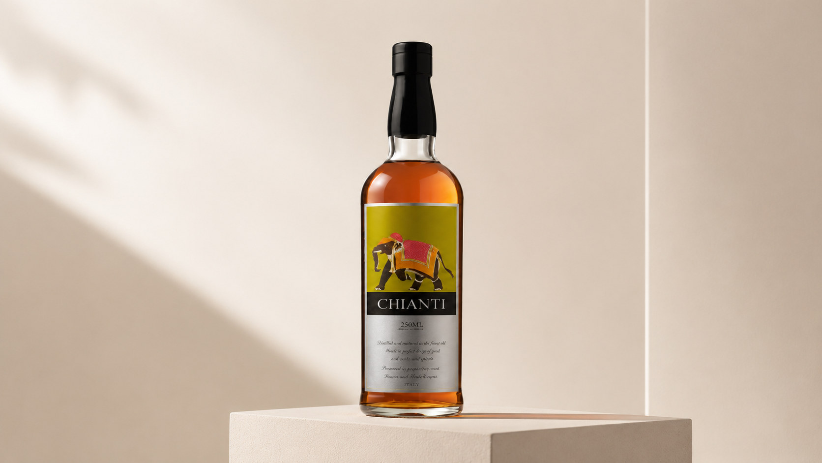
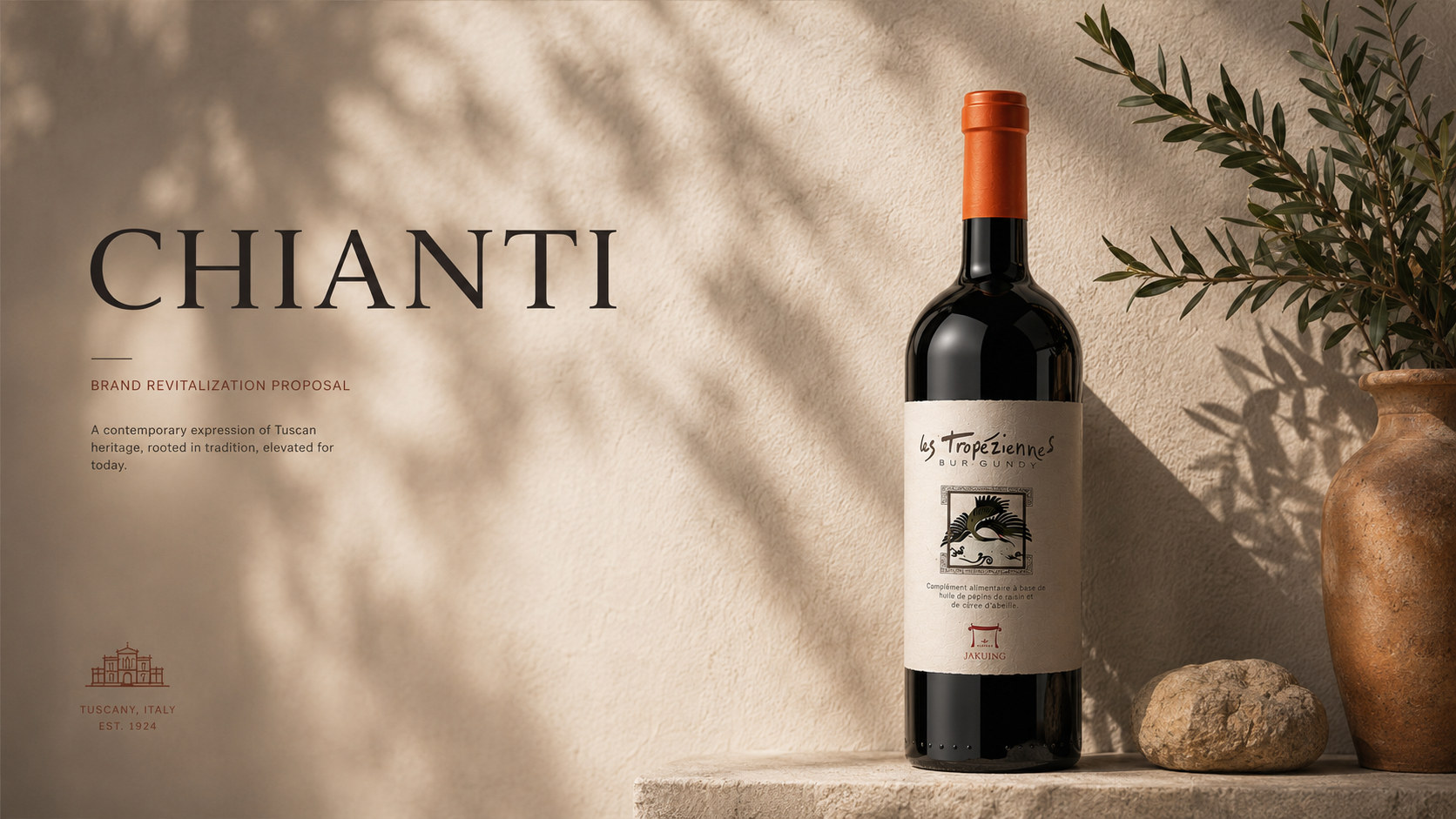
Facing the changing aesthetics of global alcohol consumption, brands are transforming from traditional alcohol products to boutique brands that integrate cultural narrative, artistic design and modern lifestyle. The new packaging image retains the classic bottle shape, amber liquid and traditional label structure, while introducing more recognizable colors, illustrations and material language, so that the product not only has the sense of history and professionalism that a wine brand should have, but also meets the needs of contemporary consumers for personality, quality and cultural expression.
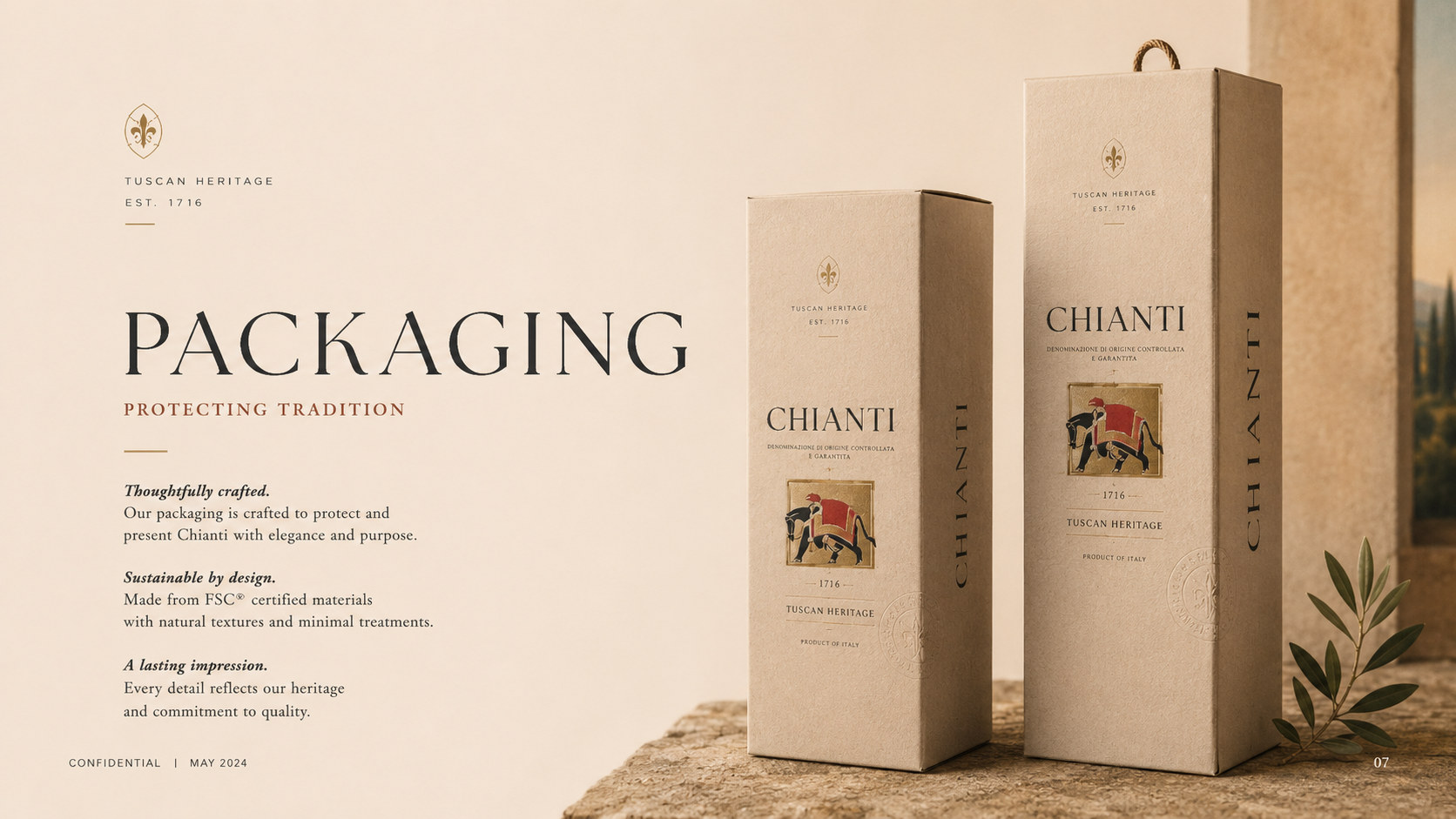
As the core visual symbol of the packaging, the elephant graphic establishes a distinct memory point for the brand. It symbolizes strength, wisdom, travel and time accumulation, and also represents the exchange and connection between different regional cultures. The new packaging is not only an update of the product appearance, but also a reshaping of the brand's value for the international market, life aesthetics and young consumer groups.
Brand spirit
CHIANTI's brand spirit is deeply rooted in natural terroir, traditional brewing culture and cross-regional exchanges. Its core spirits include:
Time × Quality × Trust
Culture × Exploration × Humanistic Temperature
These keywords clearly depict the spiritual core of the brand. Time represents the patience required for fruit ripening, fermentation, aging and flavor formation, and also reflects the brand's respect for the laws of nature and brewing rhythm; quality represents the continuous insistence on raw material selection, production technology and product standards; trust comes from the brand's protection of true information, stable flavor and long-term value. Culture reflects the regional stories, artistic traditions and lifestyles behind the drinks; exploration symbolizes the brand’s open attitude of constantly crossing boundaries and integrating different cultural elements; humanistic warmth makes the product not only a drink, but also an emotional medium for gatherings, gifts, commemorations and exchanges.
Brand concept
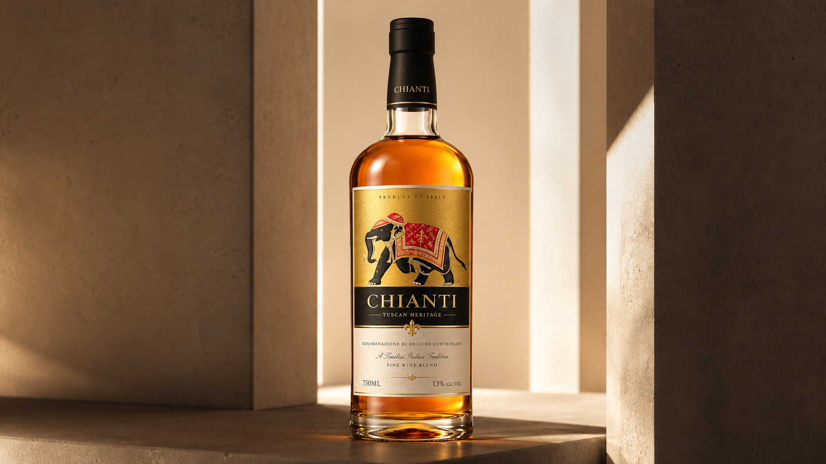
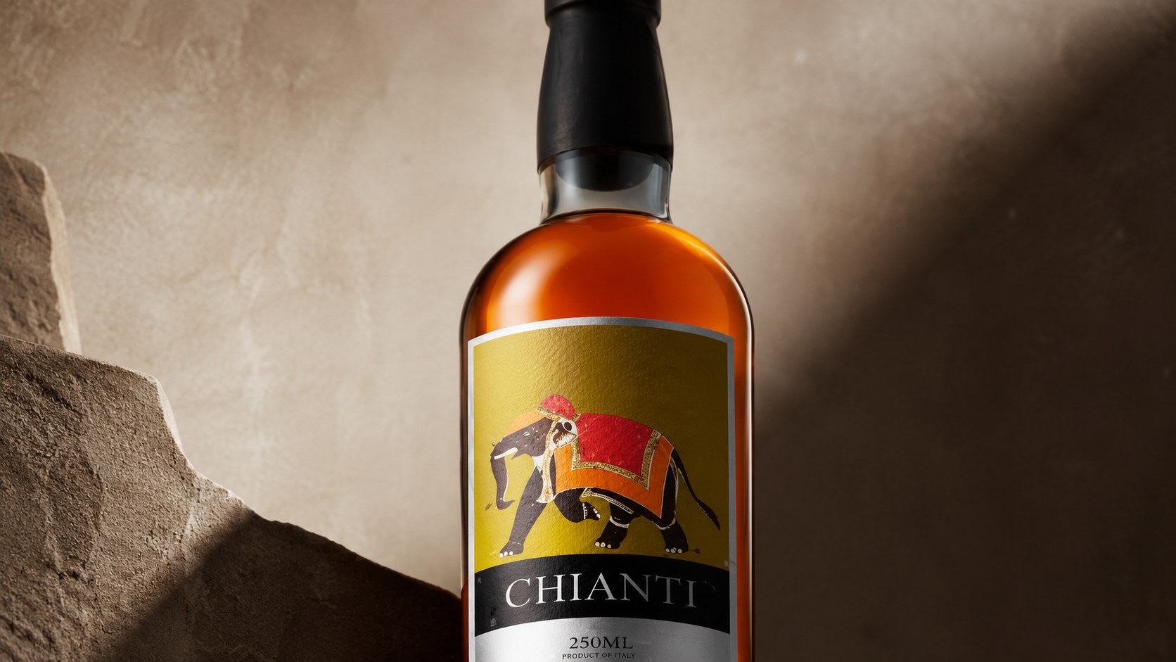
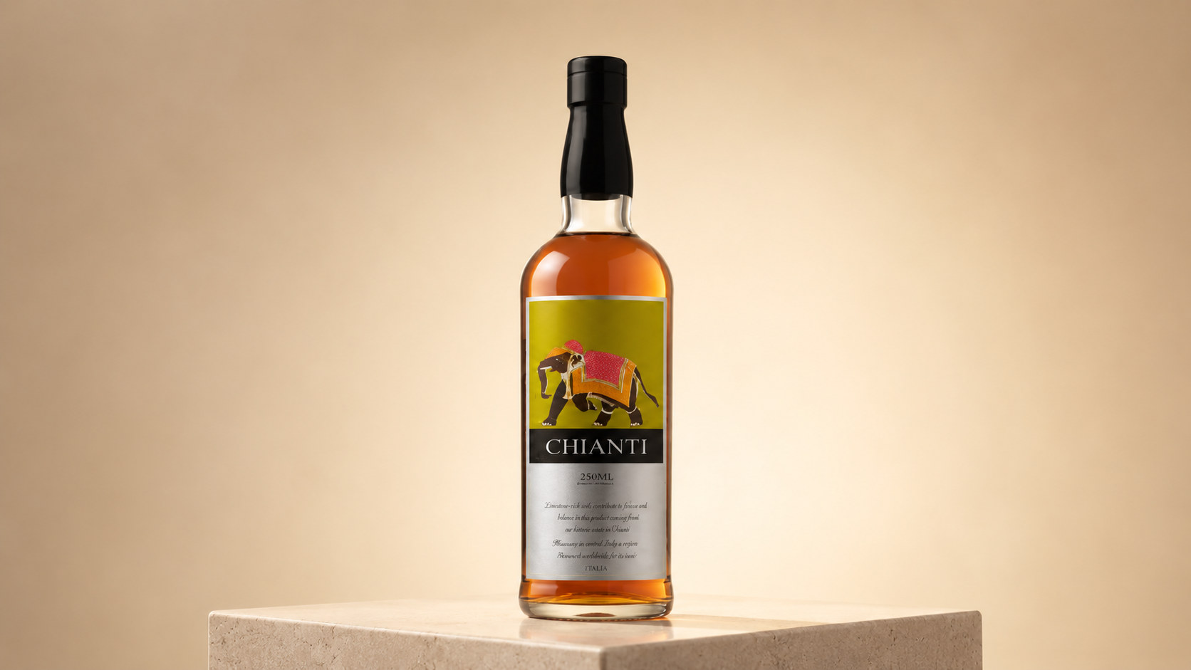
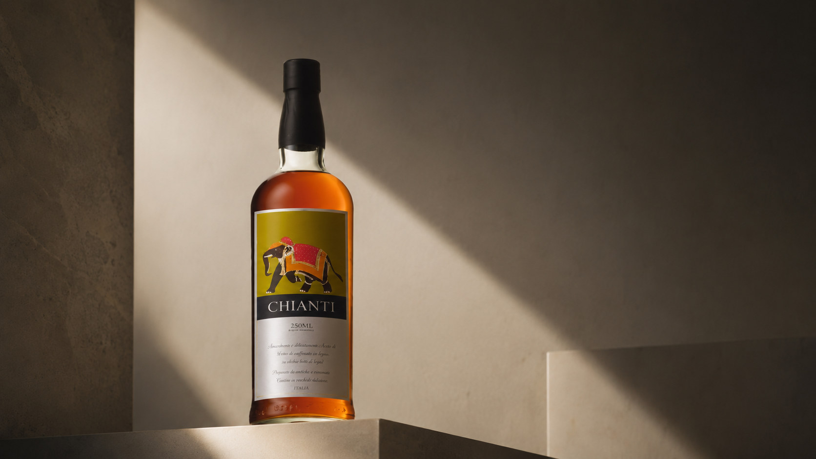
CHIANTI's brand concept emphasizes the design core of "classic order × exotic imagination". The new packaging image uses a stable and clear structure to show the professional attributes of wine products. It uses elephant illustrations, olive green, amber liquor and handmade texture details to create a brand atmosphere with a sense of travel, culture and art. Under the guidance of this concept, packaging not only focuses on visual recognition on the shelf, but also focuses on the emotional experience of consumers when they pick up the bottle, touch the label, read the information and open the product. The bottle body adopts slender and stable proportions, giving the product an elegant and restrained overall outline; the label uses a vertical central axis structure to organize graphics, brand name, capacity and product information to establish a clear and orderly reading path. The elephant graphic is located in the visual center of the label and has become the main carrier of brand story and emotional expression. It not only retains the warmth of hand-painted art, but also forms a modern identity through simple composition and bright color blocks. By combining traditional drink structures with cross-cultural graphic language, the brand establishes a balance between classic and contemporary, professional and emotional.
visual language
CHIANTI's packaging design is based on modern classicism, integrating European drinking aesthetics, travel culture and hand-made illustration language to form a warm, mature and internationally recognizable visual system.
Color and structure: Amber wine is the most important natural color in packaging, conveying the feeling of maturity, mellowness and time precipitation. Olive green is the main color of the label, echoing the land, plants, fruits and natural terroir, bringing a calm and unique visual temperament to the product. Black is used for the brand name and information area to strengthen the sense of professionalism and hierarchical relationships; warm white provides a stable background for text reading, keeping the overall vision balanced between richness and restraint.
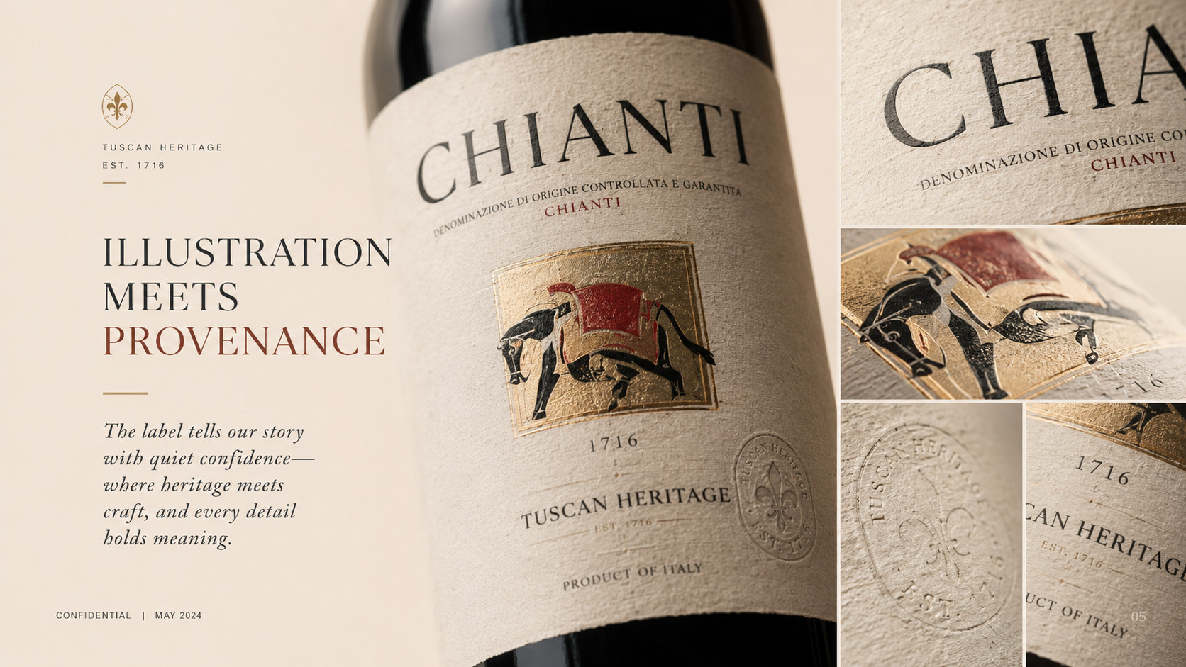
Graphics and symbols: The elephant is the most recognizable core symbol of packaging. Its image combines hand-painted paintings, fabric decoration and travel cultural characteristics, symbolizing wisdom, strength, stability and distance. The red fabric and gold decoration on the elephant's back add a cultural layer to the picture and also give the product a stronger gift attribute. The graphics are controlled within a regular rectangular frame, contrasting the free and vivid illustrations with the rational and stable layout.
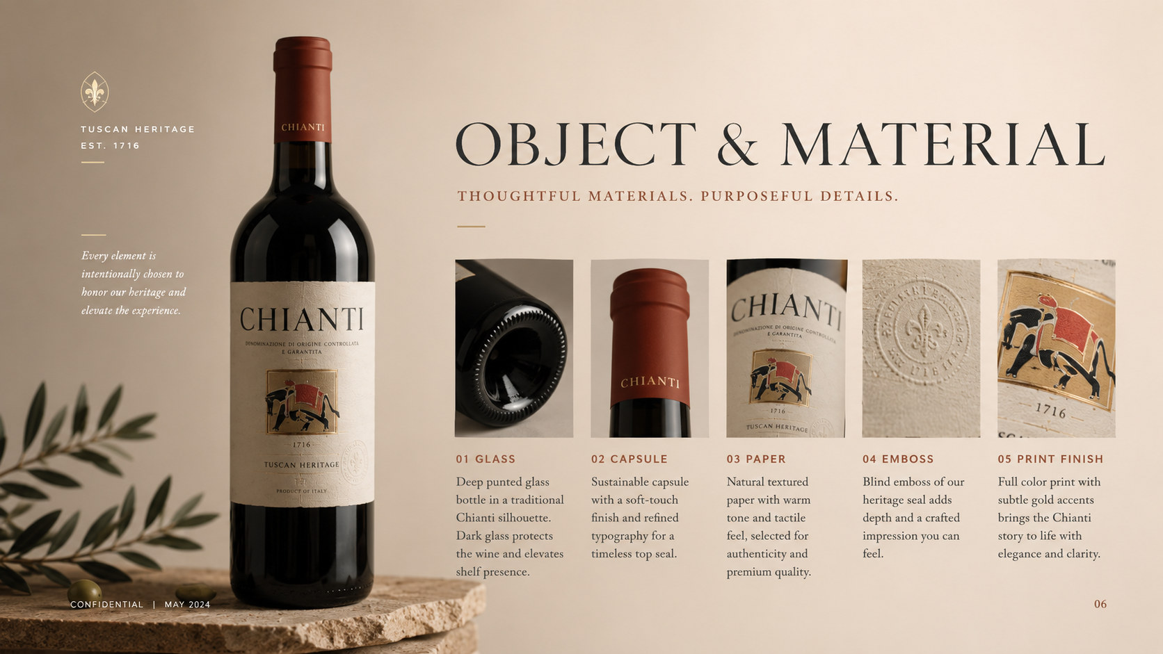
Material and texture: The bottle body is made of highly transparent glass, allowing the amber liquor to become part of the packaging, and the product quality is enhanced through the high gloss of the glass, the thick bottom of the bottle and the refraction of light. Labels can be made of high-quality paper with microfiber, cotton paper feel or slightly grainy texture, combined with local hot stamping, embossing, embossing and matte printing processes to create delicate layers of illustrations, text and borders. The black bottle seal connects the mouth and body of the bottle with a low-key gloss, adding modernity and completeness to the whole.
Font and typesetting: The brand name uses a serif font with a classic temperament. The letter structure is stable and clear, reflecting the history and professionalism of the alcoholic products. Capacity, origin and description information are arranged in lighter, smaller fonts to form a clear hierarchy with the brand name. The overall layout adheres to the central axis alignment and appropriate white space, so that illustrations, text and materials jointly form a clear and durable packaging image.
language and tone
CHIANTI's brand language emphasizes sincerity, restraint and rich imagery. Echoing the visual style of the packaging, the text expression not only retains the elegance and depth of wine culture, but also avoids overly gorgeous and empty modifications. Each piece of copy should revolve around land, fruits, time, travel and sharing, allowing consumers to understand the product flavor and cultural story through clear and delicate language. Brands can tell stories about natural surroundings, brewing processes and flavor layers; they can also depict dining tables, journeys and moments together, but always remain authentic and measured. The language needs to be warm but not deliberately sensational; be culturally sensitive but not create a reading distance; emphasize quality but not rely on exaggerated promises. Whether it is label text, product introduction, brand story or digital communication content, CHIANTI communicates with consumers in a calm, mature and open way, making every reading like a brief conversation about terroir, time and distance.
Brand Experience
CHIANTI's brand experience starts from the first moment when consumers see the amber liquor, elephant illustrations and green labels, and runs through every touch point of selection, purchase, opening, tasting and gifting.
Product experience: The slender bottle shape, transparent glass and delicate paper labels together create a rich visual and tactile experience. Consumers can feel the maturity and temperature of the product through the color of the wine, and the delicacy and care of the brand through the label texture and local craftsmanship. A clear information hierarchy helps consumers quickly understand the product name, capacity and basic information, while making the packaging have good display and collection value.
Drinking experience: The brand regards opening, pouring, smelling and drinking as part of the complete experience. The amber liquid produces warm changes under light, echoing the quiet and restrained packaging, making the product suitable for various life scenes such as dining, solitude, festivals and gifts. Every time you drink is not only a feeling of flavor, but also a connection between people, time, space and emotions.
Digital experience: The brand continues the visual system of olive green, warm white, black and amber on its official website, e-commerce platform and social media, and establishes a unified and cultural online experience through product details, illustrated stories, drinking suggestions and life scenes. Keep digital content concise, highlight the product itself and the brand story, and avoid overly commercialized visual interference.
Spatial experience: Whether in boutique wine stores, restaurants, hotels or brand exhibition spaces, CHIANTI can create a unified atmosphere through warm lighting, natural stone, dark wood and low-saturated green. The packaging and space echo each other in terms of materials and colors, allowing consumers to feel the brand's mature, quiet and exploratory temperament in different contact scenarios.
brand statement
Use time to create flavor and travel to connect cultures.
By reintegrating traditional drink structures, natural colors and artistic graphics, CHIANTI not only creates a more distinctive, mature and international packaging image, but also allows consumers to more clearly perceive the land, time and cultural stories behind the products. From an elephant graphic to a bottle of amber wine, from a delicate label to a slow sip, the brand is based on quality, uses culture as expression, and uses exploration as the spirit, making every opening a portal to the distance and every sharing a sincere and warm connection between people.