










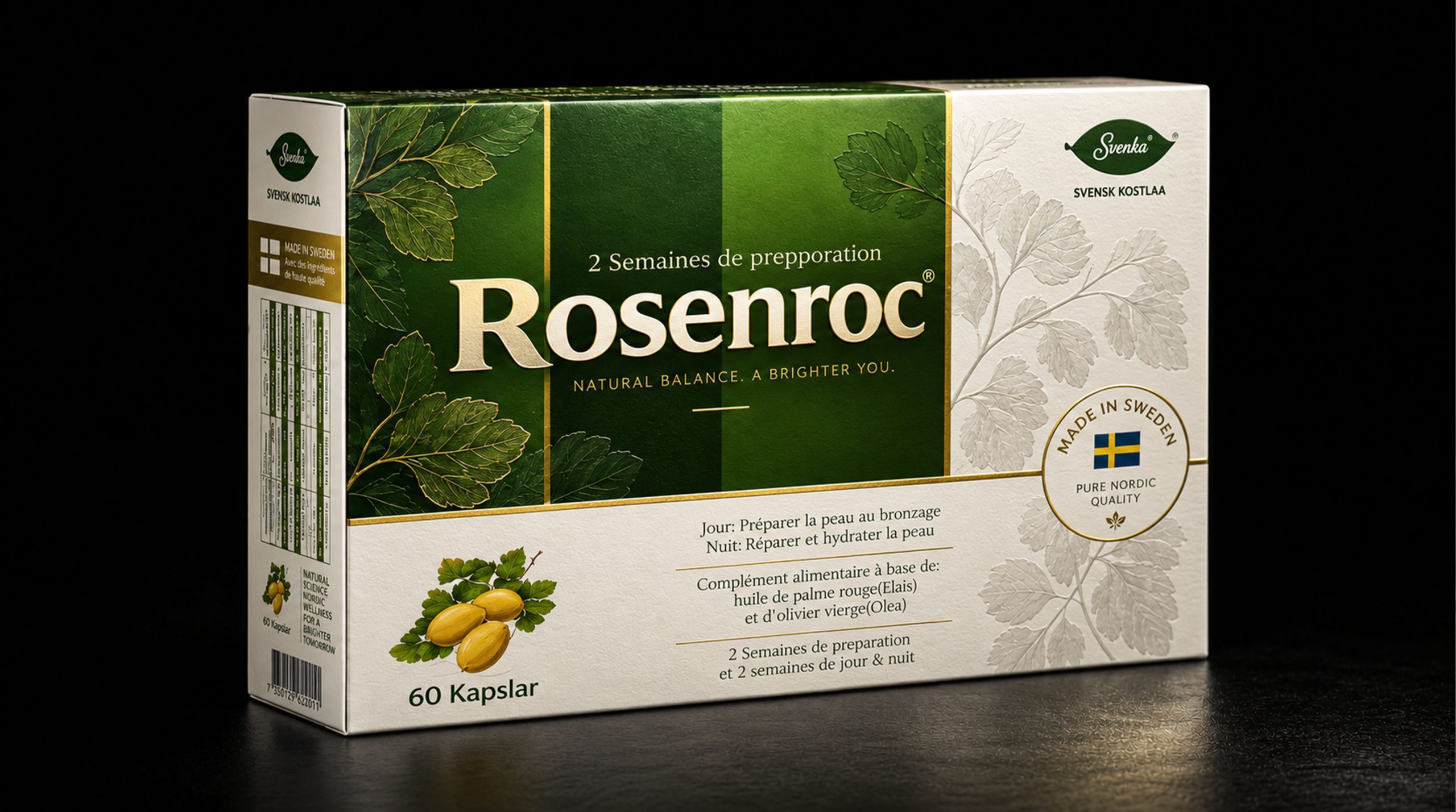
Rosenroc is a dietary nutrition brand with Nordic natural concepts, plant nutrition and modern health management as its core. The brand draws inspiration from Sweden's pure natural environment and rational and restrained lifestyle, focusing on consumers' daily nutritional needs in different seasons, life rhythms and outdoor scenes. Through plant-derived ingredients, clear information expression and standardized product systems, it provides modern consumers with more convenient, professional and quality health choices.
Faced with the continuous upgrading of global health consumption concepts and consumers' continued attention to product ingredients, usage methods and brand transparency, Rosenroc is gradually transforming from a single nutritional product into a modern health brand that integrates plant research, lifestyle guidance and systematic visual experience. The brand does not create anxiety by exaggerating its efficacy, but emphasizes regular use, rational choice and long-term self-management, so that health products can be naturally integrated into daily life.
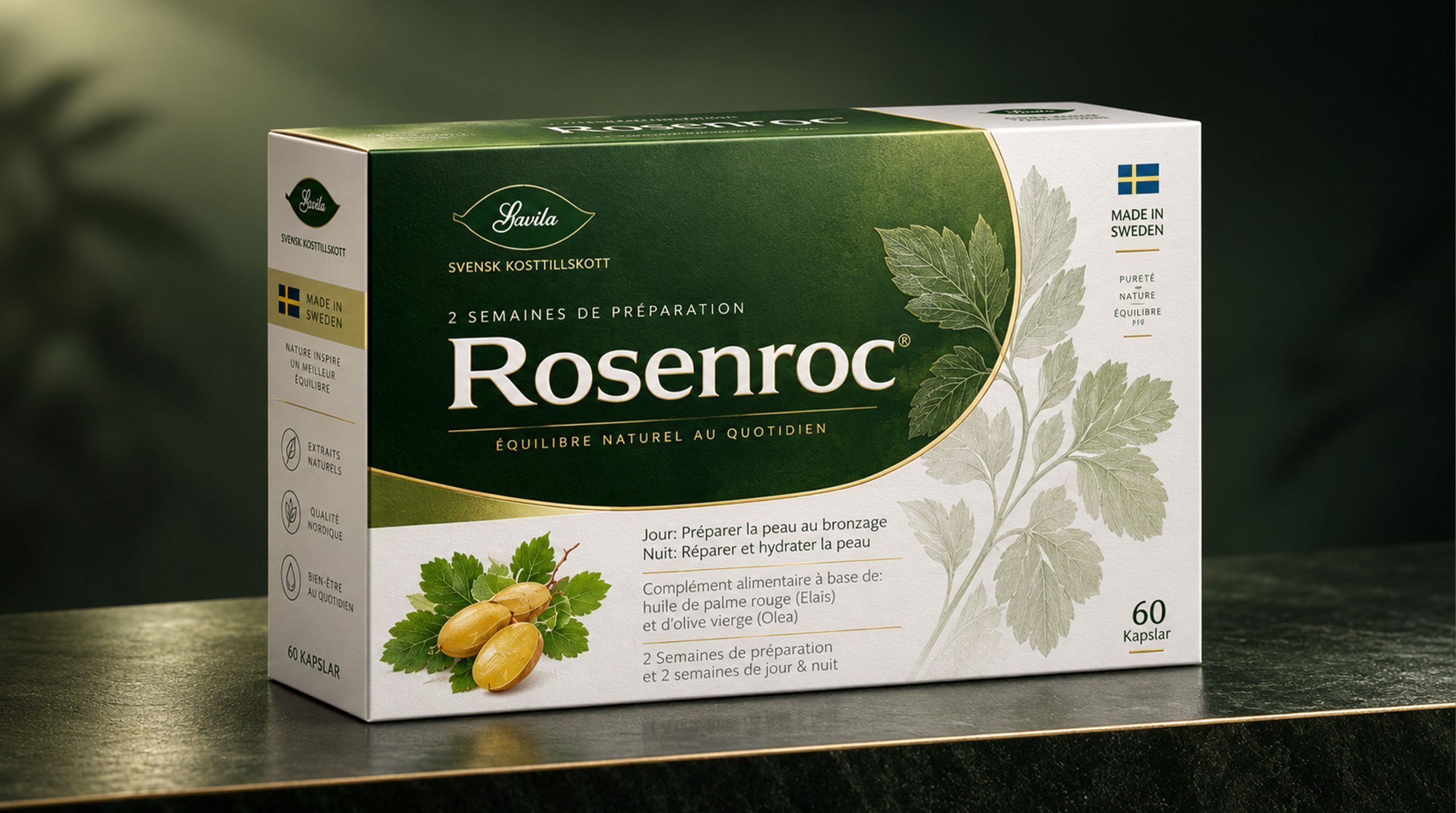
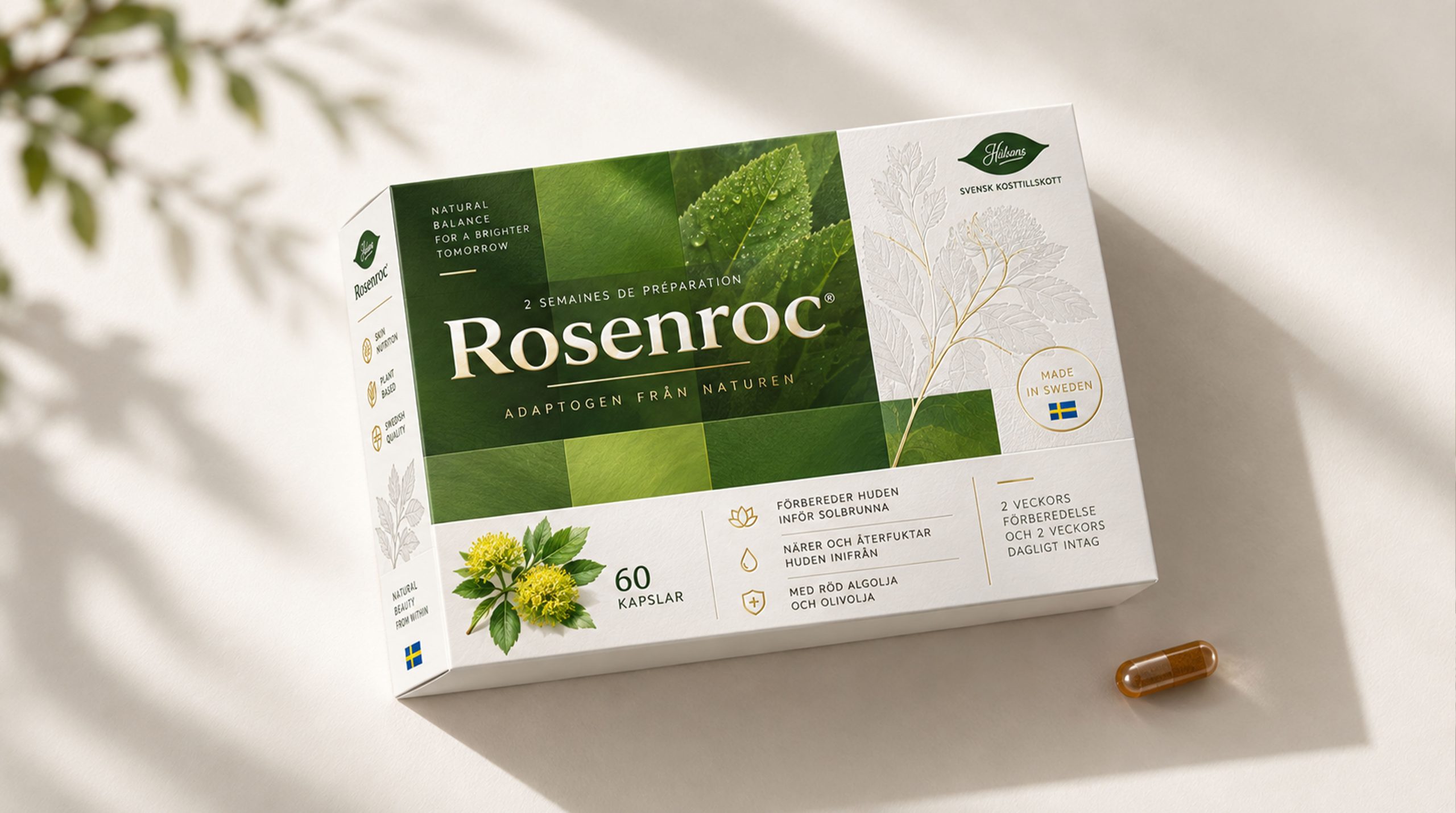
The new packaging design is an important symbol of brand transformation. It uses green plant images, modular color blocks and large white spaces to build a professional and natural visual system. While conveying information about Swedish manufacturing, plant origin and product cycle, it also creates a clear, credible and international brand image.
Brand spirit
Rosenroc's brand spirit is deeply rooted in the Nordic view of nature, scientific nutrition concepts and modern healthy lifestyles. Its core spirits include:
Nature × Reason × Trust
Plants × Science × Daily Care
These keywords clearly depict Rosenroc’s brand DNA. Nature represents the brand's focus on plant-derived ingredients, pure environment and sustainable lifestyle; rationality reflects the brand's clear expression of product information, use cycle and consumer communication; trust comes from standardized product systems, transparent ingredient descriptions and stable and consistent quality experience. Plants represent the core connection between the brand and natural raw materials, scientifically reflecting the emphasis on formula logic, product standards and usage methods, while daily care makes health management no longer a short-term behavior, but a long-term companionship integrated into the rhythm of consumers' lives. Through the combination of nature and science, the brand establishes a value system that is professional but not cold, restrained but warm.
Brand concept
Rosenroc's brand concept emphasizes the design core of "scientific order × natural perception". The new packaging image uses a clear and modular information structure to show the professionalism of the product, and uses plant images, leaf graphics and green layers to convey the natural origin and life temperature. Under the guidance of this concept, packaging not only focuses on visual recognition, but also pays attention to consumers’ actual experience in the process of selection, reading, use and ongoing management. The brand name is located in the core visual area of the package, forming a stable and clear identification center; the use cycle, product quantity, raw material information and origin information are arranged in a clear hierarchy to help consumers quickly understand product attributes and reduce reading and selection costs. The green color blocks are combined with different shades and transparency, just like the gradation changes caused by natural light passing through the leaves, retaining a sense of nature in the rational structure. By coordinating scientific information with the language of plants, Rosenroc creates a balance between professionalism, credibility and accessibility, making health packaging both functionally efficient and able to convey a calm, positive attitude toward life.
visual language
Rosenroc's packaging design is based on Nordic modernism, combining plant images, geometric partitions and highly recognizable information layout to form a visual language that is natural, clear and has professional and healthy attributes.
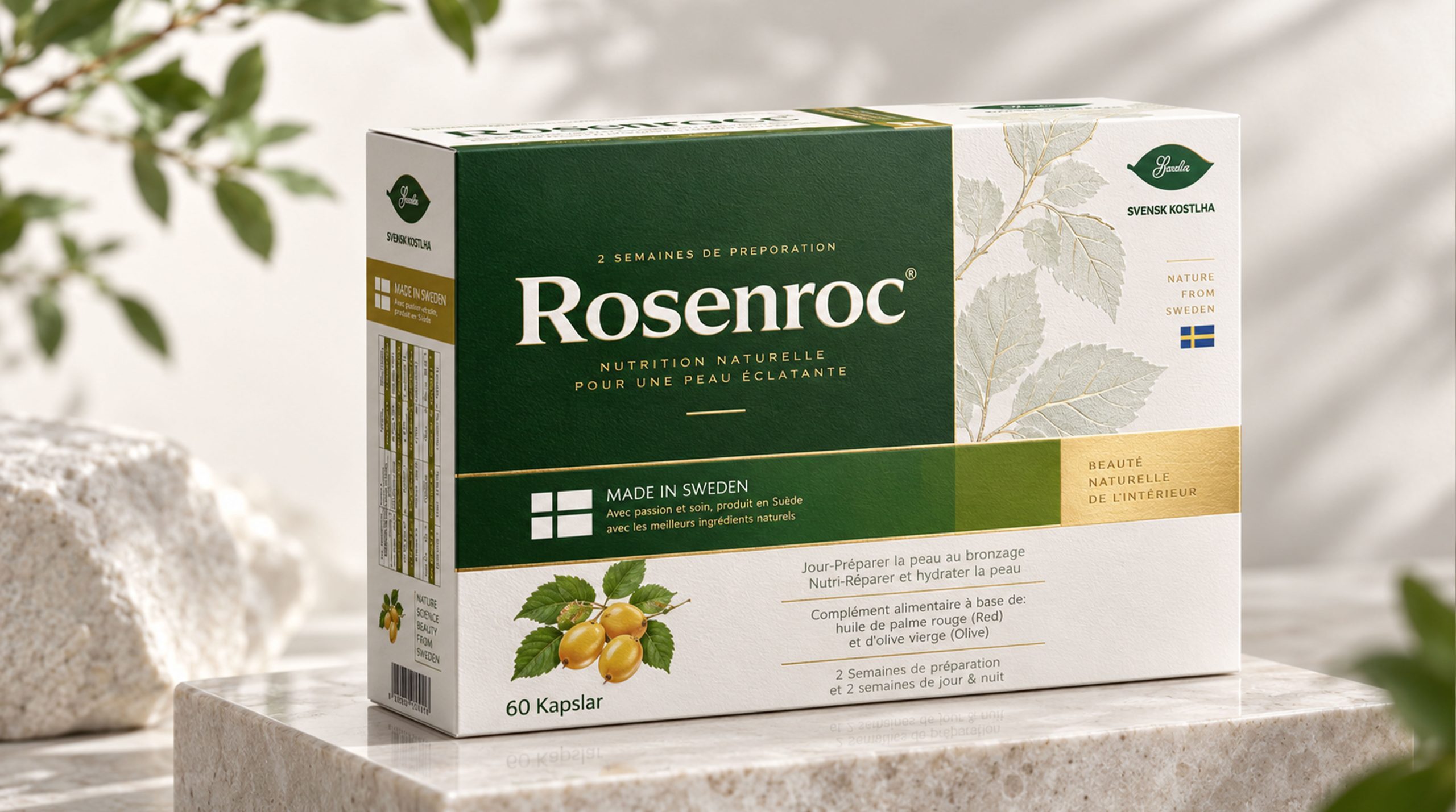
Color and structure: Green is the core visual color of packaging, symbolizing plants, growth, balance and natural vitality. Dark green conveys a sense of stability, professionalism and trust, while olive green and yellow-green strengthen the association of plant maturity, sunlight and nutrients. A large area of white serves as the basic space, providing a clear background for complex information and making the overall packaging cleaner and more rational. The packaging adopts a horizontal modular structure that integrates the brand name, plant images, product cycle, origin information and capacity instructions into a unified order.
Graphics and symbols: Images of plant leaves, branches and fruits are important visual symbols of packaging, directly establishing a connection between products and natural raw materials. In the central area, abstract green images and color blocks are superimposed to form a visual experience similar to that of a forest, tree shadows and natural light. The Swedish flag symbol and the "Made in Sweden" message strengthen the regional origin and quality impression of the product, forming a dual recognition of natural graphics and trust in the origin.
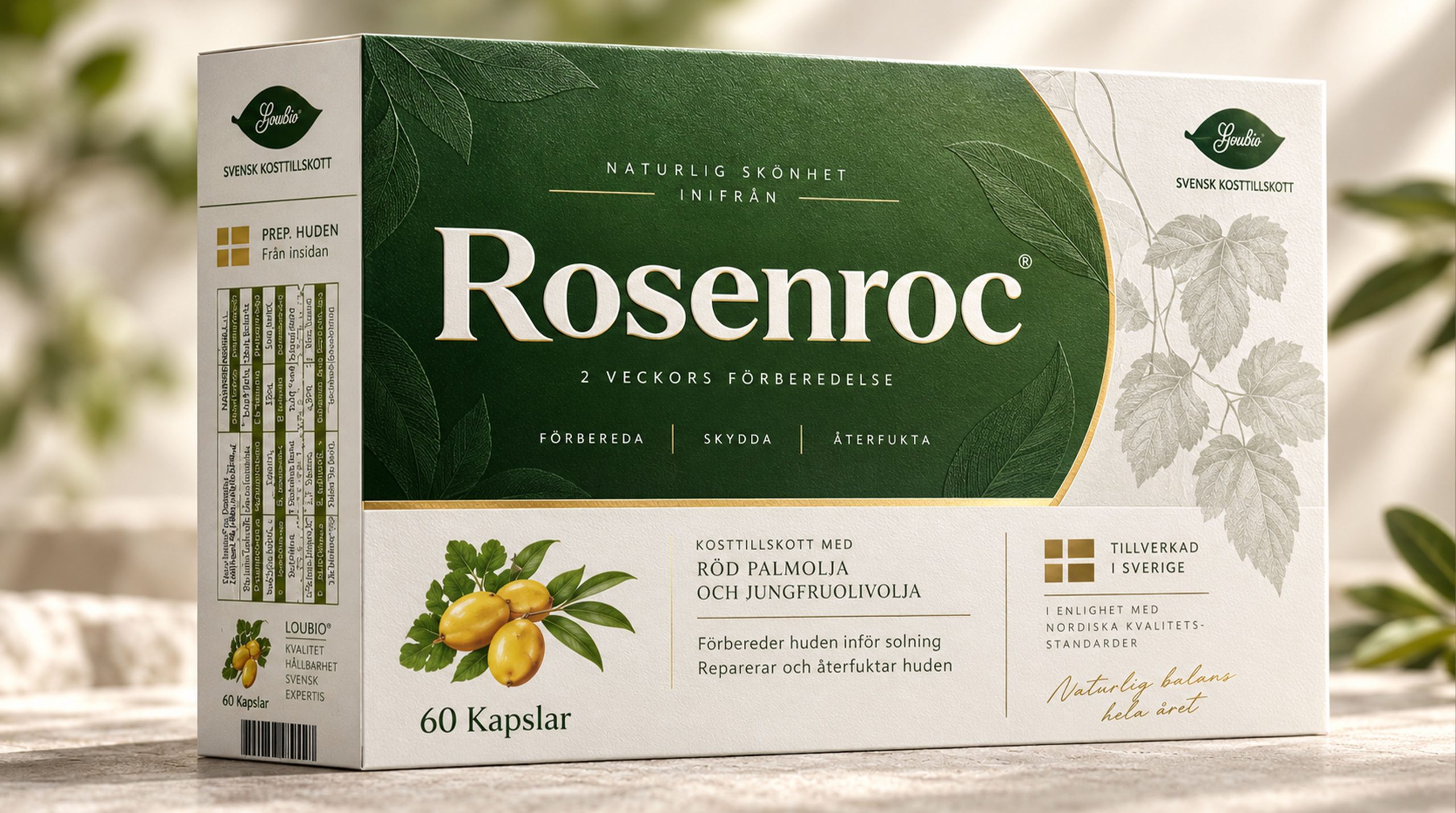
Material and texture: The packaging can use fine matte paper and low-reflective printing technology to present a clean, soft and professional-looking surface effect. The green image can be enhanced through local varnish, transparent overprinting or slight embossing, so that the plant image can produce subtle changes under different lights. Keep the white area restrained and flat, avoid excessive decoration, and let the material serve the purpose of information reading and brand credibility.
Font and typography: The brand name adopts a clear, modern and humanistic font, with a larger font size to establish the visual center. The auxiliary information uses a concise sans-serif font, and uses font size, weight and spacing to distinguish the product name, use period, ingredient description and specification content. The overall layout emphasizes alignment, white space and modular relationships, allowing different languages and multi-layered information to maintain good readability in limited packaging space.
language and tone
Rosenroc's brand language emphasizes clarity, honesty and professionalism. Echoing the visual image of the packaging, the brand text remains rational, restrained and easy to understand. It does not use over-promising or pressure-creating expressions, but uses accurate information to help consumers establish a health management method that suits them. Each piece of copy should focus on product attributes, plant origin, use cycle, life scenarios and daily management to ensure that consumers can quickly understand what the product is, how to use it and what life needs it suits. Brands can convey positive feelings about nature, sunshine, the outdoors and healthy living, but all expressions should remain cautious and truthful, and avoid describing dietary nutritional products as disease treatments. Whether it's packaging instructions, brand stories, official websites or social media content, Rosenroc communicates with consumers in calm, clear and companionable language. Professionalism does not mean complexity, and warmth does not rely on excessive modification. The brand builds long-term trust through true and measured expression.
Brand Experience
Rosenroc's brand experience starts from the first moment consumers see green packaging, plant images and clear product information, and runs through every touch point of understanding, selection, use and continuous health management.
Product experience: Through a unified green visual system and modular information structure, consumers can quickly identify product categories, use cycles, specifications and raw material directions. The packaging not only pays attention to visual beauty, but also takes into account the convenience of opening, storage, carrying and daily use. Clear instructions for use can help consumers establish regular habits and make the product a natural and stable part of their daily lives.
Digital experience: The brand continues the visual system of green, white and plant images on its official website, e-commerce platforms and social media, and establishes a transparent and professional online experience through ingredient introduction, usage methods, life suggestions and frequently asked questions. Consumers can quickly obtain necessary information and make rational judgments based on their own needs.
Spatial experience: Whether in a pharmacy, health product store, boutique supermarket or professional nutrition space, Rosenroc can be clearly identified through green modules, white backgrounds and plant images. The product display is kept clean, quiet and orderly, allowing the brand to still convey the Nordic sense of rationality and nature in a complex terminal environment.
Service experience: The brand provides consumers with more complete product understanding and usage support through clear explanations, standardized customer service and continuous content output. All communications are based on authenticity and transparency, and do not create a sense of urgency, but help consumers manage their daily status in a more calm and stable way.
brand statement
Take nature as the source and protect daily life with reason.
By reintegrating Nordic natural concepts, plant nutrition and modern design language, Rosenroc not only established a clear, professional and international packaging image, but also made the ingredients, cycles and usage methods behind health products more intuitively understandable to consumers. From a plant leaf to a clear information system, from a product selection to long-term life management, the brand is based on nature, science as a method, and trust as a connection, making every use simpler and making every health choice based on authenticity, clarity and respect for individual needs.