






Harbin Pharmaceutical Brand Mineral Oral Liquid is a functional nutritional supplement product under Harbin Pharmaceutical Group. It takes mineral supplementation as its core functional positioning and provides two completely different packaging solutions for children and adults.
In terms of packaging design, Harbin Pharmaceutical has built a set of products based on "pharmaceutical-grade trust × functional icon language × "Two colors and two lines" is a visual system with three pillars: the white and blue version uses medical-grade calm white and deep navy blue authoritative color blocks to form the first impression of "professional and trustworthy"; the red and white version uses gradient coral red and clean white to form the emotional tone of "warmth, care and vitality"; both models use a circular functional icon (intestinal/nutritional absorption symbolic graphic) as the visual abbreviation of product efficacy, and Harbin Pharmaceutical Group's red shield logo as the ultimate endorsement of brand trust. From the glass ampoule to the outer box, from a single tube to the entire box, every layer of packaging conveys the same core message: This is not a health product, this is a professional nutritional supplement produced by a pharmaceutical company.
Brand Essence
The core spirit of the packaging design of Harbin Pharmaceutical Mineral Oral Liquid can be summarized as:
Medicine × Supplement × Letter
Professional × Function × Care
"Medicine" is the core source of trust for a brand. Harbin Pharmaceutical is not a health care product brand, but an old pharmaceutical company with decades of history. This identity difference is the biggest competitive barrier for products in the health care product market - the professionalism, safety and authority carried by the words "produced by a pharmaceutical company" far exceed that of any ordinary health care product manufacturer. The packaging design maximizes this trust advantage: the red shield-shaped logo of Harbin Pharmaceutical Group is placed in the upper left corner of the front of the package with a very high priority, followed by the word "Harbin Pharmaceutical" in bold bold, and the three characters "Harbin Pharmaceutical Brand" in the largest font size at the beginning of the product name. The design logic of the entire set of text levels is: first let consumers know "This is from Harbin Pharmaceutical", and then let consumers know "what it is."
"Supplement" is the functional positioning of the product. The five words "mineral oral liquid" complete the product category definition in precise professional terms - "mineral" indicates the supplement content, and "oral liquid" indicates the dosage form. This naming method completely follows the standardized logic of drug naming ("brand name + ingredients + dosage form"), rather than the common perceptual naming of health care products (such as "Vitality Source", "Jiangule", etc.). This naming strategy with a "medicine" temperament both vertically and horizontally distances the product from ordinary health care products from the first second. The intestinal symbolic graphics in the circular function icon are presented in simple line illustrations, compressing the functional logic of "mineral supplement → intestinal absorption → body benefit" into a visual symbol that can be instantly recognized, just like the "indications" icon on a drug package - no need to read the text, just look at the picture to understand.
"Letter" is the ultimate design goal of the entire package. In an environment where trust in the health care product market is generally low, Harbin Pharmaceutical's packaging uses all visual elements to serve one goal - to build trust. The cold, medical-grade color scheme of the white and blue version conveys the signal of "professional, rigorous and reliable", the shape of the medicinal device of the glass ampoule conveys the quality hint of "this is medicine, not a drink", and the sealing feeling of the blue cover conveys the safety signal of "clean and pollution-free". Every design detail silently repeats the same sentence: "This is a nutritional supplement made by pharmaceutical companies using the same standards as pharmaceuticals."
"Professional" is reflected in every aspect of the white and blue version - from the shape of the glass ampoule and the sealing texture of the blue aluminum lid to the simple layout of the white outer box and the authoritative color block of deep navy, the entire visual language completely continues the design convention of prescription drug packaging. "Function" is reflected in the intuitive communication of circular icons and the precise labeling of product parameters - information such as iron content, zinc content, net content 10ml, attention groups and other information are presented in a standardized drug labeling format, with high information density but clear hierarchy. "Care" is the emotional background color of the red and white version - the warm tone of coral red, the soft touch of the rounded square box and the intimacy of the intestinal graphics in the functional icons, together create an emotional warmth of "Harbin Pharmaceuticals is caring about your health", making the sense of professionalism less indifferent.
Design Philosophy
The overall design concept of Harbin Pharmaceutical Mineral Oral Liquid is "packaging according to pharmaceutical manufacturing standards - two groups of people, two tone of voice, one profession". The core proposition of the design is: how to transform the professional trust of pharmaceutical companies into the most convincing visual language on the health care product shelves, while providing appropriate emotional temperatures for different groups of people.
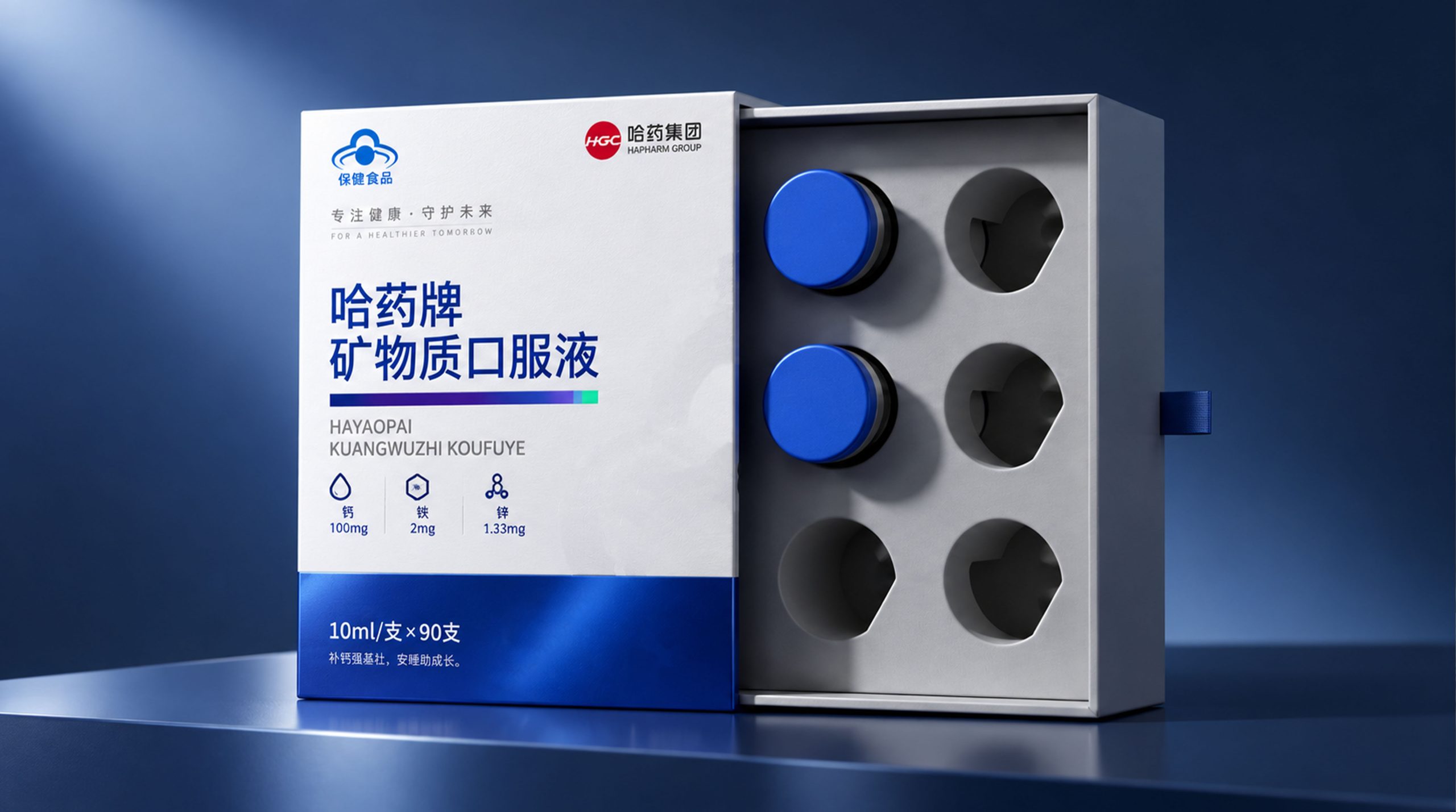
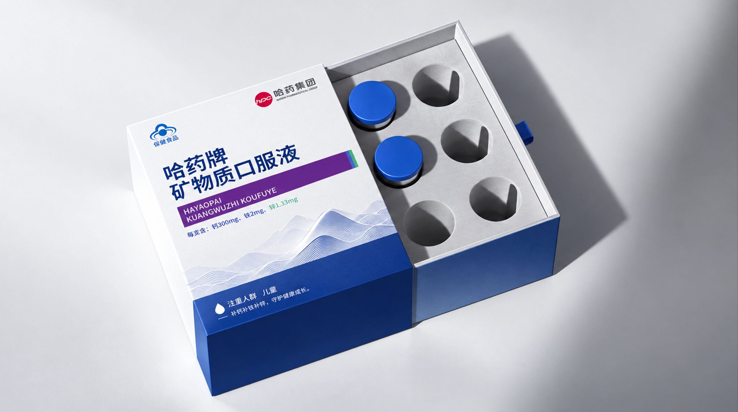
White and blue version - pharmaceutical-grade professional line (white outer box × dark blue block × glass ampoule): This is the most pharmaceutical-grade professional version of Harbin Pharmaceutical Mineral Oral Liquid. The main color of the outer box is white, which occupies about 70% of the box area, conveying the most classic visual semantics of "clean", "sterile" and "trustworthy" in pharmaceutical packaging. About one-third of the lower part of the box is finished with a dark blue color block, separated from the white area by sharp horizontal lines - this two-color split composition of "white on top and blue on bottom" is the most classic and recognizable visual paradigm in Chinese prescription drug packaging. Harbin Pharmaceutical deliberately uses this paradigm to strengthen the "medicine" quality of the product. In the upper left corner of the white area is the red shield-shaped logo of Harbin Pharmaceutical Group, followed by the word "Harbin Pharmaceutical" on the right. A small blue round icon (cloud-shaped or intestinal symbol) is used as a functional identifier on the upper left side, and the words "active ingredients" are marked next to the icon. Slightly to the left of the middle of the box, the product name "Ha Yao Brand Mineral Oral Liquid" is displayed vertically in thick dark blue fonts. The font size is very large, occupying about 40% of the height of the box, and is the visual focus of the packaging. Below the product name, the English name "HAYAOPAIKUANGWUZHI KOUFUYE" (pinyin English), the amount (iron ≥100mg, zinc ≥···mg) and the safety tips "Attention: children" are marked in small fonts. The specification information of "10ml/tube*90 tubes" and the safety statement "No food additives are allowed" are marked in small white letters in the blue color block area. The box body has a square cardboard structure, and the interior is divided with white corrugated paper covers to firmly position each glass ampoule. After opening the box, the blue covers of the glass ampoules are arranged neatly like a laboratory reagent rack - this "drug-like" visual experience is the core strategy of the design.
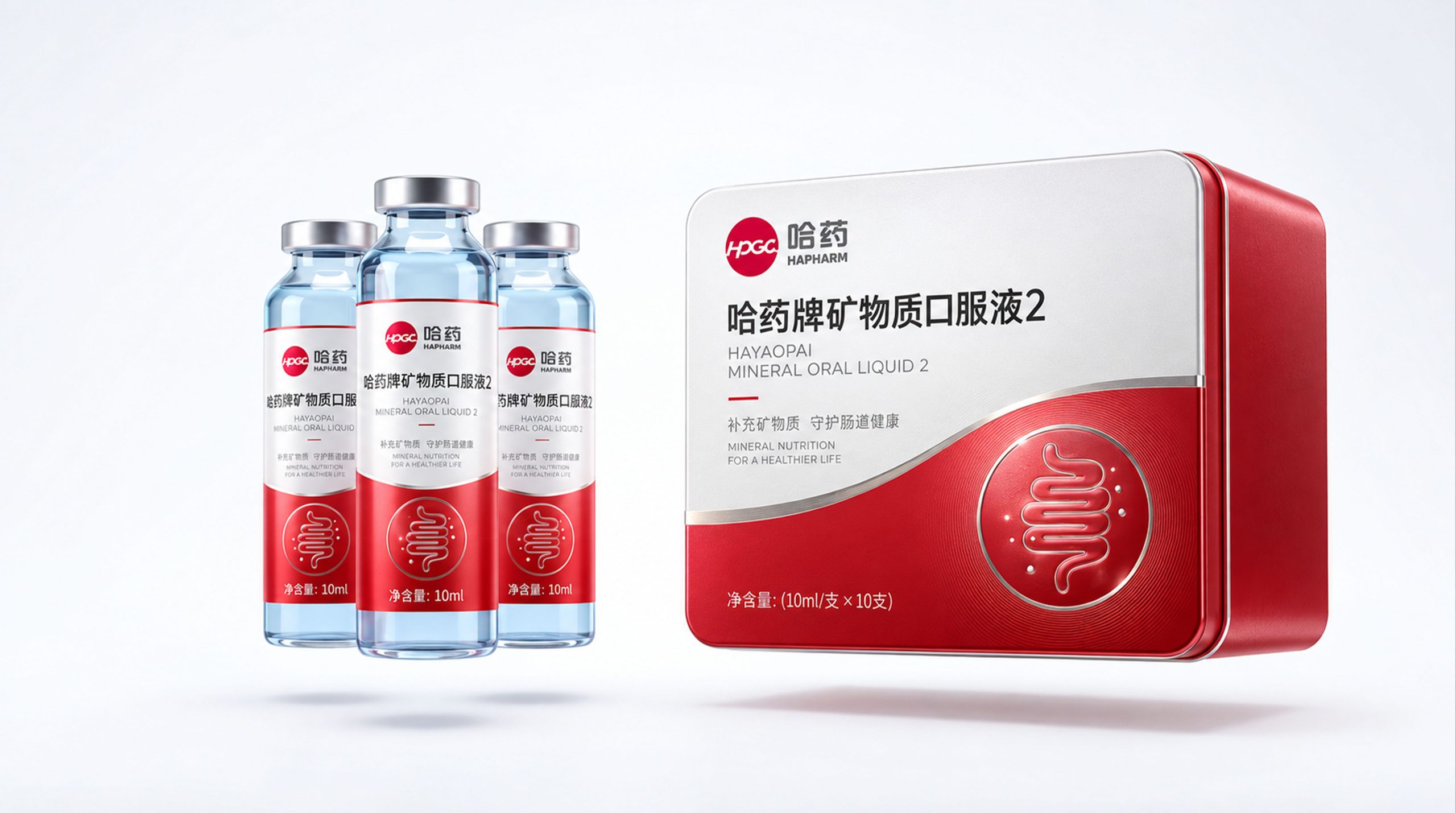
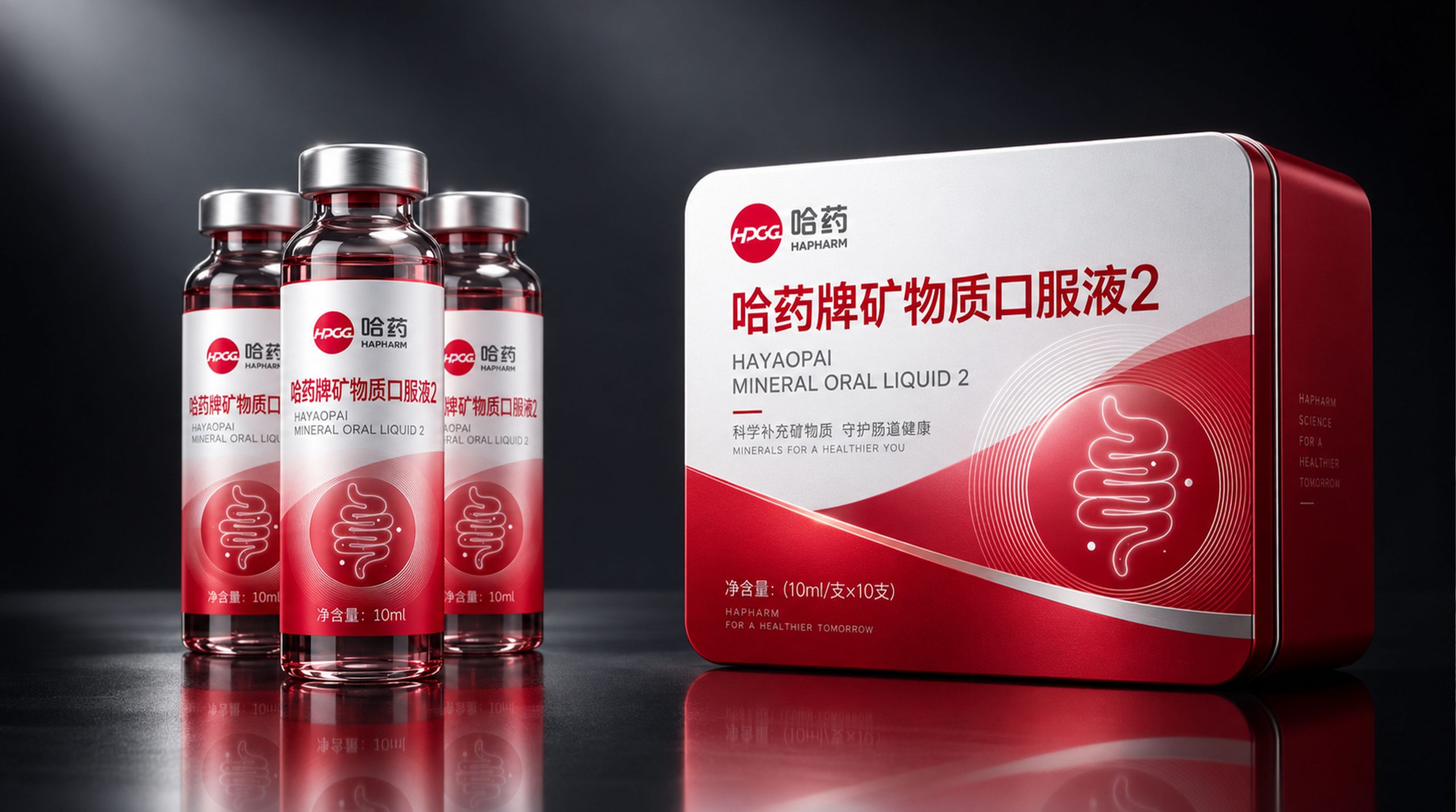
Red and white version - Warm care line (coral red iron box × gradient ampoule × rounded square box): This is the more emotional version of Harbin Pharmaceutical Mineral Oral Liquid. The outer box is a metal iron box with a square structure with rounded corners. The basic color of the box is a slow gradient from white at the top to coral red at the bottom - white occupies the upper half of the box and coral red occupies the lower half. There is a natural transition between the two colors in a very slow gradient without a clear dividing line. This gradient processing is in sharp contrast to the neat two-color segmentation of the white and blue version: the "cutting" of the white and blue version conveys rigor and order, and the "gradient" of the red and white version conveys softness and care. The upper left corner of the box also has the Harbin Pharmaceutical Group logo and the words "Harbin Pharmaceuticals". The product name "Harbin Pharmaceuticals Brand Minerals Oral Water 2" is displayed in thick dark red fonts in the middle of the box. The font size is also large, and the number "2" distinguishes the product model. The English name "HAYAOPAI MINERAL ORAL LIQUID 1" is marked below in small font size. A larger white circular function icon on the lower right side of the box presents the symbolic figure of the intestines - the icon draws the intestines with red thin lines and is surrounded by concentric red coils. The whole thing is like a functional seal in the style of a scientific illustration. The size is larger than the icon in the white and blue version, and the visual weight is more prominent. The bottom of the box is marked with "Net content: 10ml/box x 10 bottles" in small white letters. The design of the glass ampoule continues the gradient tone of the box - the upper part of the bottle is made of light blue glass (retaining the classic blue of medicinal ampoules), and the lower part gradually fades to coral red, forming a blue-red gradient that echoes the box. A white label is attached to the middle of the bottle. The Harbin Pharmaceutical logo, "Harbin Pharmaceutical Brand Mineral Oral Liquid" product name and circular function icon are printed in red on the label. "Net content: 10ml" is marked in small red letters at the bottom. The mouth of the bottle is sealed with a silver aluminum cap, maintaining the classic shape of a medicinal ampoule.
Visual Language
Harbin Pharmaceutical Mineral Oral Liquid has constructed a visual system with three pillars: "pharmaceutical-grade trust × functional icon language × two-color double lines" to establish a precise balance between professionalism and intimacy:
Color: The two packages use two completely independent color systems to form the brand's "double color and double line". The white and blue version uses medical-grade pure white (close to #FFFFFF) as the main color, and deep navy blue (approximately Pantone 289C) as the auxiliary color block. White occupies more than 70% of the visual area, conveying the most classic "clean = safe = trustworthy" visual equation of hospital whiteboards, laboratory white walls and drug instructions; dark navy as the bottom color block and product name color conveys the psychological implications of "authority", "professional" and "rigorous". The red shield-shaped logo of Harbin Pharmaceutical Group is the only warm element in the white and blue tones. Its red color is as eye-catching as a seal in the cold packaging. The red and white version uses coral red (approximately the range of Pantone 1787C to 1788C) as the main color, with white as the auxiliary color. The two colors transition naturally in a gradient manner. The choice of coral red is extremely exquisite - it is softer than red and more powerful than pink. It will neither appear too "medicinal" nor too "promotional" on the health care product shelf, but conveys a "warm professional" tone. The two sets of colors share Harbin Pharmaceutical Group's brand red as a unified color clue - it appears in the same position on both packages in the form of a logo and is a visual anchor of trust.
Graphics: The circular function icon is a core graphic element shared by both packages. The icon uses a simple line illustration to draw the symbolic figure of the intestines, surrounded by concentric circles, and the whole is like a functional seal in the style of scientific illustration. The design logic of this icon draws on the communication strategy of "indication icons" in pharmaceutical packaging - it uses a visual symbol that can be recognized instantly to compress the core function of the product (minerals are absorbed through the intestines) into an intuitive and understandable graphic. You can understand the direction of the product without reading any text. In the white and blue version, the icon appears in the upper left area of the box in the form of a small blue circle. The size is restrained and does not occupy the visual dominance of the product name. In the red and white version, the icon appears in the lower right area of the box in the form of a larger white circle. The visual weight is significantly increased and becomes the second visual focus of the box. The red shield-shaped logo of Harbin Pharmaceutical Group is the brand graphic anchor shared by the two packages. It is always located in the upper left corner of the box/bottle, with consistent size and position, and is the visual starting point of trust. In addition, the boundary between the white area and the blue area of the white and blue box is separated by a very thin red line (Harbin Pharmaceutical brand red). This red line is like a precise "marking line" in the cool white and blue tones. It is not only a decorative visual rhythm, but also a subtle extension of the brand color on the front of the package.
Font: The product name "Ha Yao Brand Mineral Oral Liquid" is presented in a thick sans-serif black font. The font size occupies an absolutely dominant position in the entire text system. The strokes are straight and thick, the spacing between words is tight, and the visual weight is great. This font selection completely follows the naming convention of Chinese prescription drug packaging: brand name + ingredients + dosage form, no more words, no more words, so rigorous that there is no room for modification. The product name of the white and blue version is presented in dark blue, while the red and white version is presented in dark red. The text color is consistent with the respective main colors. The English name is marked in Pinyin capital letters (the white and blue version is "HAYAOPAIKUANGWUZHI KOUFUYE", the red and white version is "HAYAOPAI MINERAL ORAL LIQUID 1"), the font size is extremely small, the font weight is extremely light, and it is a purely functional international information label. Labeled quantities, attention groups, specification information, etc. are presented in regular small bold or thin fonts, with clear hierarchy, high information density but not crowded - this information labeling method completely continues the industrial standards of pharmaceutical packaging, rather than the common perceptual expression of health care products. The word "Harbin Yao" is placed in thick black letters immediately to the right of the shield-shaped logo. The font size is between the logo and the product name, serving as a secondary reinforcement of the brand identity.
Packaging Structure and Details
The packaging system of Harbin Pharmaceutical Mineral Oral Liquid is based on the double-layer structure of "ampoule + outer box". The two models use different outer box materials and ampoule colors to convey their respective qualities:
Glass ampoules (common to both models): Oral liquid uses standard pharmaceutical glass ampoules as the inner packaging carrier, each with a capacity of 10ml. The bottle body is made of type I low borosilicate glass, which has good chemical stability and meets pharmacopoeia standards. The bottle height is about 65mm, the diameter is about 25mm, and the wall thickness is about 1mm. The white and blue version of the glass ampoule retains the classic transparent/light blue color of medicinal glass. The liquid in the bottle can be directly observed through the glass, reflecting the design logic of "transparency equals trust". The red and white version of the glass ampoule is made of two-color gradient glass with light blue on the upper part and coral red on the lower part (or external hot stamping/shrink film to achieve a two-color effect), and the color echoes the outer packaging of the iron box. The mouth of the bottle is sealed with a blue aluminum cap (the white and blue version is dark blue, the red and white version is coral red or silver), the cap surface is flat, and the production batch number may be marked with laser etching. The product information is presented on a self-adhesive label or heat shrink sleeve in the middle of the bottle - the label design is a miniature version of the outer box design: Harbin Pharmaceutical logo + product name + function icon + specification information.
White and blue outer box (cardboard box): The outer box is made of 350g white card with gray board structure. It has a square clamshell structure. The box size is estimated to be about 15cm × 12cm × 6cm (accommodating 90-pack) or 10cm × 8cm × 5cm (accommodating 10-pack). The surface is printed with four-color offset printing and then covered with matte film. The white area is made of high-whiteness matte coated paper to present a pure medical-grade visual sense. The blue color block is fully printed with deep navy blue spot color ink. The boundary between the white area and the blue area is separated by a thin red line of Harbin Pharmaceutical brand about 0.5mm wide, printed in a single spot color. The interior of the box is lined with white corrugated paper, and each ampoule is positioned in an independent circular groove. After the ampoule is inserted, the blue cover slightly protrudes to set off the plane. After opening the box, the blue covers are neatly arranged like a reagent rack in a laboratory. This visual experience strengthens the "drug-like" attribute of the product.
Red and white outer box (metal iron box): The outer box uses an iron box as the carrier and has a square structure with rounded corners. The box size is estimated to be about 12cm × 10cm × 5cm, and can accommodate 10 packages. The iron box is made of tinplate, and the surface is offset printed with four colors of UV curable ink. The gradient color from white to coral red is realized by precise four-color overprinting. The gradient transition zone is about 3cm wide, and the color transition is soft and natural. The rounded corners of the iron box (the R corner is about 5mm) make the box feel soft and edgeless, forming a tactile contrast with the rough right angles of the white and blue paper box. The lid of the iron box opens and closes with a plug-in structure. When opening, you can feel the precise fit of the metal and a slight "clucking" sound. Each ampoule is positioned inside the iron box with white flocking or foam padding. The color of the padding is white, which is consistent with the white transfer base on the inner wall of the box, forming an internal and external contrast of "white clean interior + colorful warm exterior". The material selection of the tin box gives the packaging a "permanence" that cannot be achieved with paper boxes - after the product is consumed, the tin box can be used for daily purposes such as a storage box for small items and a storage box for pills. This "retention after use" design strategy extends the visual exposure of the brand in consumers' daily lives.
Brand Experience
Harbin Pharmaceutical Mineral Oral Liquid builds a complete "pharmaceutical company trust" experience for consumers from three dimensions: visual, tactile and ritual sense - professional, reliable and reassuring:
Visual experience: The packaging of Harbin Pharmaceutical Mineral Oral Liquid is a clear "extraordinary" on the health care product shelves - among the health care product packaging with warm colors such as gold, dark green, purple, and orange as the mainstream, the white and blue version of the pharmaceutical-grade cold white tone suddenly appears in a sea of casual clothes, and its "unlike health care product" visual temperament is precisely its most powerful shelf differentiation advantage. The red and white version of the coral red gradient iron box injects a touch of warmth into the professional feel. The gloss and rounded corners of the metal box have a significant "gift feel" on the shelf, making it suitable for elders' gift-giving and family health purchasing scenarios. When the two models are displayed side by side, the coolness of white and blue and the warmth of red and white form a clear dual-line identification of "professional line vs. caring line", allowing consumers to quickly make a choice based on their needs (self-use vs. gift giving, children vs. adults). The neat arrangement of the blue caps of the glass ampoules after opening the box is the climax of the visual experience - multiple blue round caps on a white background resemble laboratory reagent racks. This "drug-like" visual experience is the last link to build trust.
Tactile experience: The matte coating surface of the white and blue carton provides the classic "clean but not smooth" touch of pharmaceutical packaging - it is not as delicate and smooth as a cosmetic box, nor as rough and random as a food box, but a kind of "rigorous cleanliness" in between, which exactly matches the psychological expectation of "produced by a pharmaceutical company". The touch of the red and white iron box is a significant "material upgrade" experience - the coolness and weight of the metal convey the quality signal of "this is not a cheap health product" in the hand, and the soft touch of the rounded corners injects a touch of intimacy into the coldness of the metal. The glass ampoule is the most "medicinal" element in the tactile experience - the cold, smooth and precise cylindrical shape of the glass conveys a clear psychological suggestion of "medicine" between the fingers. The sealing feel of the aluminum lid and the slight "gurgling" sound when opening confirms that the product is sealed intact - this is a tactile/auditory detail of great functional significance because it is directly related to consumers' trust in the freshness and safety of the product.
Ritual experience: The ritual of using Harbin Yao Mineral Oral Liquid is based on the "medicine-taking style" as the emotional prototype. White and blue version: Open the white carton cover and see the neatly arranged glass ampoules with blue covers. It is like opening a box of prescription drugs - the visual experience at this moment subconsciously classifies the product as a "medicine" rather than a "health product", establishing the highest level of quality trust. The series of actions of taking out an ampoule, unscrewing the aluminum cap, inserting a straw and sucking it are highly similar to the operation process of taking medicine. This "drug-like" ritual feeling strengthens consumers' psychological expectations for the efficacy of the product. Red and white version: The "goo" sound of the metal lid when opening the coral red iron box and the appearance of the ampoule in the white interior create a more "gift-like" unboxing moment - the weight and sense of ritual of the metal box naturally slow down the action of taking out the ampoule. This "solemn feeling" is highly consistent with the attributes of a pharmaceutical company of the Harbin Pharmaceutical brand - it reminds consumers: what you are opening is not a box of ordinary health care products, but a box of professional nutritional supplements made by pharmaceutical companies using pharmaceutical manufacturing standards.
Brand Statement
Produced by Harbin Medicine, nutrition is made according to the standards of making medicine. Don’t talk about feelings, just talk about facts. Harbin Pharmaceutical Mineral Oral Liquid is based on decades of reputation as a pharmaceutical company. It uses pharmaceutical-grade white and blue cold tones and warm coral red gradient double lines to construct two sets of packaging languages. It uses the shape of a glass ampoule as a quality carrier, uses circular function icons as efficacy abbreviations, and uses the prescription drug standard text system as the language of trust. It does not say "let children win at the starting line", but prints "contains iron ≥100mg"; it does not say "natural essence", but "mineral oral liquid"; it does not use gold packaging to gild itself, but uses white and glass ampoules to tell you: this is something from a pharmaceutical company. From the outer box to the ampoule, from the font to the color, every detail silently repeats the same sentence: Produced by Harbin Pharmaceutical, only speak with facts.