










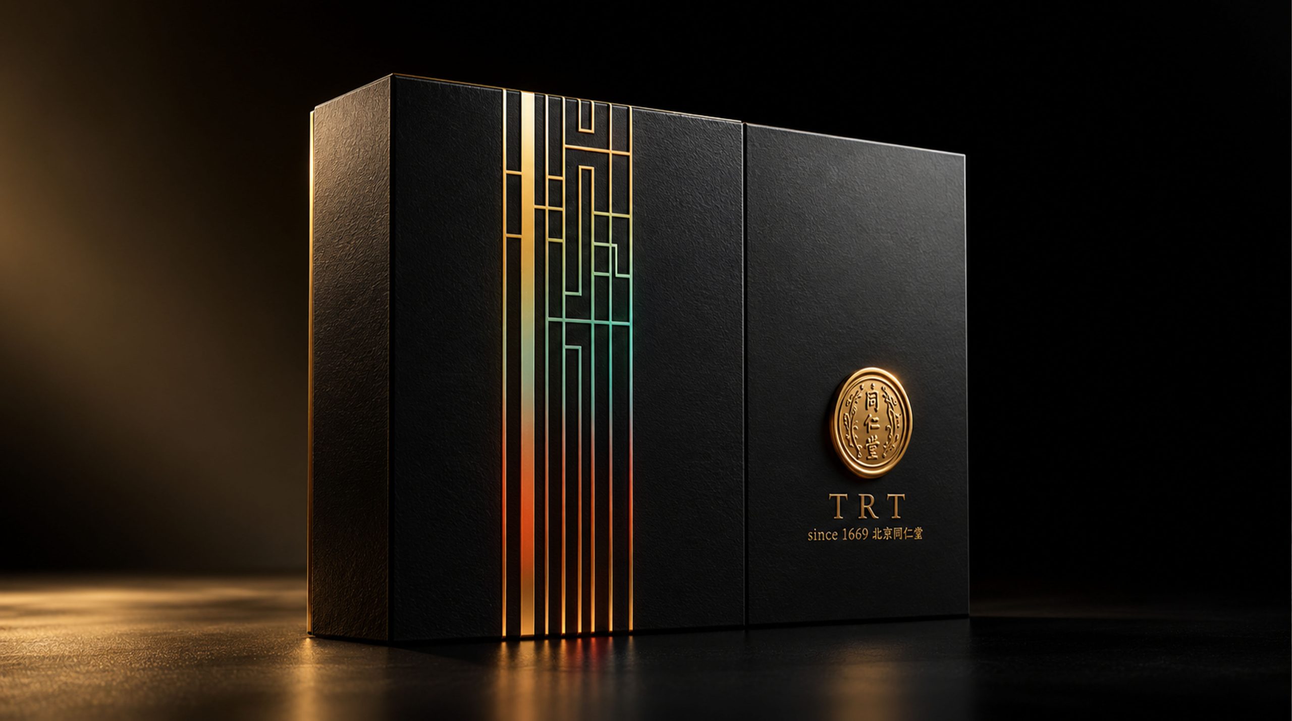
Since its establishment in 1669, Tongrentang has been deeply nourished by traditional Chinese medicine culture. After more than 300 years, it has witnessed the inheritance and innovation of traditional Chinese medicine from ancient times to the present. The brand is committed to carrying forward the traditional Chinese medicine culture and has become a well-known Chinese medicine brand in China and the world with its profound cultural heritage and extensive market recognition.
The goal of Tong Ren Tang's packaging design is to combine traditional Chinese medicine culture with modern design, break the constraints of traditional packaging, show the modernity and heritage of the Tong Ren Tang brand, and highlight its unique position in the global market. The design concept of the packaging is based on the coexistence of tradition and modernity, highlighting the brand's historical heritage while being consistent with contemporary aesthetics.
Brand Essence
The brand spirit of Tongrentang can be summarized by the following three sets of keywords:
Inheritance × Innovation × Quality
Culture × Exquisite × Unique
Warm × high-end × modern
These keywords reflect the core values of the brand. Inheritance and innovation represent Tong Ren Tang’s continuous innovation and breakthrough on the basis of adhering to the essence of traditional Chinese medicine; culture and sophistication are the brand connotations to be conveyed by packaging design, and every detail on the packaging reflects the respect for traditional culture and the pursuit of exquisite craftsmanship; warmth and modernity reflect the emotional resonance of the brand close to consumers, without losing the sense of modernity and high-end.
Design Philosophy
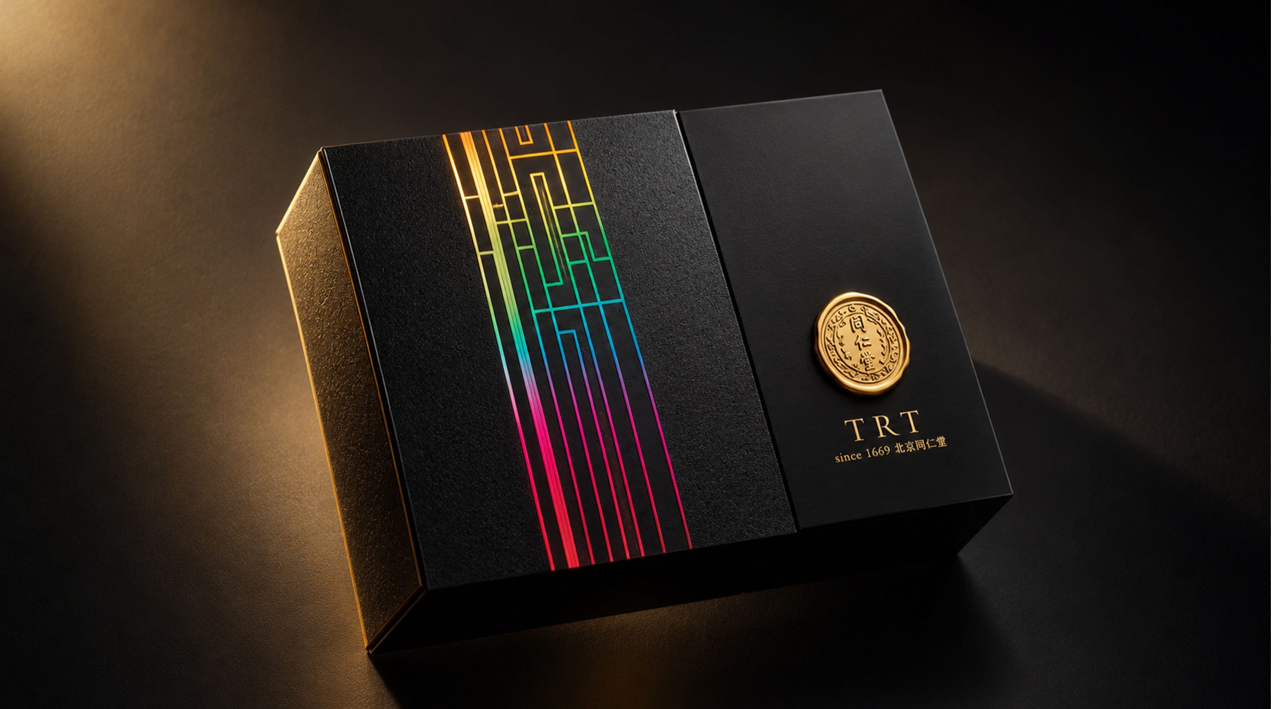
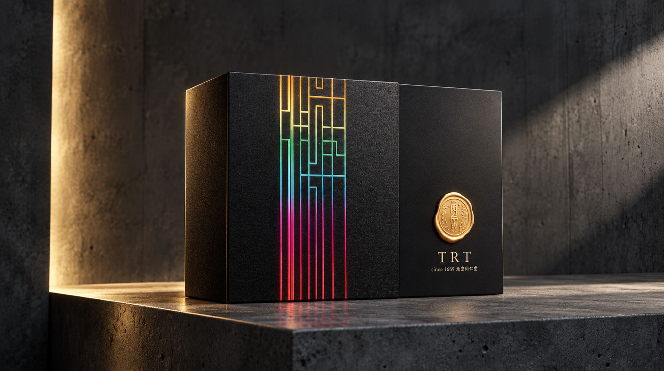
Tongrentang's brand philosophy can be summarized as "inheritance and innovation coexist, high-end and affinity coexist." In this packaging design, the designer used simple and modern graphics and colors to break the inherent impression of traditional Chinese medicine packaging. He used bold color block design and highly modern geometric shapes to convey the brand's youthful and modern visual language.
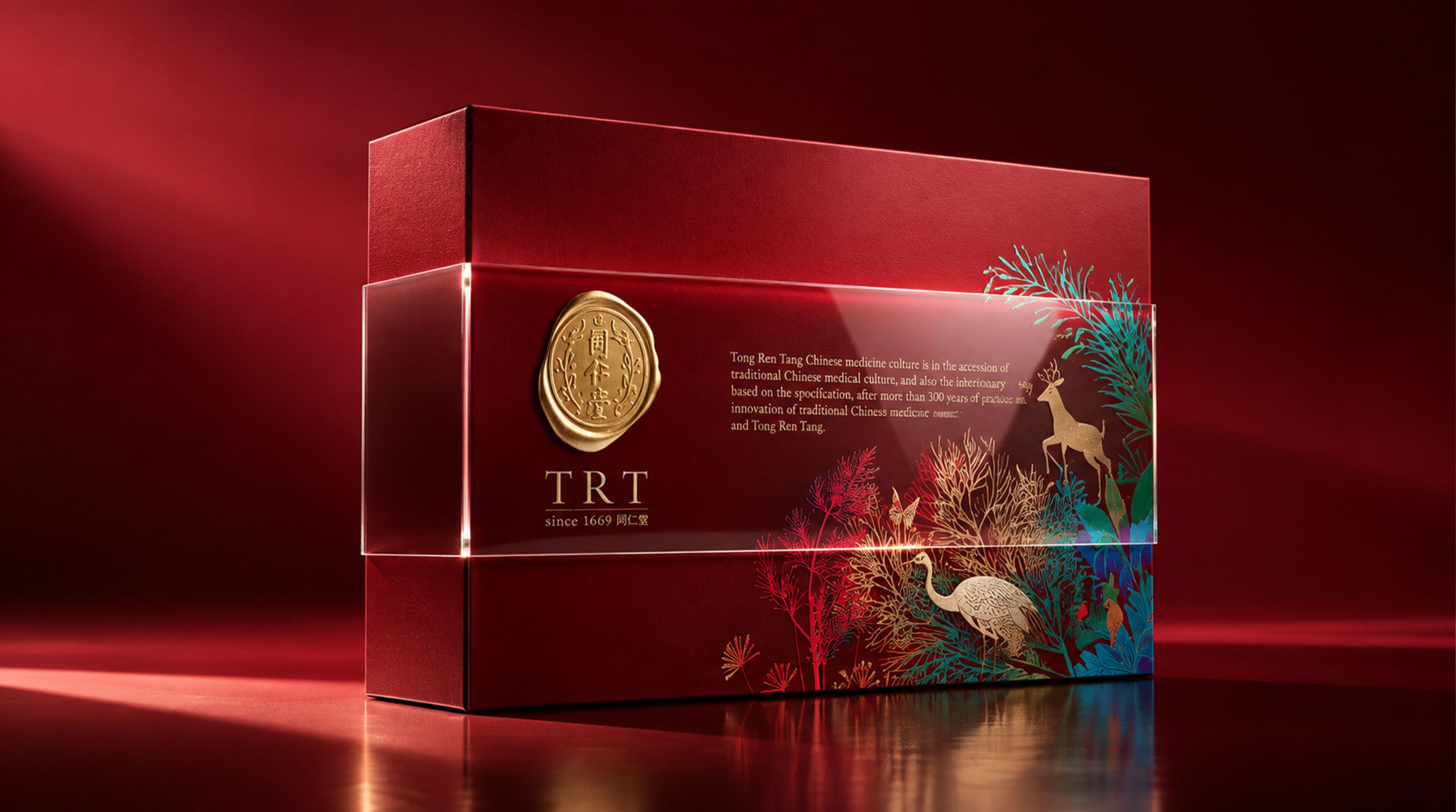
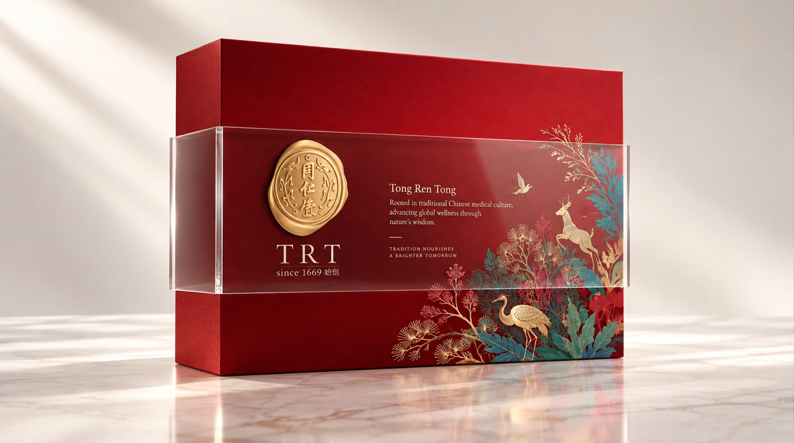
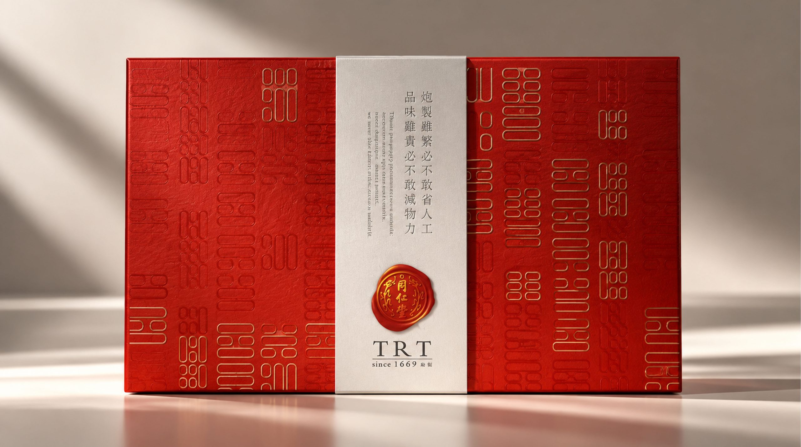
The golden elements on the packaging represent nobility and history, while the bird and flower patterns in the background incorporate natural elements, symbolizing life and health, and implying Tongrentang's respect for natural herbs and care for human health.
Visual Language
Tong Ren Tang’s packaging visual language perfectly combines traditional and modern design elements, showing a strong oriental cultural flavor while also conforming to contemporary aesthetics:
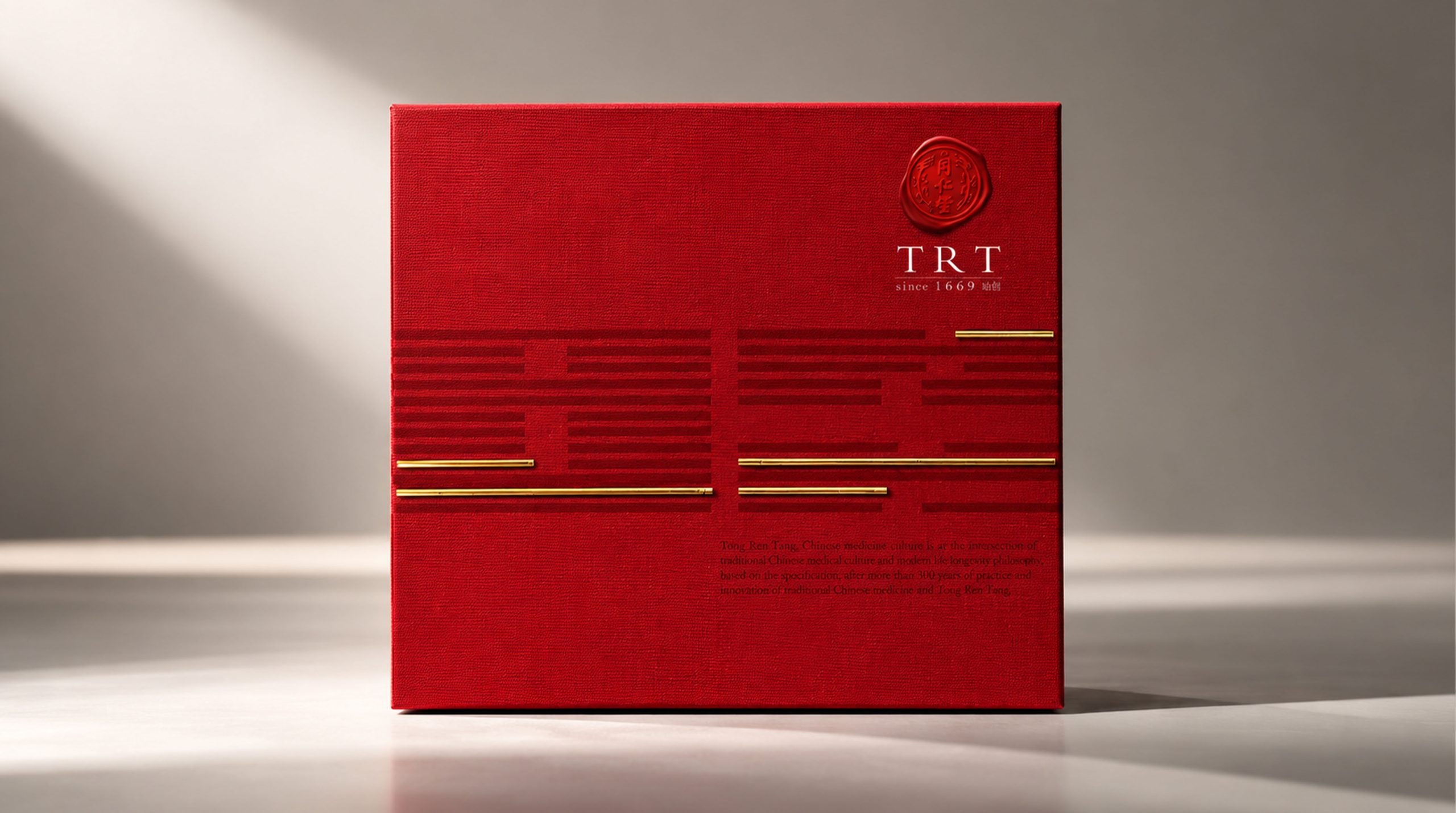
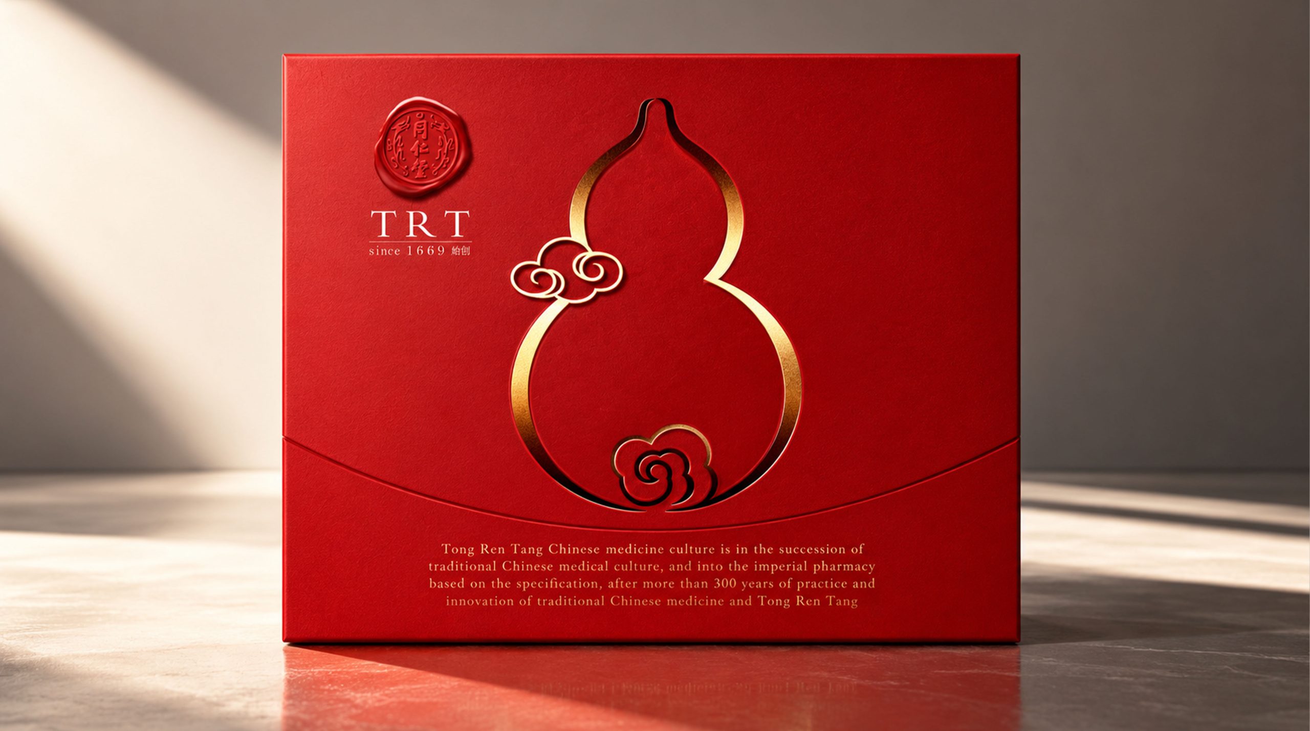
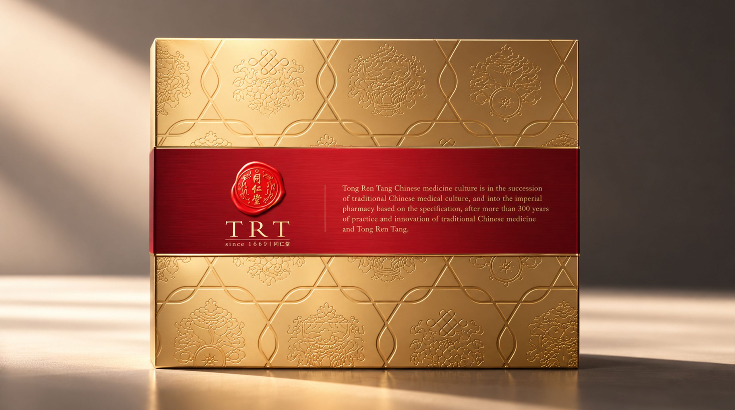
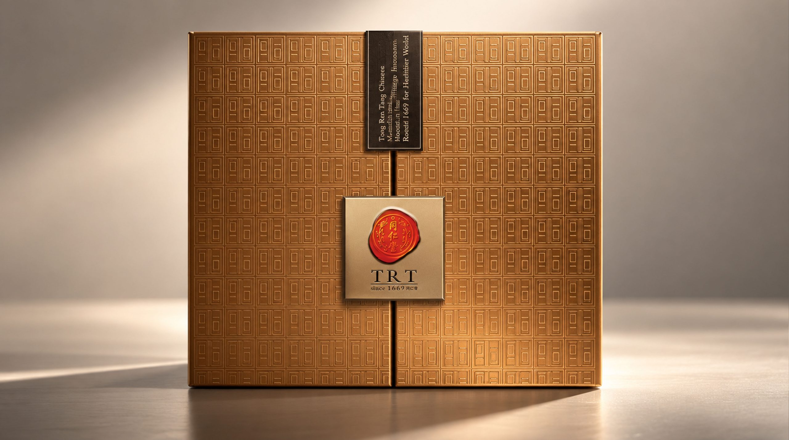
Color and structure: The packaging uses the representative red as the main color. Red symbolizes traditional Chinese auspiciousness and nobility, which enhances the visual impact of the packaging and brand recognition. At the same time, the golden metallic texture highlights the high-end positioning of the brand, and contrasts with the red, highlighting the luxury and sophistication of the product.
Graphics and textures: The packaging incorporates traditional bird and flower patterns. These natural elements symbolize the nature and vitality of traditional Chinese medicine and represent Tong Ren Tang’s emphasis on herbal plants. The golden relief pattern and the delicate texture of the background present a three-dimensional effect, enhancing the sophistication of the overall design.
Brand logo: The packaging is marked with the "Tongrentang" brand LOGO. The font design adopts a simple and concise style, which reflects the historical depth and cultural heritage of the brand. The golden circular seal below the LOGO further enhances the brand’s sense of authority and dignity.
Materials and craftsmanship: The packaging uses glossy high-quality paper and transparent plastic film, and the overall design is meticulous and modern. Through the combination of materials, a high-end and tactile product experience is presented.
Tone of Voice
Tongrentang's brand language is simple, concise and dignified. The text on the packaging not only conveys the core values of the brand, but also remains simple and high-end. The brand slogan "Inherited since 1669 to the present day" shows the historical heritage of Tongrentang, while "Herbal health care has a long history" further expresses the cultural foundation of the brand.
The text information on the packaging is direct and not redundant, aiming to clearly convey the product features and historical heritage. In terms of text style, a concise sans-serif font is used to make the information transmission clear and powerful.
Brand Experience
Tong Ren Tang’s packaging experience goes beyond simple visual presentation and brings consumers a full range of sensory enjoyment:
Visual experience: The packaging design creates a high-end and modern visual experience through a combination of bright colors and patterns. When consumers come into contact with the packaging for the first time, they will feel the brand's profound cultural heritage and historical heritage.
Tactile experience: The packaging surface is smooth and textured, and it feels extremely comfortable when held in hand. The transparent plastic film gives the packaging design a certain three-dimensional and translucent feel.
Emotional experience: Packaging is not only the appearance of the product, but also the carrier of brand culture and spirit. Every time they come into contact with packaging, consumers can feel Tongrentang's respect for traditional culture and pursuit of high-end quality.
Brand Statement
"The perfect fusion of tradition and innovation, the perfect embodiment of health and nobility." Tongrentang's packaging design demonstrates the brand's profound cultural heritage and modern innovative concepts through the clever combination of colors, patterns and materials. The packaging of each product is not just an external design, but a transmitter of the brand spirit, embodying the dual values of health and dignity.