










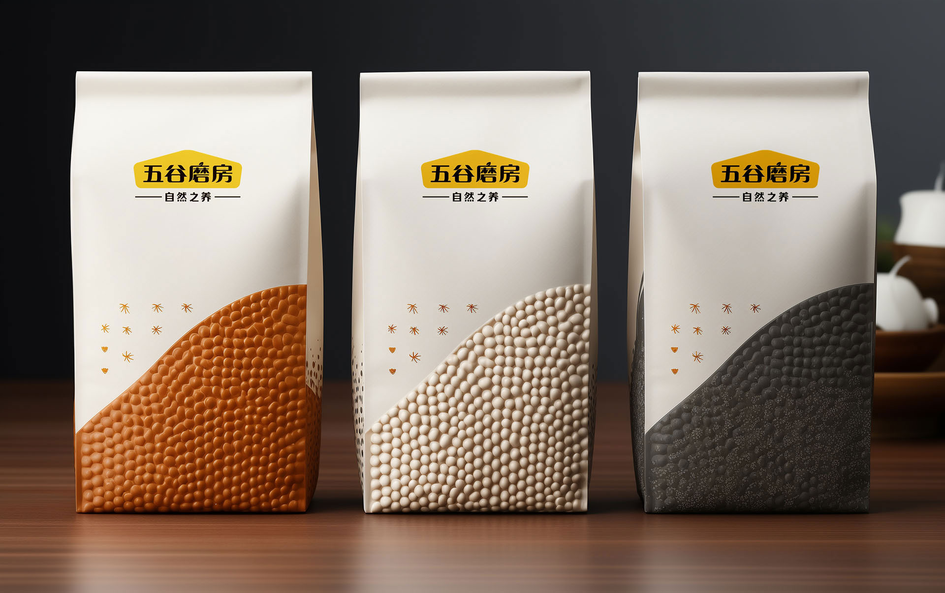
As China's leading health food brand, Wugu Mill is committed to providing consumers with nutritious, natural and pure ingredients. Since its establishment, the brand has adhered to the concepts of nature, health and innovation, based on science and culture, and delivered the brand declaration of "healthy life starts with grains".
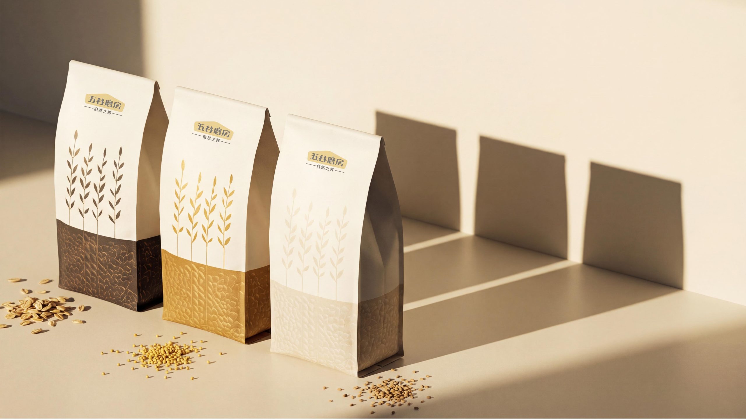
Wugu Mill's product packaging design has always focused on the combination of quality and aesthetics. Especially in this tea packaging design, the brand has further strengthened its "nature and health" brand image, using simple and modern design language, so that each package can convey a sense of purity and high-end quality in the minds of consumers.
Brand Essence
The brand spirit of Wugu Mill is summarized by the following keywords:
Natural × healthy × high-end
Purity × Simplicity × Modern
Inheritance × Innovation × Ingenuity
These keywords accurately summarize the core concept of Wugu Mill packaging design. Naturalness and health are the foundation of the brand. High-end represents the brand's persistent pursuit of quality, while simplicity and modernity demonstrate the brand's sense of fashion and innovation through the colors and shapes in the packaging design.
Design Philosophy
Wugu Mill's packaging design concept is "the combination of simplicity and purity, the balance of tradition and innovation." The designer uses modern packaging design language and combines traditional cultural elements to create a packaging design that is both natural and modern. Every detail in the packaging reflects the brand's respect for natural ingredients and its demanding quality.
The color matching and material selection in the packaging design fully demonstrate the brand's high-end positioning and pursuit of a healthy lifestyle. Each packaging not only visually allows consumers to feel the nobility and elegance of tea, but also impresses consumers on an emotional level, conveying the brand value of health and purity.
Visual Language
The visual language of Wugu Mill’s packaging design conveys the sophistication and high-end of the brand through simple and artistic design elements:
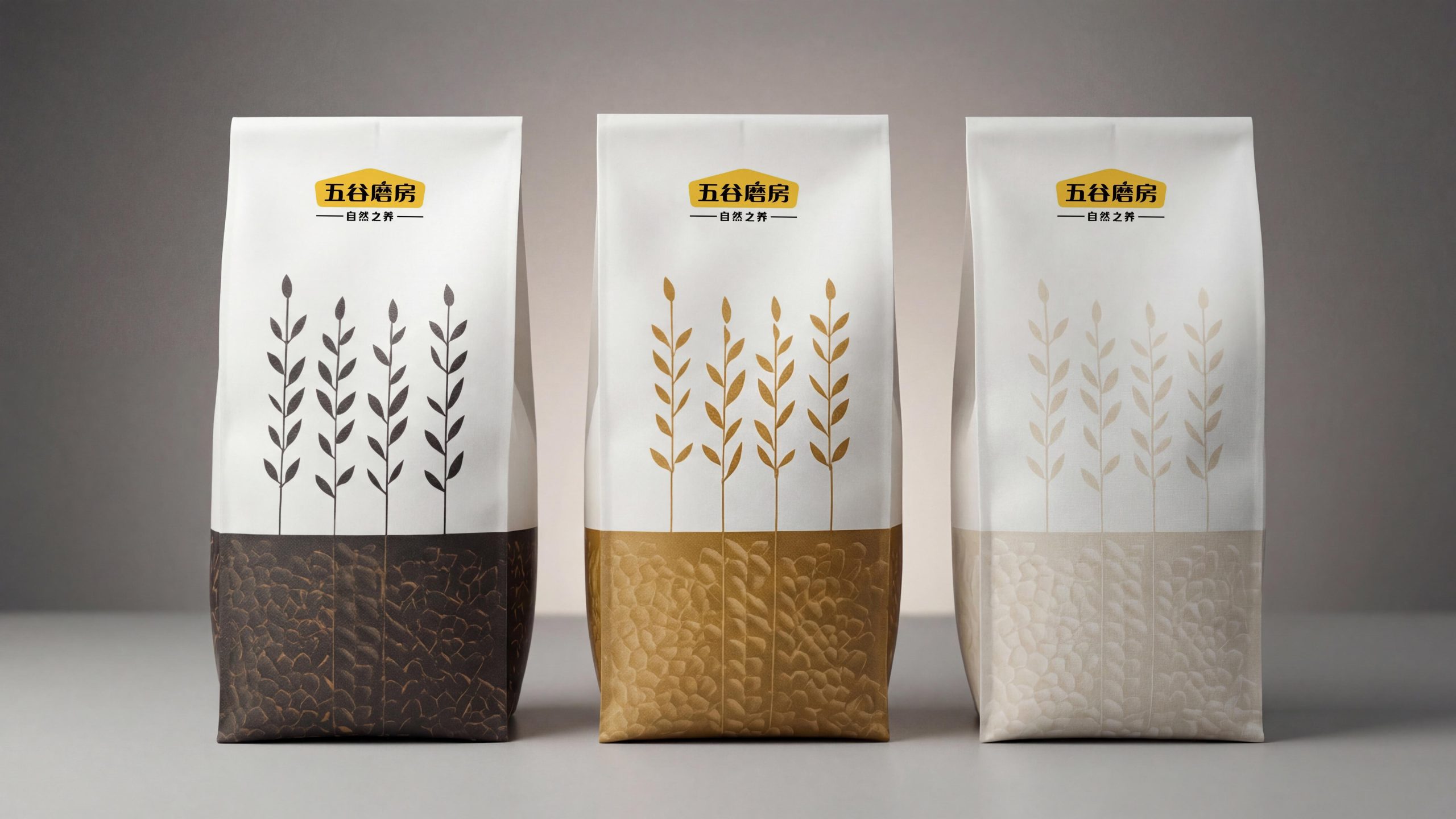
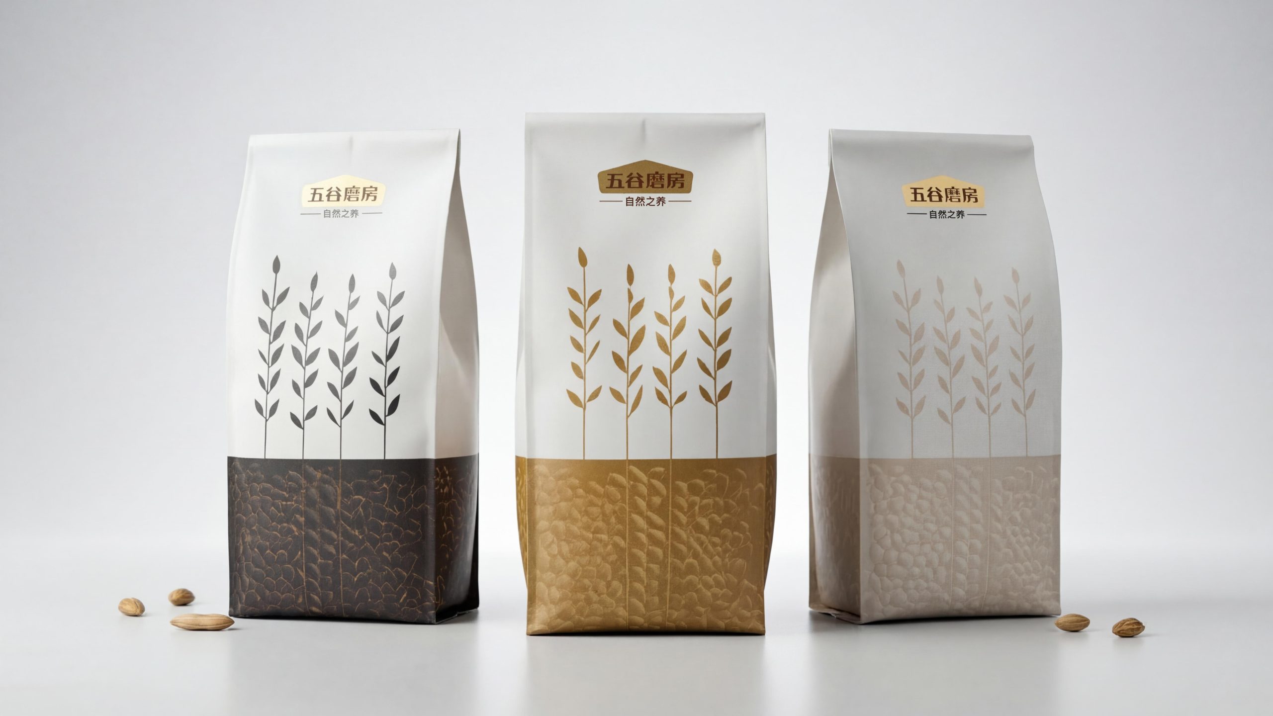
Color and structure: The main colors of the packaging are white and gold. White symbolizes freshness and purity, while gold represents high-end and luxury. The overall design is simple and full of layers, highlighting the brand's high-end and modern feel.
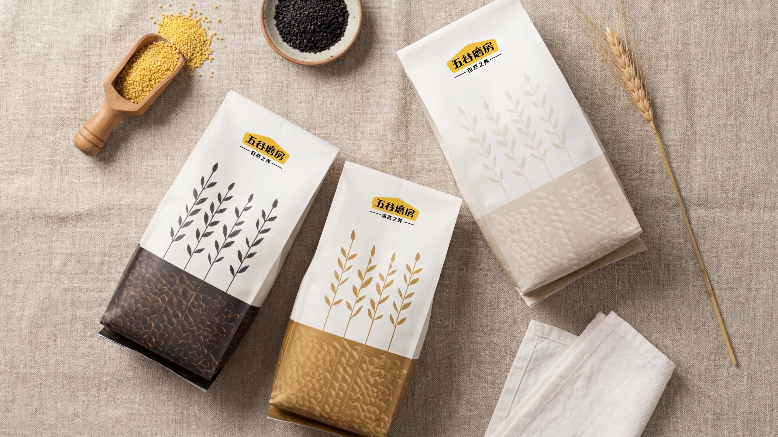
Pattern design: The design of the packaging bottle uses simple plant elements, depicting natural plant textures through meticulous lines. The pattern not only conveys the natural origin of tea, but also adds to the artistic flavor of the design. The plant patterns are simple and full of symbolic meaning, allowing consumers to feel nature and vitality.
Brand logo: The front of the package is printed with the brand logo of Wugu Mill. The font design is simple and modern, highlighting the high-end image of the brand. The gold color of the logo complements the overall design of the packaging, enhancing brand recognition.
Packaging material: The packaging is made of high-quality paper material, with a smooth surface and rich texture. Exquisite printing technology and delicate design make the packaging more high-end and comfortable to the touch.
Tone of Voice
Wugu Mill's brand language style is concise, modern and approachable. The text design on the packaging is clear and easy to understand, accurately conveying the characteristics of the product and the value of the brand. The variety, origin, year and other information are marked on the packaging of each tea, highlighting its natural, pure and healthy characteristics.
The brand language is approachable and confident, and the copywriting adopts a concise expression, emphasizing the natural ingredients and high quality of the product, avoiding lengthy modifications, and ensuring that consumers can quickly obtain the core information of the product.
Brand Experience
The packaging design of Wugu Mill not only provides a pleasant visual and tactile experience, but also brings consumers a full range of brand sensory enjoyment:
Visual experience: The color matching and pattern design of the packaging make each tea highly identifiable on the shelf. The packaging design is full of modernity without losing the traditional cultural heritage.
Tactile experience: The packaging material is excellent, the surface is smooth, and the hand feels delicate. The carving process of packaging details makes each tea packaging full of texture, bringing consumers a high-end tactile experience.
Psychological experience: Each packaging design not only visually presents the high-end sense of the brand, but also emotionally conveys the healthy and natural brand value to consumers. The exquisite design of the packaging enhances consumers' recognition of the brand and brings a new shopping experience.
Brand Statement
"Transmitting health and nature, giving tea high-end and sophistication." Through this packaging design, Wugu Mill not only demonstrates the natural purity of tea, but also conveys the brand's persistent pursuit of quality and nature through a simple and artistic design language. Each packaging conveys the brand's high-end positioning and ultimate pursuit of details.