










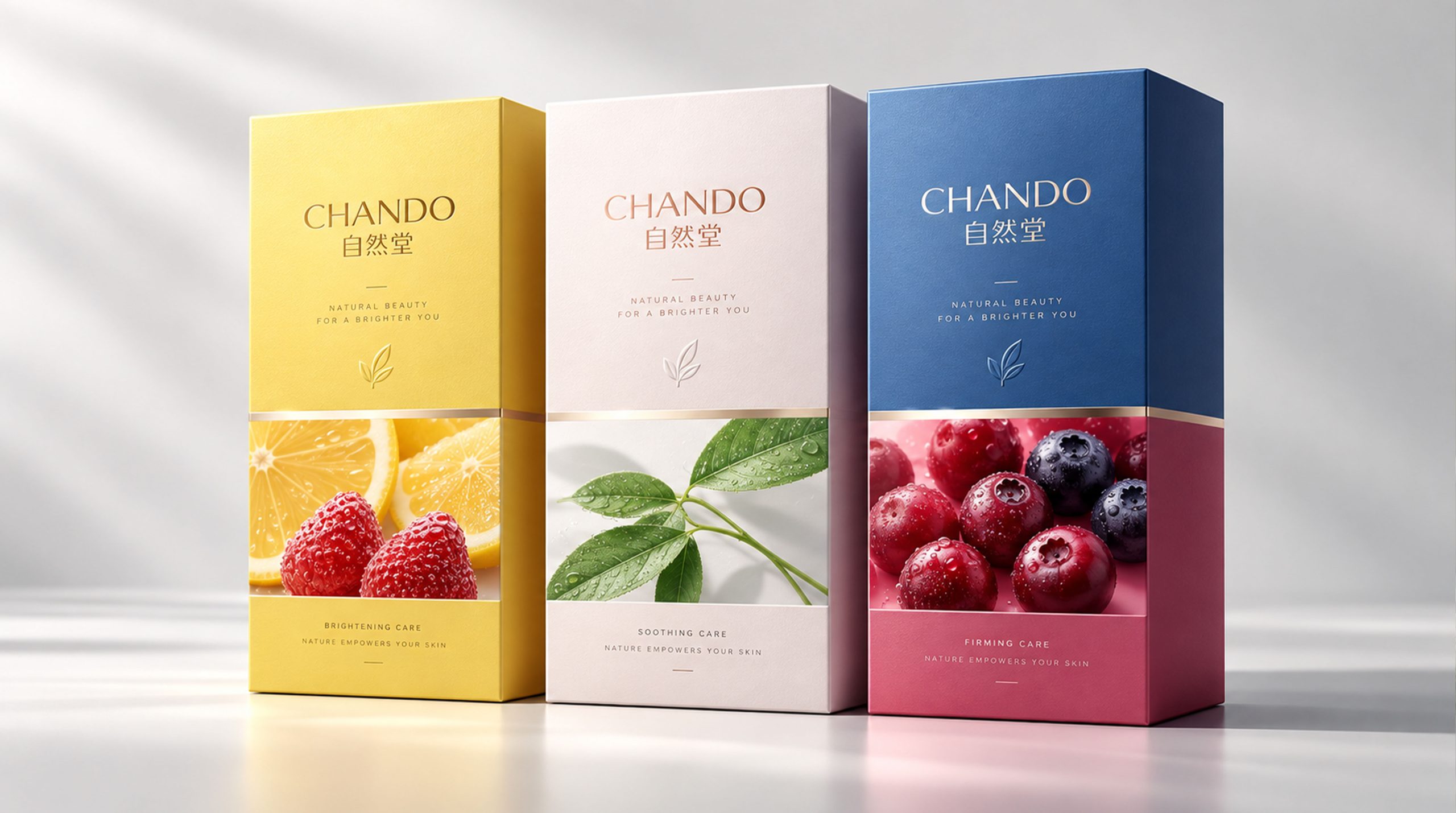
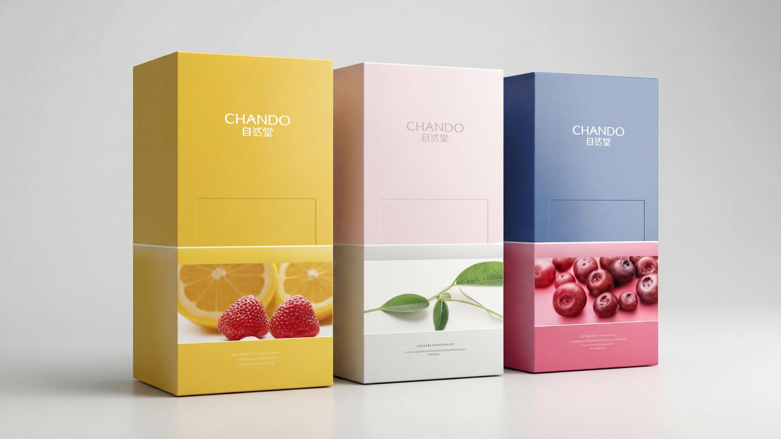
Zhitang is a leader among Chinese local cosmetics brands, committed to combining the power of nature with modern technology to create highly effective skin care products. Since its establishment, the brand has become one of the brands trusted by a wide range of consumers with its unique natural elements and innovative technology. In order to strengthen the brand image and convey the high quality and natural ingredients of its products, Chando has launched a new packaging design.
This new packaging series is mainly aimed at young consumer groups, emphasizing fresh and natural visual effects, and is committed to conveying the brand's environmental protection concepts and natural beauty through packaging.
Brand Essence
The brand spirit of Nature Hall is demonstrated through the following keywords:
Natural × Pure × Efficient
Innovation × Health × Quality
Youth × Vitality × Fashion
These keywords shape the brand image of Nature Hall. Nature and purity symbolize the brand's pursuit of natural elements, efficiency and innovation reflect the brand's technological breakthroughs, and youth and vitality are conveyed to consumers through modern design language, reflecting the brand's core appeal for the young market.
Design Philosophy
The brand concept of Zhitang is "nature and technology go hand in hand, fashion and quality dance together". In the new packaging design, the brand combines natural elements with modern design techniques. Through fresh colors and simple lines, it shows the natural quality of the product, while also showing a sense of modernity and fashion.
The core of the design concept is to make consumers feel the brand's environmental protection concept and the beauty of health through the clever use of colors and the combination of natural elements. The overall packaging's freshness, comfort and concern for environmental protection not only meet the aesthetic needs of modern consumers, but also enhance the market competitiveness of the product.
Visual Language
Zhitang’s packaging design takes color and pattern as the core to convey the brand’s natural, fresh and modern feel:
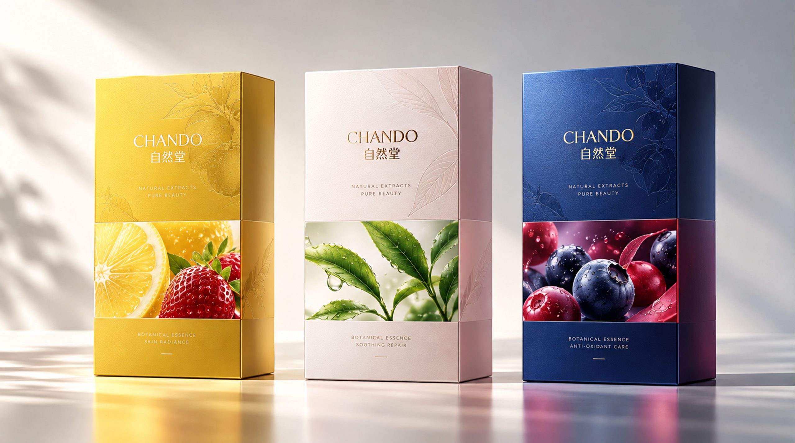
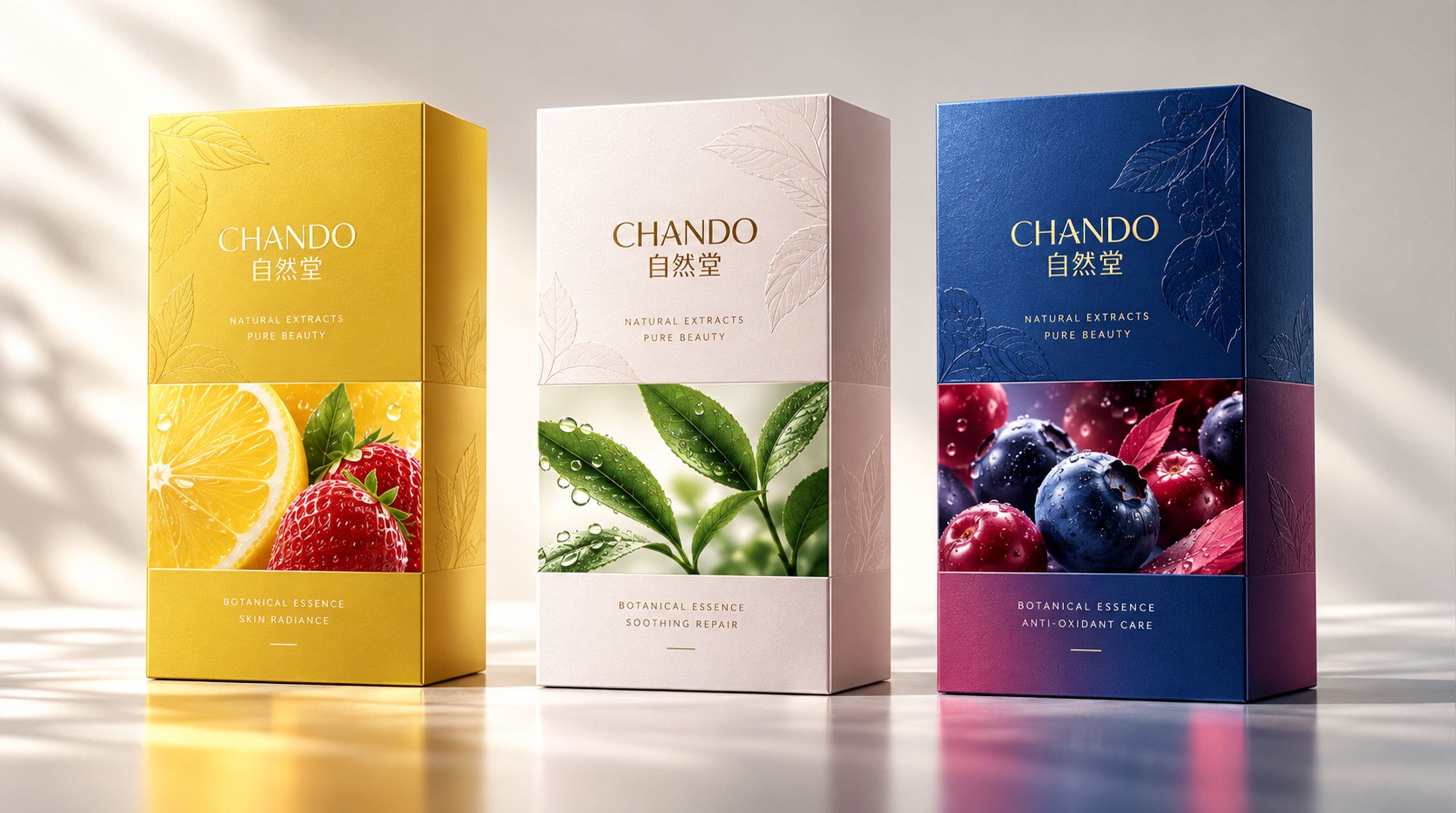
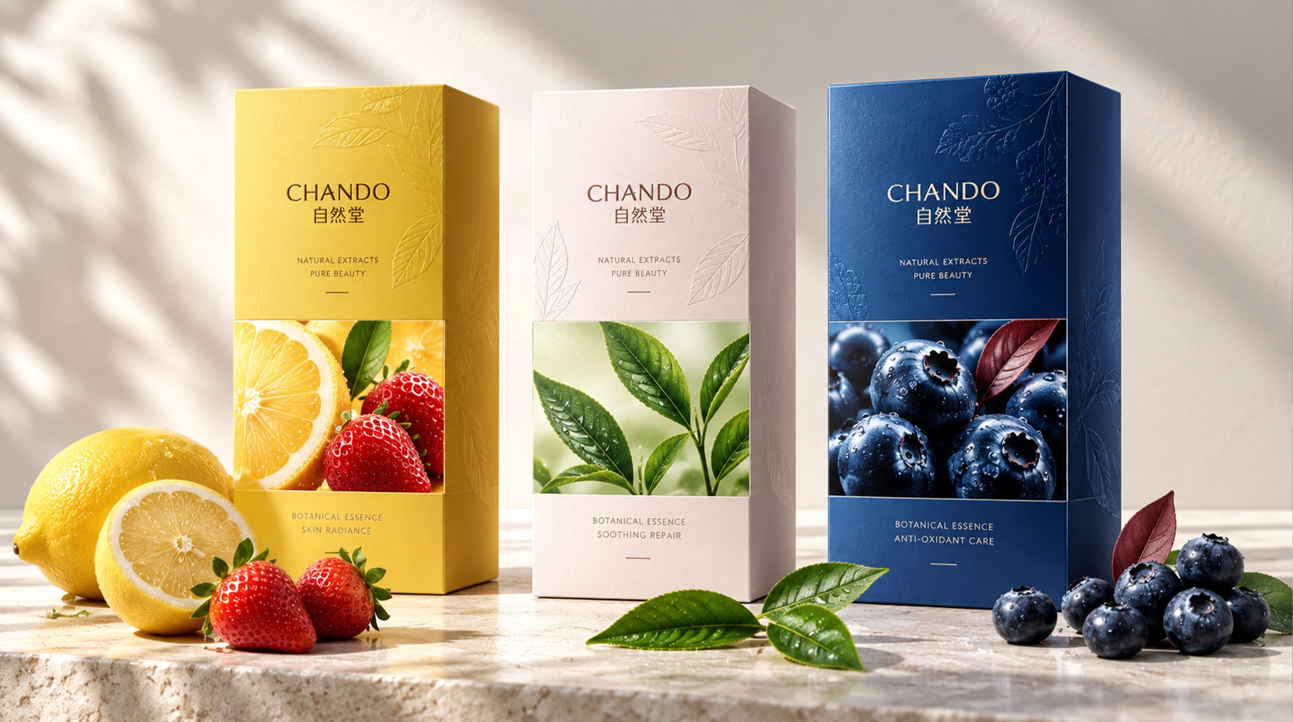
Color: The main colors of the packaging are fresh yellow, pink, green and blue, which respectively represent the colors of natural fruits and plants such as lemons, herbs, strawberries and blueberries. These colors are not only reminiscent of natural botanical ingredients, but also convey a sense of energy and freshness.
Graphics and design: The bottom pattern of the packaging uses delicate illustrations of plant leaves, highlighting the natural and pure characteristics. The upper part uses simple fonts to identify the brand and product names, which enhances the modern feel and visual impact.
Font and typography: The font design on the packaging is simple and modern, and the brand name "CHANDC" is displayed in capital letters to ensure the readability and recognition of the brand. The overall layout follows the principle of simplicity and order, making the visual effect clearer.
Tone of Voice
The language style of Zhidang’s packaging is concise, fresh and approachable. There is no excessive decoration on the packaging, which directly conveys the naturalness and efficiency of the product. Through short copy, the brand conveys the product’s benefits and natural ingredients, with a fresh and sincere tone.
Slogans on the packaging such as “Natural choice for rejuvenating skin” clearly convey the brand’s core values of nature and health. The tone is gentle and persuasive, focusing on the emotional resonance of consumers.
Brand Experience
Zido’s packaging is not only a visual presentation, but also focuses on the creation of multiple brand experiences:
Visual experience: The packaging is brightly colored and layered, giving consumers a pleasant visual impact. Each packaging conveys different natural elements and brand personality through the combination of colors and patterns.
Tactile experience: The packaging material is made of environmentally friendly and textured paper materials. Consumers can feel a soft touch when holding the packaging, further enhancing the high-end feel and comfort of the product.
Emotional experience: Packaging design evokes consumers’ emotional resonance with nature, health, and environmental protection through the combination of colors and patterns. The design of the packaging is not only beautiful, but also consistent with consumers’ lifestyle and aesthetic concepts.
Brand Statement
"Draw strength from nature and rejuvenate every day." The packaging design of Zhitang demonstrates the brand's high-end quality and natural concept through bright colors, fresh patterns and modern design language. Packaging is not only the protective layer of products, but also the carrier of brand culture, conveying the brand's deep understanding of nature, environmental protection, and health.