










Lenovo is the world's leading provider of smart devices and digital solutions. Its business covers personal computers, smartphones, data centers, enterprise services and emerging smart technologies. With "Intelligence for every possibility" as its brand vision, Lenovo is committed to using the power of technology to connect people and the infinite possibilities of the smart world.
The brand logo "Lenovo" is highly recognizable in the global technology market with its iconic slanted wordmark and distinctive red color. This auxiliary graphic design aims to build a widely scalable visual language system around the brand's core identity, providing unified and flexible visual support for the brand in diverse scenarios. This time, Qingmei Future was commissioned to lead the brand auxiliary graphic design.
The auxiliary graphic design goal is to focus on the core concept of "intelligent connection" of the Lenovo brand, and to convey the brand spirit of "everything is connected, intelligence is boundless" with a modular, scalable, and technologically-sense graphic language.
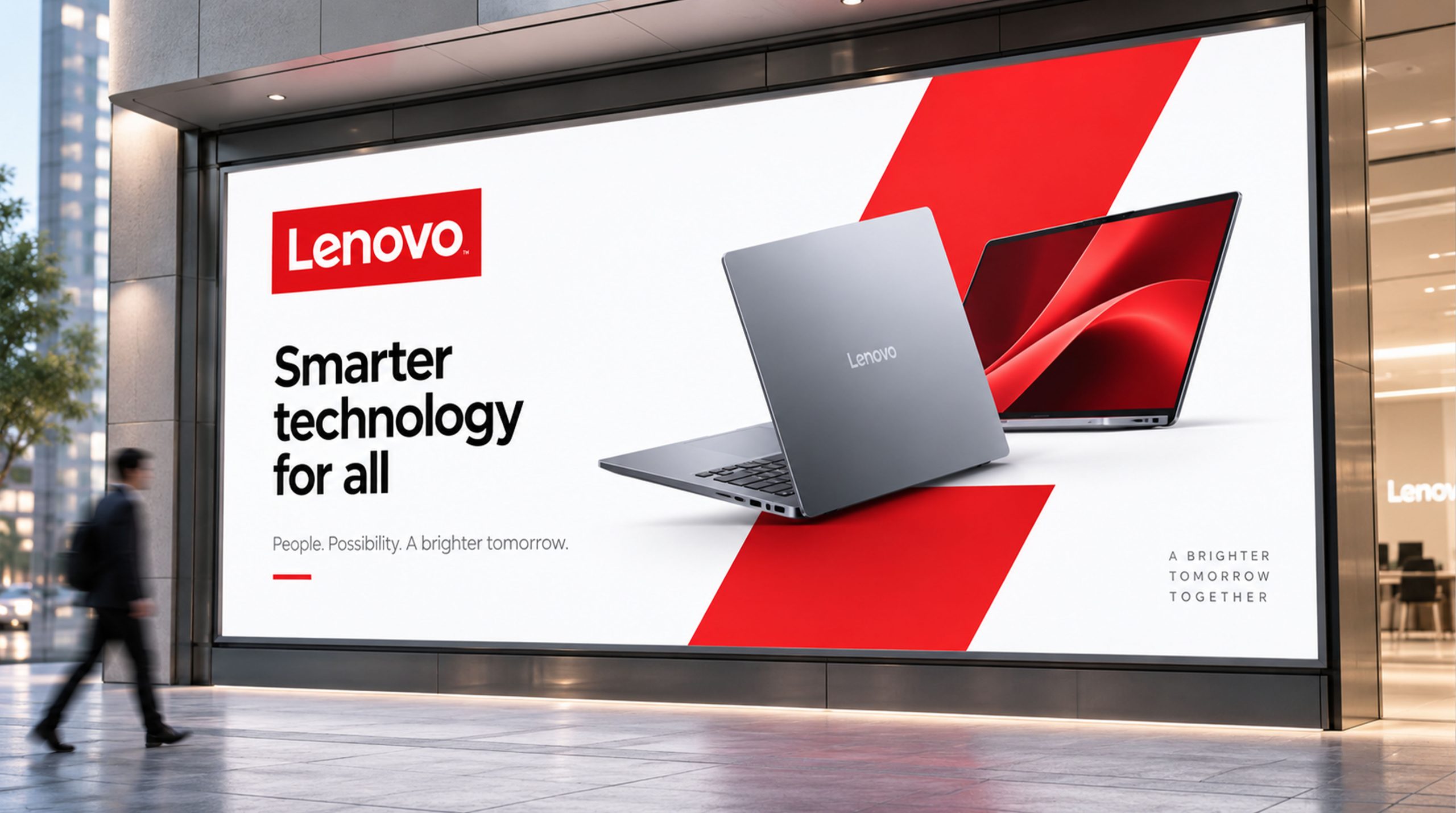
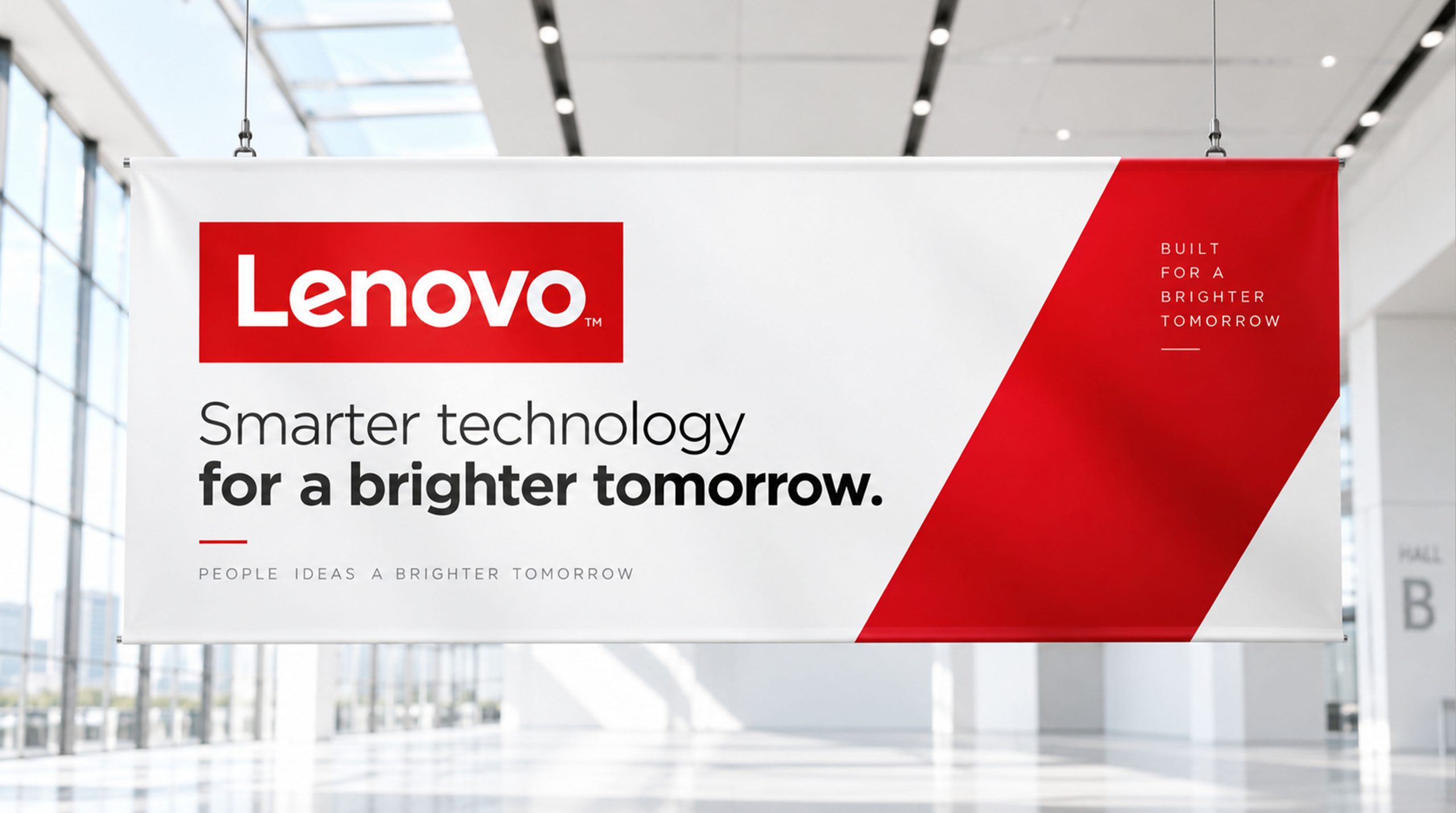
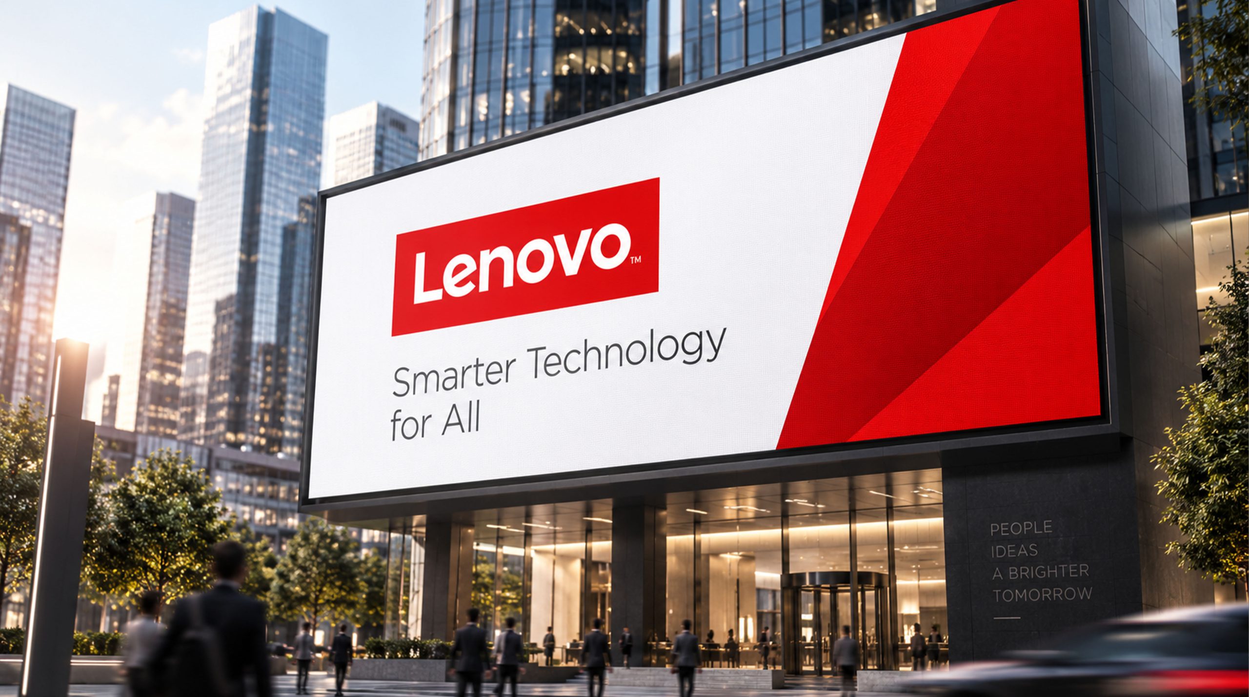
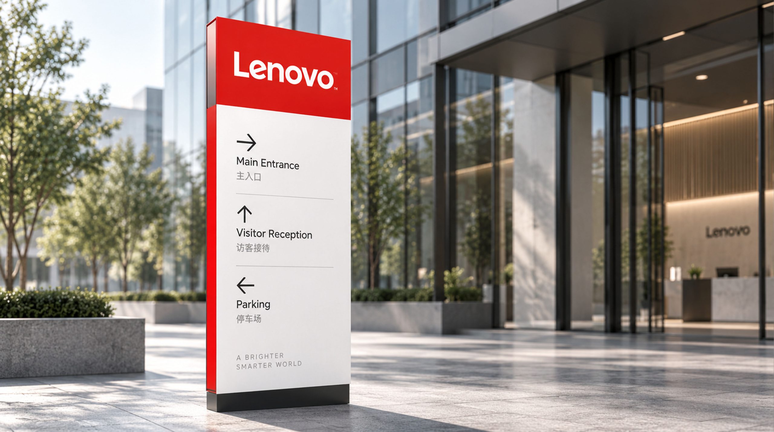
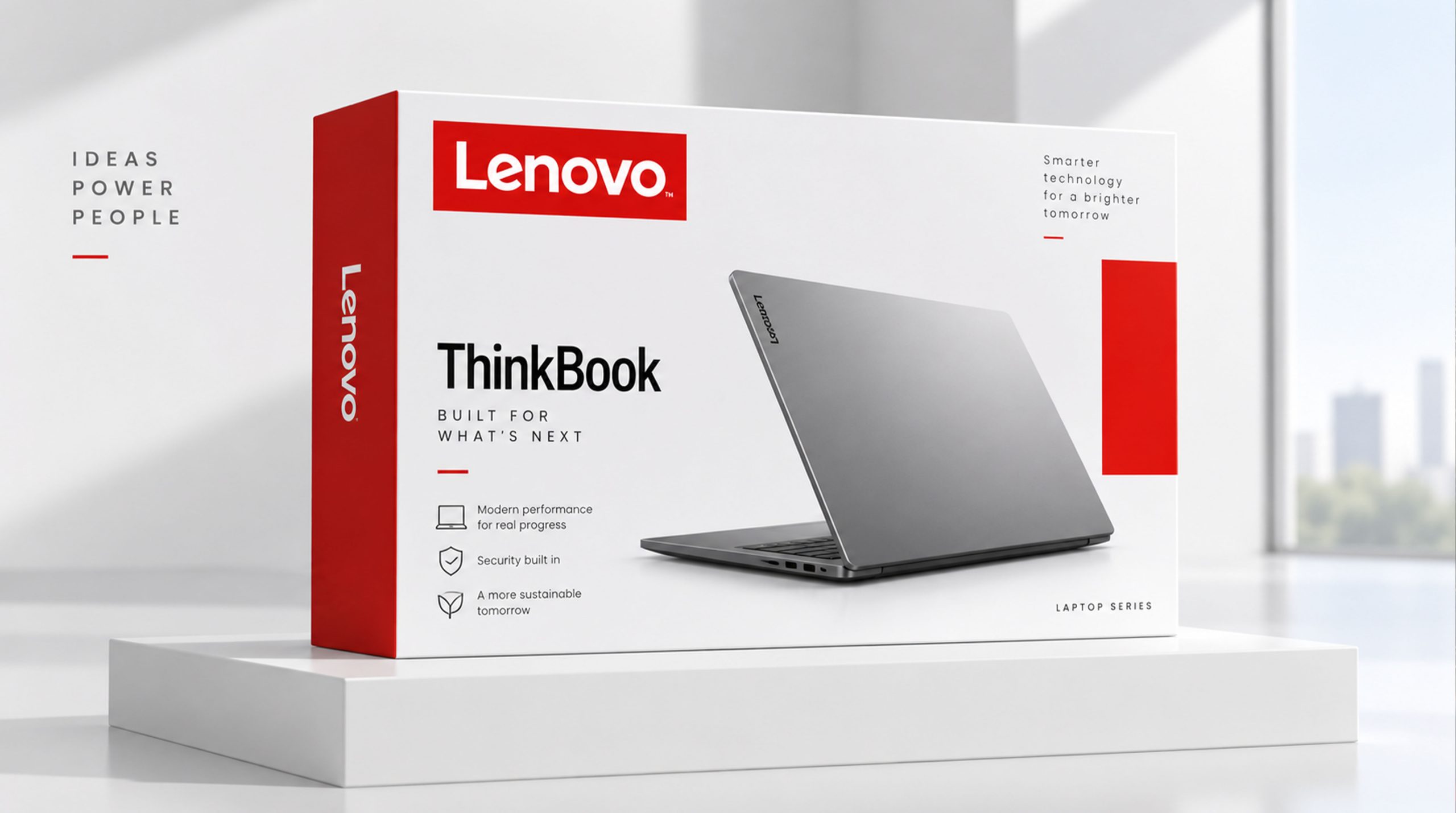
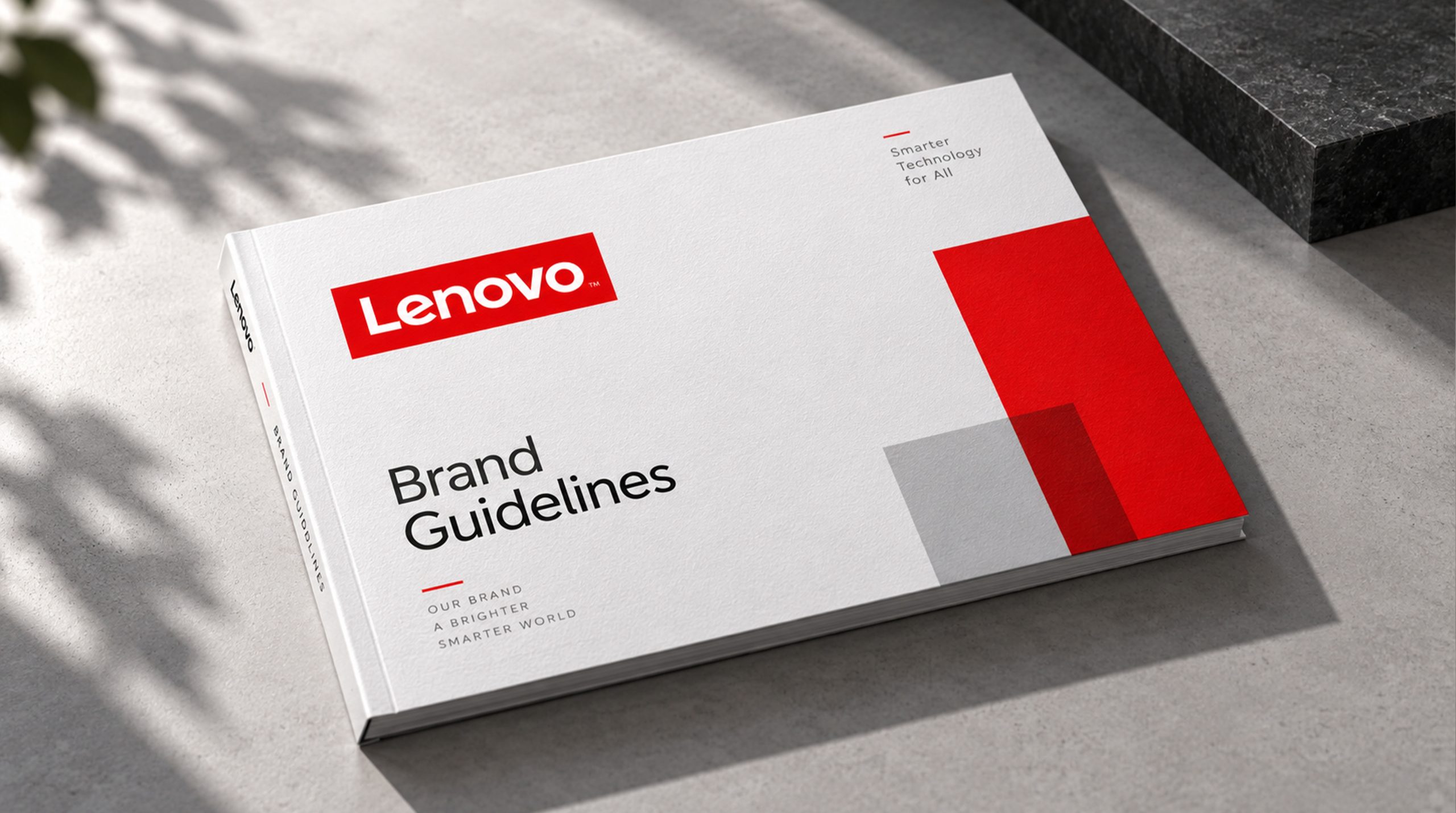
design concept
The auxiliary graphics use "Intelligent Matrix" as the core concept, extract the core visual genes from the Lenovo brand logo - inclined geometric angles and modular structural logic, and develop it into a dynamic graphics system with parallelogram as the basic unit. The parallelogram is directly inherited from the iconic tilt angle in the Lenovo wordmark, keeping the auxiliary graphics and the brand identity consistent at the visual DNA level.
base unit
The basic unit of the auxiliary graphic is a standard parallelogram, and its inclination angle is strictly taken from the inclination of the letters in the Lenovo wordmark. The parallelogram is a dynamic variation of the square under the action of tilting force - retaining the sense of order of the square while gaining forward momentum, conveying the Lenovo brand's scientific and technological spirit of "seeking innovation while being steady, and making breakthroughs in order".
The basic unit is presented in three sizes - large, medium and small three-level modules, just like the multi-scale coverage in Lenovo's product matrix from data centers to personal computers to smartphones. The proportional relationship of the three sizes follows the golden section or the progressive relationship of 2:3:5, ensuring that a harmonious visual rhythm is maintained when freely combined.
combinational logic
The basic units are arranged in various combinations according to the logic of "intelligent matrix". The units are aligned in a grid with a uniform spacing, just like the circuit modules on the chip - each unit is an independent functional module, and the modules are precisely arranged to form a powerful system as a whole.
Array arrangement: Multiple parallelograms are closely arranged in a grid to form an array pattern with a fabric texture. The units in the array can be unified in color to present a calm technological texture, or they can be gradient in color to present a dynamic sense of data flow. The array pattern can be used as a large-area background layout for the main visual of conferences, exhibition hall walls and brand packaging shading.
Radiation combination: Multiple parallelograms are arranged radially outward with the center point as the origin, just like the intelligent signal radiates and spreads from the center of the device to the surroundings. The radiation combination conveys the brand narrative of "Intelligence starts from here and connects everything". This combination is suitable for product launch key visuals, brand event main stages and social media core content.
Flow sequence: Parallelograms are arranged along an arc or diagonal in a sequence of gradually changing sizes, just like the orderly flow of data packets in the network. The large-sized units at the front end are like the starting point of data, and the small-sized units at the end are like data dissipated in the cloud. The flow sequence conveys the technical image of "data flow and unbounded intelligence".
Disassembly and reorganization: A single parallelogram can be disassembled diagonally into two triangles, and the triangles can be reassembled into arrows, stars, or more complex geometric patterns. Disassembly and reassembly convey Lenovo's product strategy of "modular thinking and flexibility" - the same set of basic units can be assembled into completely different visual solutions according to different business needs.
Dynamic performance
Auxiliary graphics use "assembly and deconstruction" as the core animation logic in dynamic media. Parallelogram units fly in from all sides of the picture at different speeds, and are accurately aligned and assembled in the central area to form a complete pattern or brand information frame; after the information is conveyed, the units are deconstructed, scattered and reorganized into the next picture again. The dynamic cycle of "assembly-presentation-deconstruction-reorganization" conveys Lenovo's technological concept of "continuous evolution of intelligent systems".
color system
The colors of the auxiliary graphics are extended based on the core color system of the Lenovo brand:
The main color Lenovo Red #E2231A is used to assist the core emphasis unit in the graphics. The red unit is like an "activated" node in the graphics matrix - in a calm array, a red parallelogram lights up, like a device being intelligently awakened. Technology grayscales #2D2D2D to #E0E0E0 form the basic color gamut of auxiliary graphics. The multi-level grayscales from dark gray to light gray provide rich brightness levels for the matrix, conveying the precise texture of metal materials of technology products. Smart Blue #0078D4 is an auxiliary graphic variant used for enterprise services and data center business lines. Blue conveys the professionalism and reliability of enterprise-level technology. Innovation Green #00A651 is used in sustainable development and ESG-related communication scenarios. Pure white #FFFFFF and pure black #000000 as canvas colors for extreme contrast.
The auxiliary graphics unit supports gradient filling - from Lenovo red gradient to dark gray, from smart blue gradient to technology gray, the gradient direction is unified along the tilt direction of the parallelogram, making the gradient itself become part of the tilt momentum.
Application extension
Product packaging: The side of the laptop packaging box is covered with a light gray array pattern on a dark gray background. A Lenovo red unit in the array is accurately aligned next to the brand logo, just like the illuminated core module on the product chip. The auxiliary graphics are presented in a low-key shading manner on the packaging, which does not overwhelm the focus, but provides consumers with a sense of ritual that "this is a sophisticated technology product" when unboxing.
Press conference and exhibition hall: The background of the main stage of the global product conference is covered with a large radiating combination. Hundreds of parallelograms radiate from the center of the stage to the surroundings, presenting a spectacular technological matrix with gradient colors from red to dark gray. At the moment when the product was unveiled, the units in the matrix lit up Lenovo red in sequence in a wave-like animation, just like the intelligent signals spreading from the new product to the world.
Digital media: The official website uses flow sequences as parallax animation elements when the page scrolls. Parallelogram units flow at different speeds as the page scrolls, creating an immersive sense of data flow. The social media template is arranged in an array as the background of the information card, and the brand information clearly emerges in the matrix.
Corporate communication: The annual report and ESG report use a variant pattern of disassembly and reorganization as the visual separation of chapters. Each chapter is presented in a different combination - the financial chapter uses an array to convey the rigor of data, the innovation chapter uses radiation to convey the spread of technology, and the sustainable chapter uses innovative green gradients to convey the concept of environmental protection.
Environmental graphics: Lenovo's global headquarters and offices around the world cover the walls of public spaces with large auxiliary graphic devices. Parallelograms are cut and installed with metal sheets, forming a matrix of light and shadow that changes over time under natural light. The glass partitions of the conference room use frosted technology to present an array pattern, which not only protects privacy, but also conveys the brand atmosphere of the technology company.
normative guidelines
The use of auxiliary graphics must comply with the following core specifications: the tilt angle must be consistent with the Lenovo word mark and must not be changed at will; the proportional relationship between the three dimensions of the basic unit must not be changed; the spacing between units must follow a unified grid, and the spacing must not be stretched or compressed at will; the Lenovo red unit occupancy in any screen The ratio should not exceed 20% of the total area, and should be "point of emphasis" rather than "overwhelming"; auxiliary graphics must not be used separately from the brand logo for the first-level touch point of brand communication; the gradient direction must be along the inclination direction of the parallelogram; the minimum distance between the auxiliary graphics and the brand logo must not be less than 100% of the height of the logo.
design results
After the release of the auxiliary graphics system, the visual unity and brand recognition of the Lenovo brand in global diversified communication scenarios have been significantly improved. The "Smart Matrix", with its tilted genes inherited from the brand identity and modular flexible extension capabilities, builds a complete and unified visual language system in product packaging, global press conferences, digital media, corporate communications and environmental spaces, conveying the brand spirit of "Internet of Everything, Unbounded Intelligence". The auxiliary graphics system provides key visual infrastructure for the Lenovo brand to upgrade from "logo recognition" to "system recognition".