










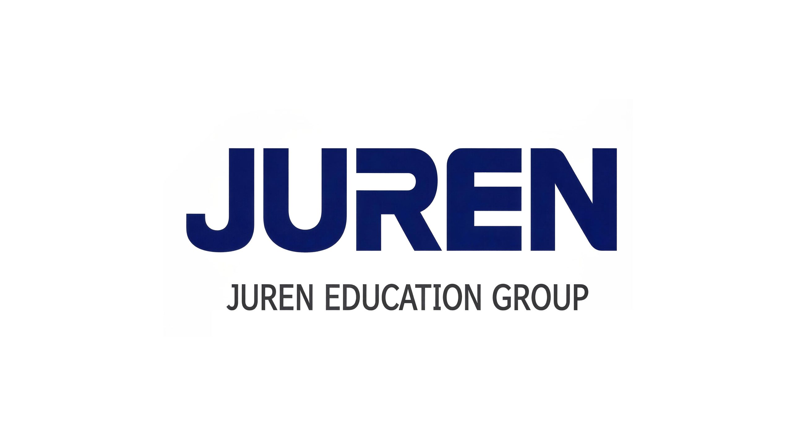
Giant Education Group is a leading enterprise in the field of private education in China. Its business covers extracurricular tutoring in primary and secondary schools, quality education, vocational education and international education. With the mission of "providing education that touches the Chinese people", it is committed to providing high-quality educational services to millions of students.
The brand name "Giant" has an extraordinary spirit - "Ju" means huge and giant, symbolizing the company's leading position and scale in the education industry; "Ren" means people-oriented, pointing out that the education industry takes the growth of people as its ultimate goal. Qingmei Future was commissioned to lead the brand identity design.
This logo design implements the team’s core philosophy into a wordmark. As a leading enterprise in the field of private education, the logo design of Giant Education Group complies with the basic principles of logo design and focuses on expressing trust, authority and international development trends. It uses steady and majestic English letters as the main identification element. It is concise, international, and easy to communicate and remember. It is the trend of international logo design.
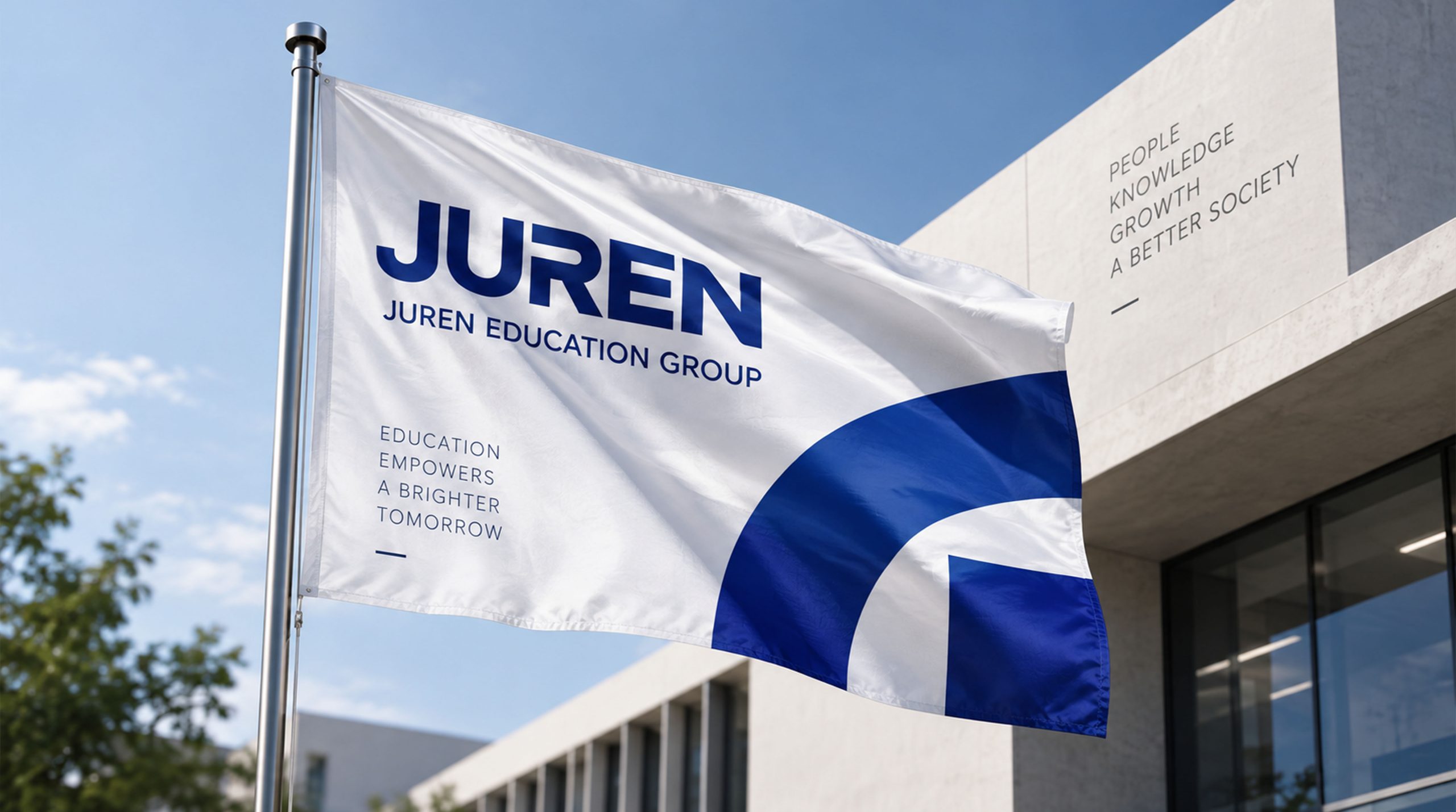
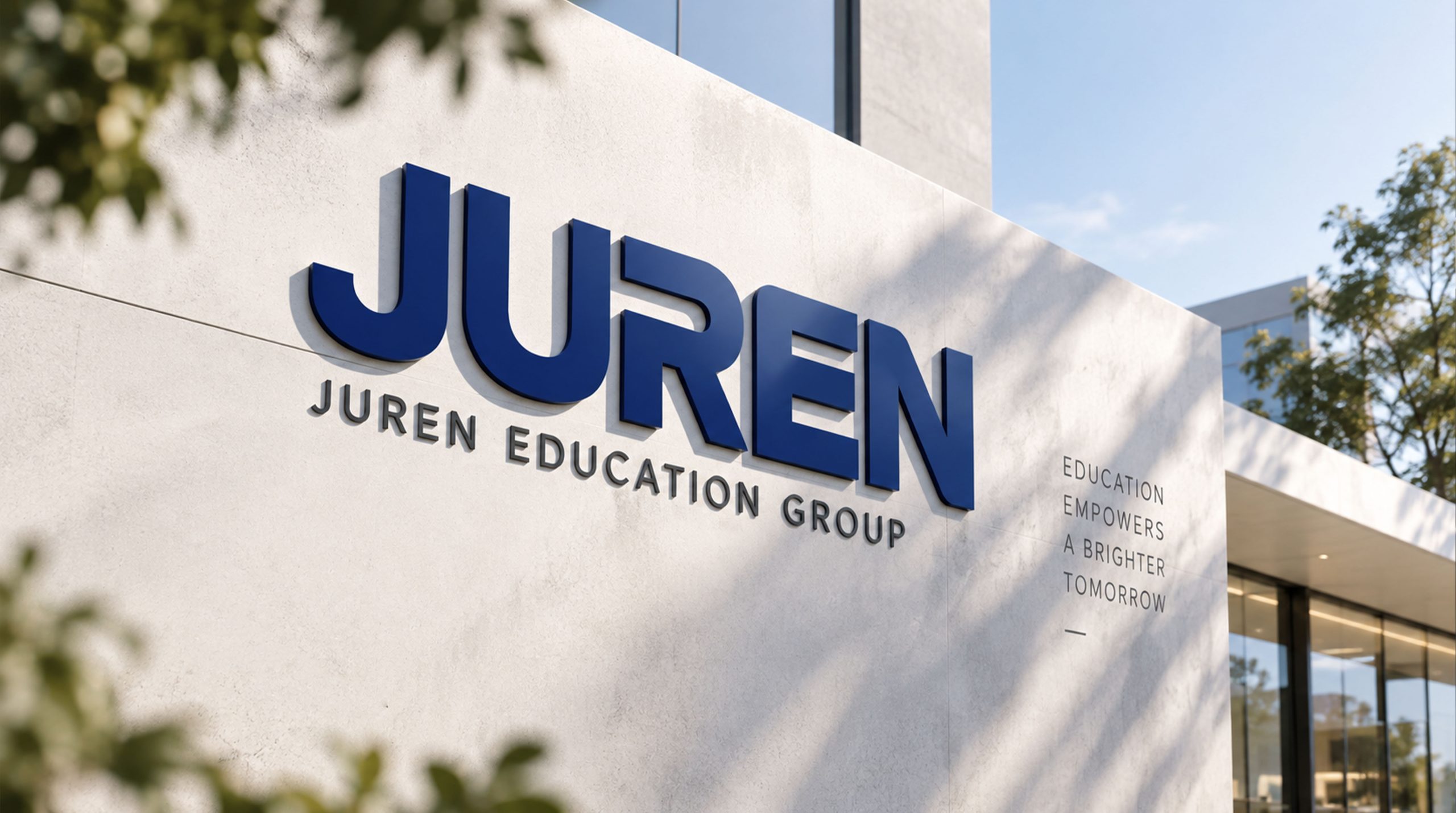
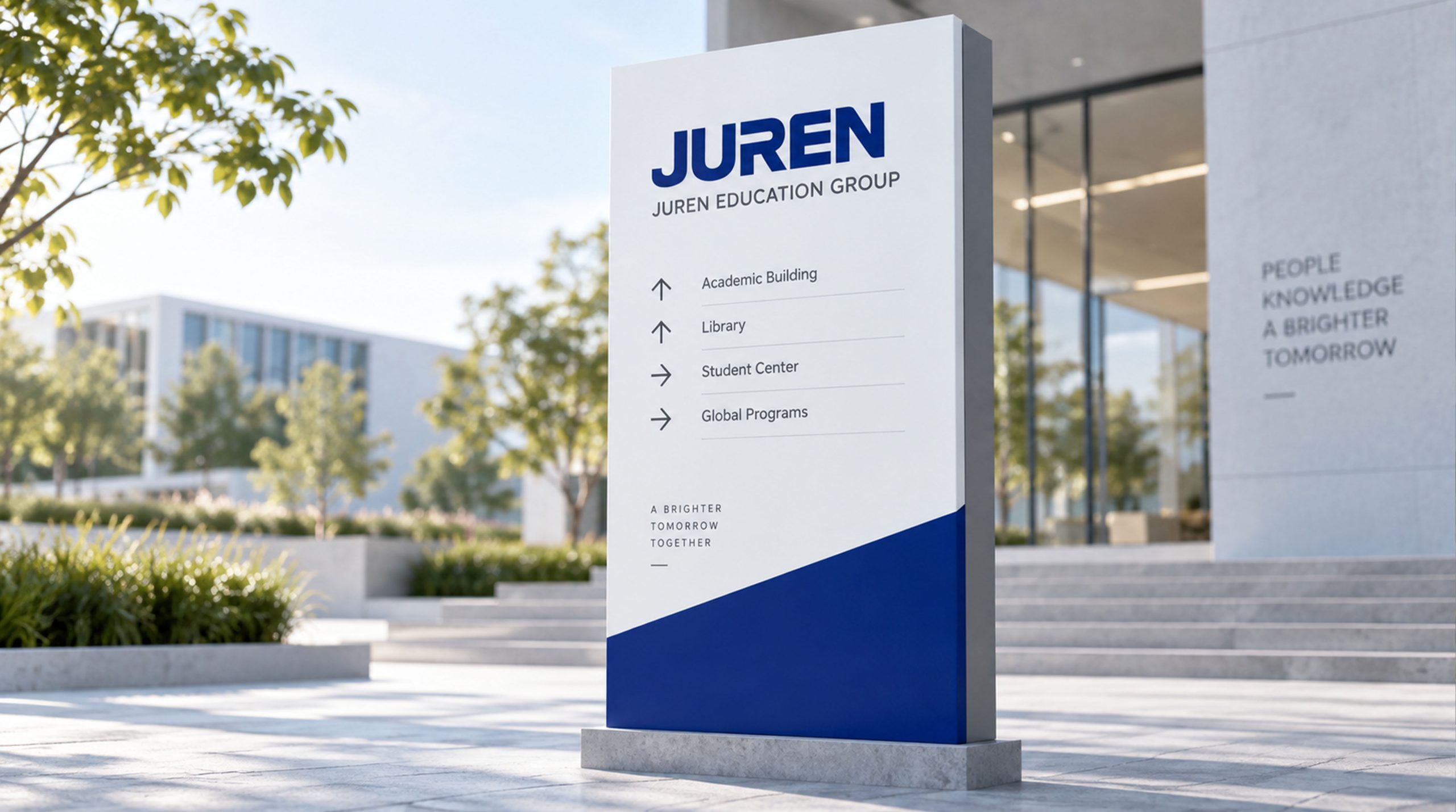
design concept
The logo uses "GIANT" in English as the core identification element and uses pure font design to convey the entire temperament of the brand. Without the use of additional graphic symbols - in the logo system of international education brands, using the word mark as the only identification element is the most mature, concise and most communication efficient design strategy. The five letters of "GIANT" are the literal English translation of the brand name "GIANT", establishing a seamless semantic connection between Chinese and English, making the brand have the familiarity of Chinese in the domestic market and the currency of English on the international stage.
graphic language
The five letters "GIANT" are carefully drawn in a custom uppercase sans serif font. The font is in uppercase rather than mixed uppercase and lowercase. The neatness of the uppercase letters is like a row of giants standing side by side—tall, neat, and eye-catching, conveying the sense of scale and authority of the education group.
The word weight is chosen to be between thick and thick, and the strokes are full and solid, occupying sufficient visual space, just like the power promised by the word "giant" - not delicate and light writing, but solid and sound engraving. Thick word weight naturally conveys the sense of trust of "strength, weight and dependence" visually - when parents entrust their children to an educational institution, the first thing they need is trust, and a thick and stable visual image is the most intuitive way to build trust.
The overall proportion of the word mark is presented in a wide, flat and slightly short configuration, with a low center of gravity - the low center of gravity is like the stable foundation of a building, conveying the sense of corporate chassis that "although the giant is big, the foundation is more stable". Visually, there is a balanced beauty. The five letters are arranged at carefully calculated spacing, with appropriate density and calm rhythm, just like the reasonable arrangement of each stage in the education process - not hasty, not impatient, and step by step.
Font composition
The English word mark "GIANT" is the core logo of the brand. The Chinese character "Giant Education" is presented in matching steady boldface, with thick and straight strokes. The character "Ju" is square and powerful like a cornerstone, and the character "Ren" is stretched out like open arms. The Chinese logo is usually placed below or to the right of the English logo to assist in identifying the identity - English dominates the international development trend and Chinese anchors the brand recognition in the domestic market.
color system
The entire logo uses dark blue as the standard color, reflecting the inclusive and broad style. The main color, Giant Dark Blue #0D2C54, is the only color used in the logo. Dark blue is the most authoritative and trustworthy color choice in the global education industry - the world's top universities such as Harvard, Yale, and Oxford all use dark blue or navy blue as the core color of the brand. Deep Blue is like a deep ocean of knowledge - inclusive of thousands of disciplines and boundless, conveying the breadth of disciplines and depth of knowledge of Giant Education Group as a leading comprehensive education enterprise.
The psychological effect of dark blue is extremely suitable for the education industry - it conveys calmness (learning requires concentration), trust (parents need peace of mind), authority (the industry needs benchmarks) and depth (knowledge needs accumulation). Dark blue is not as heavy and depressing as black, nor as frivolous and shallow as light blue. The most "educational" blue range sets the visual tone of a "trustworthy educational giant" for the brand.
Auxiliary pure white #FFFFFF is used as the standard background color and reverse white application color. The two standard applications of dark blue white background and white blue dark background ensure that the logo can be clearly presented in all scenes. Auxiliary light blue #E3EDF7 is used for information hierarchy and background transition in the brand system, like a faded extension of dark blue. Auxiliary medium gray #6B7B8D is used for auxiliary text and secondary information.
Application extension
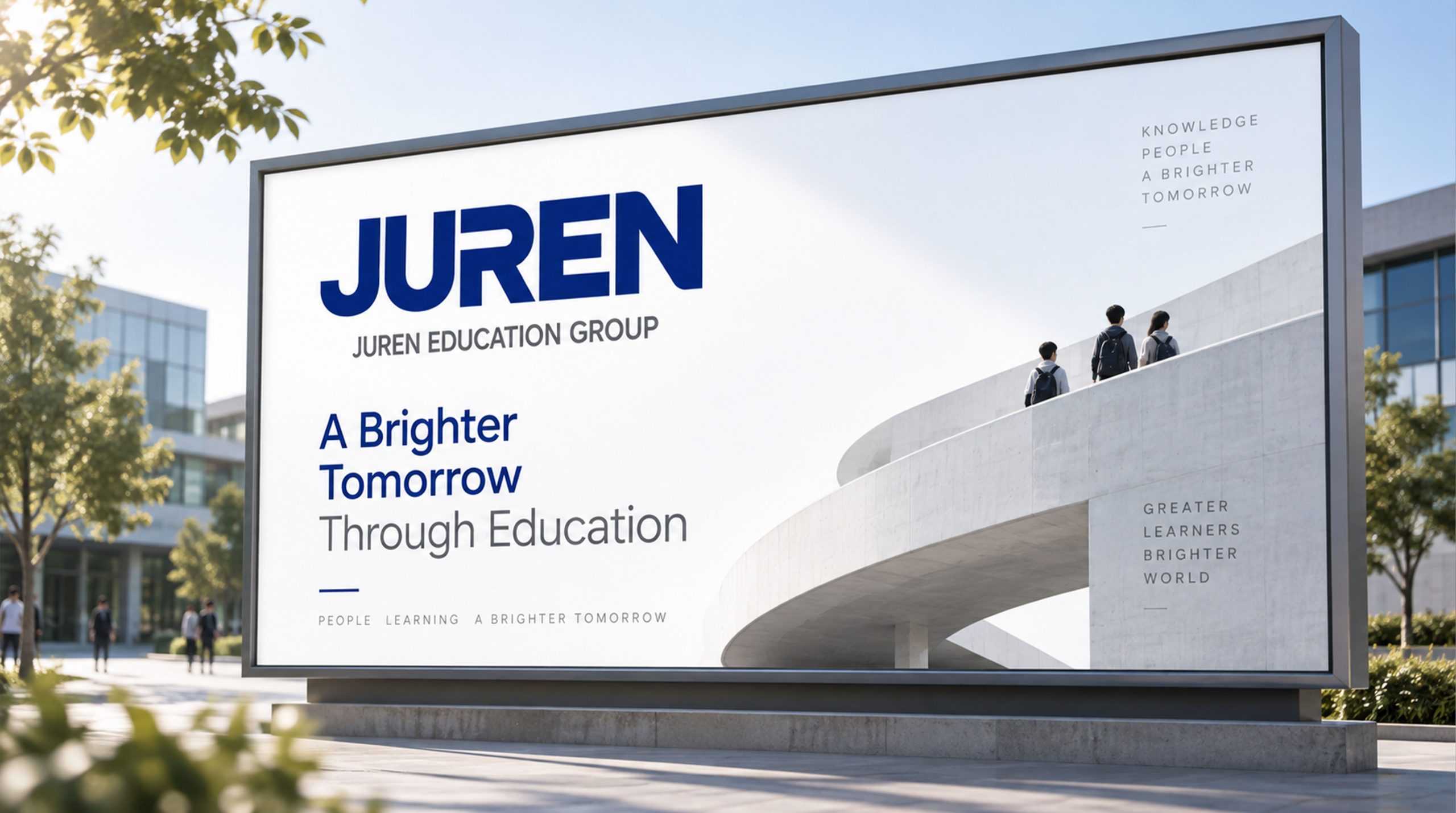
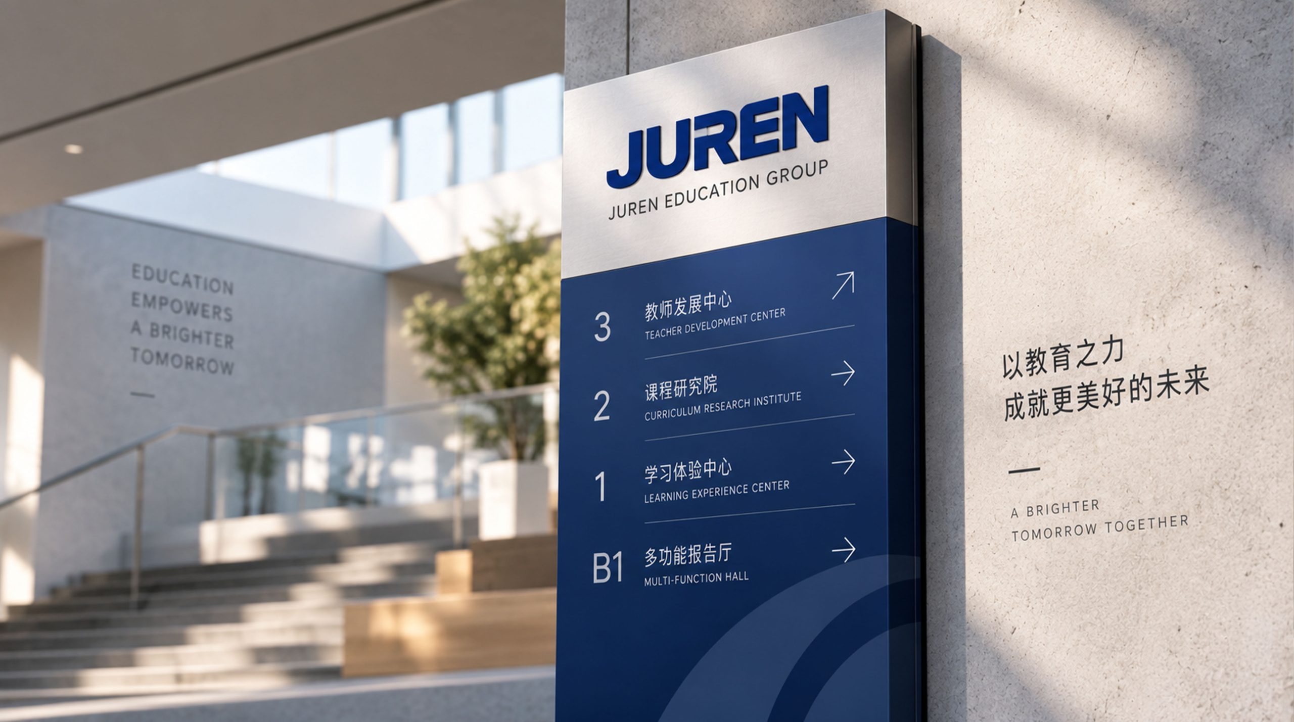
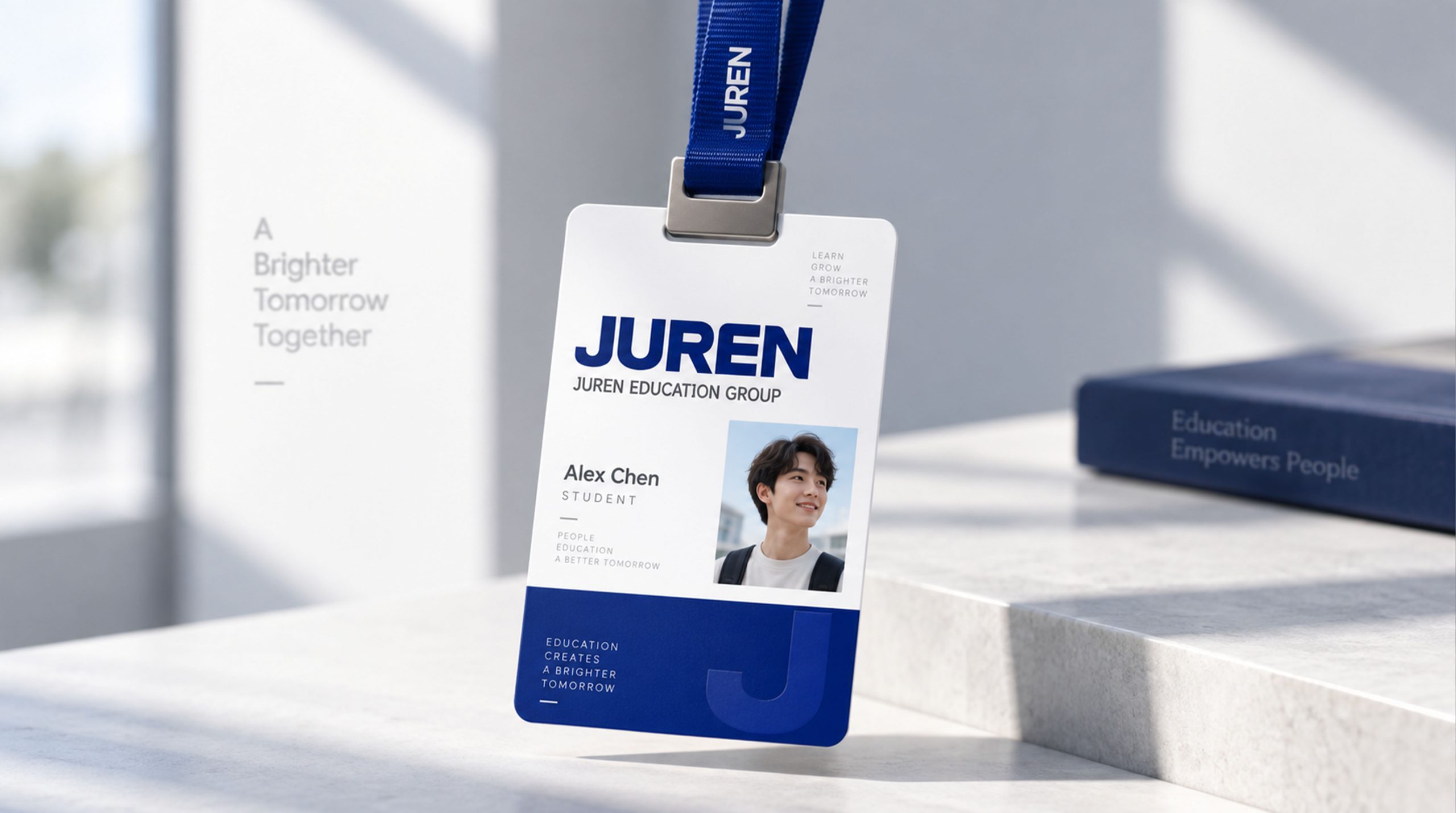
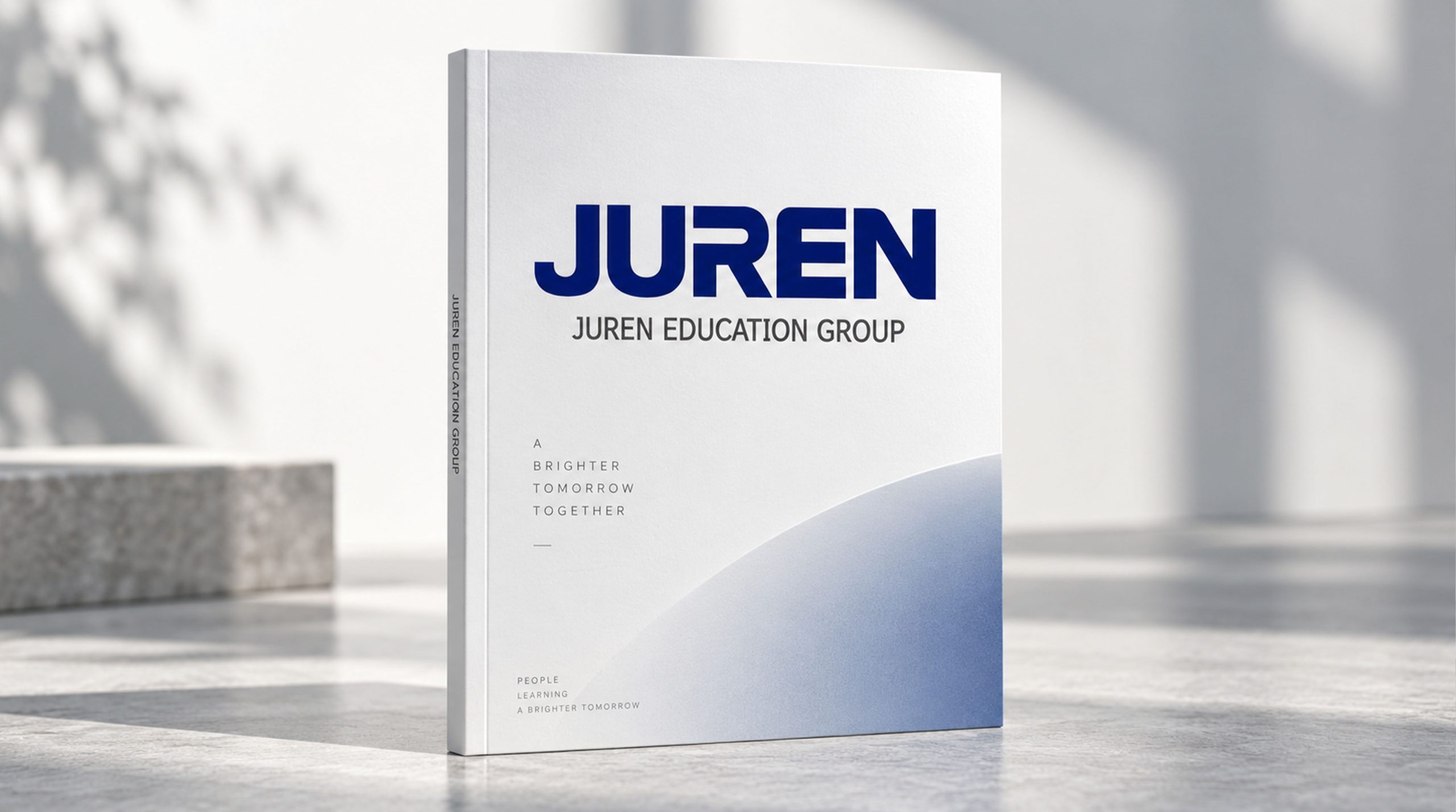
The logo can be widely used in teaching center doors, campus hall image walls and classroom logos across the country; textbook covers, student manuals, growth files and parent communication materials; official websites, online learning platforms and social media images; education industry forums, enrollment promotion activities and brand public welfare activities. In front of the door of the teaching center, dark blue "GIANT" is installed with large metal characters on the white facade. The five thick and powerful letters form a strong visual attraction on the street. Parents and students can feel the weight and trust of an educational institution from a distance - "This is an education brand worth trusting." In the campus hall, the dark blue word mark is presented in the center of the image wall in a precision-cast metal relief. The heavy volume of the letters casts a steady shadow under the light, like a row of giant silhouettes guarding the growth of students.
brand meaning
The logo contains three core images: Trust & Authority - the thick word weight and dark blue main color convey the trustworthy brand authority of the leading private education enterprise; International Vision - the pure English capital word mark uses an international design language to lay a visual foundation for the brand's global development; People-Centered - the softening of details conveys the brand character of education that is people-oriented, grand yet approachable. The overall design conveys the brand vision of "Education Giant, Trusted Choice".
Improper Usage (Protection Specification)
Do not change the custom font of the five letters or replace it with a standard font; do not modify the letter spacing or change the weight of the overall word mark; do not soften the micro-arcs in the details and restore them to sharp right angles; do not change the hue or brightness of the giant dark blue #0D2C54; do not add strokes, gradients, shadows or decorative effects that are inconsistent with the educational style; do not tilt, stretch or non-proportionally scale the word mark; keep white space ≥ the height of the word mark 35%; the minimum display width shall not be less than 30mm.
design results
After the release of the logo, Giant Education Group's brand recognition and parent trust in the field of private education continued to increase. The wordmark design with the five thick and powerful English letters of "GIANT" as the core successfully conveys the brand attributes of trust, authority and internationalization. Every detail of the letters achieves a precise balance between grandeur and softness. The dark blue standard color sets a solemn visual tone for the brand with an inclusive and broad style, laying a solid foundation for Giant Education Group to shape the quality image of an international education brand.