










Chaoyang Hospital is a large public tertiary-level hospital with comprehensive medical services as its core. It integrates medical treatment, teaching, scientific research and preventive health care, and is committed to protecting people's health with superb medical skills and a compassionate heart.
The brand name "Chaoyang" has a bright image - "Chaoyang" is the sun rising in the morning, symbolizing the hope of life, the rebirth of health and the bright future of the medical industry. Qingmei Future was commissioned to lead the brand identity design.
The design goal of the brand logo is to convey the brand image of "the rising sun and the renewed light of life" through the visual language of life hope, medical expertise and humanistic care.
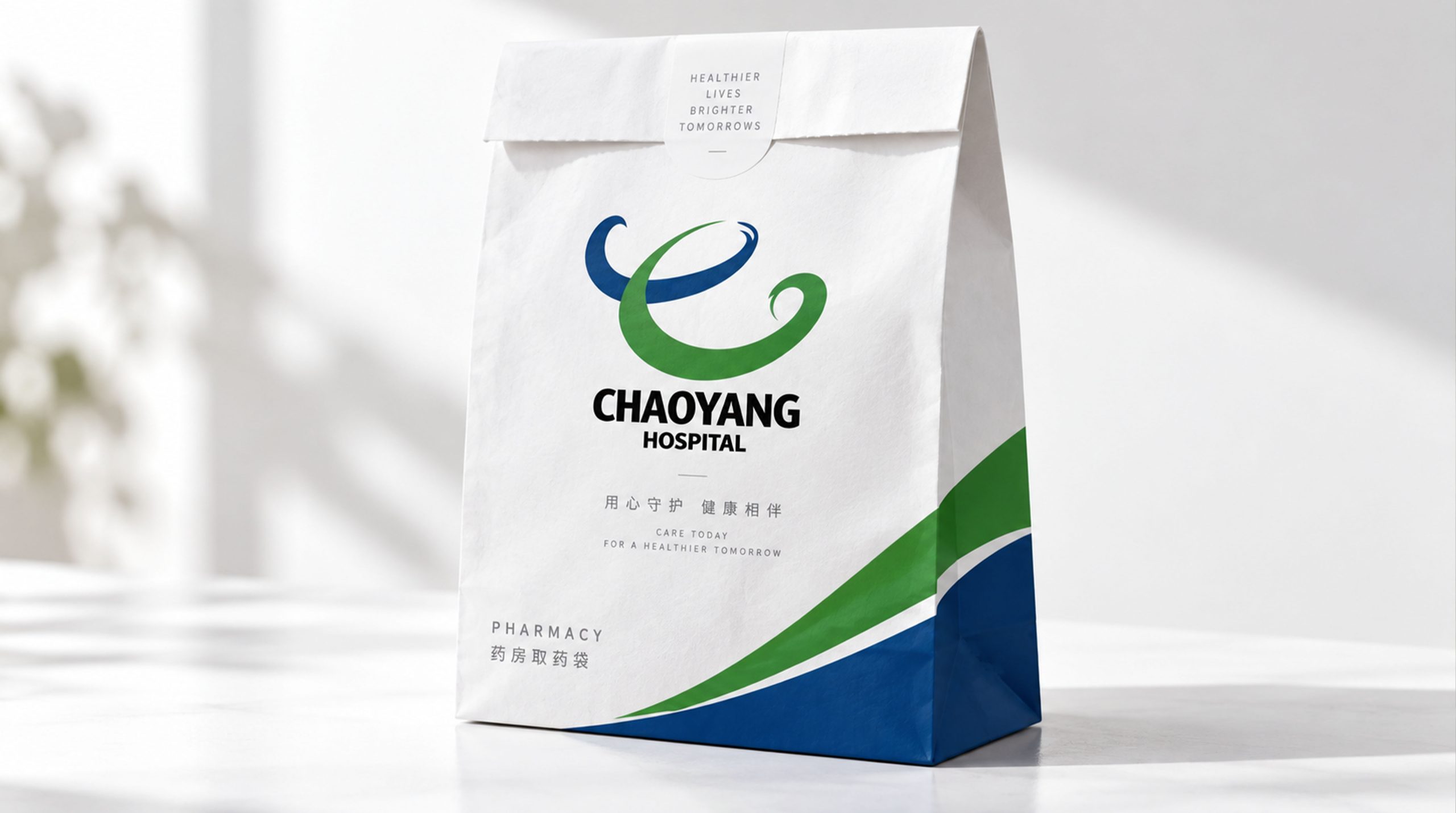
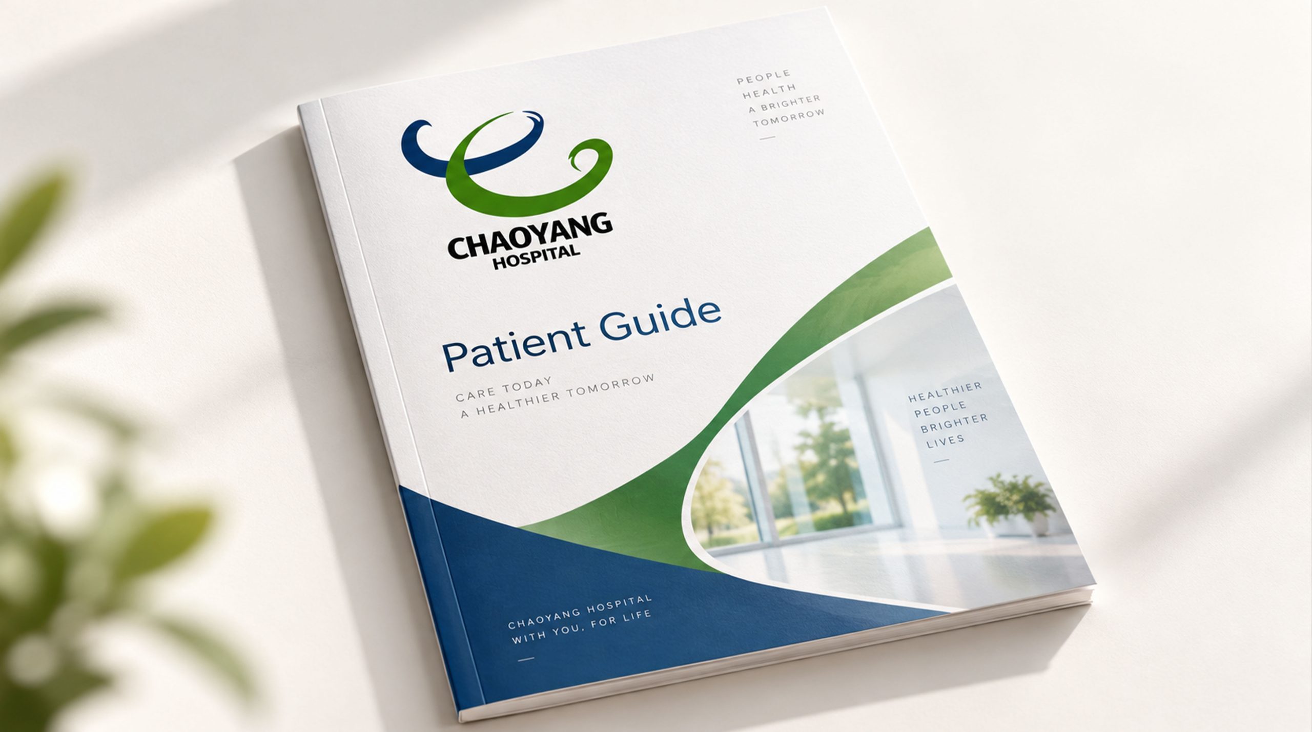
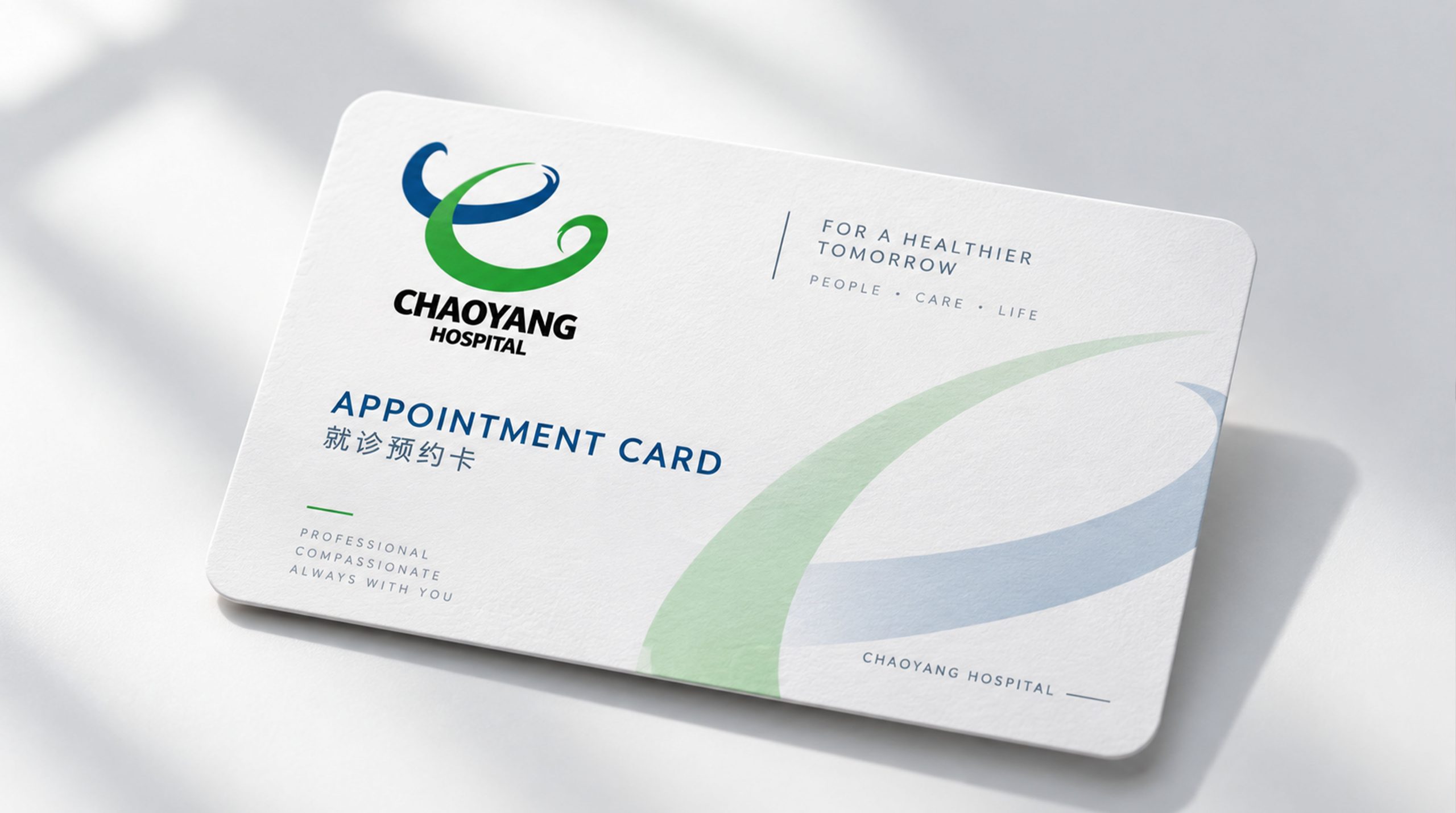
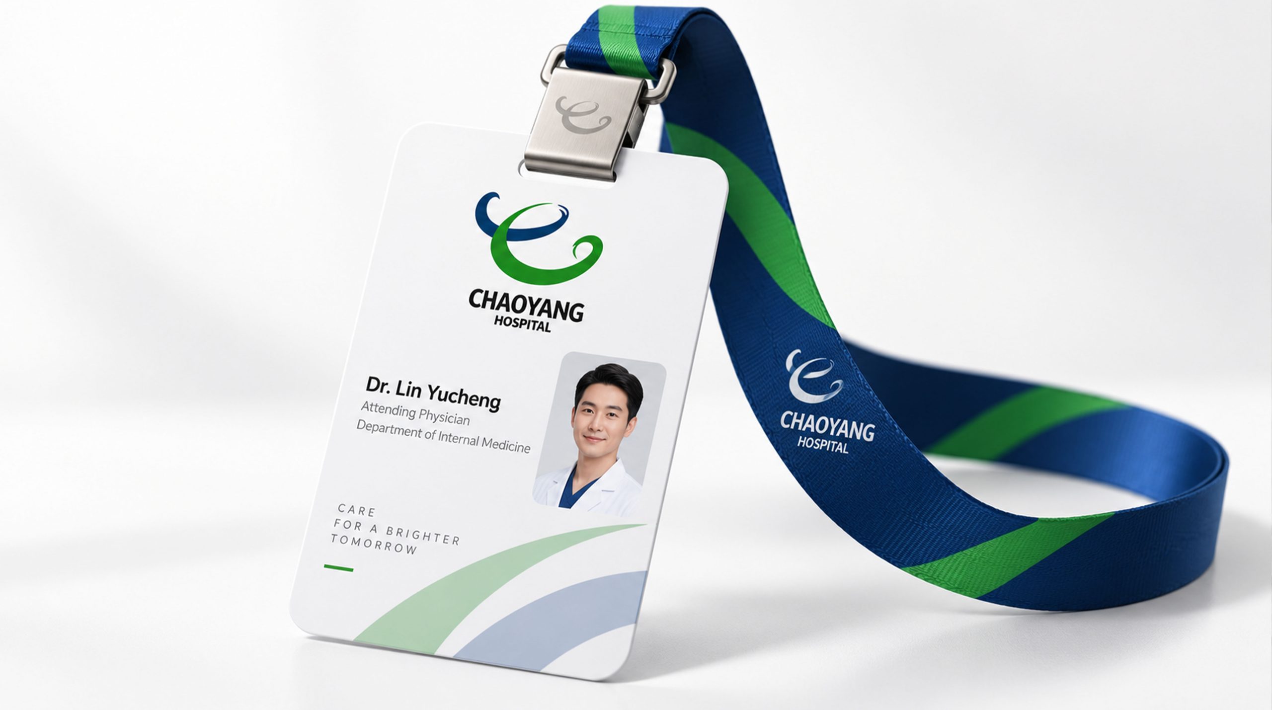
design concept
The logo takes "Sunrise of Life" as its core concept, integrating a rising sun with the medical cross symbol. The rising sun is the direct visualization of the brand name, and the medical cross is the sunrise cross, the most common identification symbol in the global medical industry, conveying that "every diagnosis and treatment is a rebirth of life."
graphic language
The main body of the figure is a semicircular rising sun, located in the upper half of the figure, with a warm and full arc. The lower edge of the rising sun is based on a horizontal line as the horizon, the moment when the sun is rising above the horizon.
The center of the rising sun circle is represented by a medical cross with equal lines. The cross is embedded in the sun disk, as if the core of the sun is the mission of medicine. The four arms of the cross are tied with rounded ends, conveying the brand's "gentle and safe" medical service philosophy.
Several simple short arcs are arranged radially above the rising sun, just like the rays of sunlight radiating outward - the light of hope shines on every patient. The overall composition constructs the "Sunrise of Life" with a simple structure of "the sun rises on the horizon, the cross is in the center, and the rays of light radiate".
Font composition
The Chinese "Chaoyang Hospital" uses upright modern boldface, with steady and clear strokes. "Chaoyang" conveys the bright image of the brand, and "hospital" clarifies the institutional attributes. The English "CHAOYANG HOSPITAL" is arranged in standard uppercase sans serif font to ensure clear identification in academic exchanges and international cooperation.
color system
The main color, Chaoyang Red #C0392B, represents life, heart and medical rescue. Red is the core symbolic color of the global medical industry, and it also echoes the warm tones of the "rising sun" - the first ray of sunshine in the morning is the warm red. Auxiliary medical white #FFFFFF is used as the standard background color and white cross. White conveys the cleanliness and safety of the medical environment. Auxiliary Hope Orange #E8750A is used in the health promotion and patient care elements of the brand system. Auxiliary professional blue #1565C0 is used for academic elements of subject construction and scientific research. The overall color is red and white, reflecting the brand temperament of "life first, professionalism and credibility".
Application extension
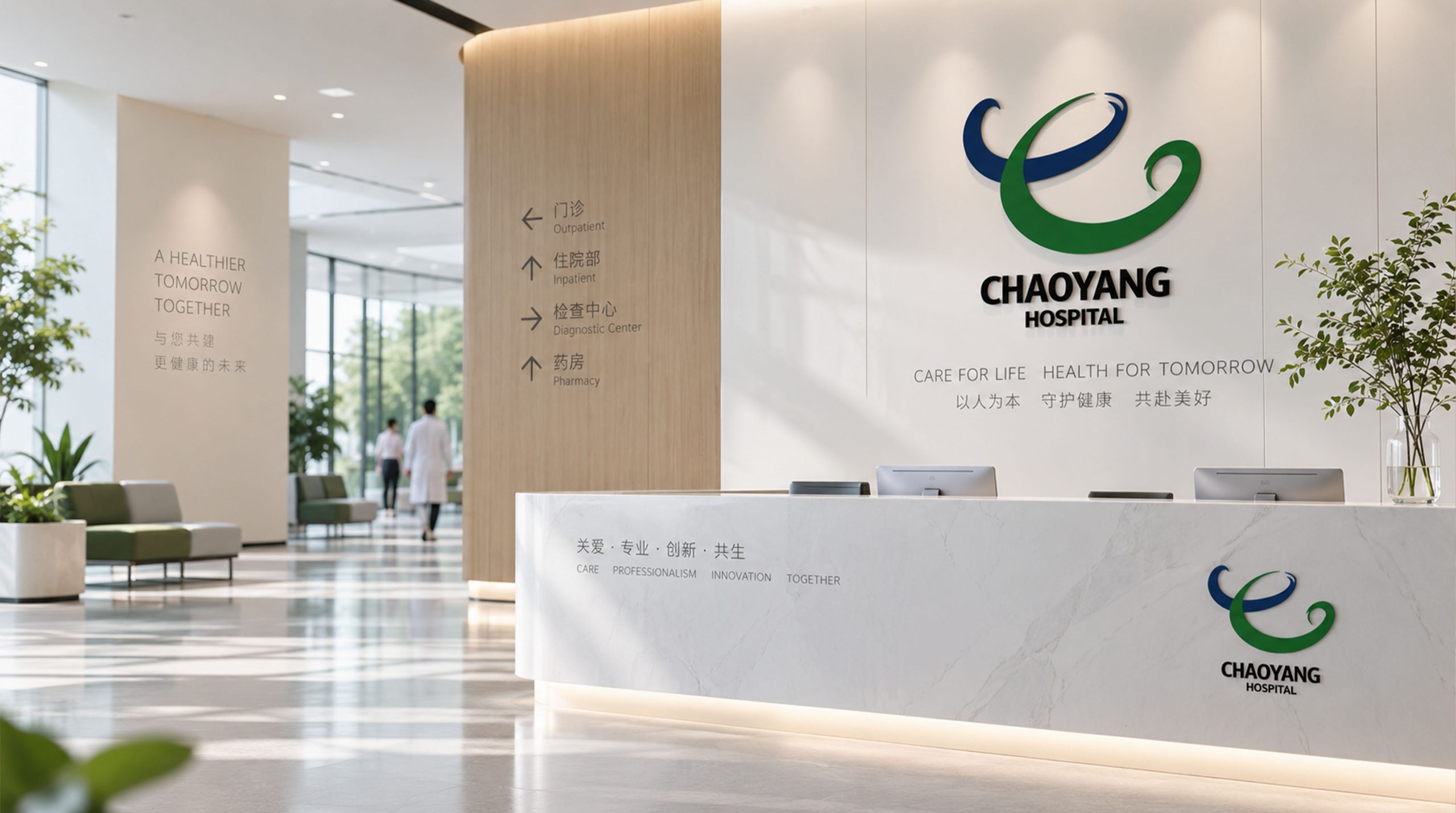
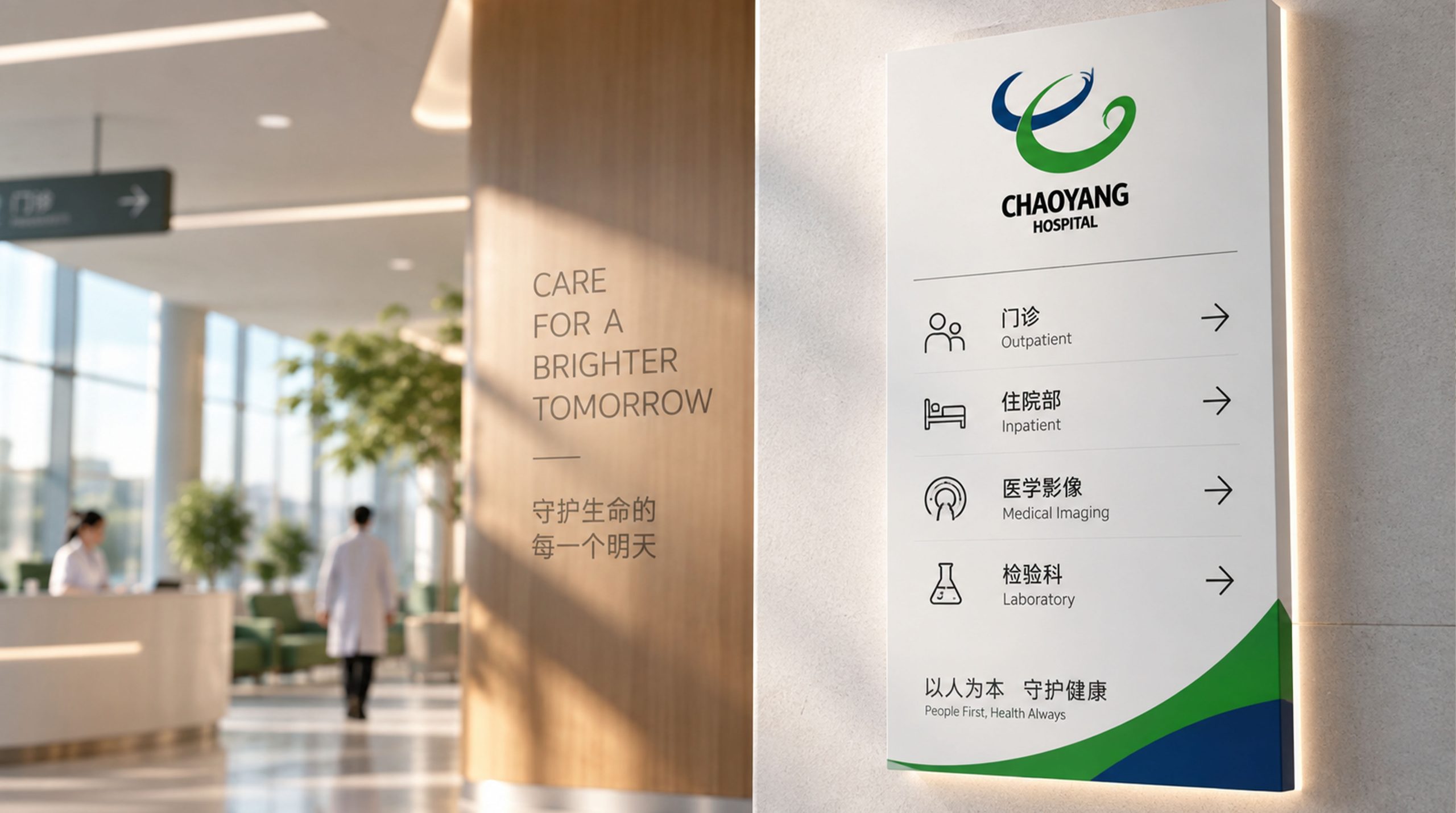
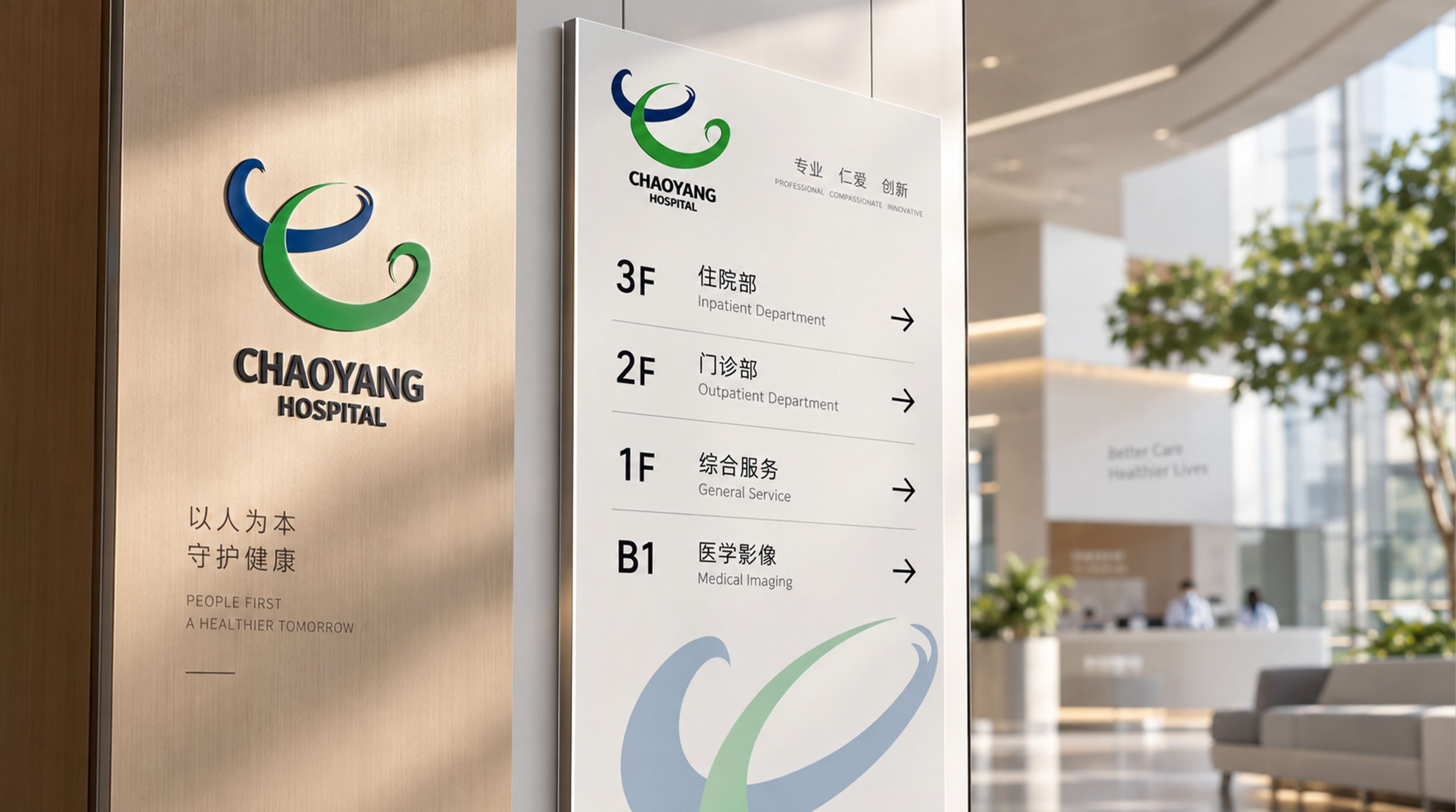
The logo can be widely used on hospital building facades and image walls in outpatient halls; medical cards, medical records, prescription notes and health education materials; official websites, online registration platforms and social media images; images of medical academic conferences and public health charity activities. At the entrance of the outpatient hall, the Chaoyang logo is presented in the center of the image wall with warm-colored lighting backlight. Patients can feel the warm power of "the rising sun and hope ahead" when they first enter the hospital. In the dynamic vision, the morning sun slowly rises from the horizon, the cross appears clearly in the center of the sun disk, and the arcs of light light up and spread outward in sequence.
brand meaning
The logo contains three core images: Hope of Life - the rising sun conveys patients' bright hope of regaining health; Medical Mission - the cross symbol conveys the core medical responsibility of saving lives and healing the wounded; Warm Care - warm colors and rounded shapes convey the hospital's people-oriented humanistic care. The overall design conveys the brand vision of "the rising sun and the renewed light of life".
Improper Usage (Protection Specification)
Do not change the proportion of the semicircle of the rising sun or the central position of the cross; do not delete the arc of light or change its radiation direction; do not change the hue of the main color of the rising sun red; do not add decorative effects that are inconsistent with the medical style; do not separate the rising sun and the cross for separate use; keep the white space ≥ 25% of the graphic height; the minimum display width shall not be less than 25mm.
design results
After the release of the logo, Chaoyang Hospital's brand recognition and patient trust in the field of comprehensive medical services have been significantly improved. "The rising sun of life" has become the core identification symbol of the brand system with its visual language of conveying hope and care, showing the brand vision of "the rising sun and the renewed light of life".