










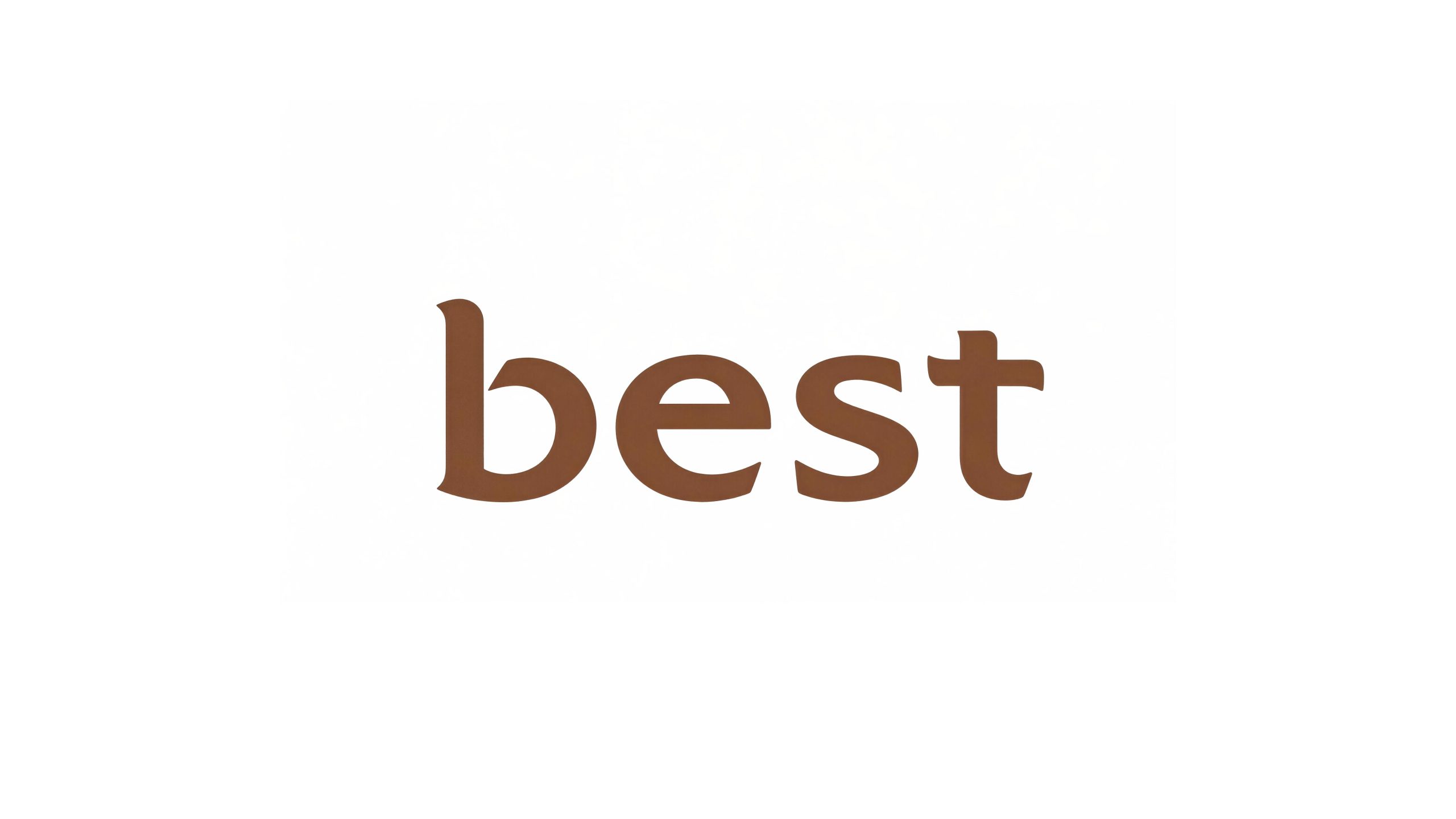
Best is an international consumer brand with nutritional and health products as its core. It focuses on the R&D and sales of functional nutritional supplements, health foods and healthy dietary solutions. It is committed to providing safe, effective and trustworthy nutritional and health products to global consumers with scientific formulas and strict quality control.
The brand name "Best" uses the most direct English word to convey the brand's ultimate promise - "the best", the best raw materials, the best formula, the best quality, so that every consumer can get the best nutritional protection. Qingmei Future was commissioned to lead the brand identity design.
The design goal of the brand logo focuses on reflecting the design attributes of international, modern, security and trustworthiness, conveying the company's reliable brand image to consumers, and using English words to express nutritional functions and company image.

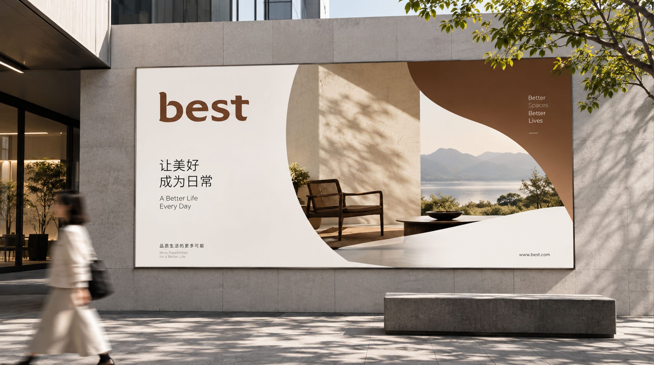
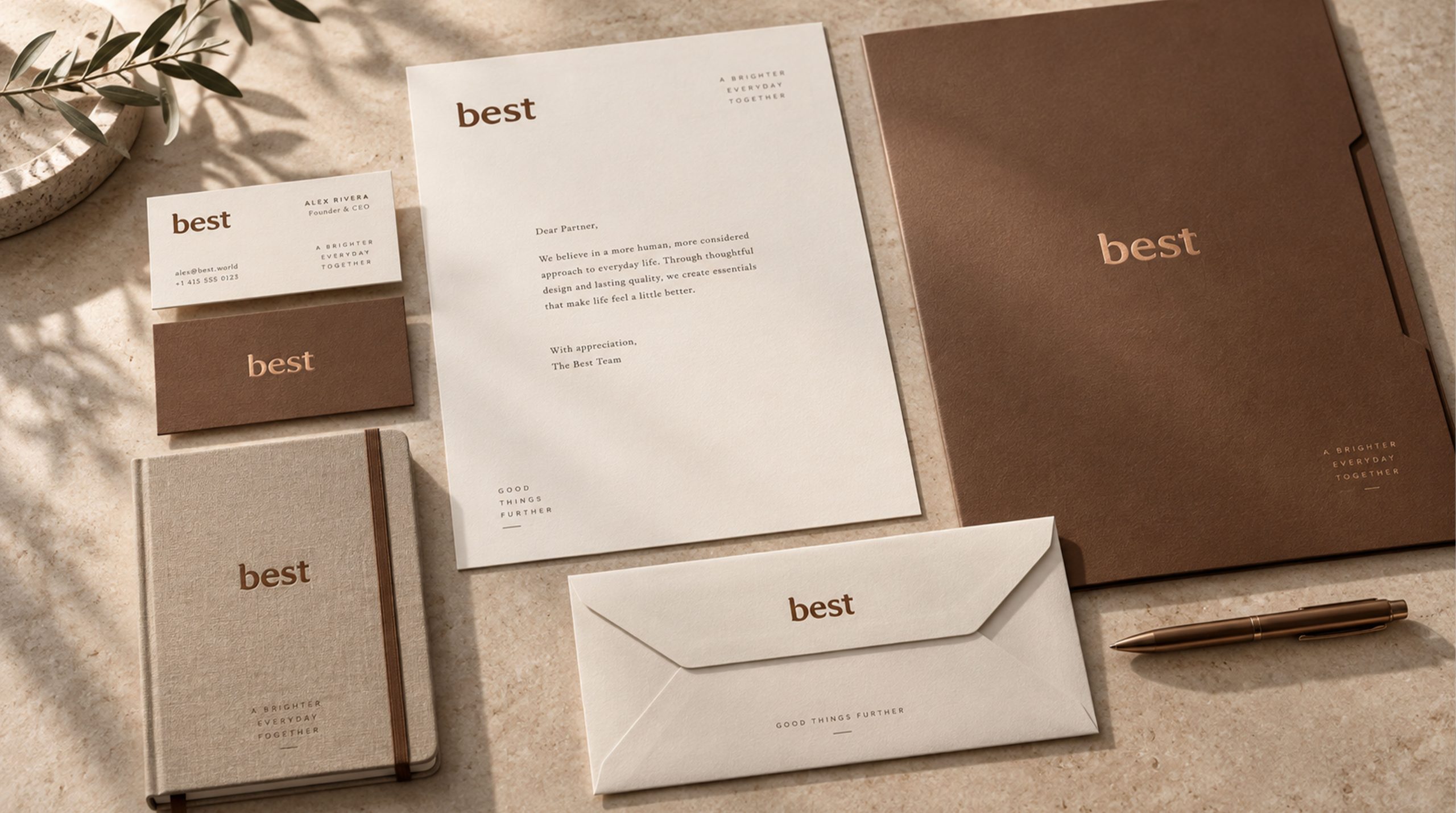
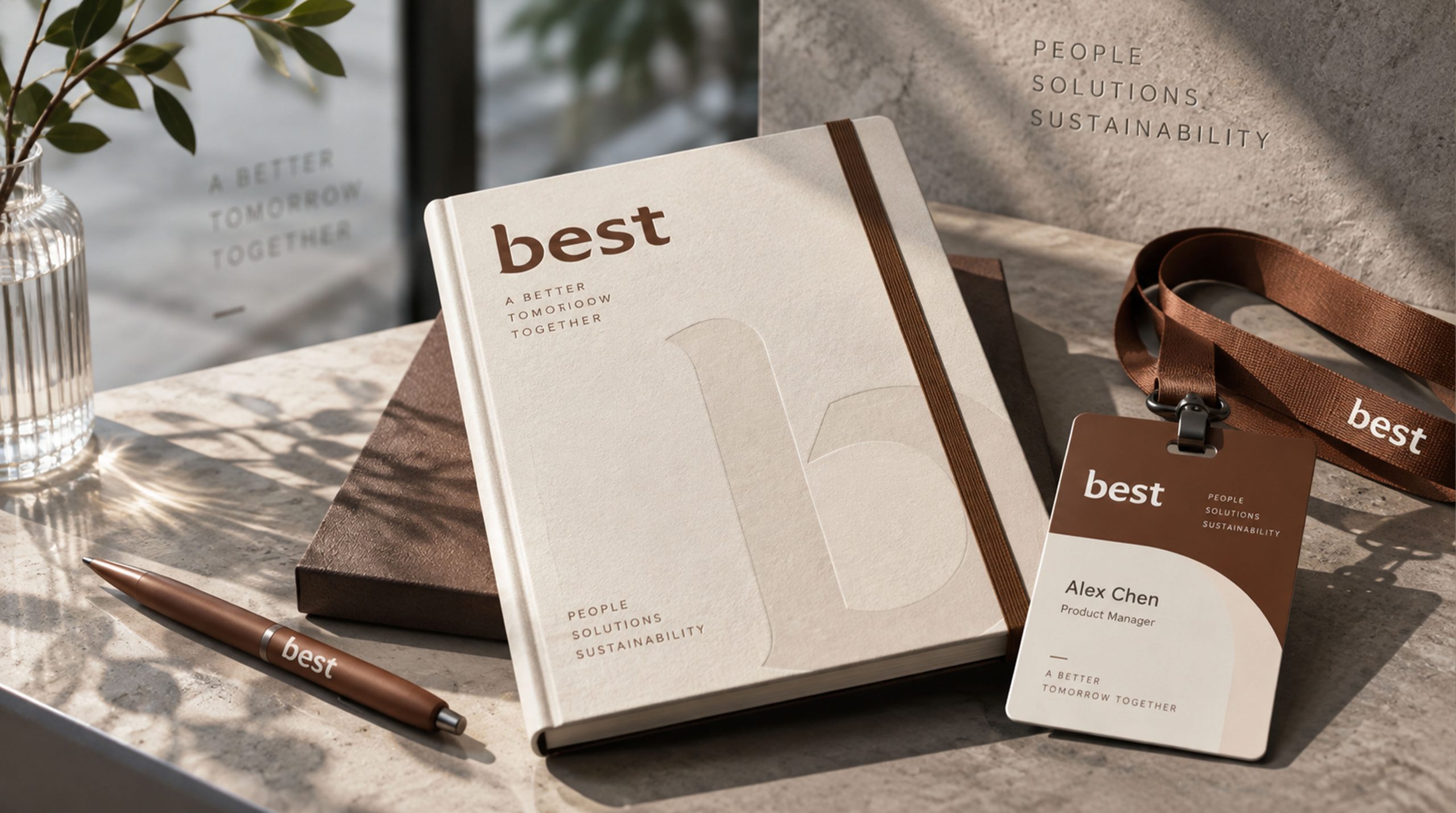
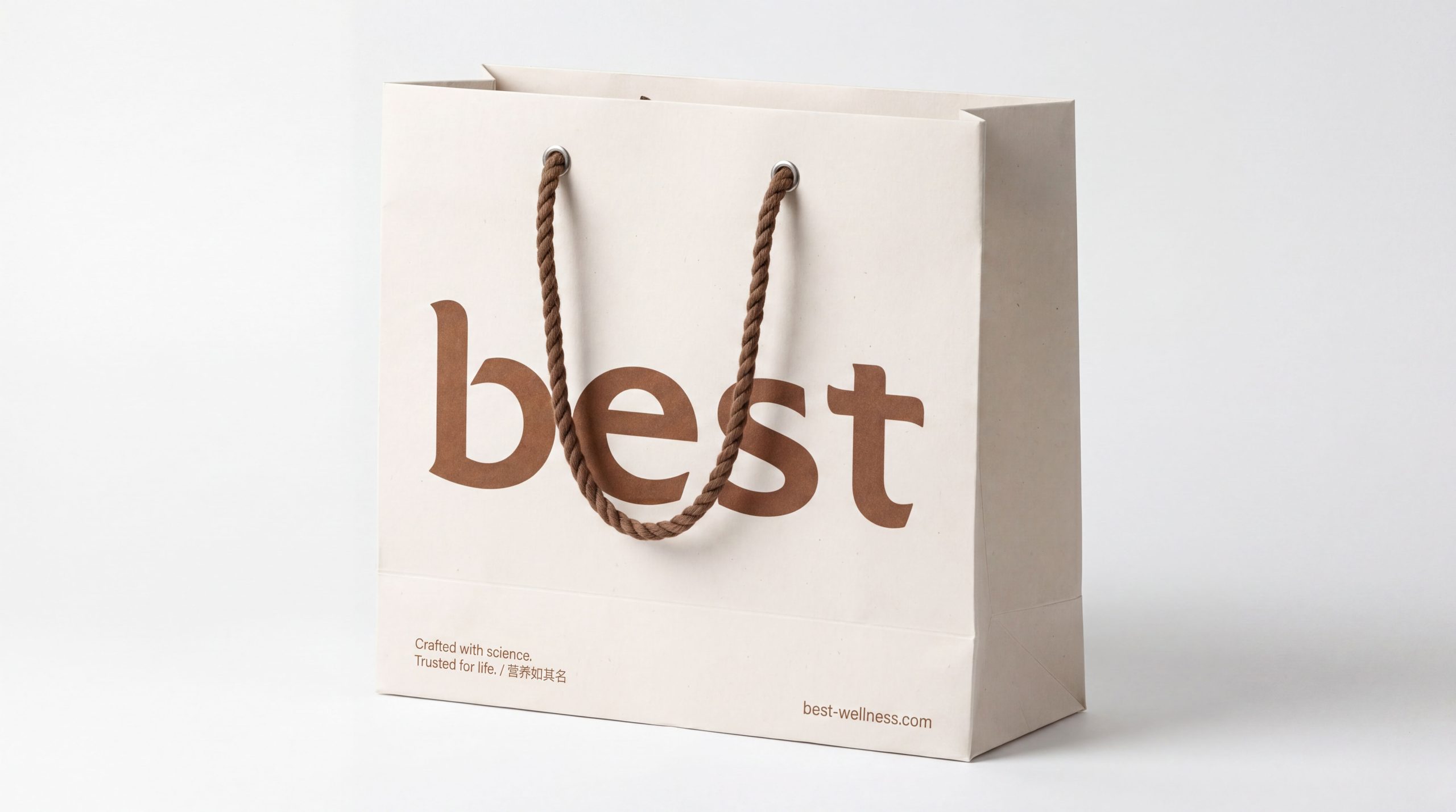
design concept
This plan uses the four English letters "Best" as the only component element of the logo, without any additional graphic symbols or decorations - only letters are used to express the company's image, which is concise and easy to remember. Every detail of the letters has been carefully processed to make them round and full of strength, stable and coordinated, conveying the brand's international quality and nutritional and healthy industry attributes with the pure power of font design.
Overall word mark temperament
The four letters "Best" are carefully drawn in a custom sans serif font. The overall skeleton of the font is presented with a stable medium-to-thick weight - not a slim and light fashion type, nor a thick, black and heavy industrial type, but the most "reliable" weight range between the two. This word weight conveys the brand character of a nutritional and health brand of "weight, strength and trustworthiness", just like an experienced nutrition consultant - calm, professional and giving people a sense of security.
verbatim detail processing
"B" - Gate of Protection. The initial letter "B" is presented in a slightly larger size than other letters, serving as the visual starting point of the entire set of wordmarks and the primary memory anchor of the brand name. The two half-arcs of "B" are presented in full and round arcs, like two full nutritional capsules or two drops of rich nutrient solution - roundness means fullness, and fullness means nutrition. The connection between the semi-arc and the vertical pen is a smooth tangent transition, eliminating all sharp corners and conveying the product's nutritional concept of "mild, safe and non-irritating". The vertical pen is steady and erected like a pillar of quality, and the two half-arcs are firmly attached to it, just like the trust of consumers is attached to the brand's quality promise.
"e" - Ring of vitality. The opening of the lowercase "e" is presented at a carefully controlled angle. The opening is not too large to maintain the integrity and fullness of the font, but not too small to maintain the clear recognition of the letter - this delicate balance is like the precise proportion of each ingredient in a nutritional formula. The internal space of "e" (character Huai) is round and spacious, just like the molecular structure model of a nutrient - full and orderly. The middle horizontal part of the "e" is rounded with a rounded end without sharp corners, conveying the brand's "smooth, friendly, non-aggressive" consumer communication attitude.
"s" - flowing rhyme. "s" is presented as an elegant double arc curve. The upper arc and the lower arc transition smoothly with uniform thickness, just like the smooth absorption of nutrients in the human body - from intake to digestion to absorption to transformation, every step is smooth and unimpeded. The curve of the "s" has been carefully considered and is neither too tight (to convey pressure) nor too loose (to convey relaxation). It uses the most comfortable arc to convey the nutritional and health concept of "balanced, smooth and natural". The starting and ending points of "s" are rounded with rounded spherical end points, like two round nutritional particles - small details that continue to strengthen the association of nutritional and healthy products.
"t" - Pillar of trust. The vertical pen of the last letter "t" appears in the most upright posture in the whole word mark, which is like the last solid inspection level in the quality assurance system - all products must pass the last "t" before they can reach the hands of consumers. The top of the vertical pen is rounded in a rounded arc without protruding sharp corners, maintaining the unified roundness of the entire word mark. The horizontal strokes run through the vertical strokes horizontally with a moderate length, and the intersection between the horizontal and vertical strokes is transitioned in a slight arc, without making a rigid straight intersection in the shape of a cross - there is strength in the roundness. The length of the horizontal stroke of "t" is carefully calculated so that when it extends to the right, it will be visually flush with the overall right border of the word mark, drawing a stable end to the entire set of word marks.
Letter spacing and overall rhythm
The spacing between the four letters is adjusted based on the principle of visual equidistance - due to the different shapes of each letter, physical equidistance will cause visual unevenness, so the uniformity perceived by the human eye is used as the standard for fine-tuning one by one. There is a natural echo between "B" and "e" because the right arc of "B" and the left arc of "e" form a natural echo. The spacing can be slightly tighter to enhance the sense of coherence. There is a straight dialog between "s" and "t" due to the closing arc of "s" and the vertical straight line of "t". The distance should be kept moderate to leave breathing space. The rhythm of the overall word mark is like a steady heartbeat - even, calm and reliable.
Balance of roundness and strength
The core design language of the full word mark is "roundness reveals strength" - all turning points use arc transitions to convey the nutritional and health attributes of "safety, affinity, and harmlessness". At the same time, the strokes themselves maintain sufficient thickness and a stable skeleton to convey the brand trust of "reliability, solidity, and security." This balance is the most critical design achievement of the entire set of wordmarks - neither appearing weak due to excessive roundness, nor appearing cold and alienating due to excessive rigidity.
Font composition
The English "Best" word mark is the core logo of the brand, and there will no longer be an additional auxiliary English font. The Chinese brand name (if necessary) is presented in a rounded sans-serif font that is consistent with the English logo style. The strokes are round and steady, maintaining the consistency of the Chinese and English visual temperaments.
color system
The main color, trust blue #1565C0, represents internationalization, professionalism, security and trust. Blue is the most trusted brand color in the global nutrition, health and pharmaceutical industries - when consumers see blue, they immediately think of "safe, proven and trustworthy". The saturation and brightness of Reliance Blue have been carefully calibrated - not too dark to avoid appearing dull and depressing, not too light to avoid appearing frivolous and thin, and convey the brand's reliable image in the blue range with the most "security". Auxiliary nutrition green #43A047 is used to identify natural ingredients and organic raw materials in the brand system, and greenly conveys the nutritional attributes of "natural, healthy, and from nature". Auxiliary vitality orange #EF6C00 is used in functional product lines and energy supplement products in the brand system. Orange conveys the functional appeal of "vitality, energy, and positivity". Auxiliary pure white #FFFFFF As the standard background color and the clean basic color of product packaging, white conveys the most basic visual promise of "purity, no additives, and safety" for nutritional and health products. Auxiliary dark gray #37474F is used for basic text and product information. The overall color is blue and white as the core, reflecting the brand temperament of "international trust, professional guarantee".
Application extension
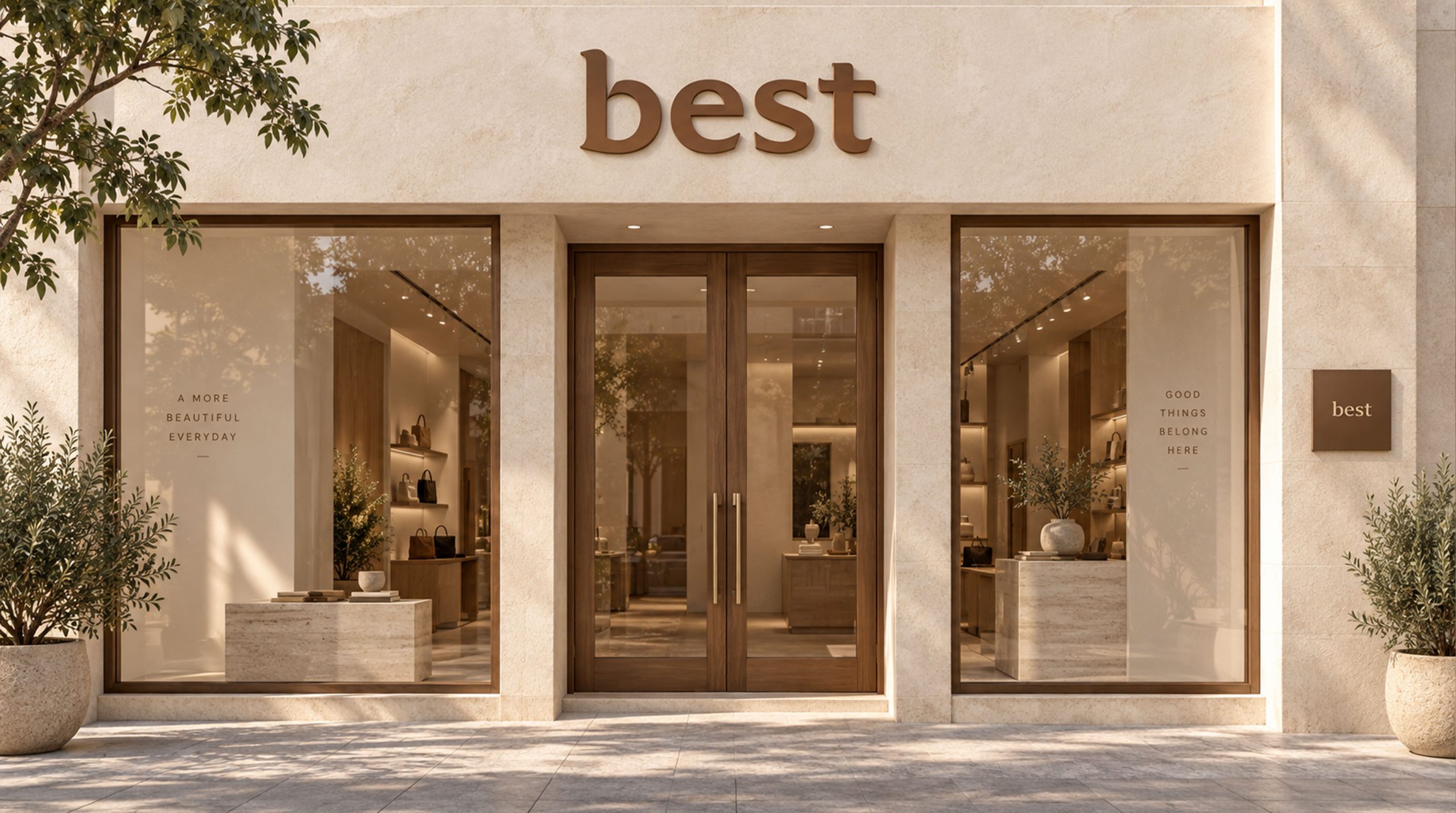
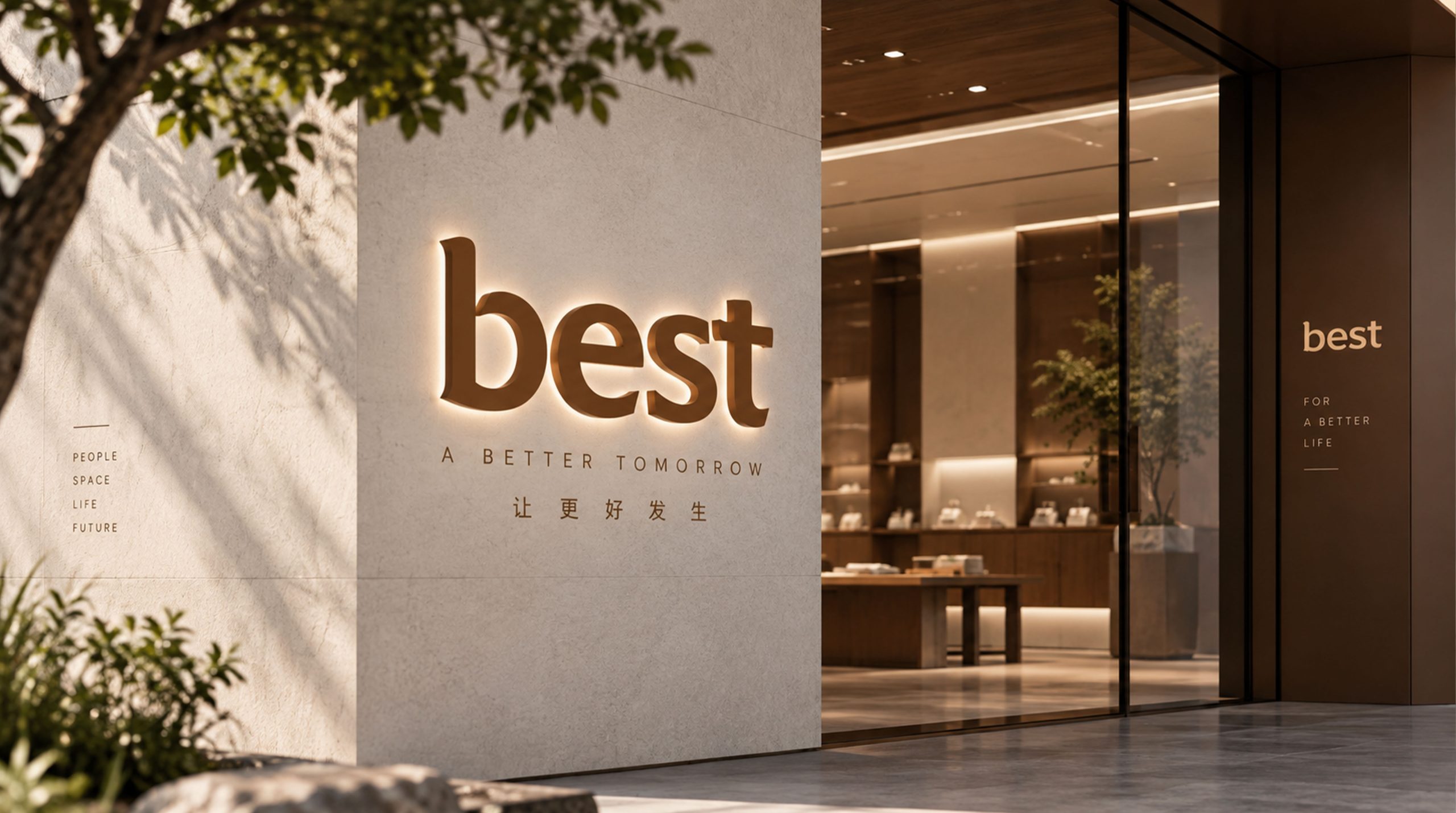
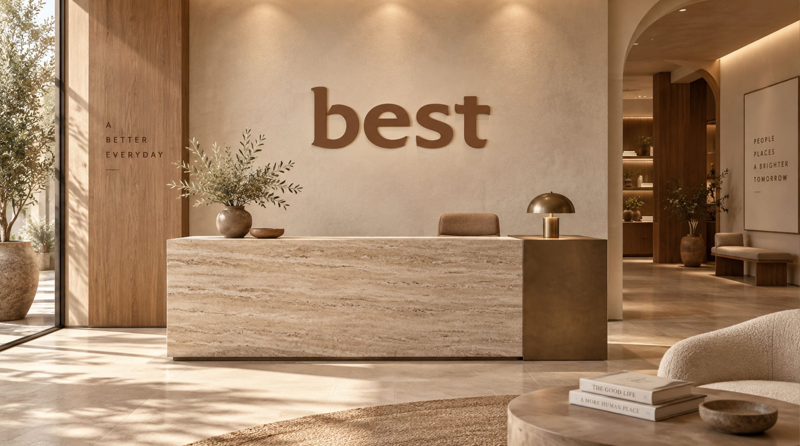
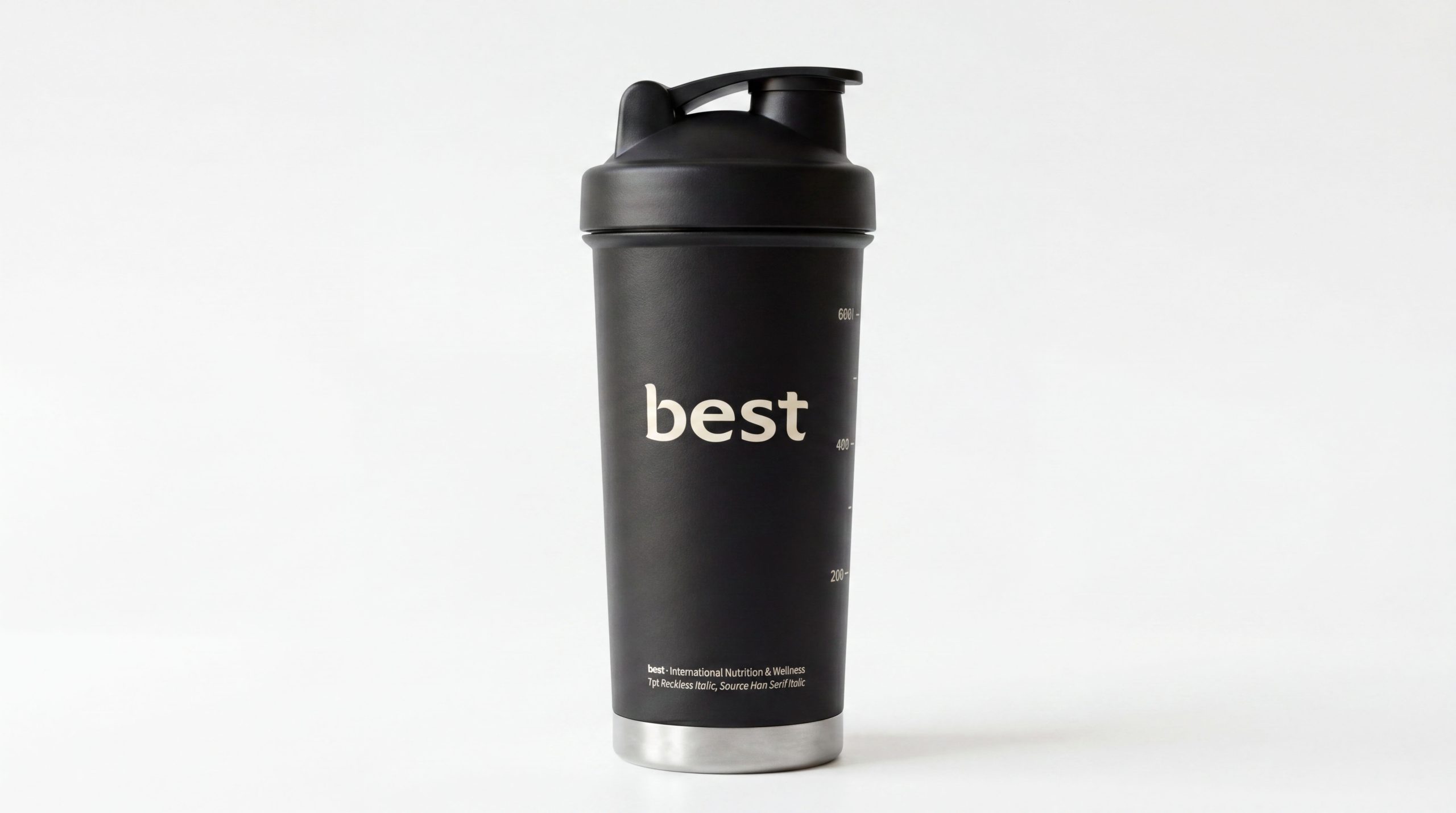
The logo can be widely used in the packaging, bottle labels and outer boxes of a full range of nutritional and health products; brand flagship store fronts, pharmacy counters and healthy living center logos; official websites, e-commerce platform flagship stores and health management APPs; international nutrition and health expos, industry academic conferences and brand cooperation event images. On the packaging bottle of the flagship nutritional supplement product, the trust blue word mark is presented in the center of the front of the white bottle using silk screen printing technology. The round lines of the four letters convey the professional signal of "precision formula, quality assurance" on the smooth bottle surface. Consumers see "Best" at a glance on pharmacy shelves - simple, international and reliable, just like a trustworthy old friend.
brand meaning
The logo contains three core images: International Standard - the international attitude of the pure English logo provides the basis for global quality recognition of the brand; Reliable Assurance - the steady word weight and calm blue color convey the brand promise of nutritional and health products that are "safe, effective and worthy of long-term trust"; Nutritional Care - the smooth detail processing conveys the brand's "gentle, close and meticulous" caring attitude toward consumer health. The overall design conveys the brand vision of "international quality, trustworthy choice".
Improper Usage (Protection Specification)
Do not change the four-letter custom font or replace it with a standard font; do not modify the spacing between letters or change the weight of the overall word mark; do not replace rounded arc turns with sharp corners; do not change the hue or brightness of the main color of Trust Blue; do not add strokes, shadows, gradients or decorative effects inconsistent with the nutritional and healthy style to the word mark; do not tilt, stretch or non-proportionally scale the word mark; keep white space ≥ the height of the word mark 35%; the minimum display width shall not be less than 25mm.
design results
After the release of the logo, Best's brand recognition and consumer trust in the nutritional and health product market have been significantly improved. With only four letters, it successfully conveyed an international, modern, secure and trustworthy brand image. The concise and easy-to-remember wordmark design laid a solid foundation for the company to build an international brand with a sense of quality, showing the brand vision of "international quality, trustworthy choice".