










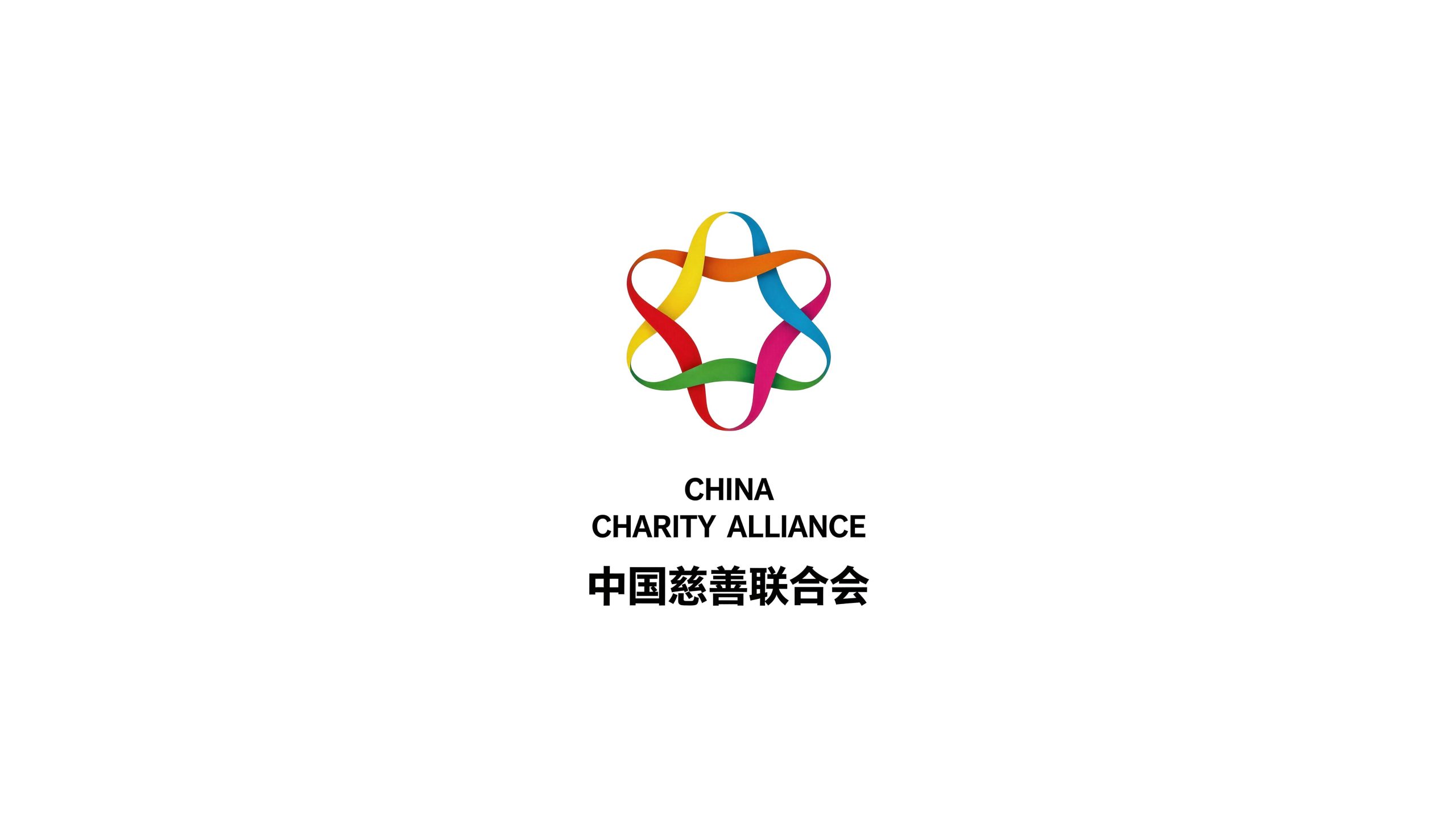
China Charity Federation is a national charity industry organization approved by the State Council and supervised by the Ministry of Civil Affairs. It was established in 2013 with the purpose of "uniting charity forces, communicating charity information, spreading charity culture, and promoting charity". It is the most representative industry hub platform in China's charity field.
The brand name directly carries the functional positioning of the organization - "China" indicates the identity of the national organization, "Charity" points out the core areas of charity, and "Federation" conveys the organizational form that brings together the strengths of all parties and builds a collaborative platform. Qingmei Future was commissioned to lead the brand identity design.
The design goal of the brand logo is to demonstrate the status of the China Charity Federation as a national hub organization in the charity industry through the visual language of the spirit of great love, joint strength and national authority, and to convey the brand image of "gathering great love, uniting for common good".
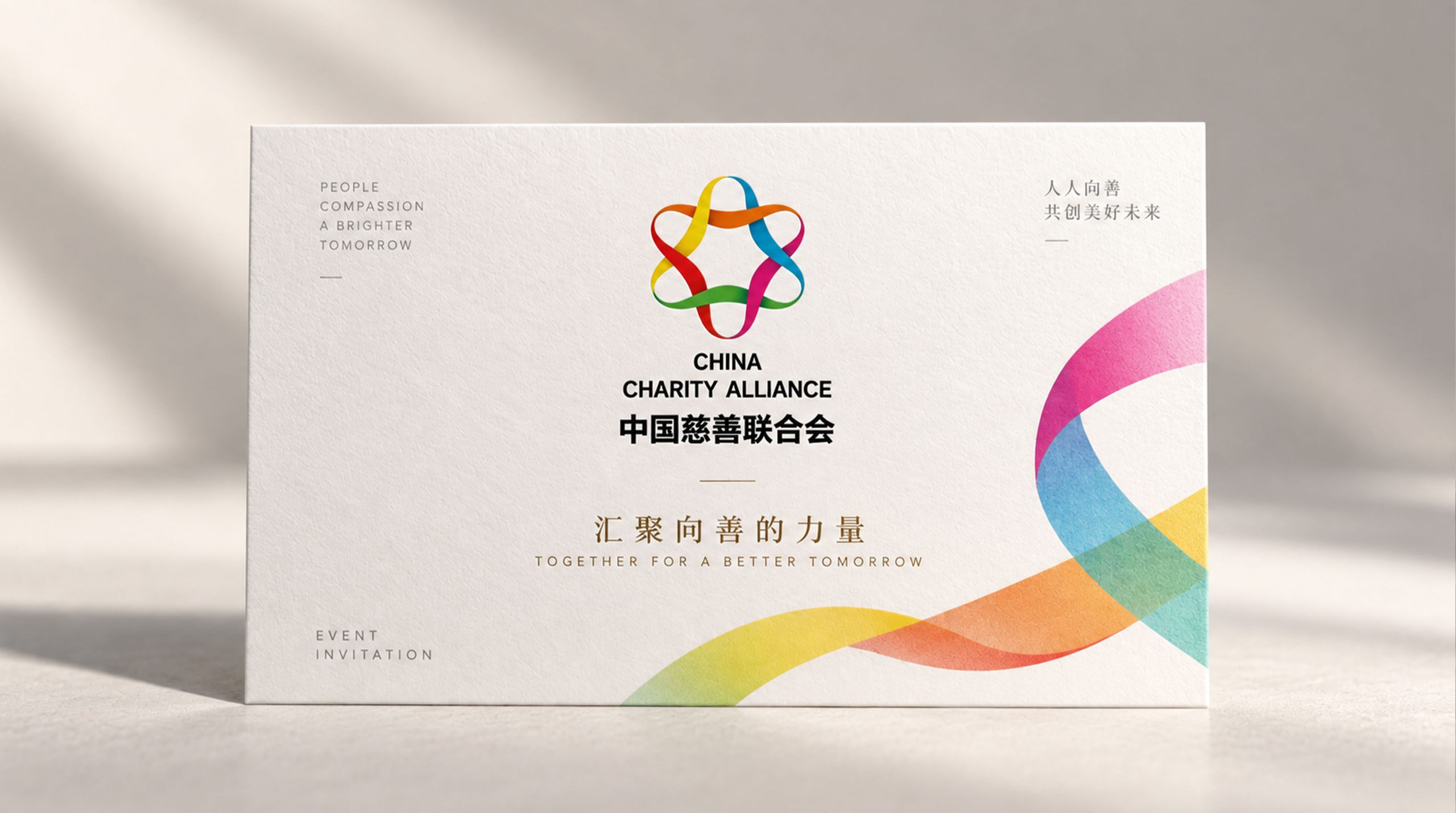
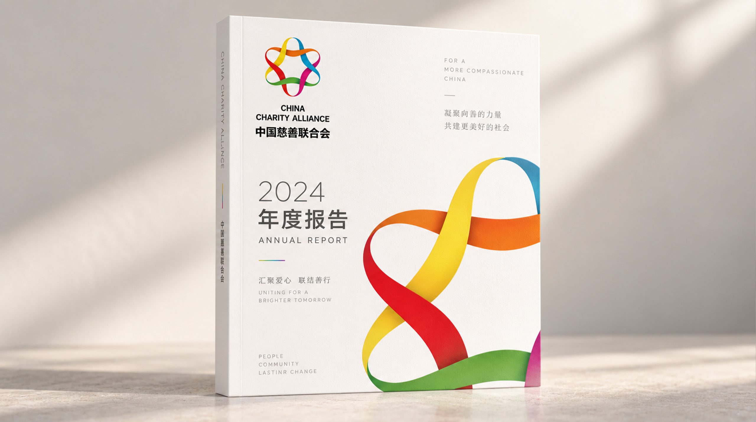
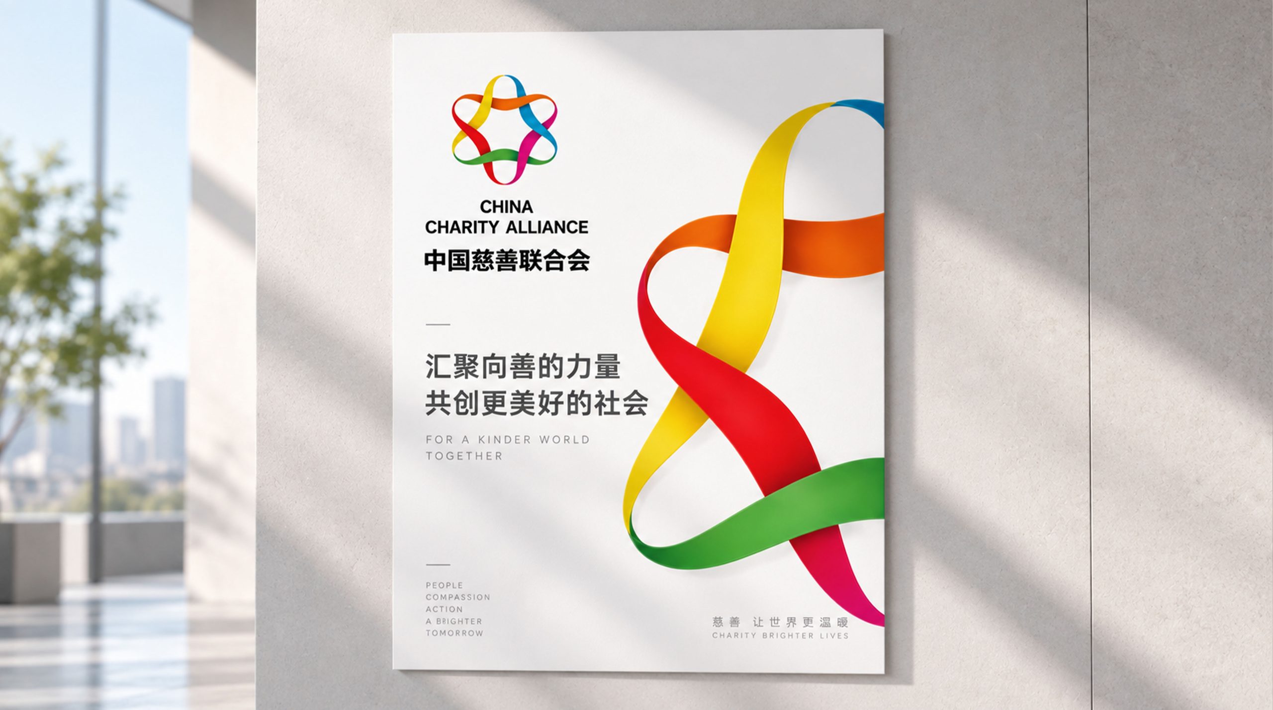
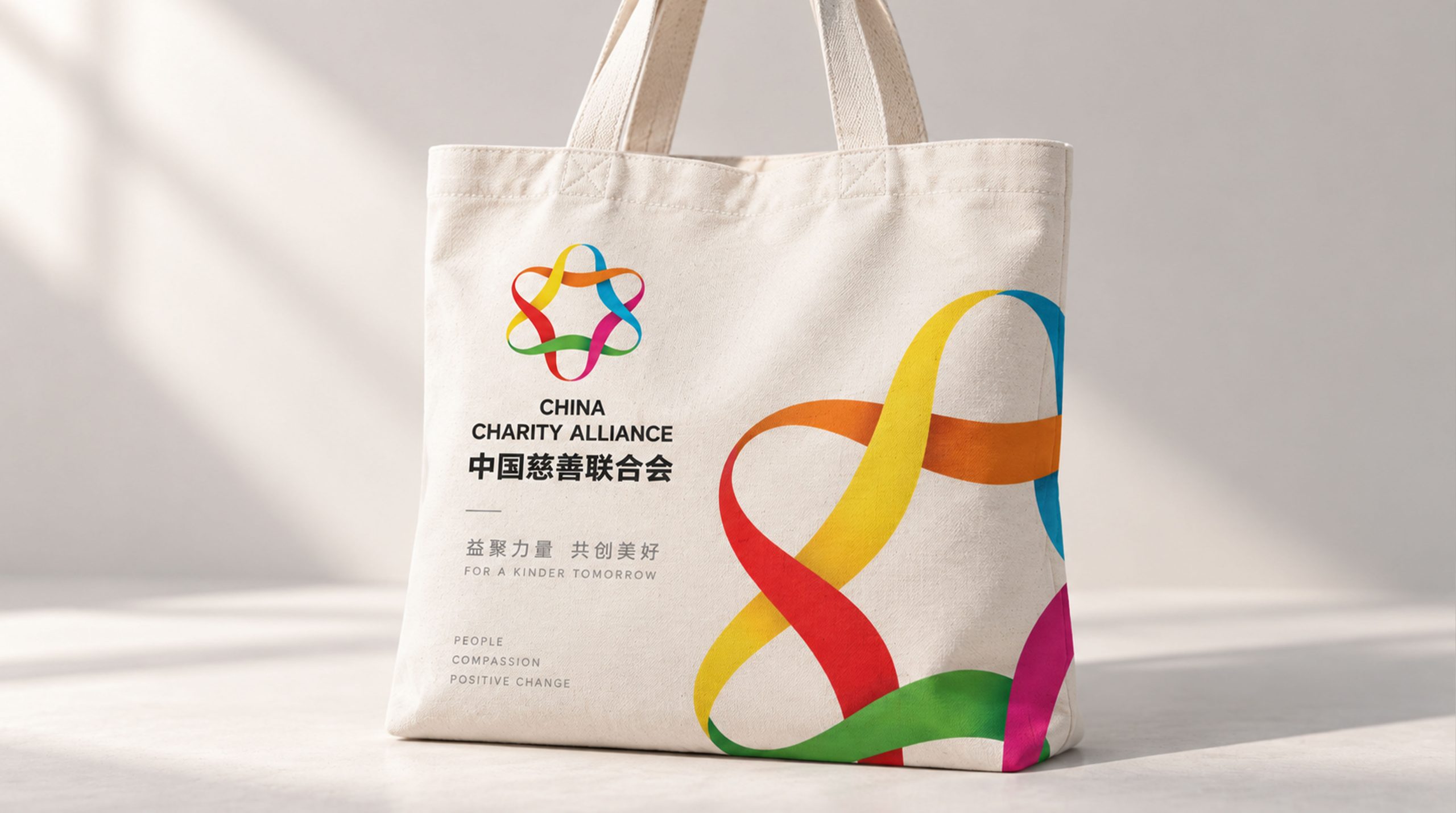
design concept
The logo takes "Hearts United for Good" as its core concept and condenses the image of many hearts united into the core visual symbol of the brand. Love is the most common emotional symbol in the field of global charity - no need for translation, across cultures, a heart is a goodwill; and "gathering of hearts" directly corresponds to the organizational attributes of the "Federation" - not a single heart, but the combined efforts of thousands of hearts. The design takes "every kind heart deserves to be seen, every goodwill deserves to be united" as the emotional starting point to build a brand totem that not only conveys the warmth of charity but also carries the power of unity.
graphic language
The main body of the graphic is composed of several hearts arranged in a ring around a common center point, forming a "flower of kindness" composed of love petals. Each heart represents a philanthropic force - the government, enterprises, social organizations, volunteers, and donors. The hearts converge toward the center from different directions, blending and supporting each other at the intersection, forming an indivisible organic whole. The top arc of love stretches outwards, and the bottom tip points to the center, as if every goodwill starts from its own starting point and finally converges on the same charitable goal. This centripetal structure is the most intuitive graphic expression of the word "union".
Adjacent hearts are naturally connected by sharing edges. The right arc of one heart is the left arc of the next heart. There is no gap or barrier between love and love, conveying the platform value of the Charity Federation of "eliminating barriers, breaking down barriers, and allowing goodwill to flow freely". The design of shared edges also makes the overall graphics more compact and unified, avoiding the loose feeling that may be caused by simple arrangement, and conveys the federation's organizational ability to integrate dispersed charity forces into systematic synergy.
The center of the graphic naturally forms a blank space due to the gathering of hearts. The shape of the space is like a small seed or a bright light - this is the core of the guardianship of all hearts and the ultimate target of charity services: everyone in need. The blank space in the center is not a vacancy, but the starting point and destination of all charitable actions. The overall outline of the graphic is approximately circular, conveying perfection, harmony and tolerance - charity regardless of size, no matter how much kindness, the Federation accepts every kindness with the most inclusive attitude. The overall composition uses a centripetal structure of "all hearts gather and good flowers bloom" to build "all hearts go to good", conveying the platform mission and charity vision of the federation.
Font composition
The Chinese "China Charity Federation" adopts a correct modern boldface, with even and steady strokes and a square and solemn structure. The word "China" carries the authoritative identity of the national organization, the word "charity" conveys the core spirit of love and compassion, and the word "Federation" clarifies the organizational attributes of the industry hub. The overall font strikes a balance between the solemn authority of a national institution and the intimacy and warmth of a public welfare organization. The English "China Charity Alliance" is arranged in standard uppercase sans-serif fonts with regular and clear fonts to ensure the organization's standardized recognition in international charity exchanges and transnational charity cooperation.
color system
The main color charity red #D42427 represents love, warmth, dedication and the spirit of Chinese charity. Red is the core symbolic color in the global charity field - red cross, red crescent, and red ribbon. Red has become the international visual consensus of "care and rescue"; red is also the representative color of China's national image, using this color to highlight the national identity of the China Charity Federation and the national background of Chinese charity culture. The fullness and warmth of charity red are like a beating heart - warm and sincere, powerful but not scorching, conveying the inner enthusiasm and lasting vitality of charity. Auxiliary Hope Orange #F5A623 is used in the communication materials and public welfare activity visuals for beneficiary groups in the brand system. Like the warm light on the skyline before dawn, it conveys the hope and warmth that charity brings to people in trouble. Auxiliary trust blue #2B6CB0 is used in formal scenarios involving system construction, industry standards and data transparency in the brand system to convey the federation's professionalism and credibility as an industry standard setter. Auxiliary Harmony Gold #C5A55A is used for recognition honors and major ceremonial elements in the brand system, symbolizing the lofty value of charity and the highest recognition of society. Pure white #FFFFFF is used as the standard background color with white space in the center of the graphic. The overall color uses charity red as the absolute core, supplemented by orange, blue and gold, reflecting the brand temperament of "love China and unite all charities".
Application extension
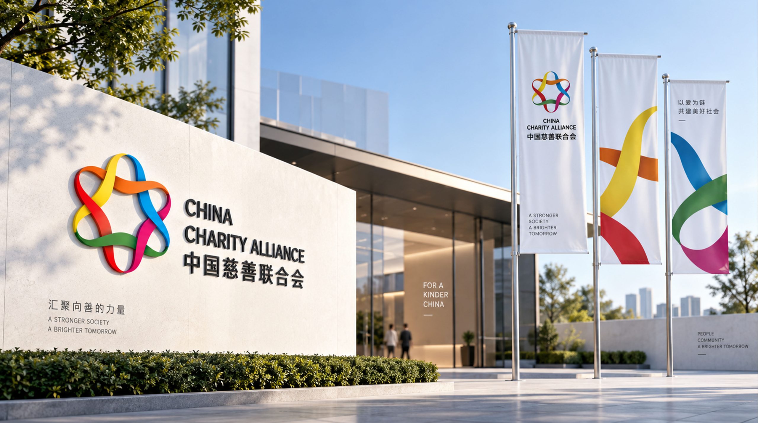
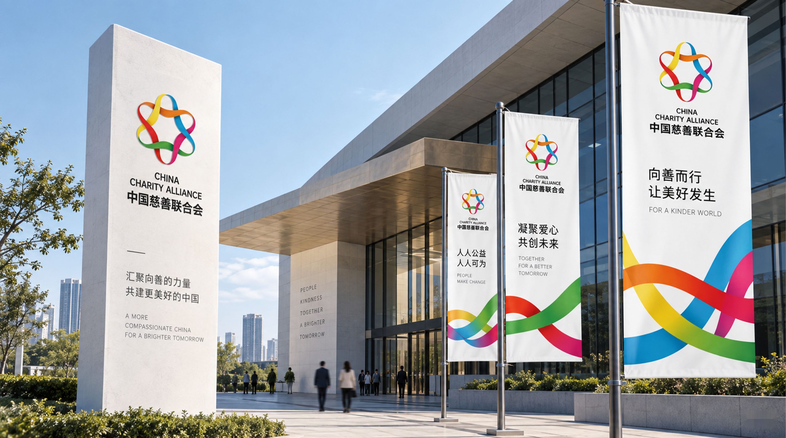
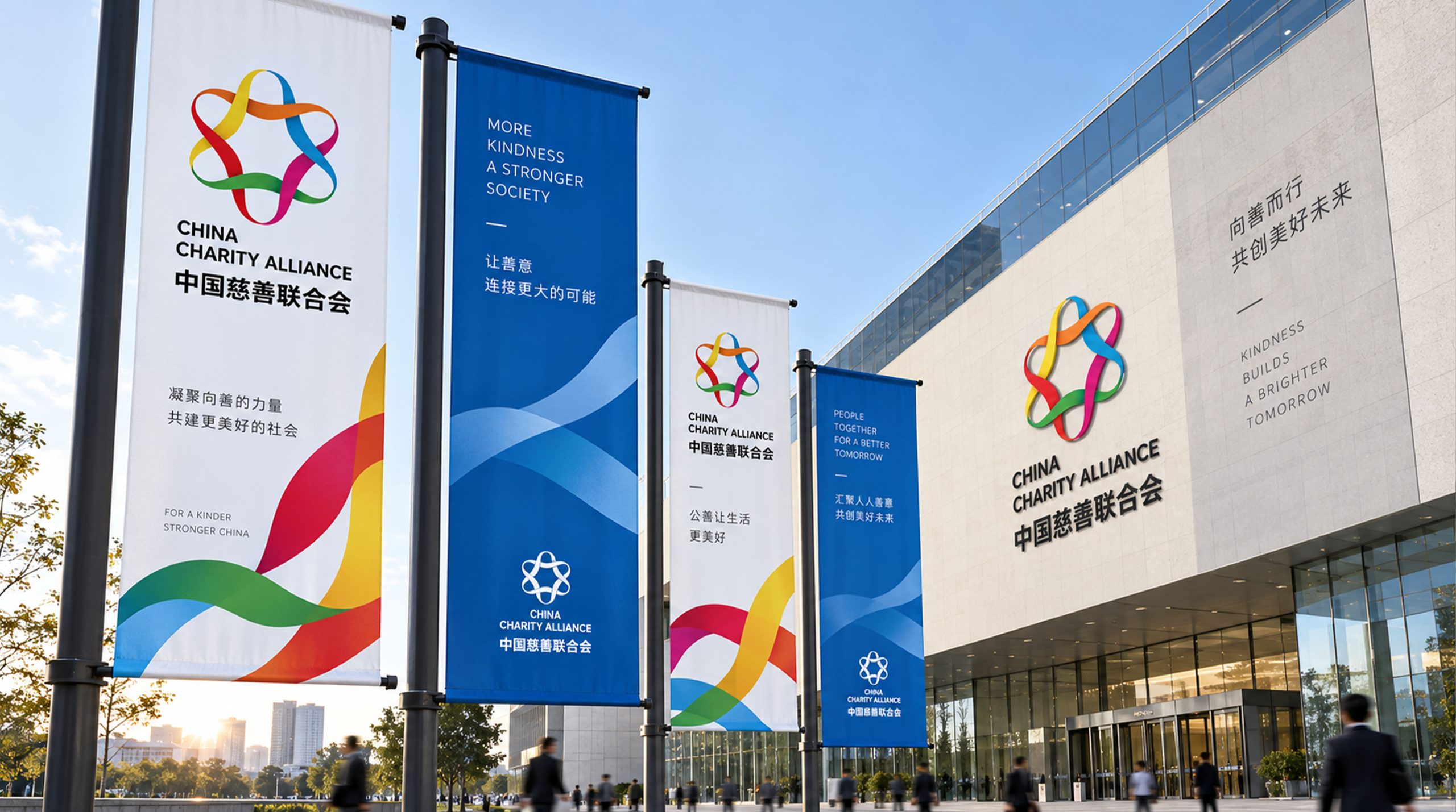
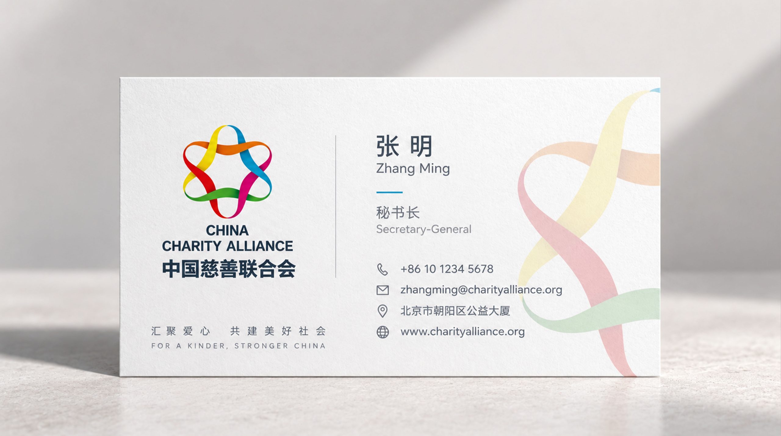
The logo can be widely used in the office space of the federation's headquarters, nameplates of local branches and on-site identification of public welfare projects; annual reports, policy research white papers, industry standard documents and charity blue book covers; official websites, public welfare information release platforms, social media images and charity cultural communication materials; images of China Charity Day, National Charity Conference, international public welfare forums and government cooperation projects; charity commendation trophies, volunteer certificates, public welfare peripheral products and commemorative badges. In large-scale public welfare activities such as China Charity Day, the Hearts graphic can be enlarged as the main visual core, and each heart is filled with a different theme color of the public welfare project - blue for education, green for medical care, orange for poverty alleviation, and green for environmental protection, making the brand symbol a visual epitome of the diverse development of China's philanthropy. In the dynamic visual, several hearts slowly gather from the center of the four directions of the picture, merge with each other at the intersection, and bloom together into a complete "flower of kindness". The light in the center gradually lights up, symbolizing the convergence of millions of goodwill into a beam of charity light that illuminates the world.
brand meaning
The logo contains three core images: Spirit of Charity - the love graphics and charity red convey the Chinese nation's millennium charity tradition of helping the poor and being charitable, and the contemporary spirit of charity; United Force - the centripetal structure of people's hearts conveys the platform mission and organizational advantages of the Federation that brings together the philanthropic power of governments, enterprises and society; Goodness goes a long way Endures) - the perfect overall outline and central light convey the beautiful vision of continued development of China's philanthropy and benefiting all people. The overall design conveys the China Charity Federation's brand vision of "gathering great love and uniting for common good".
Improper Usage (Protection Specification)
Do not change the number, arrangement or centripetal angle of hearts; do not modify the fusion relationship of adjacent hearts’ shared edges; do not change the hue of the main color of charity red or replace it with cold colors; do not add strokes, hard shadows or commercial decorations that are inconsistent with the charity style to the logo; do not split a single heart out of the overall use; keep white space ≥ 25% of the graphic height; the minimum display width must not be less than 25mm.
design results
After the release of the logo, the China Charity Federation's brand unity and public awareness in the national charity industry and public welfare fields have significantly improved. "United for Good", with its unique visual language that combines the emotion of great love and the strength of unity, has become the core identification symbol of the Federation's brand system. It is widely used in industry governance, public welfare communication and international exchanges, demonstrating the brand vision of "gathering great love, uniting for common good".