










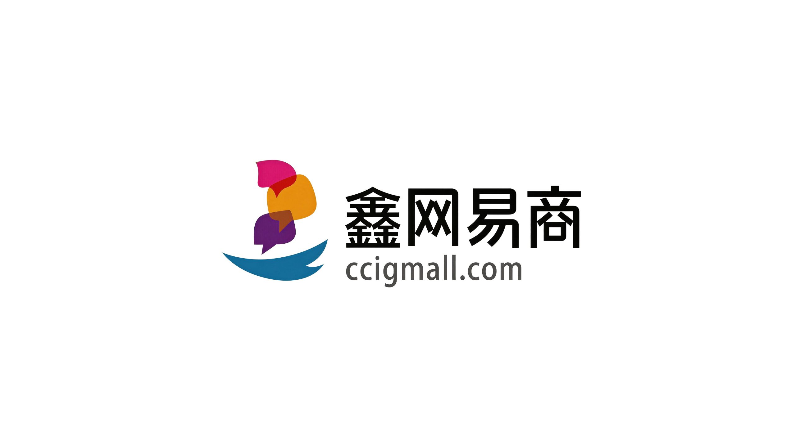
Xin NetEase is a comprehensive enterprise focusing on financial technology and digital business services. With the brand mission of "Finance empowers business and technology connects the future", it is committed to providing small and medium-sized enterprises and merchants with one-stop solutions covering digital payment, supply chain finance, business intelligence and enterprise digital transformation.
The four-character brand name "Xin NetEase" accurately conveys the core value proposition of the company - "Xin" means gold and prosperity in the shape of three gold superpositions, symbolizing the accumulation and growth of wealth and the core attributes of financial services; "Net" means network and interconnection. It symbolizes the technological genes of digital platforms and the interconnection of all things; "yi" means easy and transaction, which not only conveys the convenience and efficiency of services, but also points out the business nature of commercial transactions; "shang" means business and merchants, clarifying the core service objects and industry fields. Qingmei Future was commissioned to lead the brand identity design.
The design goal of the brand logo is to demonstrate the industry positioning of Xin NetEase as a financial technology service enterprise through the visual language of financial technology, digital connection and business empowerment, and to convey the brand image of "good finance and business connections all over the world".
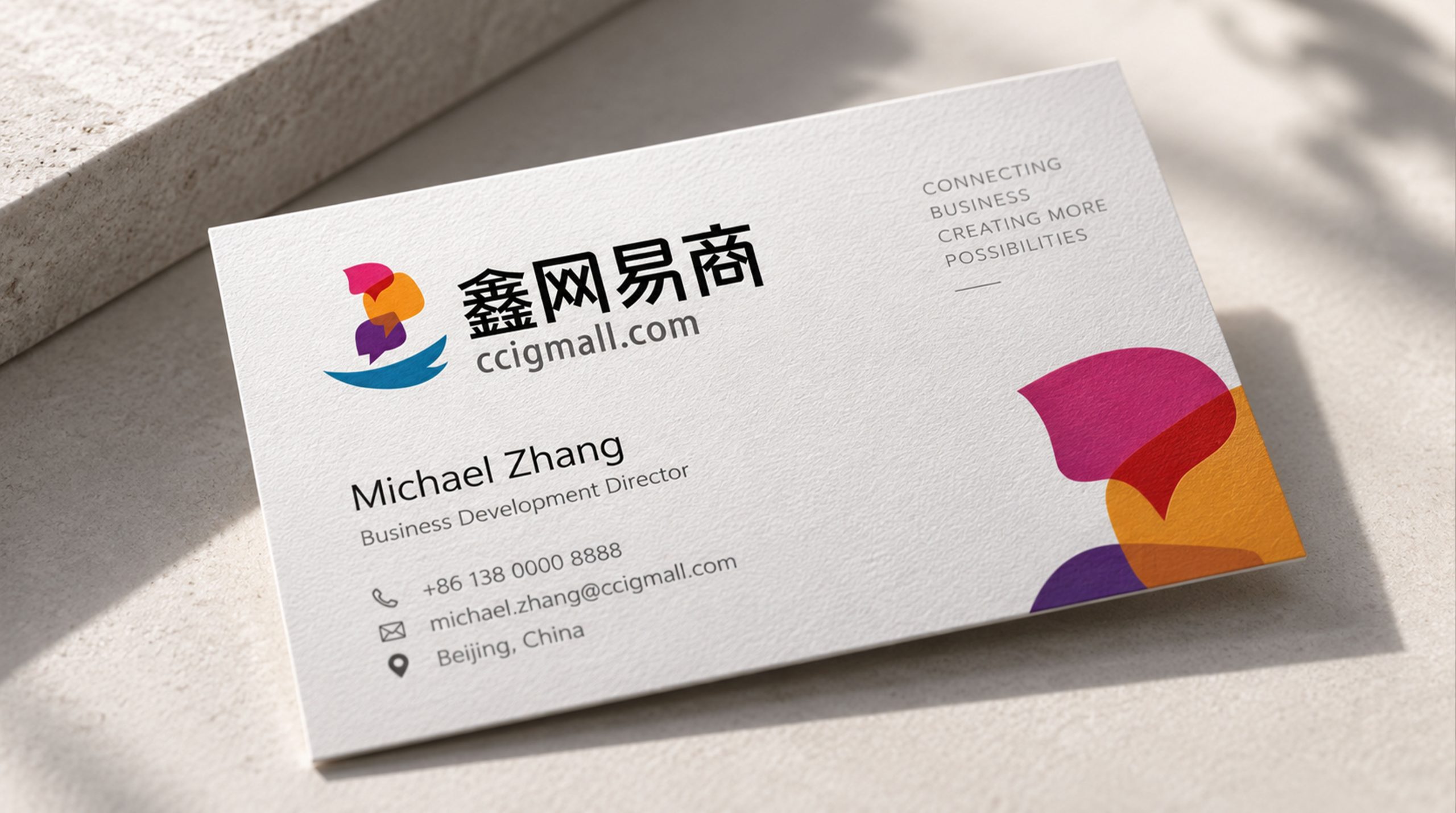
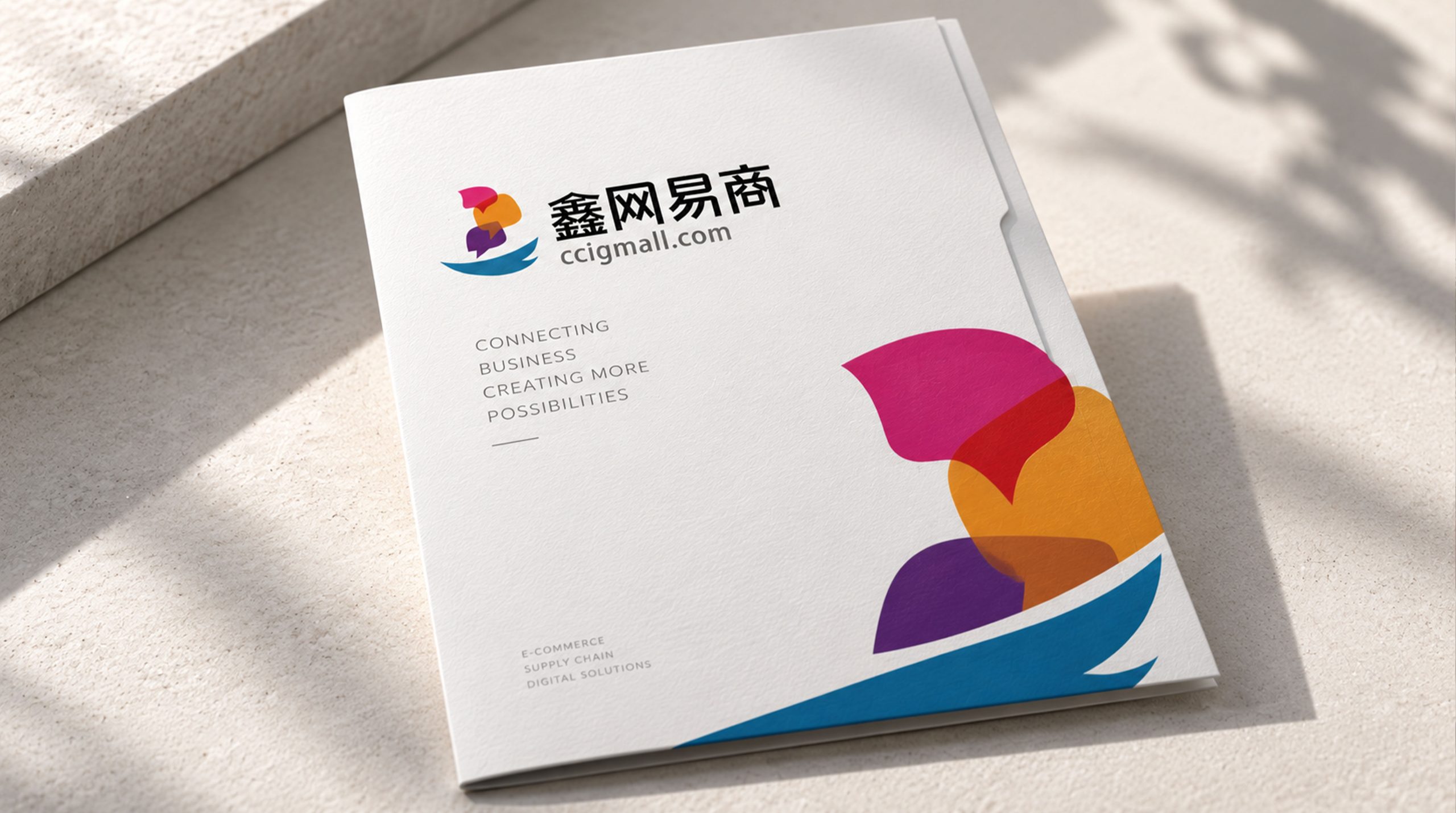
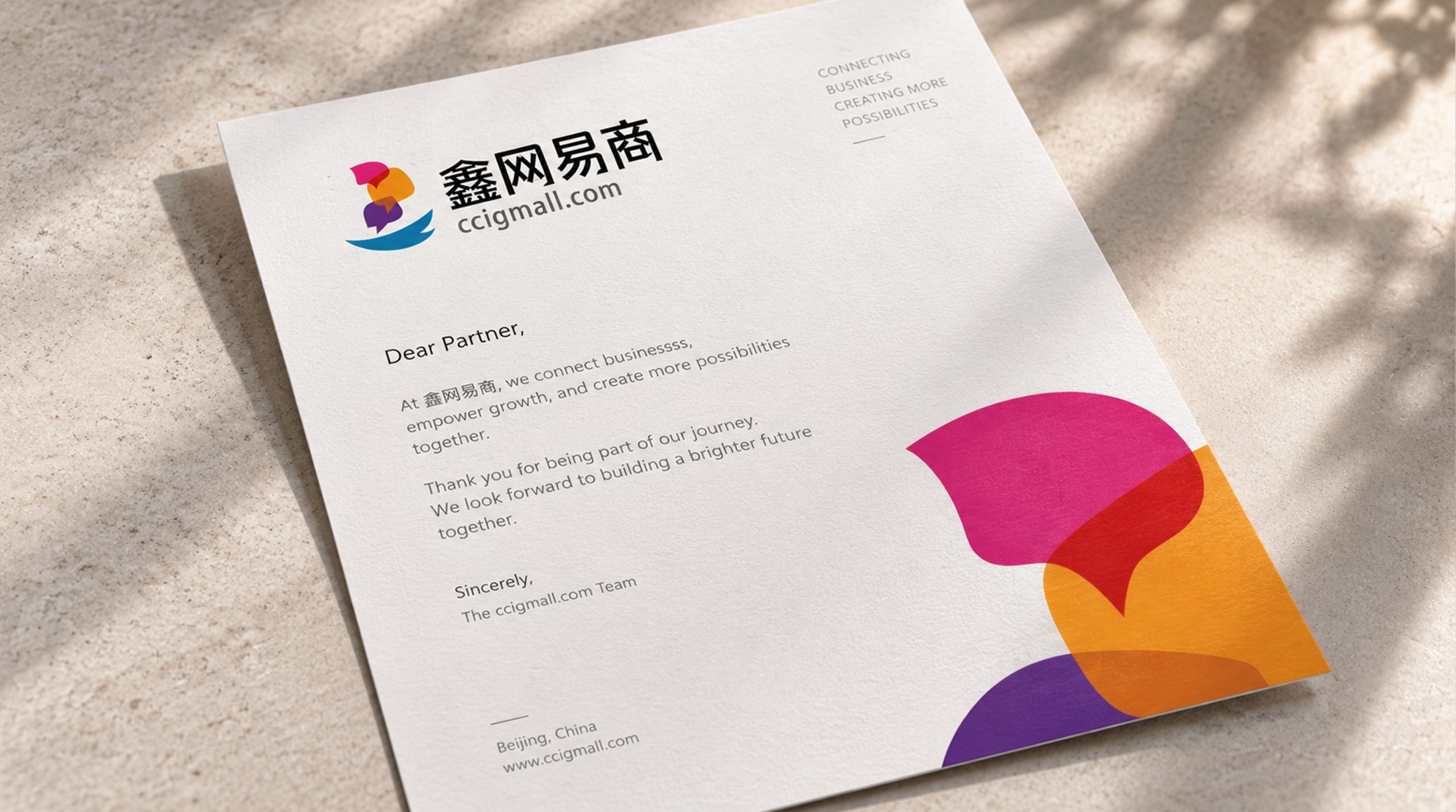
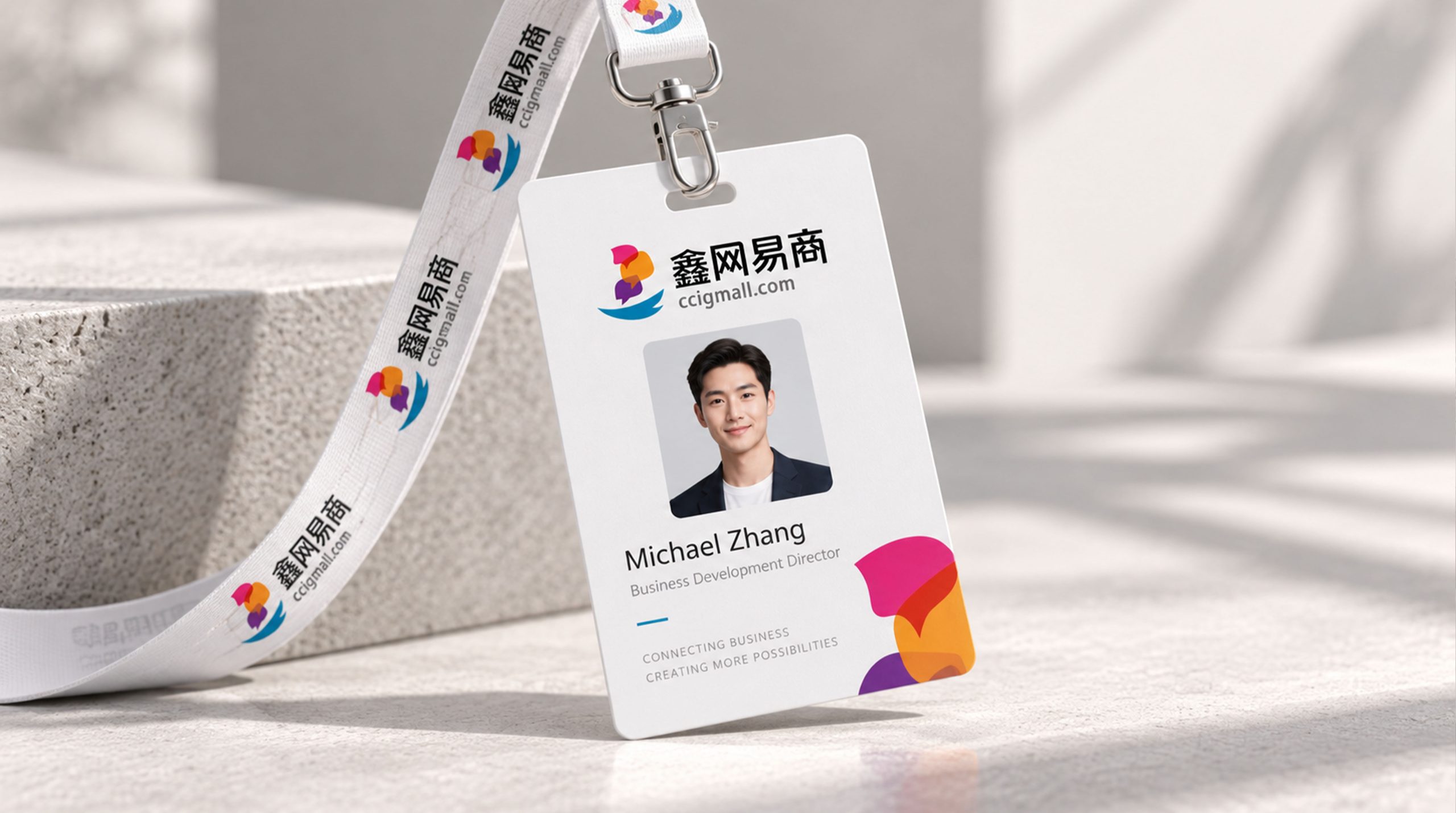
design concept
The logo takes "Golden Network" as its core concept and integrates the value circulation of finance with the connection architecture of digital networks to create a brand symbol that not only conveys financial attributes but also carries technological genes. The design draws inspiration from the superimposed Chinese character structure of the word "xin", and uses three interconnected nodes to form a networked graphic skeleton - each node represents a business entity, and the connecting lines between the nodes represent capital flow, data flow and commodity flow. The integration of the three flows is the digital business ecosystem built by Xin Net E-Commerce for its customers.
graphic language
The main body of the graphic uses three geometric rhombus or hexagonal nodes as the core elements. The three nodes are distributed in a triangle, just like the spatial arrangement of the three "gold" characters in the character "Xin" - two up, one down, and as stable as a golden mountain. The rhombus is the most symbolic geometric shape in the financial field. Its four equal-length hypotenuses are like the facets of a diamond, conveying value, precision and preciousness. The triangular arrangement of the three rhombuses echoes the structure of the word "Xin" and transforms the first letter of the brand name into a visible geometric symbol in the most intuitive way.
The three nodes are connected to each other with precise straight lines, forming a complete triangular network structure. The connecting line is like a data transmission channel in a digital network - funds flow between nodes at high speed and information is transmitted in real time in the channel, conveying the core service value of Xin Net E-commerce digital platform to "make capital flow more efficient and business connections more convenient". The triangle is the most stable structure in geometry. Three points form a plane and cannot be deformed. It conveys the safe, stable and unshakable technical architecture and risk control capabilities of the financial technology platform.
The center of each of the three nodes is marked with a small dot. The dot is like an active signal light in the network - always on means that the system is online, transactions are smooth, and services are continuous, conveying the platform's technical commitment to uninterrupted operation 24/7. The intersections of connecting lines and the spaces between nodes form a precise grid rhythm, just like the data blocks in a blockchain ledger arranged in sequence, conveying the technical pursuit of data security and transaction transparency by financial technology companies. The overall outline of the graphic is in the form of an upward equilateral triangle or an approximately circular, solid structure, with a steady center of gravity and balanced proportions, conveying the reliability and professionalism of a financial service institution. The overall composition builds "Golden Network Commerce" with the integration logic of "three golds form a new currency and three points form a network", conveying the brand's financial foundation and technological connection.
Font composition
The Chinese "Xin Net Yi Shang" uses modern sans-serif fonts, with even and neat strokes and precise and compact structure. The complex structure of the three-gold superposition of the character "Xin" is presented with clear stroke levels, ensuring that it is still readable in small-size applications; the character "Net" conveys the systematization of the platform with a square frame structure; the strokes of the character "Yi" convey the convenience of service smoothly; the character "Shang" has a correct structure to convey the formality of business. The overall font maintains a good business temperament in a sophisticated order with a sense of technology. The English "XINWANGYISHANG" or the brand's English abbreviation is arranged in a standard uppercase sans-serif font with a regular and modern font to ensure the brand's recognition in cross-border financial cooperation and international business scenarios.
color system
The main color Xinjin Blue #1B5FAA represents financial technology, trust, professionalism and digitalization. Blue is the most widely used brand color in the global financial technology industry - from Ant Group to PayPal, blue has become the international visual consensus of "technology + finance". Xinjin Blue meets the trust needs of the financial industry and the innovative temperament of the technology industry with a calm and rational tone, achieving a precise balance between the dark blue of traditional finance and the bright blue of Internet technology. Auxiliary wealth gold #D4A440 is used for financial attribute elements in the brand system - payment success page, wealth management logo and high-end customer materials. The gold color is directly related to the financial semantics of the word "Xin", conveying wealth appreciation and value protection. The combination of blue and gold conveys the dual brand signal of "the rationality of technology + the value of finance" in the field of financial technology. Auxiliary data green #00B074 is used for transaction success status, growth indicators and positive data feedback in the brand system, delivering positive signals of "smooth transactions and business growth". Auxiliary neutral gray #666666 is used for auxiliary text and interface information levels. Pure white #FFFFFF is used as the standard background color and the basic color of the platform interface. The overall color uses blue and gold as the dual core, reflecting the brand temperament of "financial ethics and technology empowerment".
Application extension
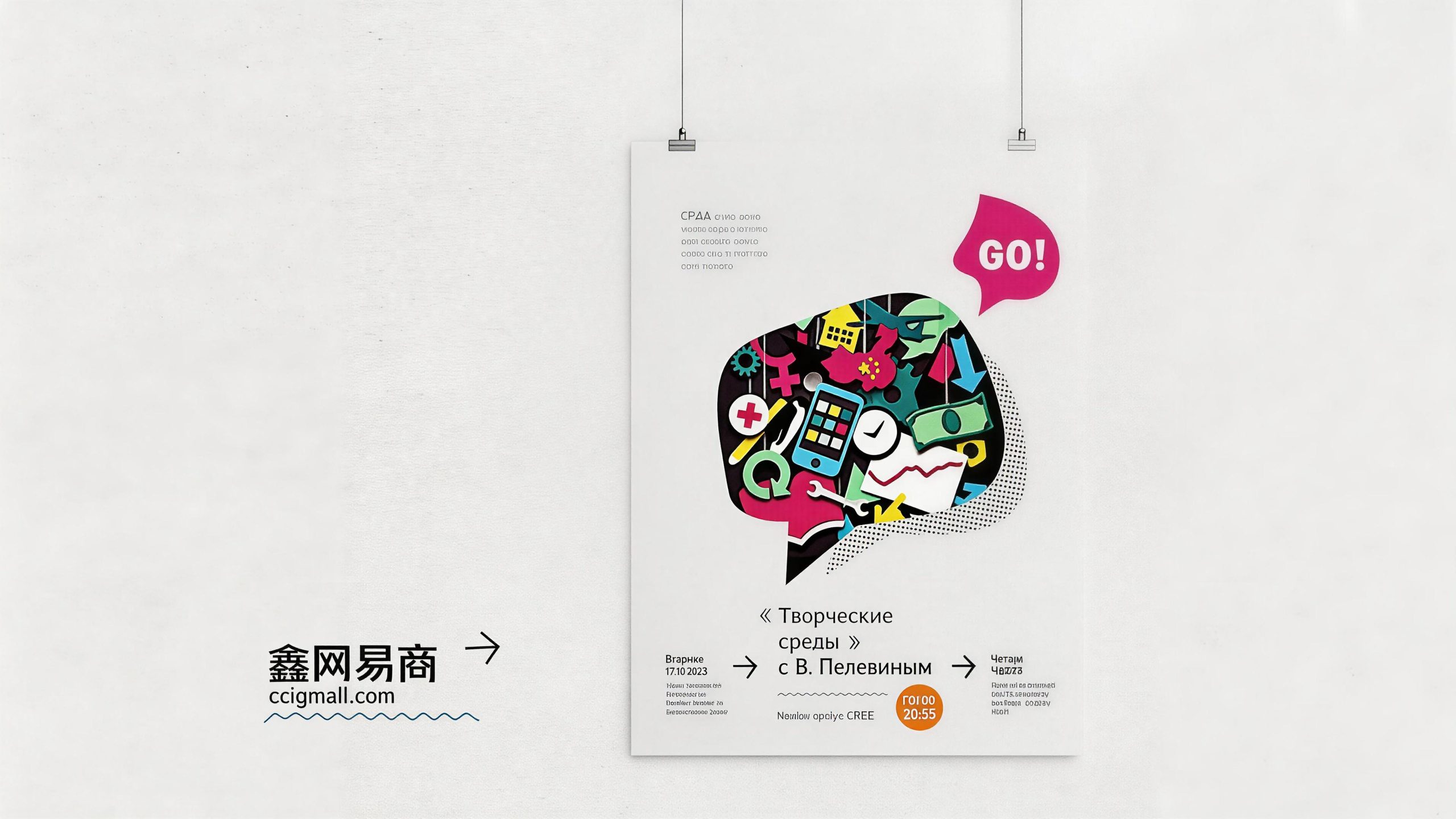
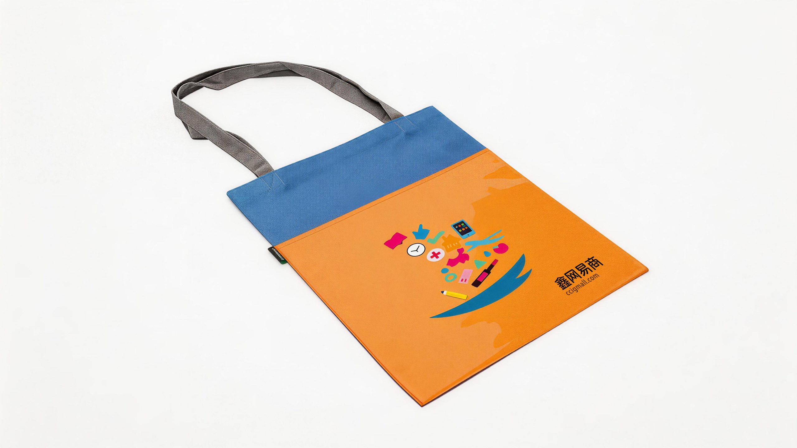
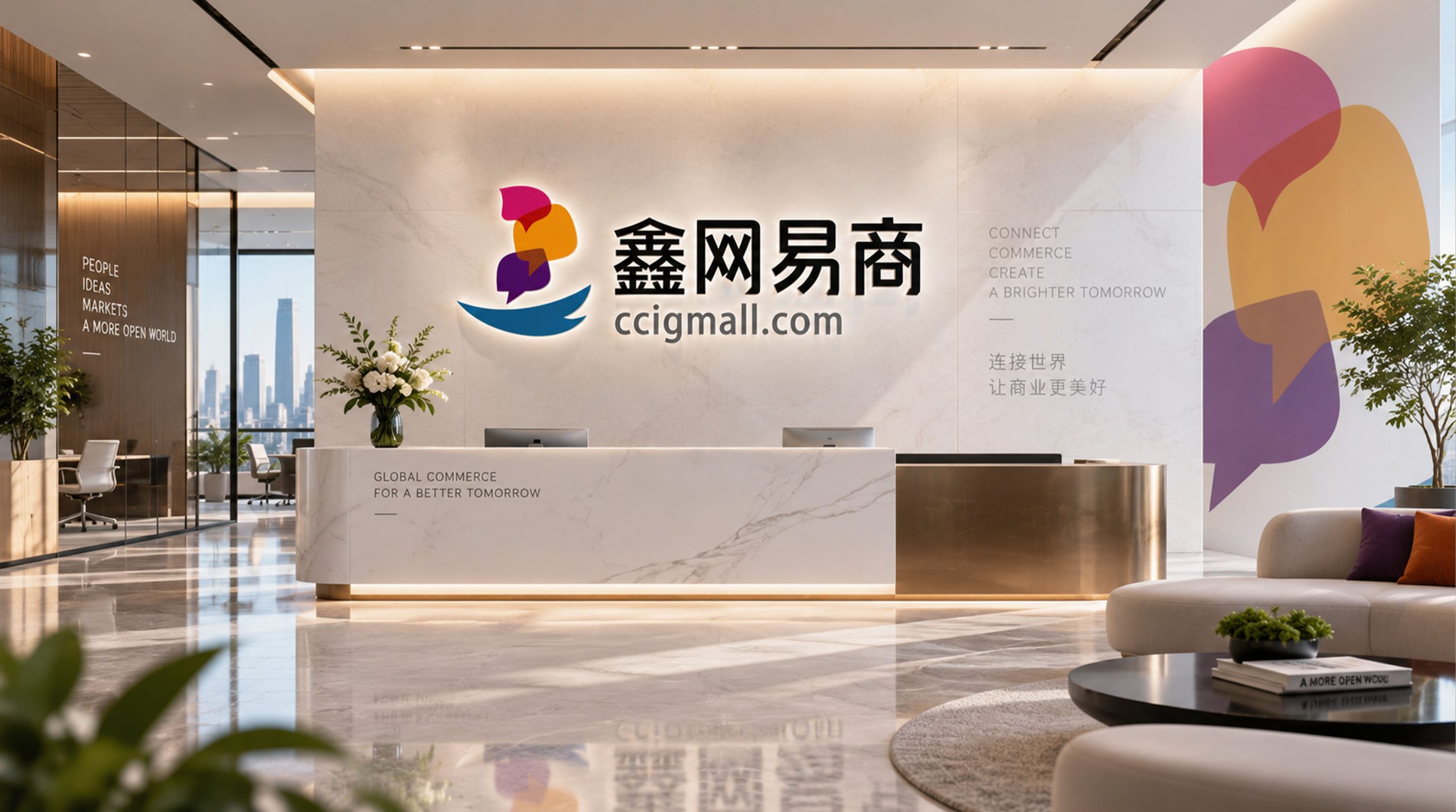
The logo can be widely used in corporate headquarters office space, local branches and service outlet logos; merchant POS terminal labels, cashier logos and store cooperation nameplates; official websites, merchant management backends, mobile APP icons and interfaces, mini program entrances and API partner pages; financial technology summits, digital business forums, industry exhibitions and government cooperation project images; corporate brochures, investment plans, investor relations materials and brand stationery systems. In the merchant-side application scenario, the blue gold logo is presented in a simple labeling form at the checkout counter and store entrance, like a "digital certification badge", conveying the technical trust that "this store has accessed Xin NetEashang's digital business services" to every consumer entering the store. In the dynamic visual, three diamond-shaped nodes light up in sequence, and the connecting lines flow between the nodes at high speed like data flow. The triangular network structure gradually takes shape in the flow of data, symbolizing that Xin NetEase uses financial technology to connect every business node and activate the value of every transaction.
brand meaning
The logo contains three core images: Financial Convergence - the three-diamond "Xin" structure conveys the convergence and value-added of financial resources and the brand's wealth management attributes; Digital Connection - the network structure composed of nodes and connecting lines conveys the platform's scientific and technological mission of "connecting thousands of merchants and opening up data islands"; Business Empowerment (Business Empowerment) Empowerment) - The solid triangular architecture delivers Xin NetEase to build a safe, efficient and reliable digital business infrastructure for small and medium-sized enterprises. The overall design conveys Xin NetEase's brand vision of "finance is sound and business is connected to the world".
Improper Usage (Protection Specification)
Do not change the triangular arrangement or mutual spacing ratio of three diamond-shaped nodes; do not modify the number of connecting lines or the connection relationship between nodes; do not change the hue of the main color of Xinjin Blue or replace it with warm colors; do not add gradients, strokes or traditional decorative effects inconsistent with the technological style to the logo; do not split nodes and use connecting lines alone; keep white space ≥ 25% of the graphic height; the minimum display width must not be less than 20mm.
design results
After the release of the logo, Xin NetEase's brand recognition and industry influence in the fields of financial technology and digital business services have been significantly improved. "Golden Net Business", with its unique visual language that integrates financial value and digital network, has become the core identification symbol of Xin Net E-Commerce's brand system. It is widely used in platform operations, merchant expansion and brand communication, demonstrating the brand vision of "Financial ethics, business connections all over the world".