





LOGO & IDENTITY / Project 013
Sunshine 100
Sunshine 100 is a well-known comprehensive urban operator in China. With the corporate mission of "creating value for the city", its business covers the development of complexes in urban core areas, operation of characteristic neighborhoods, cultural and creative real estate and new urbanization projects. It is committed to creating benchmark projects with urban humanistic spirit and life aesthetics with differentiated product concepts.
The brand name "Sunshine 100" has a clear meaning - "Sunshine" symbolizes brightness, warmth, transparency and a positive attitude toward life; "100" represents 100% pursuit of quality, 100% dedication and 100% commitment to a perfect life. Qingmei Future was commissioned to lead the brand identity design.
The design goal of the brand logo is to show Sunshine 100's unique positioning as an integrated urban operator through the visual language of sunshine vitality, urban humanity and quality life, and to convey the brand image of "sunshine life, 100% ideal".
design concept
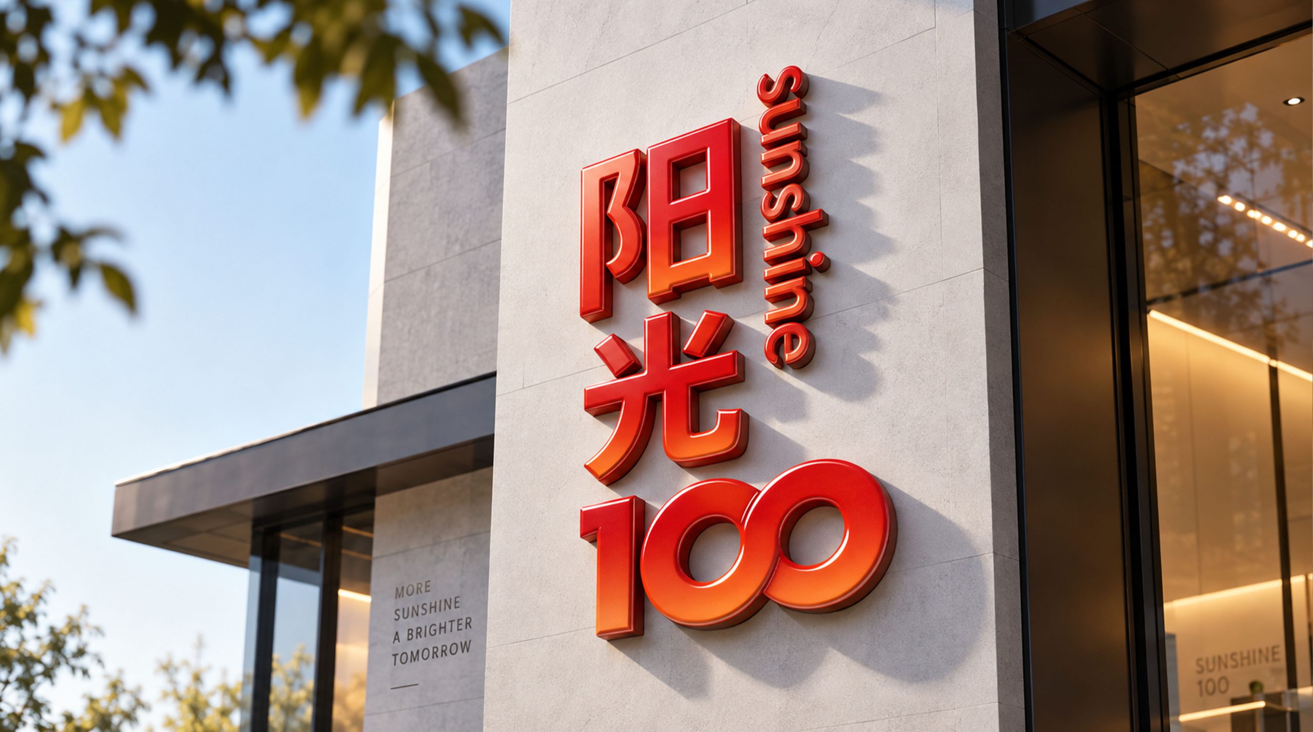
The logo takes "Light of the City" as its core concept and creatively integrates the sunlight penetrating the city skyline with the brand identity of the number "100" to build a brand symbol that not only conveys the energy of sunlight but also carries the ideals of the city. Sunlight is the most essential and beautiful element in urban life - a good city should allow every street to be illuminated by sunlight and every resident to be bathed in warmth. With sunshine as the core of the logo, it directly declares the brand's development philosophy of "illuminating urban life with a sunshine-like concept".
graphic language
The main body of the graphic uses the number "100" as the visual skeleton, and graphically reconstructs and imbues the three digital characters with imagery. "1" is presented as a tall vertical line, like the silhouette of an iconic building in the city skyline - it is the most eye-catching tower in the block and the most powerful stroke in the city skyline, conveying the benchmark status and high leadership of the Sunshine 100 project in the city. The top of "1" extends with a diagonal line radiating to the upper right, just like the first ray of morning light erupting from the top of the building, giving the upright vertical line dynamic energy like sunlight.
The two "0"s appear in full circles or ovals, like two juxtaposed suns, round, warm and full of energy. The first "0" can be slightly larger than the second "0", forming a visual rhythm of near and far, just like two suns arranged back and forth on the city skyline, conveying the brand's generosity of "more than a ray of sunshine and more than a moment of warmth". The two circular interiors maintain a sense of transparency with simple white spaces, just like sunlight itself - pure, free of impurities, and unrestricted, conveying the brand's planning concept of "openness, transparency, and free breathing" for urban space.
The number "100" is arranged at a dynamic angle tilted to the right, just like the sun shining on the earth at a warm angle - not the vertical exposure at noon, but the most pleasant setting sun at the golden hour, conveying the unique warm humanistic temperament and aesthetic attitude toward life of the Sunshine 100 project. The tilted angle also gives the static figures a sense of forward motion, just like the pace of a city's continuous development. The overall composition constructs "city light" with the integration logic of "numbers are sunshine and sunshine is city" to convey the brand's urban ideals and life vision.
Font composition
The Chinese "Sunshine 100" uses a modern sans-serif font. The strokes of "Sunshine" are round and bright, and the structure is cheerful and stretched, just like the words themselves are emitting light; "100" is presented with customized numbers that are consistent with the style of the graphic logo, ensuring that the visual genes of the text logo and the graphic logo are unified. The English "SUNSHINE 100" is arranged in a dynamic sans-serif font, with bright and neat fonts. "SUNSHINE" conveys the international expression of sunshine, and "100" maintains a consistent font style with Chinese numbers. The overall word mark uses a brisk visual rhythm to distinguish it from the heavy solemnity of traditional real estate companies, conveying Sunshine 100's brand personality of "being a warm city operator".
color system
The main color, sunshine orange #FF8C00, represents sunshine, vitality, warmth and urban energy. The rich orange is like the most beautiful moment when the whole city is enveloped in golden orange light when the sun sets - the buildings are coated with gold edges, the streets are filled with warm light, and the faces of pedestrians are reflected warmly and softly. Orange is the most differentiated brand color in the real estate industry - different from the calm authority of blue, the ecological appeal of green and the solemn tradition of red, orange conveys "the passion and beauty of life itself" and is highly consistent with Sunshine 100's brand concept of "creating a warm life for the city". Auxiliary clear sky blue #4A90D9 is used for urban elements and project promotion materials in the brand system. It is like the clear blue sky above when the sun is shining. The combination of orange and blue forms a natural color combination of "sunshine and sky" - where there is sunshine, there must be blue sky, conveying the bright urban life created by the Sunshine 100 project. Auxiliary warm white #FFF8F0 is used as the background tone in the branding system, like the warm soft light of the early morning sun on the white wall, providing soft breathing space for the passion of orange. Auxiliary graphite gray #3D3D3D is used for basic text and supporting information. The overall color is orange as the core and supplemented by blue, reflecting the brand temperament of "sunny city, dynamic life".
Application extension
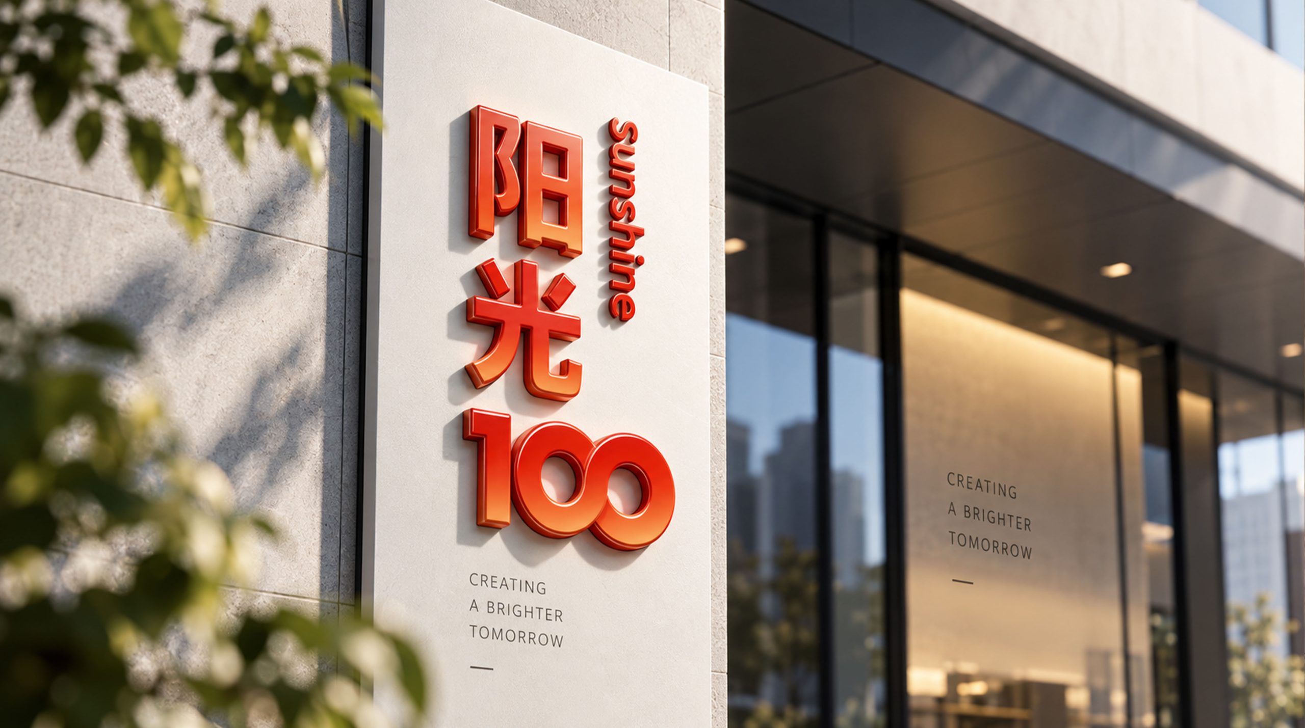
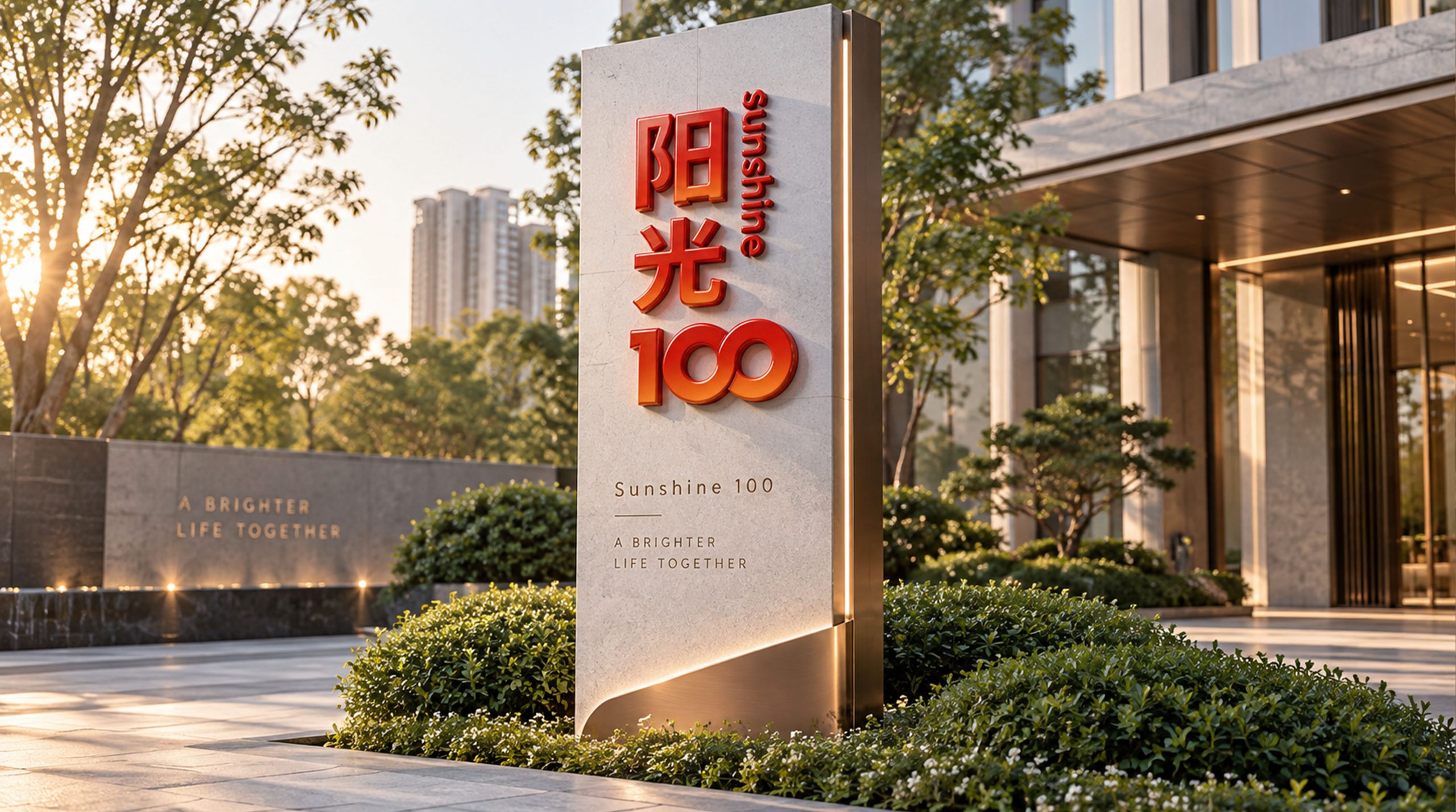
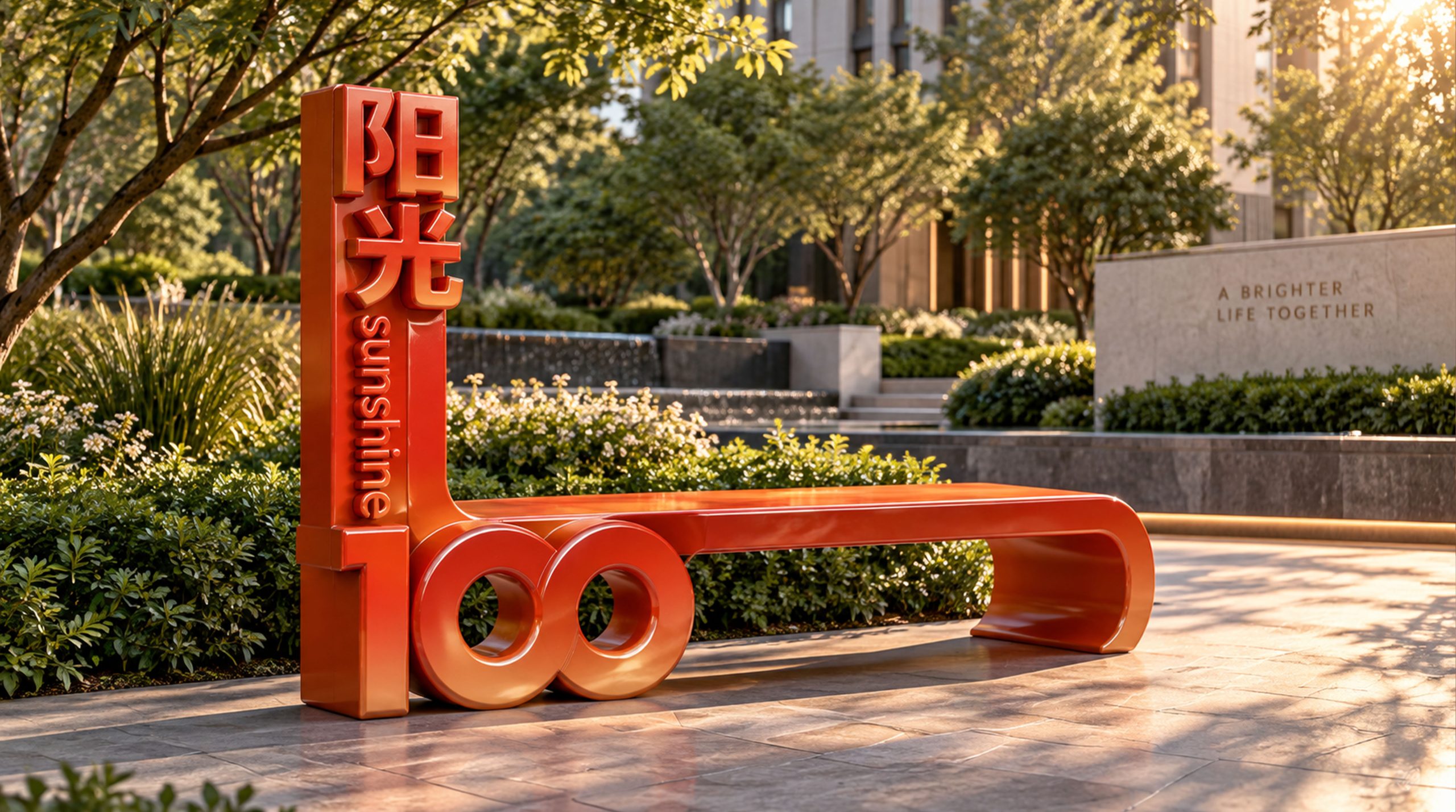
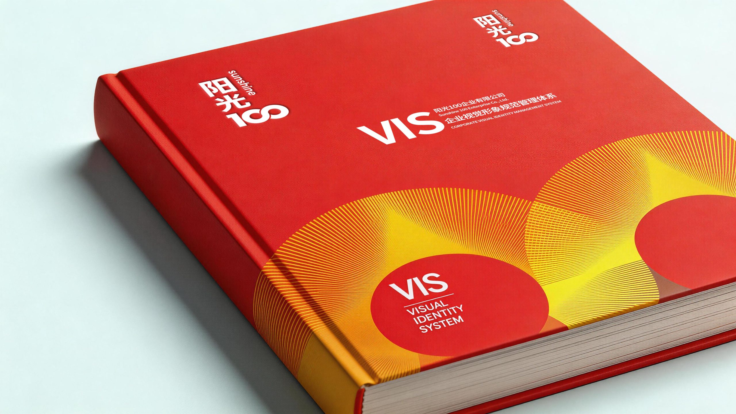
The logo can be widely used in urban complex project facades, sales office image walls, block guidance systems and commercial space signs; project brochures, brand brochures, investment brochures and high-end invitations; official websites, mobile APP interfaces, social media images and urban marketing materials; city operation forums, cultural and creative real estate summits, special neighborhood promotion meetings and brand cross-border event images; commercial tenant cooperation materials, owner community logos and urban life festival event visuals. In the iconic scene of the brand at the entrance of the Sunshine 100 characteristic block, the Sunshine Orange logo is presented in the form of a lighting installation art on the block entrance arch. During the day, the bright orange color attracts the flow of urban people, and at night, the warm orange light illuminates the entire street, making the brand logo a warm light source in the city's night scene. In the dynamic vision, "1" rises from the ground, with light bursting from the top, and the two "0"s rise slowly from both sides of the building like two suns. The golden-orange light gradually fills the entire picture, symbolizing Sunshine 100 illuminating every city it touches with the power of sunlight.
brand meaning
The logo contains three core images: Sunshine Energy - the radiating "1" and the double round sun convey the brand's positive attitude and warm energy like sunshine to illuminate urban life; Urban Vision - the architectural number "1" and the city skyline image convey Sunshine 100's corporate mission as an integrated urban operator to "create value for the city"; 100% quality (100% Commitment) - the complete number of "100" conveys the brand's 100% investment and 100% commitment to product quality, service experience and urban life. The overall design conveys Sunshine 100's brand vision of "sunny life, 100% ideal".
Improper Usage (Protection Specification)
Do not change the proportional relationship, tilt angle or arrangement of the three numbers "100"; do not modify the radiation direction of the top light line of "1" or the connection relationship with the main vertical line; do not change the hue of the main color of sunshine orange or replace it with cold colors; do not add strokes, hard shadows or heavy decorations inconsistent with the dynamic style to the logo; do not separate the numbers and the light elements for separate use; keep the white space ≥ 25% of the graphic height; the minimum display width shall not be less than 25mm.
design results
After the release of the logo, Sunshine 100's brand recognition and market uniqueness in the fields of comprehensive urban operations and cultural and creative real estate have been significantly improved. "City Lights", with its unique visual language that combines sunshine vitality and urban humanity, has become the core identification symbol of the Sunshine 100 brand system. It is widely used in urban projects, commercial operations and brand communication, showing the brand vision of "sunshine life, 100% ideal".