










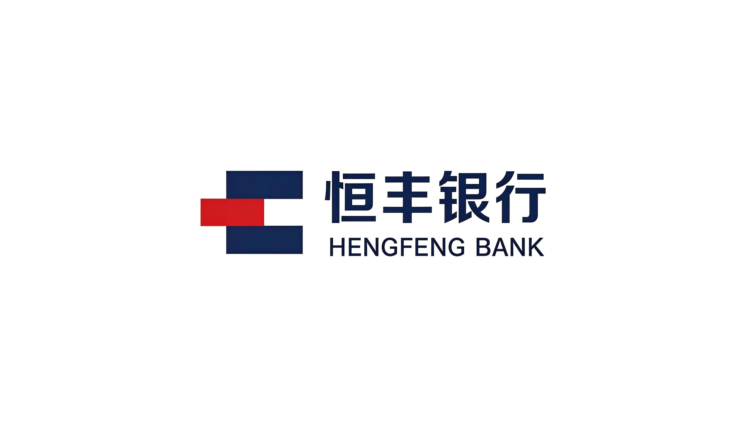
Hengfeng Bank is one of the 12 national joint-stock commercial banks in China. It was founded in 1987 and is headquartered in Yantai, Shandong. With the brand concept of "Persistence reaches far, Feng benefits the people", it is committed to providing a full range of financial services to corporate customers and individual customers.
The brand name "Hengfeng" carries the financial belief of stable operation - "heng" means eternity and constancy, symbolizing the long-lasting stability of bank operations and long-term commitment to customers; "feng" means abundance and harvest, symbolizing the continued growth of wealth and the continuous enrichment of service value. Qingmei Future was commissioned to lead the brand identity design.
The design goal of the brand logo is to demonstrate the industry status of Hengfeng Bank as a national joint-stock commercial bank through the visual language of financial authority, stability, reliability and continuous growth, and to convey the brand image of "lasting stability, prosperity and long-term success".
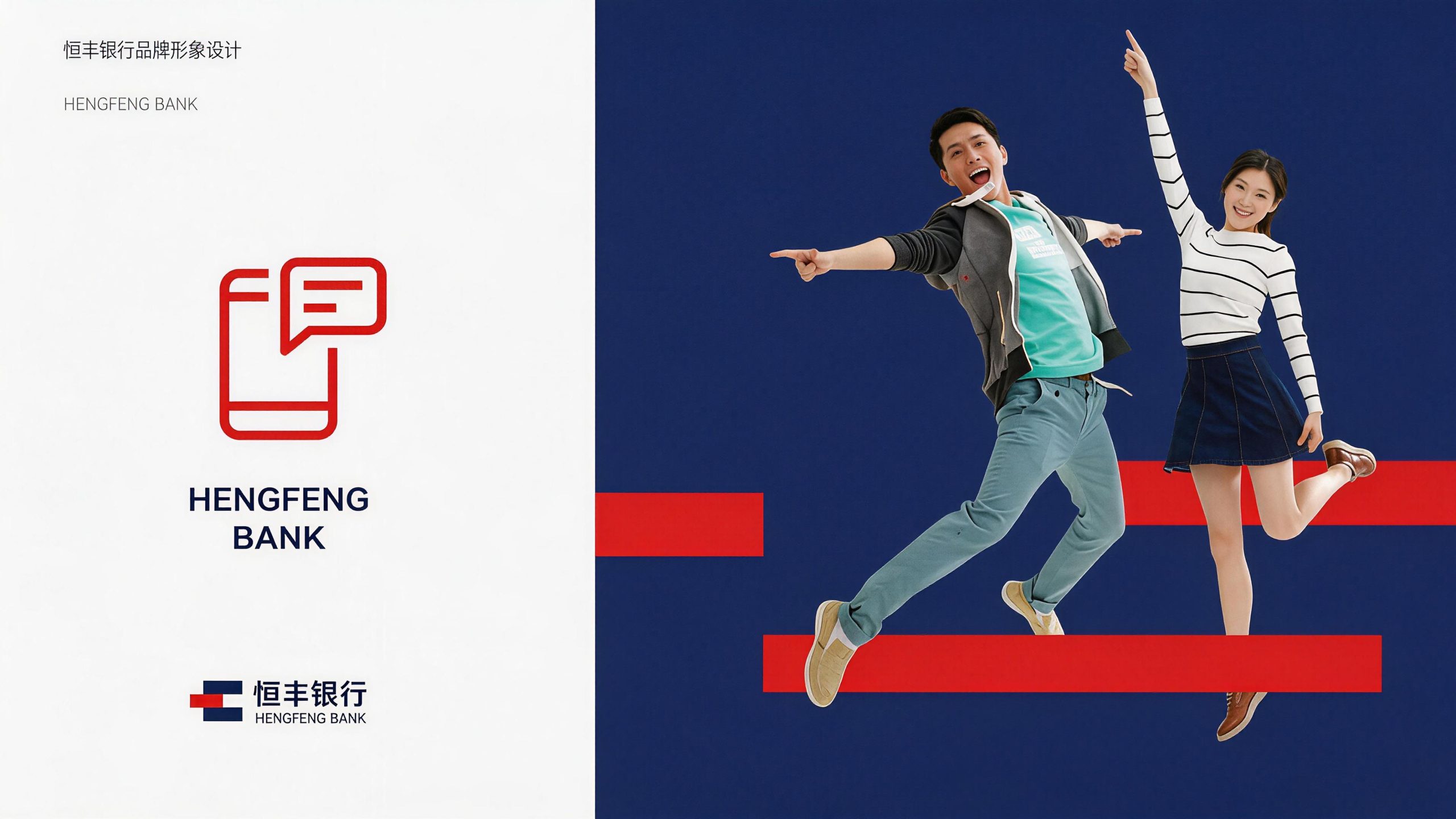
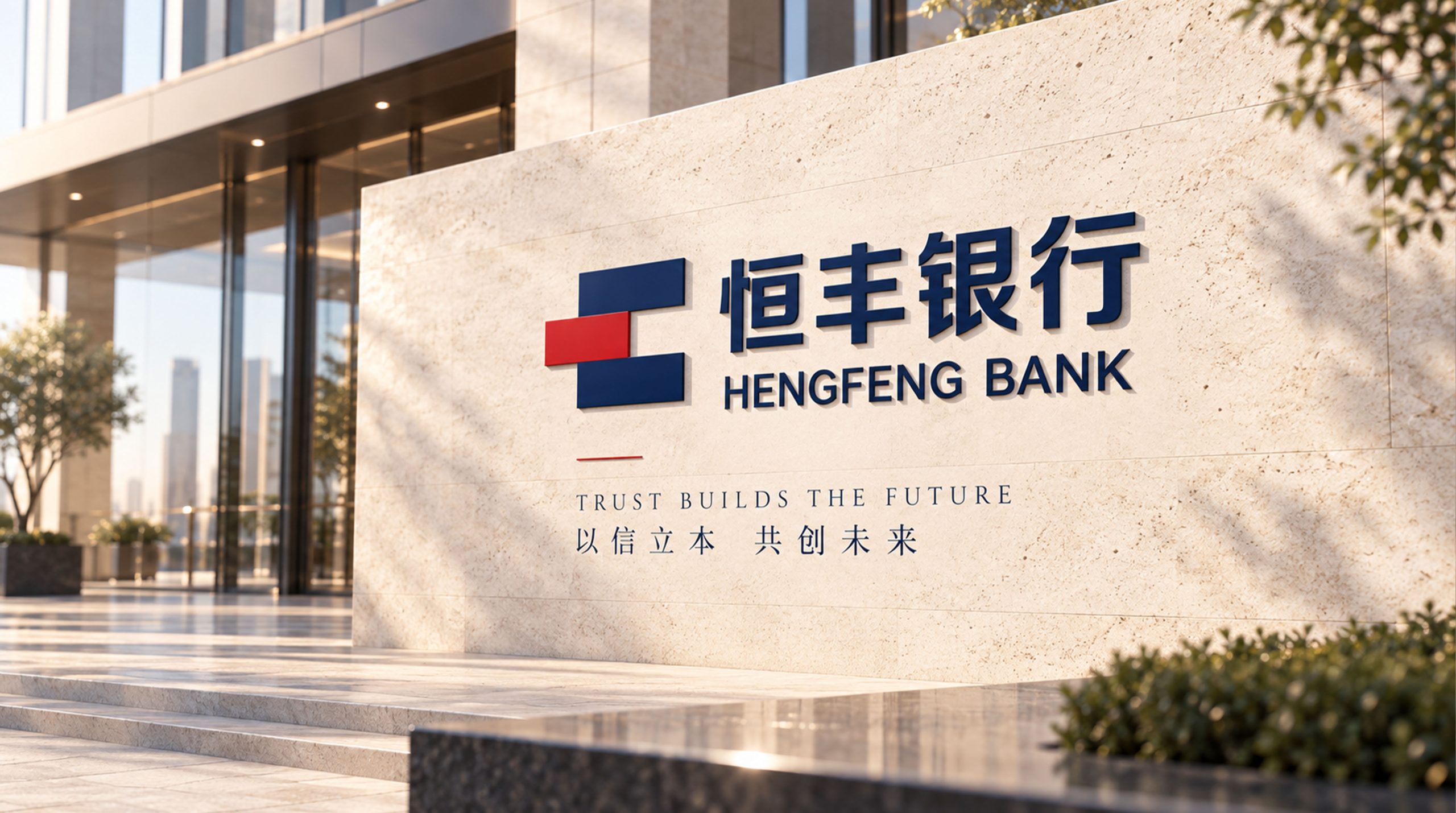
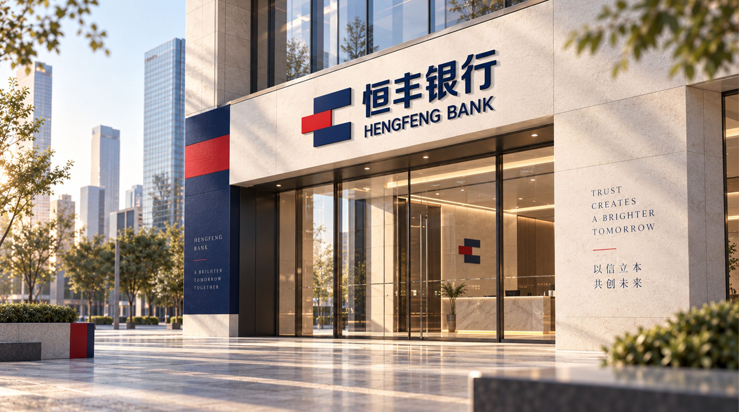
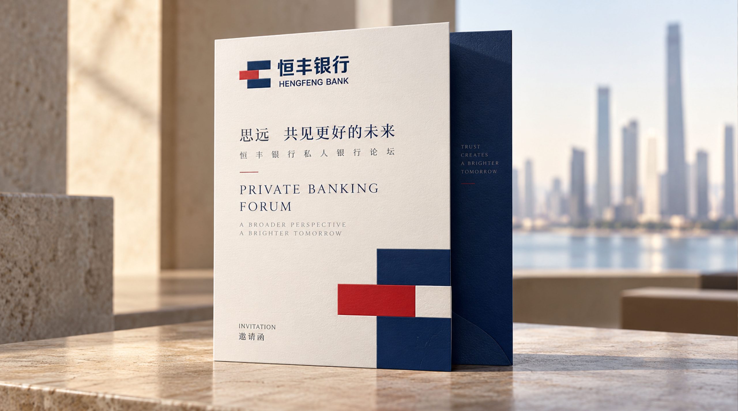
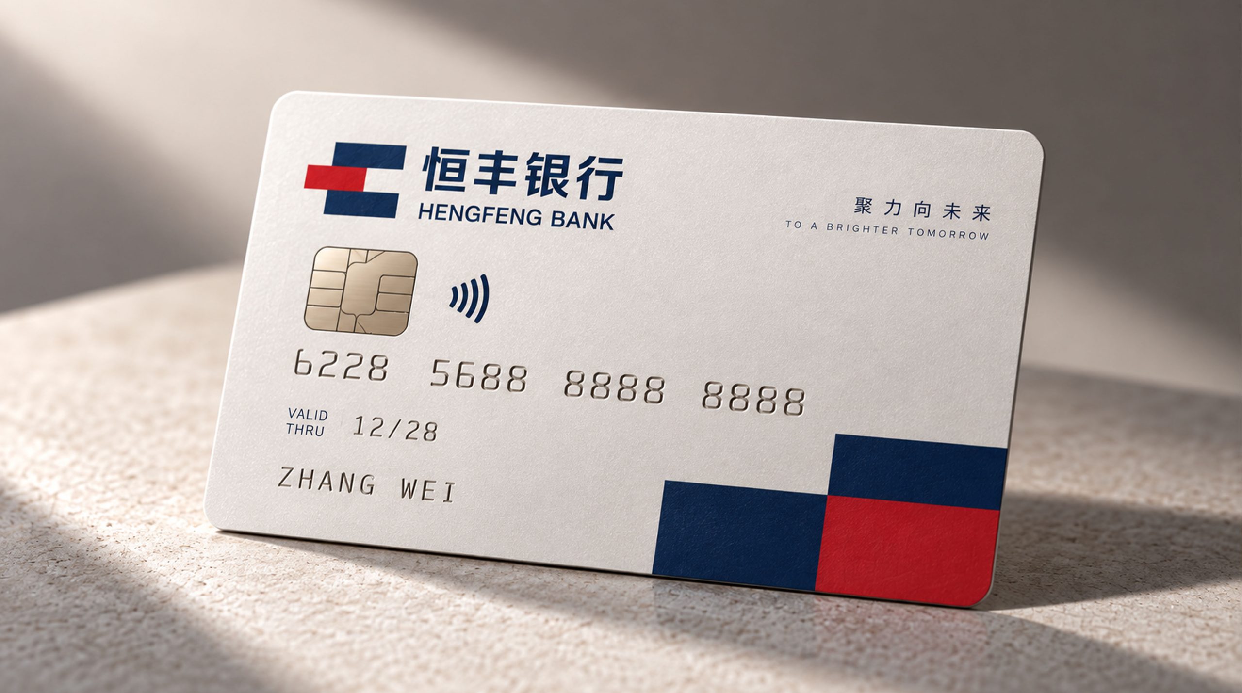
design concept
The logo takes "Seal of Evergrowing" as its core concept and integrates the solemn shape of traditional Chinese seals with the simple order of modern financial brands to create a brand symbol that is both culturally authoritative and industry-recognizable. In Chinese culture, the seal is the highest symbol of credit and commitment - "One seal is issued, and one promise is worth a thousand gold". With the seal as the core of the symbol, it directly establishes a deep connection between the bank brand and the word "credit".
graphic language
The graphic uses a square outer frame of the seal as the overall structure, and artistic strokes inside the frame form an abstract variant of the word "Hengfeng" or a geometric treatment of the brand's initials. The square frame conveys the rigorous and institutionalized management of bank operations—financial institutions are founded on integrity and are based on rules. Foundership is the most fundamental visual language of the bank brand. The strokes in the frame are intertwined and arranged in even lines, just like the inscriptions on ancient copper coins or the inscriptions on bronze vessels, retaining the cultural charm of traditional seal cutting in a modern geometric order. The space between the strokes has been precisely calculated, and the positive and negative shapes rely on each other, and the virtual and the real complement each other, forming a rigorous and rhythmic visual order within the square inches.
The trend of lines within the graphics implies a dynamic trend of upward growth, just like the branches of a plant extending upward from the roots, conveying the image of growth and abundance carried by the word "feng" - Hengfeng Bank not only protects the safety of wealth, but also promotes the continued growth of wealth. The thickness of the lines remains absolutely uniform, conveying the objective, fair and standardized professional ethics of financial institutions. The overall composition builds a "financial seal" with a structure of "external text, internal text, seal and letter" to convey the brand's credit foundation and professional strength.
Font composition
The Chinese "Hengfeng Bank" uses upright modern boldface, with thick and even strokes and a square and stable structure. The word "heng" vertically beside the heart conveys perseverance and concentration, the word "feng" three horizontally and one vertically conveys layers of abundance, and the word "bank" directly points out the attributes of the financial industry. The four characters are overall calm and majestic, conveying the authority and scale of a national commercial bank. The English "EVERGROWING BANK" is arranged below the Chinese characters in a standard uppercase sans-serif font. The word "Evergrowing" accurately conveys the brand connotation of "lasting growth". The fonts are regular and evenly spaced, ensuring that the brand is clearly identifiable in international financial exchanges and cross-border business.
color system
The main color, Hengfeng Red #CC2222, represents the orthodox identity and proactive business attitude of Chinese financial institutions. Red is the most common brand color in China's banking industry - from Industrial and Commercial Bank of China to China Merchants Bank, red has become the national color memory of Chinese financial institutions. The choice of this color allows Hengfeng Bank to naturally integrate into the visual context of China's banking industry. The richness and calmness of Hengfeng Red are different from ordinary bright reds. The restrained and thick color temperature conveys the historical accumulation and operating strength of national banks. Auxiliary gold #B8943E is used for noble elements and wealth management business logos in the brand system, symbolizing wealth appreciation and abundant returns. The combination of gold and red is the most classic "double-win" color combination for Chinese financial brands. Auxiliary dark gray #333333 is used for basic text and auxiliary information, supporting the luxury of red gold with a calm tone. Pure white #FFFFFF is used as the standard background color and the inside of the seal is left blank. The overall color is red gold as the core, reflecting the financial brand temperament of "credit-based, wealth-rich".
Application extension
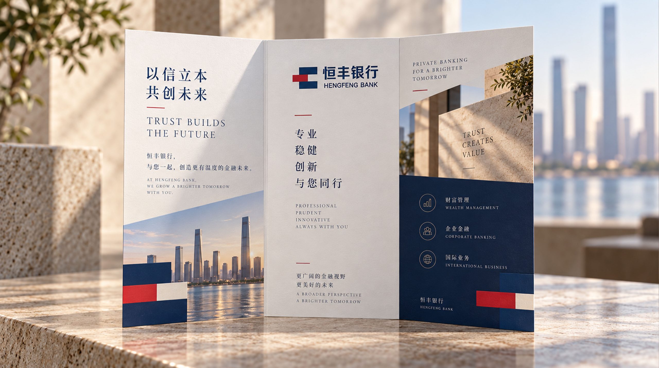
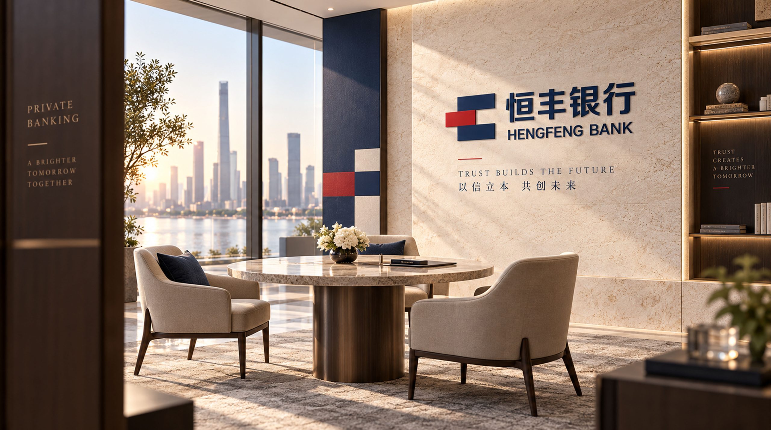
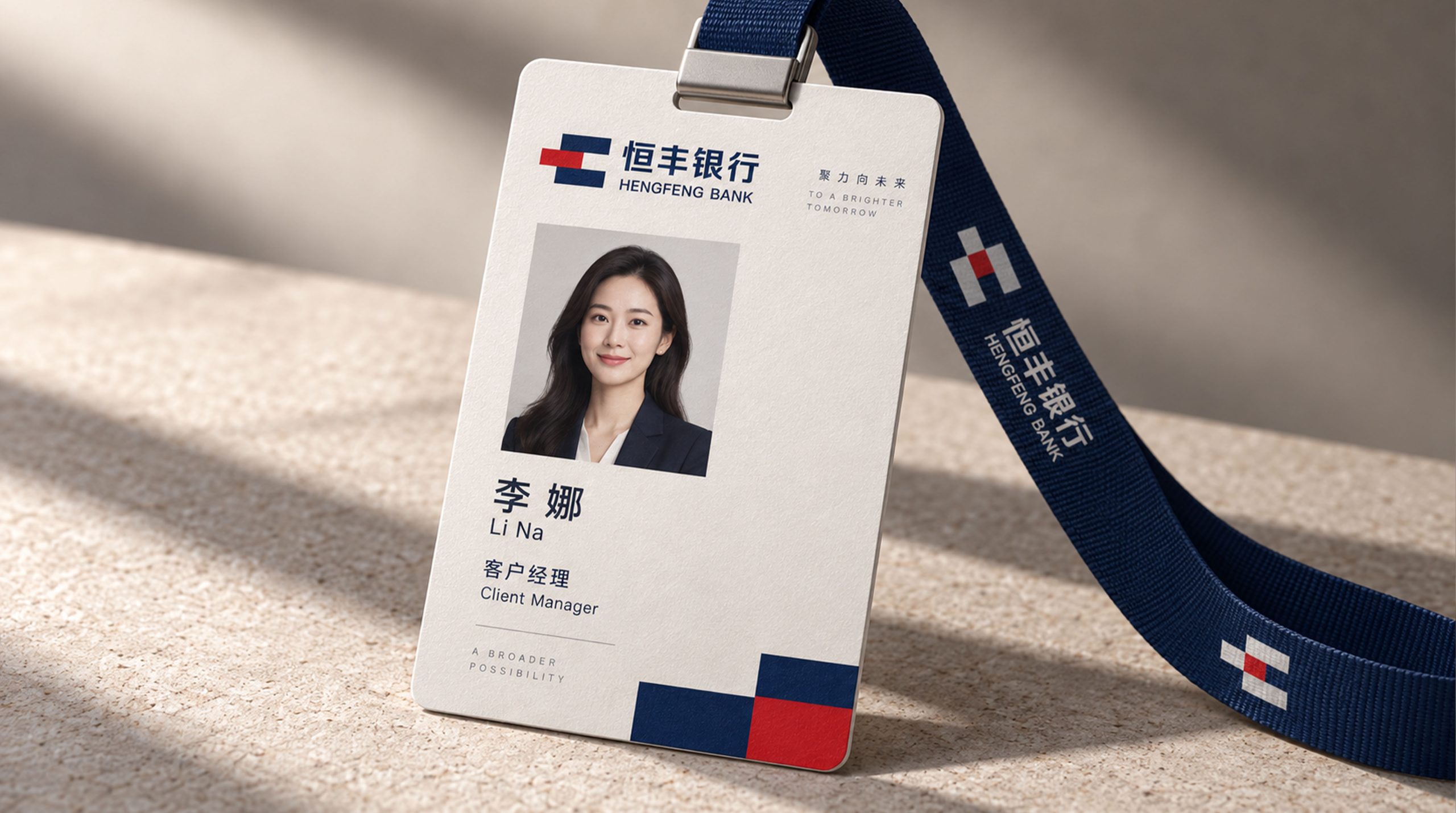
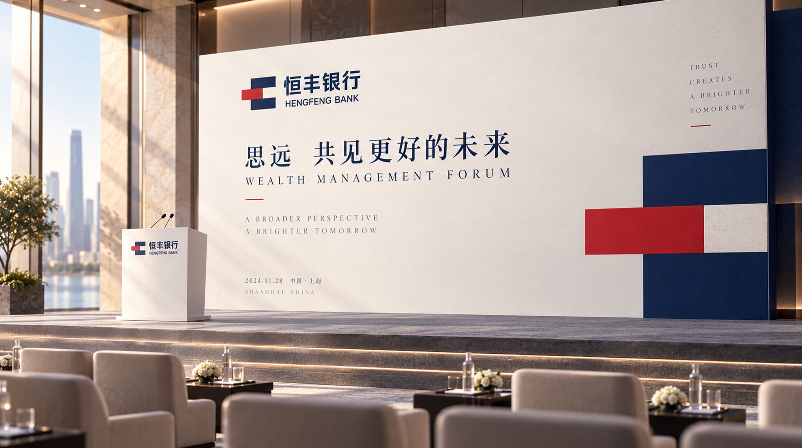
The logo can be widely used in bank head offices and branch doors, business hall image walls, ATM machine interfaces and VIP wealth management room nameplates; bank card faces, passbook covers, financial product instructions and contract documents; official websites, mobile banking APPs, online banking platforms and digital marketing materials; financial industry summits, bank-enterprise cooperation forums, press conferences and government cooperation project images; business gifts, employee badges, cash transport vehicle logos and brand stationery systems. In the dynamic vision, the outer frame of the seal is formed from the four corners to the center, and the internal strokes grow and arrange in sequence, just like a financial letter is completed in front of your eyes, symbolizing Hengfeng Bank's brand history based on credit and standards. The seal graphic can be extended into a visual parent element and used for business classification icons, financial product level logos and brand pattern systems.
brand meaning
The logo contains three core images: Seal of Trust - the shape of the seal directly conveys the credit foundation of the bank brand "One Promise, Thousands of Gold"; Eternal Stability - the square structure and uniform lines convey the long-lasting stability and rigorous standardization of bank operations; Prosperous Growth - the upward growth trend of the internal lines conveys the brand promise of continuous appreciation of wealth and continuous enrichment of service value. The overall design conveys Hengfeng Bank's brand vision of "persistence for the long-term and prosperity for the benefit of the people".
Improper Usage (Protection Specification)
Do not change the square proportion or rounded corners of the seal's outer frame; do not modify the thickness, spacing or interweaving relationship of the internal strokes; do not change the hue or lightness of the main color of Hengfeng Red; do not add gradients, strokes, shadows or decorative effects that are inconsistent with the financial style; do not rotate, tilt the seal or separate the outer frame from the internal strokes; keep the white space ≥ 25% of the graphic height; the minimum display width must not be less than 25mm.
design results
After the release of the logo, Hengfeng Bank's recognition and professional image in the national bank brand system have been significantly improved. "The Seal of Hengfeng", with its visual language that integrates traditional seal culture and modern financial order, has become the core identification symbol of Hengfeng Bank's brand system. It is widely used in branches, financial services and brand communication across the country, demonstrating the brand vision of "lasting stability, prosperity and long-term success".