










Anbang Insurance Group is a large comprehensive insurance group in China. Its business covers property insurance, life insurance, health insurance, asset management, banking and finance and other diversified fields. With the brand mission of "Safety for the people of the world and the prosperity of every family", Anbang Insurance Group is committed to providing a full range of risk protection and wealth management services to hundreds of millions of customers.
The brand name "Anbang" carries the core value promise of the insurance industry - "An" means safety and peace of mind, symbolizing the safety barrier and inner peace that insurance products build for customers; "Bang" means country and family, symbolizing the grand pattern of brand services covering thousands of households and benefiting the national economy and people's livelihood. Qingmei Future was commissioned to lead the brand identity design.
The design goal of the brand logo is to demonstrate Anbang Insurance Group's industry status as a large comprehensive insurance group through the visual language of safety, stability, reliability and national scale, and to convey the brand image of "security protection, stability for thousands of families".

design concept
The logo takes "Shield of Anbang" as its core concept and integrates the protective image of the shield with the stable structure of the traditional Chinese city to create a brand symbol that directly conveys the core function of "safety and security". The shield is the most common visual metaphor in the global insurance industry - the essence of insurance is a strong shield that protects customers from risks. With the shield as the core of the logo, the brand can convey the industry signal of "guarding" and "protection" to customers in the first place. The image of the city echoes the sentiments of family and country in the word "state", conveying Anbang Insurance's grand brand narrative of protecting thousands of families and stabilizing a state.
graphic language
The graphic uses a shield shape as the overall frame. The upper end of the shield is wide and straight, the arcs on both sides draw down steadily, and the bottom ends are rounded. The overall shape is thick and full, with a steady center of gravity, like a cast iron shield standing before the wind and rain, conveying an unshakable sense of security and protective power. The upper edge of the shield is shaped like the square teeth of the city wall crenellations - three to five evenly arranged square teeth are like the battlements of an ancient city wall, directly echoing the city image of the word "state", elevating the shield from a simple defensive tool to an important weapon for protecting a city and its people. The battlements and the shield are integrated into one body, conveying Anbang Insurance's dual protection commitment of "not only protecting the safety of individuals, but also protecting the country of thousands of families."
The simple lines inside the shield form a geometric variant of the brand's initial "A". "A" has an isosceles triangle as its basic structure, with the top tip pointing upward like the highest point of the roof, symbolizing the meaning of protection conveyed by the roof radical of "An" - a house means safety, and a shield means solidity; the two diagonal lines of "A" are like the two slopes of the house extending to both sides, which is stable. The ground supports the entire triangular structure, conveying the stable protection structure that insurance products build for customers; the horizontal pen in the middle is like a door beam running through the left and right, sealing the open triangle into a solid whole, conveying the industry creed of "promises are fulfilled, and there are no gaps in protection" in insurance contracts. There is a uniform negative space between the geometric lines of the "A" and the shield-shaped frame, which presents a simple and powerful modern financial brand texture as a whole. The overall composition uses a double-layer structure with "words standing on the shield and stacks on the shield" to build the "Ampang Shield", conveying the brand's protective nature and industry mission.
Font composition
The Chinese "Anbang Insurance Group" adopts a stable modern boldface, with thick and even strokes and a square and dignified structure. The word "An" on the roof radical is like the shelter of a house, conveying safety and security; the word "Bang" on the right ear is like the shape of a city, conveying the family, country and people; the word "insurance" directly points out the attributes of the core industry; the word "group" highlights the scale and comprehensive strength of the enterprise. The English "ANBANG INSURANCE GROUP" is arranged in standard uppercase sans-serif fonts, with regular and steady fonts and even spacing, ensuring that the brand is clearly identifiable in the international insurance market and cross-border financial cooperation. Chinese, English and shield-shaped graphics form a standard brand composition of "picture on the left and text on the right" or "picture above and text below".
color system
The main color Anbang Blue #003D7A represents trust, security, professionalism and financial authority. Dark blue is the most widely used brand color in the global insurance industry - from PICC to Allianz Insurance, dark blue has become the international visual consensus that "insurance is safety". The choice of this color allows Anbang Insurance to naturally integrate into the brand context of the insurance industry. The depth and calmness of Anbang Blue are like the tranquility of the deep sea - no matter how rough the sea surface is, the deep sea is always calm, conveying the deep sense of security that insurance products provide customers with "no matter the wind and rain, with inner peace". Auxiliary guardian gold #C5A55A is used for noble elements in the brand system and high-end product line logos, symbolizing wealth protection and value protection. The warmth of gold injects a touch of care and commitment to customers into the calmness of dark blue. Auxiliary stable gray #666666 is used to assist the information level in the text and brand system, and supports the blue and gold visual main body with neutral tones. Pure white #FFFFFF is used as the standard base color with white space inside the shield. The overall color is blue and gold as the core, reflecting the insurance brand temperament of "safe, reliable and worthy of trust".
Application extension
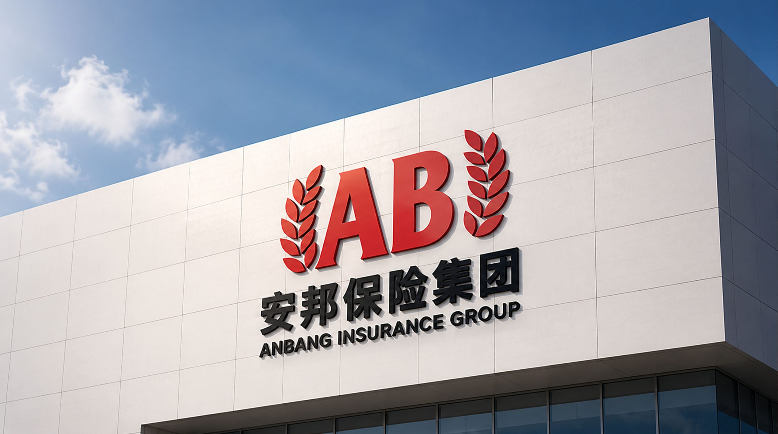
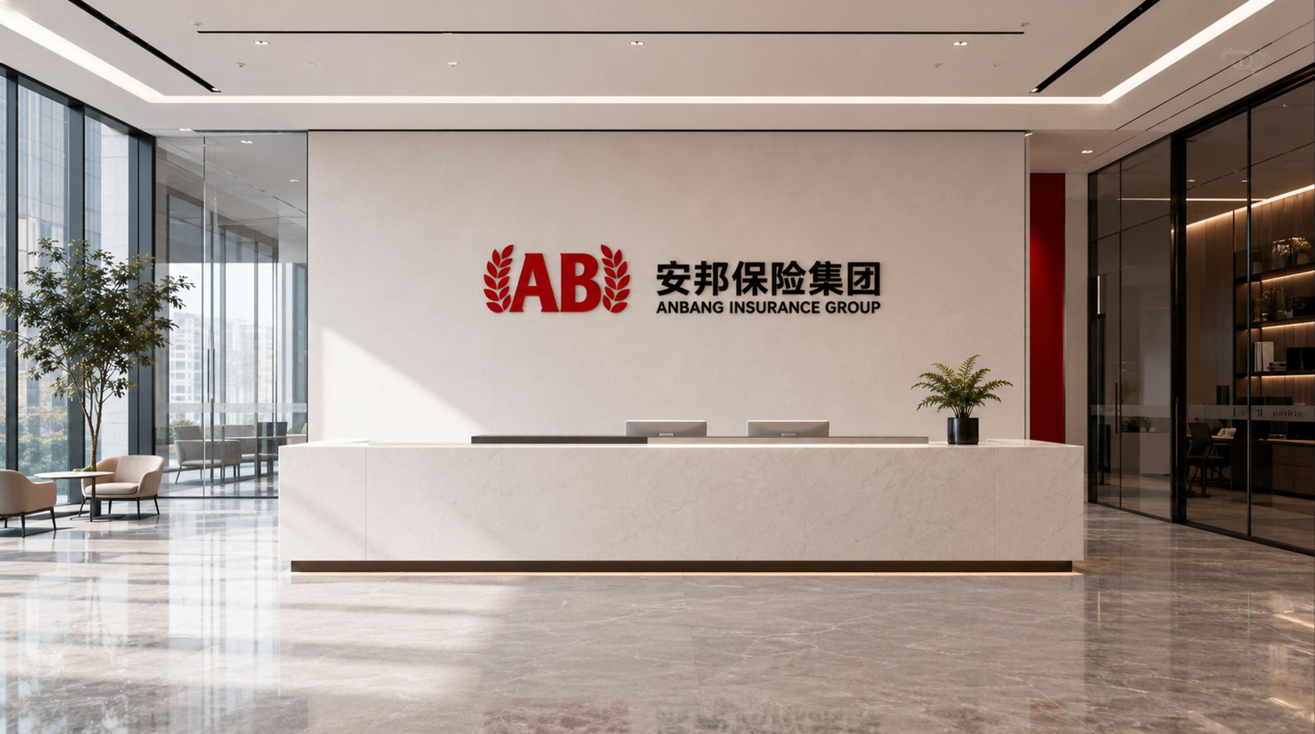
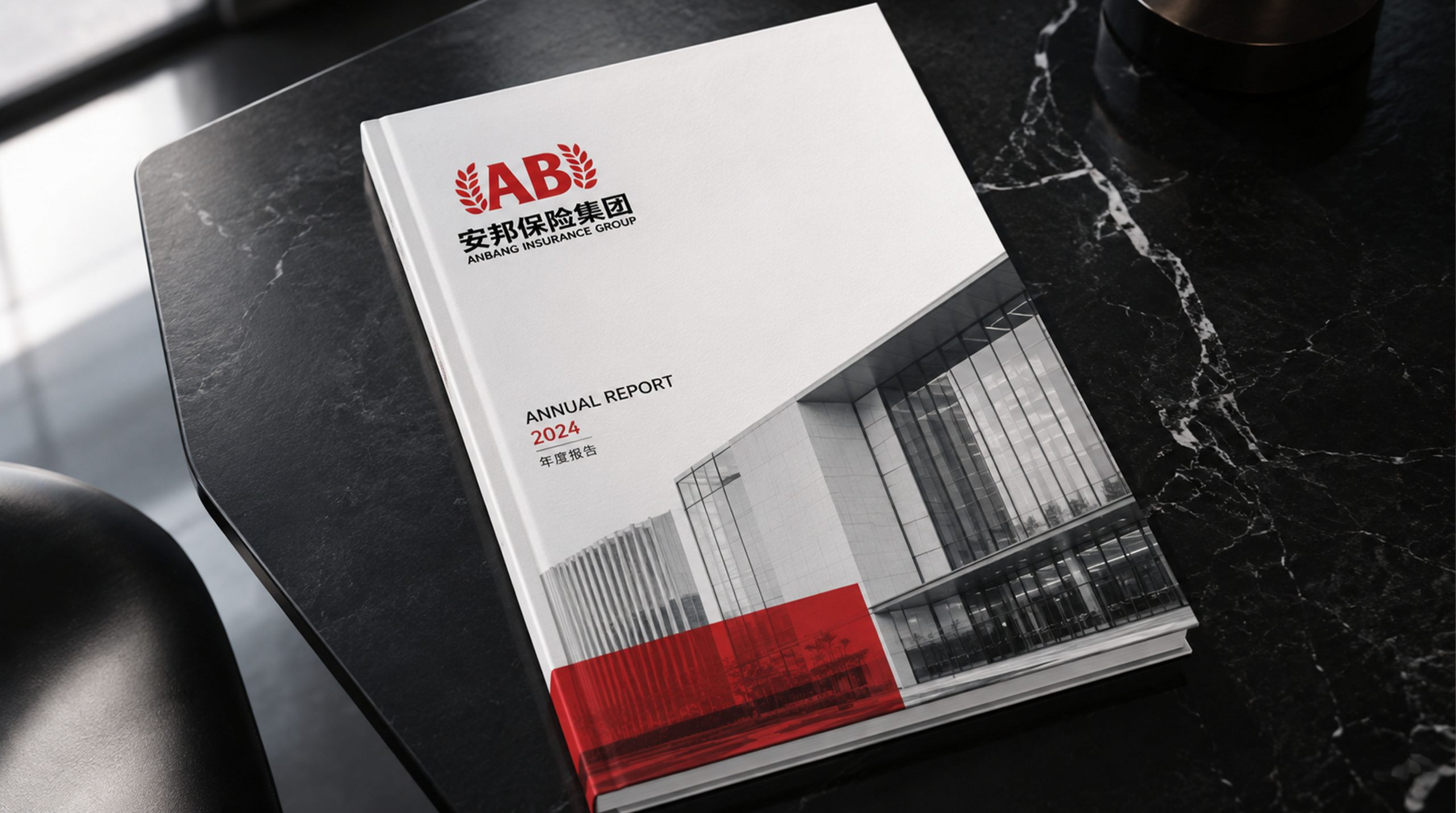
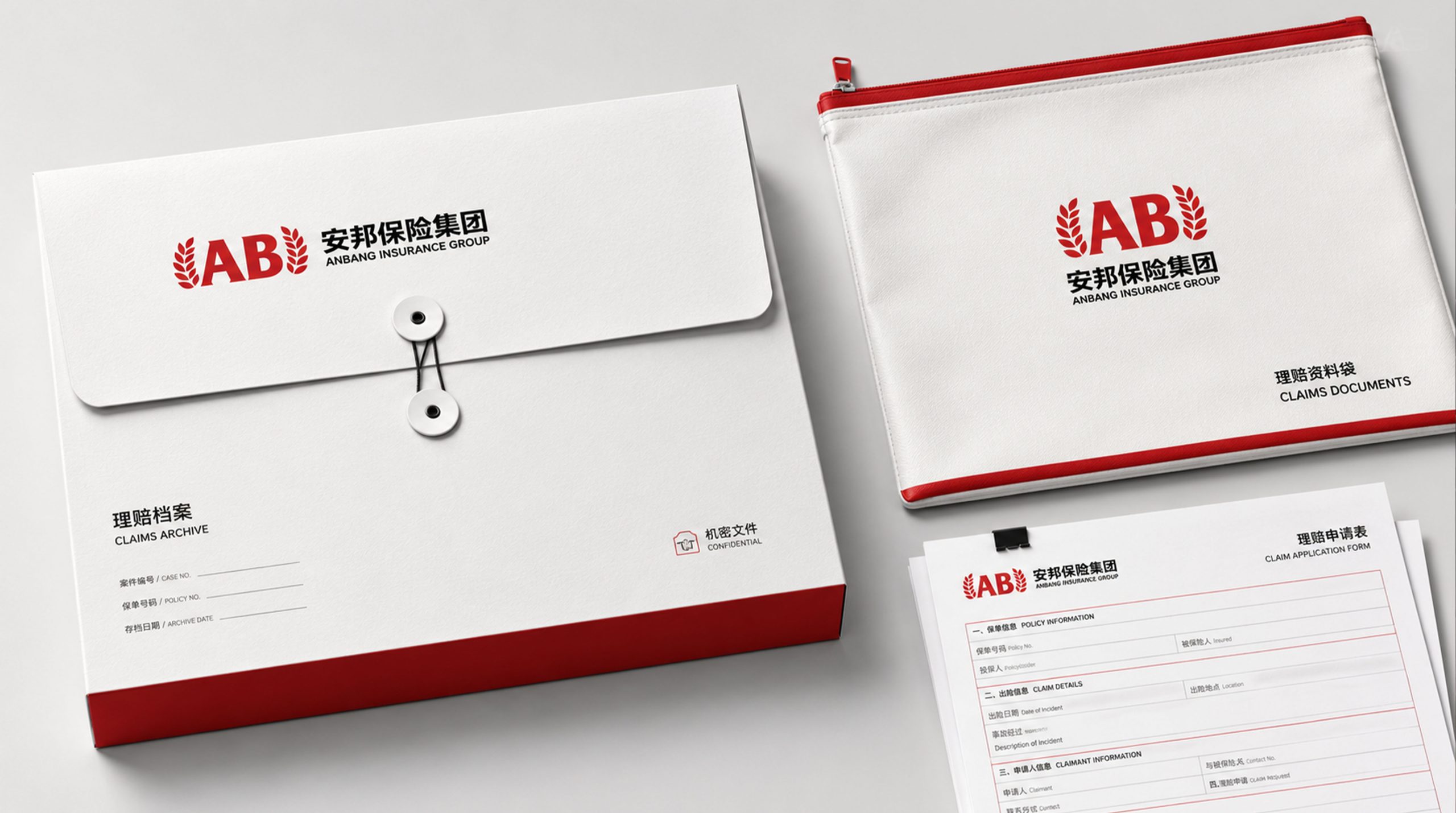
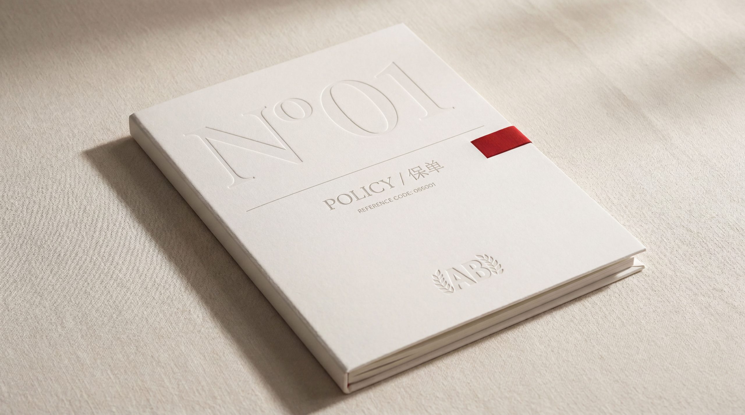
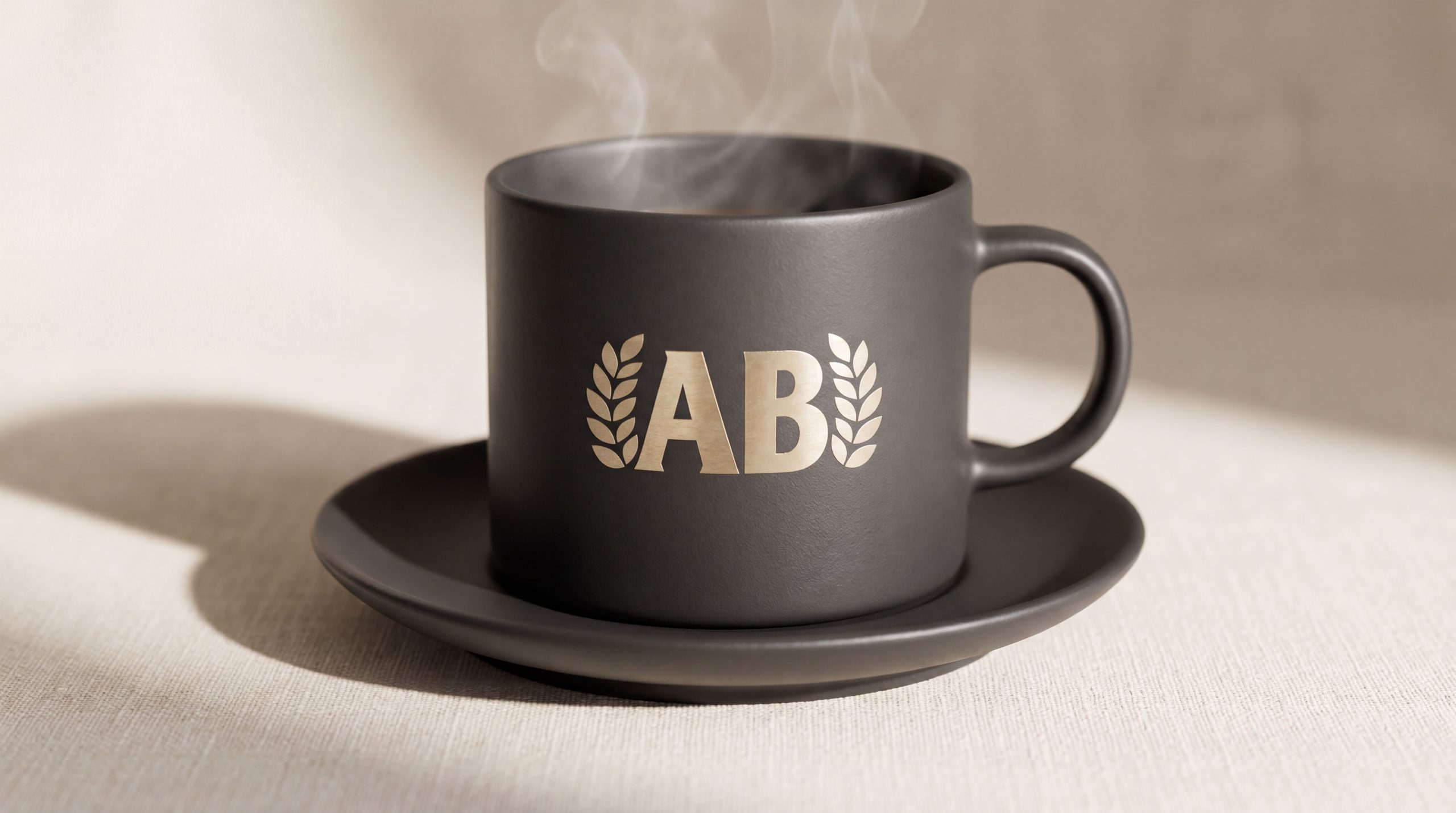
The logo can be widely used in the group headquarters building, national branch doors, business hall image walls and customer service center guidance systems; insurance contract covers, policy documents, claims manuals and customer rights statements; official websites, mobile APP interfaces, online insurance platforms and digital marketing materials; insurance industry summits, bank-insurance cooperation forums, press conferences and government cooperation project images; business gifts, employee badges, service vehicle logos and brand stationery systems. In the dynamic vision, the shield shape expands steadily from the center to the surroundings, with battlements standing in sequence at the top. The letter "A" emerges from the center of the shield and stands upright, like a protective shield slowly rising in front of customers, symbolizing that Anbang Insurance has built a solid safety barrier for customers before risks come. The shield and battlement patterns can be extended into visual mother elements for product classification icons, protection level logos and brand graphic systems.
brand meaning
The logo contains three core images: Safety Shield - the shield shape directly conveys the core function and brand promise of "defending risks and protecting customers" in the insurance industry; Fortified Nation - the battlement shape conveys Anbang Insurance's grand service pattern of protecting thousands of households and being as stable as a city; Steady & Trustworthy - the triangular stable structure of the "A" letter and the main color of dark blue convey the lasting stability and professional reliability of the insurance group's operations. The overall design conveys Anbang Insurance Group's brand vision of "protecting with peace of mind and stabilizing every family".
Improper Usage (Protection Specification)
Do not change the overall proportion of the shield, the curvature of the arc or the way the bottom is gathered; do not modify the number, spacing or square tooth shape of the battlements; do not change the hue or brightness of the main color of Anbang Blue; do not add gradients, strokes or decorative effects inconsistent with the financial style; do not separate the shield, battlements and the "A" letter for separate use; keep the white space ≥ 25% of the graphic height; the minimum display width shall not be less than 25mm.
design results
After the release of the logo, Anbang Insurance Group's brand recognition and customer trust in the comprehensive insurance and financial services fields have been significantly improved. "Anbang Shield", with its visual language that combines the image of protection and the feelings of family and country, has become the core identification symbol of Anbang Insurance's brand system. It is widely used in the national institutional network, insurance services and brand communication, demonstrating the brand vision of "safeguarding and stabilizing all families".