










Evergrande Hotel Group is the high-end hotel business segment of Evergrande Group. With "lasting quality and grand style" as its brand credo, its operations cover a variety of business formats such as super five-star resort hotels, urban business hotels, and supporting hotels in cultural and tourism complexes. Its business territory covers key cities and core tourist vacation destinations across the country.
The brand name "Hengda" is majestic - "Heng" means permanence and eternity, symbolizing the hotel's long-lasting commitment to quality that can stand the test of time; "Da" means grandeur and grandeur, symbolizing the grand layout of the hotel space and the comprehensive and thoughtful service system. Qingmei Future was commissioned to lead the brand identity design.
The design goal of the brand logo is to demonstrate the industry status of Evergrande Hotel Group as a high-end hotel brand in China through the visual language of super five-star quality, grandeur and international vision, and to convey the brand image of "lasting excellence and grand model".
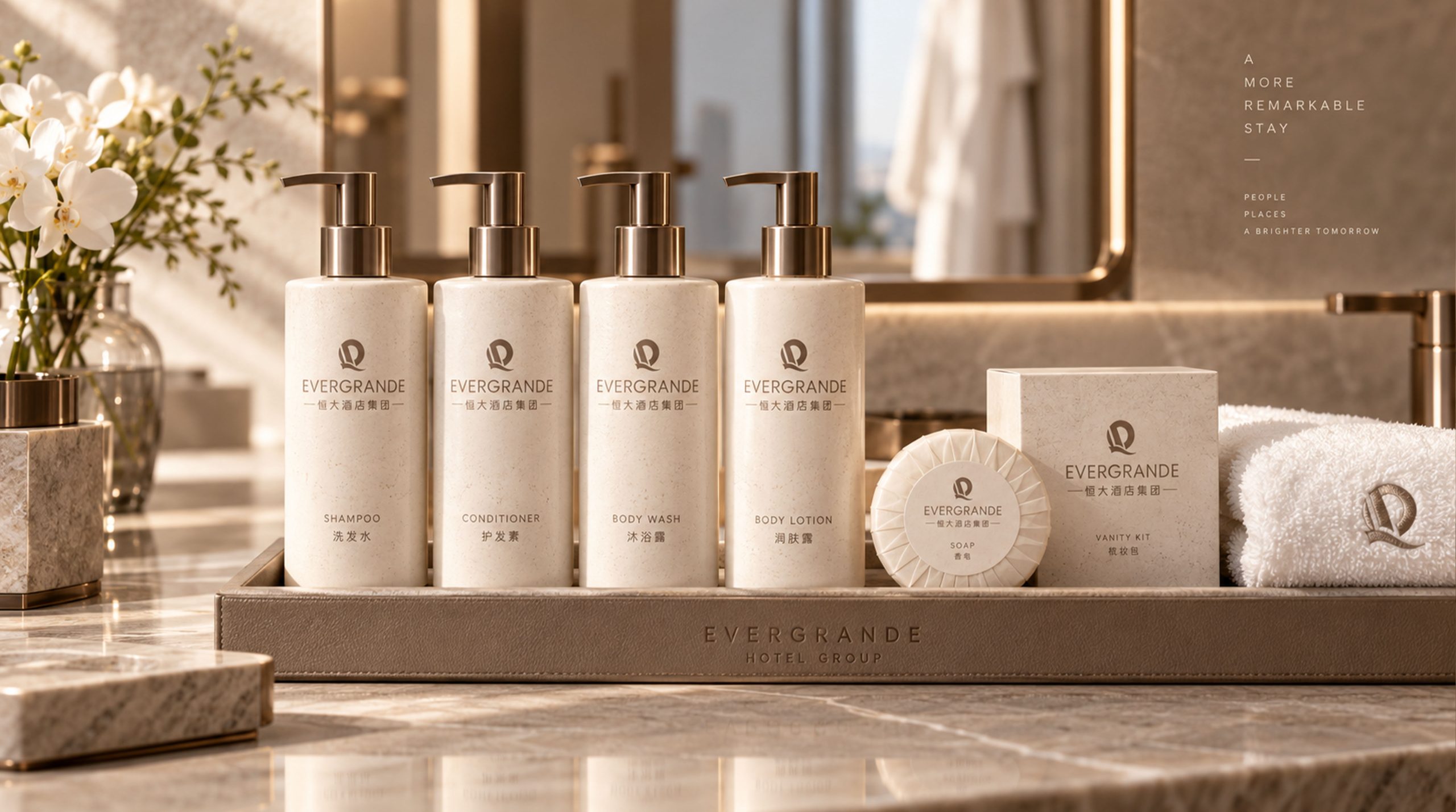
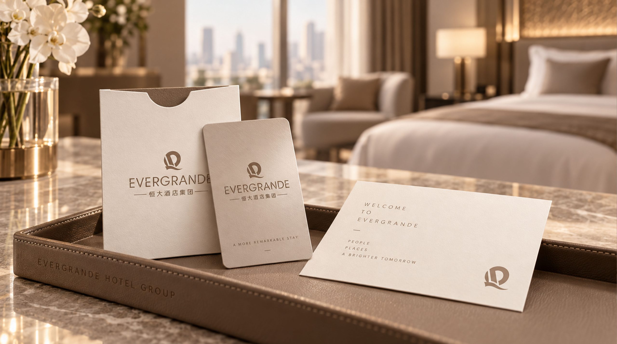
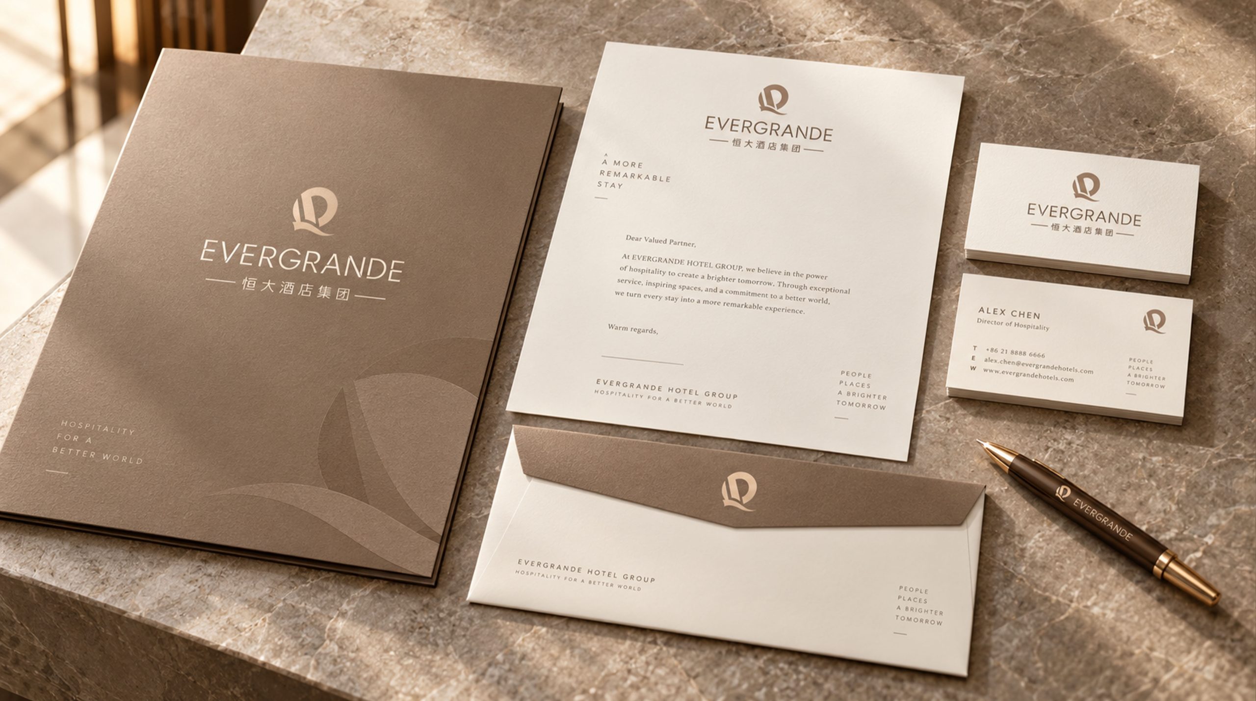
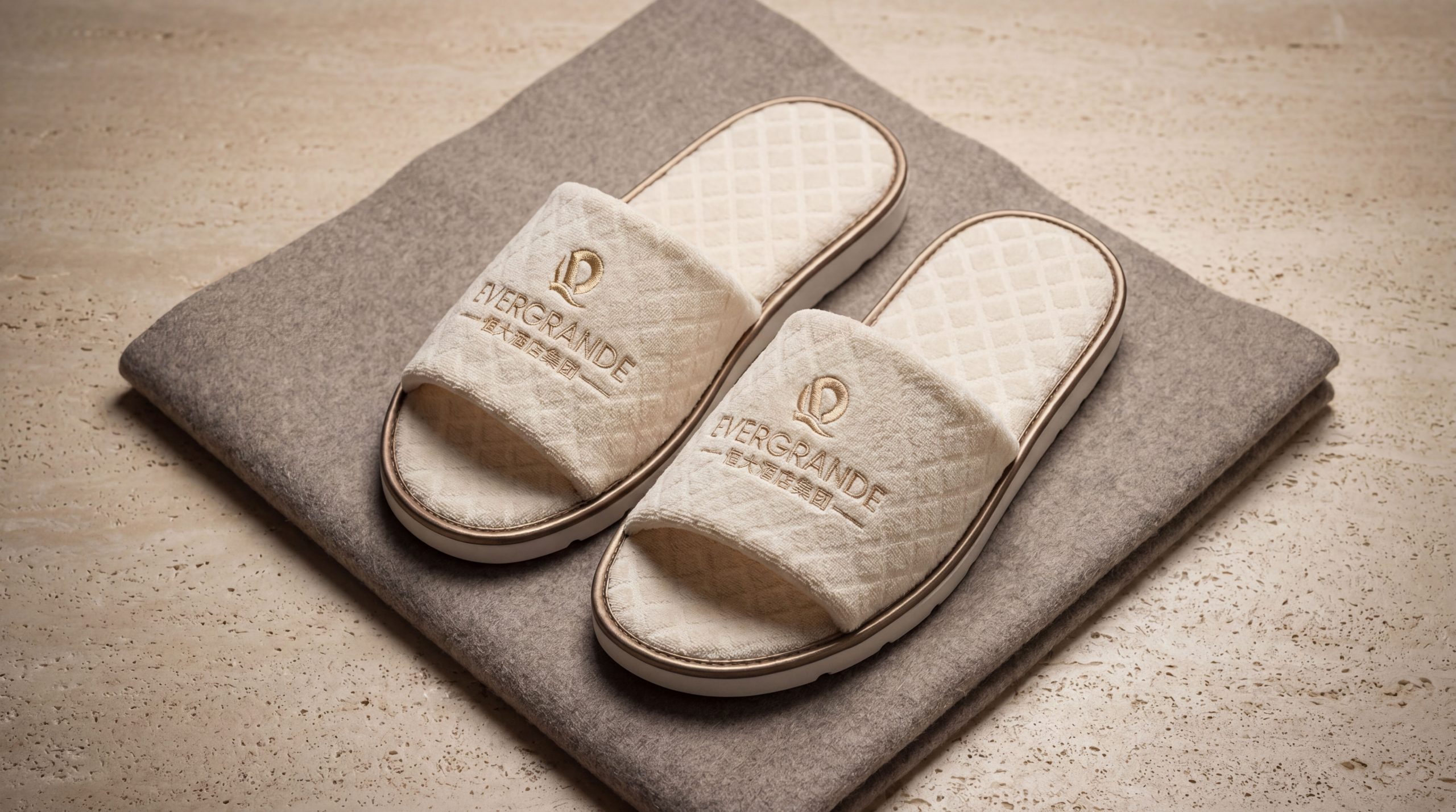
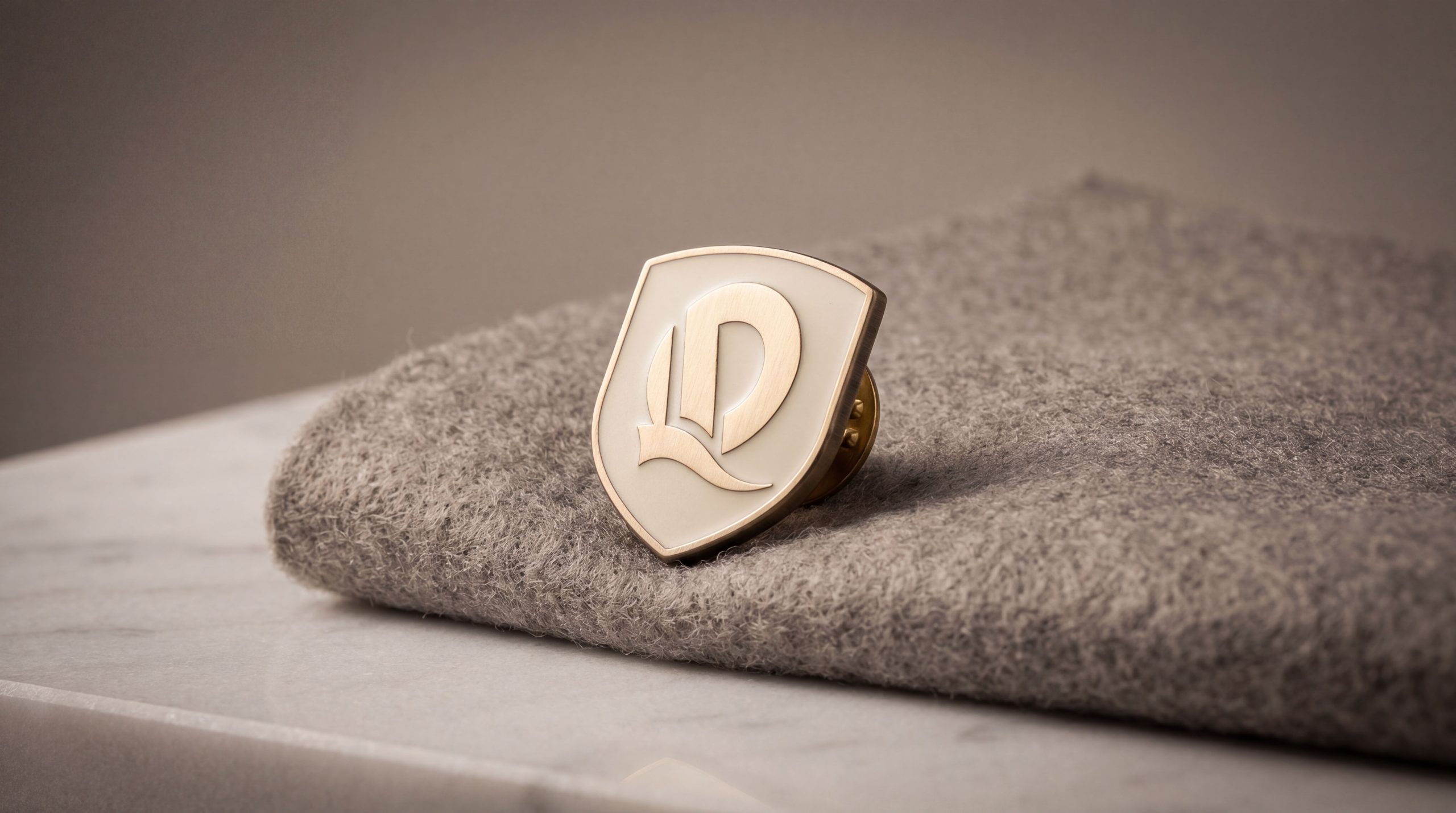
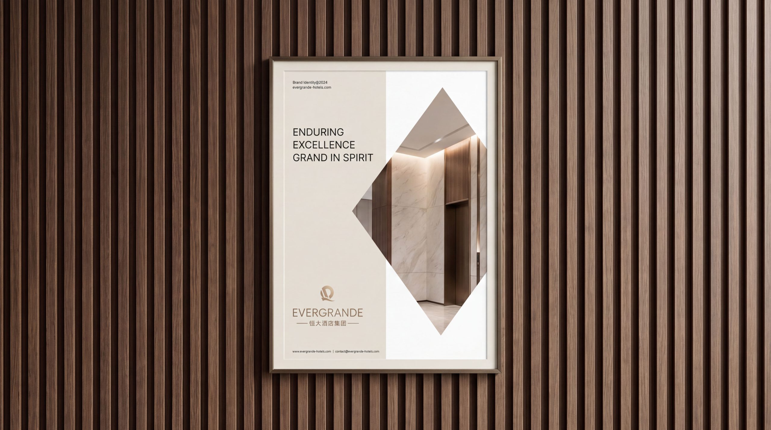
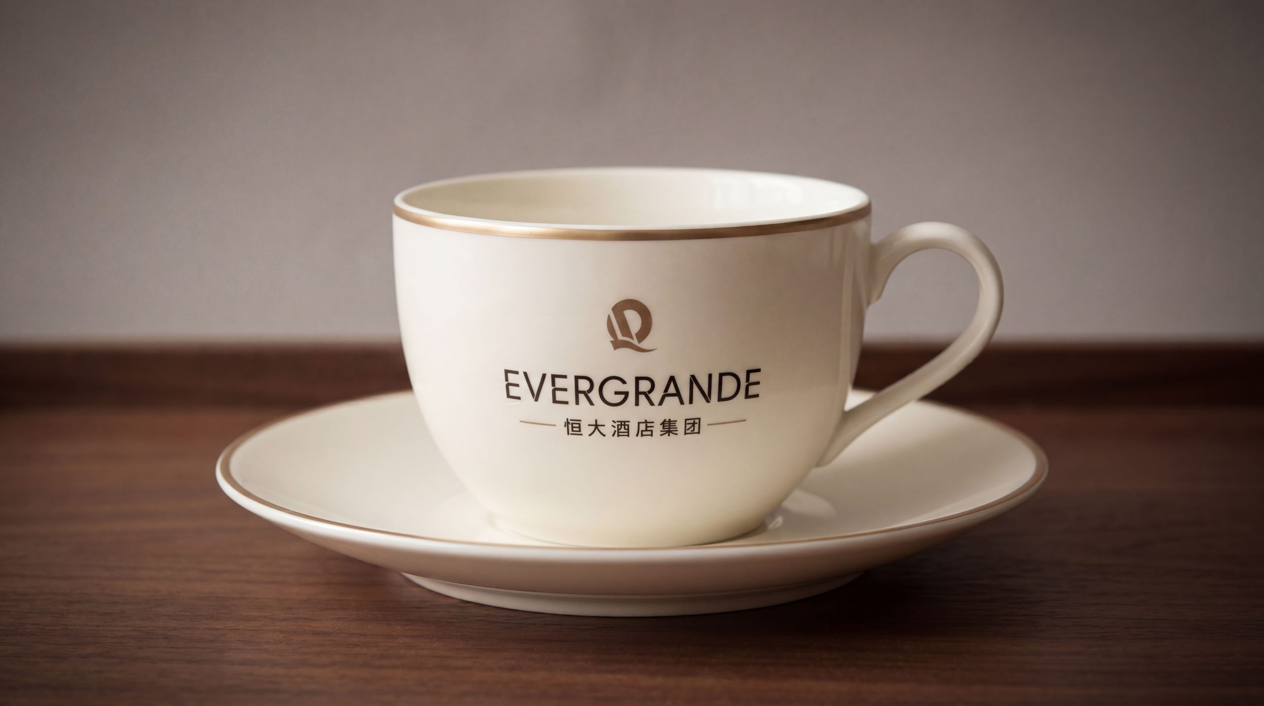
design concept
The logo takes "Eternal Crown" as its core concept and integrates the supreme nobility of the crown with the shield's promise of protection, creating a brand badge that combines the style of an international luxury hotel with the magnanimity of a Chinese high-end brand. The crown is the most common noble symbol of global luxury hotel brands, and the shield carries the service oath of "protecting every guest's noble experience" - the combination of the two allows the logo to convey the "super five-star" quality signal to guests at the first time.
graphic language
The graphic uses a shield as the overall frame. The shield is wide at the top and tapered at the bottom, with symmetrical and full arcs on both sides, conveying the classic badge spirit of "protection, stability and glory". The shield-shaped top is terminated by an exquisite crown, which is composed of five symmetrical arches. The arcs arch upward gracefully and are embellished with beads at the top. The shape is solemn, luxurious but not cumbersome, conveying the supreme positioning of a super five-star hotel. The interior of the shield uses simple geometric lines to form a variant of the brand's initial letter "H" - the two vertical lines of "H" stand on the left and right sides of the shield in a slender and straight posture, and the horizontal strokes in the middle run through the left and right with a slightly curved connecting line. The whole is like two symmetrical columns in the hotel lobby holding up the dome beams, and the architectural letter shape hints at the grandeur and grandeur of the hotel space.
The vertical stroke of the "H" letter extends upward to connect with the crown, forming an integrated visual relationship between the letter and the crown - the crown is not an independent decoration suspended above the shield, but an organic component that grows naturally from the letter structure, conveying the brand's service concept of "nobility comes from quality itself". The shield-shaped bottom is closed at the tip, and the closing point is supplemented by a small diamond-shaped decoration, conveying the pursuit of ultimate and exquisite quality. The outer edge of the shield is outlined with double lines, thick on the outside and thin on the inside, maintaining a sophisticated level of detail while being solemn. The overall composition uses a three-layer structure of "the crown is added to the shield and the words stand on the shield" to construct the "eternal crown", conveying the brand's luxury positioning and long-term commitment.
Font composition
The Chinese "Evergrande Hotel Group" adopts a dignified modern Song style, with thin horizontal lines and thick vertical lines, clear strokes and a grand structure. The two characters "Evergrande" are calm and steady, conveying the scale and determination of the brand; the four characters "Hotel Group" are regular and restrained, clarifying the industry attributes and corporate size. The English "EVERGRANDE HOTEL GROUP" is arranged in a classic uppercase serif font. The font is broad and straight, and the serifs are exquisite and clear. It is consistent with the font tradition of top international hotel brands, ensuring the brand's high-end recognition on global hotel booking platforms and the international business travel market. Chinese and English are distributed up and down or horizontally on the right side around the shield-shaped badge, forming a complete brand identity system.
color system
The main color Evergrande Gold #B8860B represents luxury, nobility and super five-star quality. Just like the warm luster of the golden decoration under the crystal lamp in the hotel lobby, it directly conveys the noble atmosphere of a high-end hotel. Gold is the most recognized brand color in the global luxury hotel industry - from Ritz-Carlton to Peninsula Hotels, gold has always been the visual synonym for "top luxury". Evergrande gold distinguishes itself from excessively shiny bright gold with a matte and restrained texture, conveying the brand style of "luxury but not dazzling, expensive but not vulgar". Auxiliary royal black #1A1A1A is used for shield outlines, brand wordmarks and basic system elements. It uses the deepest tone to provide stable background support for gold. The combination of black and gold is the most classic color combination of international luxury brands. Auxiliary ivory white #FFFFF0 is used for the background color and high-end printing materials in the brand system, just like the warm and soft light of high-count cotton bedding in five-star hotel rooms, conveying a sense of delicate and comfortable quality. The overall color is centered on gold and black, reflecting the brand temperament of "long-lasting luxury and elegant model".
Application extension
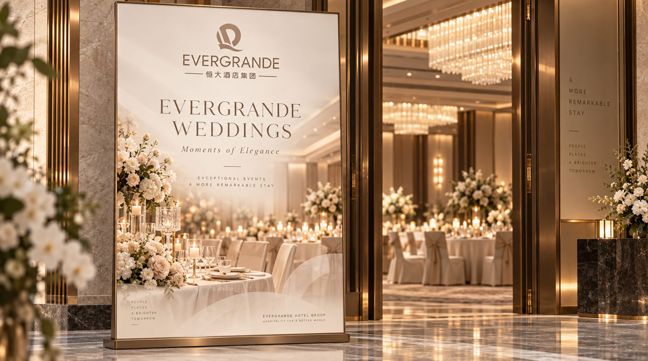
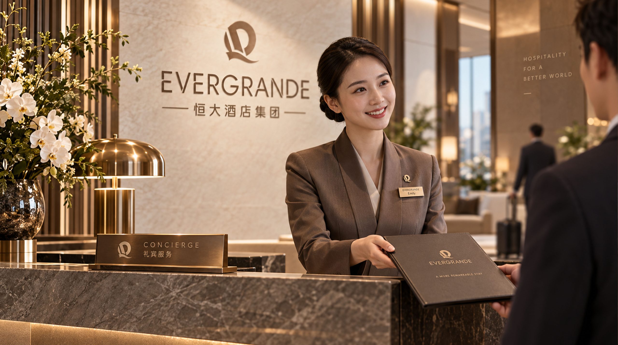
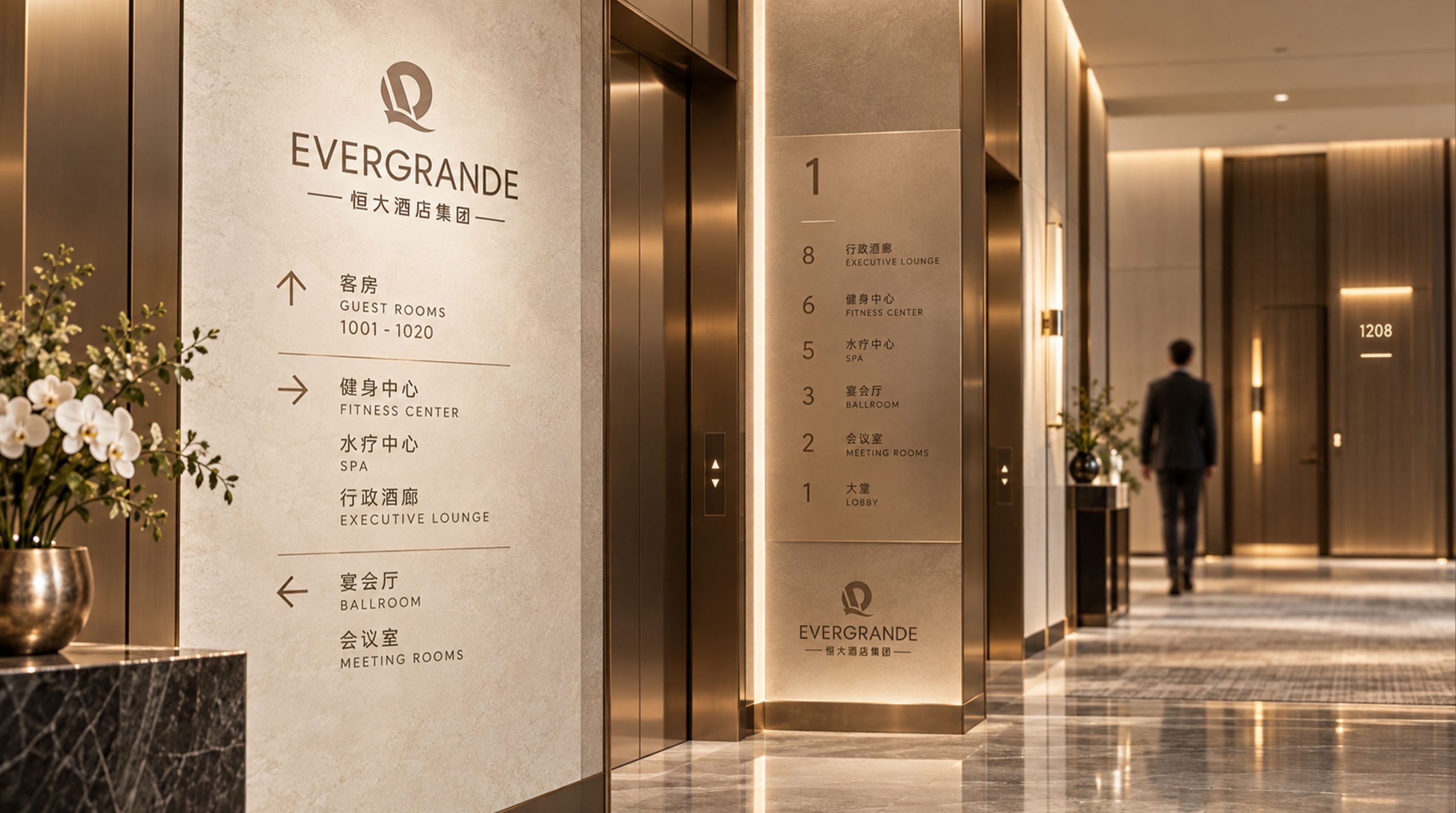
The logo can be widely used in hotel building facades, lobby image walls, front desk nameplates, elevator rooms and floor guidance systems; guest room door numbers, room cards, bathrobe embroidery, toiletry kit labels and bedding woven labels; brand official website, online booking platform, mobile APP interface and OTA channel store image; brand album, business invitations, VIP membership cards and high-end gift box packaging; industry selection, hotel alliance, cultural tourism promotion conference and international hotel exhibition image. In the hotel lobby, the first touch point of brand experience, a golden shield-shaped badge is presented in the center of the front desk background wall with metal relief or backlight technology. Guests can feel the brand ritual of "Eternal Crown" at the first moment of check-in. In the dynamic vision, the shield shape slowly takes shape from bottom to top, with the "H" letter standing tall and tall, and the crown blooming gorgeously from the top of the letter. The golden luster flows and shines along the edge of the shield shape, symbolizing the noble experience of Evergrande Hotel that crowns every guest with long-lasting quality.
brand meaning
The logo contains three core images: Supreme Luxury - the crown and gold convey the supreme quality positioning of a super five-star hotel and the distinguished status and courtesy of guests; Eternal Care - the shield-shaped guardian image conveys the hotel's long-lasting commitment to the safety, comfort and satisfaction of every guest; Grand Vision - the architectural shape of the "H" letter and the grand badge composition convey Evergrande Hotel Group's nationwide business scale and international brand vision. The overall design conveys Evergrande Hotel Group's brand vision of "enduring excellence and grandeur".
Improper Usage (Protection Specification)
Do not change the symmetrical proportion, arc curvature or bottom closing method of the shield; do not modify the number of arches of the crown or the connection relationship with the "H" letter; do not change the hue of the main color of Evergrande Gold or replace it with silver or copper; do not add gradients, strokes or cartoon processing inconsistent with the luxury style; do not separate the crown, shield and letters for separate use; keep the white space ≥ 25% of the graphic height; the minimum display width shall not be less than 30mm.
design results
After the release of the logo, Evergrande Hotel Group's brand recognition and luxury image have been significantly improved in China's high-end hotels and cultural tourism and resort fields. "Eternal Crown", with its visual language that combines the style of international luxury hotels and the magnanimity of Chinese high-end brands, has become the core identification symbol of Evergrande Hotel Group's brand system. It is widely used in hotels, reservation channels and brand communication across the country, demonstrating the brand vision of "lasting excellence and grandeur".