










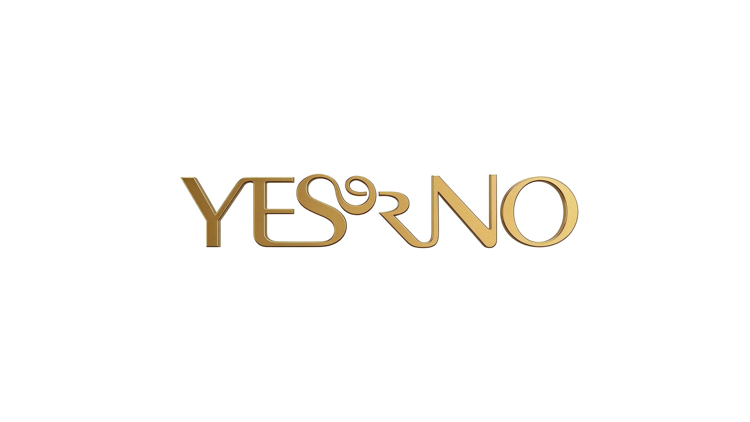
YES or NO is an affordable luxury jewelry and accessories brand for urban fashionable women. With the brand philosophy of "choice is attitude", it encourages every woman to show her own style and independent personality in every decision in life.
The brand name "YES or NO" itself is a proposition full of dramatic tension - between affirmation and denial, it is a woman's bold expression of life, beauty and self. Qingmei Future was commissioned to lead the brand identity design.
The design goal of the brand logo is to demonstrate the high-end positioning of YES or NO as an affordable luxury fashion brand through the ultimate sense of fashion, jewelry craftsmanship and artistic visual language, and to convey the brand personality of "exquisite, elegant, independent and courageous"
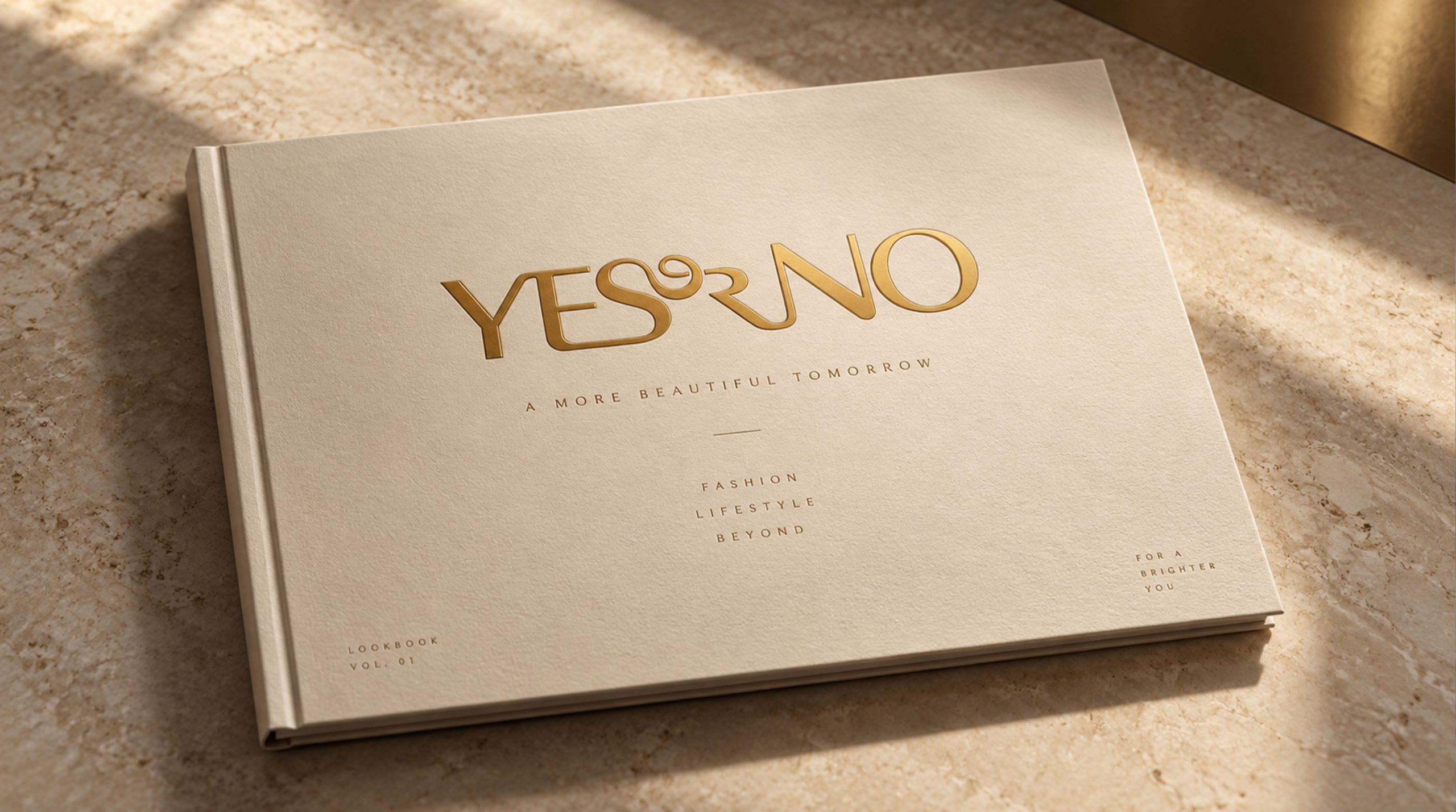
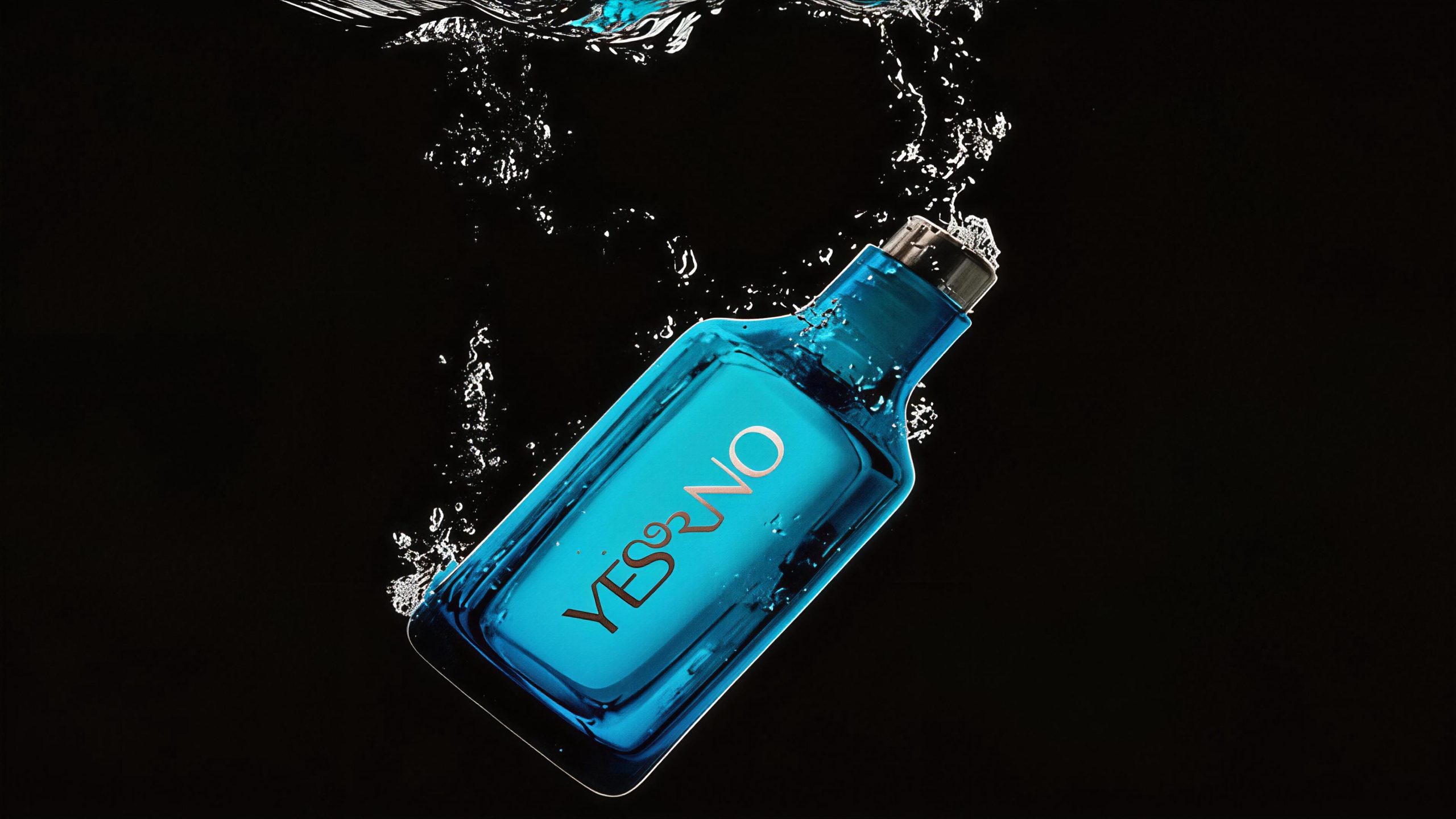
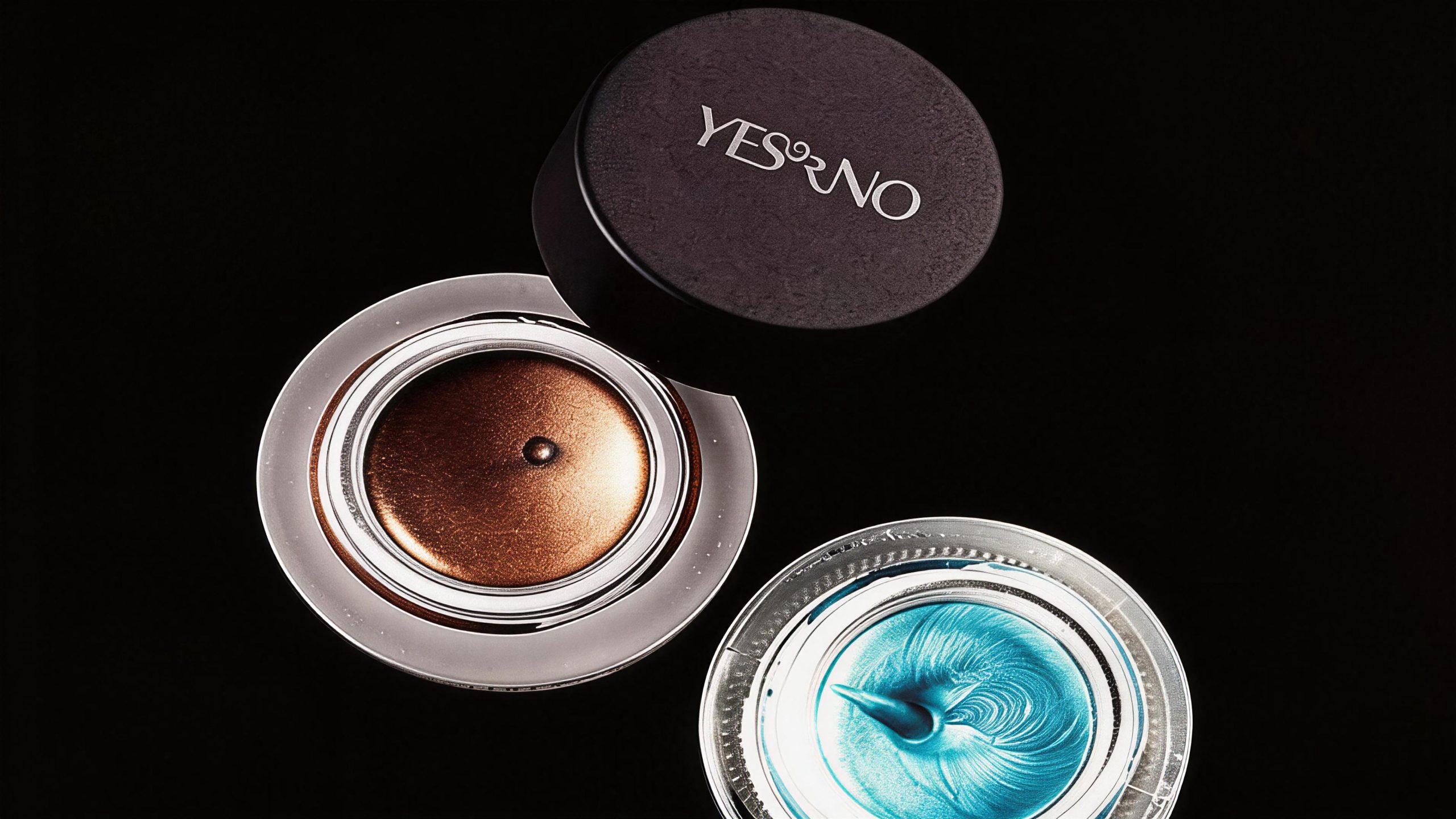
Design concept and graphic language
The logo takes "Typography as Jewelry" as its core concept, reshapes the font form of "YES or NO" in an artistic way, and transforms the brand name itself into a piece of exquisite and elegant visual jewelry. The design focuses on expressing the sense of fashion, and boldly artistically handles the middle part of the letters - the letters are intertwined, connected, and interspersed with each other in smooth curves, like a delicate and elegant necklace that winds and unfolds, wrapping around the heart, and the sense of fashion emerges. The overall design uses a pure word mark as the only visual element without any additional graphic symbols, embodying the minimalist luxury concept of "font is the brand, and the brand is the accessory".
The three letters "YES" are in capital form, with tall and slender strokes and a broad and powerful structure, conveying the brand attitude of affirmation, courage and confidence. The two strokes of the word "Y" open upward at a sharp angle, like the V-shaped jewelry silhouette at the neckline; the three horizontal strokes of the word "E" are arranged at equal intervals, with a rigorous structure yet elegant; the end of the word "S" naturally extends a soft curve, and smoothly transitions to the right into the starting stroke of "or", forming an organic connection between the letters. "or" is written in lowercase cursive, with slender and soft strokes and winding curves, like the most delicate buckles and decorative knots on a necklace, injecting a ray of softness and romance into the strength of the capital letters. The connection between "o" and "r" forms an elegant spiral loop, just like a gold wire buckle in jewelry craftsmanship. It is the most recognizable and artistic visual focus in the entire logo. The word "NO" returns to its uppercase form, and the diagonal stroke of the "N" runs through it with a sharp diagonal line, conveying the same bold attitude in negation; the word "O" wraps up the whole situation with a perfect circle, just like the round pendant at the end of the necklace, drawing an elegant end to the entire "font necklace". From "YES" to "or" to "NO", the size, thickness, and straightness of the letters form a carefully arranged rhythmic change, just like beads of different sizes on a necklace connected in series, showing the exquisite rhythm and wearability of jewelry as a whole. The overall composition uses the uniqueness of special-shaped fonts to construct "text jewelry" to convey the brand's fashion edge and craftsmanship quality.
Font composition and color system
The font design of the logo itself is the core creative asset of the brand. The uppercase letters use a customized high-contrast serif base, with distinct changes in stroke thickness—the vertical strokes are slender and slender, the horizontal strokes are light and elegant, and the font proportions are narrow to high, showing a slender figure and elegant temperament like high fashion. The floral part of the lowercase "or" is composed of free handwritten curves. The strokes are continuous and undulating, forming a dialog between sensibility and rationality with the rational structure of the capital letters, giving the brand a multi-faceted character. The special-shaped processing of the letters makes the entire wordmark unable to be copied by any standard font library. It has extremely high uniqueness and anti-counterfeiting value, and has become an irreplaceable visual gene of the brand.
The main color is luxury gold #B8943E → #D4AF60, which is the only color used in the logo, representing light luxury quality, exquisite craftsmanship and fashionable taste. Gold is presented with a matte texture to avoid the cheap feeling of excessive shine, and conveys the brand style of "low-key luxury" with restrained and restrained luster. The color temperature of gold is warm, between rose gold and classic gold, which is in line with the mainstream aesthetic trend of contemporary fashion jewelry. In practical applications, the logo supports metal hot stamping, embossed embossing, laser engraving and other high-end processes, making the word mark truly have a jewelry-like material touch on the physical medium. Auxiliary dark gold #8A6D2F is used for application variations of the logo on a dark background to maintain the recognition of the golden tone; pure black #000000 and pure white #FFFFFF are used as standard background colors to set off the high-end texture of the gold wordmark with the purest black and white contrast. The overall color system is run through with a single golden color, reflecting the ultimate fashion positioning of "one color is luxury, one word is decoration".
Application extension and brand significance
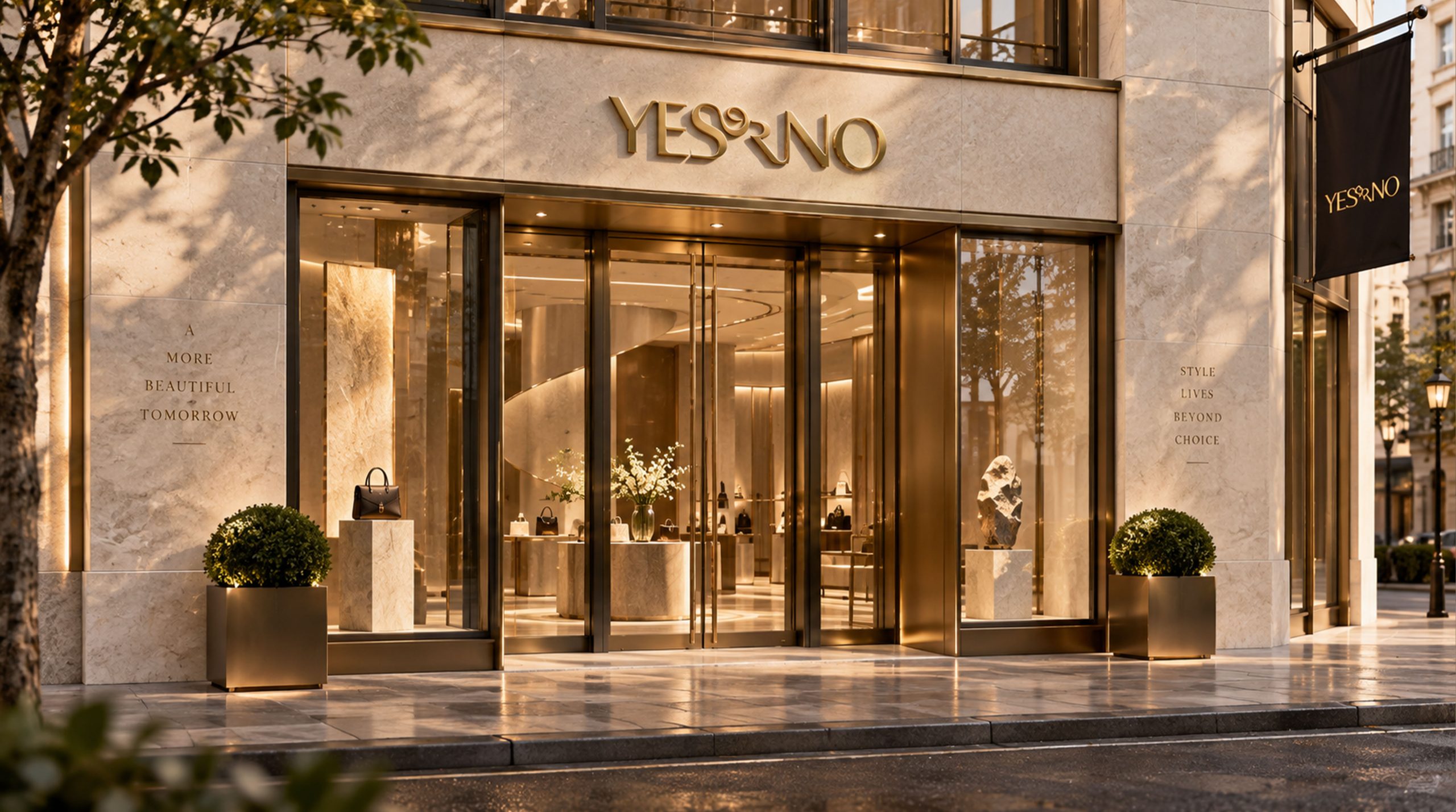
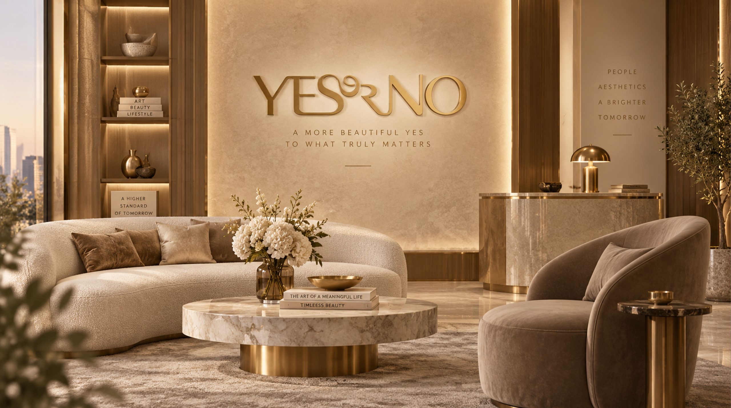
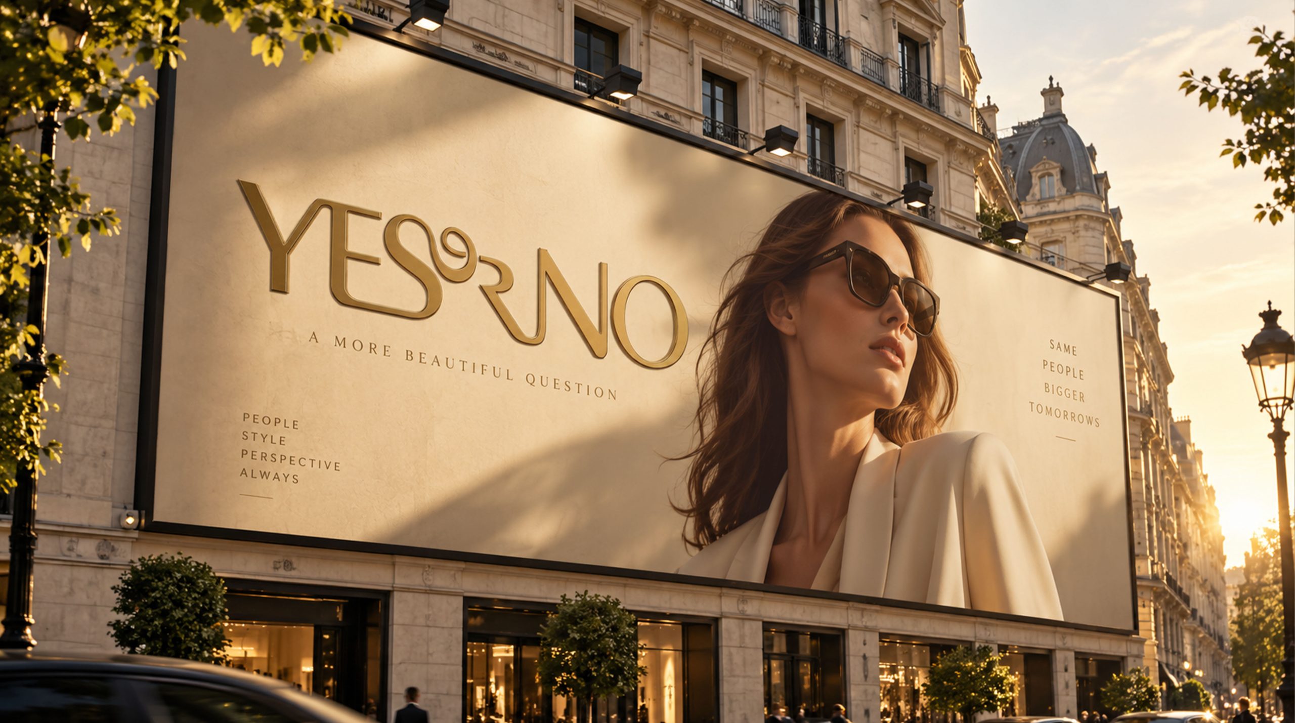
The logo has strong system scalability and can be widely used in jewelry product packaging boxes, velvet bags, hangtags and quality certificates; brand flagship store doors, window displays, counter nameplates and shopping bags; brand official websites, e-commerce details pages, social media images and fashion magazine advertisements; new product launches, fashion week co-branded activities, buyer stores and high-end shopping mall pop-up images; VIP membership cards, brand manuals, limited co-branded gift boxes and fashion peripheral accessories. In the dynamic vision, the golden letters can be formed one by one, wound and connected like gold wires, and the final spiral loop of "or" is elegantly rotated and shaped, symbolizing the final delicate closure of a necklace at the fingertips. The spiral pattern of "or" can be independently extracted as a brand super symbol, which can be used as a brand imprint in pattern systems, packaging dark patterns, store decorations and digital interfaces.
The logo contains the three core images of the YES or NO brand: Fashion Attitude (Fashion Attitude) - the uniqueness and artistic treatment of the special-shaped font conveys the brand's ultimate pursuit of fashion and avant-garde expression; Jewelry Craft (Jewelry Craft) - the golden wordmark is wrapped around like an exquisite necklace, using the font itself to interpret the craftsmanship aesthetics of the jewelry brand; Bold Choice (Bold Choice) - the brand proposition of "YES or NO" encourages every woman to choose herself and define her style with a bold attitude. The overall design conveys YES or NO's brand vision of "defining attitude through choice and expressing oneself through fashion".
Improper Usage (Protection Specification)
Do not change the connection method, curvature or winding relationship between letters; do not modify the shape or position of the "or" spiral loop; do not change the hue, brightness or metallic texture of the main color of luxury gold; do not replace customized special-shaped wordmarks with standard fonts; do not Add strokes, shadows, gradient light effects or texture overlays to the logo; do not rotate, tilt or split "YES", "or" and "NO" into independent elements; keep the white space around the logo no less than 25% of the height of the wordmark; the minimum display width must not be less than 35mm.
design results
After the release of the logo, YES or NO's brand recognition and fashion influence in the field of affordable luxury jewelry and fashion accessories have significantly increased. The "special-shaped golden word mark", with its unique visual language that is as delicately wound as a necklace, has become the core identification symbol of the brand system, which is extremely unique and memorable. The logo is widely used on product packaging, brand stores, fashion magazines and social media, showing the brand vision of "fashionable boldness, sophistication and elegance".