










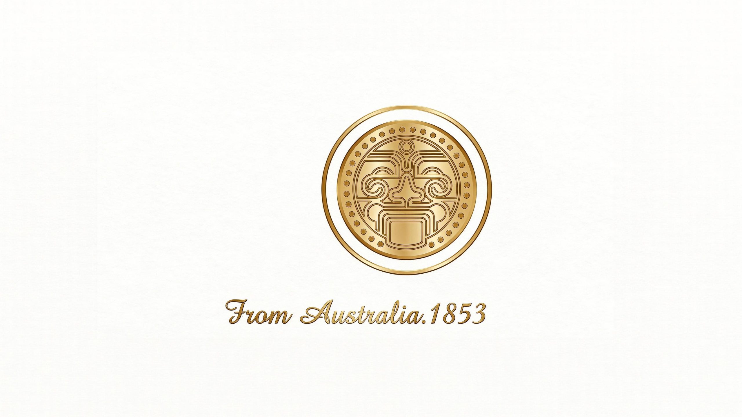
The AOZ brand originates from Australia and was founded in 1853. It carries a century-old history and the original vitality of the southern hemisphere continent.
The brand is based on Australia's pure nature and Aboriginal culture, and is committed to bringing Australian quality to the global market and establishing a high-end brand image with both cultural depth and international vision.
The design goal of the brand logo is to demonstrate the high-end positioning of AOZ as a century-old brand originating from Australia through the visual language of history, quality and cultural depth, and to convey the brand temperament of "original power, modern beauty, and international quality".
Design concepts and language graphics
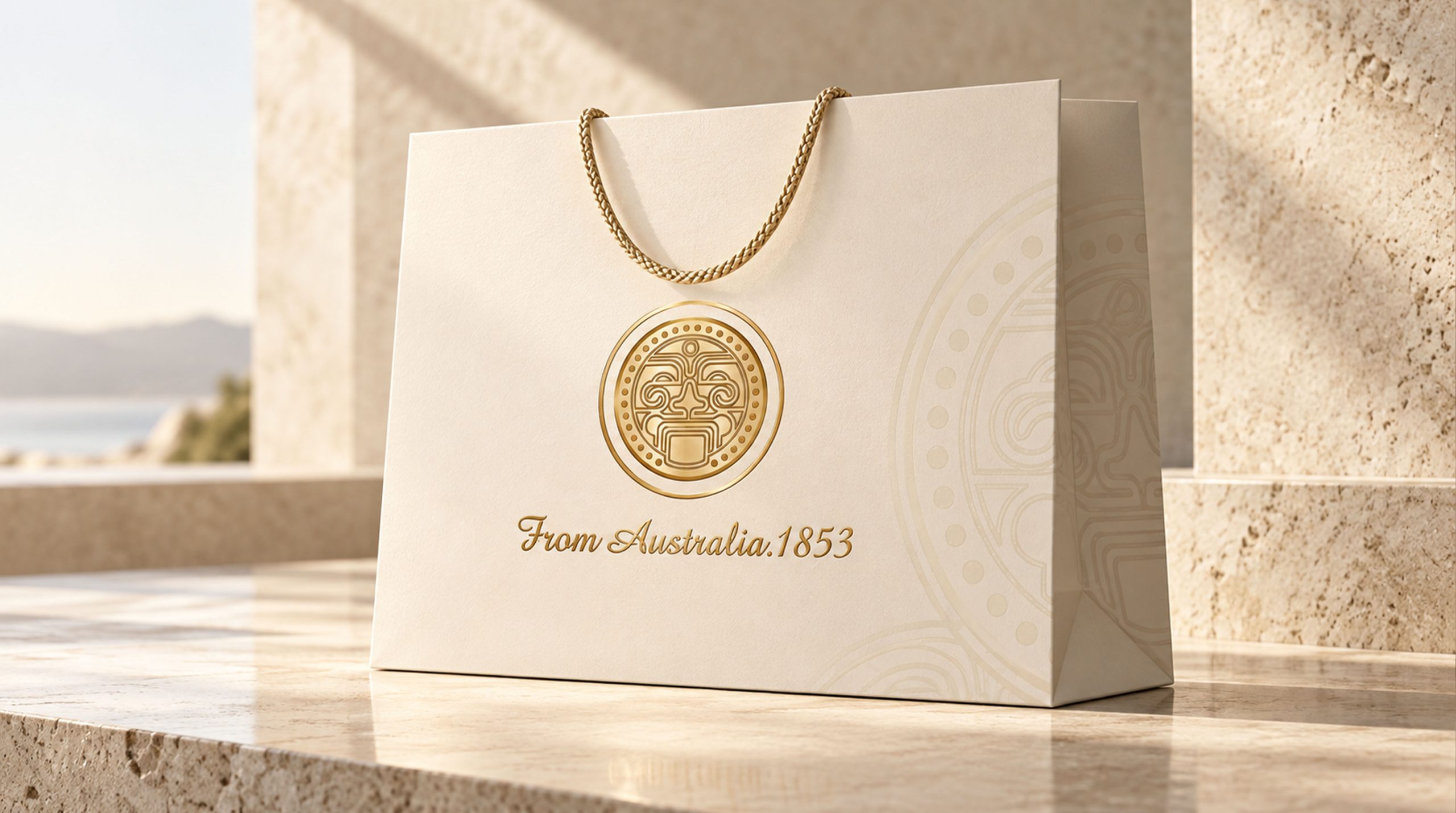
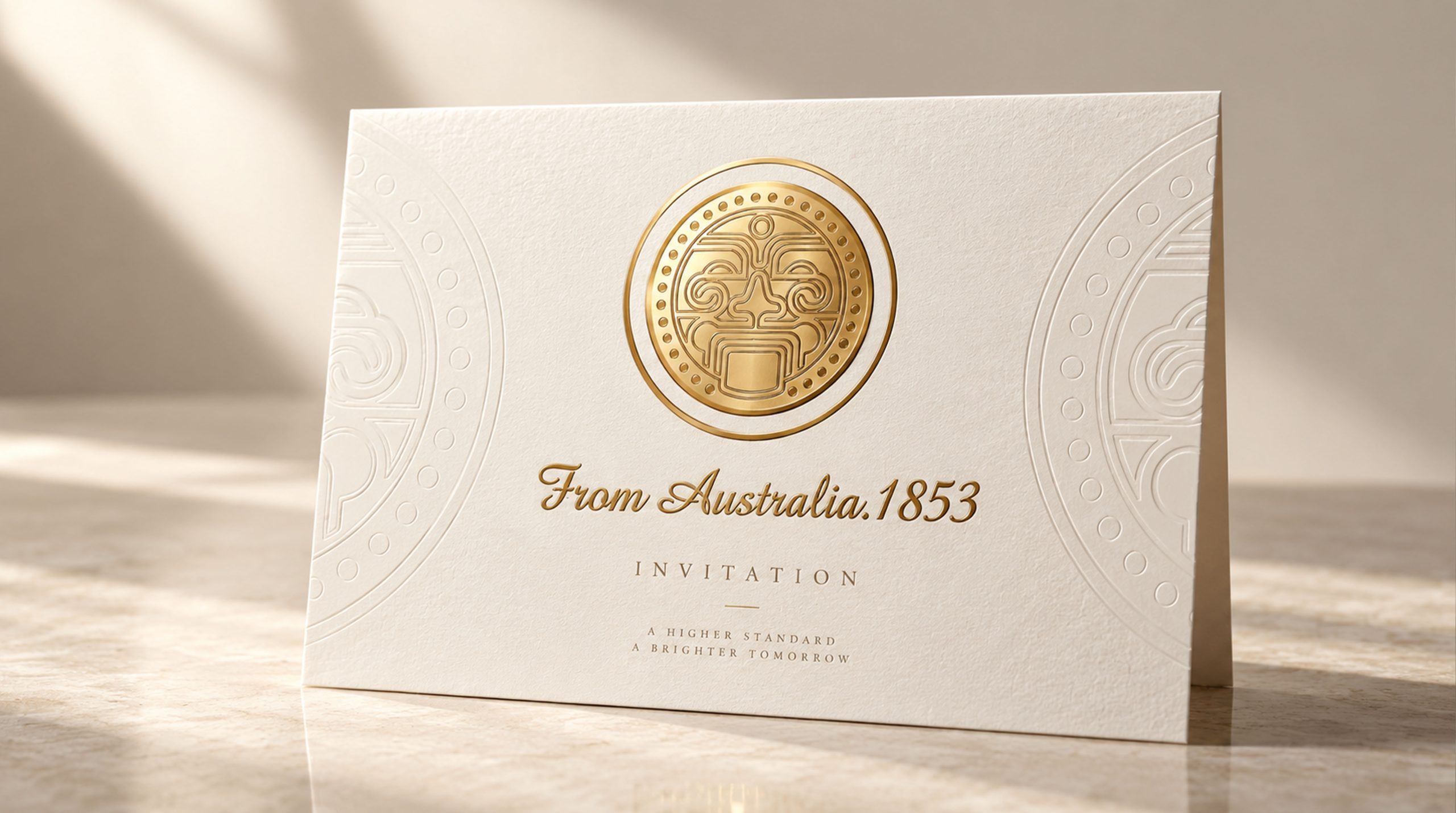
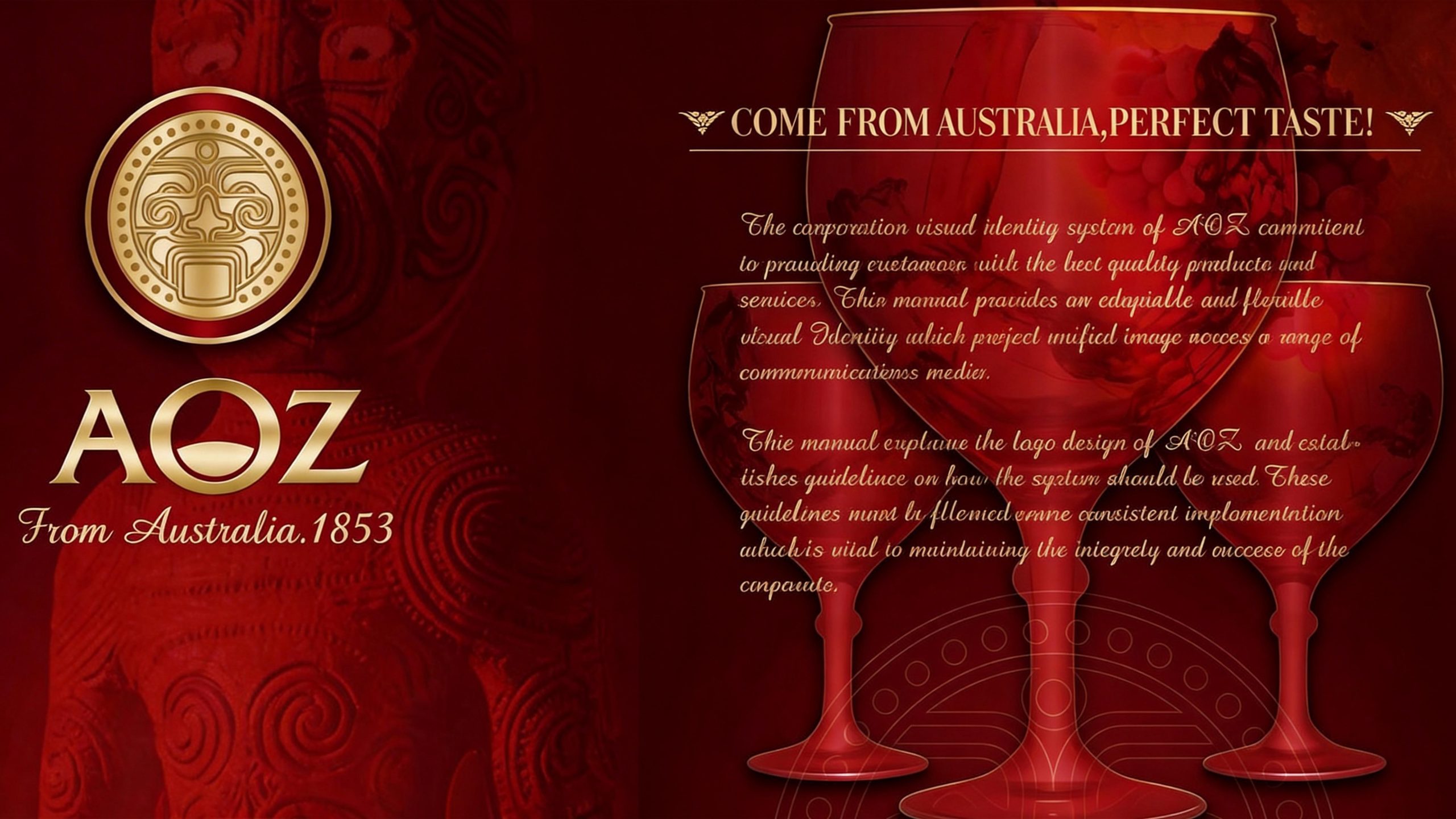
The logo takes "Australian Aboriginal Totem" as the core concept, with a golden circular badge as the main body, and embedded with a highly summarized and refined Aboriginal mask totem. The totem shape is derived from the masks of gods in Australian Aboriginal art. The symmetrical curly lines and geometric facial features form a solemn and mysterious visual center, implying "the power and wisdom originating from the depths of the earth". The overall design integrates the original vitality of ancient totems with the exquisite quality of modern brands, reflecting the dual attributes of AOZ brand between cultural heritage and international expression.
The circular badge structure symbolizes integrity, eternity and quality commitment, while echoing the classic shapes of gold coins and seals, conveying the authority and trust of a century-old brand; the totem mask uses symmetrical rolling patterns to construct the facial contour, and the eyebrow arch, nose and mouth lines are intertwined layer by layer, retaining the mysterious tension of aboriginal totem art. , and gives it an elegant decorative beauty through the simplification of modern lines; the edge of the badge is surrounded by a circle of uniform dots, like the bead arrangement in tribal ceremonies, enhancing the ritual sense and solemnity of the totem; the double-layered golden ring wraps the main body of the badge, strengthening the brand's high-end texture and systematic visual order. The overall composition uses rigorous symmetrical geometry and rich curve details to build a "cultural badge" to convey the brand's historical depth and quality commitment.
Font composition and color system
The English "From Australia.1853" adopts the classic Italian italic writing style, with smooth and elegant strokes and extended fonts, conveying the brand's sense of history, international quality and gentlemanly temperament. "AOZ" is the secondary identification point of the logo. The font is grand, concise and international. It is presented in steady sans-serif capital letters. The strokes are straight and the structure is open, establishing the international sense of quality and trust of the Oz brand. The combination of the italicized origin label and the year number points out the brand's Australian origin and century-old heritage, forming a classic brand endorsement structure of "origin + historical year".
Main color quality gold #C5943A → #E8C76A As the absolute main color of the logo, it represents high-end quality, historical accumulation and precious value. The golden relief texture gives the totem a metallic thickness and luster; dark gold #8B6914 is used to depict the dark parts and details of the totem lines, enhancing the relief level and three-dimensional depth; bright gold #F0D88C Used for high-gloss areas and edge light to enhance the sophistication and craftsmanship of the badge; the dark brown background #3A2815 supports the golden body in dark background applications, symbolizing the heaviness and original power of the Australian earth. The overall color system is run through a single golden color, reflecting the high-end positioning of "century-old brand, golden quality", different from the colorful fast-moving consumer brand style, and conveying AOZ's restrained, noble and trustworthy brand proposition.
Application extension and brand significance
The logo has strong system scalability and can be widely used in product packaging, bottle labels, gift box embossing and sealing stickers; brand flagship store fronts, counter displays, shopping guide materials and shopping bags; brand official websites, e-commerce details pages, social media visual images; high-end tastings, industry exhibitions, and international trade fair backgrounds. In the dynamic vision, the golden badge can present a rotating relief effect, and the totem details are displayed in the flow of light and shadow, symbolizing the lasting vitality of the brand's century-old heritage. Totem patterns can be extended into visual mother elements and used for packaging shading, membership card surfaces, brand pattern systems and high-end gift customization.
The logo contains the three core images of the AOZ brand: Cultural Heritage - Aboriginal totems represent the profound heritage of Australian Aboriginal culture and the spiritual origin of the brand; Centennial Quality - the golden badge and the 1853 vintage convey the brand's time-tested quality commitment; Global Trust - the classic fonts and modern totems are refined to show the brand's sense of quality and trust for the global market. The overall design conveys AOZ's brand vision of "originating from Australia, century-old quality, and global trust".
Improper Usage (Brand Guidelines)
Do not change the line structure, symmetry relationship or detail proportion of the totem mask; do not modify the hue, brightness or gradient level of the main gold color; do not replace the relief texture effect with flat color blocks; do not rotate, tilt or separately extract the partial lines of the totem for use; keep the white space around the logo not less than 25% of the diameter of the badge; the minimum display width must not be less than 30mm.
design results
After the release of the logo, AOZ's brand recognition in the fields of high-end consumer goods and international trade has significantly improved. "Golden Totem Badge + Australian Origin Endorsement" has become the core visual identity symbol of its brand system. It is widely used in product packaging, international exhibitions and brand flagship stores, demonstrating the brand vision of "Origin from Australia, Quality for a Century".