










Changbai Mountain International Resort is located in the hinterland of the Changbai Mountains in Jilin Province, China. Relying on Changbai Mountain's world-class natural ecological resources and profound regional cultural heritage, it creates an international comprehensive tourism and vacation destination that integrates mountain vacations, ice and snow sports, hot spring health care, and cultural experiences.
The brand adheres to the development concept of "the blending of natural beauty and cultural charm" and is committed to presenting global travelers with a spiritual residence that combines elegant taste and native ecology.
The design goal of the brand logo is to use a modern and grand design style and a fashionable and elegant color system to fit the characteristics of the tourist resort itself, highlight the elegant taste and unique design concept, reflect the artistic taste and elegant layout of Changbai Mountain International Resort, and convey cultural literacy with unique new tourism connotations.
Design concepts and language graphics
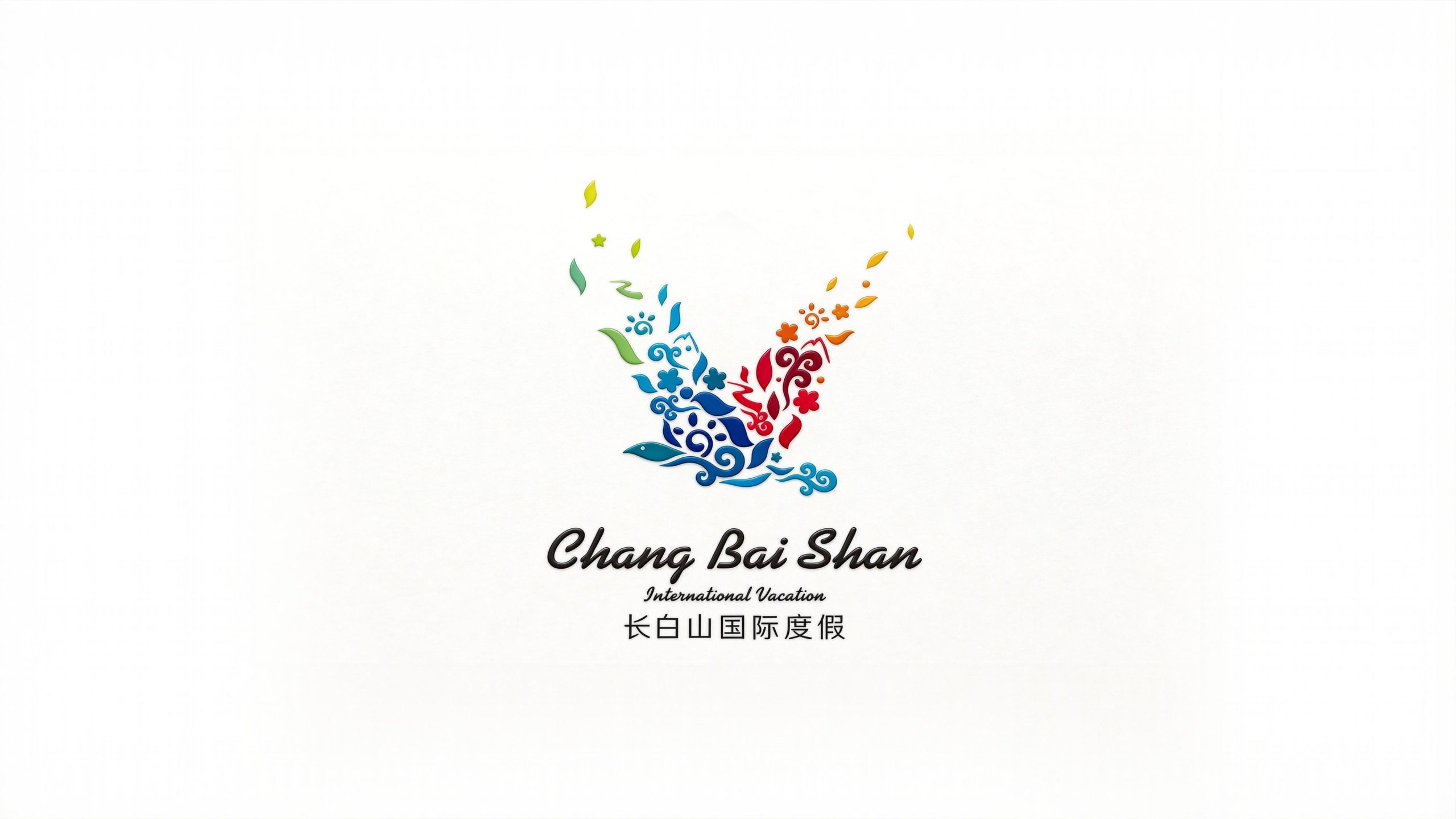
The logo takes "Blossom in Flight" as the core concept and uses an abstract bird with wings spread as the main graphic. The bird's body is not depicted realistically, but is made up of dozens of natural and cultural elements - flowers, branches and leaves, cirrus clouds, swimming fish, water patterns, stars - to create an organic whole full of vitality and cultural connotation. The bird spreads its wings and soars upwards, and the petals and leaves at the tips of the wings naturally float away like colorful fragments, which means "all things in nature come together as one, and cultural connotations spread their wings and fly high". The overall design integrates the original natural ecology and regional cultural symbols of Changbai Mountain into a smart and elegant graphic, reflecting the dual attributes of the resort between natural beauty and humanistic charm.
The overall shape of the flying bird symbolizes the yearning for freedom, distance and travel, and conveys the openness and lofty vision of the resort to the international market with its spread-wing posture; the left wing of the bird body is mainly blue, incorporating elements of curling clouds, water ripples and swimming fish, symbolizing the natural charm of the clear water of Changbai Mountain Tianchi, mountain streams and winter ice and snow; the right wing is mainly warm colors, gathering flowers, petals and vine patterns Like this, it symbolizes the blooming of flowers, ecological prosperity and cultural youth of Changbai Mountain in all seasons; the leaves and petals at the tips of the wings float into the air, gradually changing from green to golden, just like the flying autumn leaves, conveying the poetry of time in the changing seasons and the rich layers of vacation experience; the curling blue auspicious cloud pattern at the bottom holds up the whole flying bird, which is not only a modern interpretation of the traditional oriental cloud pattern, but also hints at the fairyland image of Changbai Mountain shrouded in clouds and mist. The overall composition uses free and flexible collage aesthetics to construct the "bird of all things", conveying the brand's natural heritage and cultural style.
Font composition and color system
The English "Chang Bai Shan" uses an elegant serif writing style, with smooth and stretched strokes and a gentle arc when rising and closing the pen, conveying the elegance and international aesthetics of the resort brand. "International Vacation" is arranged in slim Italian italics below the main title. The font is light and restrained, highlighting the brand's international vacation positioning. The Chinese "Changbai Mountain International Resort" is presented in modern Song font, with thin horizontal strokes and thick vertical strokes, and a dignified structure. While maintaining the traditional cultural charm, it echoes the Chinese and Western styles with the English serif font. The overall font system strikes a balance between elegance and modernity, ensuring the brand’s dual applicability in travel communication and high-end business scenarios.
Color-wise, the logo uses the full natural spectrum from cool to warm. Changbai Blue #0068B7 → #00A4E4 is used as the main color on the left wing, representing the clear water of Tianchi, the crystal clear ice and snow, and the clear mountains. The depth and purity of blue convey the spiritual beauty of Changbai Mountain’s world-class natural ecology; Mountain Flower Red #D32F2F → #E65100 is used for the floral elements on the right wing, symbolizing the passion for life, the temperature of culture and the richness of vacation experience; Autumn Leaf Gold #F9A825 → #FDD835 is used for the leaves and petals floating on the wingtips, conveying the poetry of golden autumn time and the elegant style of quality vacation; ecological green #2E7D32 → #81C784 is used for leaves and vine elements, reflecting the ecological foundation and green development concept of the Changbai Mountain original forest; Tianjiqing #00BCD4 is used for the auspicious cloud pattern at the bottom, symbolizing the ethereal connotation of the cloud wonderland and Eastern culture. The overall color system is run through with colorful but not cluttered natural color matching, reflecting the brand temperature of "landscapes with colors and culture with charm", and expressing the deep connotation of the resort with fashionable, elegant and atmospheric colors.
Application extension and brand significance
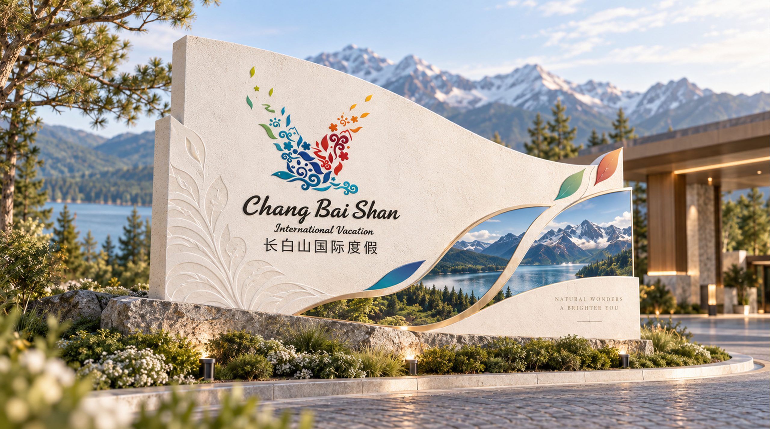
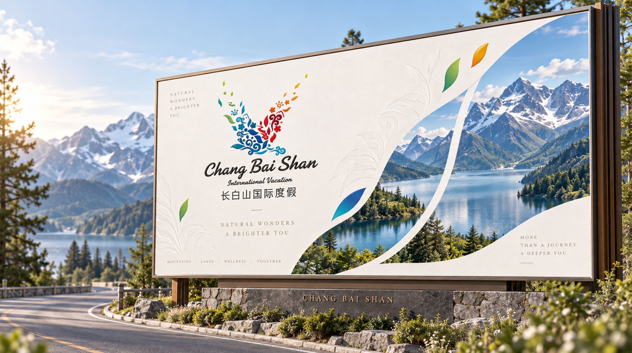
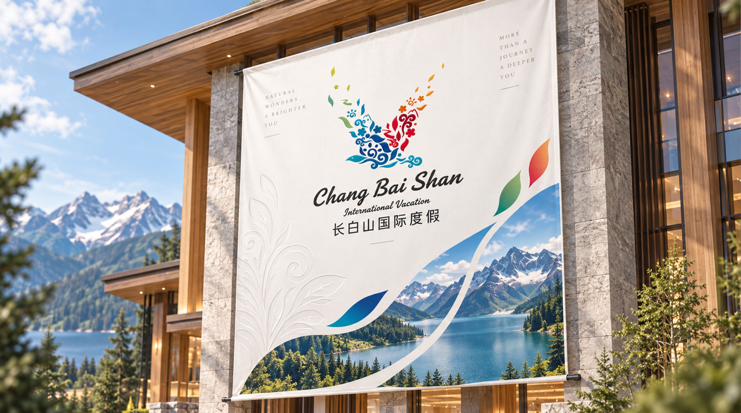
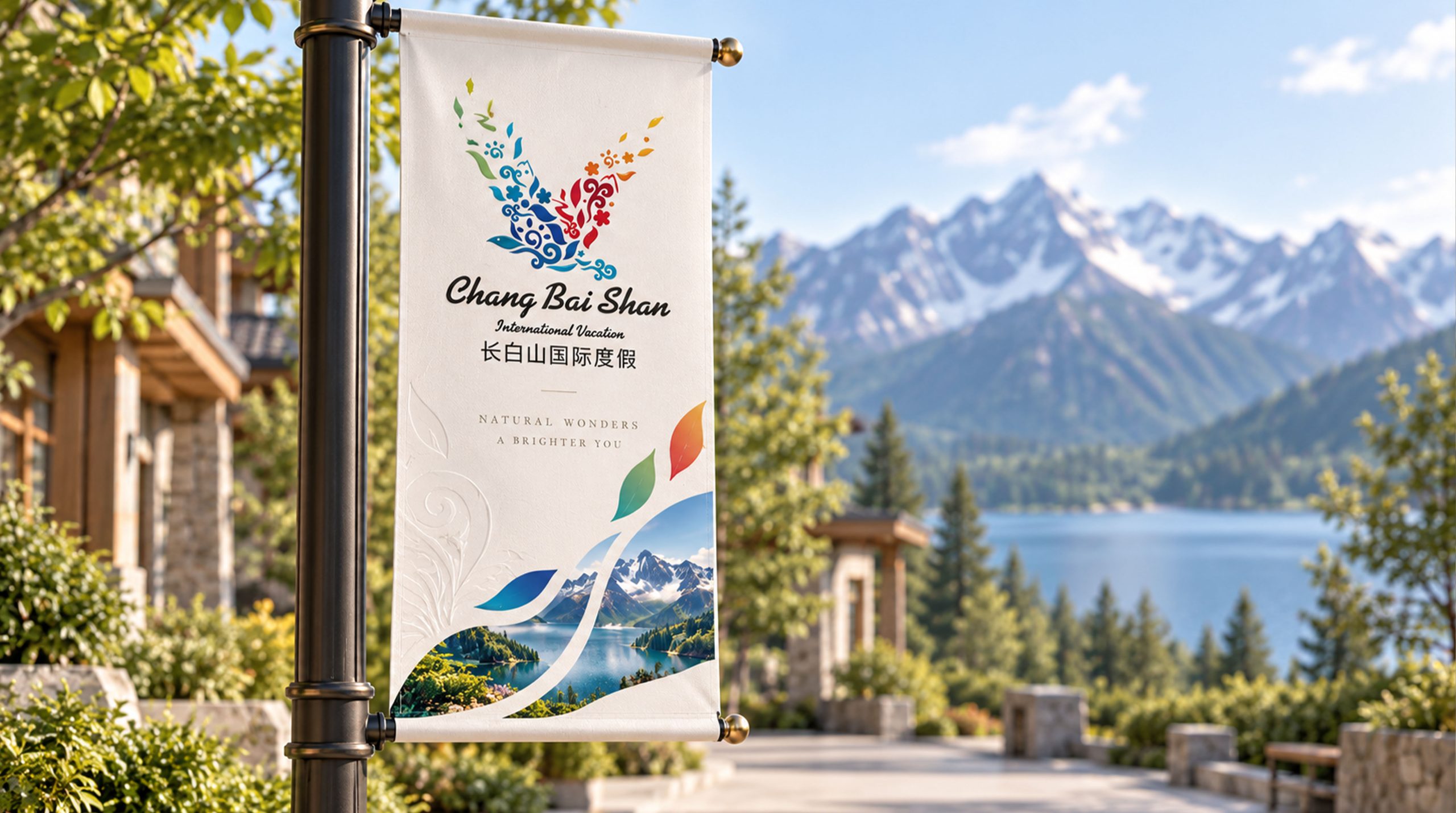
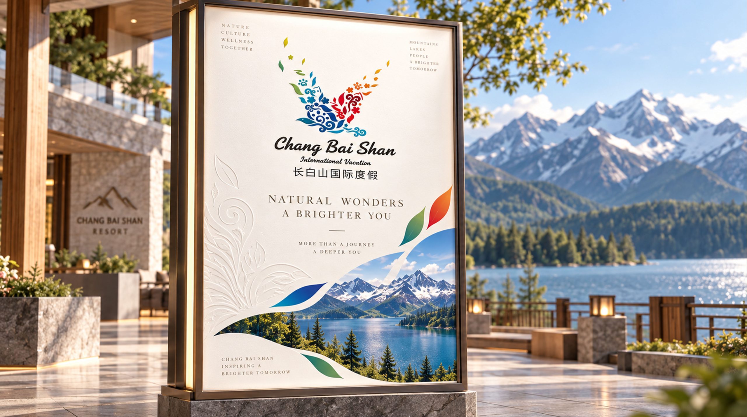
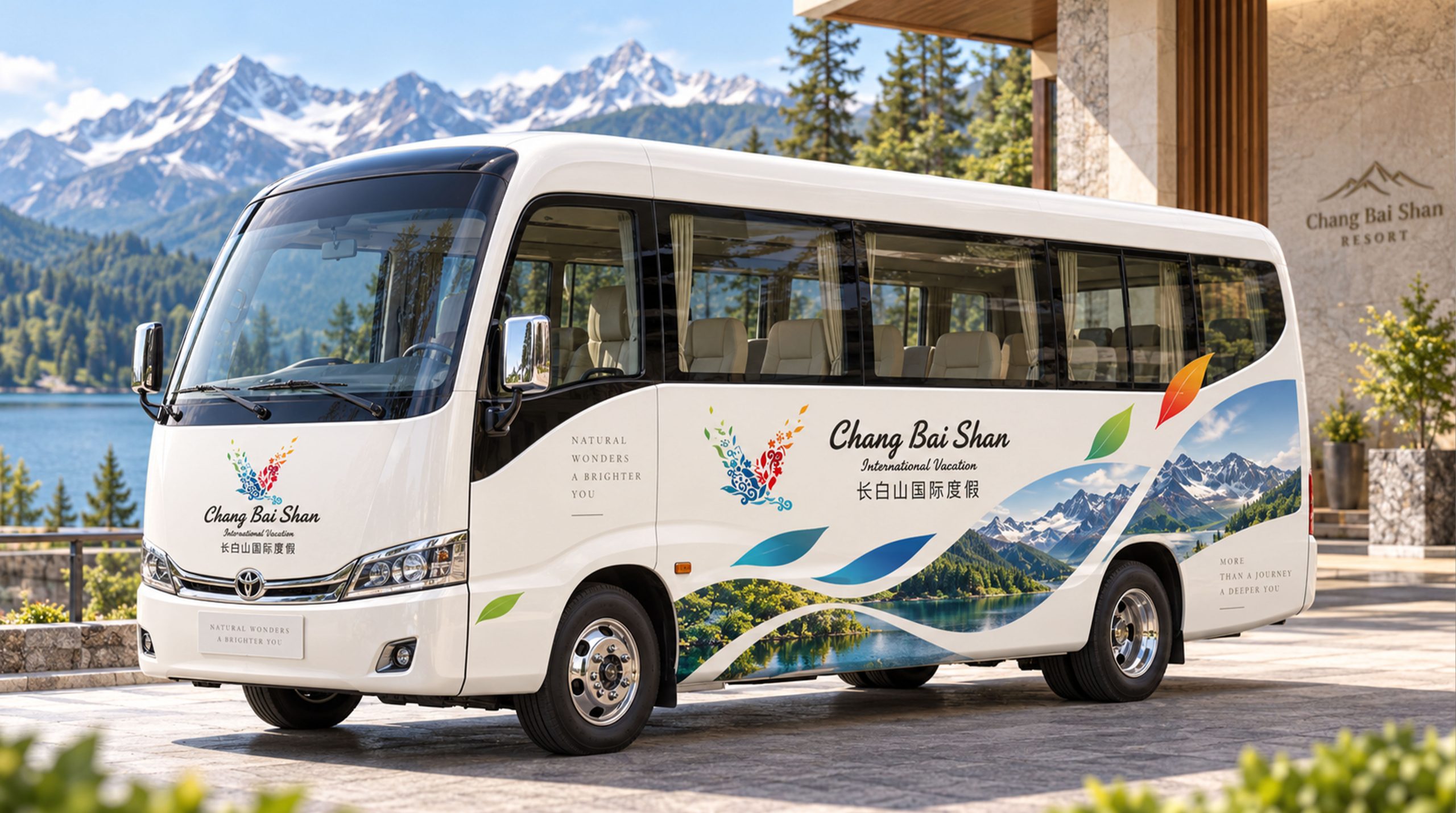
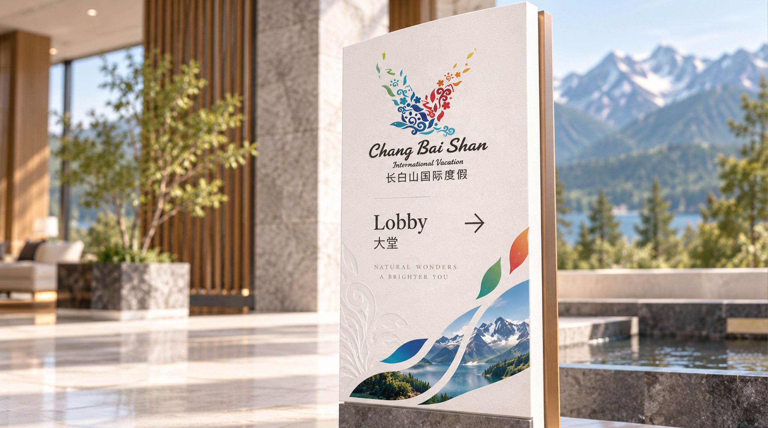
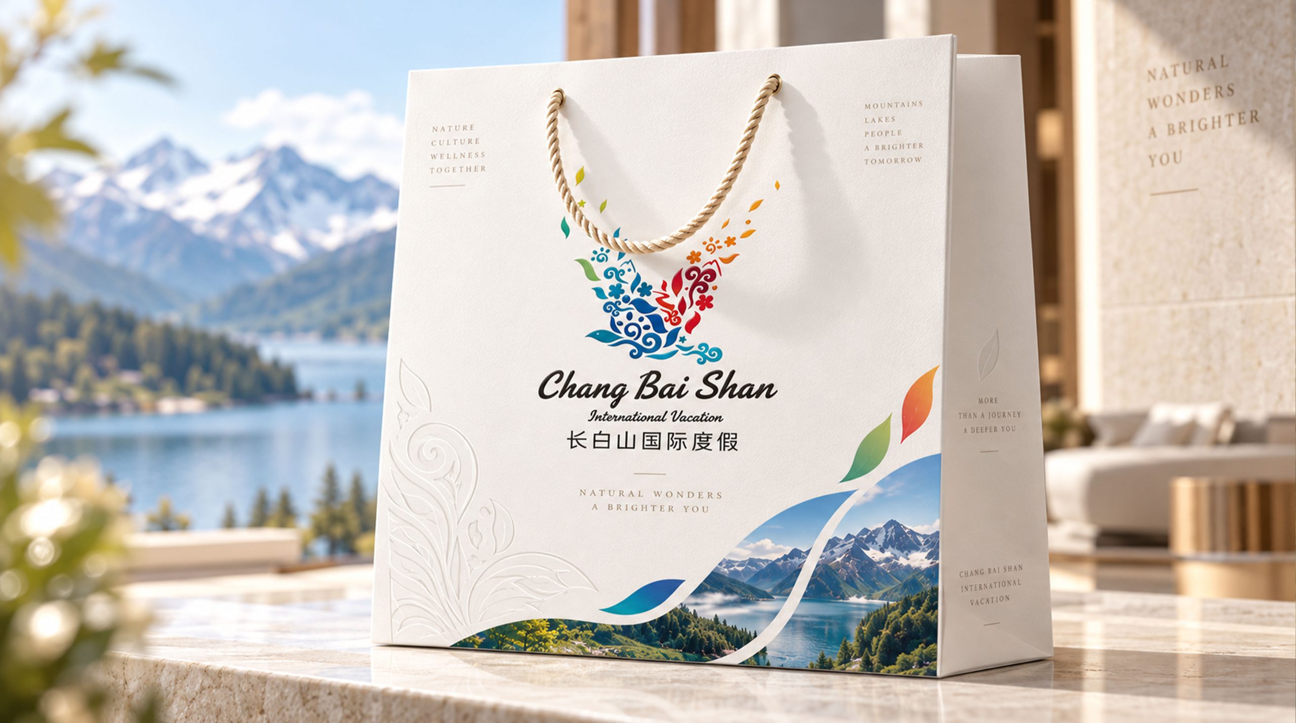
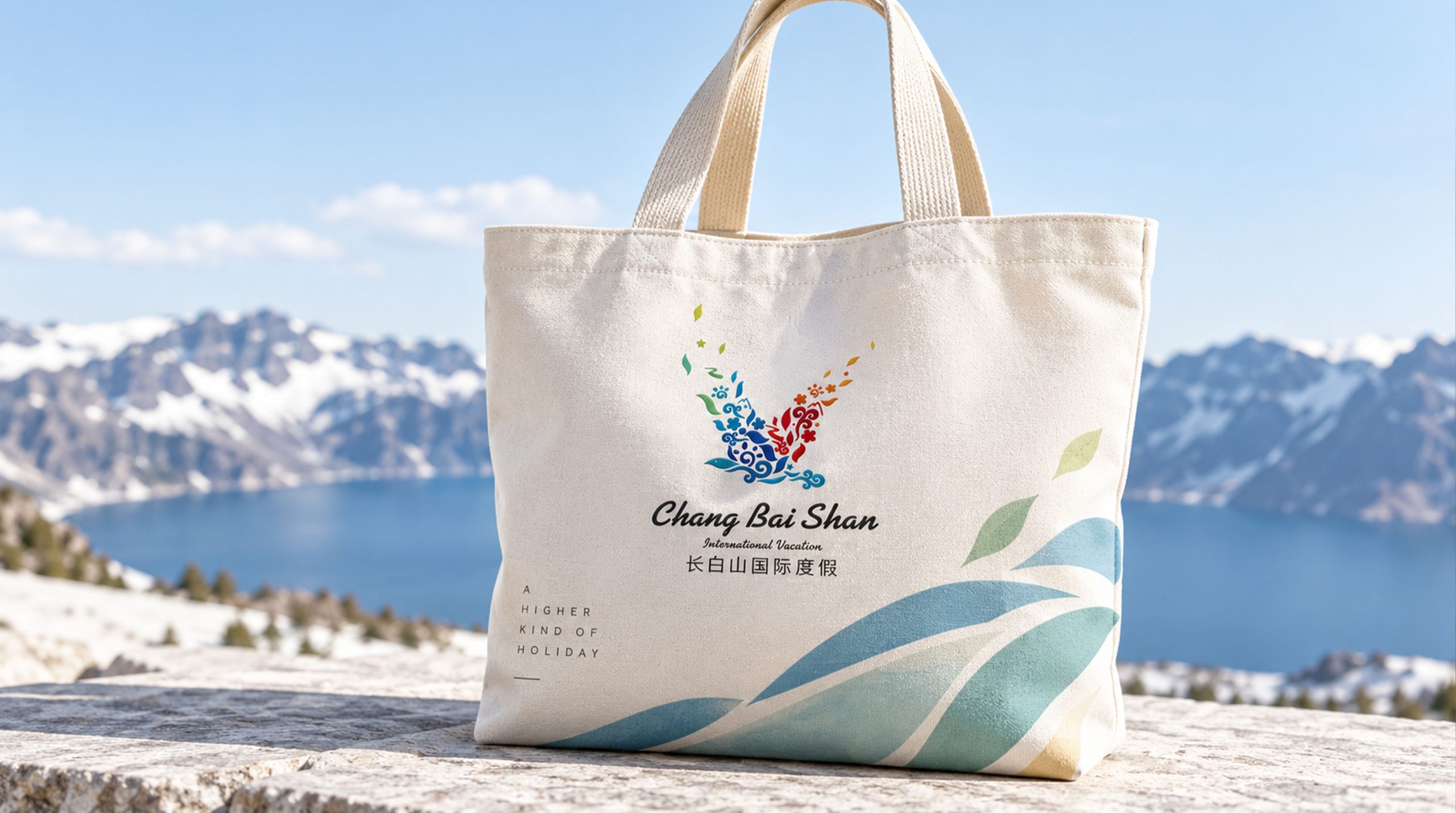
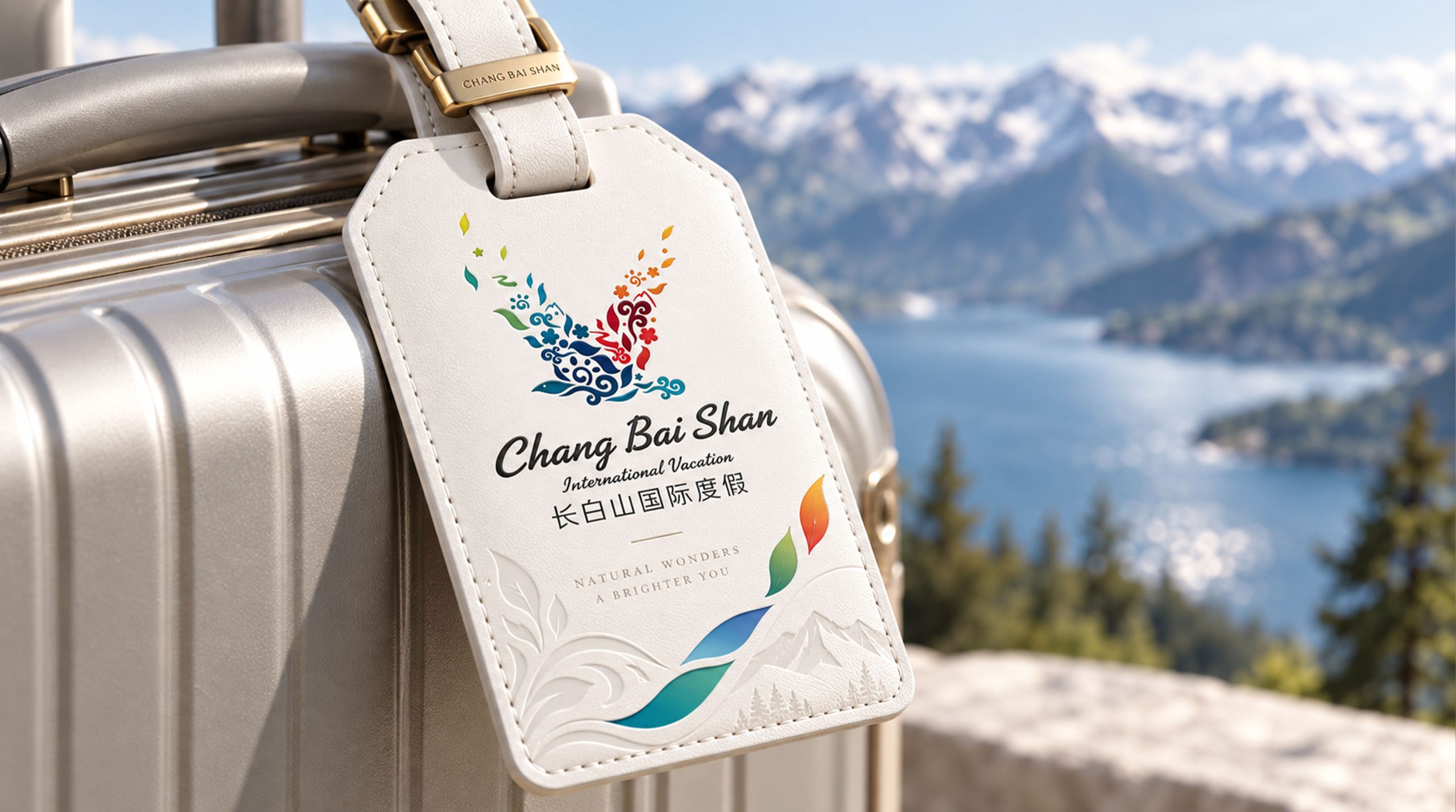
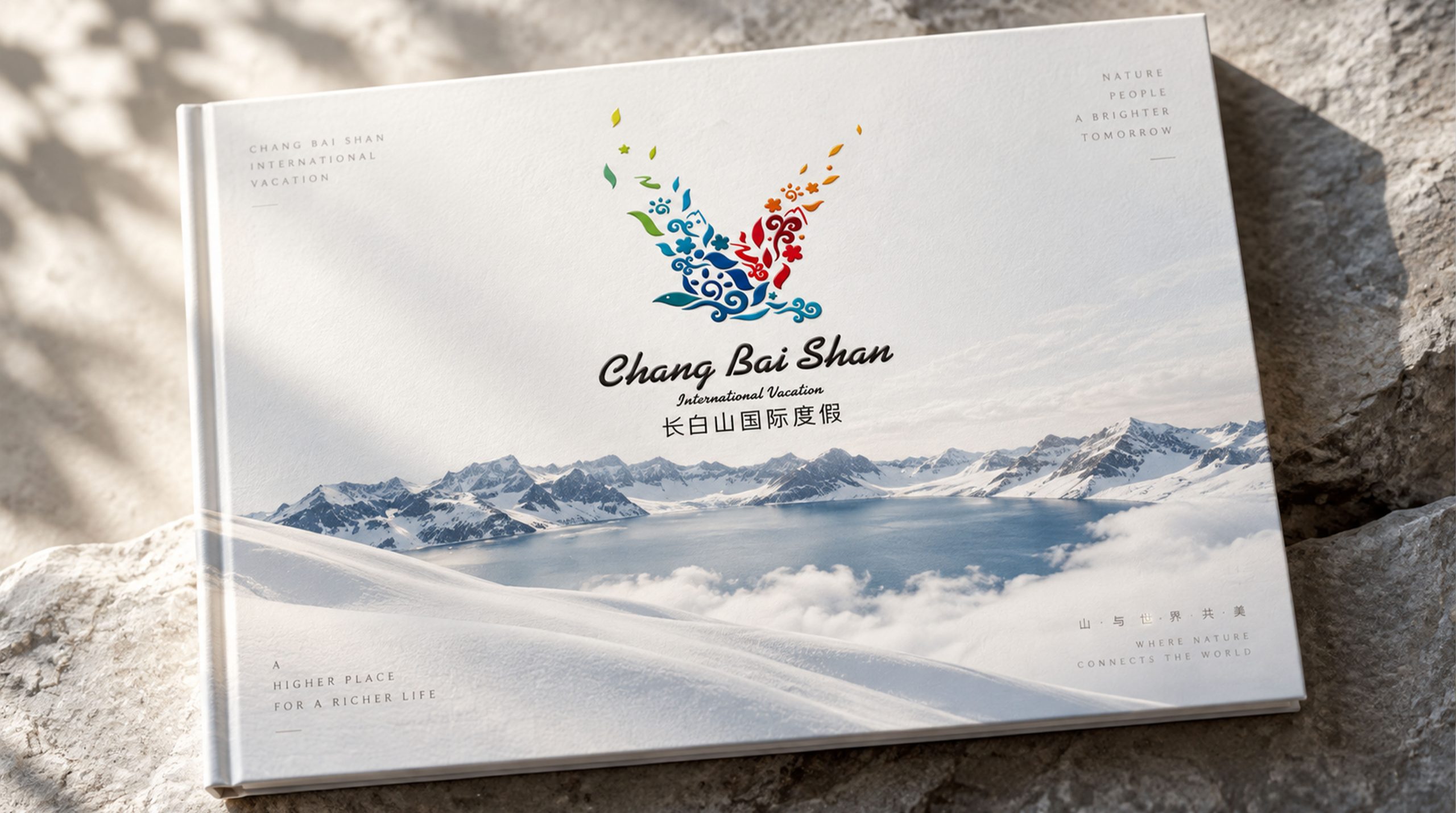
The logo has strong system scalability and can be widely used in resort entrance gates, scenic spot guidance systems, hotel lobbies and guest room supplies; travel brochures, scenic spot tickets, souvenirs and cultural and creative peripheral products; official websites, online booking platforms, social media communication and international tourism promotion materials; tourism expos, international tourism summits, government cultural tourism promotion conference images; environmental visual systems of teahouses, cultural experience halls, hot spring centers and ice and snow sports venues in resorts. In the dynamic visual, various natural and cultural elements can be gathered in sequence and assembled into the shape of a flying bird, and then the flowers and leaves on the wing tips float in colorful colors, symbolizing that travelers will fly away with beautiful memories after harvesting the rich gifts of nature and culture in Changbai Mountain. The flowers, cloud patterns, water patterns and other elements in the flying bird collage can be extracted as visual mother elements, which can be used for environmental decoration patterns, brand pattern systems, seasonal theme visuals and digital interface design.
The logo contains the three core images of the Changbai Mountain International Resort brand: Nature's Spirit - blue water patterns and swimming fish represent the spiritual beauty of Changbai Mountain Tianchi and the original ecology; Cultural Blossom - warm flowers and oriental cloud patterns convey the profound heritage and elegant style of regional culture; Soaring Horizon - flying birds with spread wings symbolize the freedom and fun of the vacation experience and the brand's open vision for the international market. The overall design conveys the brand vision of Changbai Mountain International Resort "Between mountains and rivers, above culture, and a world journey", and reveals the intrinsic cultural quality and artistic taste through the design of the external image.
Improper Usage (Protection Specification)
Do not change the outline proportion, wing angle or element distribution of the overall shape of the bird; do not modify the hue or the direction of the cool and warm gradient of each color area; do not delete or replace the natural and cultural elements inside the bird's body; do not add strokes, shadows, external glow or texture overlay effects to the logo; do not rotate, mirror or extract local elements separately from the overall use of the bird; keep the white space around the logo not less than 25% of the height of the graphic; the minimum display width must not be less than 35mm.
design results
After the release of the logo and overall VI, the brand recognition and cultural style of Changbai Mountain International Resort in the domestic and foreign cultural tourism markets have been significantly improved. With its unique visual language that combines natural spirituality and cultural connotation, "Collage Birds" has become the core identification symbol of the resort's brand system. It is widely used in international tourism promotion, scenic environmental visuals and cultural tourism products, showing a new tourism brand image of "culture, connotation and taste".