










POP KIDS EDUCATION is a children's education brand under New Oriental Education Technology Group. Its training targets children aged 4-14. It is committed to providing Chinese children with an innovative, sunny, educational and entertaining growth experience with an international perspective and a European-oriented education method.
The brand adheres to the educational philosophy of "learning in happiness and growing in learning", integrating rigorous teaching systems and fun interactive methods to create a future-oriented children's education benchmark. Comprehensively enhance the brand's international image and children's affinity.
The design goal of the brand logo is to demonstrate the professionalism of Paopao Children's Education as a leading children's education brand through a childlike, international and European-style visual language. While maintaining the rigorous temperament of children's education, it also satisfies children's lively and entertaining way of educating and enjoying, and creates an innovative, sunny and positive modern brand image.
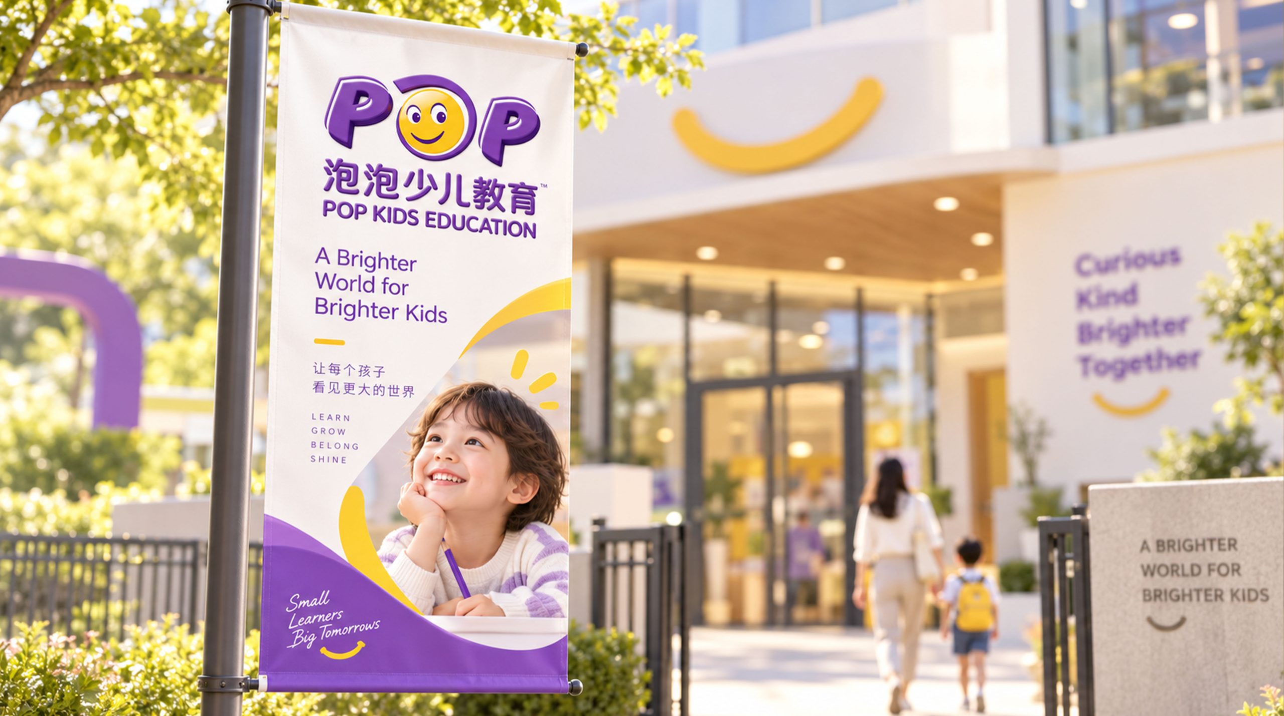
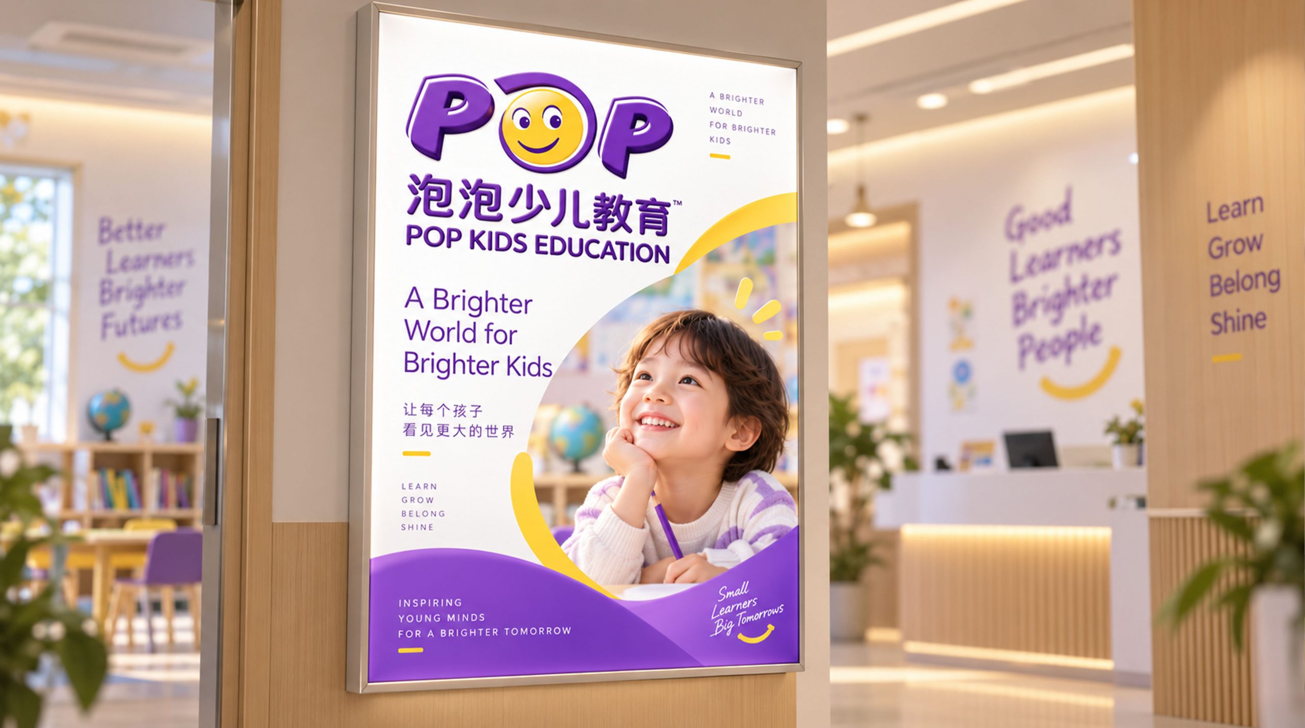
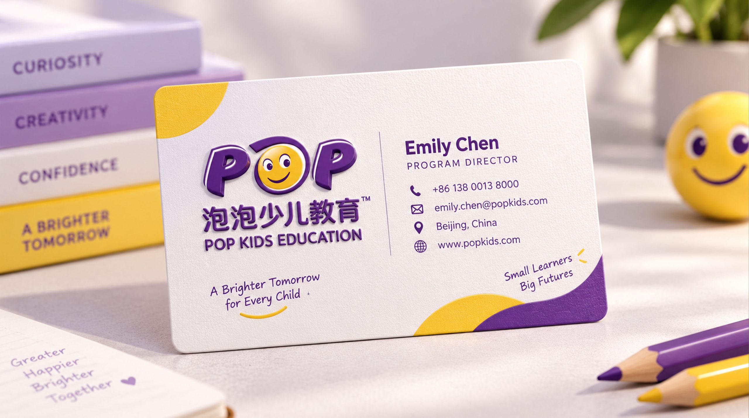
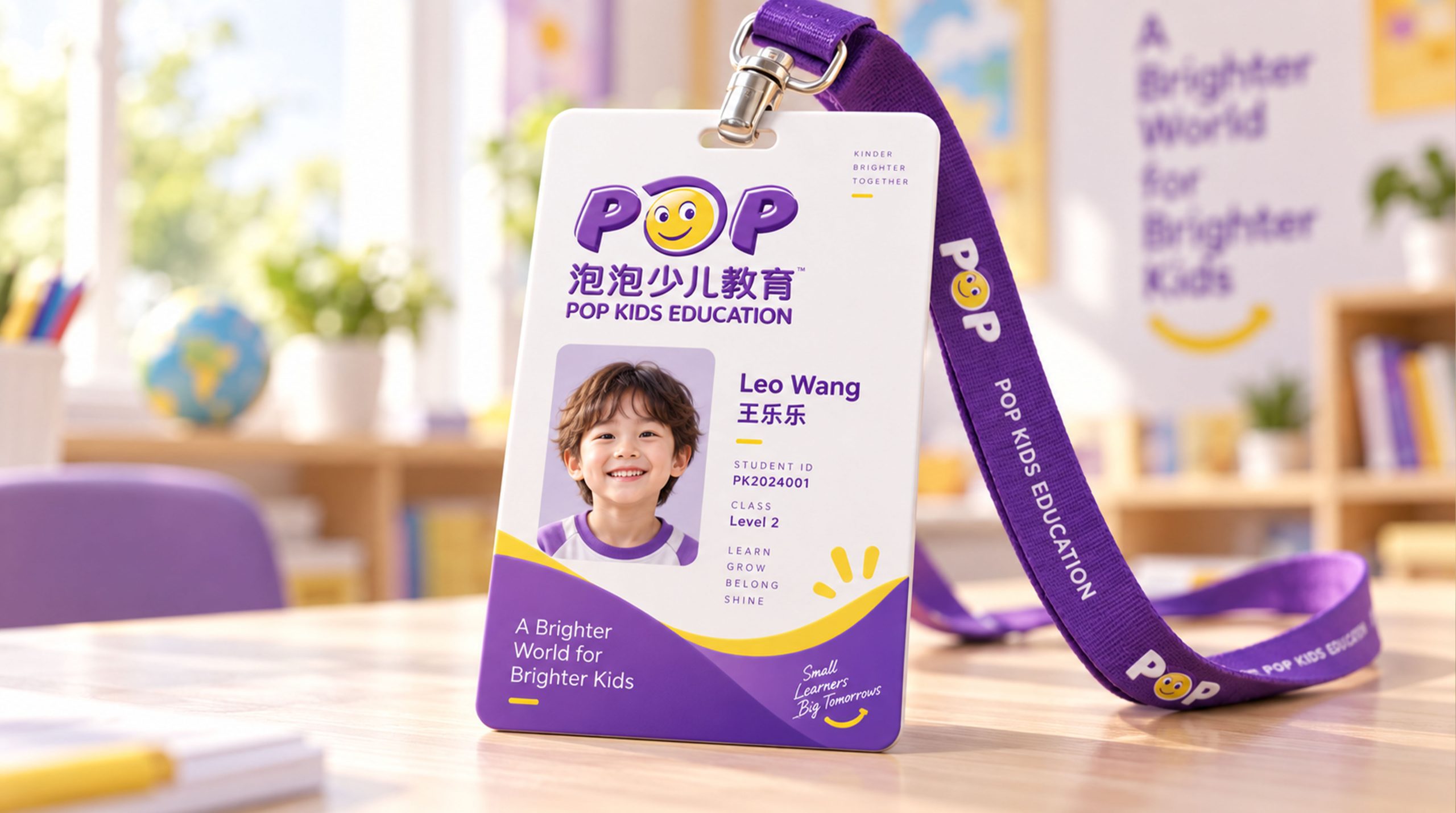
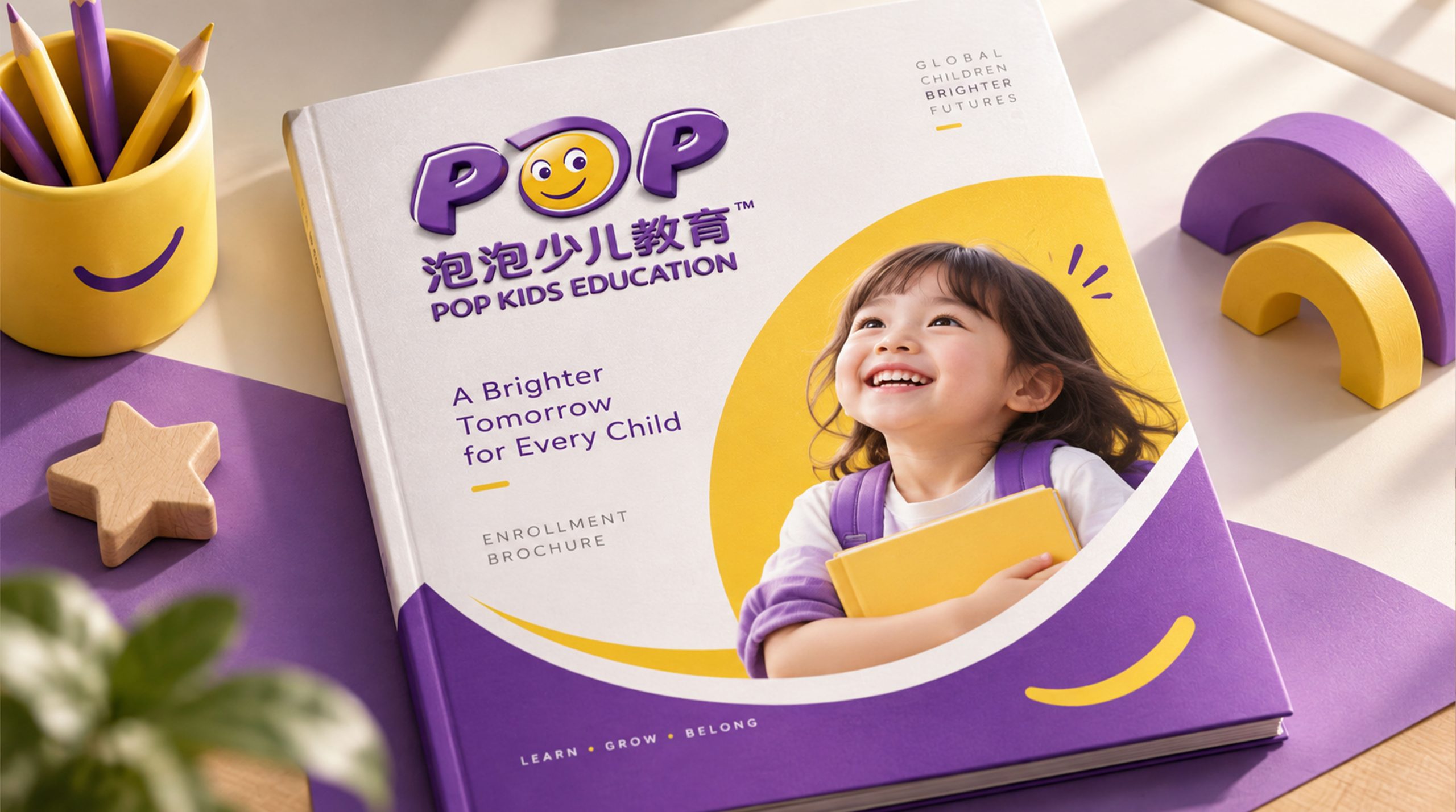
Design concepts and language graphics
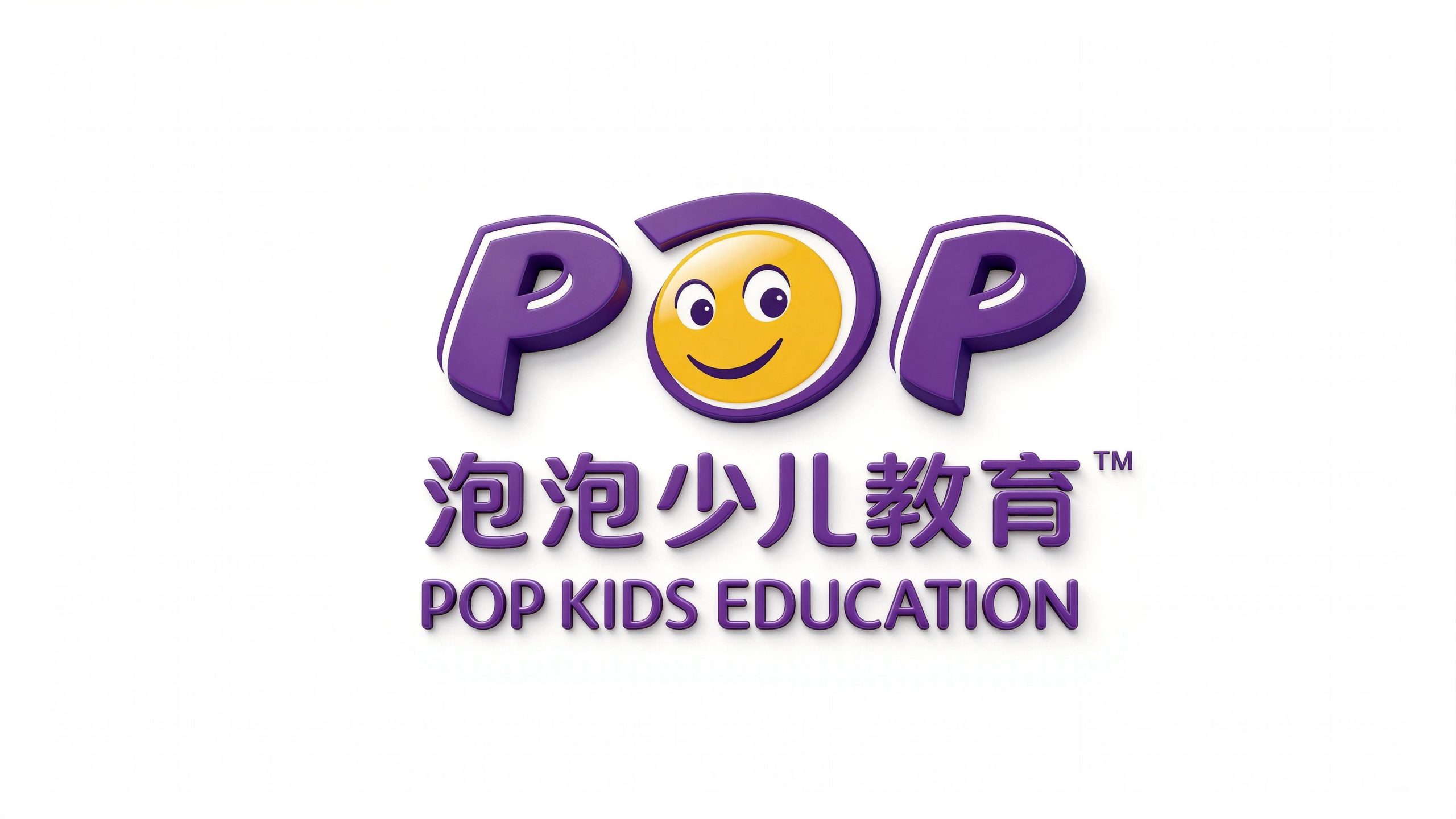
The logo uses the three letters "POP" as the core visual subject, and is presented in a three-dimensional expanding bubble glyph, which is round, full, elastic, and jumping as lightly as the bubbles that children love. The design focuses on creative corrections to the shape of the middle letter "O" - transforming "O" into a golden smiling face. The round face, smart eyes and raised corners of the mouth form a highly contagious smile expression, which means "every child smiles in happiness". The smiling face is naturally embedded between "P" and "P", which is not only an organic component of the letter structure, but also the core symbol of brand emotion. The overall design reflects the dual attributes of Bubble Children's Education between educational professionalism and children's affinity.
The three-dimensional expanded glyph symbolizes the lightness of bubbles and the full vitality of childhood. The rounded corners of the strokes eliminate all sharpness and convey a safe, friendly and inclusive brand atmosphere; the smiling "O" is presented in a golden circle with warm and bright colors. The eyes are slightly different in size and slightly tilted, giving The expressions are dynamic and personalized, making them different from stylized emoticons, and more like the innocence of real children; the three-dimensional shadow and highlight processing of the letter "P" give the logo an exquisite texture like a European toy, which not only guarantees the quality of an educational brand, but is also full of fun and imagination. The overall composition uses round and orderly three-dimensional glyphs to build a "happy bubble" to convey the brand's educational warmth and international aesthetics.
Font composition and color system
The English "POP" adopts a customized three-dimensional round font with full and expanded strokes and a symmetrical and stable structure. The three-dimensional effect gives the letters a toy-like touch and weight, and has the design quality and international recognition of a European children's brand. The Chinese "Pao Pao Children's Education" is presented in a rounded modern black font, with thick and straight strokes and a balanced structure. It not only maintains the rigorous temperament that an education brand should have, but also forms a unified style with the "POP" word mark through rounded corners. The English "POP KIDS EDUCATION" is arranged below the Chinese text in a standard capital sans-serif font, with regular fonts and moderate spacing, strengthening the brand's international positioning and European educational features. The overall font system strikes a balance between fun and standardization, ensuring the brand’s dual applicability in educational scenarios and market communications.
The main color bubble purple #5B2D8E is the absolute main color of the logo, representing the noble quality of imagination, creativity and education. Purple symbolizes wisdom and inspiration in European culture, which is in line with the brand's positioning of a European education style; the golden smile #F5B731 → #FFD54F is used as the core smile element, representing sunshine, happiness and the warm light of the children's world. The gradient transition of golden yellow enhances the three-dimensional sense and affinity of the smile; high-gloss white #FFFFFF Used for the three-dimensional highlights of the letters and the white area of the smiley face to enhance quality details and visual hierarchy; the shadow deep purple #3A1B5C is used for the three-dimensional shadow surface of the letters to enhance the three-dimensional depth and toy texture. The overall color system uses purple and gold as the core combination, reflecting the brand temperature of "wisdom and happiness in parallel". It is different from the blue and green cold-toned style of traditional education brands, and conveys the value proposition of Bubble Children's Education of "edutainment and sunshine growth".
Application extension and brand significance
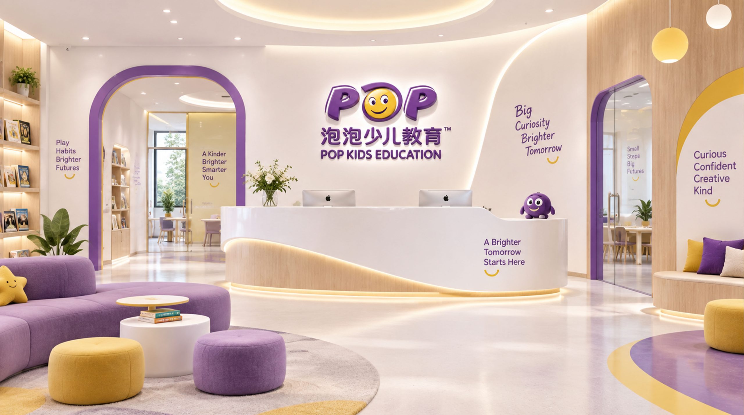
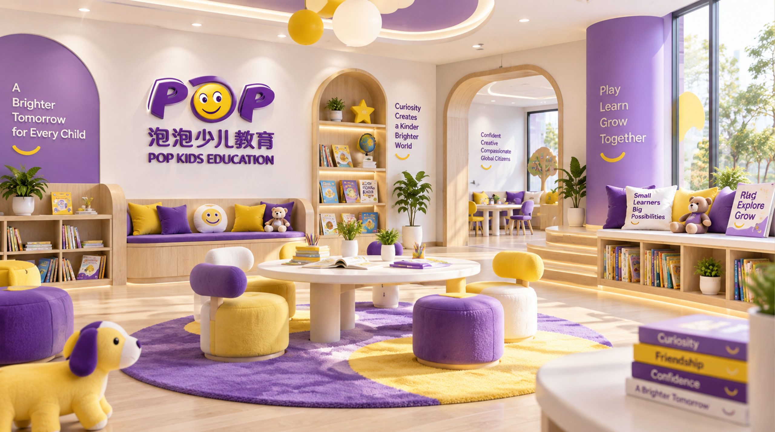
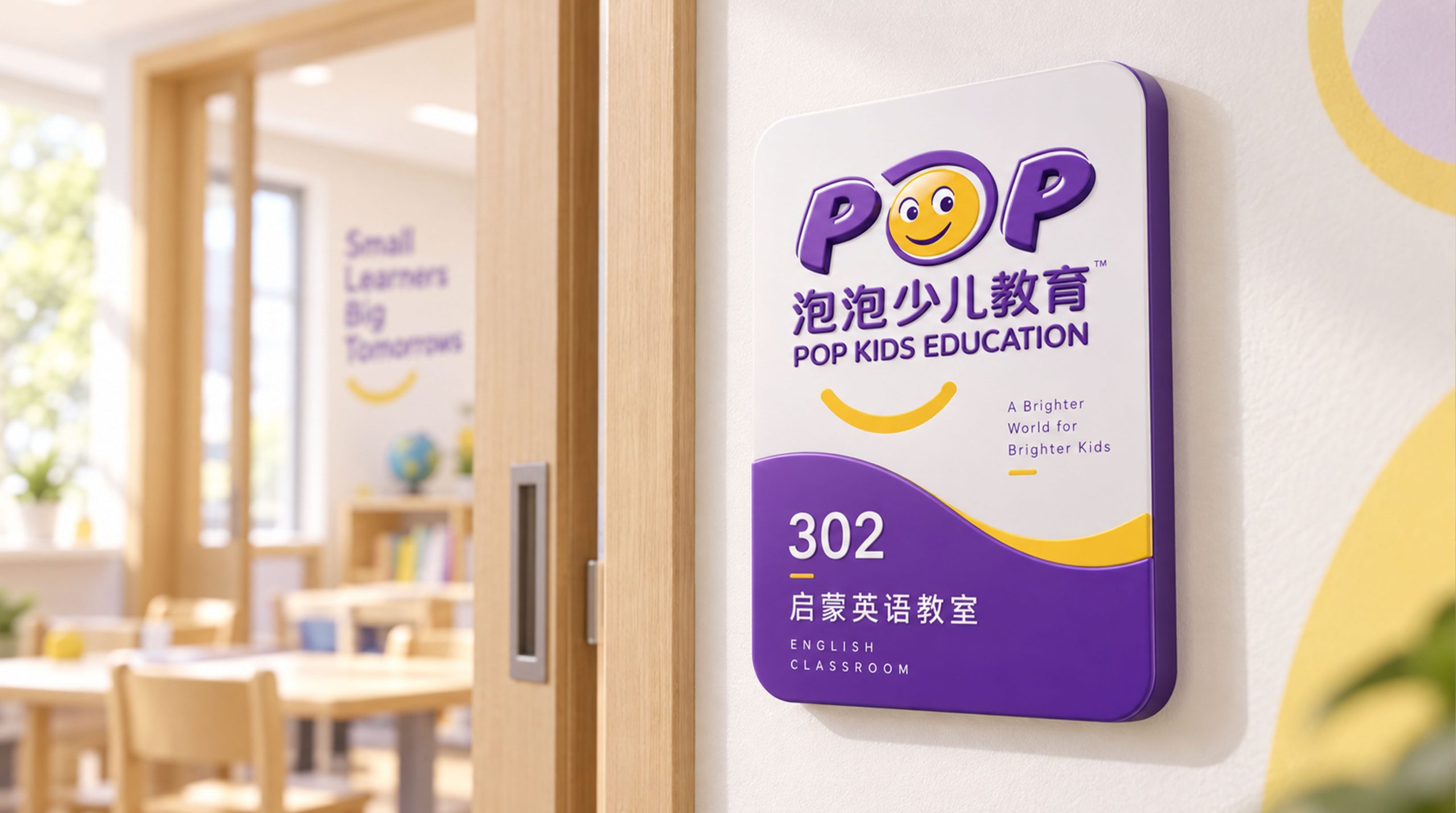
The logo has strong system scalability and can be widely used in teaching center doors, front desk image walls, classroom guides and campus environment systems; textbook covers, exercise books, learning stationery and course peripheral products; enrollment posters, online course pages, social media communication and parent communication materials; brand activities, children's competitions, summer camps and international exchange project images; brand peripheral toys, school bags, cultural and creative gifts and holiday customized products. In the dynamic vision, the smiling face "O" can present interesting animations such as blinking and smiling, and the letters "P" can appear one by one in the form of bubbles bouncing, symbolizing the children's continuous growth and blooming in happiness. The smiling face image can be extended into a brand IP parent element and used for emoticon pack systems, course characters, interactive games and child-friendly interface design.
The logo contains the three core images of the Paopao children’s education brand: Joyful Learning - the smiling "O" represents the real smile that blooms in every child's learning; International Quality - the European-style three-dimensional glyphs and purple-gold color scheme convey the professional quality of international education; Sunny Growth - the golden warm light and expanding vitality glyphs symbolize children's positive and confident growth under the sun. The overall design conveys the brand vision of Paopao Children's Education of "happy learning, sunny growth, and connecting the world".
Improper Usage (Protection Specification)
Do not change the expression details, eye angle or mouth curvature of the smiling "O"; do not modify the hue or brightness relationship between the bubble purple and the golden smile; do not remove the three-dimensional effect of the letters or flatten them; do not rotate, tilt or extract the smiling face separately from the "POP" wordmark for use; keep the white space around the logo not less than 25% of the height of the wordmark; the minimum display width shall not be less than 30mm.
design results
After the logo revision was released, Paopao Children’s Education’s brand recognition and affinity in the fields of children’s education and international training have been significantly improved. "Three-dimensional bubble word mark + smiling O" has become the core visual identity symbol of its brand system. The more infectious smiling face image is deeply loved by children aged 4-14 years old. The logo is widely used in teaching centers, course products and market communications, showing the brand vision of "happy learning, sunny growth" and successfully creating an innovative, sunny and positive modern brand image.