











A comprehensive wayfinding system for Suning's large-format appliance stores, covering exterior identification, vehicle and pedestrian arrival, entrances and directories, floor and category zoning, product demonstrations and trials, checkout and collection, after-sales service and accessibility.
The goal is a repeatable, low-maintenance wayfinding system that can scale with extensive product ranges and heavy footfall. It helps first-time visitors find their bearings quickly, guides returning customers to their destination zone in three steps, and supports standardized operational management.
Assess the current state and define the goal
Site surveys and observations at different times of day revealed uneven information density, inconsistent temporary signage, unclear hierarchies for pricing and customer benefits, insufficient separation of vehicle and pedestrian routes, and reflections that reduced legibility at night. These findings shaped three objectives. Navigation: eliminate uncertainty at key decision points, make turns easy to anticipate, and provide reassurance along longer routes. Legibility: establish a clear relationship between viewing distance, type size and contrast for reliable reading in all conditions. Operations: template all variable information so updates take 5–10 minutes and remain consistent across stores.
Methodology (Systematic Strategy)
The strategy follows a structured framework: one grid, two viewing ranges, three sign types, four coding levels and five delivery stages. One grid: a consistent 8 pt/4 mm module governs sign layouts and hardware tooling, creating a coherent appearance across stores. Two viewing ranges: 10–25 m for storefront identification and main category directories; 1–7 m for directions and operating instructions, each with defined type size, contrast and illuminance thresholds. Three sign types: permanent signs for storefronts, floor directories and zones; variable information for prices, featured products, member benefits and collection number ranges; and temporary guidance for peak-time queues, maintenance diversions and emergency evacuation. All use standardized magnetic or slide-in fittings. Four coding levels: store–floor–category zone–shelf/location, using letters and numbers linked to inventory, order picking and collection systems. Five delivery stages: survey and modeling, prototyping, pilot refinement, full rollout, and handover of the asset register and standard operating procedures.
Visual and information rules
Color: Suning Yellow provides functional emphasis, Suning Blue anchors the environment, and white carries information. Safety and accessibility use high-visibility yellow and green, clearly differentiated from promotional colors. Typography and sizing: highly legible Chinese and Latin sans-serif typefaces give both languages equal prominence. Zone signs use 80–120 mm lettering, route directions 30–40 pt, and operating instructions and rules 18–24 pt. Monospaced type is preferred for prices and numerical information to maintain alignment. Icons and arrows: consistent stroke weights, corner radii and clear space follow ISO and accessibility standards. Arrows, numbering and price-label graphics share geometric proportions for consistent recognition at every distance. Layout: left alignment, evenly spaced columns and fixed line spacing establish a clear reading sequence: Where am I? Where am I going? How do I get there? Which floor? Which location or counter? What do I do next? Lighting and finishes: neutral 4000–4500 K lighting; matte laminates or fine-textured painted finishes on primary information surfaces; reflective metal restricted to frames and accents.
Touchpoint Rollout (Scenario-Based Implementation)
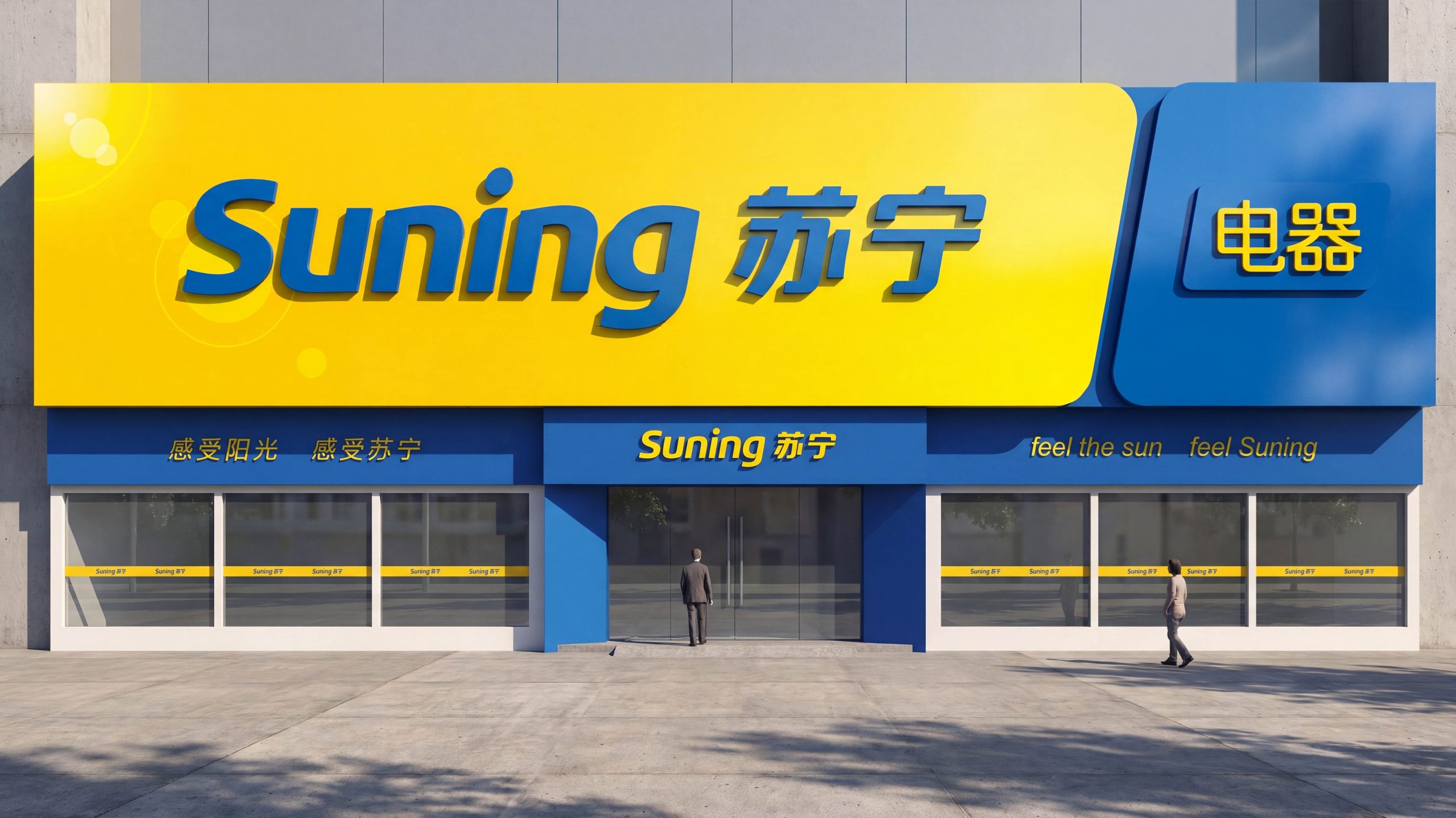
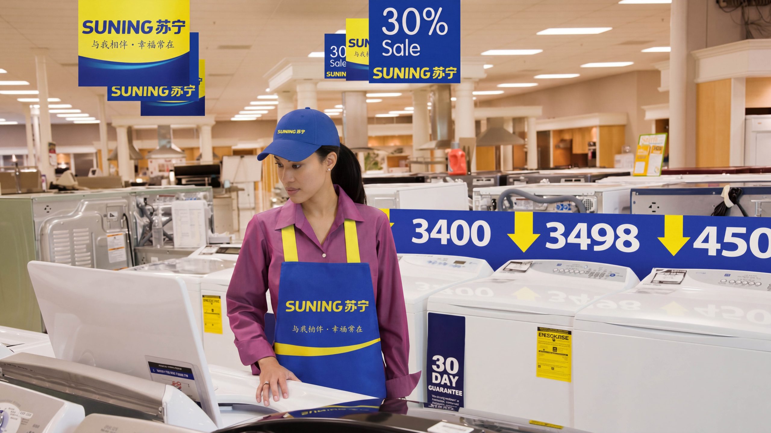
Exterior and arrival: illuminated storefront lettering and projecting flags provide visibility from two directions. Pole-mounted directional signs work with separate vehicle and pedestrian routes at parking entrances, while ground markings lead directly to the entrance, collection point and after-sales service. Entrance and overview: the first information display combines a floor directory, daily highlights and service listings. A quick-reference directory at the lifts highlights popular destinations such as televisions, air conditioners, computers, trade-ins and after-sales service. Categories and demonstrations: main category entrances use a three-part sign structure—category, usage scenario and route confirmation. Demo islands pair self-service trial instructions and precautions with NFC or QR access to specifications, stock availability and installation guides. Pricing and benefits: standardized price-label templates run across endcaps and shelf edges, presenting model, key benefits, price, membership/installment options, trade-in, and extended warranty/installation in that order. Promotional materials share the same layout system to maintain visual coherence. Checkout and collection: checkout checklists cover invoices, installments, extended warranties and delivery appointments. Collection areas combine number-range displays with a one-way circulation loop; waiting areas show estimated wait times and collection instructions. After-sales and safety: service desks organize information into service, required documentation and expected time. Accessible lifts, baby care rooms, AEDs, fire safety equipment and evacuation routes are signposted repeatedly at aisle ends and corners, with minimum illuminance maintained at night.
Delivery and operation and maintenance mechanism
An integrated operating framework connects the asset register, template library and live data. Every sign has a unique code, installation location and maintenance record. Price labels, promotional cards, collection number ranges and crowd-management materials are generated from templates and can be printed locally, allowing one person to complete an update in five minutes. QR codes link to live floor plans, inventory, installation procedures and emergency plans. Inspection checklists define frequency, tolerances, cleaning and illuminance requirements. Deliverables include a wayfinding master plan and sign location drawings, a layout and icon manual, exploded hardware drawings and bills of materials, mounting heights and lighting specifications, plus operating procedures and training materials. The system can be replicated quickly across cities and store formats, maintaining clear organization, reliable legibility and a consistent brand presence over time.