










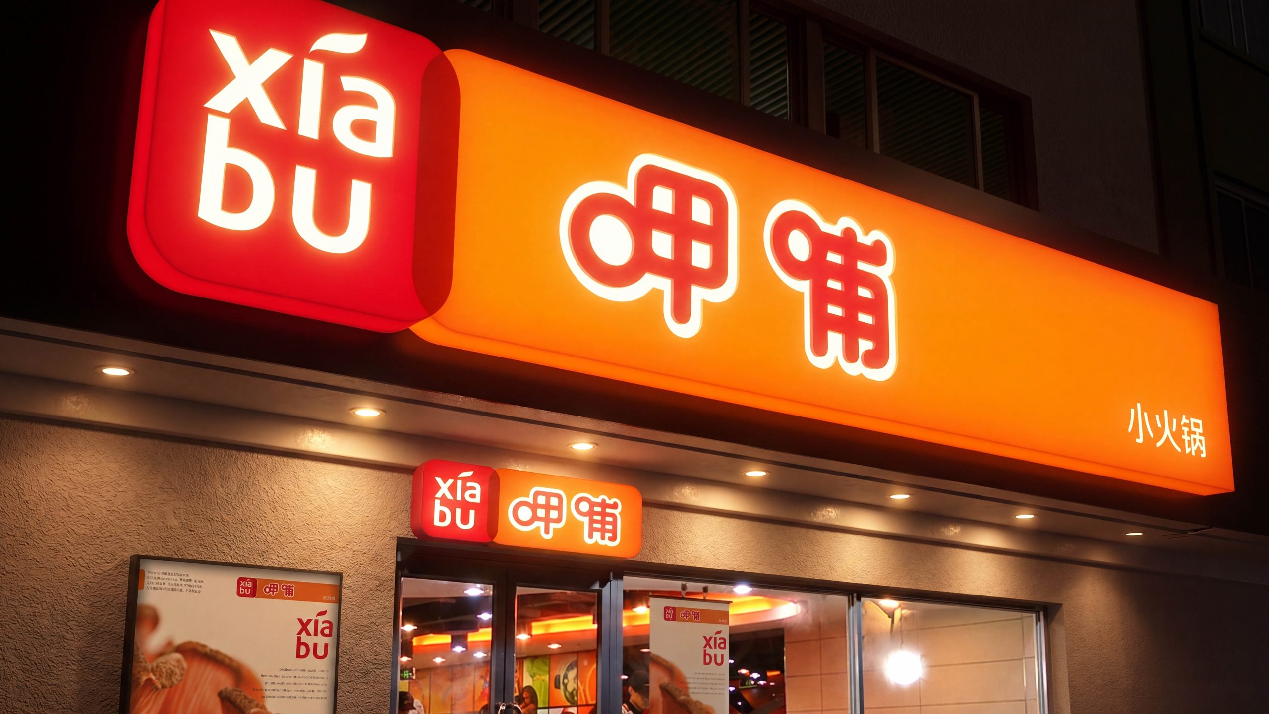
A systematic wayfinding program for Xiabu Xiabu restaurants, designed to establish highly consistent, easily maintained signage standards across multiple cities, store formats and scales, unifying customer entry and exit routes, service touchpoint recognition and brand presentation. The system covers exterior signage, entrance lobbies, waiting

research and strategy
Drawing on customer profiles, sales-per-square-meter structures and peak-hour circulation data, we defined a strategic framework of “prioritize high-frequency nodes, front-load decision information, minimize distraction.” Information is organized into three tiers: Primary (direction and orientation), Secondary (process and operation) and Tertiary (notices and guidelines). With arrival time, wrong-turn rate and reliance on return-visit guidance as core KPIs, the system ensures wayfinding evolves from simply being seen to being used correctly.
Information Architecture and Coding
A unified information architecture and numbering system. IA-1 Wayfinding layer: core nodes including entrances, waiting areas, pick-up counters, cashiers and restrooms. IA-2 Process layer: sequential guidance from queue ticket to seating, ordering, sauce station, pick-up and checkout. IA-3 Rules layer: queuing etiquette, right-of-way along circulation routes, hygiene and safety, and child and accessibility notices. An 8pt baseline grid and fixed type area define spacing and weight across headings, body text and supporting information. Icons and text scale in fixed proportion, so every level shares one style and every scenario one rhythm. All sign locations follow a four-part code (store, floor, zone, node) that supports inspections, replacements and asset register management.
Visual and Material Standards
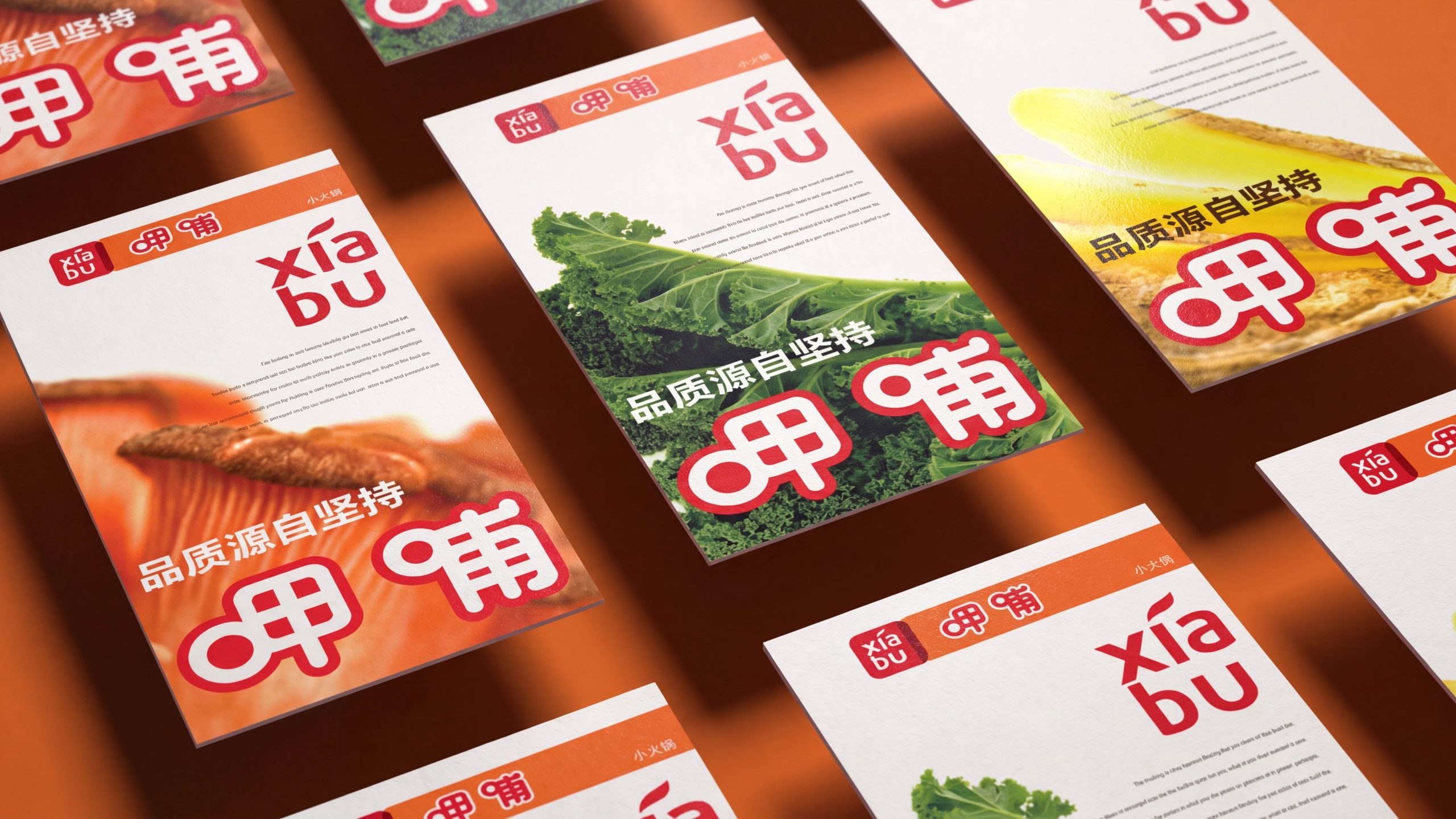
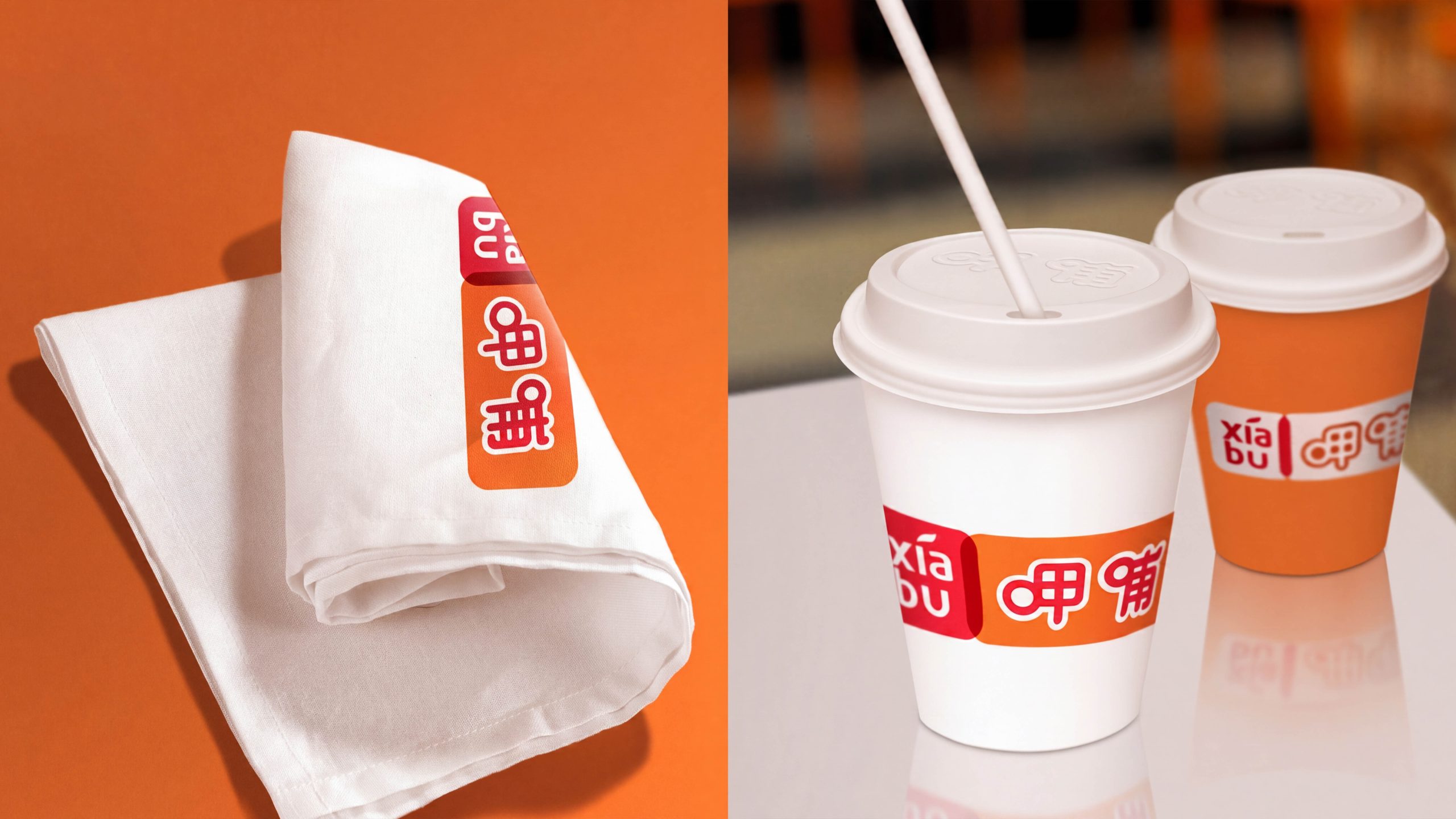
The visual language uses a highly recognizable orange as the brand ground, a neutral dark gray to carry information, and high-reflectivity white at night for legibility in low light. Chinese text is set in a highly legible sans-serif family, paired with a matching sans-serif for English and numerals, for consistent recognition at long, medium and short range. The icon system is built on neutral geometric forms with inset rounded corners, with unified arrow angles and terminal chamfers. Materials prioritize stain resistance and easy cleaning: screen-printed aluminum composite panels, UV direct digital printing and high-adhesion films. High-contact points have rounded corners and impact-resistant edges. Replaceable information modules use magnetic mounts or concealed rails to reduce maintenance costs.
Touchpoint Layout and Circulation Organization
Exterior and entrance: a recognition range of 30–50 m is guaranteed, and an “overview + peak-hour information” display outside the door shortens the decision to enter. Lobby and waiting area: queue numbers and estimated wait times appear side by side, and rules information is kept apart from pedestrian flow to avoid compounding congestion. Ordering and preparation: process bars and station numbers show the sequence, and key prompts move forward to the preceding node to reduce backtracking. Self-service sauces and pick-up: categorized icons, minimal instructions and counter edges aligned to a common sightline lower the learning curve for first-time users. Checkout and exit: the payment path is clearly separated from the exit, and return-visit circulation and delivery pick-up stay out of each other’s way. Receipt information and exit prompts are combined to improve table turnover.
Implementation and Evaluation
A closed loop of standards, implementation, evaluation and iteration. Standards include the wayfinding manual, color and contrast specifications, type and icon libraries, material and installation guidelines, and coding and asset register templates. Implementation delivers placement plans, elevation details, custom node drawings and night-time illuminance checklists. Evaluation tracks first-visit time to destination, wrong-turn rate, perceived queue time, frequency of staff intervention and night-time legibility. Quarterly inspections and annual reviews drive minimal-intervention updates as new categories and circulation changes arrive. This keeps the system consistent, replicable and easy to maintain as the brand expands.