










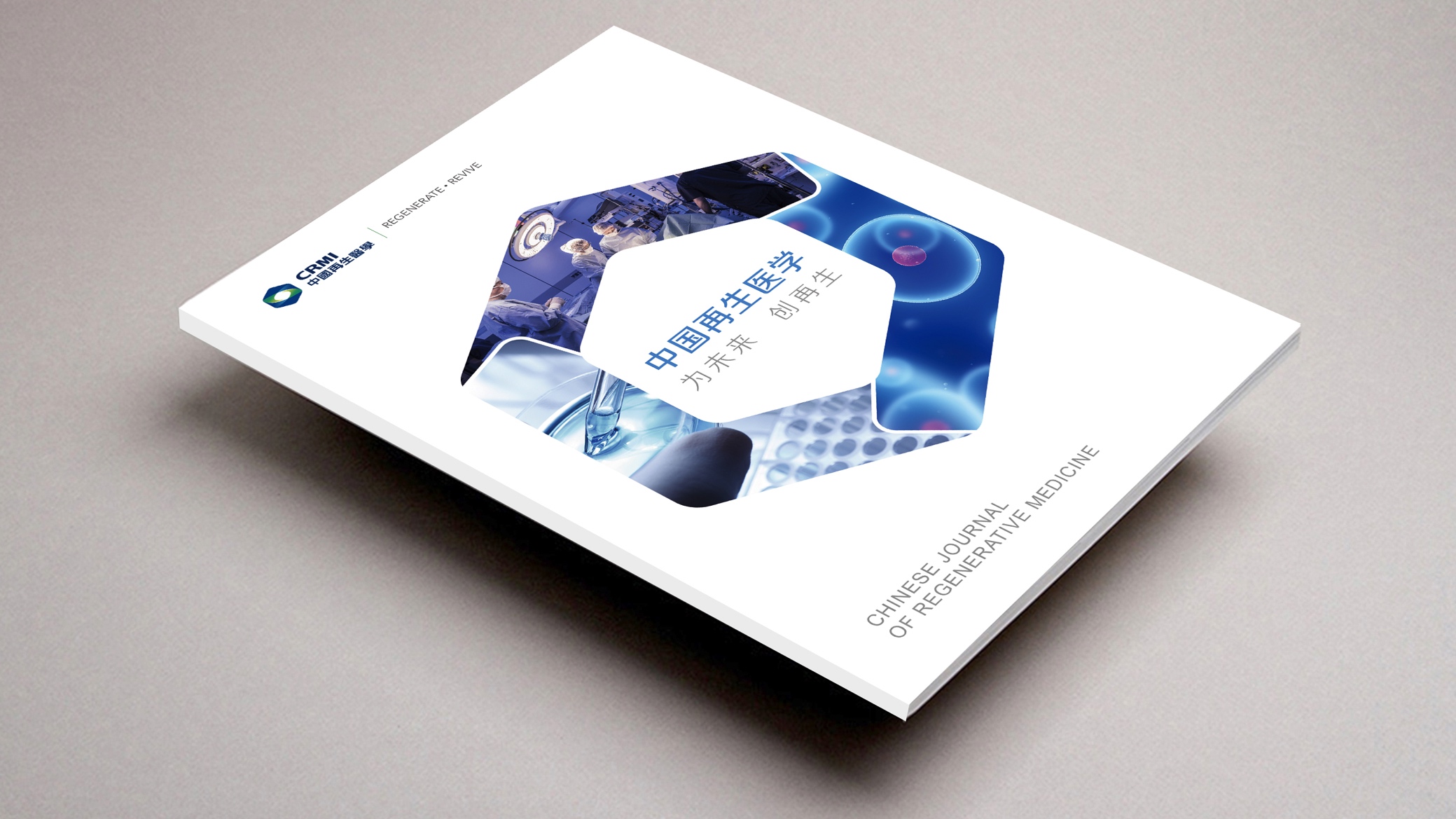
Industry context: As China’s biopharmaceutical sector grows rapidly, three priorities define brand building: the efficiency of translation from research to clinic, public understanding of frontier medicine, and industry credibility.
Brand role: China Regenerative Medicine is positioned as an integrated communications brand for both the public and professionals, connecting research institutions, clinical platforms and industry partners.
Design goal: Create a visual identity and publication system that combines scientific rigor with human warmth, making “credible, readable, usable” the foundation of every touchpoint.
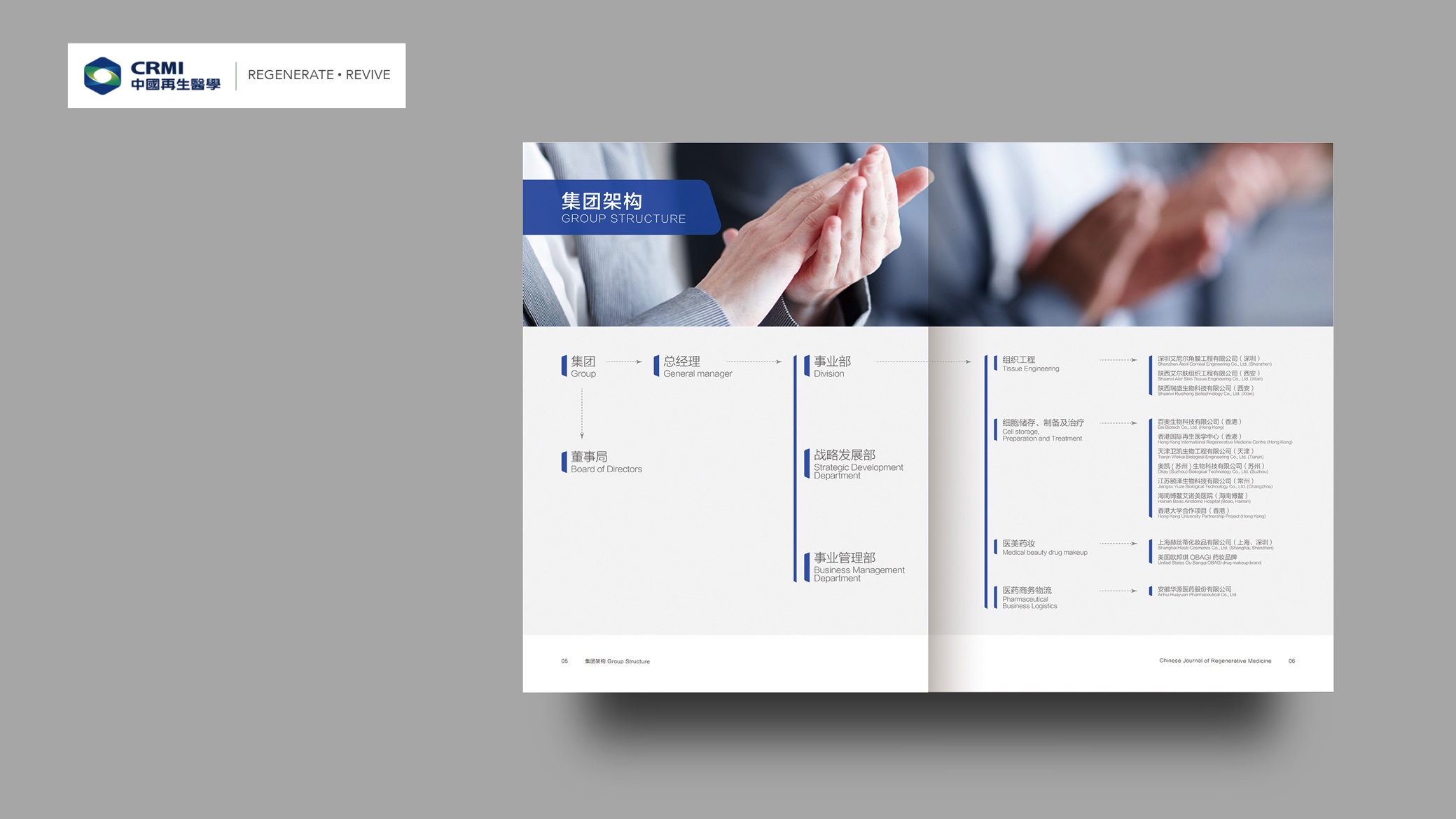
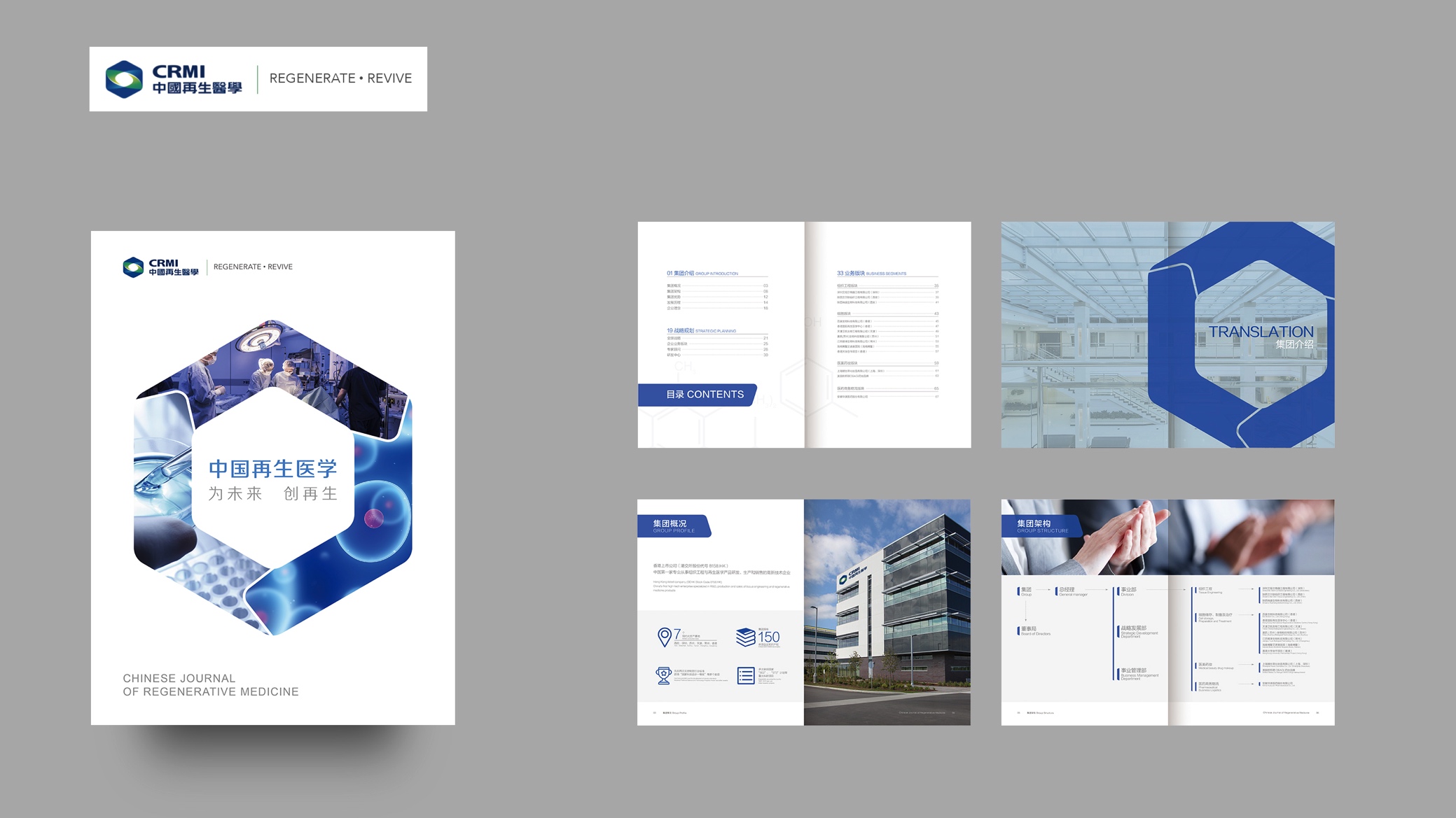
design concept
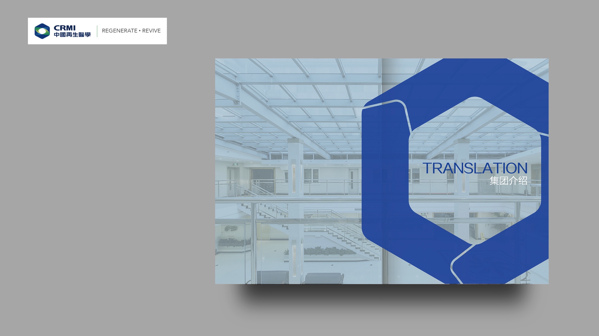
Visual starting point: The hierarchy of cell, tissue and organ serves as an abstract motif, combined with the scientific graphic vocabulary of hexagons and rings to express regeneration, repair and circulation. Structural concept: A geometric, symmetrical core extends outward in rings, signifying a verifiable path from research to clinic, while open negative space leaves room for interdisciplinary storytelling. Value expression: Warmth within a rational structure, so the reading experience feels credible but never cold, expert yet approachable.
Graphic Language
Geometric composition: The hexagon (a stable honeycomb structure) and the ring (a regenerative cycle) are the primary forms. An outer frame reflects the order of the printed page, while inner lines evoke cell membranes and the edges of petri dishes. Symmetry: Key visuals use axial or radial symmetry, emphasizing the scientific ethos of standardization and reproducibility. Open space: A “breathing zone” between headlines and imagery, with its width tied to type size, keeps the information hierarchy clear and reading effortless. Scientific imagery: Microscopy, lab equipment and clinical scenes are color-graded consistently to avoid stylistic clashes between photographs.
Fonts and composition
Chinese: A Song (serif) family with academic character and strong long-form readability is used for body text, with refined, heavier strokes for headlines to ensure clarity in print and on screen. English: Baskerville or a serif of similar character is used for scientific terms and citations, bridging science and classicism; a neutral sans serif handles data and UI elements for modernity and legibility. Hierarchy: Headline, subhead, standfirst, body and footnote follow a 1.25 scale with a unified leading table, keeping order across spreads. Alignment with the logo: Type ratios cascade with the square composition and hexagonal margins of the core graphic into a coherent grid, creating a stable overall impression.
color system
Primary: Research Blue (suggested #1F58A8), representing rationality, depth and credibility. Secondary: Life Green (suggested #34B37E) and Neutral Charcoal (suggested #444444), carrying regeneration and hope, and text and reflection, respectively. Grayscale: Nine steps from #111 to #EDEDED for charts, dividers and de-emphasized information. Usage: White and light gray dominate for readability; blue and green provide emphasis and layering, avoiding the excessive saturation of “tech glare.”
Grid & Layout
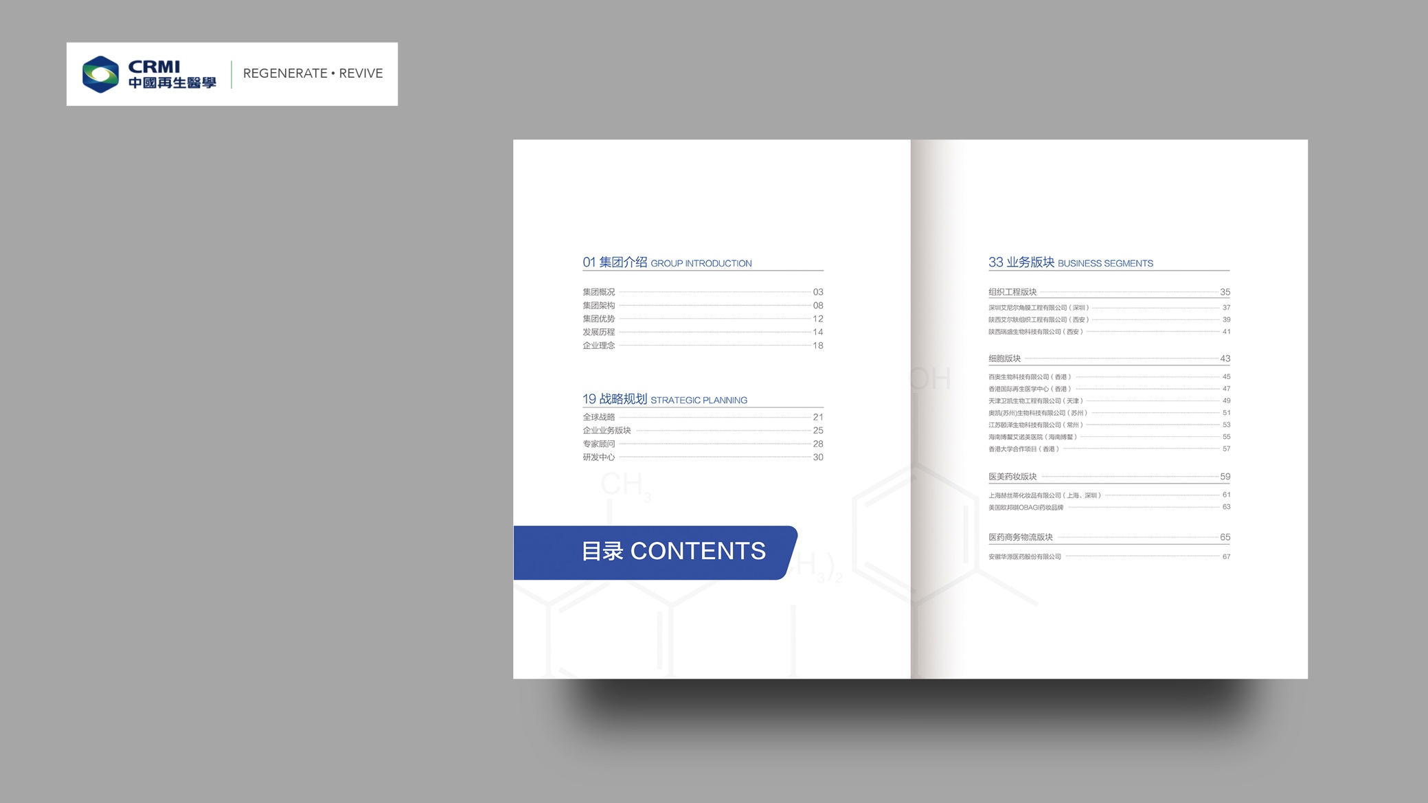
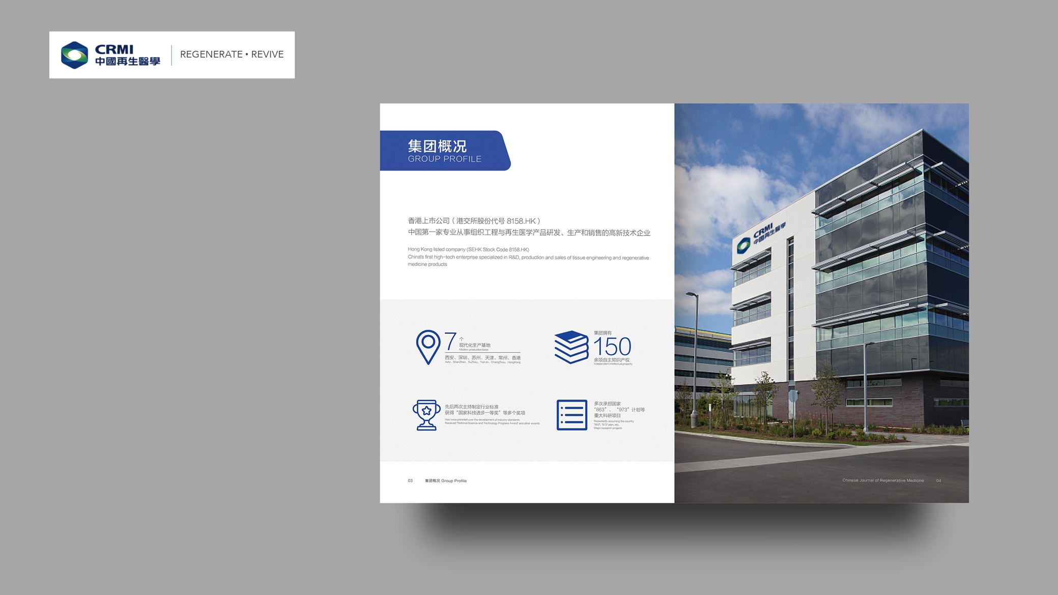
To accommodate three content densities (paper abstracts, clinical case atlases and industry reports), we created three publication master templates. Type A (Academic Features): a 12-column grid with generous margins for long-form articles, in-depth interviews and methodology. Type B (Case Studies): an 8-column grid with an even split of image and text, highlighting key flowcharts and comparative images. Type C (At a Glance): a 6-column grid of modular information cards for timelines, partner lists and data pages. Every template includes components such as title bands, sidebars and data footers, so any content placed within achieves a consistent style. This is where the sense of order comes from: transparent rules and reproducible execution.
Logo & Symbol
Primary form: A ringed hexagon at the core, with an inner “research window” that can hold key imagery or theme words. Clear space and minimum size: 0.5x clear space on all sides; minimum print width 25mm, minimum digital size 48px. Adaptations: Use the reversed version on dark backgrounds; on busy backgrounds, use the logo container with a white base to keep recognition clean. Sub-brands and events: Swap the theme color or subtitle within the core geometric frame to create isomorphic variants for event identities.
Imagery & Materials
Imagery style: Neutral, with balanced warm and cool tones and consistent film grain and noise thresholds; micrographs retain crisp detail without over-sharpening. Paper: Specialty stock for covers (fine matte cotton texture or micro-sand finish); high-opacity matte coated or eco-friendly woodfree stock for interiors, avoiding show-through that hinders chart reading. Finishing: Spot UV highlights structural lines or theme words; debossing defines the logo container, making touch part of recognition. All finishes follow a “what you see can be reproduced” principle for easy reprinting.
Application and extension
Publication and journal covers: A three-part structure of geometric container, theme image and bilingual title ensures series consistency across issues. Exhibitions and wayfinding: The hexagonal grid translates into directional arrows and zone signage, creating clear circulation that meets the cleanliness and safety requirements of medical spaces. Online platforms: The layout is componentized, with headlines, abstracts, captions and footnotes mapped one-to-one to the print hierarchy; motion follows a “soft in, soft out, rational and steady” rhythm. Public education materials: Complex concepts are broken down into Q&A cards, step cards and risk–benefit cards for quick public understanding.
Fonts and composition
Brand Protection & Misuse
To keep the system consistent across teams and suppliers, we made the “don’ts” explicit: never stretch, rotate or alter the logo’s proportions; never change the primary or secondary colors, or add gradients, outlines or drop shadows to the logo; never place the logo directly on busy, high-noise photography; use a white container instead. Minimum width is 25 mm in print and 48 px on screen; below that, the simplified version applies. Type sizes, line spacing and chart stroke weights follow the specification table, with no substitute fonts or arbitrary bolding. These constraints may look strict, but they are what allow the brand to look like itself in any context.