










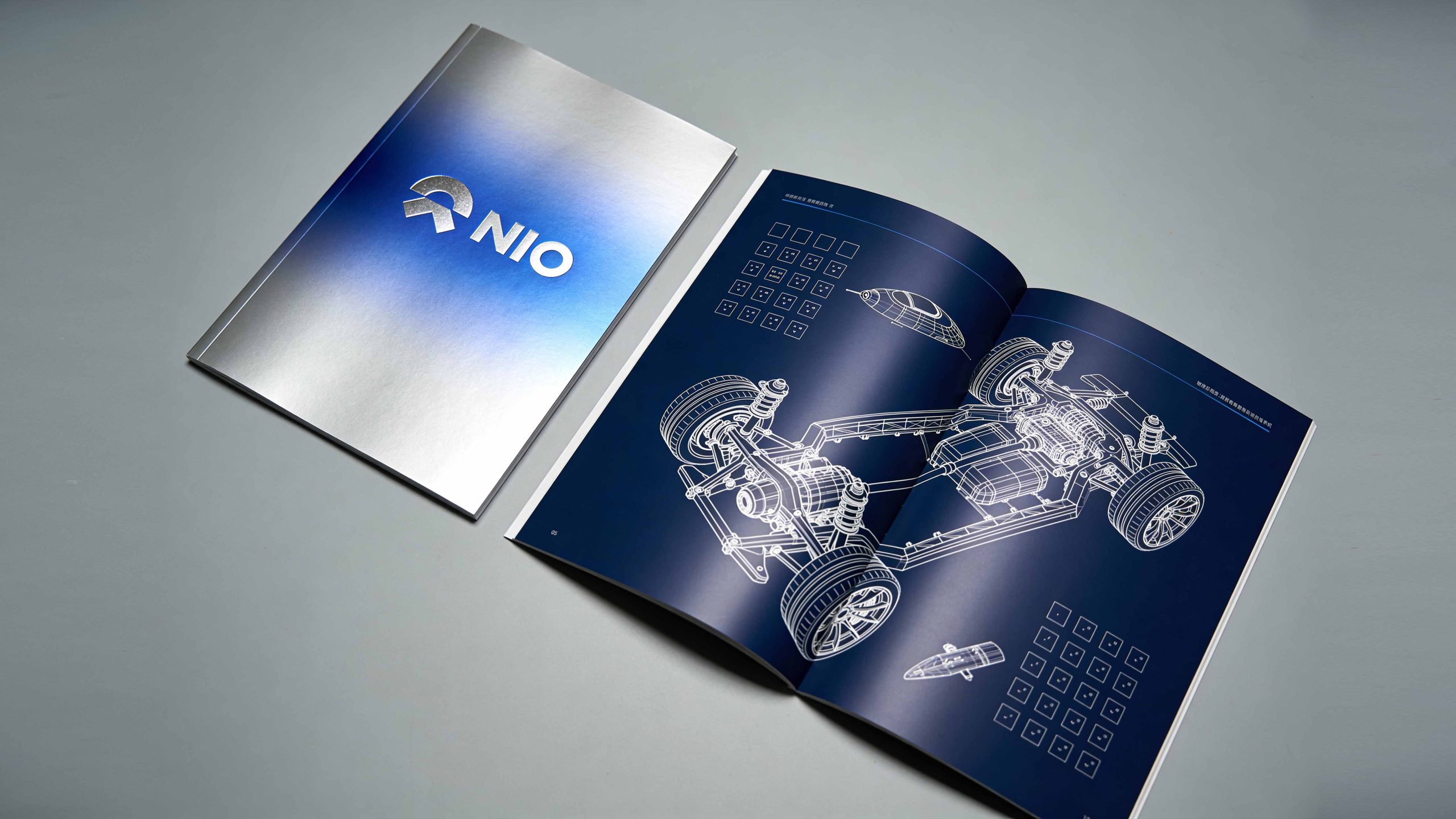
This project is to design a brand brochure and visual planning system for NIO, aiming to jointly build the brand’s forward-looking temperament with a pioneering vision of future travel and high-end intelligent technology.
The design goal is to present the brand characteristics of the brand "Blue Sky Coming" through systematic visual structure and technological narrative.
The entire volume is themed "Future of Travel. NIO is here", integrating the power of technology and the elegance of design to demonstrate NIO's forward-looking landscape and user entrepreneurial spirit as the world's leader in high-end smart electric vehicles.
design challenge
NIO is not only the pioneer brand of high-end electric vehicles in China, but also the definer of future travel lifestyle. The design needs to achieve the following balance in the visual language: sense of technology × sense of temperature: it should not only reflect the cutting-edge technology of smart electric vehicles, but also convey the community temperature and emotional connection of user enterprises; sense of future × sense of quality: it should not only maintain the pioneering expression of forward-looking vision, but also show the exquisite craftsmanship of high-end manufacturing; sense of power × sense of elegance: it should not only continue the hard-core strength of high-performance electric vehicles, but also incorporate the restraint and calmness of design aesthetics. The core challenge is - how to make the design combine the foresight of technology and the warmth of the brand, so that the album has both technical depth and emotional resonance.
Strategy and philosophy
The project takes "the power of technology and the elegance of the future" as its core design concept. Visual philosophy: based on the dual-line logic of "forward-looking and quality coexisting", reflecting the precision of technology and the elegance of design; Structural logic: using a high-end automotive publication-level typesetting system to organize the brand value in layers to form a multi-dimensional structure of "vision-technology-product-community"; color system: using deep blue + metallic silver + The holographic gradient becomes the main color, supplemented by skyline light effects and technical wireframes, symbolizing forward-looking, technology and blue sky vision; graphic language: integrating chassis architecture diagrams, technical wireframes, body curves and skyline logos to establish a "visual system under future order"; cultural expression: introducing technical blueprints, engineering drawings and product images to give the album both professionalism and a sense of future ritual. The core of the concept: use technology to present future power, and use design to continue the brand's warmth.
Design presentation
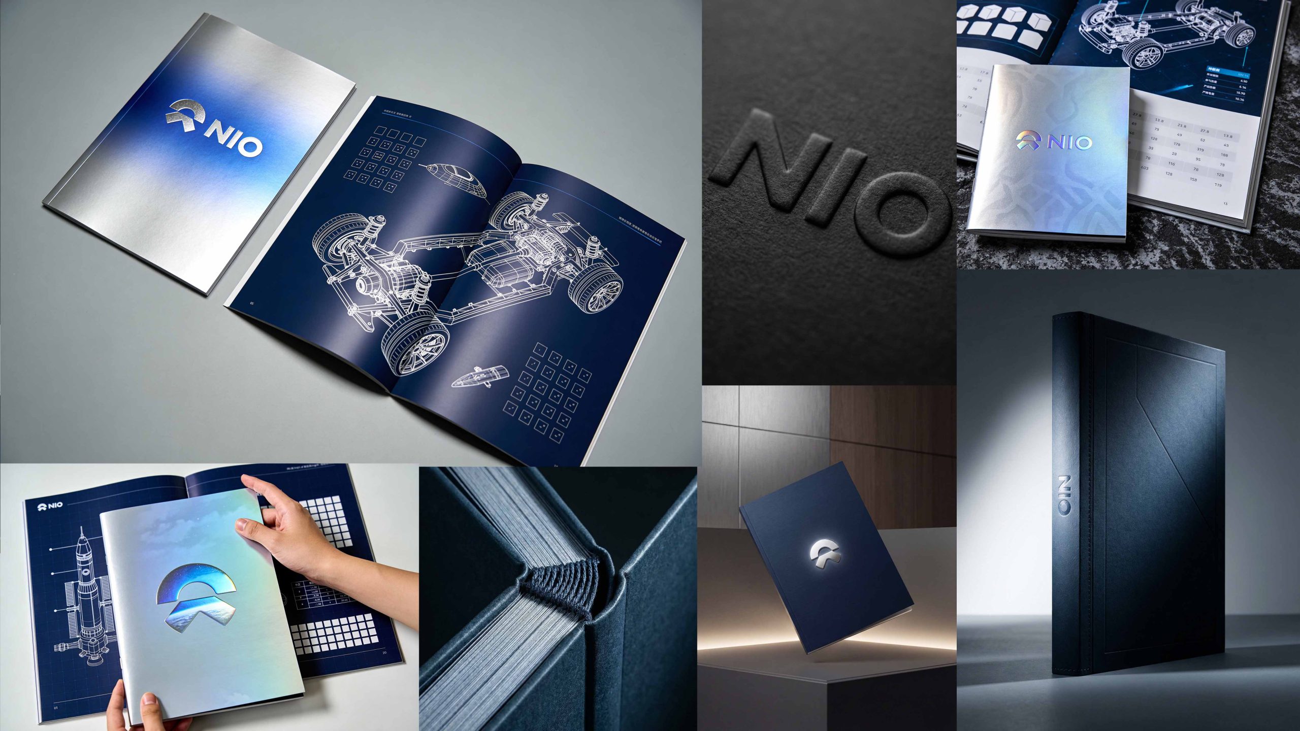
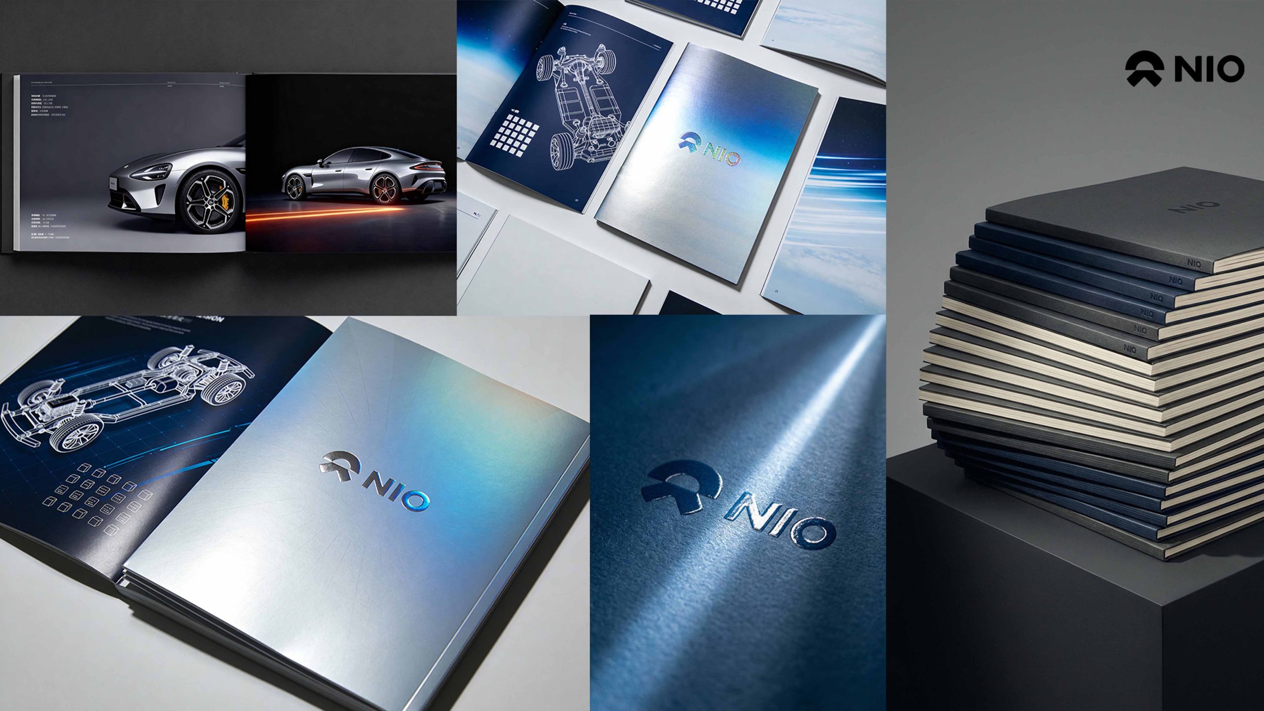
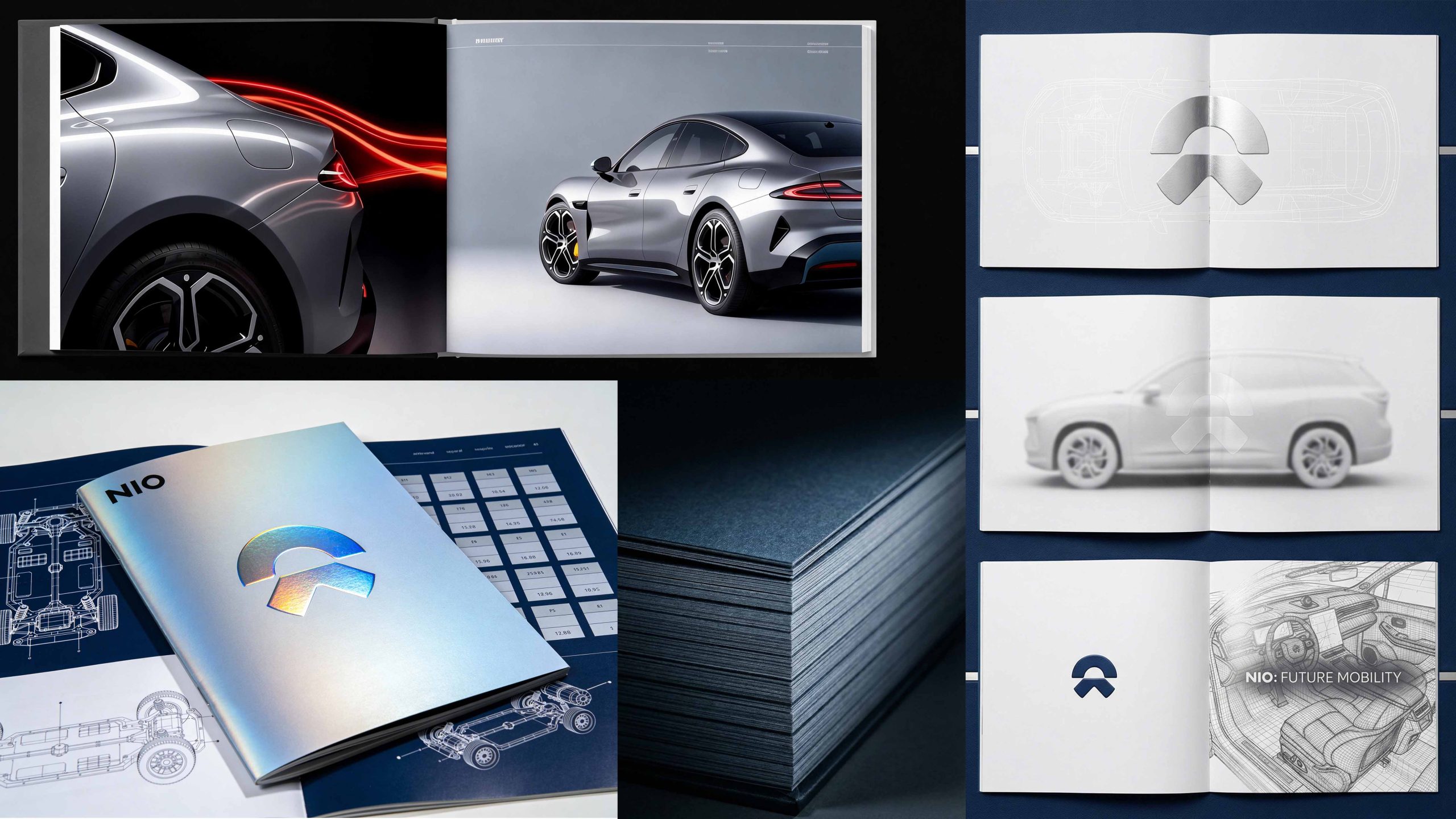
Cover design: The main colors are metallic silver gradient and azure blue, reflecting the sense of technology and the future; the center uses the holographic gradient skyline logo as the visual core, supplemented by hot stamping technology and metallic texture coating; the title is bilingual in Chinese and English, conveying the global high-end pattern. Chapter logic: 1. Brand vision; 2. Technical architecture; 3. Product matrix; 4. Design philosophy; 5. User community; 6. Future travel.
Internal page design: Modular structure: technical pages and product pages are alternately presented, forming a "technology × design" rhythm; layout design: the deep blue background and white technical wireframes form the visual tension of "blueprint aesthetics", and the technical depth is presented with chassis architecture diagrams; image language: real shots of high-end models, chassis structure wireframes, and close-ups of body curves are used to convey power and elegance; cultural pages: introduce technical parameter tables, engineering blueprints, and design sketches to express the depth of research and development. Technology and materials: The cover uses brushed metal coating + holographic hot stamping logo + embossing process; the inner pages are made of high-gram heavy dark blue art paper to ensure a high degree of restoration of technical drawings and vehicle model images. The overall style reflects "the foresight of technology × the elegance of design × the warmth of the brand".
Achievements and Impact
As the brand's official high-end publication, the album is widely used in global press conferences, NIO Day events and high-end customer communications. Through the integration of technical logic × design narrative × brand order, the design has successfully created NIO's visual image of "both technological foresight and user warmth". The project is considered by the brand owner to be "one of the most futuristic and brand-deep high-end publications" and has become the core blueprint of NIO's global brand visual system.