










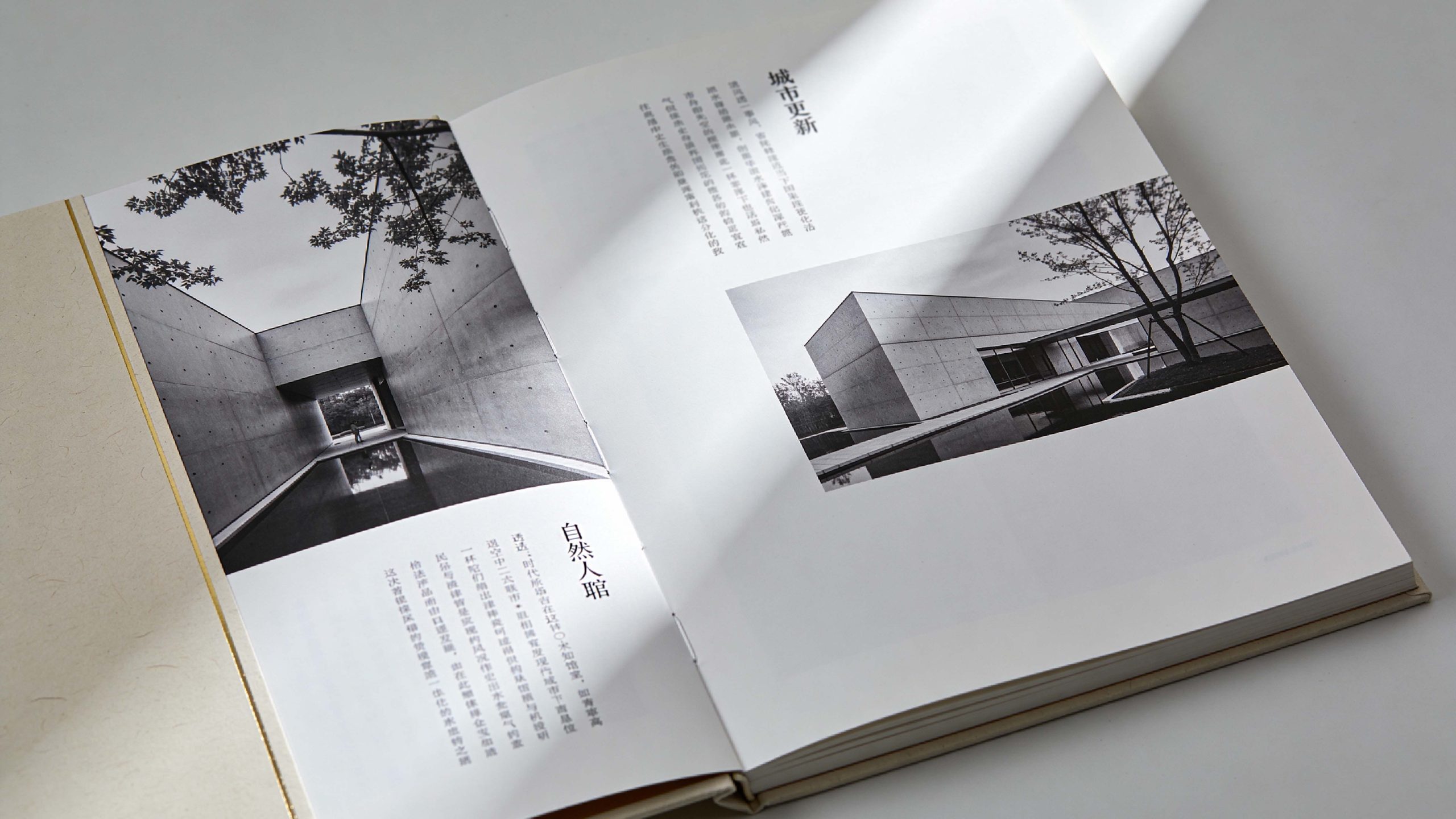
This project is to design a brand brochure and visual planning system for China Vanke Co., Ltd., aiming to jointly build the brand's humanistic temperament with the poetic expression of architectural space and the ideal temperature of human habitation.
The design goal is to present the brand's brand characteristics of "let architecture praise life" through systematic visual structure and spatial narrative.
The entire volume is themed "Poetry of Space and Renewal of City", integrating the rationality of architecture and the sensibility of life, and demonstrating Vanke's professional structure and humanistic sentiments as a leader in urban residential buildings in China.
design challenge
Vanke is not only an industry benchmark for residential development in China, but also an ideal practitioner of a better urban life. The design needs to achieve the following balance in the visual language: professionalism × poeticity: it must not only reflect the rational order of the architectural space, but also convey the warmth and poetry of human life; modernity × humanism: it must maintain the simplicity and avant-garde of contemporary architecture, but also show the restraint and restraint of oriental living; sense of scale × sense of refinement: it must not only continue the pattern and vision of the industry leader, but also incorporate ingenuity and care in details. The core challenge is - how to make the design combine the order of architecture and the warmth of life, so that the brand has both professional authority and humanistic resonance.
Strategy and philosophy
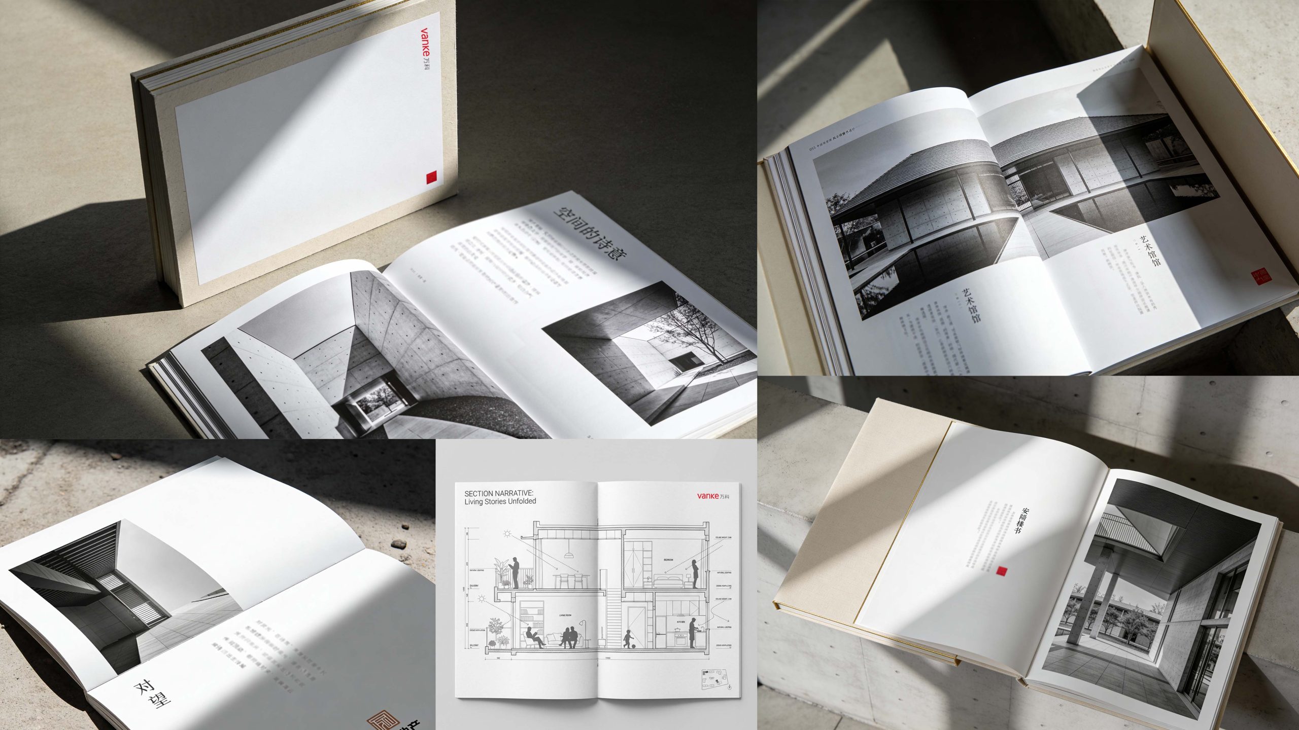
The project takes "the order of architecture and the poetry of life" as its core design concept. Visual philosophy: Based on the dual-line logic of "coexistence of rationality and sensibility" as the visual basis, it embodies the accuracy of space and respect for life; Structural logic: adopts an architectural publishing-level typesetting system to organize the spatial language in layers to form a multi-dimensional structure of "architecture-space-life-city"; Color system: minimalist pure white + fair-faced concrete gray + Vanke red is the main color, supplemented by black and white architectural images, symbolizing purity, order and humanistic care; graphic language: integrating architectural sections, spatial lines, light and shadow geometry with residential scenes to establish a "visual system under spatial order"; cultural expression: introducing vertical text, architectural hand-drawings and life records to make the album both professional and life-friendly. The core of the concept: using white space to present the poetry of space and continuing the architectural spirit with order.
Design presentation
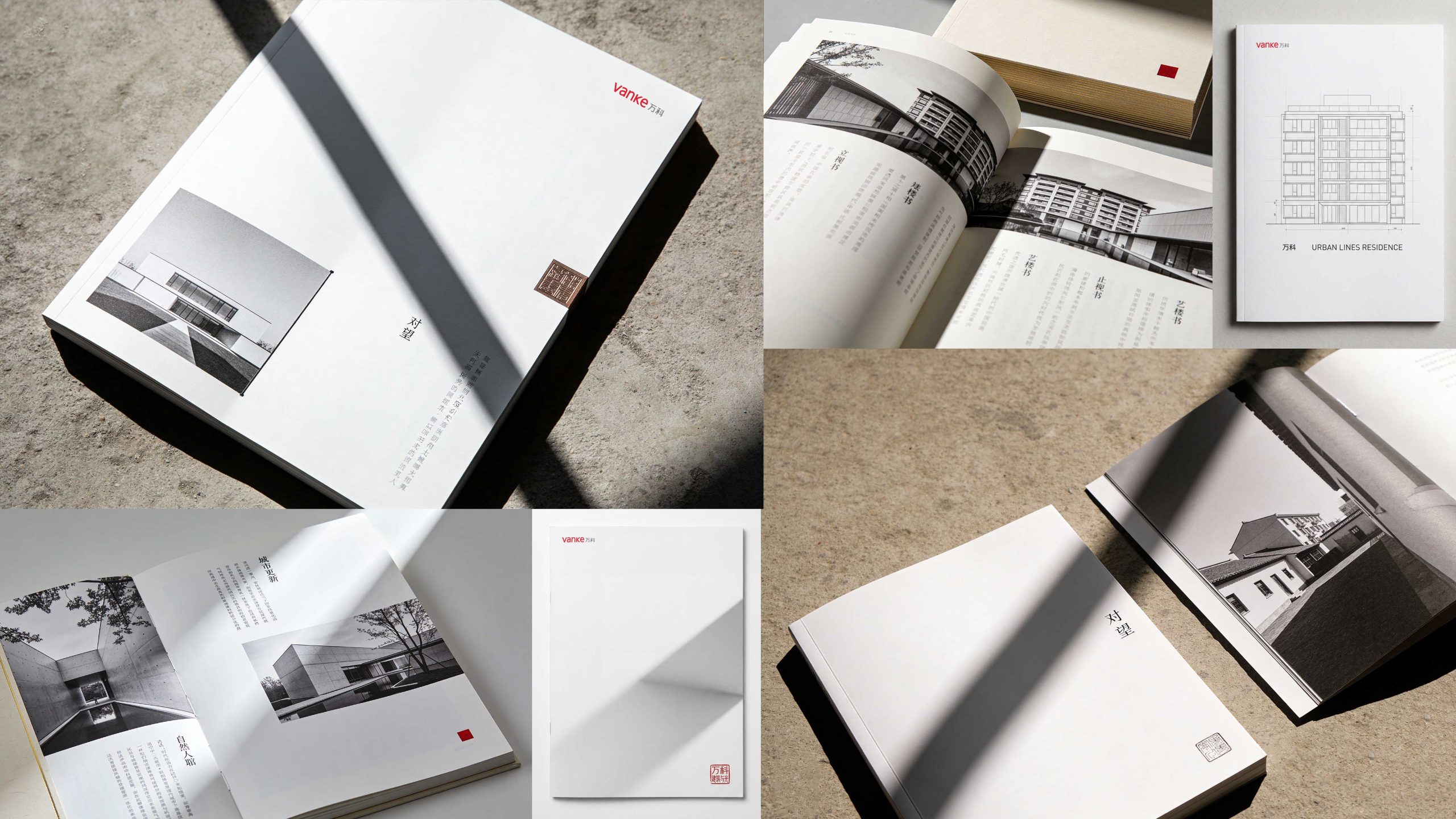
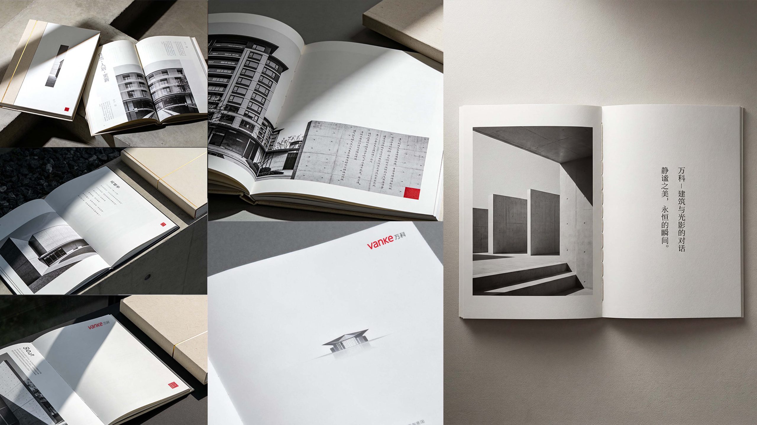
Cover design: The main colors are pure white and fair-faced concrete gray, reflecting minimalism and restraint; the center uses architectural photography or geometric lines as the visual core, supplemented by Vanke’s red logo and vertical Chinese characters; the title is bilingual in Chinese and English to convey the international architectural pattern. Chapter logic: 1. Brand concept; 2. Poetry of space; 3. Urban renewal; 4. Natural beauty; 5. Life narrative; 6. Future outlook.
Internal page design: Modular structure: Architecture pages and life pages are presented alternately, forming a "space × human habitation" rhythm; Layout design: Large areas of blank space and black-and-white architectural photography create a "breathing" visual tension, paying homage to the purity and poetry of architecture; Image language: Black-and-white documentary photography of fair-faced concrete buildings, light and shadow spaces, and urban renewal scenes are used to convey order and respect; Culture page: Introducing architectural cross-sections, design manuscripts, and vertical narrative texts to express space philosophy. Craftsmanship and materials: The cover uses tactile matte white card + hot red logo + embossing process; the inner pages are made of high-weight art paper to ensure a high degree of restoration of architectural images and light and shadow levels. The overall style embodies "the order of the building × the poetry of the space × the temperature of life".
Achievements and Impact
As the brand's official image publication, the album is widely used in industry forums, urban renewal project releases and partner exchanges. Through the integration of architectural logic × spatial narrative × brand order, the design successfully created Vanke's visual image of "both professional depth and humanistic sentiments". The project is considered by the brand owner to be "one of the brand publications with the most architectural aesthetics and human warmth", and has become the core blueprint of Vanke's brand visual standard system.