










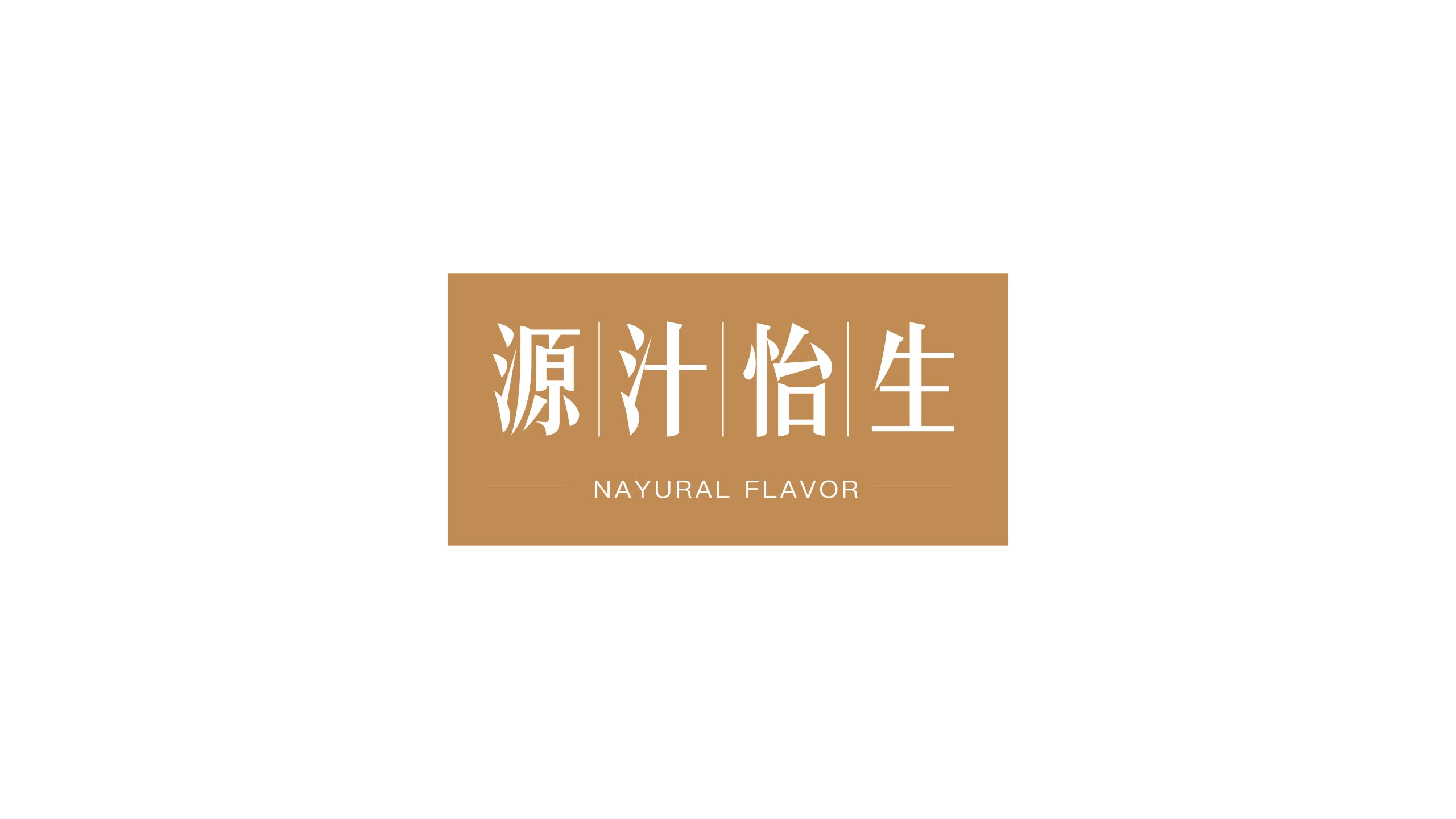
Yuanzhi Yisheng is a brand dedicated to natural fruit juices and healthy nutrition foods, championing a lifestyle of “returning to nature and savoring purity.”
Across packaging and communications, the brand sought a simple, highly recognizable visual language that conveys purity, health and Eastern wellness aesthetics, creating an impression of understated luxury and natural elegance in the crowded health food market.
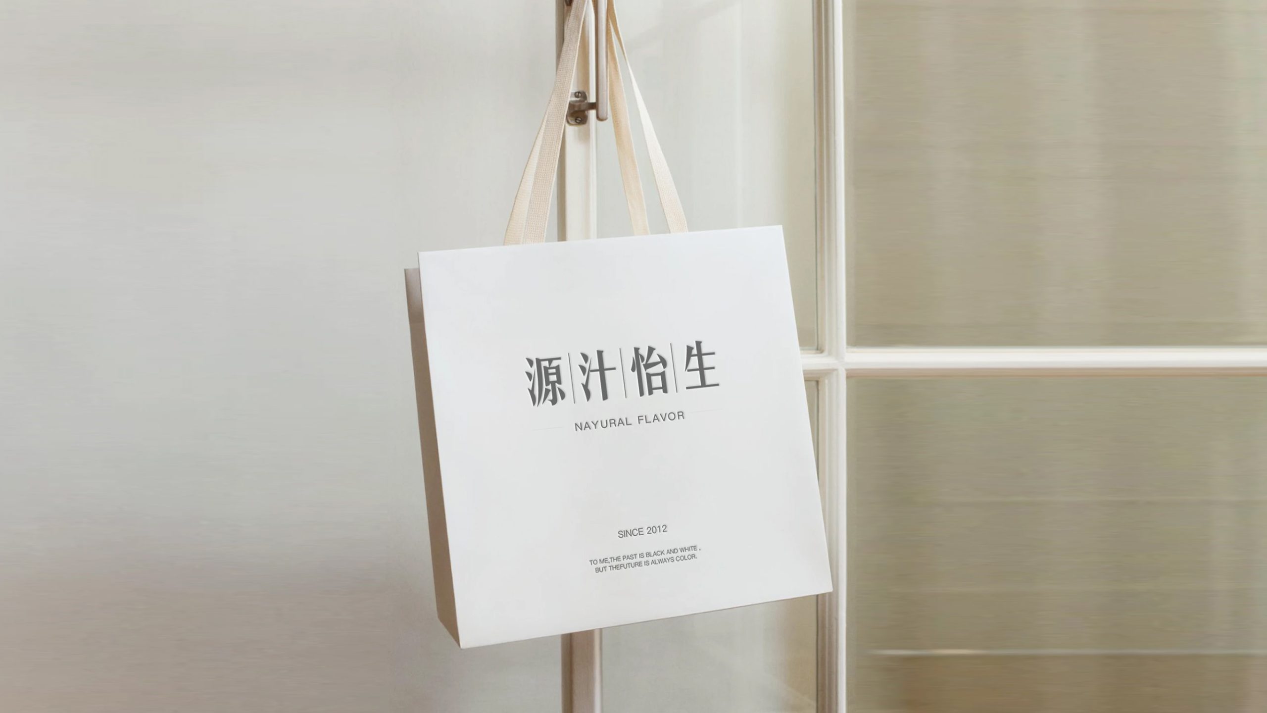
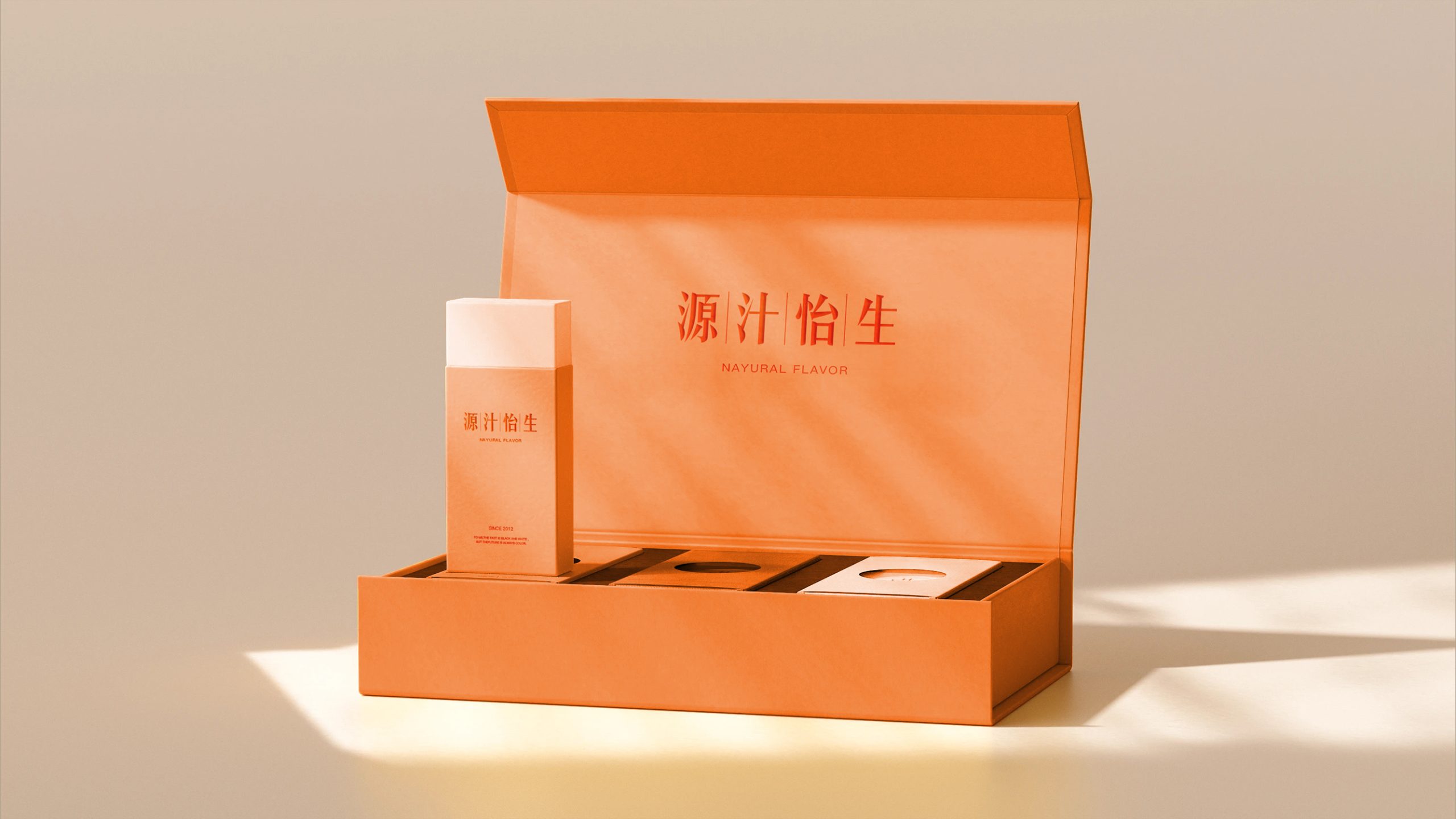
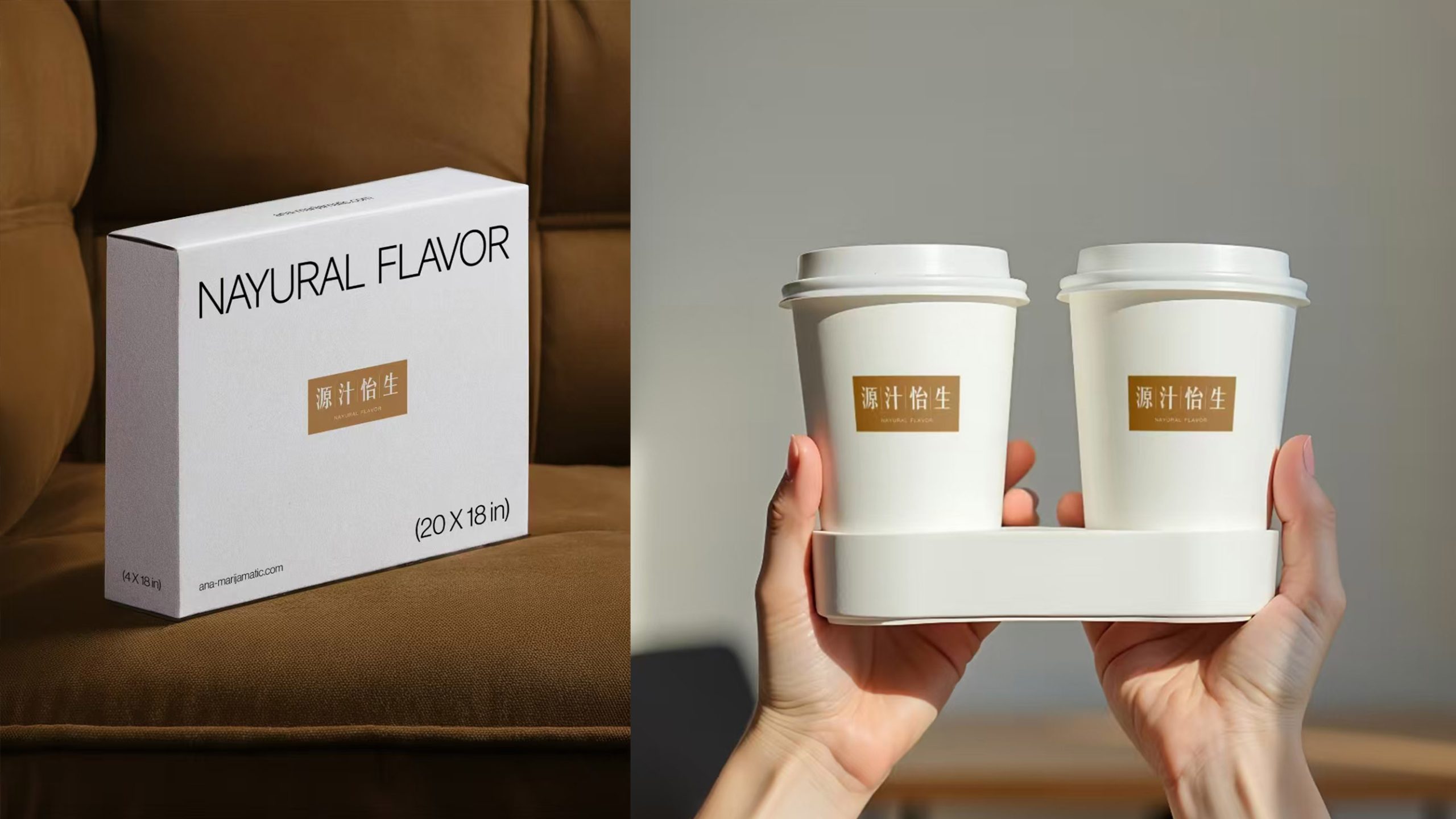
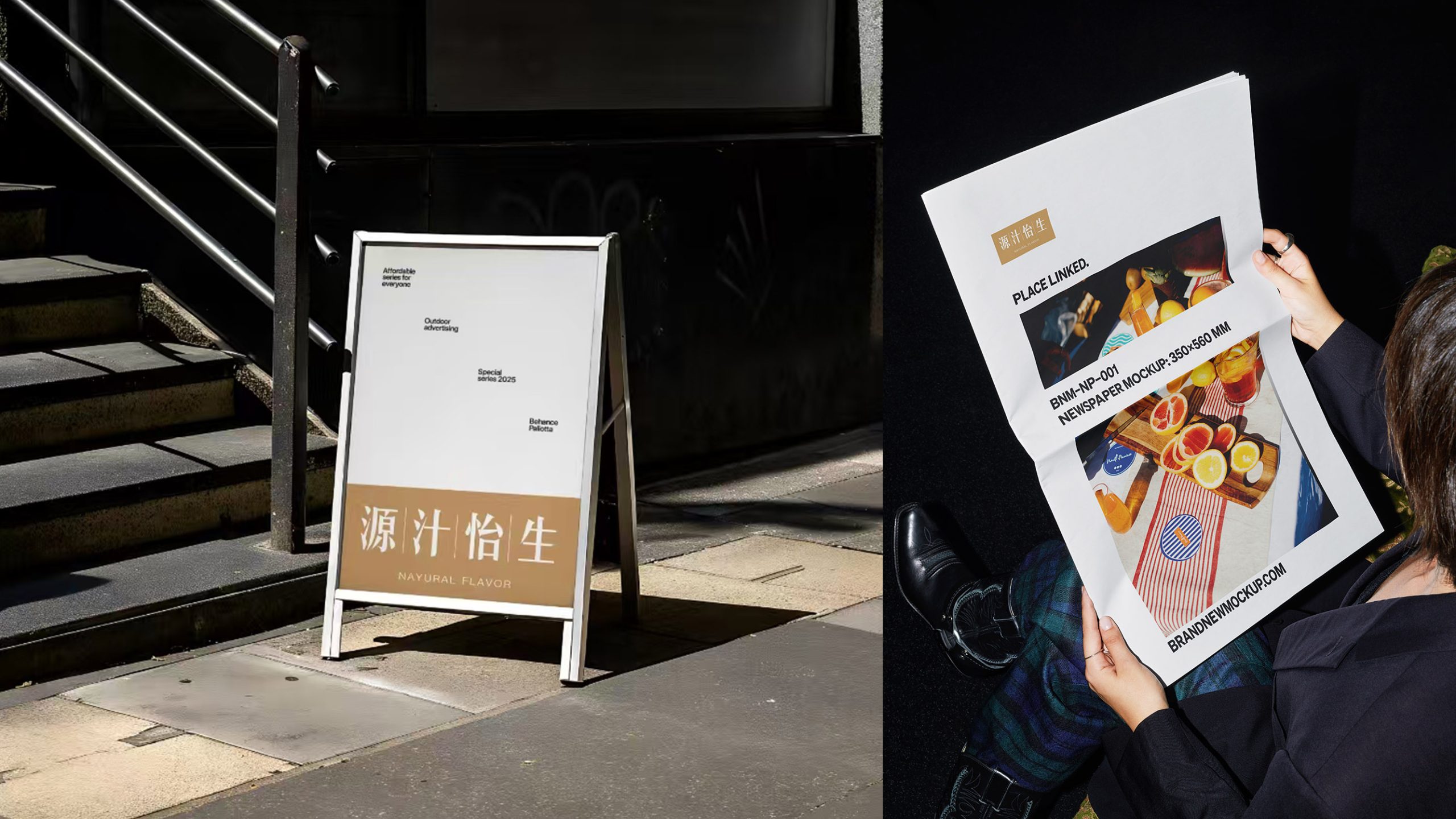
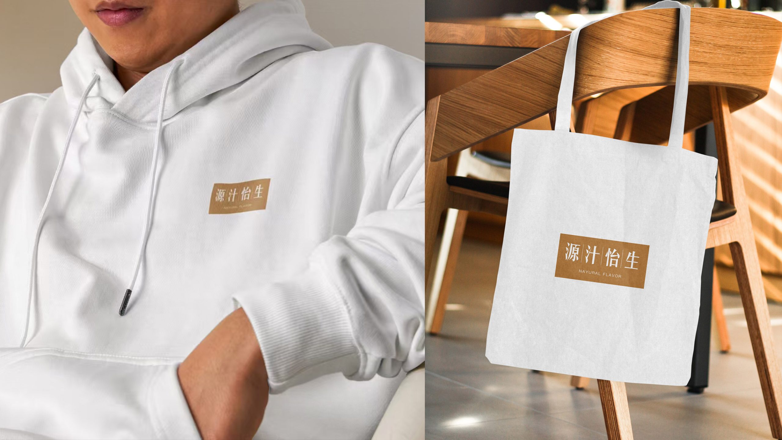
design concept
Guided by the idea that “nature’s essence begins with purity,” the mark pairs a gold-brown square with restrained lettering, symbolizing a brand that distills the best of nature and delivers healthy energy with balance and gentleness. The composition is minimal and disciplined, free of ornament, drawing on the Eastern principle that “emptiness is beauty” to express the brand’s essence: natural, pure, understated and trustworthy.
graphic language
Rectangular base: stability and reliability, like the earth bearing nature’s gifts. Vertical Chinese characters: echo the order of traditional calligraphy and underline the brand’s Eastern character. Light English lettering: brings a modern, international feel. Balanced white space: gives the design room to breathe, conveying a character that is “simple yet exceptional.” Defined by structural stability and harmonious proportion, the identity reinforces trust and quality.
Fonts and composition
The Chinese characters use a custom fine-stroke Song typeface with elongated forms and tapered strokes for a premium Eastern feel. The English wordmark “NATURAL FLAVOR” is set in a minimal sans serif, creating a balanced contrast between rationality and warmth. The Chinese-to-English ratio is about 3 : 1, centered within the gold-brown field as a focal point, ensuring strong recognition and consistency on bottles, storefront signage and advertising alike.
color system
Primary Gold Brown #B78E5C evokes nature, warmth and a healthy quality of life; secondary Ivory #F6F2E8 represents purity and calm, creating a soft contrast; and Dark Espresso #5A4733, used for type or outlines, conveys steadiness and professionalism. Soft and easy on the eye, the palette combines a natural feel with modern refinement, giving the brand a jade-like warmth in the premium health beverage market.
Application and extension
Applications include: juice bottles, beverage packaging, gift boxes and labeling; the brand website, in-store wayfinding, displays and merchandizing; and promotional materials, posters and visual extensions. The gold-brown field can stand alone as a background texture to unify the brand’s visual language. On packaging, it pairs with botanical textures or ingredient illustrations to reinforce the “from nature” theme. In animation and digital media, it can emerge gradually like “golden sunrise light,” symbolizing the flow of life energy.
brand meaning
With a visual philosophy of “harmony within the square, resonance within simplicity,” the mark conveys three core values. Nature: taken from nature, returned as health. Balance: the centered harmony of Eastern aesthetics. Authenticity: trust and quality built on pure, unadulterated juice. Yuanzhi Yisheng is more than a juice brand; it represents a way of life, nourishing body and mind with nature’s flavors and awakening the senses with the beauty of simplicity.
Improper Usage (Protection Specification)
Do not alter the proportions or color values of the gold-brown background. Do not change letter spacing or type size ratios. Do not add shadows, embossing, gradients or outlines. Do not reverse the mark out on dark backgrounds. Maintain clear space of at least 20% of the mark’s height on all sides. Minimum width: 30 mm.
design results
After launch, overall visual consistency across the brand system rose by 64%, establishing a distinctive “Eastern nature × international aesthetics” style. Well received across packaging, retail and digital channels, it is regarded as a model of refined simplicity in the health beverage category. Qingmei Future has included the project in its Health and Natural Brand Systems showcase as a leading example of Eastern minimalism in food branding.