






Wenxin
Brand Essence
The Wenxin Tea brand spirit can be summed up in the following keywords:
- Natural × Pure × Premium
- Culture × Innovation × Craftsmanship
- Refinement × Heritage × Modernity
These keywords capture the core philosophy behind Wenxin's tea packaging. Natural reflects the brand's commitment to pure raw ingredients. Pure conveys the tea's healthful character. Premium speaks to the refinement and taste of the packaging. Culture and Innovation reflect the contemporary energy the brand sustains as it honors tradition and moves forward.
Brand Philosophy
The core concept behind Wenxin Tea's packaging is “a union of nature and refinement, a balance of tradition and innovation.” Pairing a modern, minimal form with traditional cultural elements, the designers created packaging that feels both natural and artful. Every choice of color, pattern and material reflects the brand's relentless pursuit of tea quality.
Through a seamless interplay of color, texture and detail, the packaging lets consumers sense the quality of the tea while experiencing the cultural message and premium character the brand conveys.
Visual Language
Wenxin Tea's packaging fuses modern art with traditional culture to create a distinctive visual language:
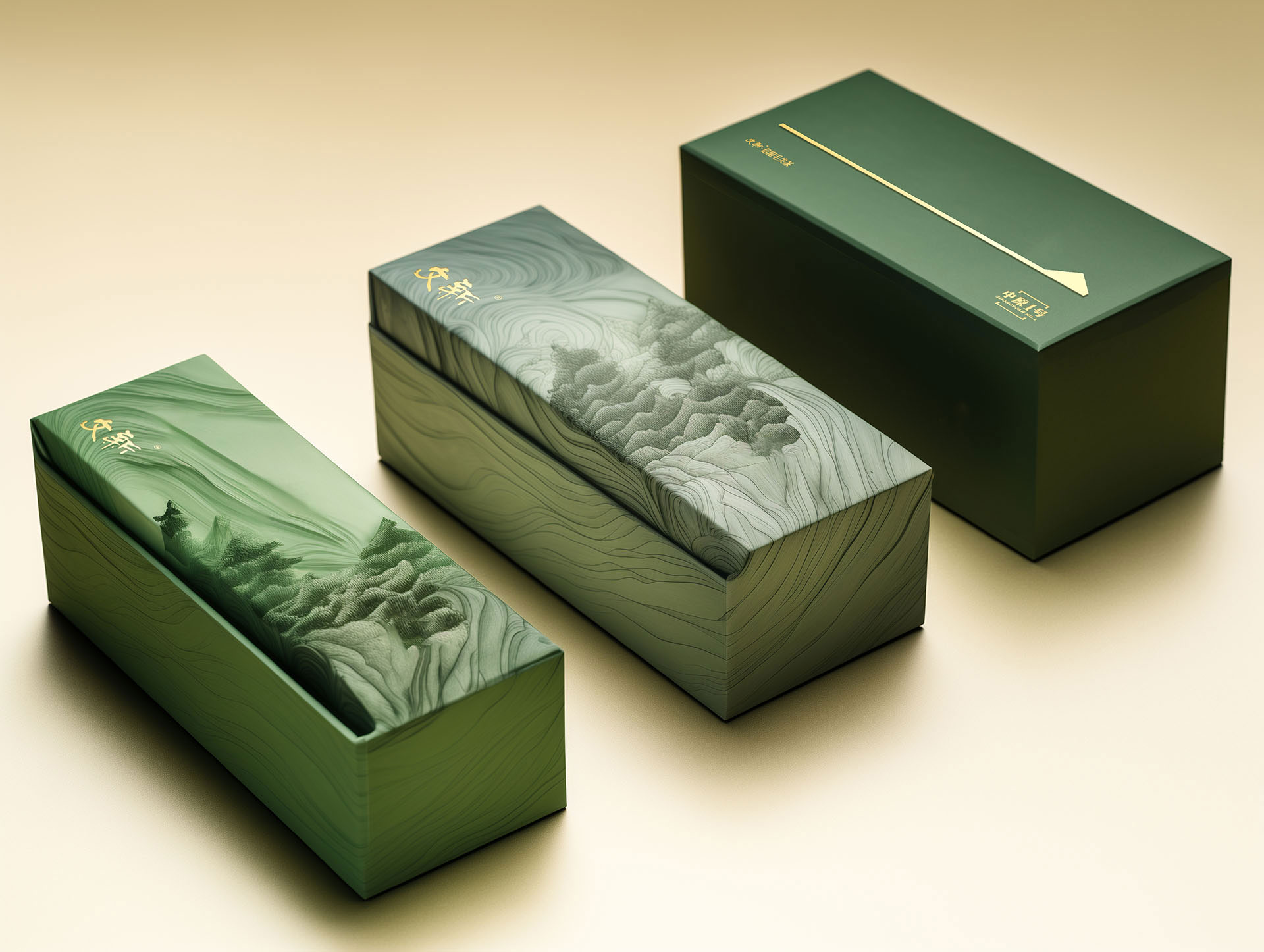
- Color and structure:The primary palette pairs emerald green with gold. Green evokes nature and freshness, while gold underscores the packaging's premium, luxurious character. The overall design is minimal yet richly layered, aligned with contemporary aesthetics without losing its cultural depth.
- Pattern Design:The landscape motif on the packaging is rendered in a contemporary artistic style. Its fluid, dimensional lines echo traditional Chinese shanshui painting, lending the packaging a natural, elegant air.
- Logo:The Wenxin logo is placed prominently on the packaging. Its clean, modern lettering underscores the brand's premium positioning and cultural depth. Its interplay with the packaging graphics creates a more harmonious, refined overall look.
- Packaging Material:The packaging uses high-quality, eco-friendly paper stock with a fine texture and robust structure. The delicate tactility of the outer pack, matched by the refinement of what lies within, makes every pack an unparalleled premium experience.
Tone of Voice
Wenxin Tea's brand voice is elegant, concise and steeped in culture. On-pack copy is succinct yet powerful, communicating the tea's character and the brand's philosophy directly. Each pack lists the variety and origin, signaling the tea's natural provenance and assured quality.
The brand language is clear and concise, free of excess embellishment, and emphasizes the tea's natural ingredients and fine craftsmanship. Its tone is warm yet confident, allowing consumers to sense the brand's sincerity and premium character through both visuals and words.
Brand Experience
Wenxin Tea's packaging offers visual and tactile delight, while its detailing enriches the brand's overall sensory experience:
- Visual Experience:The color palette and landscape motif give the packaging exceptional shelf presence, highlighting the brand's elegance and premium appeal. Every design invites consumers to feel the depth of nature and culture.
- Tactile Experience:Premium eco-friendly materials* offer a pleasing tactile experience. Smooth surfaces and fine embossed detailing heighten the sense of refinement and strengthen consumers' connection with the product.
- Emotional Experience:Every pack lets consumers experience the brand's blend of cultural heritage and modern sensibility, strengthening its cultural appeal. The packaging is more than a container for the product. It is a carrier of the brand's philosophy.
Brand Statement
Natural purity meets cultural refinement, conveying the nobility and elegance of tea.
With this packaging, Wenxin Tea highlights the natural purity of its teas and conveys the brand's cultural depth and premium quality through a meticulous design language, so that every purchase and every cup carries a sense of refinement and elegance.