










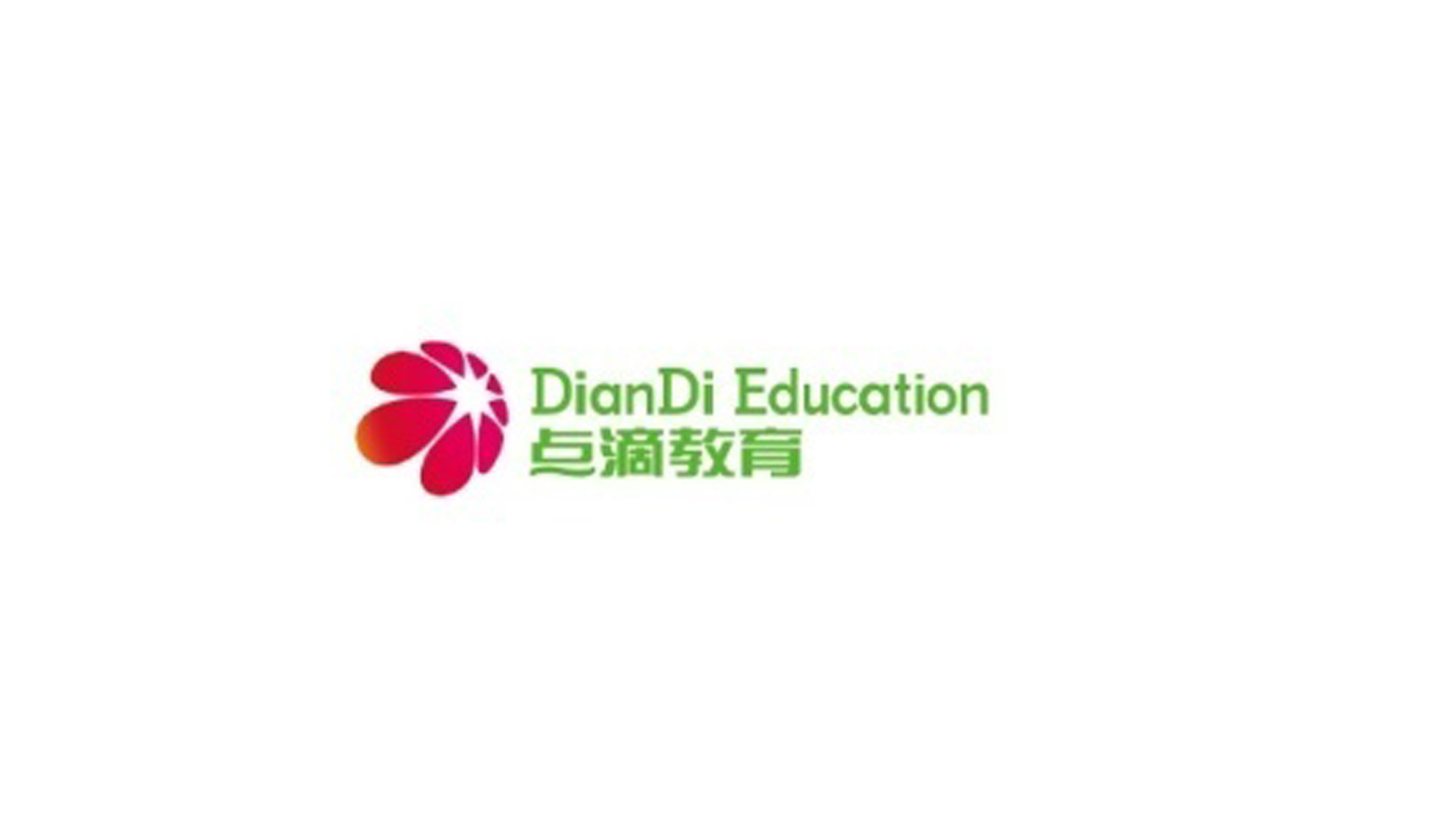
DianDi Education is an education brand dedicated to well-rounded education and holistic development for young people. Its vision, “Let every small step of growth gather into the light of the future,” guides its courses, growth mentoring and emotional support, helping children build confidence and creativity.
The company sought a vibrant, positive visual symbol to express its educational philosophy of “small steps × growth in bloom.”








design concept
The core idea of the mark comes from the symbolic image of “Bloom from Drops.” Radiating petals form a circular, converging shape. Each petal represents a child’s incremental progress in learning and growth, and the outward-blooming gesture embodies the inspiration, inclusiveness and hope of education. Combining natural softness with systematic order, the form conveys the warmth and vitality of a “flower of education.”
graphic language
Converging petals: the gathering energy of growth, accumulation and discovery. Radial circular composition: the wholeness and continuous expansion of education. Gradient layers: the progressive development of knowledge and emotion. Central negative space: room for the mind and the origin of thought. The mark interprets the humanistic spirit of education in the language of nature. It is full of life and aligned with the brand’s visual tone in international education.
Fonts and composition
DianDi Education is set in a rounded sans-serif: simple, soft, friendly, and approachable. The Chinese name uses a balanced, modern medium-weight gothic, steady yet warm, readable and inviting. The lockup follows the international convention of symbol left, type right, reflecting a brand structure of "Eastern spirit × global expression."
color system
Warm Red #D23C56: passion, inspiration and vital energy. Coral Orange #F57A5C: growth, warmth and a positive outlook. Fresh Green #8CC63F: hope, education and the future. White #FFFFFF: purity, openness and inclusivity. The red-to-orange gradient echoes the green lettering, creating the brand’s core impression of “a love of education × green growth.”
Application and extension
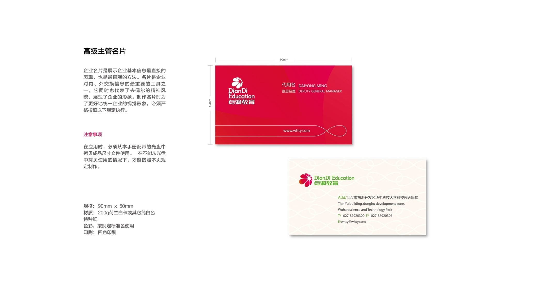
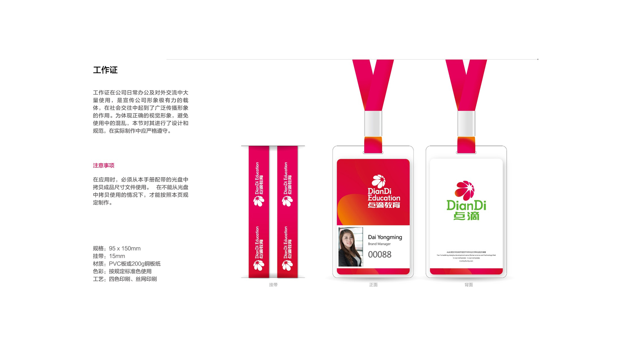
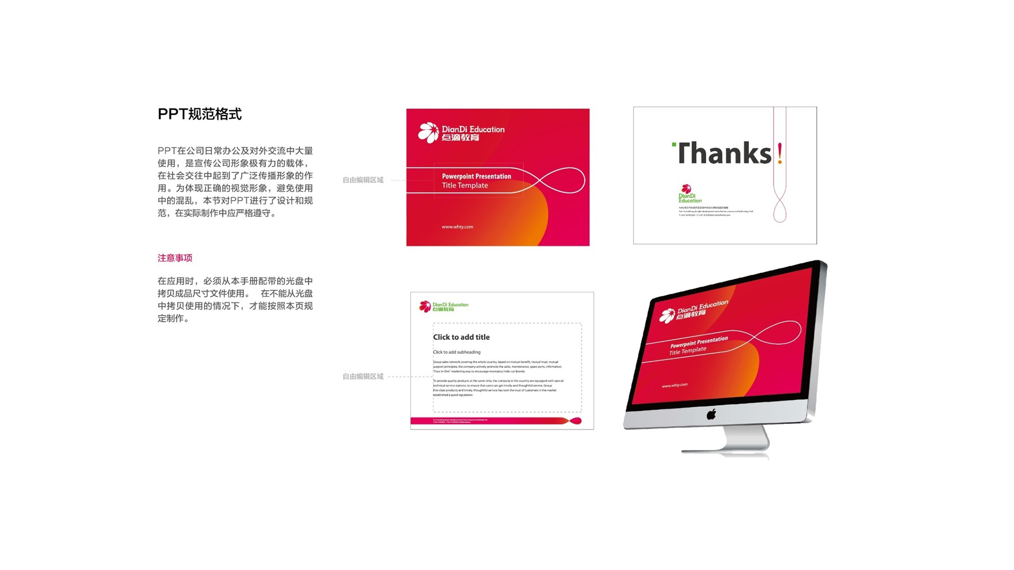
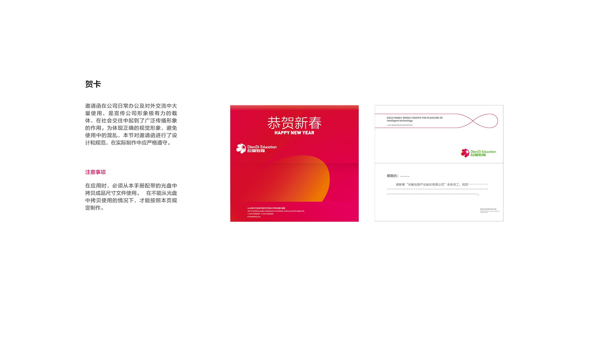
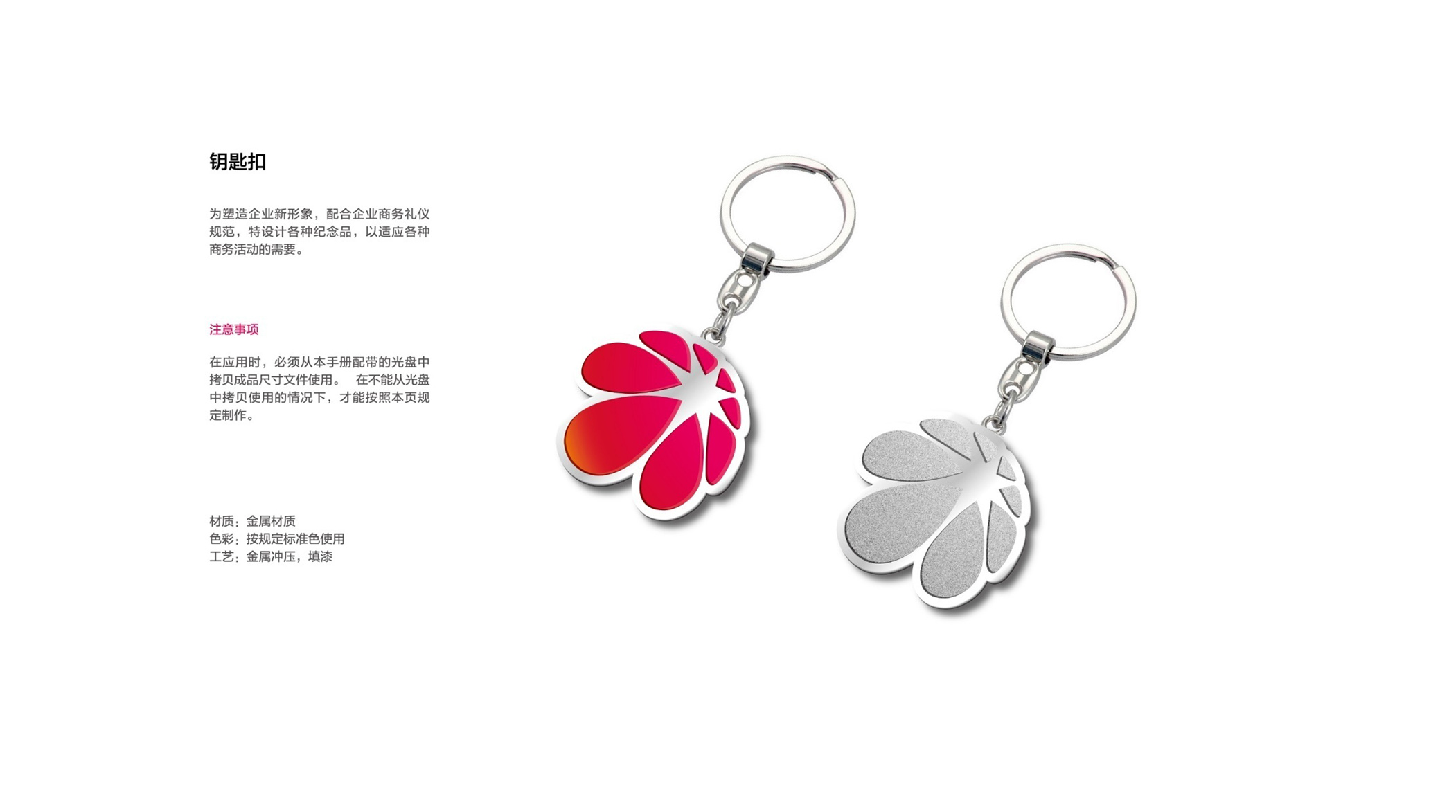
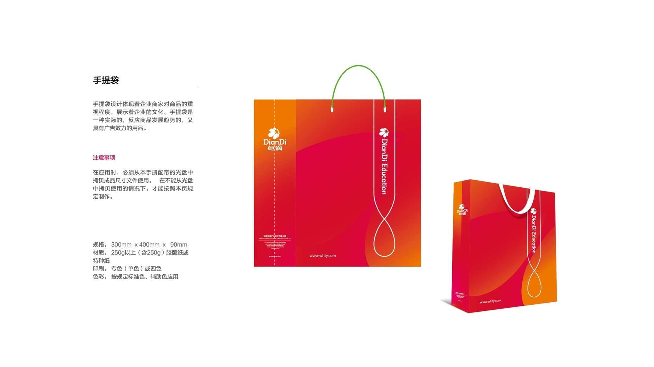
The logo is highly adaptable across touchpoints. Brand: school storefronts, the website and admissions brochures. Product: textbook covers, stationery, student handbooks and event materials. Space: wall graphics, wayfinding and interactive characters. In motion, the petals unfold clockwise one by one, embodying the brand spirit of “inspired learning, blossoming wisdom.”
brand meaning
The DianDi Education logo expresses the brand’s educational philosophy of “small drops gathering × growth in bloom”: petals for accumulated growth; the circle for wholeness and inclusivity; the gradient for warmth and vitality; green for hope and the future. More than a visual mark, it is a brand conviction about the love of education and the power of growth.
Improper Usage (Protection Specification)
Do not alter the number of petals or the gradient direction. Do not adjust color saturation or replace the primary colors. Do not skew, outline or add shadows. Recommended minimum display width: 28mm.
design results
Built on “human warmth × the energy of growth,” the DianDi Education logo establishes a warm, trustworthy and internationally minded education brand. Its “drops into blossoms” motif extends across campus spaces, publications and event systems, making it a benchmark in the education sector for combining approachability with symbolic depth. The project represents Qingmei Future’s mature work in education and youth-development brand design, achieving complete unity from visual identity to educational philosophy.