











Shinya is a technology brand specializing in optical intelligence and vision algorithms. Its vision is “to make light the language of intelligence,” delivering high-precision solutions for future cities and smart devices through optical recognition, sensing and display technologies.
The company sought a simple, rational logo rich in technological symbolism to express its brand spirit of “precision optics × future intelligence.”

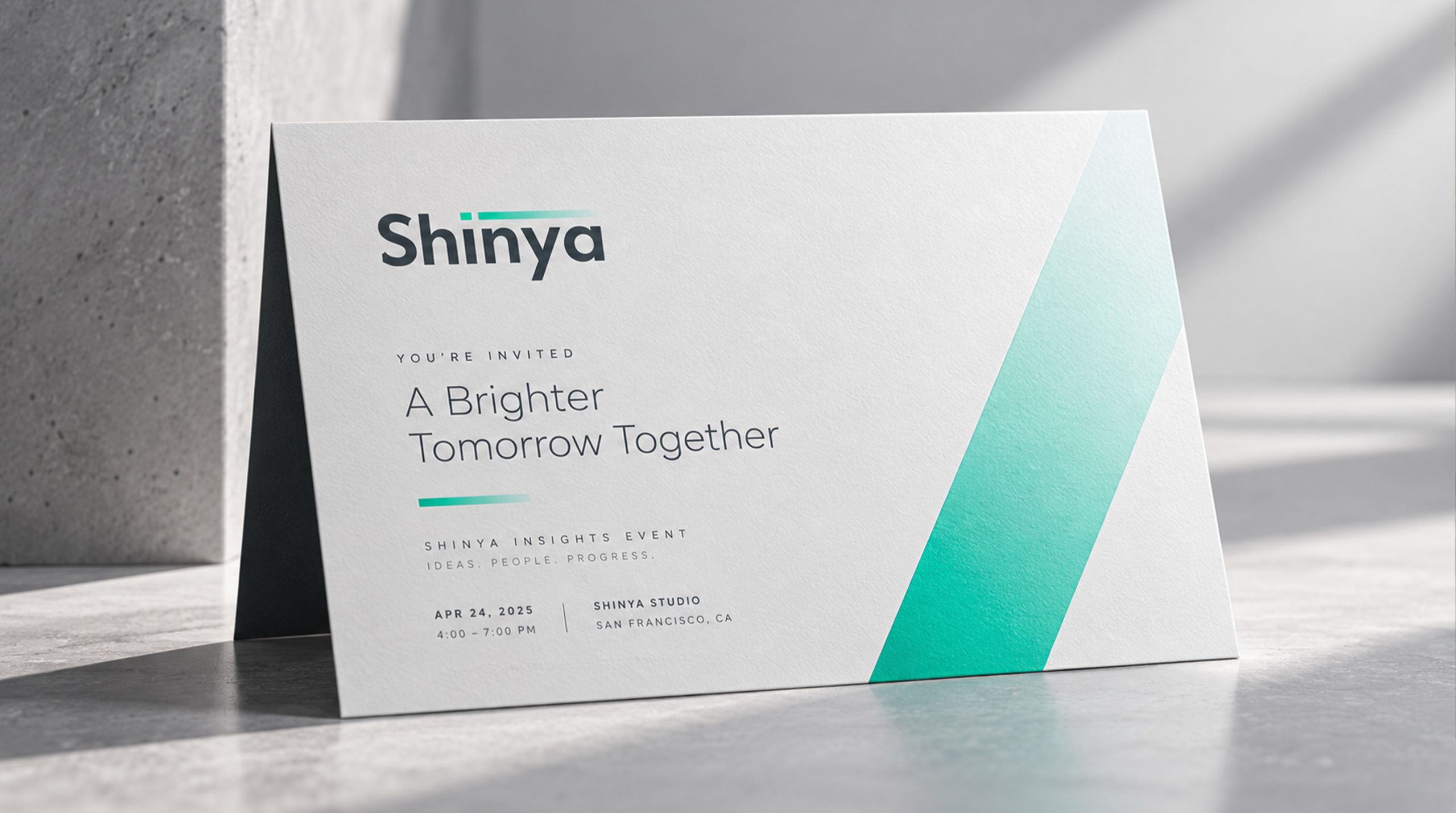
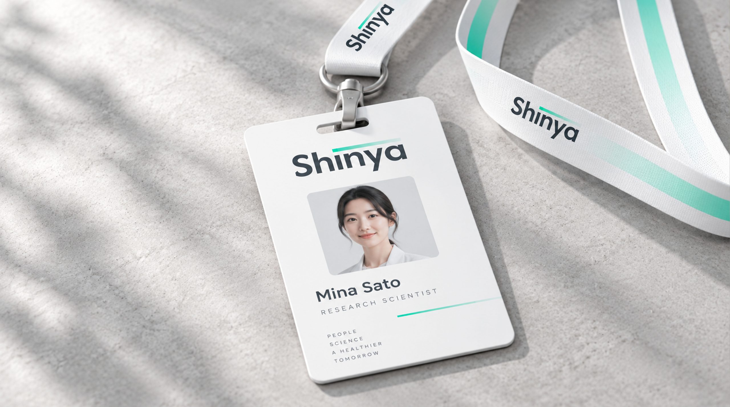
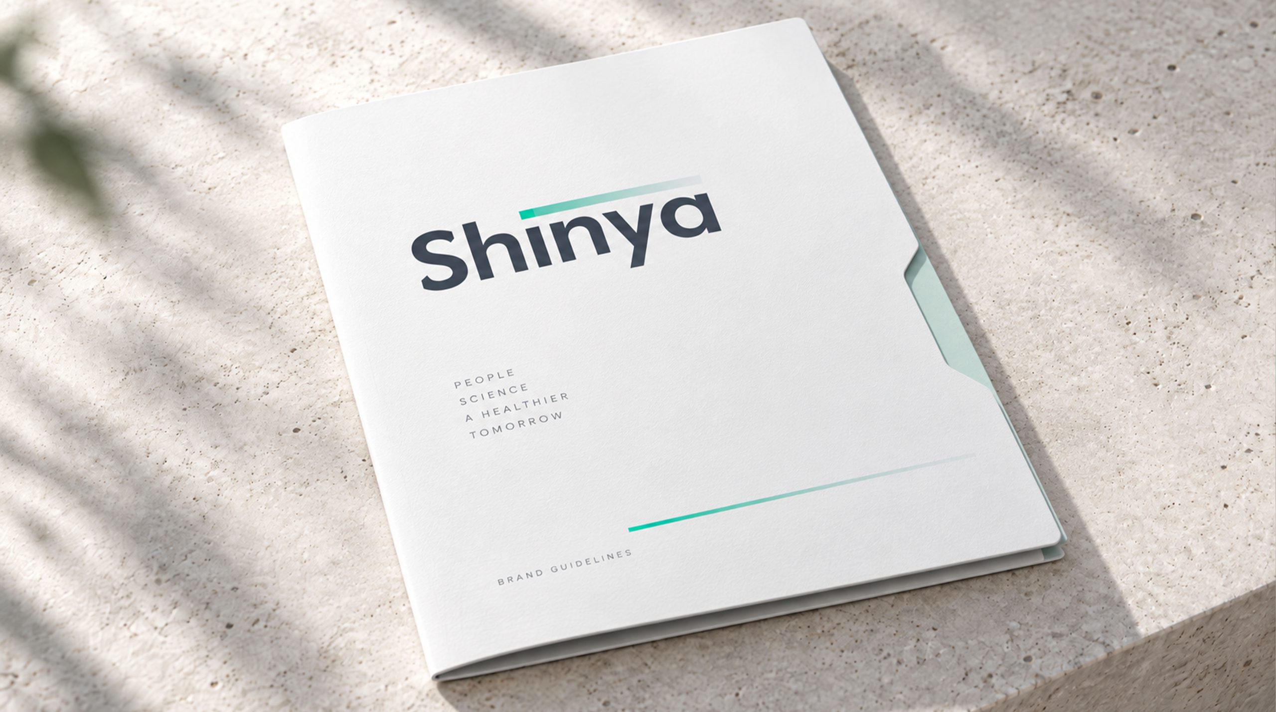
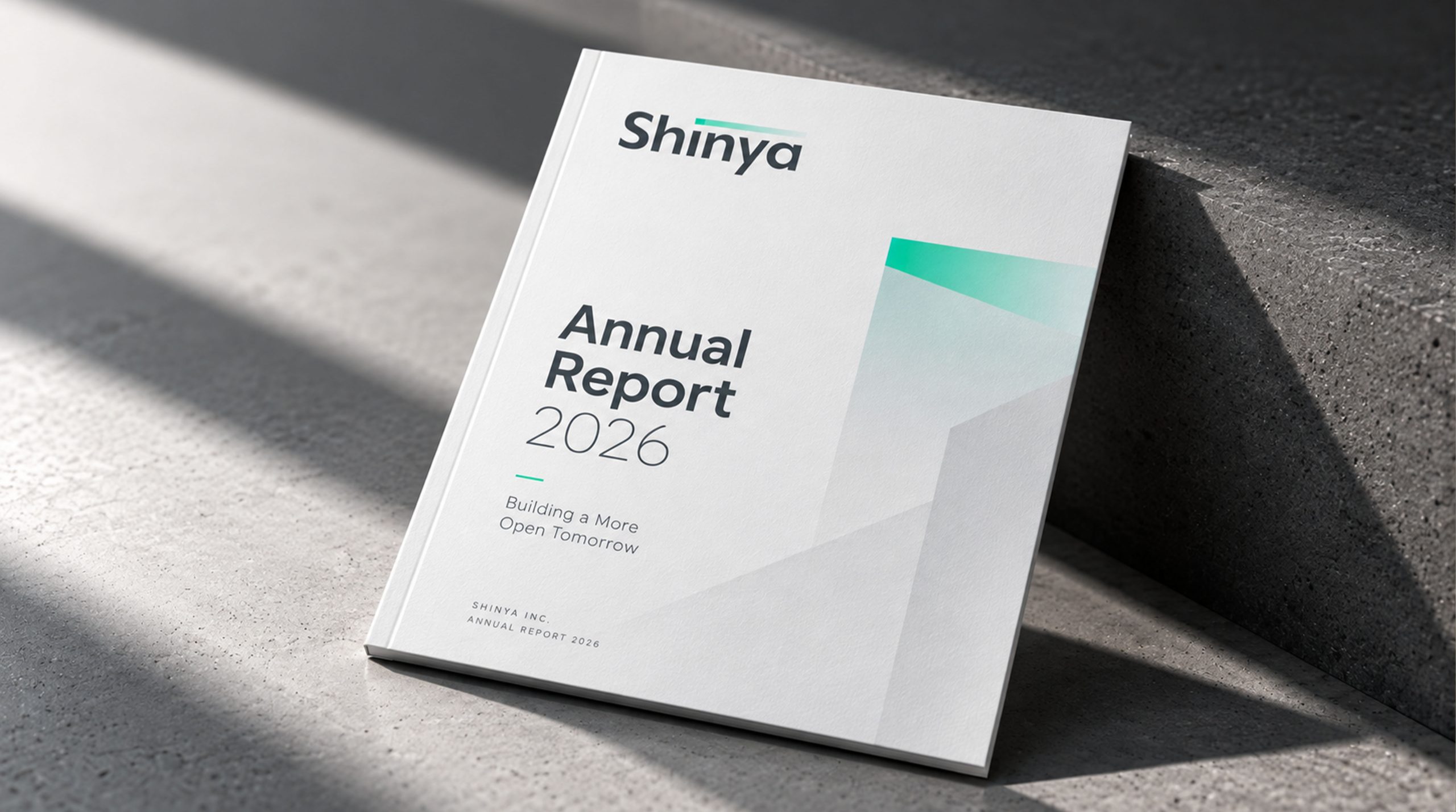

design concept
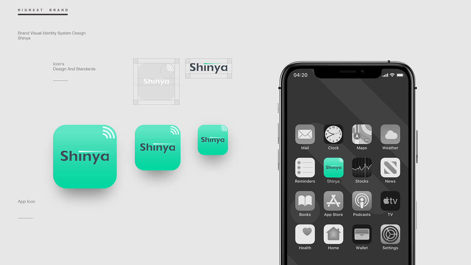
The core idea is “Light as Intelligence.” A minimal wordmark is crowned by a gradient band of light, symbolizing technological illumination, flashes of inspiration and signals of the future. Grounded in rational typography and accented by soft light, the design strikes a balance of “cool logic × intelligent warmth.”
graphic language
Horizontal light band: intelligent signals, speed and optical transmission. Gradient: the diffusion of light and the extension of technological energy. Minimal layout: clarity of information and systematic order. Initial-capital structure: stability and international recognition for the brand name. Using line as its language and light as its symbol, the logo expresses the brand idea of “light as the medium, inspiring intelligence.”
Fonts and composition
The Shinya wordmark uses a custom modern sans-serif with geometric strokes, balanced proportions and generous, airy spacing. The soft structure of the lowercase letters conveys the human side of technology, while the light band above aligns precisely with “S-h-i-n,” creating a visual order that reconciles the rational and the emotional.
color system
Primary: Deep Slate Blue #3A444B, for technological rationality and trust. Secondary: Light Aqua gradient #A8E0D5 → #E8F8F3, for light, innovation and future intelligence. White space #FFFFFF, for purity, precision and openness. The palette follows a principle of “calm base × soft light,” combining technical professionalism with perceptible warmth.
Application and extension
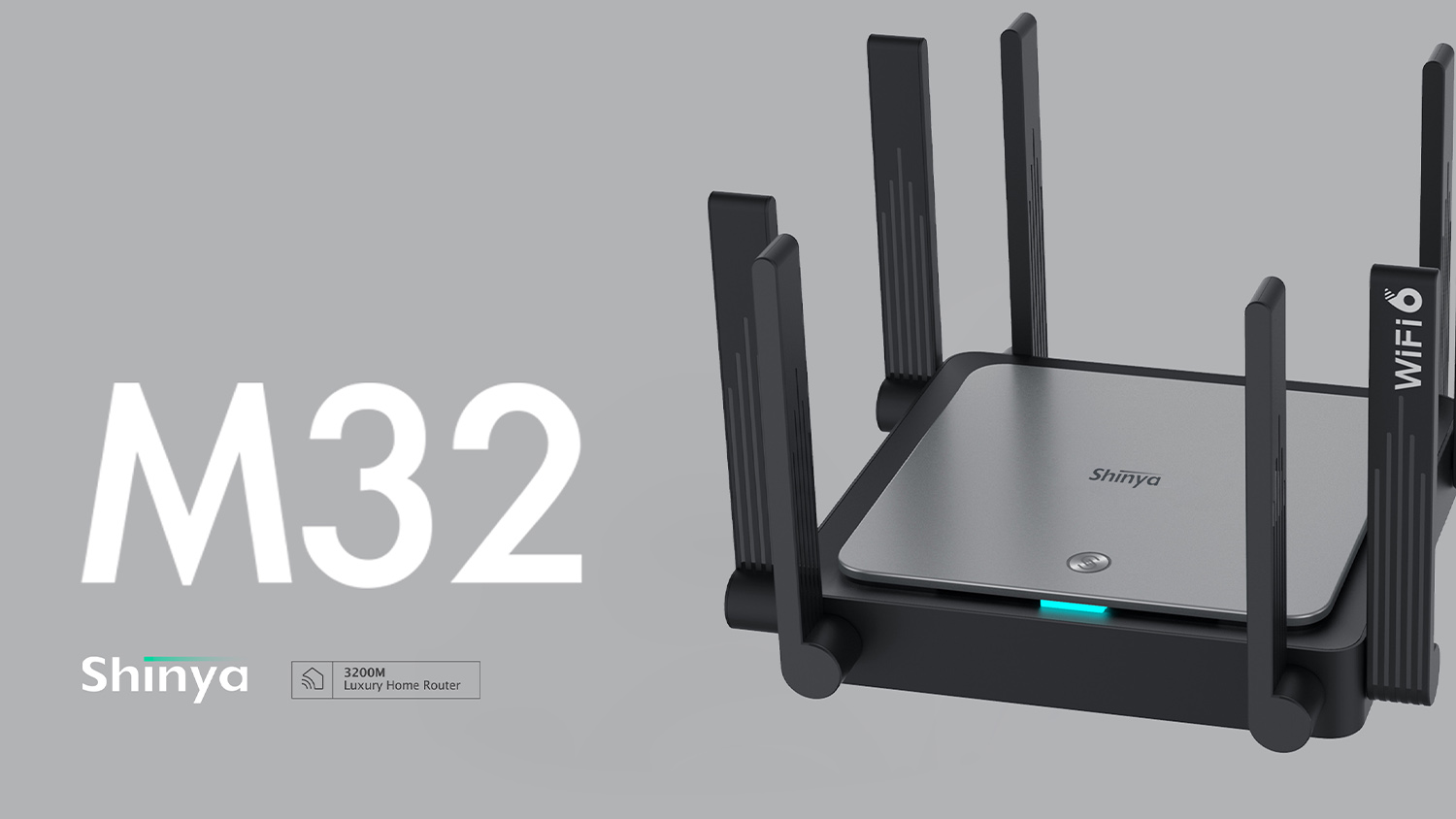
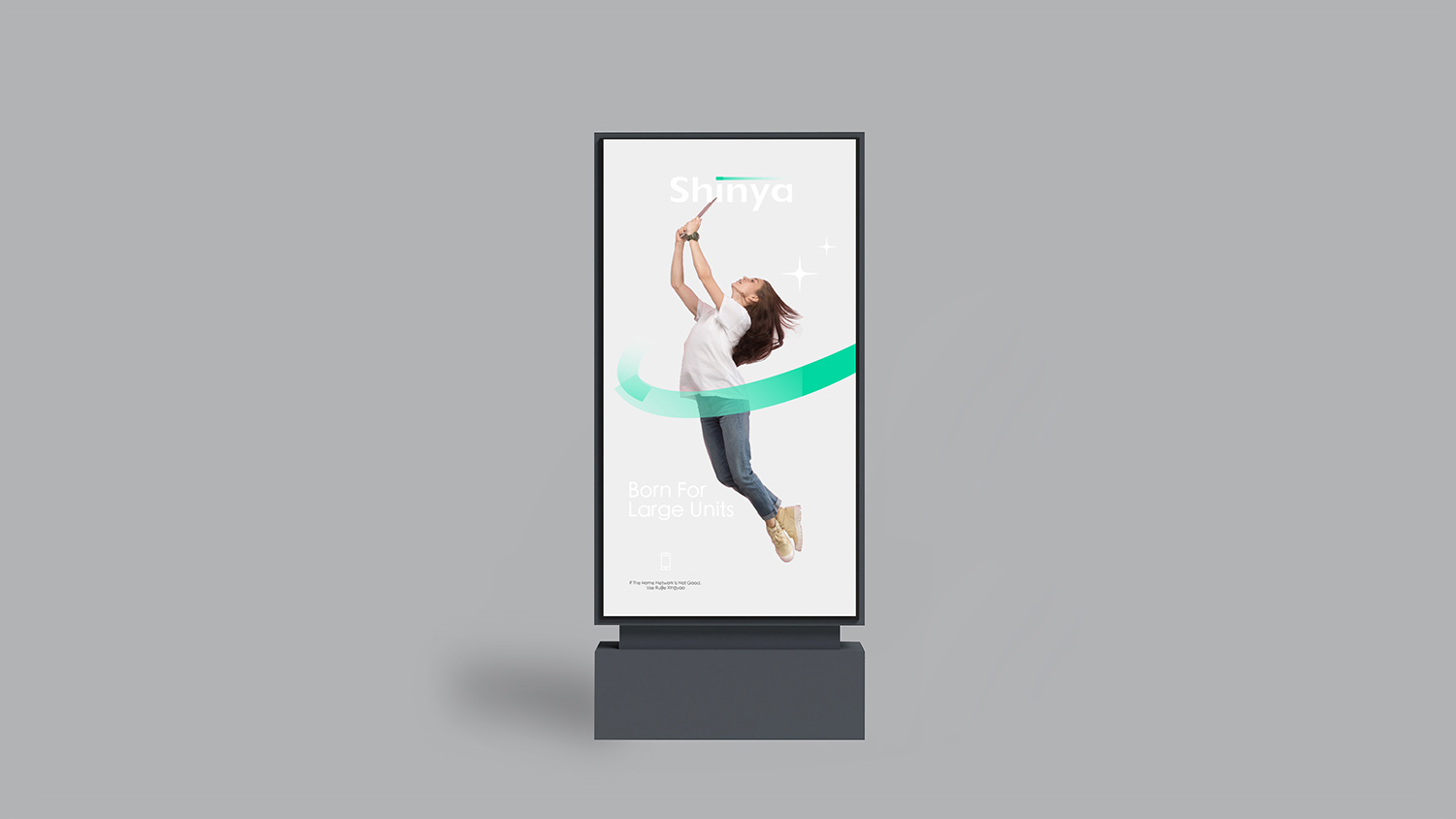
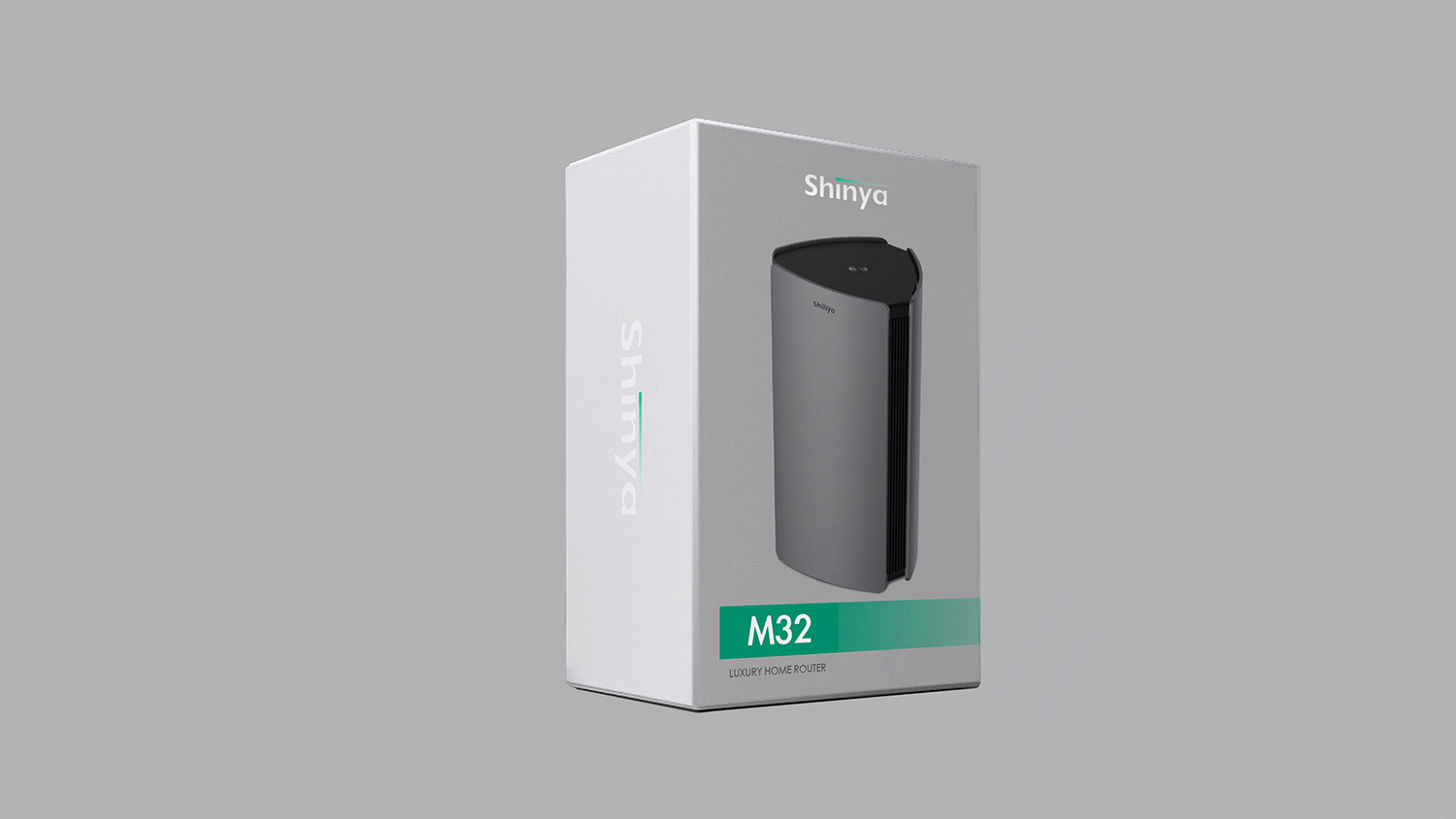
The logo is highly adaptable internationally and instantly recognizable as technology. Corporate: website, technology exhibitions and investor reports. Product: smart devices, lens housings, packaging and boot screens. Space: light-band wayfinding or lighting installations for immersive brand experiences. In motion, the light band flows and fades, symbolizing the awakening of intelligence.
brand meaning
The Shinya logo captures the brand’s essence of “optical intelligence × a precise future”: light band → illuminating intelligence; gradient → innovative energy; geometric type → technological logic; white space → rationality and purity. More than a corporate mark, it symbolizes a brand belief: with light as the frontier, seeing into the future.
Improper Usage (Protection Specification)
Do not change the direction or position of the light band gradient. Do not modify type weight, letter spacing or proportions. Do not add shadows or outlines. Recommended minimum display width: 24mm.
design results
With a design language of “rational geometry × optical intelligence,” the Shinya logo establishes a highly recognizable brand in optical technology and AI vision. The light band has become the core symbol of the visual system, widely used in interface animation, device indicator lights and architectural lighting. The project represents Qingmei Future’s mature work in visual languages for optical intelligence and future technology, uniting brand identity and technological symbolism.