










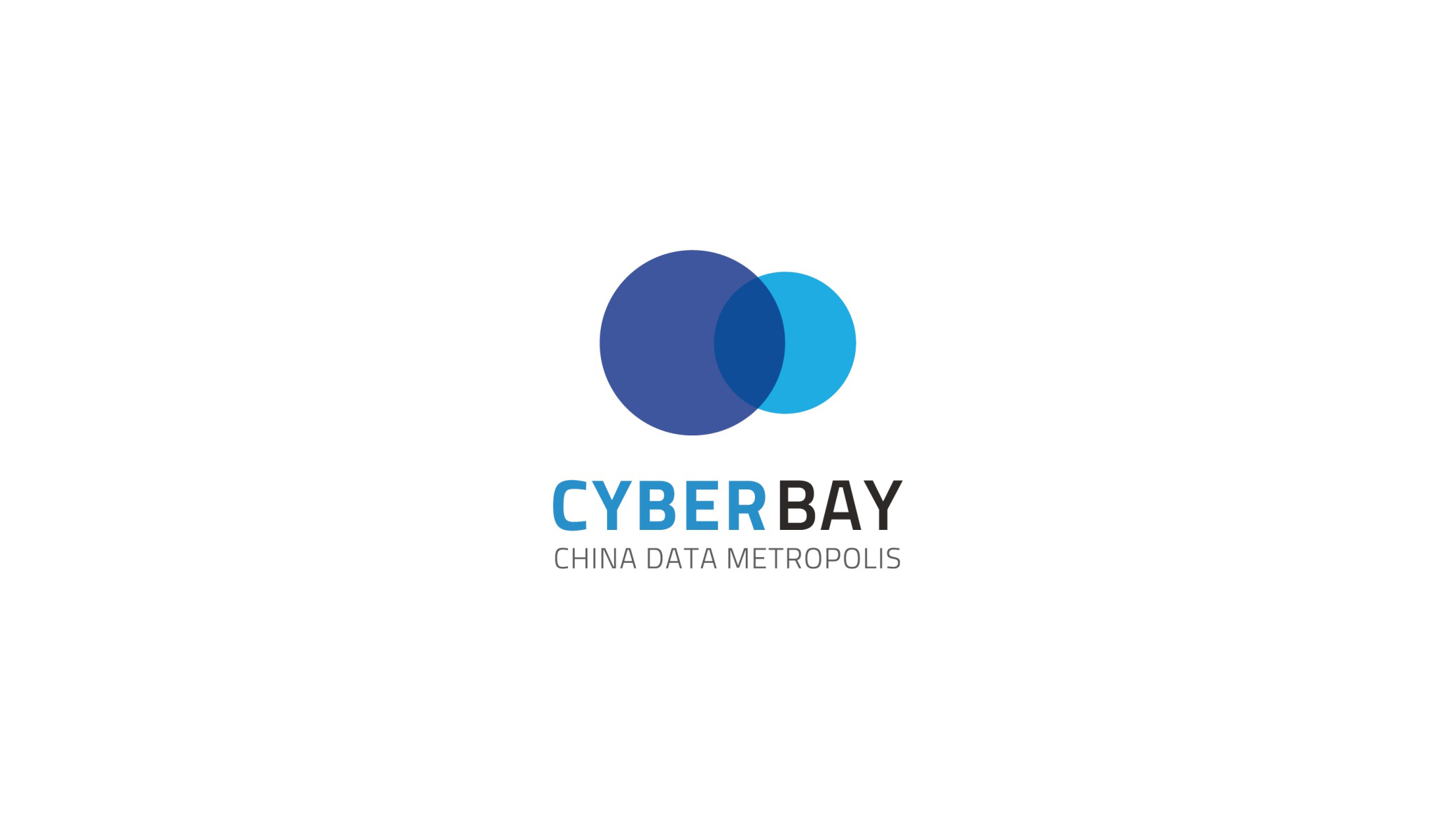
CYBERBAY (China Data Metropolis) is a digital industry cluster centered on data technology and smart city development. Positioned as “a pioneer of China's smart cities and data ecosystems,” it is dedicated to building big data centers, AI platforms and city-scale information infrastructure.
The brand sought a visual system combining technological rationality with urban inclusiveness, expressing its vision of data convergence × intelligent symbiosis × the future city.





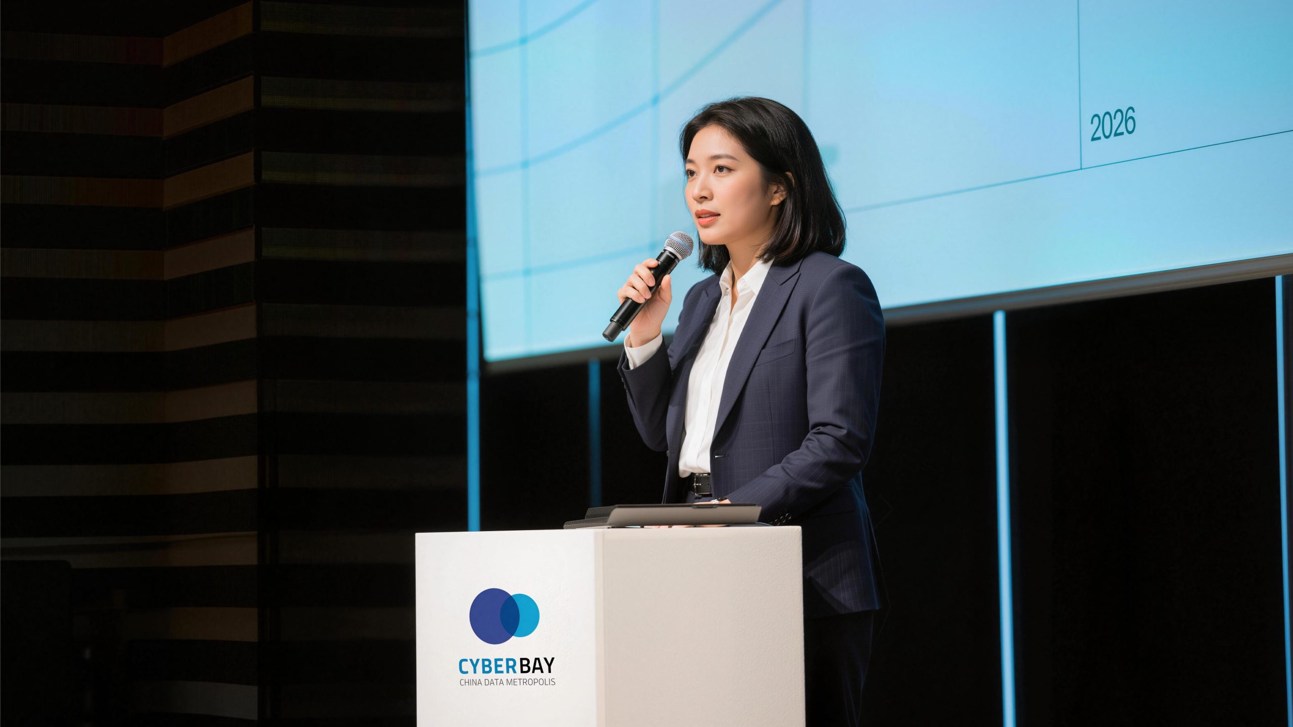
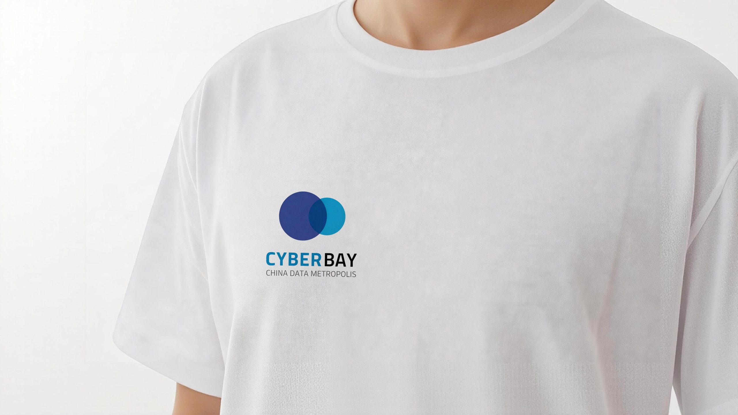
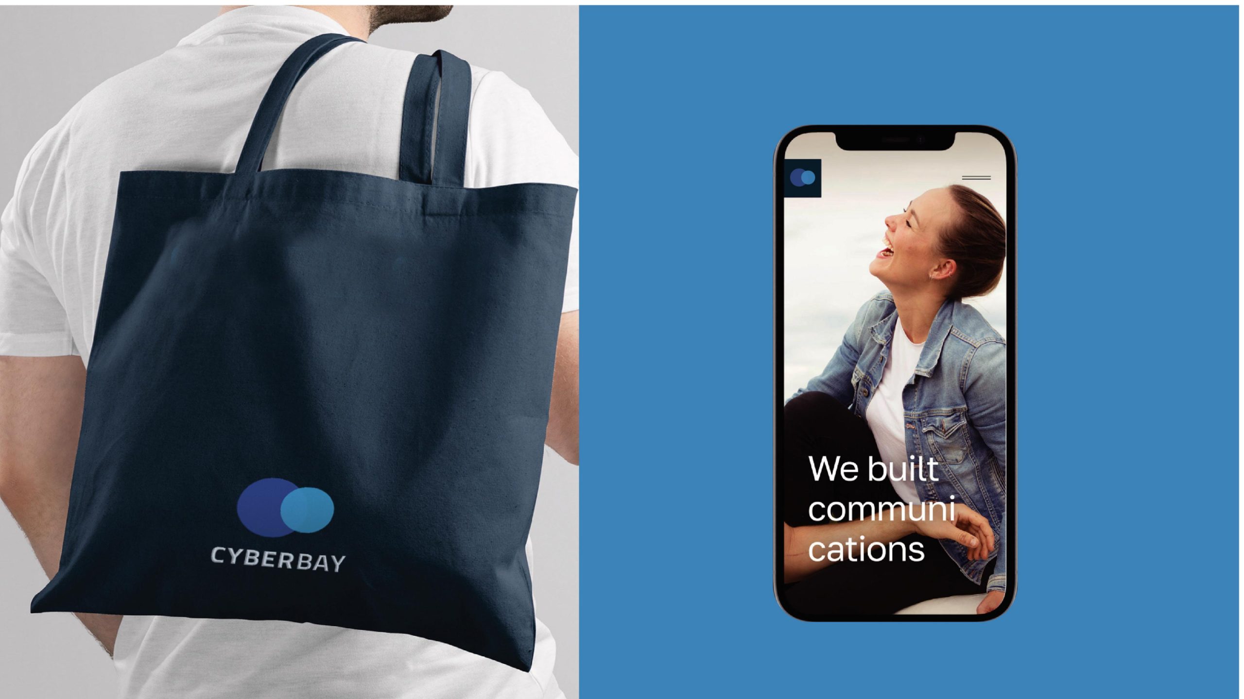
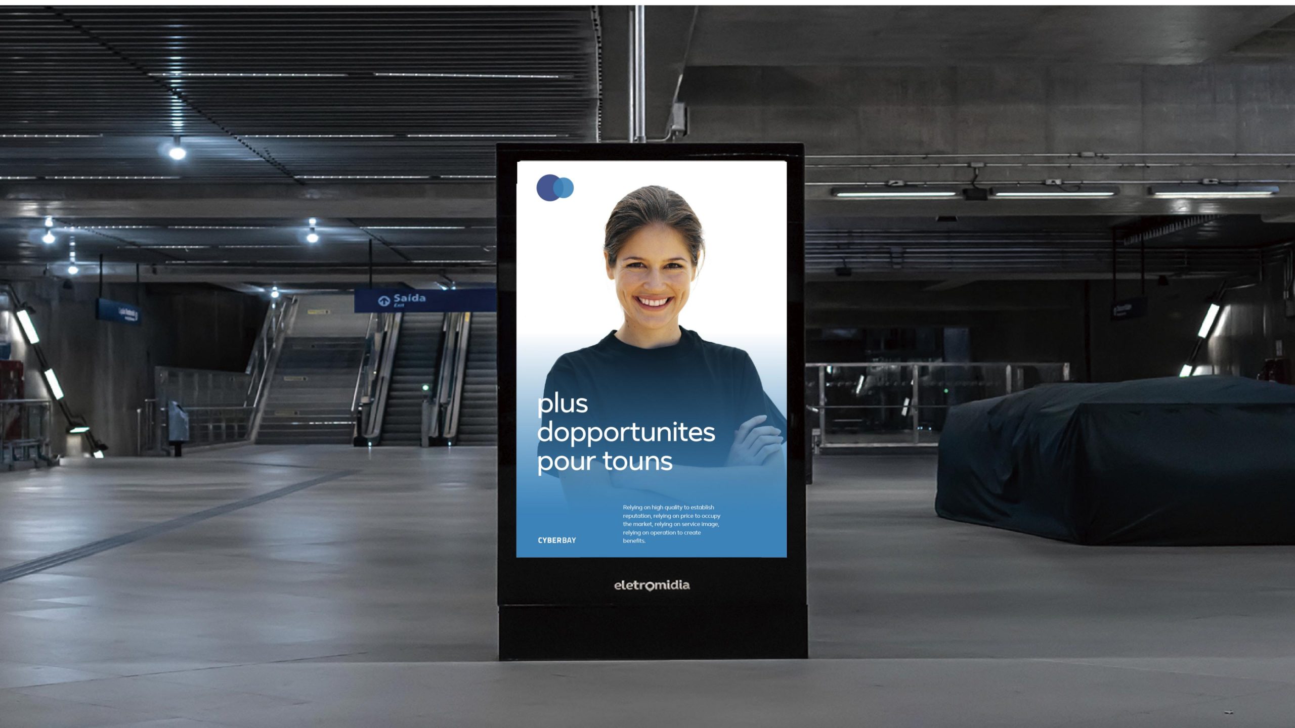
design concept
The logo's core idea is Data Convergence — the meeting and coexistence of information. Two overlapping circles form the primary mark, symbolizing the fusion of data and city, technology and humanity. The circle is the most inclusive and extensible of geometric forms, representing open systems and infinite connection. Where the circles overlap, a new spatial relationship emerges — an expression of the innovative, collaborative and symbiotic spirit of the data city.
graphic language
Intersecting circles: the fusion and symbiosis of data × city; Transparent overlap: sharing, connection and the birth of new value; Blue palette: technological rationality, trust and the glow of intelligence; Minimal geometry: a heightened sense of internationalism and futurity in the visual identity. The mark evokes data streams meeting within the city, striking a visual balance between rational systems × human warmth.
Fonts and composition
The CYBERBAY wordmark is set in a geometric sans serif with a compact structure and symmetrical, orderly strokes, conveying the precision of a technology system. Beneath it, the descriptor “CHINA DATA METROPOLIS” appears in a lighter weight, clarifying the brand's function and strengthening its international voice. A clear contrast in weight and the pairing of black and blue create hierarchy and professionalism.
Color System
Deep Blue #2E3E8C: technological rationality and depth of thought; Bright Blue #55A6DA: innovation, openness and digital energy; Charcoal #3A3A3A: stability and authority; White #FFFFFF: a pure, transparent data ecosystem. The blue palette forms the brand's core color range, reinforcing the primary visual impression of technology × city × ecosystem.
Application and extension
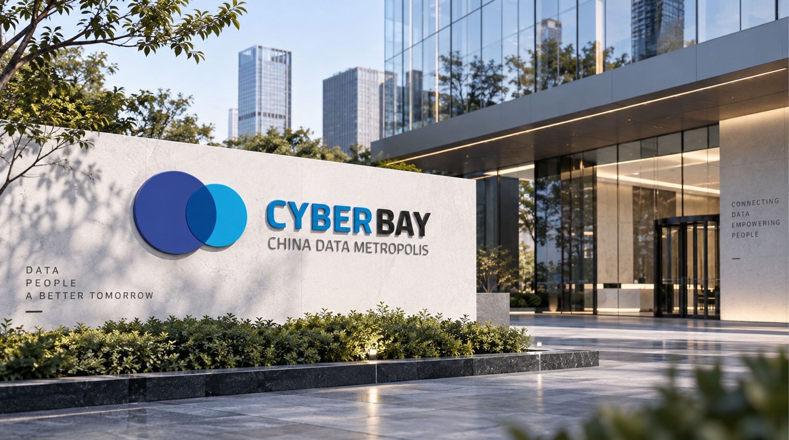
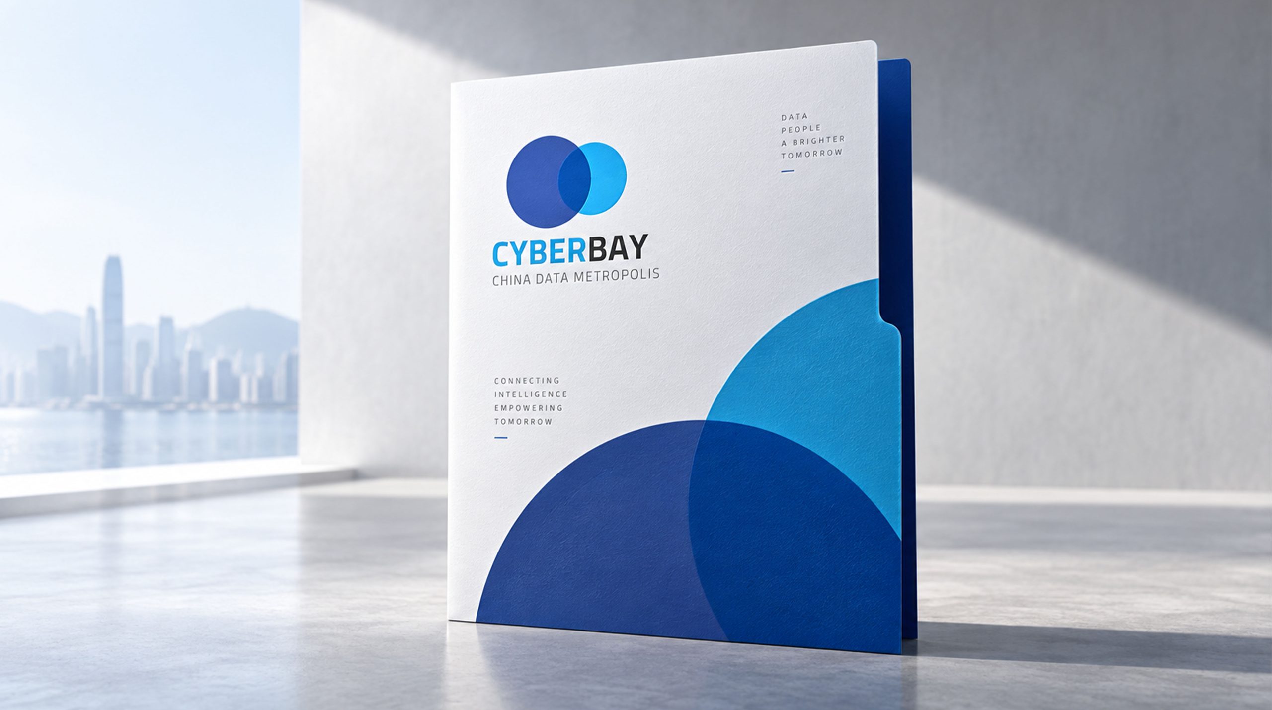
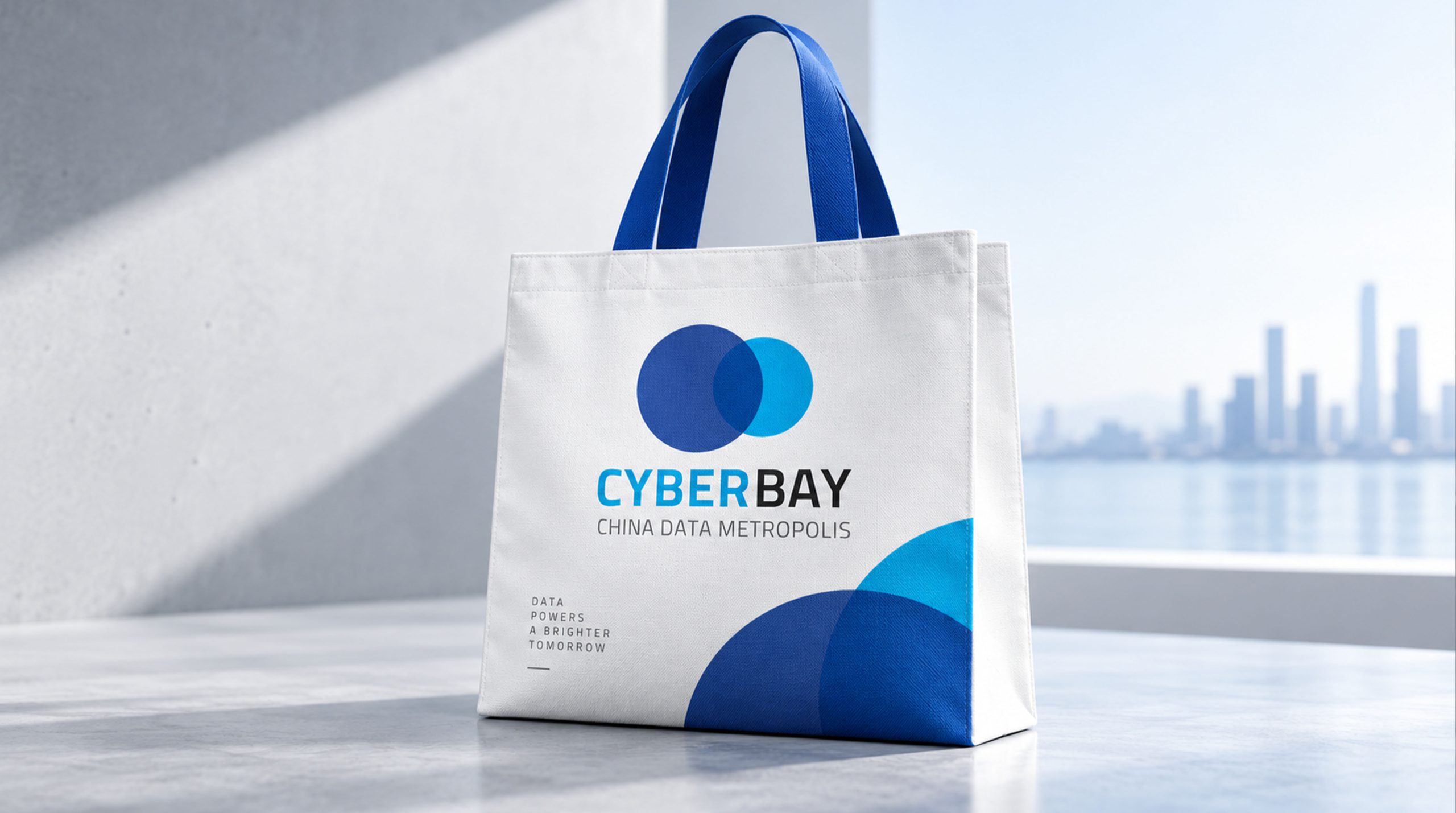
The logo is highly versatile and internationally recognizable across applications: Corporate: website, data centers and strategic announcements; Product: software interfaces, device icons and smart device housings; Spatial: extended into overlapping light-sphere installations in city exhibition halls, technology showrooms and industrial park wayfinding. In the motion version, the two circles slowly converge and pulse with energy, symbolizing data collaboration and the flow of intelligence.
brand meaning
The CYBERBAY logo expresses a brand philosophy of data fusion × intelligent symbiosis: Twin circles → fusion and collaboration; Transparent overlap → openness and sharing; Luminous blue → technology and trust; Minimal composition → future and global reach. More than a visual identifier, it is a visual metaphor for the spirit of the digital city — letting data connect the world and intelligence build the future.
Improper Usage (Protection Specification)
Do not alter the proportions or overlap of the circles; do not modify the blue palette or add gradients or outer glows; do not skew, break or add shadows to the mark. Recommended minimum width: 30 mm.
design results
Built on a visual language of rational geometry × intelligent symbiosis, the CYBERBAY logo establishes a highly recognizable presence across technology parks, smart city pavilions and international forums. Its intersecting circles have become a visual symbol of a co-created data ecosystem, applied widely across digital industry spaces, interactive interfaces and multimedia display systems. The project represents Qingmei Future's mature expression in smart city and data ecosystem branding, unifying data visualization and brand philosophy.