










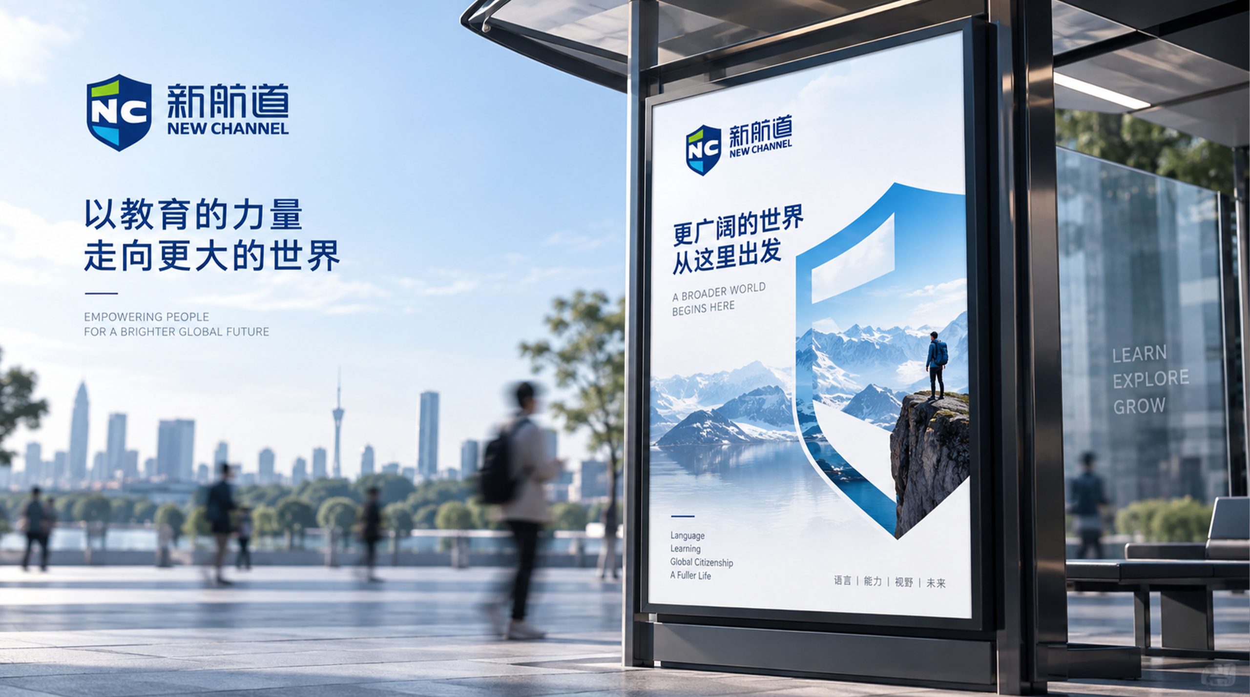
This project developed the logo system for New Channel Education Group. As education becomes increasingly international, the goal was to create a brand image that stands for professionalism, trust and growth, using a flat, modern and highly recognizable visual language.
Built on a shield form that integrates the letters N and C, the logo symbolizes the guardianship of knowledge and the power of education.


design concept
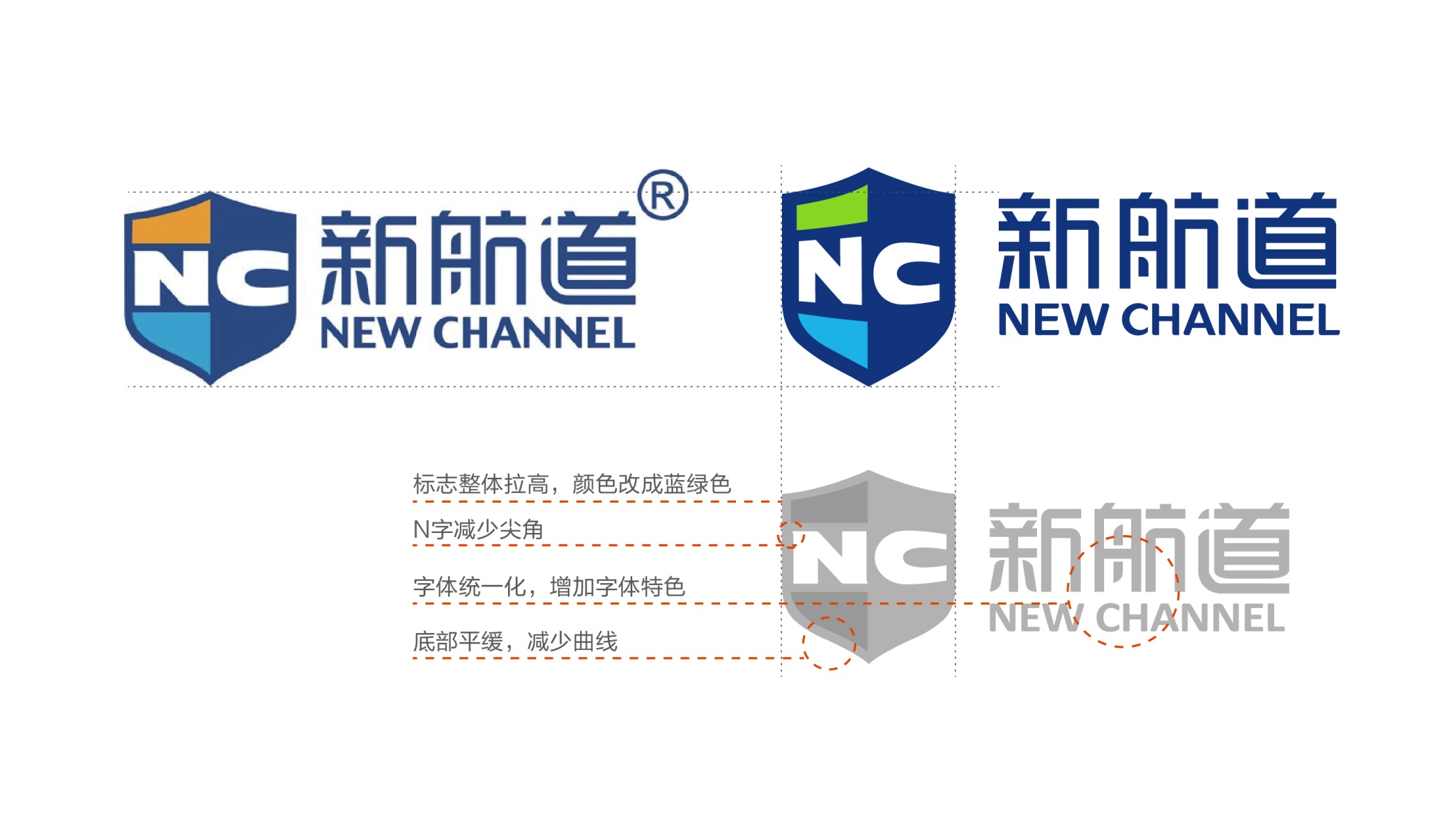
The core symbol, a shield combined with the letters NC, embodies the brand's educational spirit of “safeguarding dreams and helping them set sail.” The shield represents the protection and strength of knowledge, signifying that students receive systematic support and grow with confidence within the New Channel system. The letters N (New) and C (Channel) merge in a geometric composition that feels stable, modern and technologically forward. Together they form an “Education Shield,” representing a brand that guides students on their international journey with expertise and conviction.
graphic language
Shield structure: guardianship, solidity and academic authority; NC monogram: the brand's core initials and its connection to global education; Layered color blocks: the stages of a learning journey (Foundation → Advancement → Achievement); Angled cuts: the courage to break through and explore the unknown. Simple yet layered, the mark reinforces the brand's role as a symbol of trust in education.
Fonts and composition
The NEW CHANNEL wordmark uses a modern sans serif with compact construction and clean, straight lines, conveying rationality and professionalism. The Chinese name is custom-refined with square, well-grounded letterforms that balance the shield. The bilingual wordmark follows a stacked Chinese-English layout at an overall ratio of 1 : 1.5 (symbol : wordmark), ensuring clear recognition and an international feel across media.
color system
Primary Education Blue #1D4E9F: knowledge, rationality and the spirit of international education; Secondary Green #6CBF6A: growth, hope and student potential; Tech Blue #4BA3D3: youthfulness and a sense of the future; White #FFFFFF: purity, trust and intellectual awakening. Layered blues and greens create a visual rhythm of wisdom, trust and growth, defining the brand's “education × future thinking” character.
Application and extension
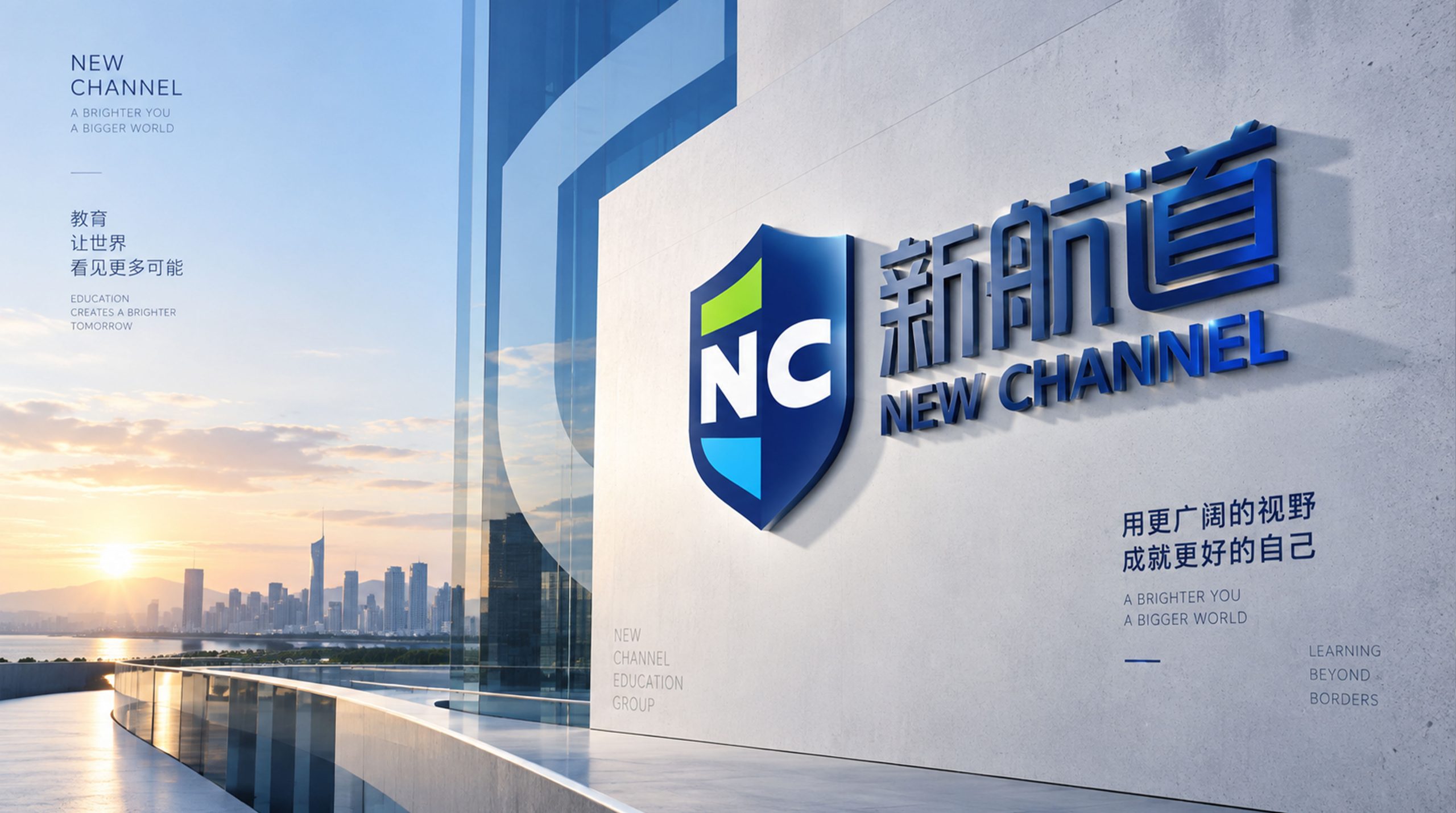
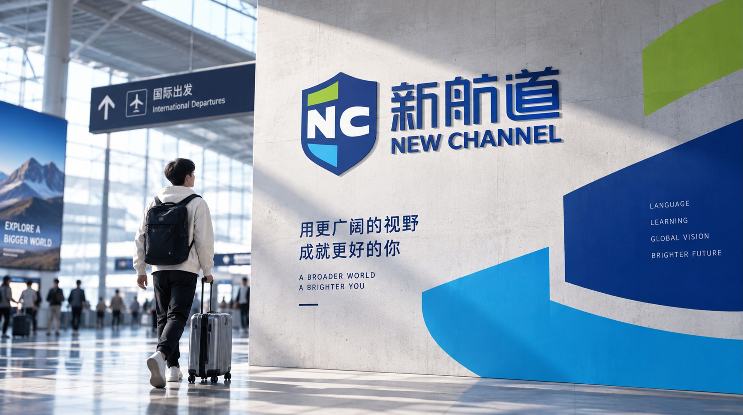
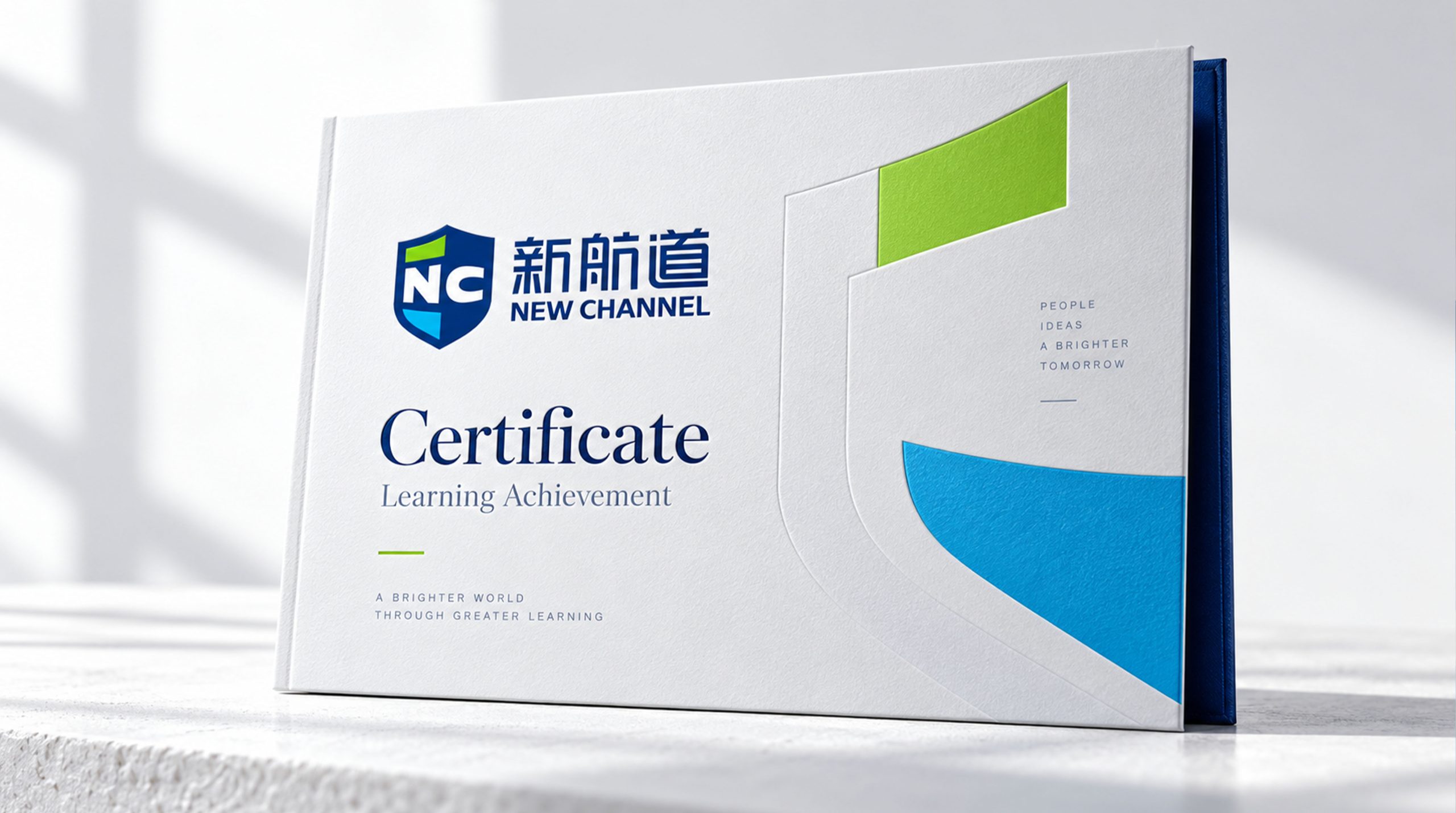
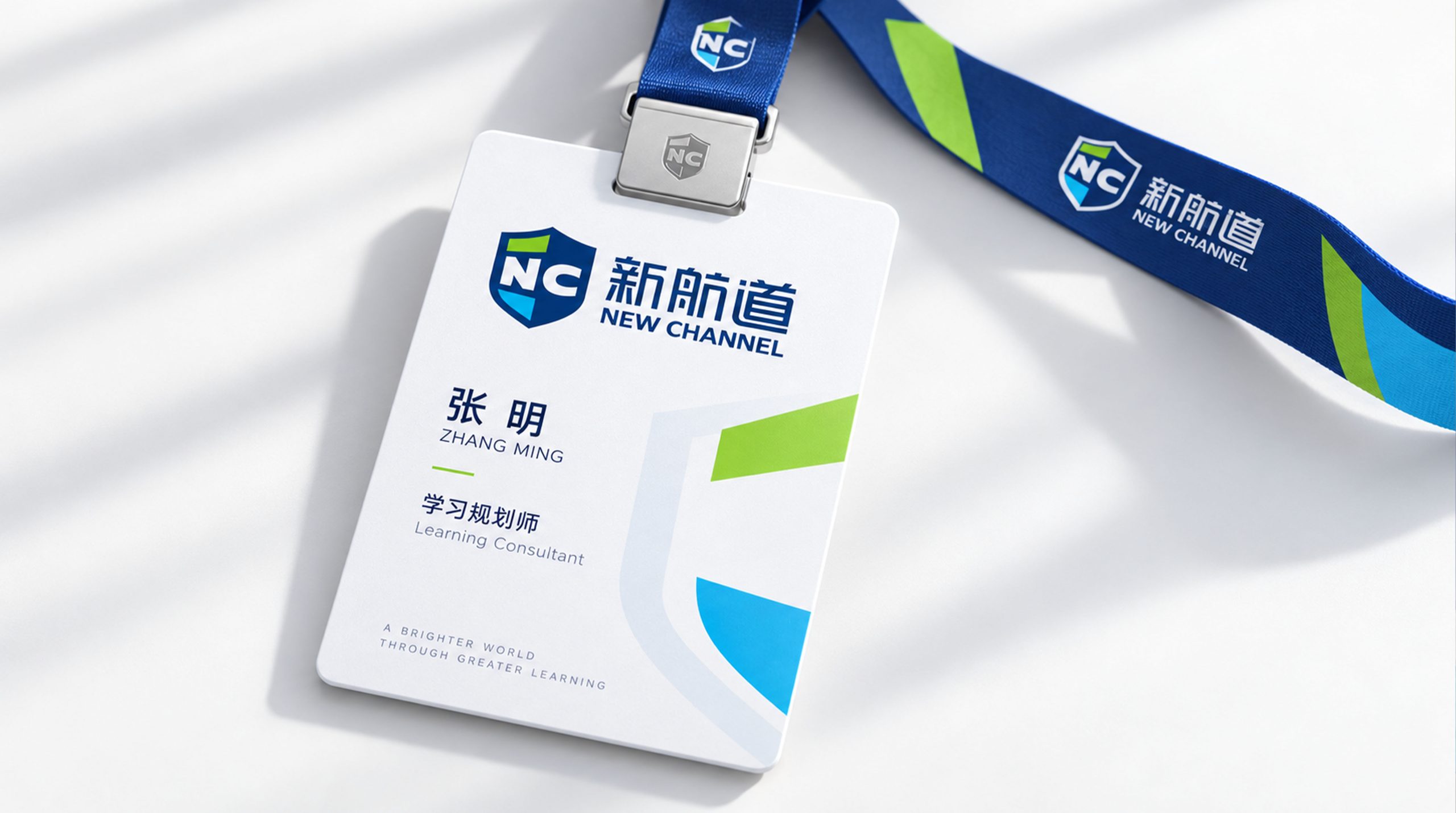
The logo applies across the full New Channel education ecosystem: textbook covers, student cards, certificates and uniforms; campus signage, classroom wayfinding and promotional materials; website and app interfaces, and intros for teaching videos; posters, enrollment brochures and event backdrops. The shield can also stand alone as a mark of educational accreditation for official uses such as digital badges and certificate seals.
brand meaning
The logo expresses New Channel's core philosophy of “guiding dreams, connecting to the world”: New Beginning: blue represents knowledge and the voyage ahead; Channel of Trust: the shield symbolizes educational security and institutional strength; Global Education: a clean, modern composition conveys global connectivity. The overall identity reflects both the conviction and the warmth of a leader in language education.
Improper Usage (Protection Specification)
Do not alter the shield's proportions or corner angles; Do not change the primary blue or add gradients; Do not rotate, skew, outline or mirror the logo; Do not separate the letters from the shield; Maintain clear space of at least 25% of the logo height; Minimum size: 30mm.
design results
Following the launch, New Channel achieved gains in both recognition and trust across China's education sector. The “Education Blue Shield” has become the emblem of its authoritative teaching system and is applied across branches nationwide and online platforms as a unified visual standard. Designed by Qingmei Future, the project was featured in the Yearbook of Visual Systems for Education Brands and Learning Experiences.