










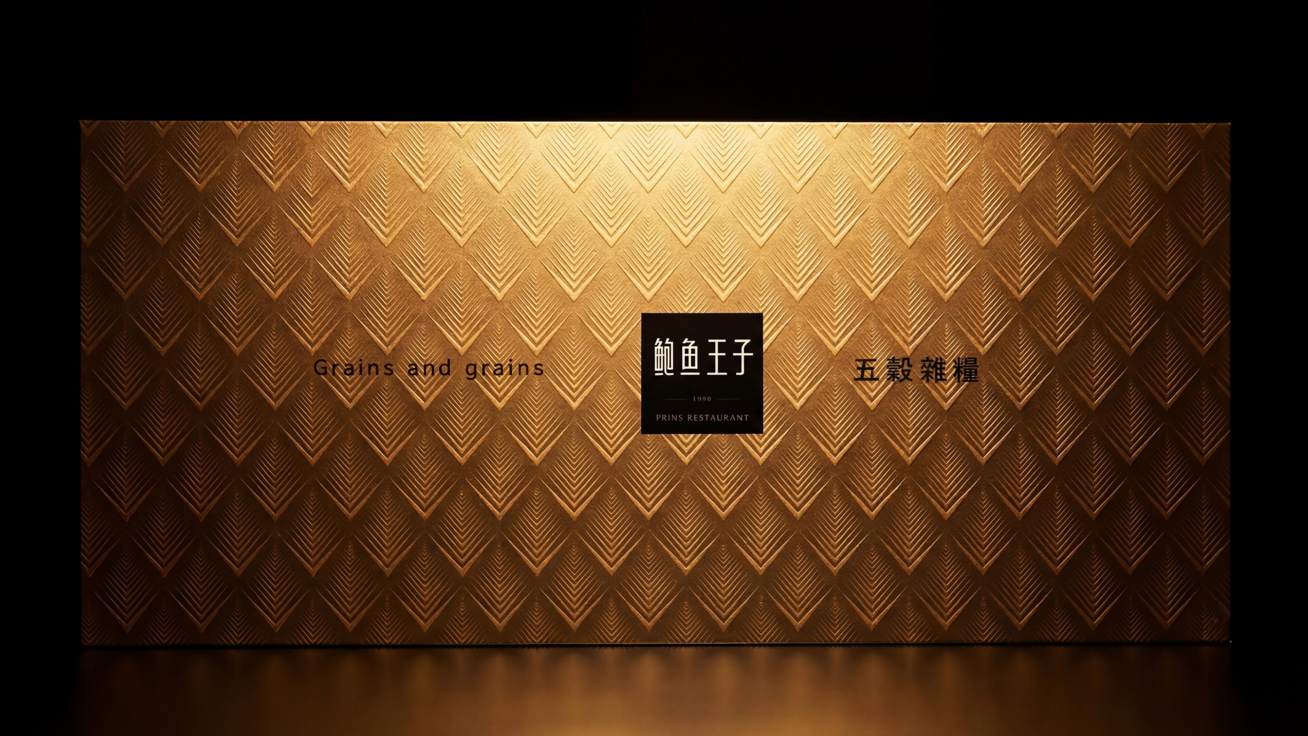
While Prine Restaurant (founded in 1999) is deeply involved in the field of high-end delicacies and gifts, it has extended a new line of cereals and grains based on the concept of "food nutrition", extending the brand's respect for the Chinese food culture from delicacies of the mountains and seas to field grains and herbal essences.
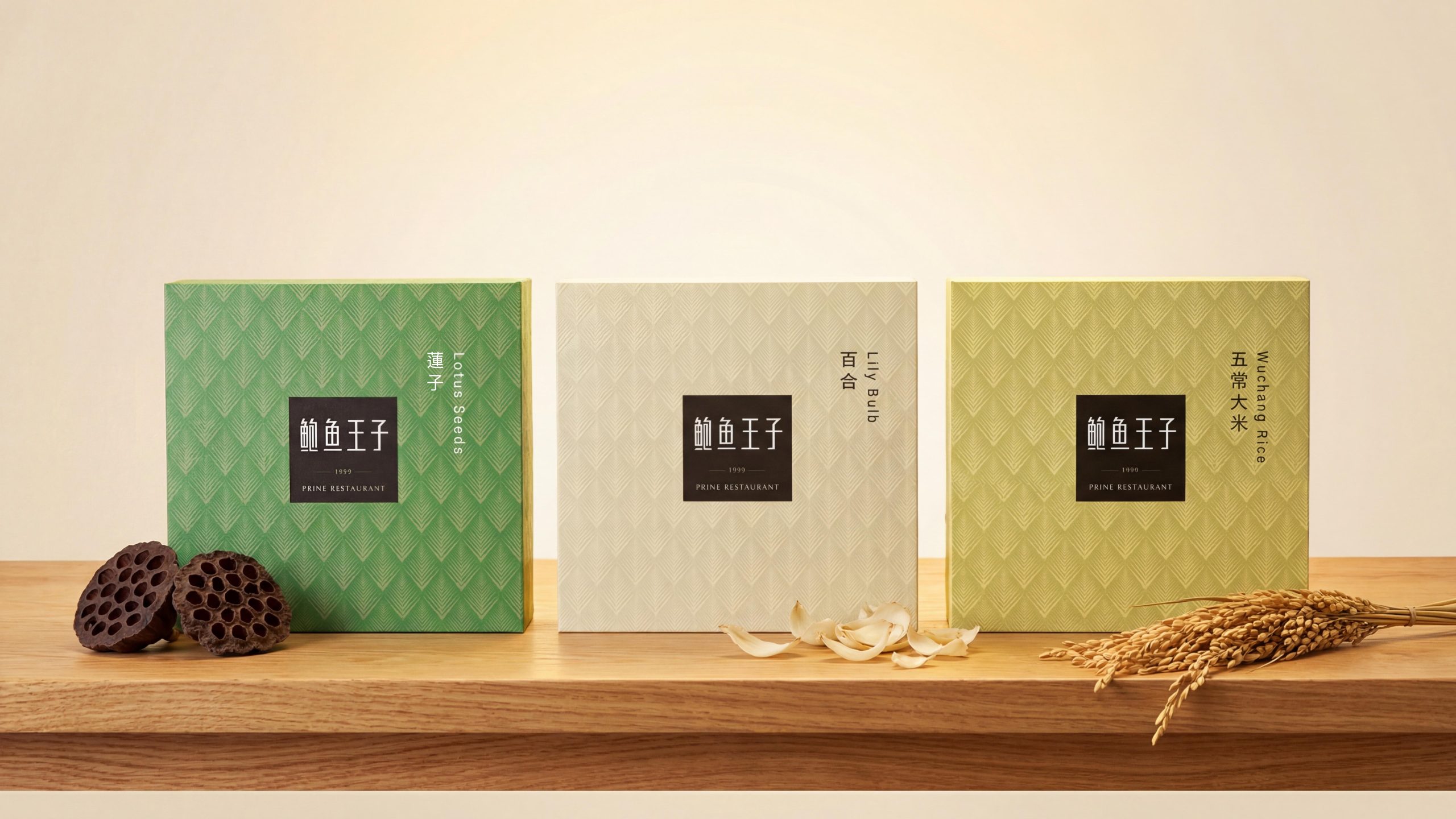
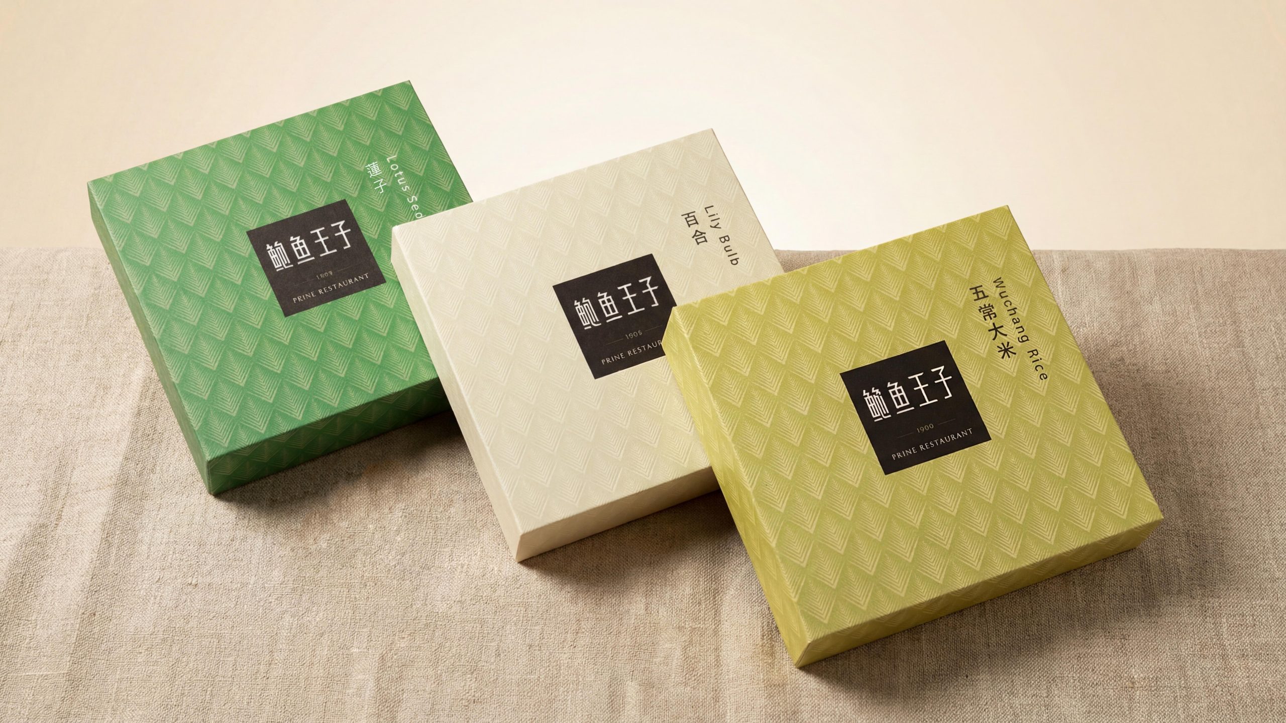
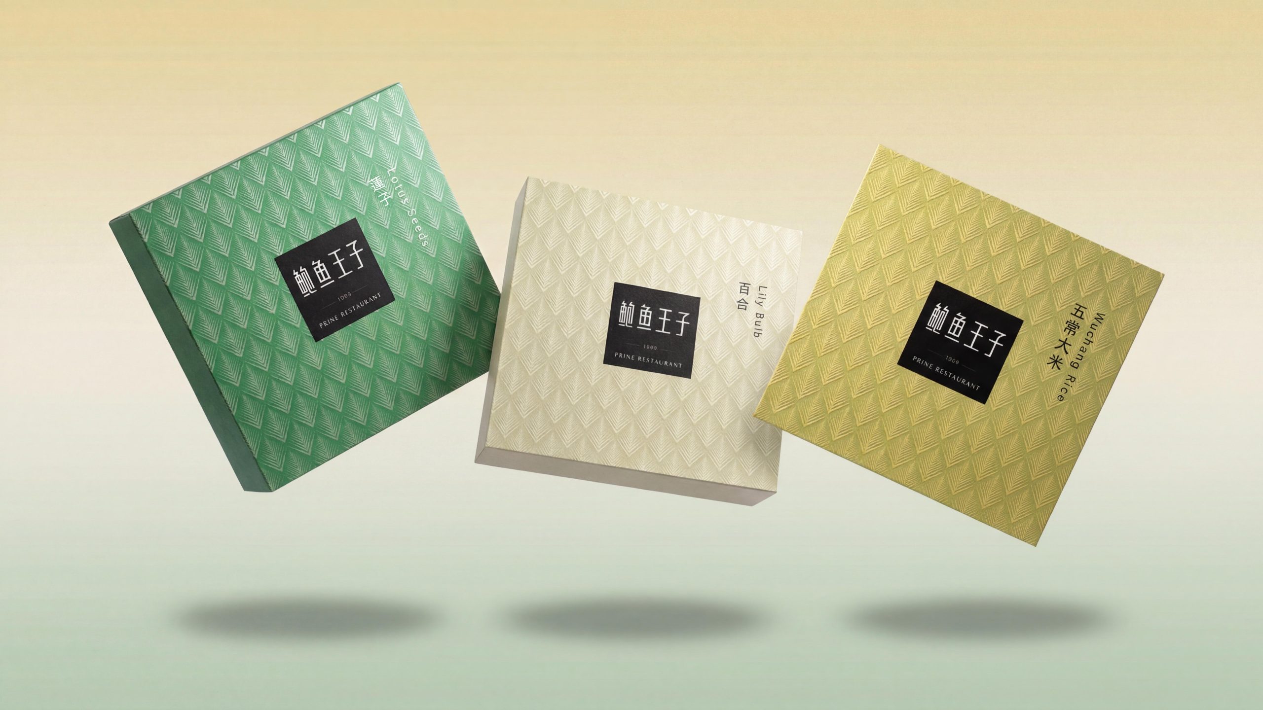
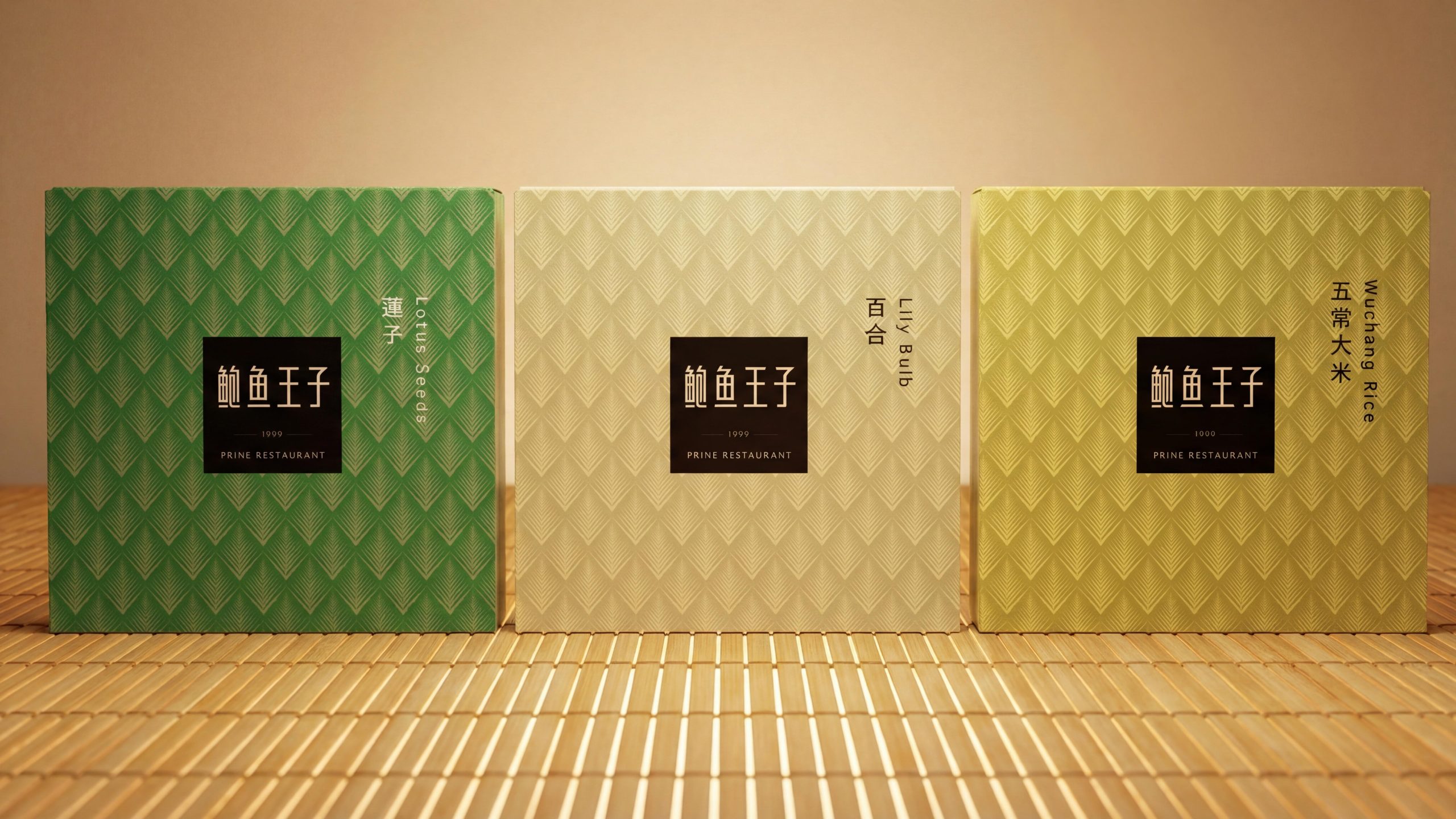
This series of packaging of grains and grains covers two major product forms: one is a square single-product gift box represented by Lotus Seeds, Lily Bulb, and Wuchang Rice, which are divided into three colors: emerald green, elegant white, and tender grass yellow, showing a fresh and elegant oriental food quality; the second is "Grains and grains" The horizontal rectangular comprehensive gift box with the theme of "grains" is dominated by the rich and luxurious harvest gold, which brings together a variety of grain products in one box.
The entire series continues the brand's iconic fan-shaped diamond pattern visual gene. Under the premise of unified decoration, it uses a softer and warmer color system and a more exquisite square box shape to create a new visual context that is different from the Gourmet Gift series - if we say The red and blue patina gift series is the brand's feast, and the whole grain series is the brand's pastoral pastoral. It uses the simple beauty of grains and the gentle power of nourishment to interpret the extension of the brand philosophy of "preciousness does not have to be strong, and authenticity is also luxury."

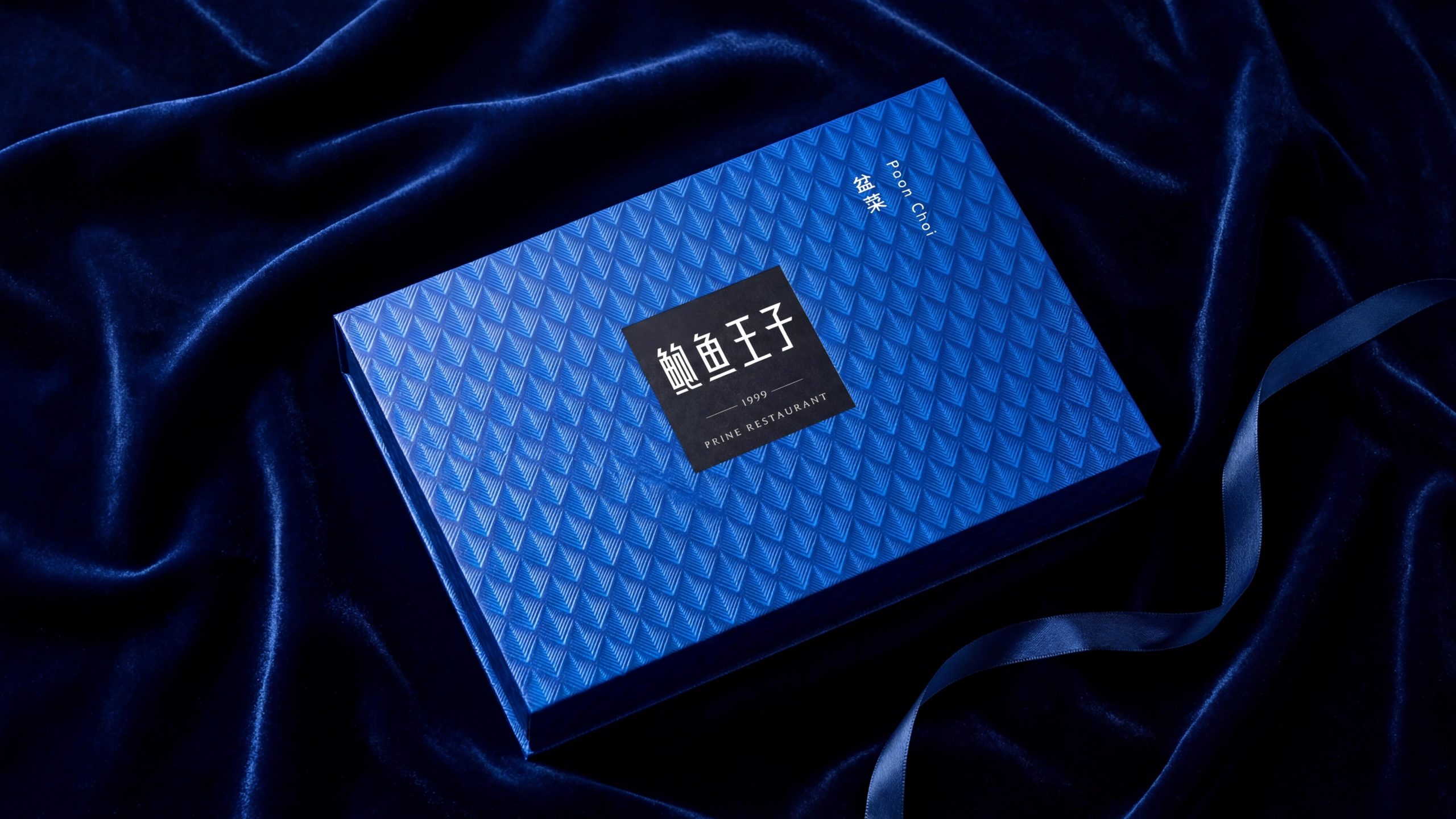
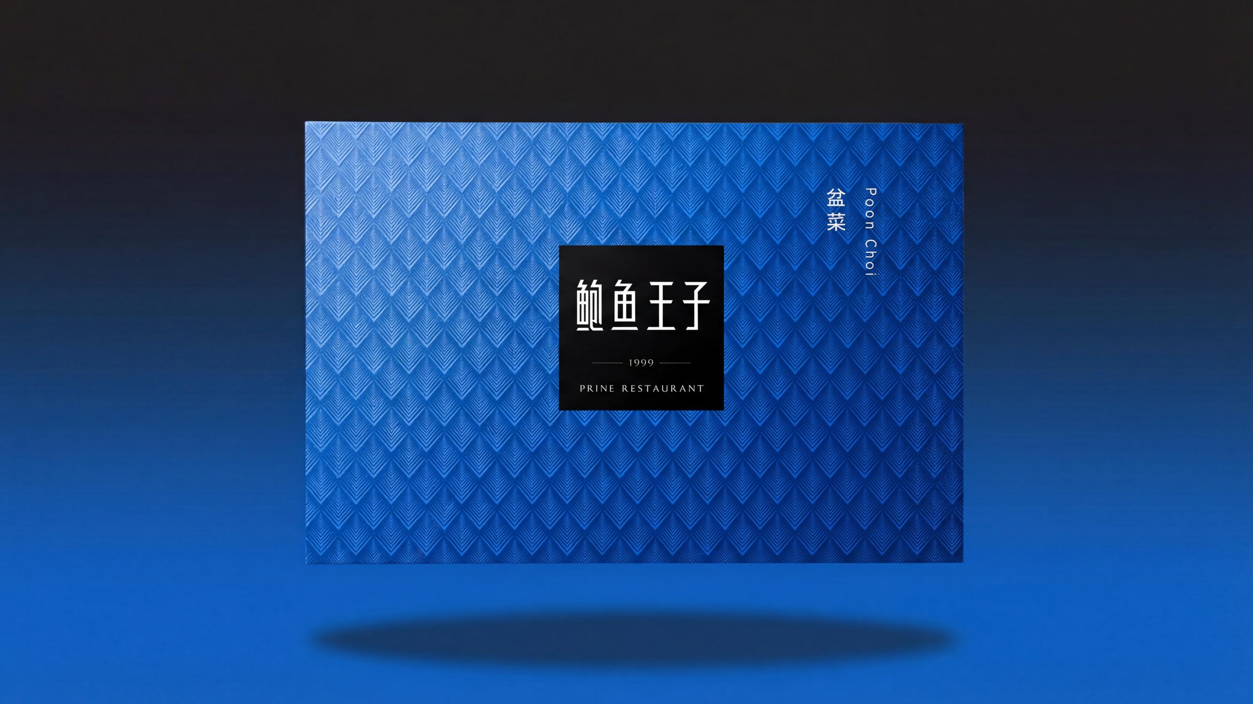
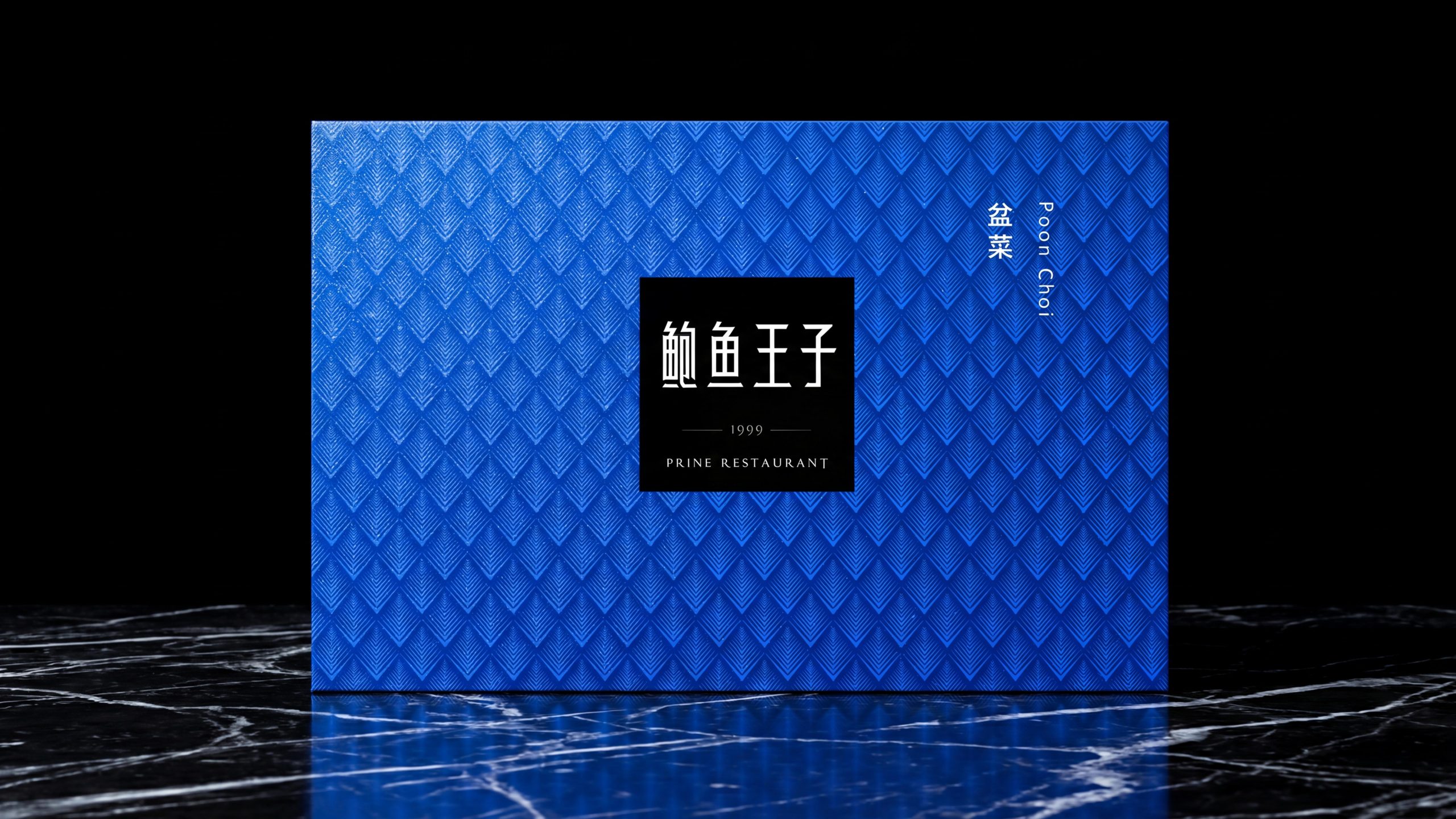
Brand Essence
Abalone Shell Pattern × Seal × Palette
Texture × Authority × Season
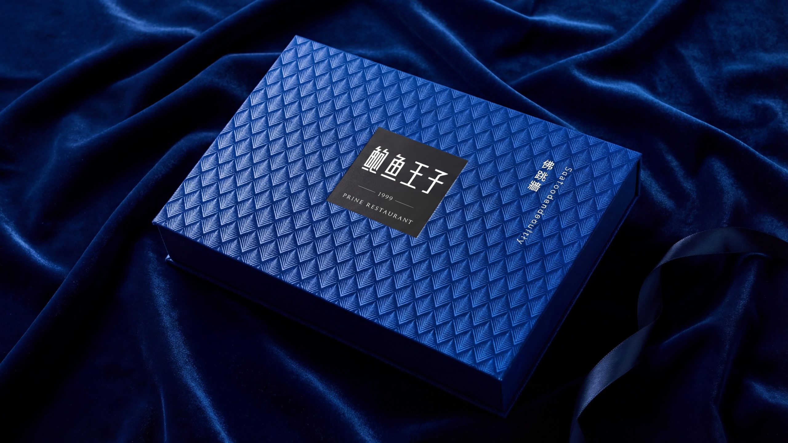
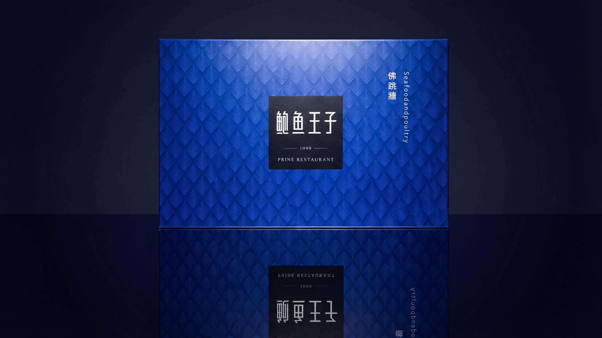
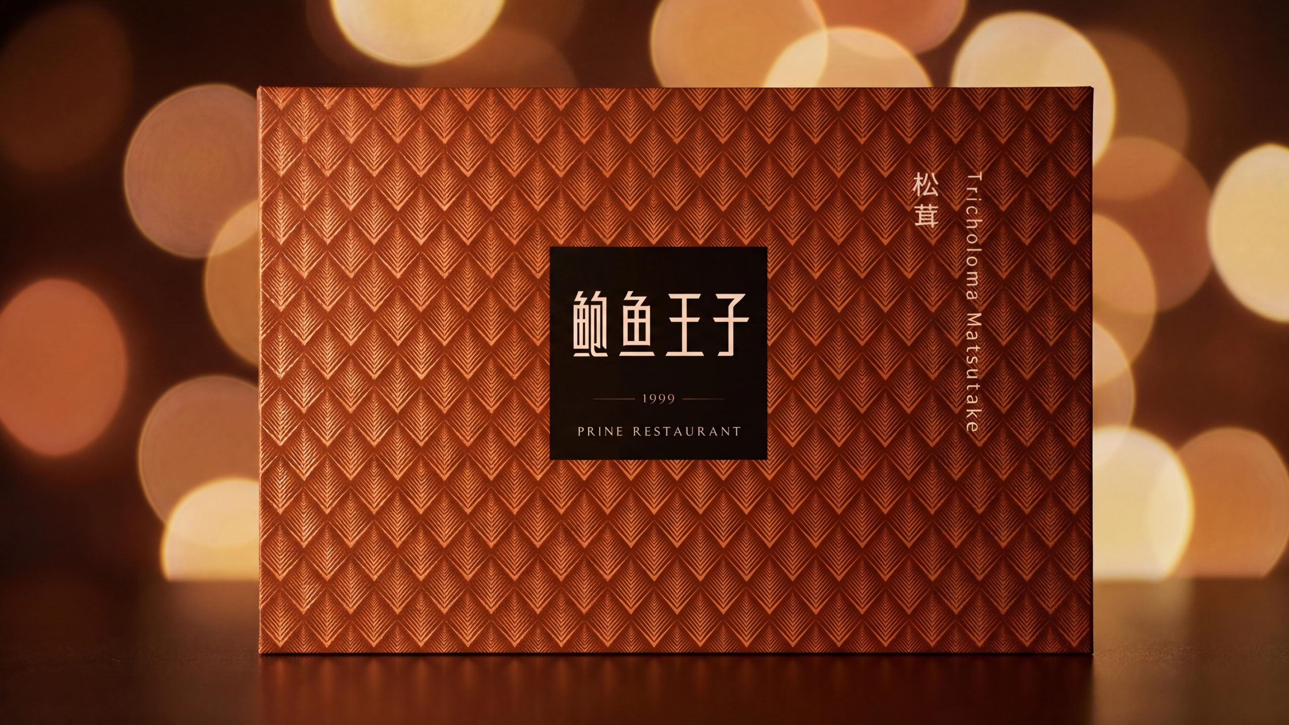
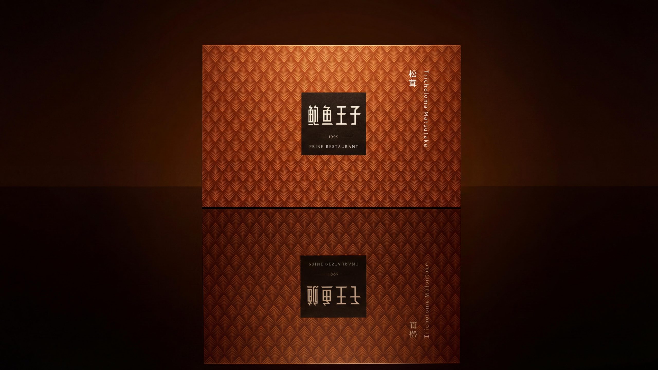
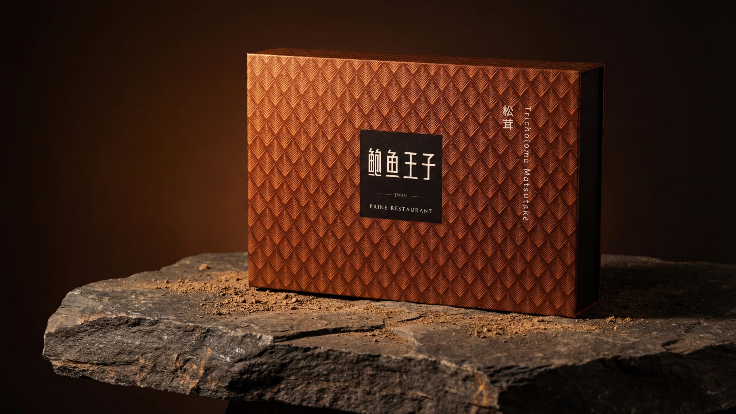
"Xiang" is the core visual gene of the brand. The arrangement of the abalone shell's flakes is abstracted into a geometric diamond pattern - each unit is composed of multiple thin lines that converge upward, like an open fan or an upright flake. Hundreds of units are spread across the board in a neat diamond grid. This pattern is the core visual asset of the brand - it is not a picture, but a layer of "texture", just like the fabric pattern on high-end custom furniture, quietly covering the entire surface, not grabbing attention, but the quality is immediately apparent at the first touch.
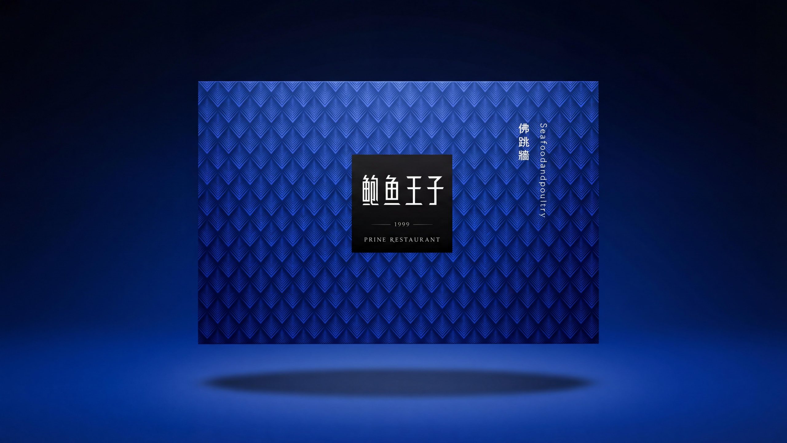
"Zhang" is the authoritative anchor of the brand. The black square brand label is like a seal centered on the flake pattern - the high contrast between the black background and the white/gold brand name ensures absolute readability on any background. The four characters "Prince of Abalone" are presented in customized modern Song font, with straight strokes and a subtle sense of decoration. "1999" is wrapped up and down with a thin line dividing the line, and "PRINE RESTAURANT" is marked below it in small capital serif font. Three layers of information constitute the classic high-end catering brand logo structure of "brand name + founding year + English name".
"Color" is the coding strategy of the product matrix. The same set of flake patterns and the same black square medal are interpreted in different background colors to realize the "one pattern with multiple colors" product line decoration - this strategy allows each gift box to have its own independent emotional color in an absolutely unified layout, while ensuring a visual sense of family when multiple styles are juxtaposed.
Brand Philosophy
The overall design concept is "One flake, ten thousand colors - using textures to replace pictures, and using colors to distinguish scenes."
The currently available versions include: Brown-gold version - Tricholoma Matsutake: The box surface has a dark brown-gold base, and the flake pattern is covered with embossing/embossing in varying shades of the same color. The overall color tone is like the pine needles and brown soil of the autumn forest, which is highly consistent with the mountain attributes of matsutake. The word "Matsutake" and the English name "Tricholoma Matsutake" are marked vertically on the right side. There is a black square seal brand logo in the center on the left side of the box.
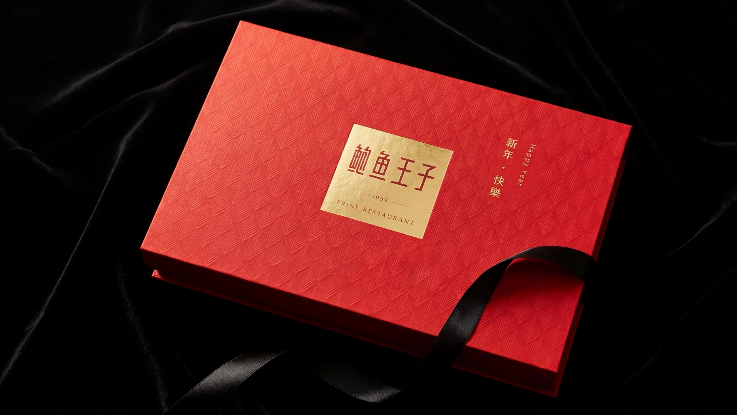
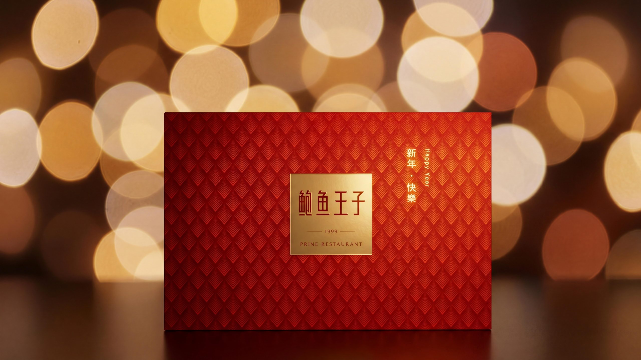
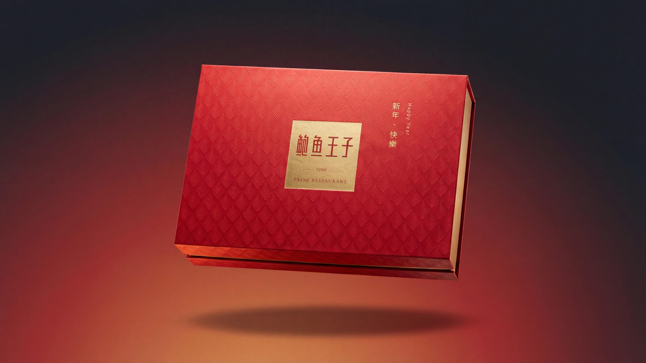
True red version - Happy New Year (Happy Year): The box surface is based on festive true red, and the flake pattern is covered with light red embossed chains of the same color. On the left side of the box is a golden square brand logo (this square seal changes from black to gold to enhance the sense of festival), and on the right side are gold vertical markings "Happy New Year" and "Happy Year". The two-color combination of red and gold is an absolutely classic color combination for Chinese festival gifts.
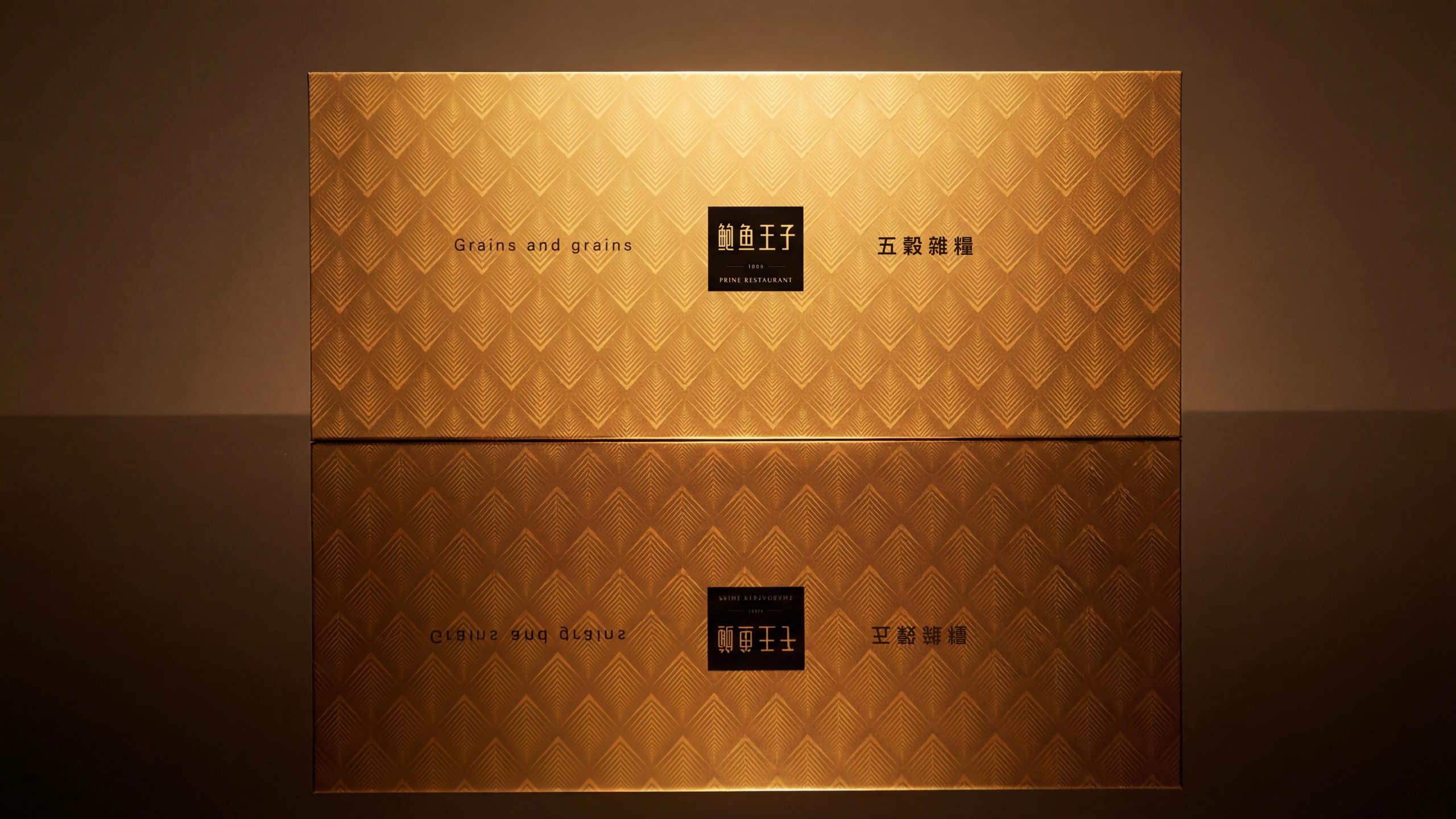
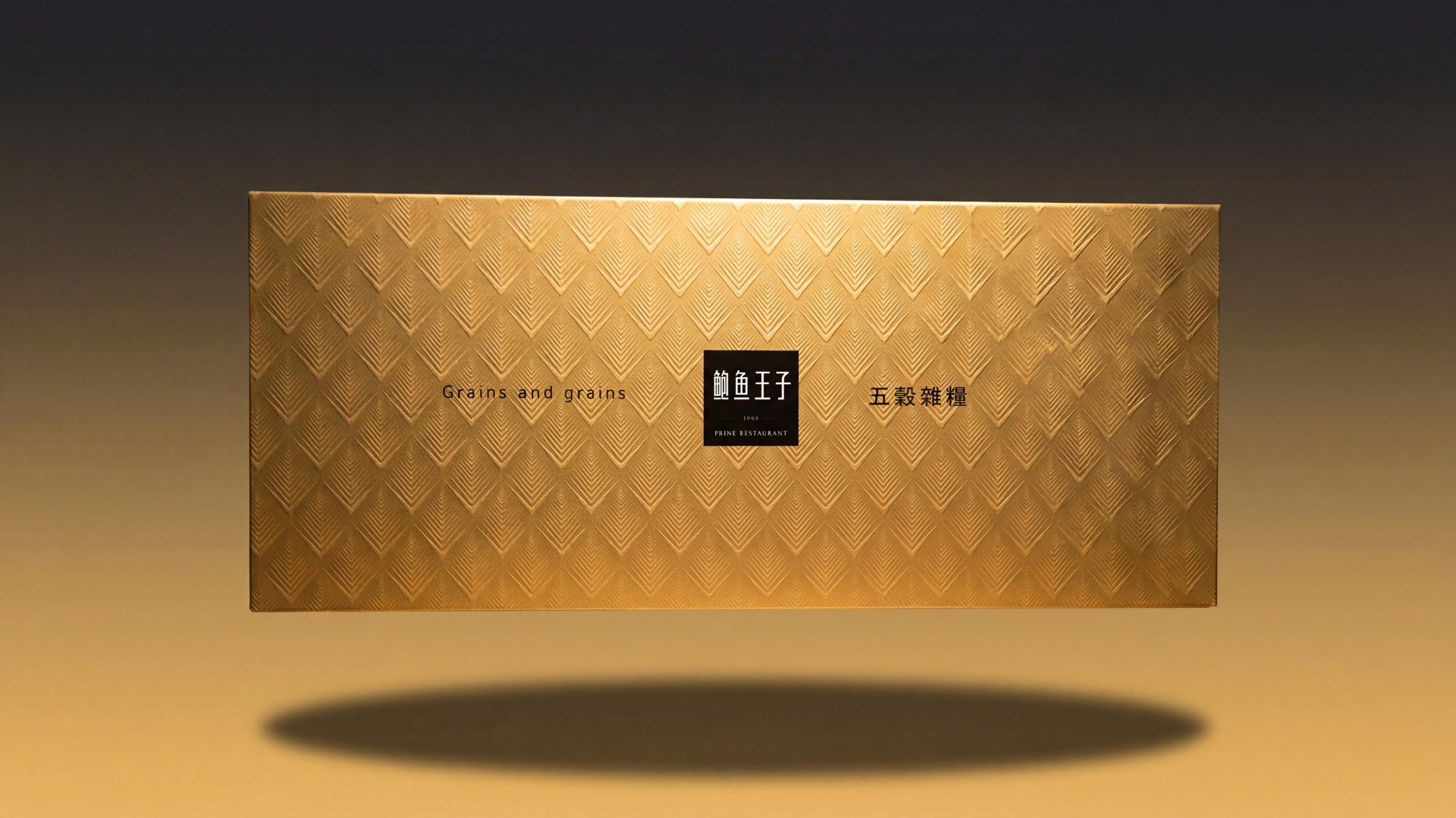
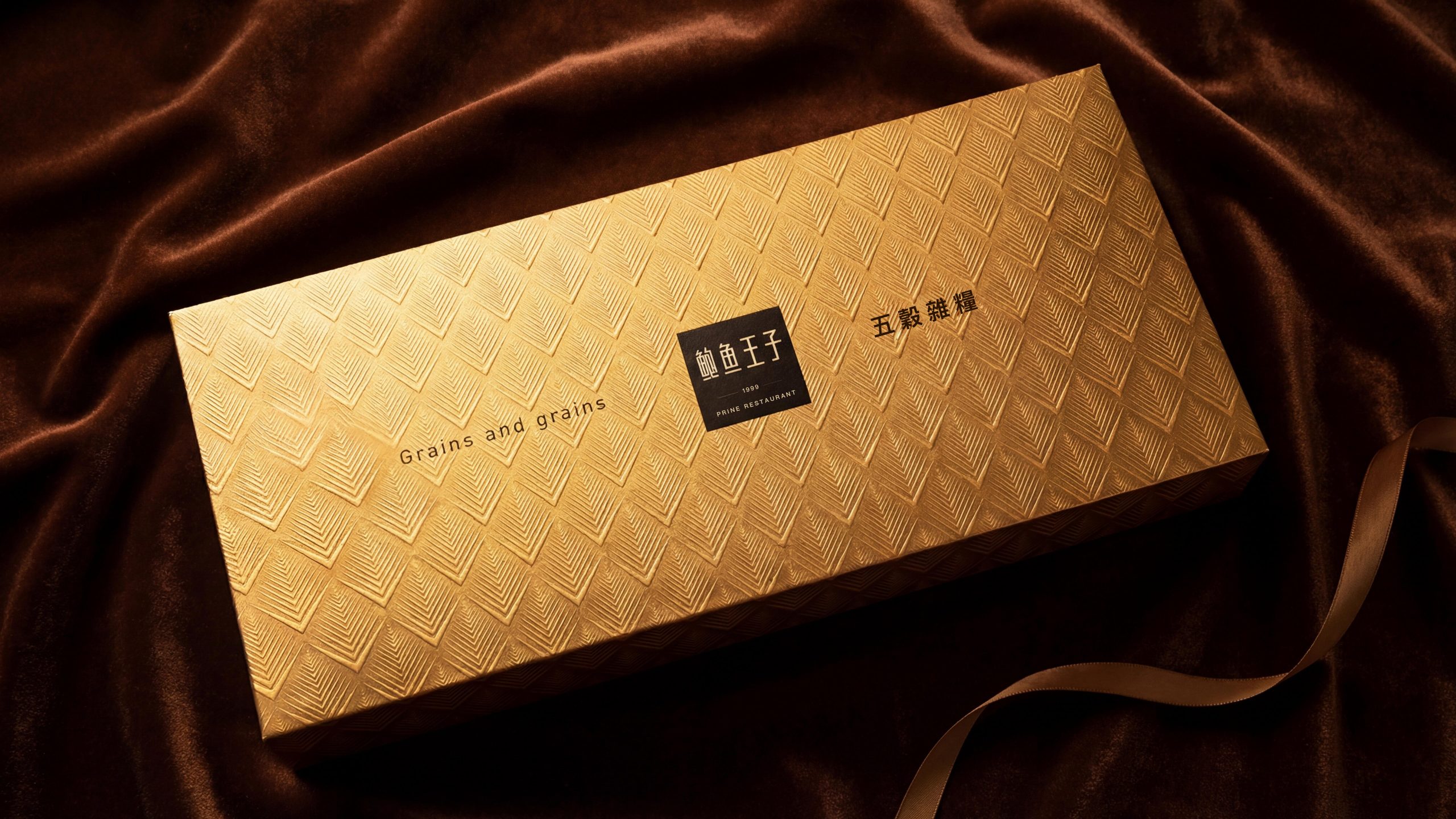
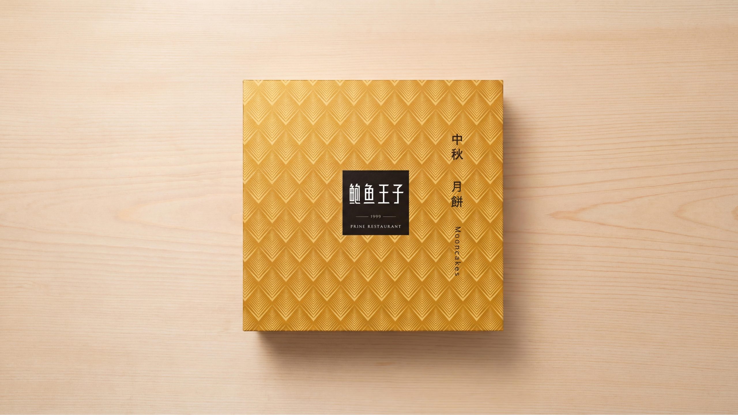
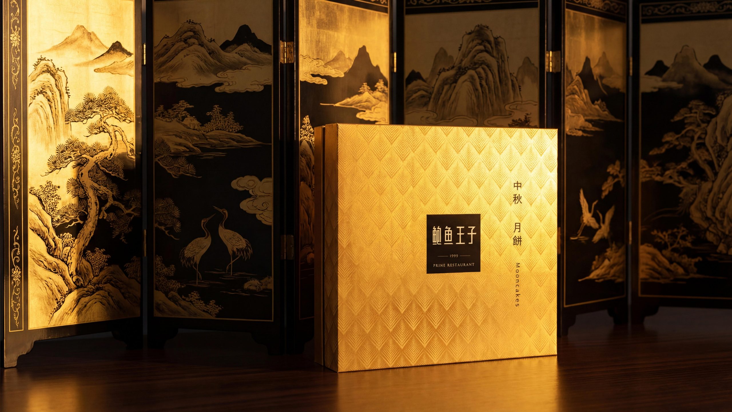
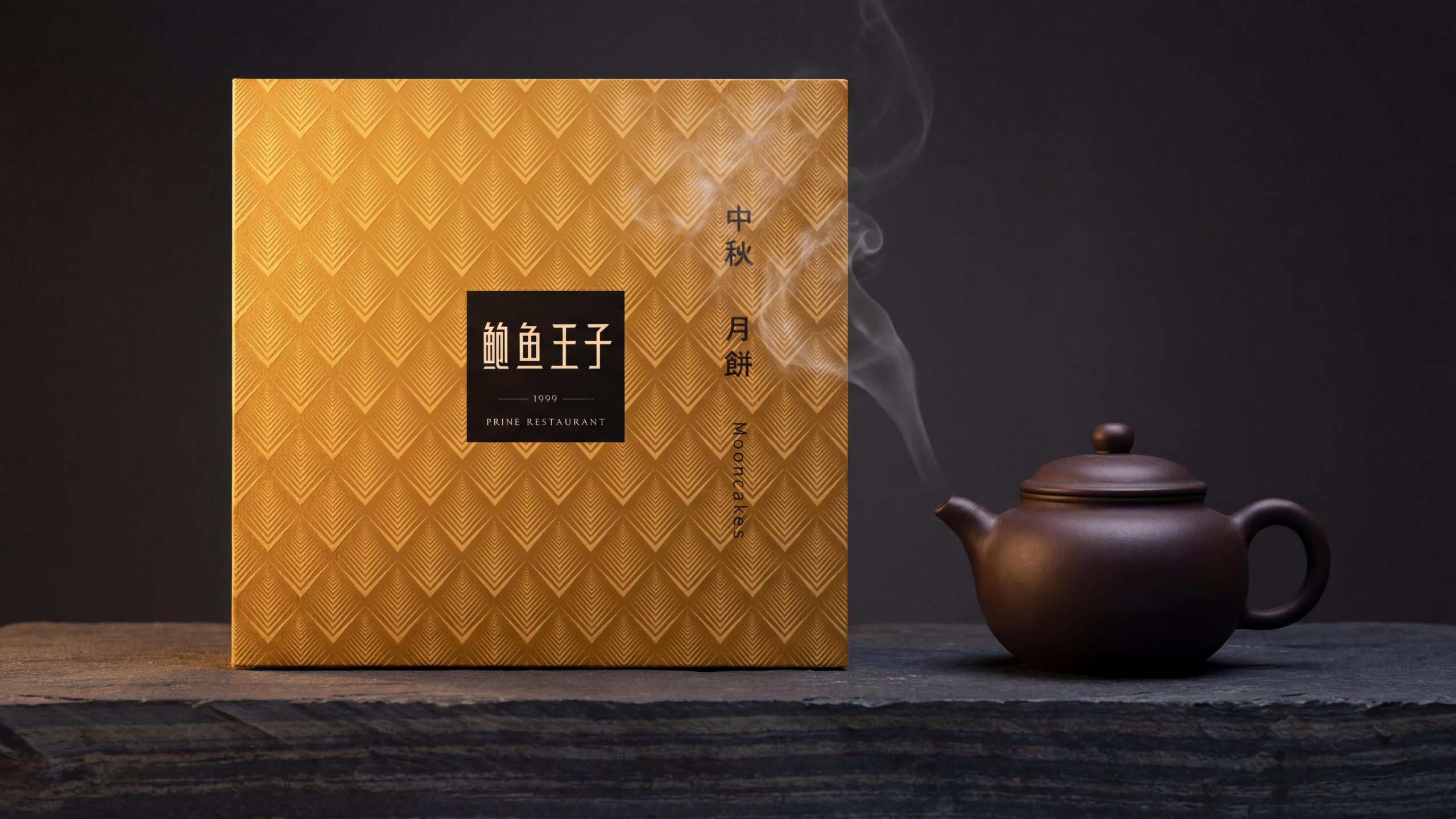
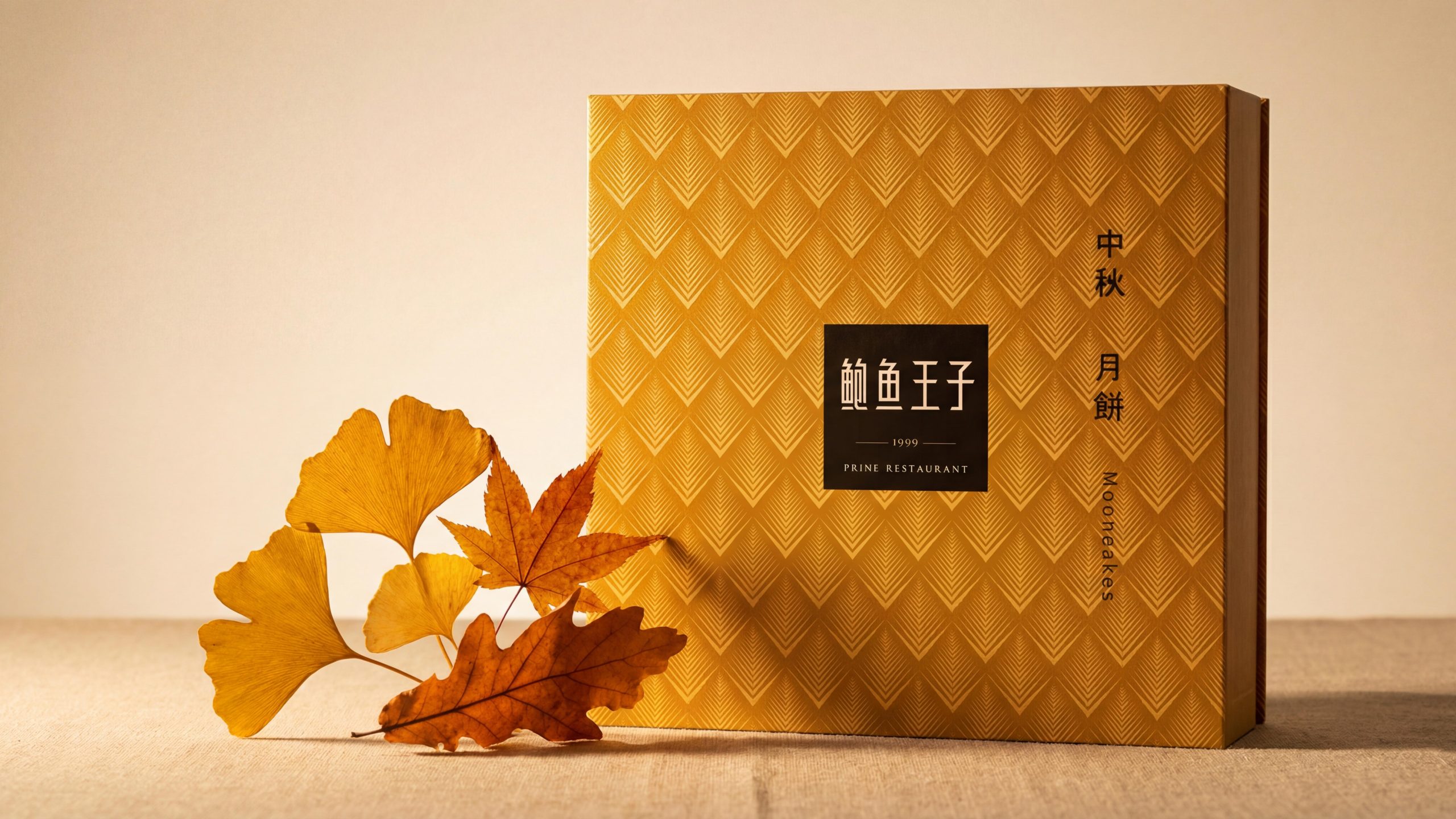
Gold version - Grains and grains: The box surface has a full gold base, and the flake pattern is filled with deep gold embossed/embossed chains of the same color. The metallic luster makes the three-dimensional texture the most prominent among all versions. "Grains and grains" are marked vertically on the right side. The English name of the same model on the left is marked in italics. The box body has a wide horizontal structure and is more slender in proportion than other versions.
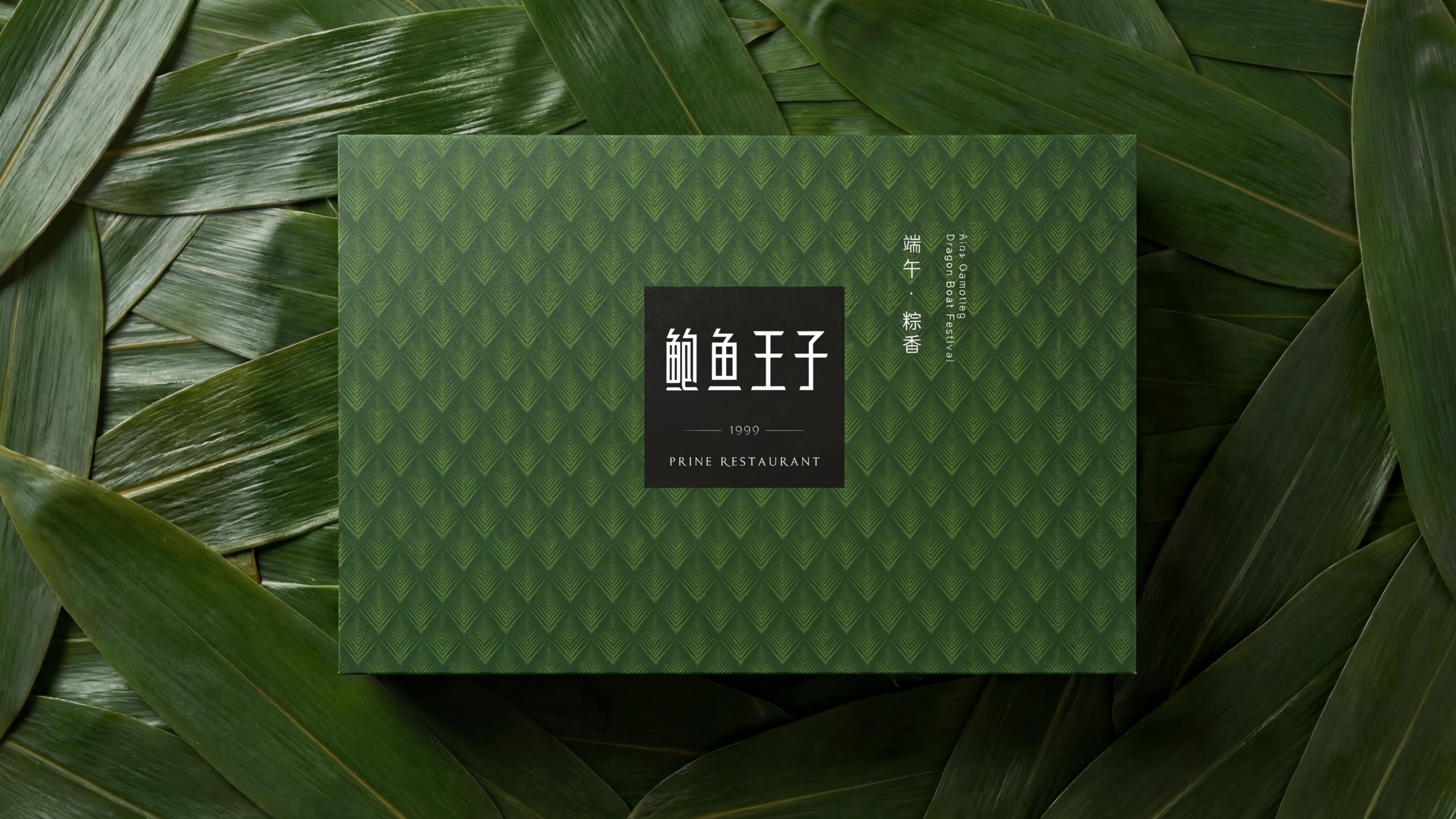
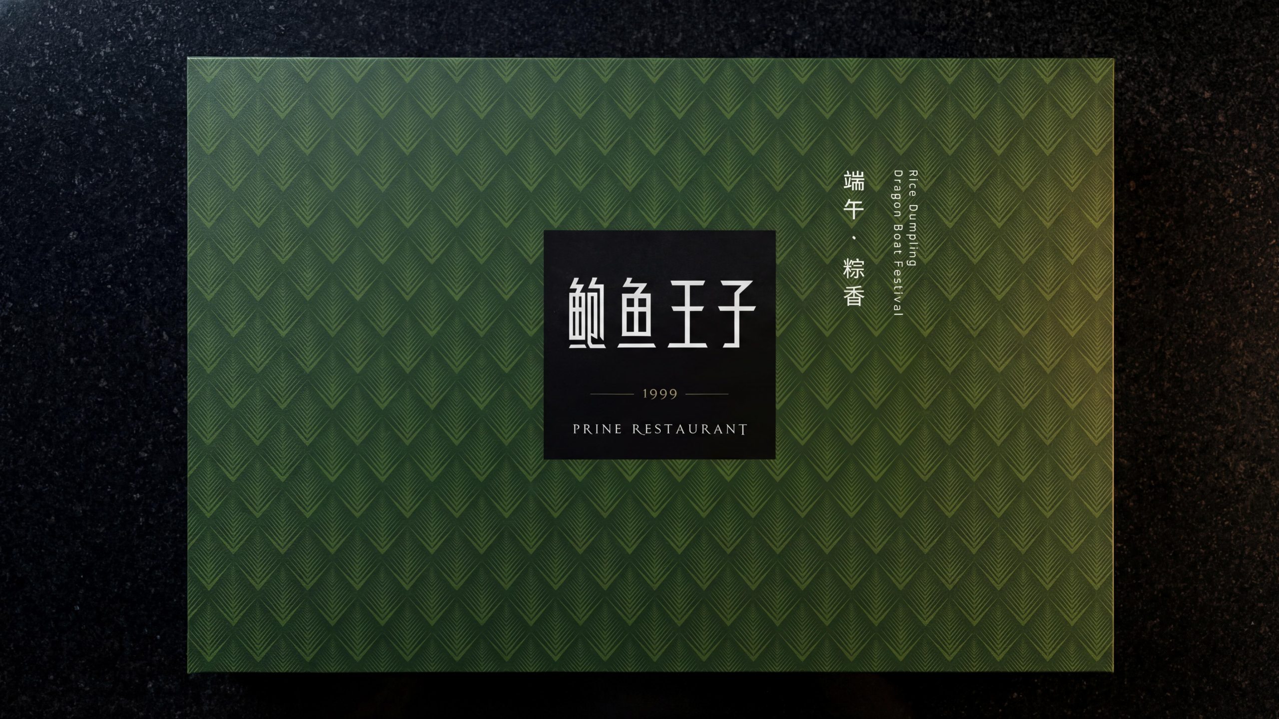
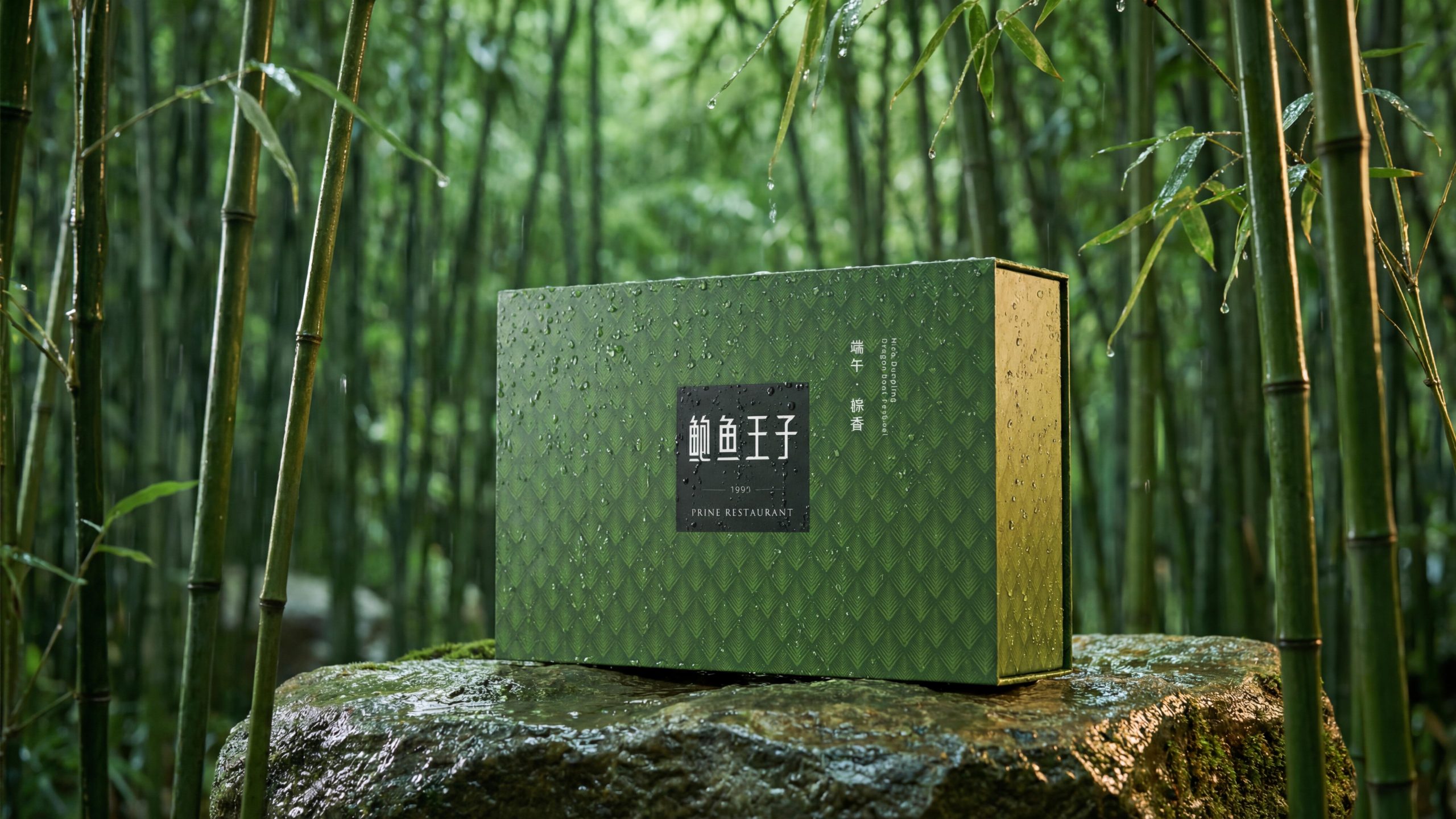
Leaf green version - Dragon Boat Festival (Dragon Boat Festival): The box surface has a dark leaf green background, and the lobster pattern is filled with green embossed chains of the same color. The words "Dragon Boat Festival·Cantonese Fragrance" and "Also Qianxing Dragon Boat Festival" are marked vertically on the right side. The green color of the leaves forms the most intuitive seasonal relationship with the leaf attributes of the Dragon Boat Festival leaves.
Emerald green version - Lotus Seeds: The box surface has an emerald green background, and "Lotus Seeds" and "Lotus Seeds" are marked vertically on the right side. Square box shape.
Off-white version - Lily (Lily Bulb): The box surface has a light off-white background, with "Lily" and "Lily Bulb" marked on the right side. Square box shape.
Yellow-green version - Wuchang Rice: The box surface has a light yellow-green background, and "Wuchang Rice" and "Wuchang Rice" are marked on the right side. Square box shape.
All versions share the same flake pattern, the same square seal branding, and the same layout structure—the only changes are the background color and the product/festival name on the right. This extremely unified design strategy ensures that when multiple gift boxes are juxtaposed, a visual array of "different seasons of the same family" is presented.
Visual Language
Color: Taking "one pattern with multiple colors" as the core strategy. The same flake pattern is interpreted in different background colors, and each color accurately corresponds to the product attribute or festive scene: brown gold corresponds to the earthy and autumnal atmosphere of mountain mushrooms (matsutake); true red corresponds to the celebration and enthusiasm of the New Year; full-page gold corresponds to the harvest and preciousness of grains; leaf green corresponds to the fragrance and freshness of the Dragon Boat Festival; emerald green corresponds to the elegance of Lianzi; off-white corresponds to the elegance of lilies; and yellow-green corresponds to the freshness of rice. The black square is the only color constant that runs through all versions (except for the New Year's edition, where the square becomes gold to enhance the festive feel) - it maintains absolute readability and authority on any background. The texture and background are always shades of the same color, rather than contrasting colors. This "same-color texture" strategy ensures that the texture is always perceived as a "texture" rather than a "pattern."
Graphics: The flake pattern is the absolute core of the entire visual set. Each unit is composed of multiple thin lines that converge upward to form a rhombus, like an open fan or an upright lobster. The pattern is presented on the box surface using embossing/relief technology in the same color and depth, showing subtle three-dimensional effects and light and shadow changes under different light angles. This kind of "no picture, pure texture" visual strategy is extremely rare in high-end food gift boxes - most competing products rely on photos or illustrations of ingredients as the visual subject, while Abalone Prince replaces all images with pure material language, raising the "sense of quality" from the visual level to the tactile level. The black square brand logo is the only "island" in the ocean of textures - it interrupts the continuity of the texture with an absolutely black plane, forcing the eye to focus on the brand name.
Font: "Abalone Prince" is presented in a customized modern Song font with regular strokes and subtle decorative details. The text color is white or gold (depending on the version). "1999" is presented in a thin serif font, separated by extremely thin decorative lines at the top and bottom, just like the year mark on a high-end business card. "PRINE RESTAURANT" is centered under the year in small capital serif font. The product names ("Matsutake", "Happy New Year", "Grains", etc.) are presented in vertical Song or italics on the right side of the box, followed by the English name in vertical serifs or italics. The visual weight of the product name is always lower than the brand seal, ensuring a visual hierarchy of "brand first, product second".
Tone of Voice
The text language is as concise and restrained as a "business card" - no description of taste, no list of functions, no pile of modifiers, just like a chef's business card: only the name and address, no menu.
The naming strategy of "Abalone Prince" combines the authority of "abalone" as an ingredient and the noble symbol of "prince" into one. The year mark of "1999" implies the nearly thirty years of brand history - among high-end catering brands, time itself is the strongest endorsement. The English name "PRINE RESTAURANT" places the brand in the context of international high-end catering.
The product names are named in the most concise way: "Matsutake", "Lianzi", "Lily" and "Wuchang Rice" - only the names of the ingredients are marked without any modifiers. Don't say "Yunnan wild matsutake", just "matsutake"; don't say "Wuchang scarce rice", just say "Wuchang rice". The brand's attitude is: the name of the ingredient itself is already the best selling point, and any modification is redundant.
The festive version uses the most restrained festive terms: "Happy New Year" and "Dragon Boat Festival" - instead of overly formal blessings such as "Congratulations on the New Year" and "Dragon Boat Festival", it conveys the most sincere holiday greetings in the most everyday tone.
Brand Experience
Visual: Abalone Prince’s gift box is a significant “pure texture outlier” in the high-end food gift box market. In the gift box packaging that mainly uses photos of food ingredients, landscape illustrations or golden patterns, a gift box with only a full-page embossed flake texture and a black square seal as the visual main body is like a shape with an architectural skin texture that suddenly appears among a pile of flat prints. When multiple styles are juxtaposed, the color sequence of brown gold, pure red, full gold, dark green, emerald green, off-white, and yellow-green is like a set of high-end Na-dye fabric sample cards, with a strong visual sense of family.
Tactile: Tactile is the core competency of this package. When your fingers cross the surface of the box, the embossed relief of the flake pattern creates a precise "concave-flat-concave-flat" rhythmic touch on your fingertips - just like touching the surface of a hand-knitted product. This tactile feeling is slightly different on different background colors: the metallic luster of the gold version makes the texture the strongest three-dimensional, and the edge of each "flake" can be clearly felt with the fingertips; the matte version has a softer touch and the texture is faintly visible. The contrast between the smooth surface of the black square area and the surrounding texture adds a "leisurely quiet" node to the touch.
Scene: The color coding strategy allows each gift box to be naturally embedded in the corresponding scene. The New Year red and gold version can be understood without explanation in the Spring Festival gift scene; the green version with lotus leaves is like a gift wrapped in lotus leaves in the Dragon Boat Festival scene; the autumn tones of the brown gold version form a natural connection with the mountain attributes of matsutake. The visual effect of the "elegant color sequence" when the three small boxes are juxtaposed naturally encourages the purchase of a set. No matter what the scene is, the tactile texture of the flake texture gives the gift box a sense of "object" that goes beyond ordinary gifts - the recipient can feel "this is not an ordinary gift" the moment they touch the surface of the box.
Brand Statement
Abalone Prince - a flake, all year round. You can tell it at your fingertips, no words needed. Abalone Prince uses the geometric full-page embossed pattern inspired by abalone shell flakes as the visual core, uses the black square seal brand mark as the authoritative anchor, and uses a multi-color and multi-season color coding strategy to accurately match the product line with the festival scene. It doesn't use photos of ingredients to tell you what's inside, but uses a layer of precise texture to tell you what grade it is; it doesn't use gold lace to put luxurious labels, but uses a quiet black square to complete the entire brand narrative; it doesn't pile up modifiers such as "wild", "scarce" and "selected", but writes the word "matsutake" and turns away - because good things can be seen at your fingertips and don't need to be said.