










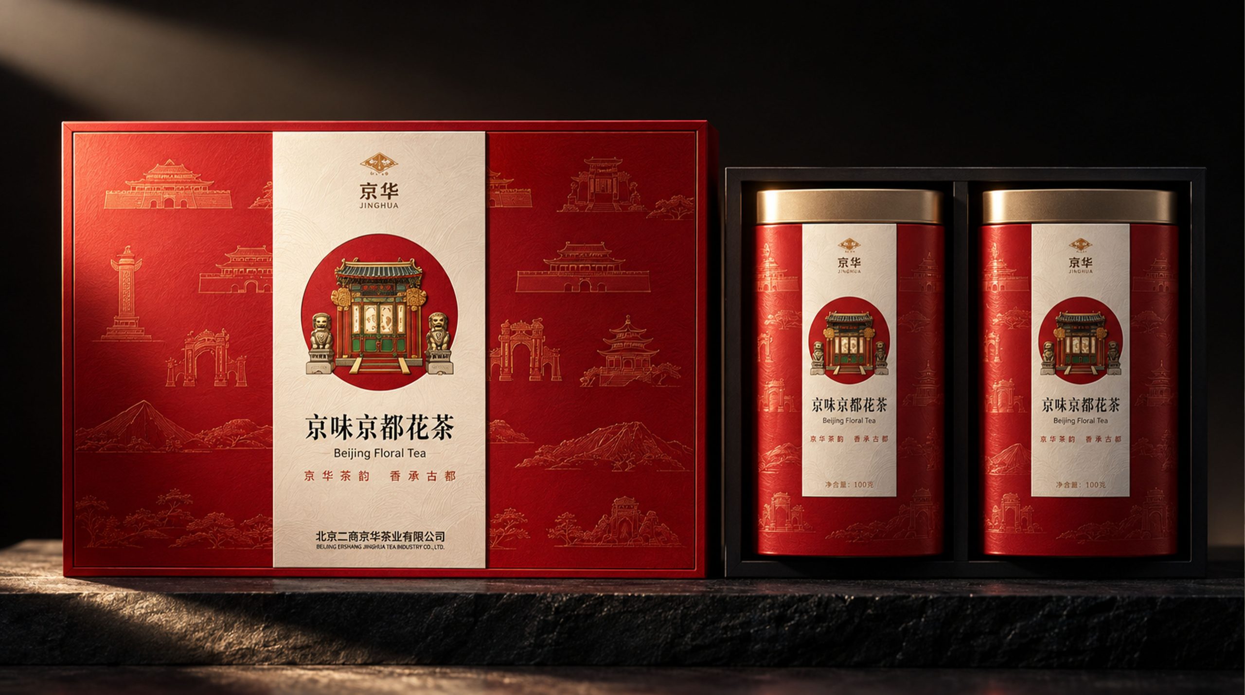
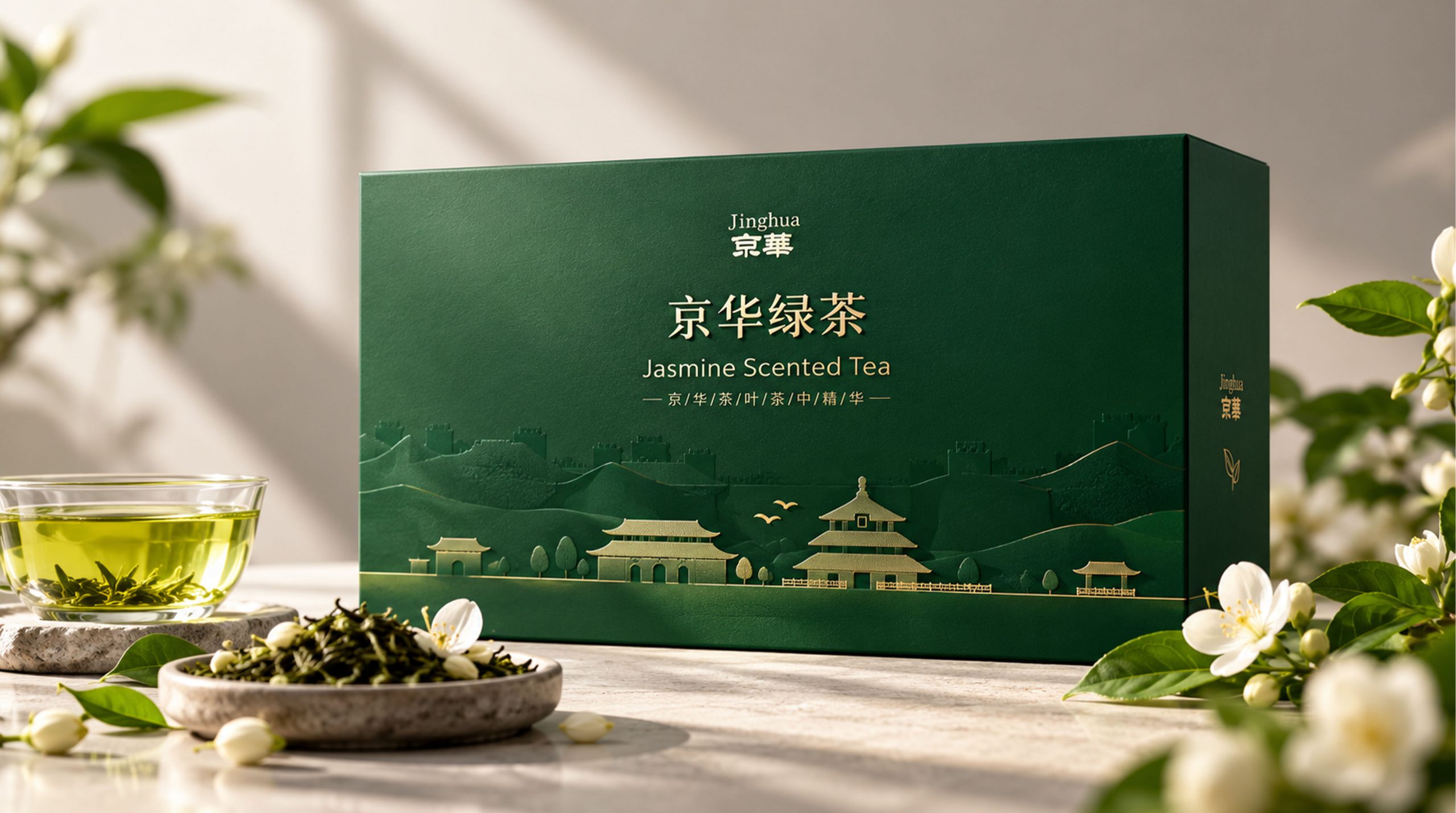
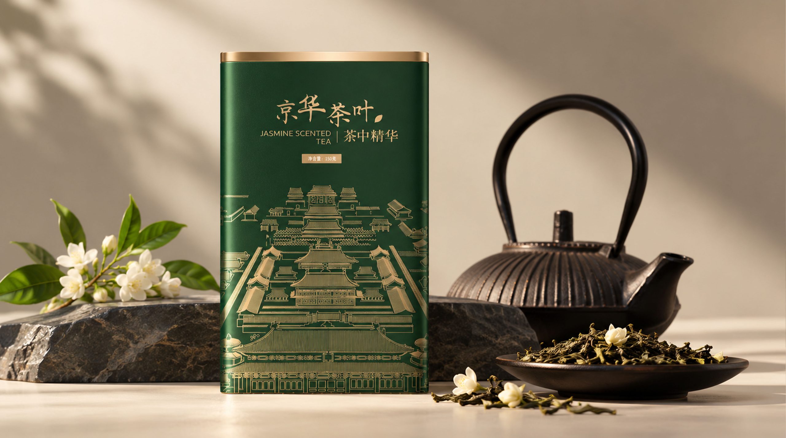
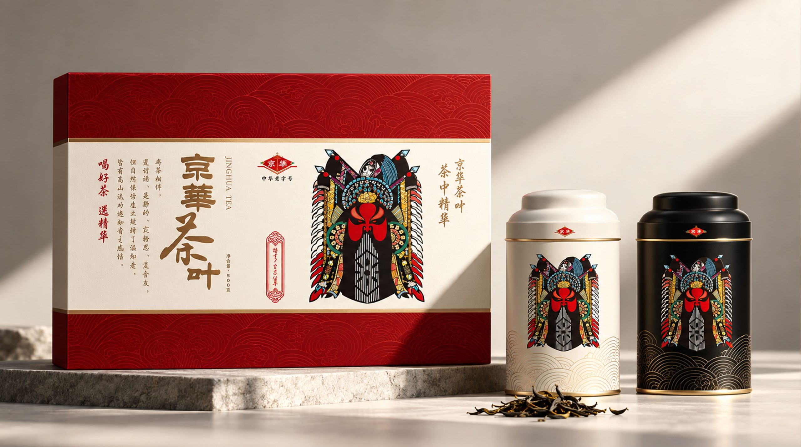
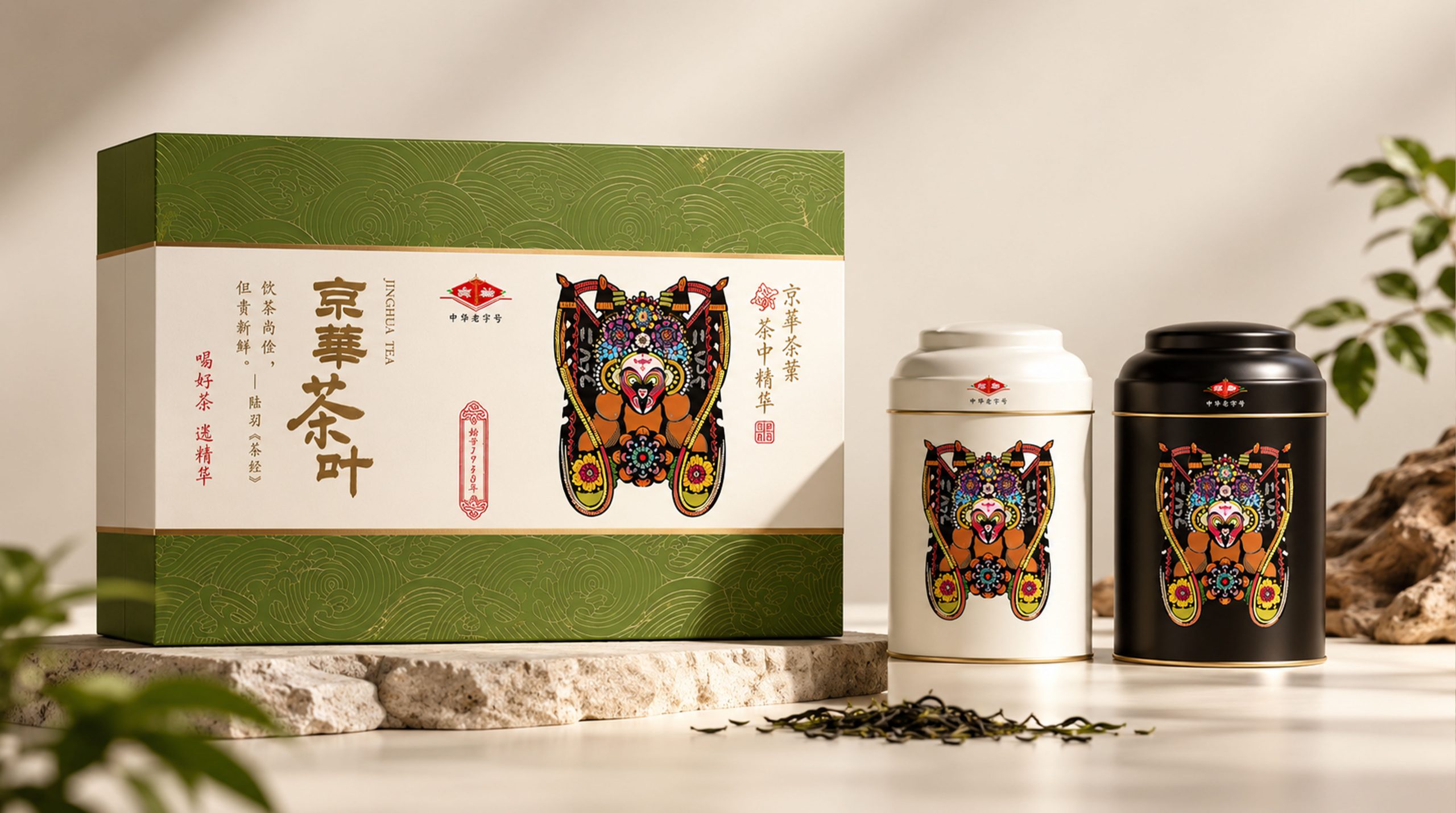
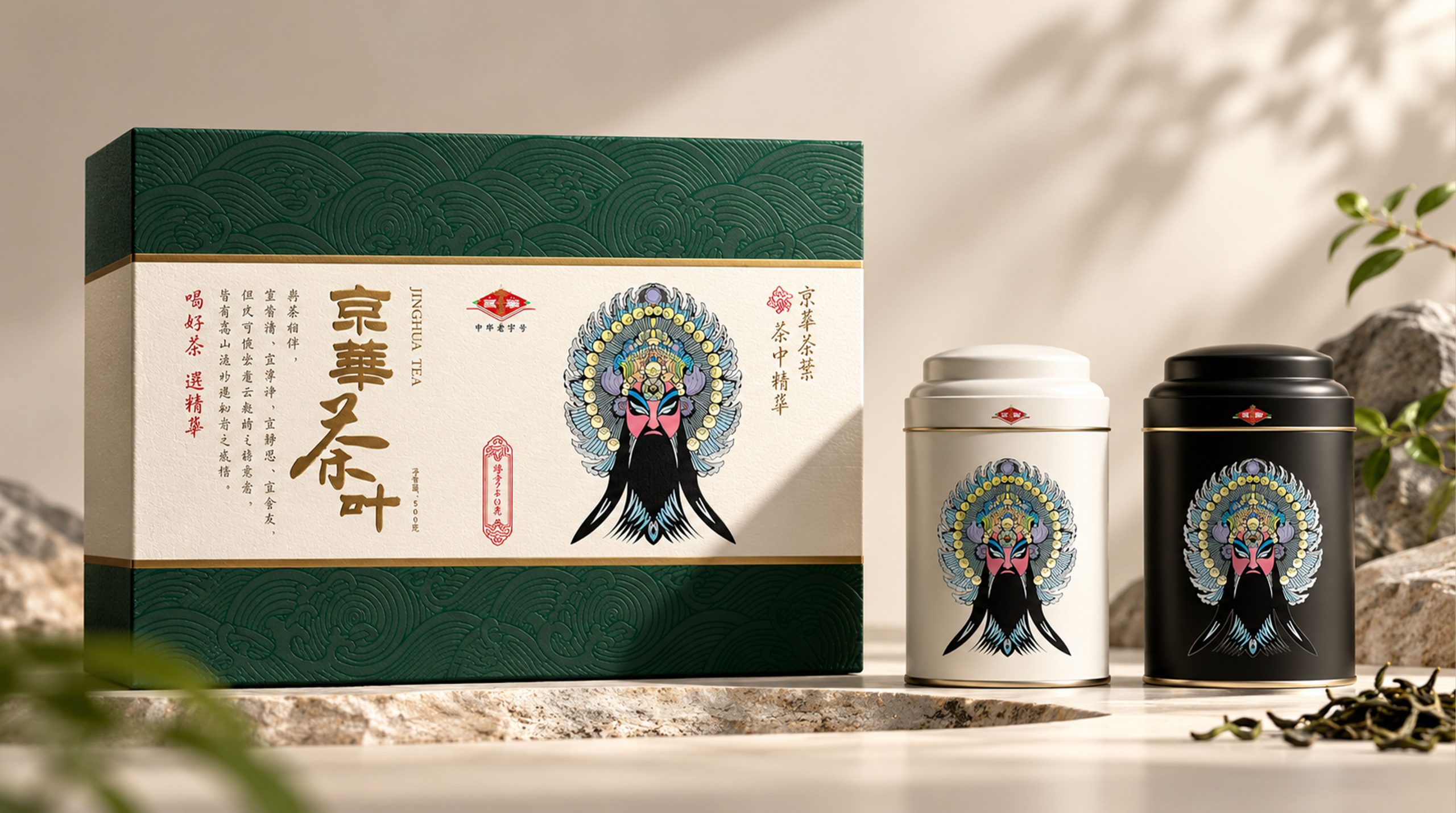
JINGHUA is a classic tea brand owned by Beijing Ershang Jinghua Tea Co., Ltd. It takes "Beijing flavor and Beijing charm" as its cultural positioning, and uses Beijing's architectural landmarks and historical memories as visual narrative carriers to build a packaging aesthetic system of "one city, one tea". The brand name is taken from the "Hua" color of "Beijing" city - it is both the emblem of Beijing and the essence of tea. The brand slogan "Jinghua Tea, Essence of Tea" accurately anchors this dual meaning with pun rhetoric.
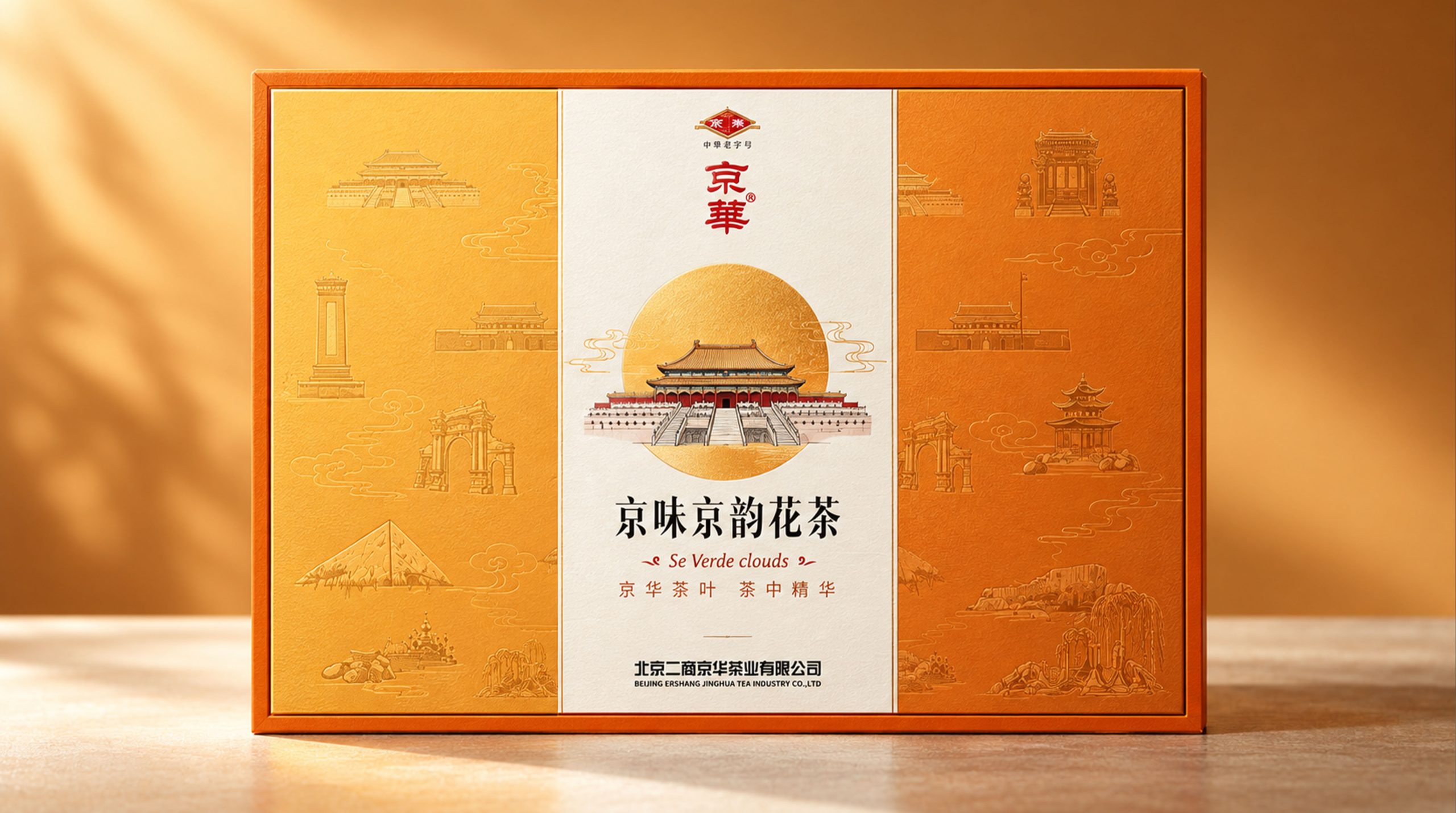
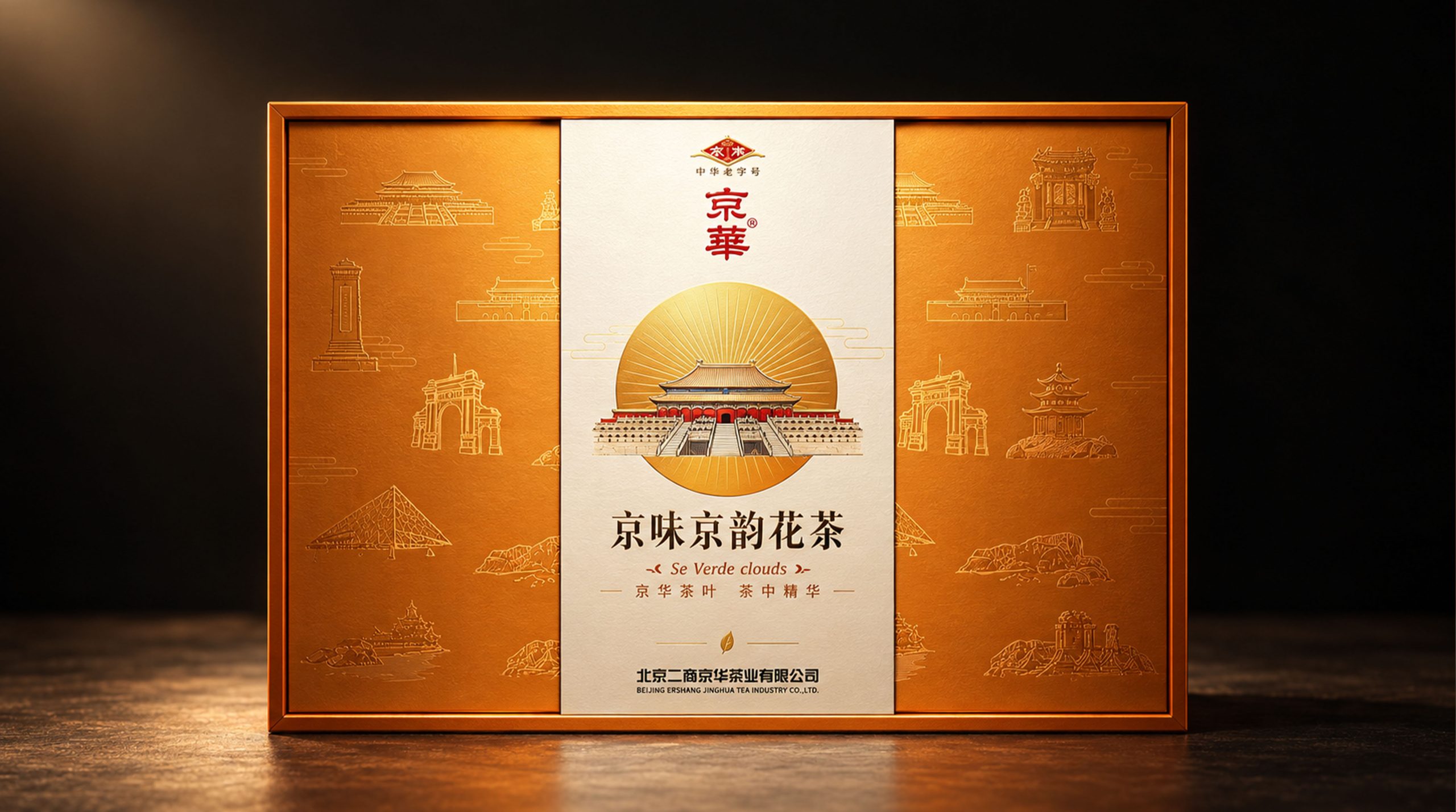
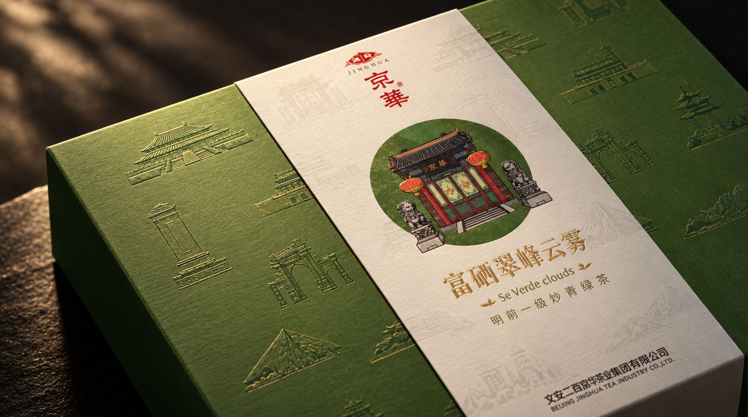
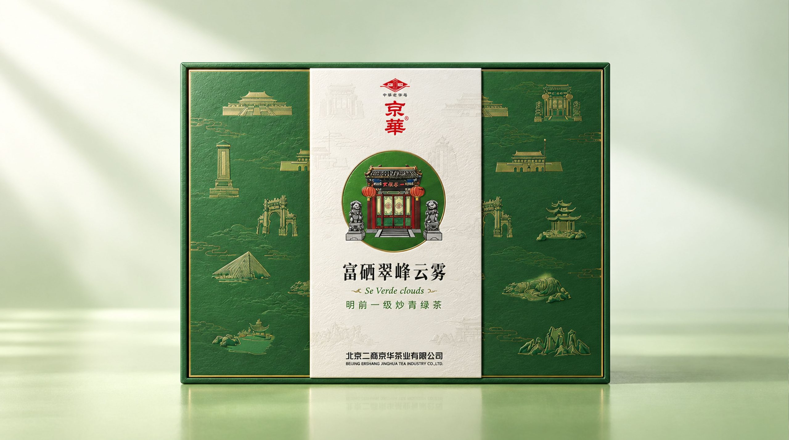
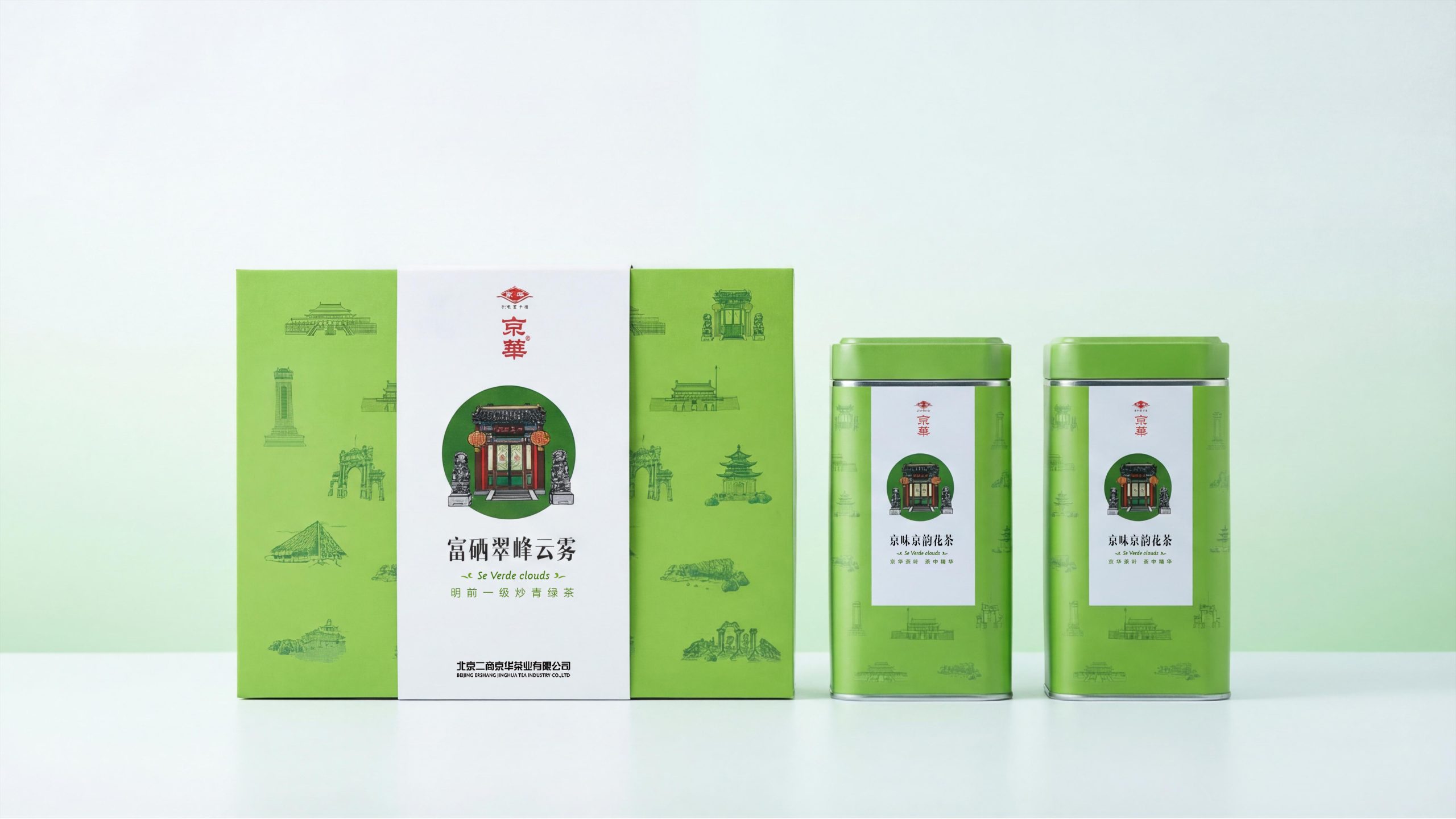
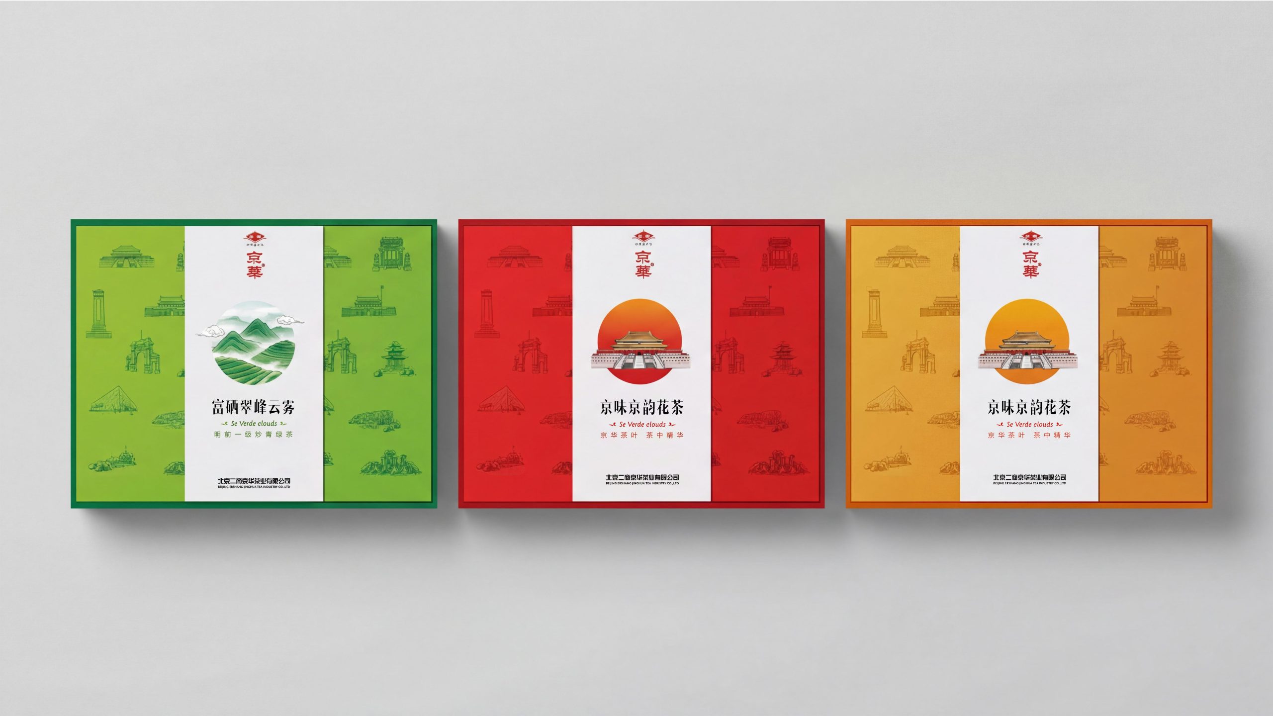
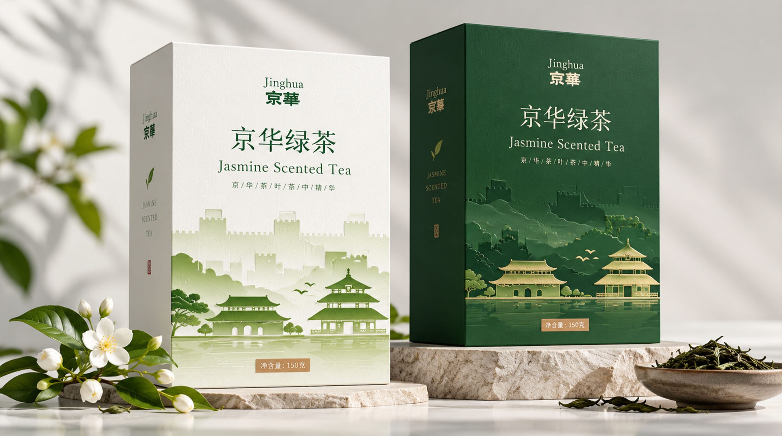
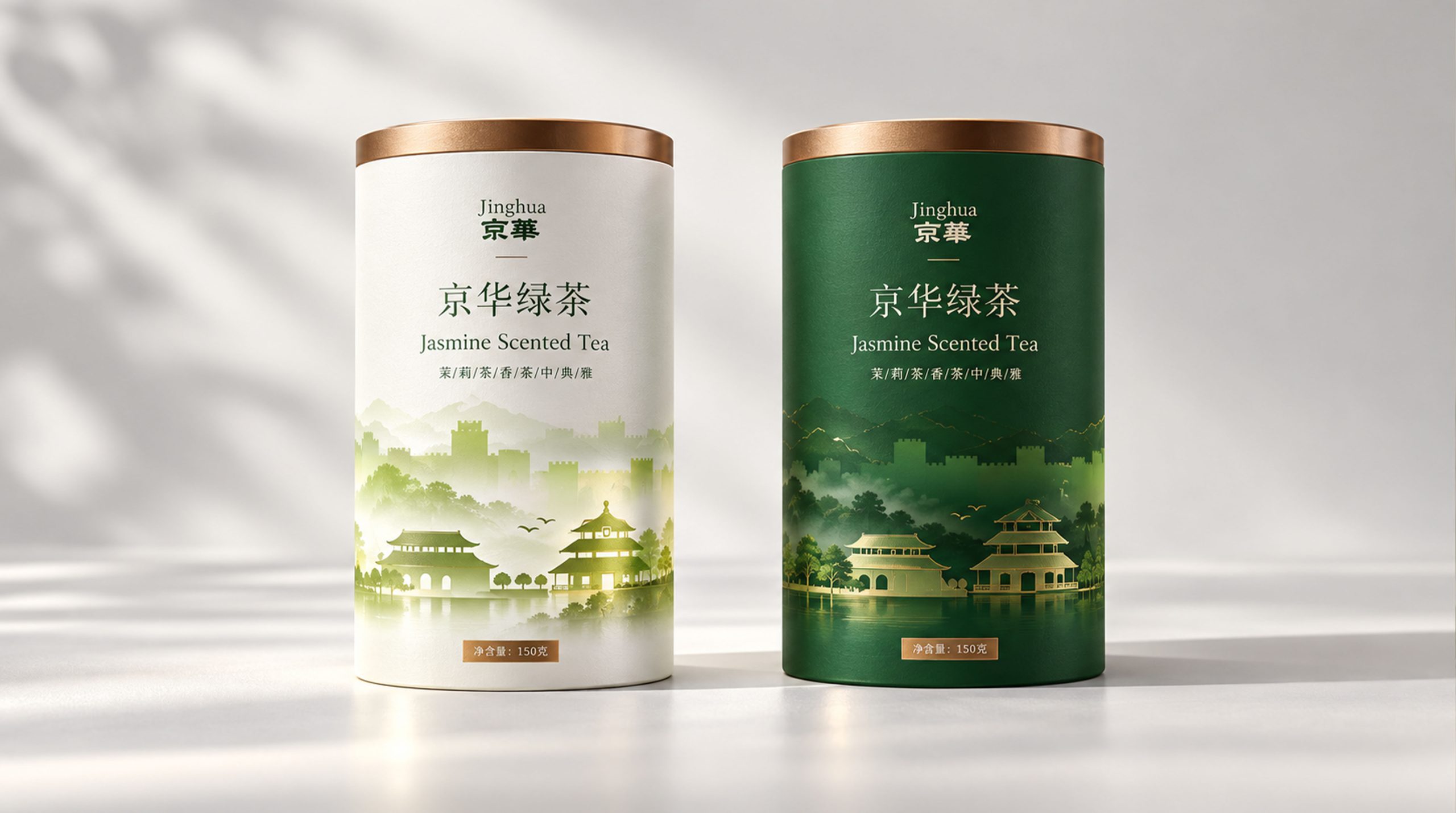
In terms of packaging design, Jinghua uses three colors - emerald green, amber gold and Chinese red - to correspond to different tea product lines. Each product is decorated with "white center panel + The two-zone composition of "Colorful Shading" is the basic format, with the finely painted circular main image of Beijing's iconic ancient buildings in the center, and the line drawings of Beijing landmarks scattered on the shading forming the depth of the visual hierarchy. Finally, a box of tea leaves is transformed into a visual letter from the city of Beijing - opening it is like unfolding a miniature picture of the capital.
Brand Essence
The core spirit of Jinghua packaging design can be summarized as:
City × tea × ceremony
Landmark × Color × Ceremony
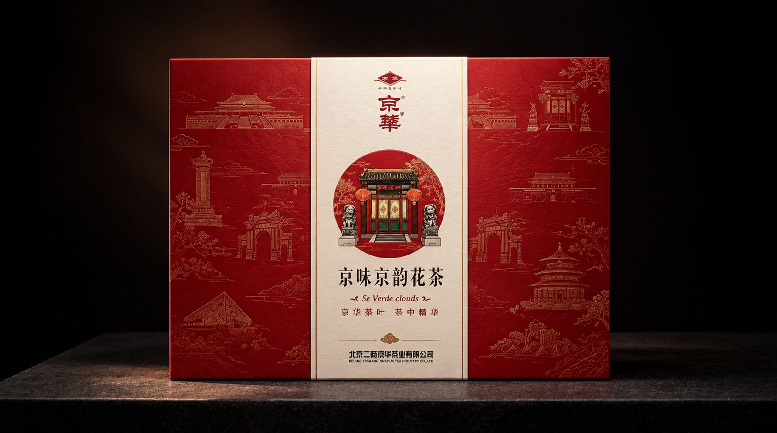
"City" is the most fundamental identity gene of the brand. Jinghua is not a generalized Chinese tea brand, but a "Beijing tea brand" with clearly marked geographical coordinates. This regional identity is not only reflected in the word "Beijing" in the brand name, but also in every aspect of the packaging visual system - from the finely drawn Beijing archways and palaces in the main image to the dense line drawings of Beijing landmarks such as the Temple of Heaven, Huabiao, the Great Wall, the Summer Palace, and the Forbidden City turrets in the background pattern. The entire package is like a "Beijing Architectural Illustration" with tea as the medium. The brand firmly anchors its cultural legitimacy on Beijing's 800-year-old imperial memory: this is not only "good tea", but also "Beijing's good tea" - its taste has the spirit of this city.
"Tea" is not only a product in Jinghua's system, but also an aspect of Beijing's urban culture. Jinghua has chosen to focus on categories with distinctive Beijing tea cultural characteristics, such as "Beijing-flavored Scented Tea" and "Se-enriched Cuifeng Yunwu" - scented tea is the mainstream daily tea drinking for old Beijingers, while green tea represents the brand's pursuit of quality upgrades. The grade label of "Mingqian First-Class Fried Green Tea" conveys quality information in a precise and restrained way, unobtrusive but never vague, just like the way old Beijingers treat guests - don't say it on the face, but know it in your heart.
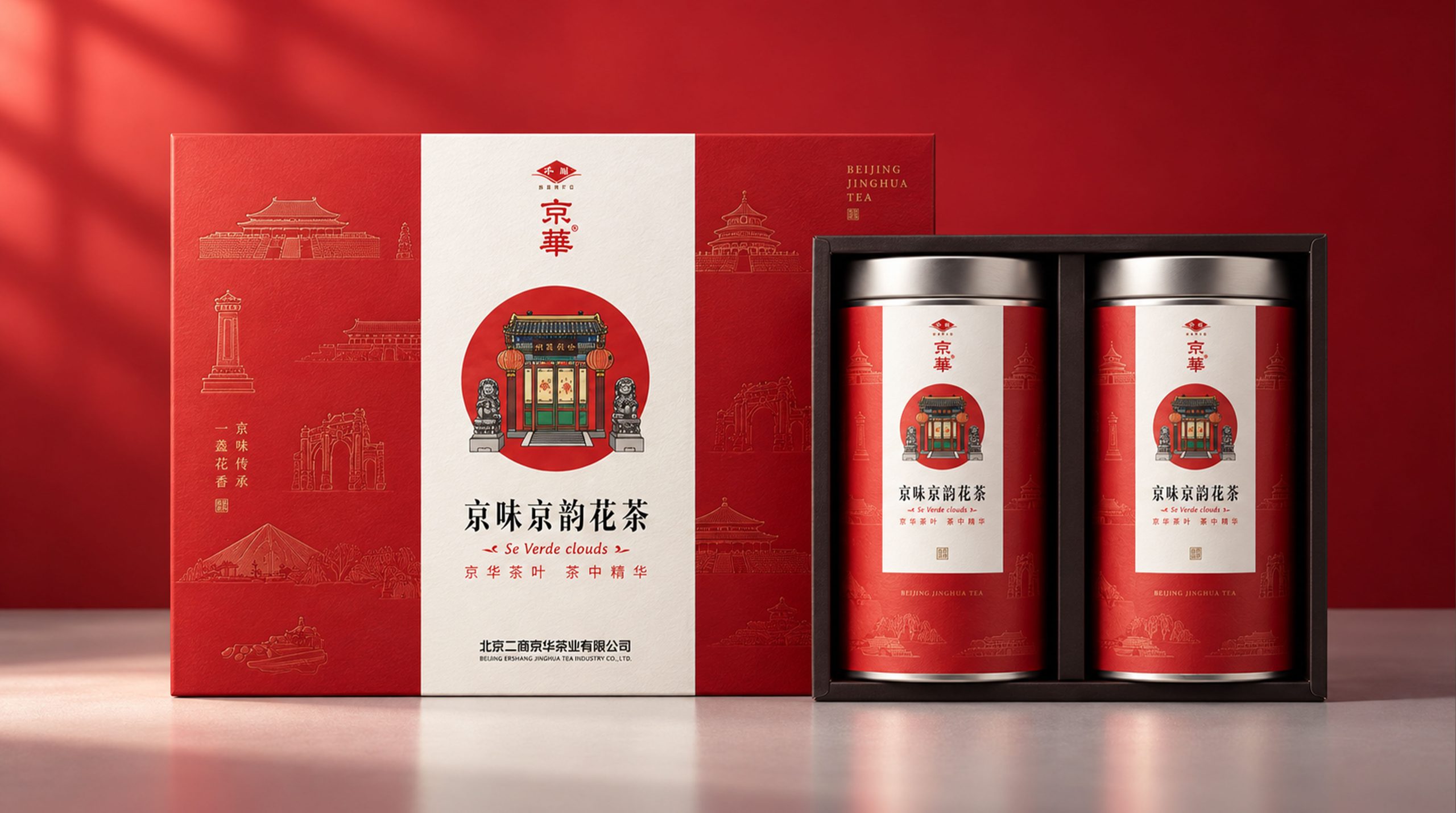
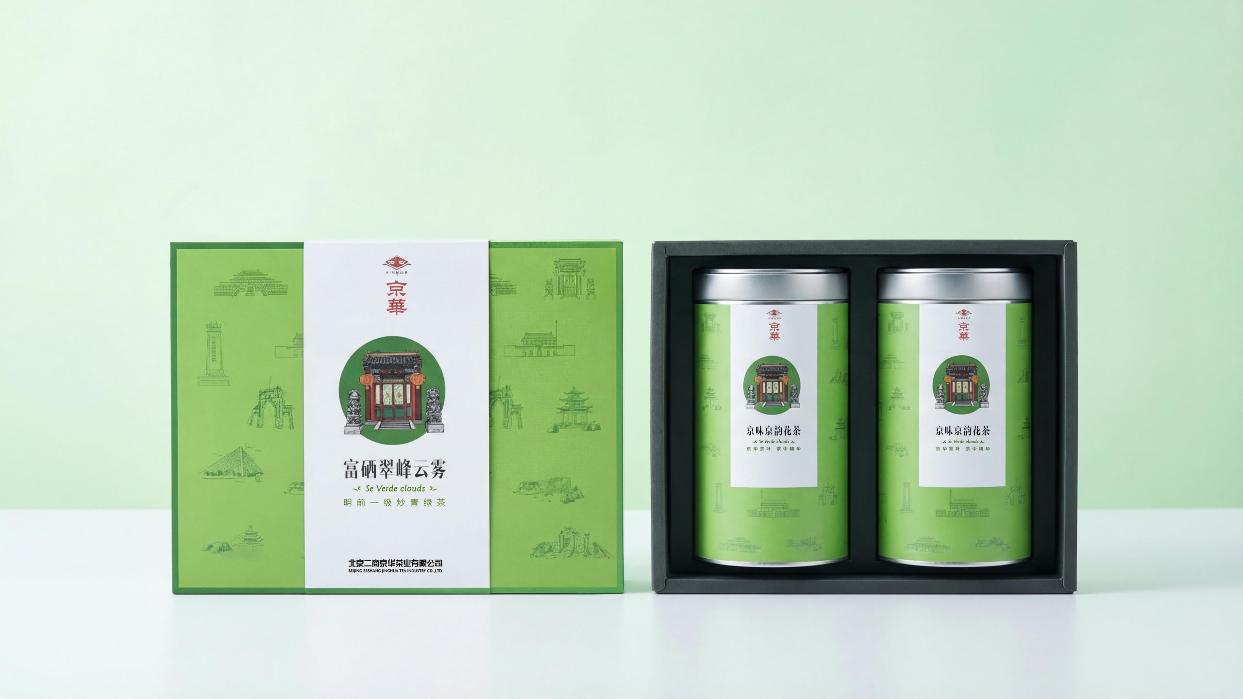
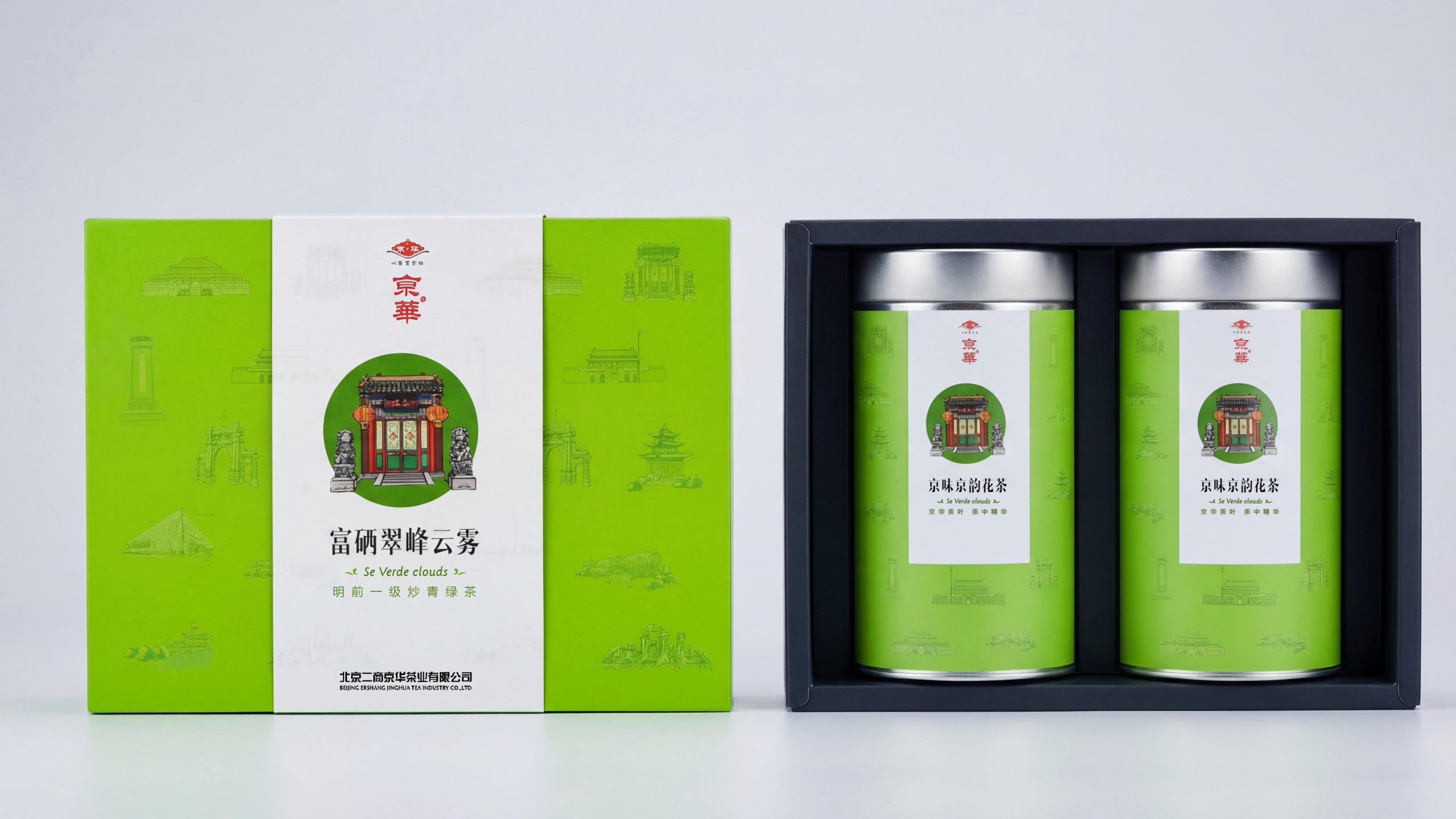
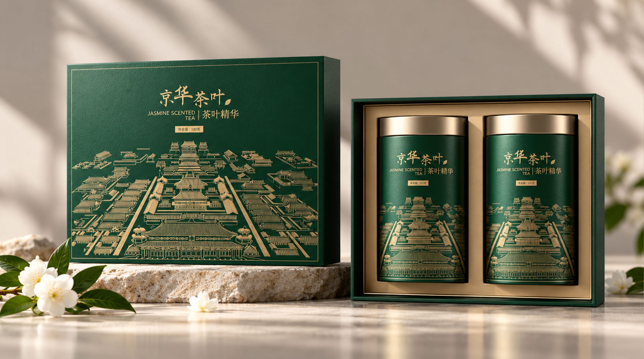
"Gift" is the ultimate functional positioning of Jinghua packaging design. The three color gift boxes all adopt the classic gift structure of outer box + double cans. The two metal tea cans inside are neatly arranged on the black lining. The moment you open the box, it is like opening the curtain of a stage - the two tea cans sit on the "stage" in a symmetrical composition, solemn and ceremonial. Jinghua understands the core code of Chinese tea ceremony culture: the quality of the tea itself is important, but the "face" and "face" of the tea as a gift are equally important. The color selection of the gift box - the elegance of emerald green, the nobility of amber gold, and the joy of Chinese red - accurately cover the three core scenarios of business gifts, filial piety and festival gifts, making Jinghua an "unmistakable gift choice".
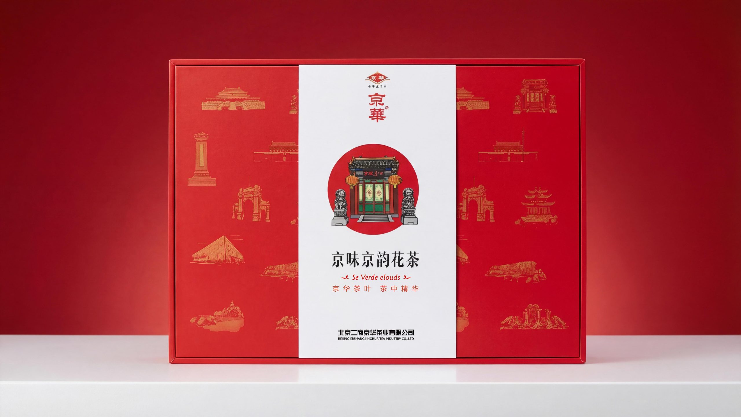
"Landmark" is the core vocabulary of visual storytelling. The center of the front of each gift box features a circular main image that carries a finely painted painting of an iconic ancient building in Beijing - the bracketed eaves of the archway and the golden roof and red walls of the palace. Each stroke is drawn with a precision close to that of an architectural meticulous painting. The colors are full but not gaudy, and the details are rich but not complicated. The circular composition choice coincides with the traditional Chinese meaning of "a round sky" and frames the architectural scene in a ceremonial "window" - through this round window, consumers see the most symbolic architectural face of Beijing. "Color" is the first visual signal of category differentiation. Three colors cover the sides and back of the gift box with high-saturation full-color backgrounds, forming a strong color aura: emerald green corresponds to the freshness of green tea, amber gold corresponds to the mellow warmth of scented tea, and Chinese red corresponds to the festive joy of scented tea. "Ceremony" is the emotional score of the entire package - from the ancient architectural scene on the outer box to the black stage lined inside to the dignified arrangement of metal tea cans, every level builds a sense of "solemn" ritual, like a miniature tea ceremony in Beijing.
Design Philosophy
Jinghua takes "a city in a box - using architecture as language, color as tone, and tea ceremony as ritual" as its overall design concept. The core proposition of the design is: how to condense the cultural depth of Beijing, a three-thousand-year-old city, into a tea gift box, so that when consumers open the gift box, they will not only see tea, but also a city.
Round window main image - architectural portrait: The front center of each gift box has a circular main image with a diameter of about 10cm as the visual core. The circular interior uses finely painted techniques to present an iconic ancient building in Beijing - the emerald green version is a traditional capital archway (presumably the Five Archways of the Qianmen or the Glazed Archway of the Imperial College), with stacked brackets, glazed roofs, stone lions squatting, and hanging plaques. Each architectural component is accurately depicted with a realistic technique, and the colors are mainly vermilion, bright yellow, indigo, and stone green, which is consistent with the real building. The colors of the paintings on the building are highly consistent; the amber gold version shows the front of a grand palace (presumably the Hall of Supreme Harmony or the Tiananmen Gate Tower), with gold tiles and red walls, Xumi base, and white stone railings, showing a solemn and warm atmosphere in the golden halo like the setting sun; the Chinese red version also uses the archway as the main image, but it presents a more warm and festive visual tone against the red background. The circular main image is not delineated with lines, but the circular area is naturally filled with architectural images and then naturally blended into the background with color gradients and edge blur, making the architectural image look like a real scene revealed from the round window, rather than a sticker.
Landmark shading - city memory map: The full color area (side panel and shading area) of the gift box uses the line drawing group images of famous landmark buildings in Beijing as the shading pattern. These line drawings are drawn with thin single-color lines - light green lines for the emerald green version, gold lines for the amber gold version, and light red lines for the Chinese red version - in tones that are slightly darker or lighter than the background color, creating a faint "watermark" effect. Recognizable landmarks include: Huabiao (white stone pillars in front of Tiananmen Gate), Temple of Heaven Hall of Prayer for Good Harvests, Forbidden City Corner Tower, Great Wall Beacon Tower, Summer Palace Seventeen-Arch Bridge, National Stadium Bird's Nest, etc. These buildings are freely distributed among the shading in a scatter-point perspective, and do not follow any geographical location logic, but are arranged based on the sense of balance of visual rhythm. The presence of the shading line drawing is precisely controlled at the threshold of "surprise if discovered, no impact if not discovered" - it does not compete for the attention of the main image, but once consumers notice and identify them one by one, a miniature "Beijing Landmark Treasure Hunt" game starts, adding interactivity and topicality to the gift box.
Dual-zone composition - a ceremonial space of white and color: The front of each gift box uses a dual-zone composition of "white panel + color shading" as the basic format. The white panel accounts for about 55-60% of the front area, and is located on the left or center, carrying core content such as the brand logo, circular main image, product name, English subtitle, and producer information, with a plain white background to ensure clear communication of information; the color shading area accounts for about 40-45%, located on the right or both sides, with full-page background color + landmark line drawing shading to form the brand's color identification and cultural depth. The intersection of white and color is neatly divided by straight lines without any gradient or transition processing - this decisive division gives the composition a sense of order like a building facade, like the juxtaposition of a white wall and a colored wall.
Visual Language
Jinghua has constructed a visual system with three pillars: "Architectural Illustration × Color Coding × Ceremony Typesetting". The design of each visual element serves the core proposition of the brand - the trinity of "Beijing × Tea × Ceremony".
Color: Jinghua has established a clear category color coding system with three high-purity theme colors. Emerald green (approximately Pantone 375C to 368C range) is the main color of the green tea series. It is bright and lively, with the fresh vitality of early spring buds. This green is not a calm dark green nor a cold emerald green, but a green that is close to "Mingqian tea soup" - it implies the core selling point of the product: freshness, tenderness and newness. Amber gold (approximately Pantone 137C to 1235C range) is the main color of the high-end scented tea series. It is warm and mellow, with a noble luster like the setting sun. This gold is not the gold of the nouveau riche, but a calm and warm gold close to "old beeswax" - it hints at the mellow fragrance of scented tea and the historical heritage of the brand. Chinese red (approximately Pantone 485C to 1795C range) is the main festive color of the scented tea series. It is red, neither orange nor purple. It is a faithful color translation of traditional Chinese palace wall red - it can convey the emotional signals of "joy", "festival" and "blessing" without any text explanation. The three main colors are all printed with full-page high saturation to cover the shading area, creating a strong shelf impact. At the same time, the large area of white panel is used as a buffer to prevent the color from being too noisy and losing the sense of quality. White plays the dual role of "background" and "breathing space" in all three designs. The clean white of high-whiteness coated paper provides the purest display background for the brand logo, product name and main architectural image.
Graphics: Jinghua's graphic system consists of three levels - the first level: the main image of the circular building, which is the absolute core of the visual system, with one image for each model, presented with fine painting techniques, and assumes the cultural narrative function of the brand; the second level: the landmark line drawing shading, which is the cultural depth of the visual system, with more than ten monochrome line drawings of Beijing landmarks scattered in the shading area, serving as the brand's regional identity marking function; the third level: the brand logo graphic, that is, the Jinghua logo The traditional pattern and the word "Jinghua" in a medium-red diamond-shaped frame are located in the upper center of the front of the gift box, serving as an anchor for brand recognition. The three graphic levels are arranged according to the visual logic of "focus-diffusion-anchoring": consumers' eyes are first attracted by the brightly colored circular main image (focusing), then wander along the landmark lines in the shading (diffusion), and finally return to the brand logo at the top to complete the closed loop of brand memory (anchoring). The architectural painting style in the circular main image is somewhere between traditional gongbi and modern illustrations - it is more relaxed and lively than pure gongbi (the lines are smoother and the colors are brighter), and it is more rigorous and refined than cartoon illustrations (the architectural proportions are accurate and the component details are faithful). This "half gongbi, half illustration" eclectic style makes Jinghua's visual tone neither too old-fashioned nor too fashionable, and accurately hits the positioning range of "cultured mass brands".
Font: The brand name "Jinghua" appears in traditional Chinese fonts in the red diamond-shaped logo frame. The font is in customized regular script with thick and straight strokes, just like the inscription on a plaque, conveying the sense of heaviness and orthodoxy of a time-honored brand. The product names "Beijing flavor Beijing scented tea" and "Se-enriched Cuifeng cloud" are presented in modern regular script or variety script. The font size is larger and located in the center below the circular main image. The font selection is between traditional calligraphy and modern title characters - it has the skeletal charm of calligraphy and the regularity and clarity of printed characters, ensuring long-distance recognition in gift scenarios. The English subtitle "Se Verde clouds" is presented in lowercase serif italics, with a very small font size, located below the product name, and surrounded by small decorative wavy lines "~" at both ends. Although this detail is small, it adds a touch of European sophistication to the overall layout, hinting at the brand's attempt at international expression. The grade description "Mingqian first-grade fried green tea" is presented in a regular small boldface, with the font size being about one-third of the product name, located between the product name and the English subtitle, and completing the product description with minimalist functional information. The name of the producer, "Beijing Ershang Jinghua Tea Co., Ltd." and the corresponding English name are arranged at the bottom of the gift box in the smallest font size, Song/Hell font. The font size is very small but the arrangement is regular, just like the signature of an official document - this treatment gives the packaging a sense of authority as "official product". The brand slogan "Jinghua Tea, the Essence of Tea" appears in a medium-sized regular font on the amber gold version and the Chinese red version gift box. It is located between the circular main image and the producer's information. The refined eight-character contrast completes the final determination of the brand value.
Tone of Voice
The written language of Jinghua is consistent with the Beijing accent of "orthodox but not pretentious" - it has the confidence and weight of a time-honored brand, but does not reject people thousands of miles away; it talks about culture, but uses human language.
The brand name "Jinghua" is presented in traditional Chinese characters in the logo. This choice itself is a language attitude - the use of traditional Chinese characters implies the brand's conscious pursuit of traditional orthodoxy, just like the signature plaques in old Beijing must be written in large block letters, without simplified characters, cursive writing, or discounting. The word "Jing" anchors the regional identity, and the word "Hua" declares the pursuit of quality - the splendor of Beijing and the essence of tea. These two words complete the entire self-definition of the brand.
The product name "Beijing flavor Beijing scented tea" uses the two overlapping words "Beijing flavor" and "Beijing charm" to form a strong regional label - consumers have not yet tasted the tea, but the two characters "Beijing" in the product name have already completed their understanding of the cultural identity of the product. The choice of "taste" and "rhyme" is also extremely delicate: "taste" is an intuitive experience at the sensory level (this tea has the flavor of Beijing), and "yun" is an aesthetic experience at the cultural level (this tea has the charm of Beijing). The combination of the two elevates a cup of scented tea from a "delicious drink" to a "cultural experience." "Selenium-rich Cuifeng Yunwu" constructs the product name of the green tea series in a more literary language - "Selenium-rich" conveys health function information (selenium element), "Cuifeng" depicts the image of the origin (green tea mountains), and "Clouds" creates a quality atmosphere (high mountains and clouds produce good tea). The six words are like a miniature landscape poem.
The English subtitle "Se Verde clouds" is an interesting language choice - it is not a standard English translation, but a mix of Spanish "Se Verde" (green) and English "clouds" (clouds) to form an exotic phrase, surrounded by decorative wavy lines "~ ~" at both ends. The overall feeling is more like the product line name of a fragrance brand or specialty coffee than the English name of traditional tea. This choice of "non-standard translation" hints at the brand's strategy for international expression: instead of doing a word-for-word literal translation of "Chinglish", it uses a mixed language with an aesthetic sense to build the international imagination of the product.
The brand slogan "Jinghua Tea, the Essence of Tea" uses neat horoscopes to express the brand value in a concentrated way. "Jinghua Tea" is the expansion of the brand name, and "the essence of tea" is the final tone of the brand promise - the tone is neither humble nor overbearing, neither exaggerated nor modest, just like an experienced old Beijinger saying calmly about his own good things: "This is good stuff." There is no explanation of why it is good, and no list of the effects of the craftsmanship of the place of production - whether it is good or not, you will know after brewing a cup. The grade label of "Mingqian First-Class Roasted Green Tea" completes the last piece of the puzzle of product information in extremely restrained professional terms - "Mingqian" marks the picking season, "First Class" marks the quality level, "Fried Green Tea" marks the craft category, and "Green Tea" marks the category attribution - the eight words are like the notes of a tea reviewer, professional, precise and not one more word. The full name of the producer "Beijing Ershang Jinghua Tea Co., Ltd." appears in the smallest font size at the bottom of the gift box, just like the signature and seal of an official document - the four characters "Beijing Ershang" imply the brand's state-owned enterprise background and supply and marketing system origins, adding a layer of trust and endorsement of "official product" to the brand.
Brand Experience
Jinghua has built a complete "Beijing Tea Ceremony" experience for consumers from the three dimensions of vision, touch and ritual - solemn but not dull, lively but not frivolous, just like a proper Beijing-style hospitality:
Visual experience: Jinghua’s gift boxes form a strong visual attraction on the shelves with their highly saturated theme colors and detailed main architectural images. When the gift boxes of the three colors are displayed side by side, they resemble a miniature "color spectrum wall" - the freshness of emerald green, the luxury of amber gold and the warmth of Chinese red are juxtaposed, allowing consumers to perceive the brand's complete product matrix from a distance. When viewed at close range, the architectural details in the circular main image become a visual "deep water area" - the number of brackets in the archway, the color levels of the glazed tiles, the posture details of the stone lions, and the text content of the plaque. Each of them can withstand closer inspection. This "the more you look at it, the more you see it" graphic density provides consumers with a visual information volume that far exceeds that of FMCG packaging. The line drawings of landmarks in the shading are hidden "layers of Easter eggs" - consumers gradually discover the outlines of familiar landmarks such as the Temple of Heaven, Huabiao, and the Great Wall through repeated viewing. Each discovery is like encountering a familiar corner on the streets of Beijing, giving rise to the pleasant feeling of "recognition". After opening the box, the contrast between the black lining and the colorful tea cans creates a dramatic effect of "stage unveiling" - the two tea cans are like the protagonists under the spotlight on the black background, dignified and with a sense of presence.
Tactile experience: The matte coating surface of the outer box provides a delicate but not slippery grip. Your fingertips can vaguely feel the flatness of the coated paper and the stiffness of the gray board under the coating - this "tough delicacy" perfectly matches the brand's "orthodox but not pretentious" temperament. If the circular main image area is embossed or partially UV-treated, consumers can feel the texture jump from flat to slightly convex when their fingertips pass over it, just like touching a relief - the outline of the building acquires a physical presence at their fingertips. The touch of the metal tea can is the first "material transition point" after opening the box - from the warmth of the paper outer box to the coolness of the metal can body. This temperature difference marks the transition from "gift packaging" to "product body" at the sensory level. The slight "pop" sound when the can lid is opened and the instantaneous release of the sealing sensation confirm the integrity of the product's seal with dual auditory and tactile signals - this is the most functional sensory detail in tea packaging, because it is directly related to consumers' trust in the freshness of the tea.
Ritual experience: Jinghua's box opening ceremony is based on the "unveiling ceremony" as the emotional prototype. Prologue - Color Recognition: Consumers recognized Jinghua's iconic colors and the main image of the circular building among the many gifts. At this moment, the brand's color coding system completed its core function - long-distance brand recognition. The first scene - Viewing the painting: The consumer looks at the front of the gift box at close range, and his eyes linger on the main image of the circular building - this is a moment of "micro-reading". The consumer is like looking at a small architectural painting, identifying the type and details of the building. The group of line drawings in the landmark shading form the cultural background of Beijing in the peripheral vision. Act 2 - Opening: Open the lid of the box with both hands, the black lining unfolds like a stage curtain, and two tea cans sit on the "stage" in a symmetrical composition - the ritual sense of this moment comes from the "solemnity of symmetry" and the "drama of light and dark": the strong contrast between the white/green/gold/red outer box color and the black lining creates a visual effect of "a gift being grandly presented". The third act - taking out the can: The consumer takes out the tea can from the black lining. The cool touch of the metal and the moderate weight (estimated to be about 150-250g per can) convey a "real" sense of satisfaction in the palm of the hand - this is not just a flowery shelf, there is real good tea in the can. The entire ceremony takes about 15-20 seconds from color recognition to taking out the can. The pace is neither slow nor fast, which matches the Chinese tea ceremony culture of "not in a hurry nor in a hurry" in hospitality.
Brand Statement
Jinghua Tea, the essence of tea. The charm of a city is all in one cup. Jinghua takes the 800-year-old imperial capital culture of Beijing as its brand foundation, takes the fine paintings of archways and palaces as its visual core, uses three-color coding of emerald green, amber gold and Chinese red to construct a tea product matrix, and uses a three-layer gift structure of "outer box + black lining + double cans" to complete the ritual expression of the tea ceremony. It does not do bland minimalism, because the cultural heritage of Beijing does not allow for blandness; it does not do exaggeration, because the confidence of a time-honored brand does not need to be piling up. The packaging of Jinghua is like the city itself - smooth but rich in details, solemn and warm in the world. The circular architectural painting in each gift box is a window looking at the city of Beijing; the fragrance of tea in each tea pot is the city's hospitality that has taken eight hundred years to brew. When you open a box of Jinghua, you open a chapter of Beijing’s flavor, charm, and tea China.