










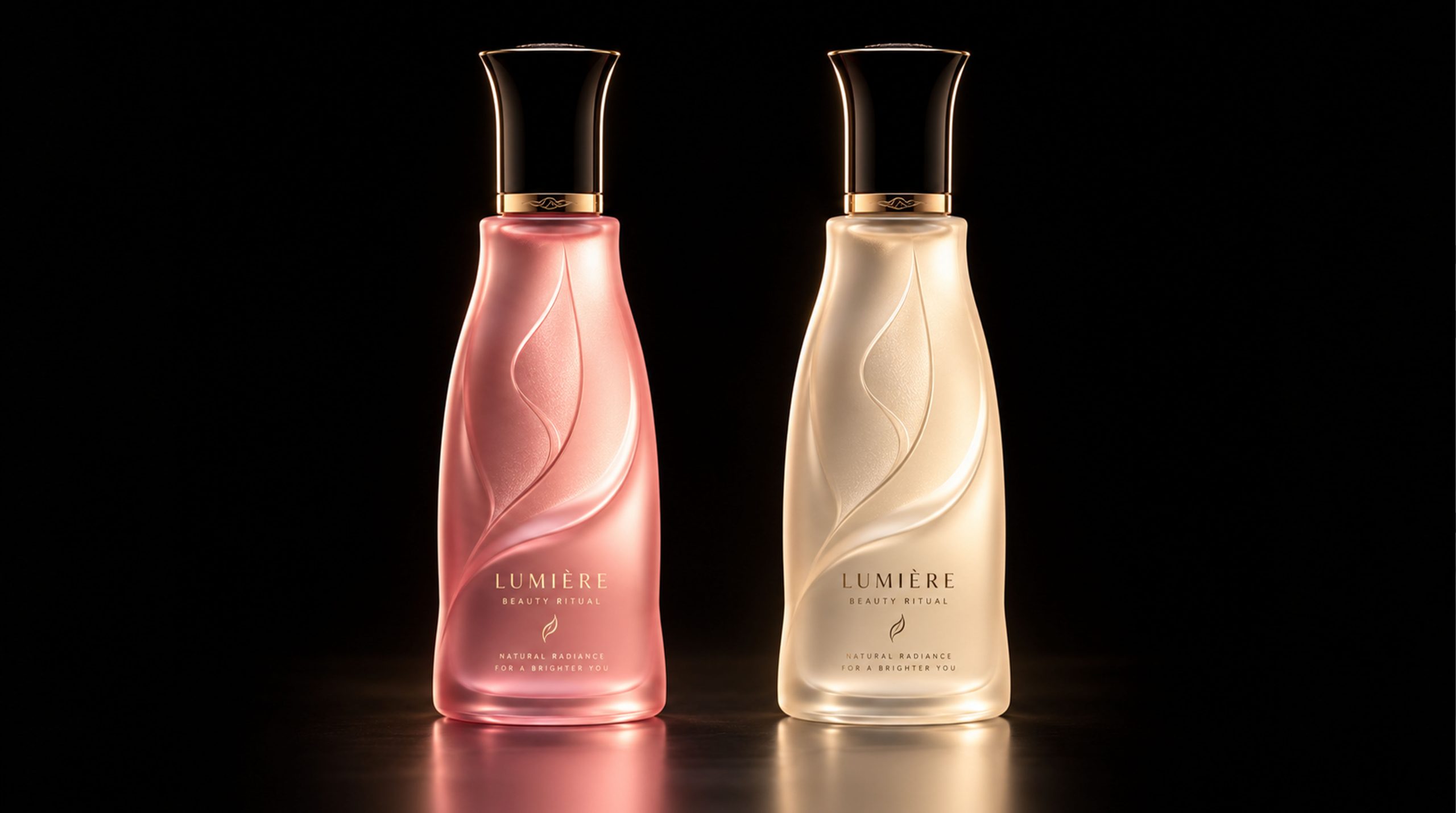
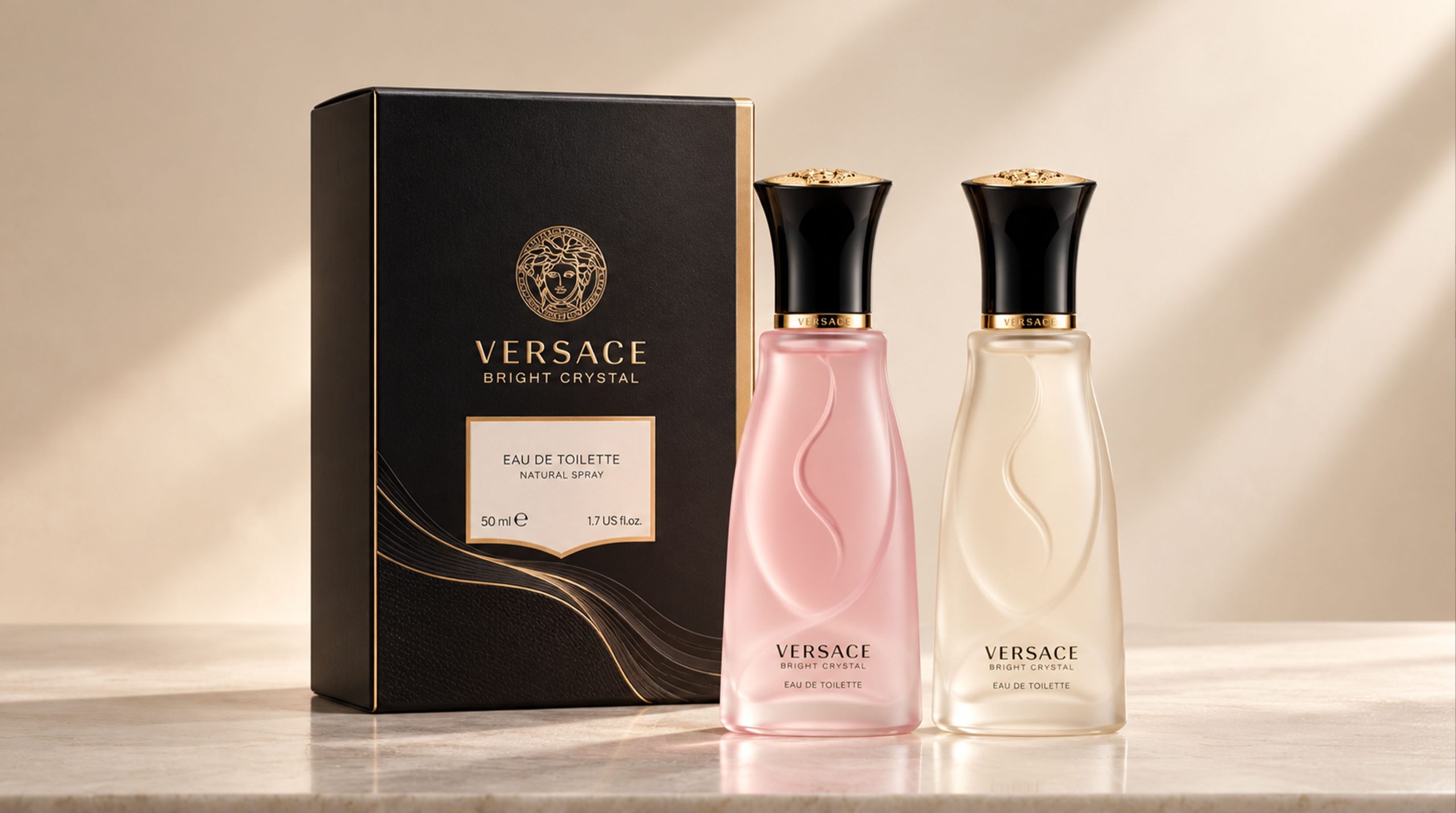
Versace Bright Crystal Eau de Toilette Natural Spray is a classic fragrance series created by Versace specifically for modern women. This version is presented in a two-tone frosted glass bottle - rose pink and milky white juxtaposed - and is paired with a classic black box and Medusa emblem. The bottle body has a unique flame relief as the core vision. Under the soft light of the frosted texture, it exudes a dual temperament that is both sensual and pure, interpreting Versace's new understanding of female beauty: both passionate and elegant; both bright and restrained.
Brand Essence
The core ethos of the design of the Versace Bright Crystal Frosted Edition can be summed up as:
Sensibility × Purity × Twins
Soft light × flame × female power
"Sensual" is reflected in the gentle tone of rose pink and the smooth curves of the bottle; "Purity" comes from the hazy frosted texture of the milky white version, like the light in the morning mist; "Twin" points to the harmonious dialog formed when the two bottles are juxtaposed - different tones and temperaments, but sharing the same soul. "Soft light" is the unique atmosphere given to the bottle by the frosting process. "Flame" is the core image of the relief pattern on the bottle, symbolizing the inner burning power and passion of women. "Female power" is the deepest emotional proposition of the entire series.
Design Philosophy
The design of the frosted version of Bright Crystal is based on the core concept of "fire burning in soft light". Different from the flamboyant brilliance of the high-gloss version, the frosted treatment envelops the bottle in a layer of hazy soft light. The light is no longer dazzling, but gently diffused, as close and warm as candlelight.
The flame-shaped relief on the front of the bottle is looming against the frosted glass. It does not steal the attention, but is exciting when you look closely. This is the essence of the design: expressing enthusiasm in a restrained way. The gradually widening tower-shaped bottle is stable and powerful. It is equipped with a black matte trumpet-shaped bottle cap and a golden metal ring, forming a perfect balance between softness and rigidity, warmth and cold, giving the bottle an overall mature and elegant temperament.
Visual Language
The visual language of the frosted version is based on "softness", showing rich levels in restraint:
Color: The two-color scheme has its own personality - rose pink is gentle and warm, with a youthful and sensual atmosphere; milky white is pure and hazy, exuding a mature and elegant luster. The two are like two soft lights against the black background, creating a halo-like reflection on the marble countertop, creating a high-end dramatic beauty. The outer box is made of deep matte black and is embellished with a gold-plated label and Medusa emblem, creating a strong visual contrast with the softness of the bottle.
Pattern: The front of the bottle is engraved with a flame-shaped relief using an intaglio process. The lines are smooth and full of tension. Under the diffuse light of the frosted glass, it presents a hazy beauty. The flame pattern is both a visual focal point and a metaphorical expression of the brand’s inner passion for women. The front of the outer box uses a white hot-stamped label, which presents the brand name and product information in classic serif fonts, which is clean and neat.
Font: The outer box label uses "VERSACE" as the main visual, followed by "BRIGHT CRYSTAL", and "EAU DE TOILETTE / NATURAL SPRAY" ends with a small font size. The information level is clear, and together with the Medusa badge, it forms the complete visual identity of the brand.
Packaging Structure and Details
The entire package consists of two parts: bottle and outer box, which complement each other:
Bottle structure: It adopts a tower-shaped design with a wide bottom and a narrow top. The bottom of the bottle is broad and stable, and gradually narrows upward to form an elegant neck. The overall proportion is slender and powerful. The surface of the bottle has been evenly frosted and feels as delicate as satin. A precise golden metal ring at the neck of the bottle separates the bottle body from the cap. It is the only metal embellishment on the bottle, quietly and accurately enhancing the overall texture.
Bottle cap structure: The black matte trumpet-shaped bottle cap expands upward, with a unique and recognizable shape. The top is slightly rounded, and the whole is like a blooming calyx, forming a visual rhythm that echoes the tower shape of the bottle.
Outer box structure: The outer box is made of a classic clamshell hard box, all matte black, with the brand name hot stamped on the top, and a white hot stamped label on the front to present product information in the center. The top of the label is a golden Medusa emblem, and the bottom is a shield-shaped decorative line. The overall composition constitutes Versace's iconic royal visual language.
In terms of craftsmanship details, the frosting of the bottle body is even and delicate, without any graininess; the flame relief is formed in one step with a precision mold, and the edges of the lines are clear and smooth; the matte black coating of the outer box feels warm and moist, and the hot stamping printing is delicate and shiny, and the overall craftsmanship is extremely high.
Tone of Voice
The text language on the outer box is concise and restrained, conveying the strongest brand presence with the least information. "VERSACE" uses the largest font size to declare the identity, "BRIGHT CRYSTAL" uses the subtitle to highlight the personality of the perfume, and "EAU DE TOILETTE NATURAL SPRAY 50ml / 1.7 US fl.oz" ends with functional language, without a word being redundant.
The overall tone of the brand is calm and confident, requiring neither excessive modification nor emotional rendering - the name Versace itself is the strongest language. The visual context formed by the matte black background of the outer box, the golden Medusa and the white nameplate has clearly laid out the brand's luxurious tone, and the text is just the final confirmation.
Brand Experience
The Bright Crystal frosted version creates a complete sensory experience for users from three levels: visual, tactile and emotional:
Visual experience: When the two bottles are juxtaposed, the dialog between pink and white is elegant and moving, just like the meeting of two women with different temperaments. The addition of the black outer box gives the entire package a sharp contrast between high and low - the depth of the box and the softness of the bottle, the tension between rigidity and softness is fascinating.
Tactile experience: The texture of frosted glass is the most unforgettable detail of the entire package. Holding it in your hand is like holding a piece of delicate cold jade, with both the weight of glass and the gentle touch of frosting. The flame relief is looming when the fingertips are lightly traced, adding a touch of pleasure of exploration.
Emotional experience: The warmth of rose pink and the purity of milky white jointly construct Bright Crystal's comprehensive imagination of femininity - she can be passionate or indifferent; she can be bright or elegant. This package allows every owner to find their own side of it.
Brand Statement
"Under soft light, every woman is her own flame." Versace Bright Crystal frosted version uses a two-color juxtaposed soft bottle as a carrier, with flame relief as the emotional core and frosted soft light as the visual language, expressing the inner sensibility and strength of women in a gentle and firm way. The calmness of the black outer box gives the entire package a sense of elegance that cannot be ignored. Every time you take it out, it is a redefinition of your own temperament.