










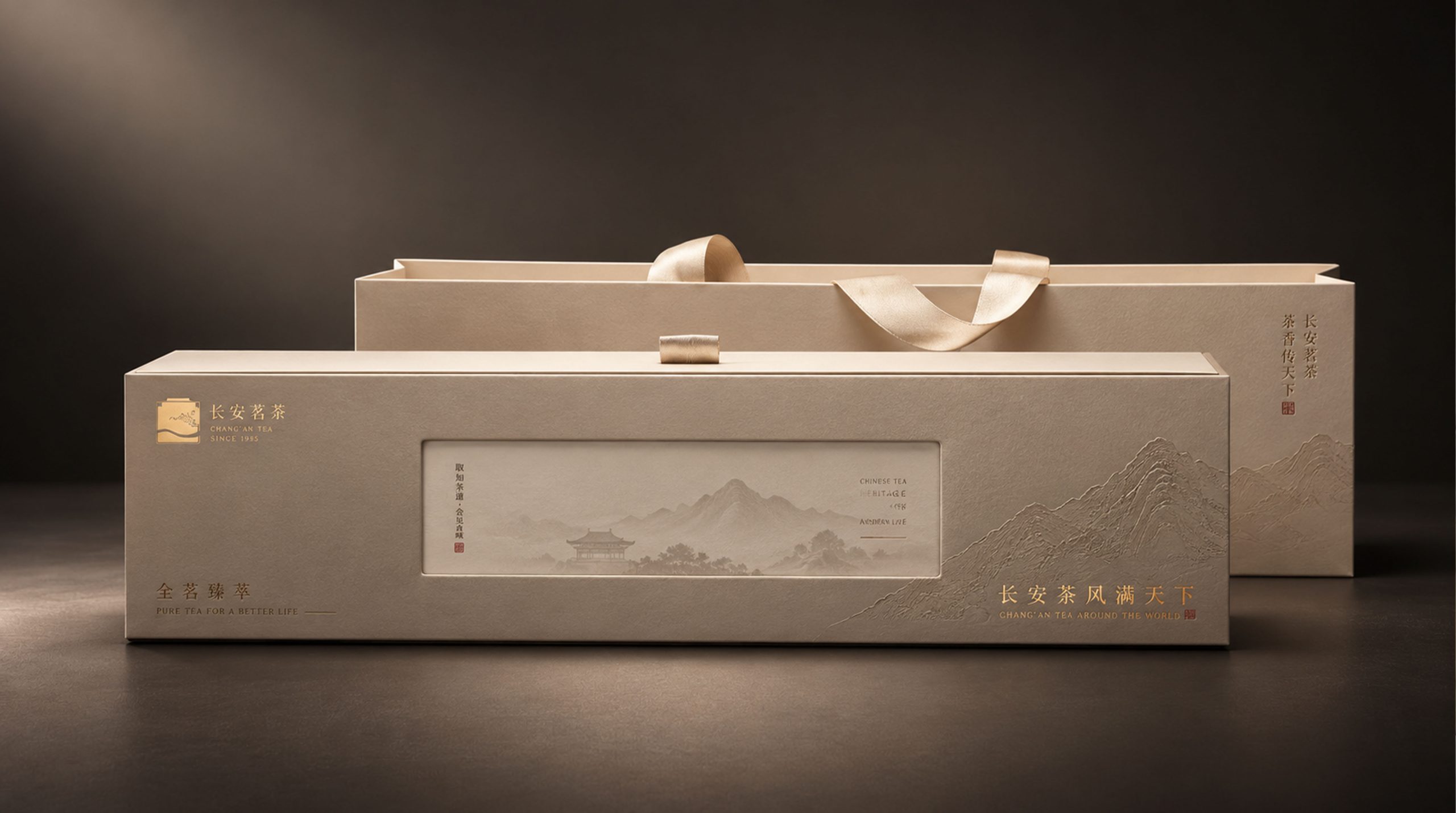
Chang'an Gongcha takes "Chang'an tea is popular all over the world" as its brand spirit and launches the Jin Hua Hei Cha gift box. With an extremely restrained and elegant visual language, it presents a contemporary tea gift with the temperament of a Tang-style literati. The whole gift box is based on warm warm beige (Warm Ivory). The box surface extends horizontally and has a narrow proportion, like a slowly unfolding hand-scroll painting.
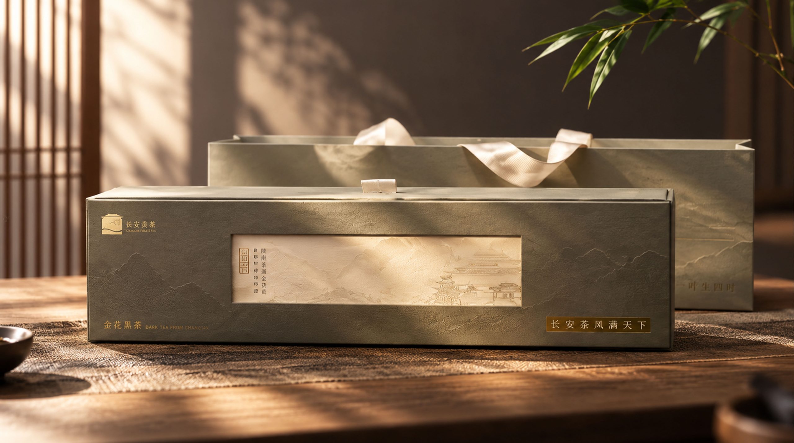
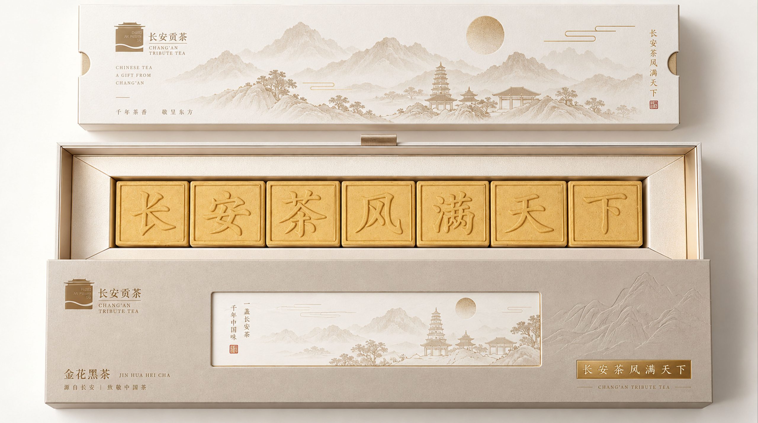
A delicate white rectangular window is embedded in the middle of the box. The window has a very light landscape painting and an image of an ancient pagoda as the background, with vertical ancient rhyme text and a vermillion seal, just like the essence of a hand scroll; a small gold logo and The "Chang'an Gongcha" brand name is arranged horizontally, with the product name and pinyin of "Golden Flower Black Tea" written in gold fonts on the lower left, and a golden bottom plate carrying the brand proposition of "Chang'an Tea is popular all over the world" on the lower right. There is a white satin handle on the top of the box for easy carrying of gifts.
The matching handbag and gift box adopt the same warm beige color, forming a complete gift visual system. The entire set of packaging uses "Tang style impression" as the aesthetic background, "hand scroll narrative" as the structural logic, and "elegance and restraint" as the design attitude, creating a high-end tea gift packaging image that combines historical depth, cultural confidence and contemporary sophistication.
Brand Essence
The core spirit of Chang'an Gongcha Golden Flower Black Tea Gift Box can be summed up as:
Tang style × tribute tea × cultural confidence
Elegant × ethereal × scroll narrative
These keywords form the unique spiritual core of the Chang'an tribute tea brand and this golden flower black tea gift box. Tang style is the most fundamental cultural coordinate of the brand - the word "Chang'an" directly positions the brand in the image of the capital city of the Tang Dynasty, the most glorious Chinese civilization, giving the brand a cultural depth that transcends geographical indications - the prosperity of the Tang Dynasty, the open pattern of all nations coming to the dynasty, and the noble tradition of paying tribute to the palace. All these images of the Tang Dynasty are activated and injected into the brand gene through the word "Chang'an". "Gong Tea" further strengthens the product's revered positioning - tribute, that is, something dedicated to the emperor, elevating the product from ordinary tea to the value level of "royal use." Cultural confidence is the underlying temperament of the brand spirit - "Chang'an tea is popular all over the world". The brand proposition uses a sense of exhalation and exhalation to express the ultimate vision and cultural ambition of the brand - not only to sell good tea, but also to use Chang'an as the spiritual center to spread the charm and style of Chinese tea culture to the world.
Elegance is the core quality of the gift box at the visual level. The whole body is warm and off-white, rejecting the heavy tones such as dark brown, dark gold, and dark green that are common in the tea packaging market. Instead, it wraps the whole body in a plain and clean tone that is close to rice paper and Kaiyuan soap glaze, carrying the honor of tribute tea with a simple and elegant body. The emptiness is inspired by the large amount of white space on the box surface and the minimalist information layout - more than two-thirds of the box surface is pure warm beige white space, and information and images are only distributed in specific positions on the box surface as embellishments, as if the huge white space itself is a design language - it conveys a sense of space, a sense of breathing, and an artistic conception of "making something out of nothing" that belongs to Eastern aesthetics. The scroll narrative is the unique structural aesthetics of this gift box - the narrow horizontal proportions and the white landscape window embedded in the middle transform the entire box surface into a slowly unfolding banner scroll, giving the tea ceremony a narrative rhythm and aesthetic ritual that belongs to the tradition of Chinese calligraphy and painting.
Design Philosophy
The design concept of the Golden Flower Black Tea Gift Box is based on the core starting point of "scrolls carrying inscriptions, which always carry the Tao". Taking the aesthetic logic of traditional Chinese hand-scroll paintings as the core reference, the design team regarded the surface of the gift box as an unfolded fragment of a banner scroll - the narrow horizontal proportions provide a scroll-like visual rhythm. The white landscape window in the middle is like the essence of the picture in the middle of the scroll. The brand information on the left and the brand proposition on the right are separated at two ends like the inscription and signature of the scroll. The large area of warm white white space is like the meaningful blank space in the scroll.
The design language is based on the three major principles of "elements as the base, gold as the dots, and paintings as the windows". Plain color is the absolute basis of the entire design - warm off-white white occupies the largest area of the box, setting the core tone of "prime is precious" in the packaging. All images, text, and colors are restrained embellishments on this plain background, rather than overwhelming coverage. ; Gold is the only color element in the design - it appears in key positions such as the brand logo, product name text and the bottom plate of "Chang'an Tea Style Mantains the World" in an extremely restrained manner, just like the gold foil inscription on a scroll painting, providing the most accurate visual reminder in the smallest area. A bright and noble signal; the landscape painting window is the visual focus and narrative core of the entire design - it uses a white rectangular "window" in the center of the box. Inside the window, a very light landscape artistic conception and images of ancient pagodas are used to construct a miniature literati landscape picture, accompanied by vertical rows of ancient rhymes. The words and a vermilion seal condense the four-in-one classic aesthetic of "poetry, calligraphy, painting, and sealing" in Chinese calligraphy and painting into this small visual window, giving the box a sophisticated and far-reaching visual narrative space against the large area of elegant white space.
The overall design pursues a multi-layered design philosophy of "using elements as the base, empty space as the environment, gold as the seal, and painting as the eye" - not using the visual fullness to prove the value of the packaging, but using the emptiness of the blank space, the restraint of the gold, and the indifference of the landscape to construct a deep texture that belongs to Chinese literati aesthetics. When the gift box rests on the table, it is like a jasper scroll from the Tang Dynasty - plain package, golden inscription, landscape painting, and seal signature - a cultural image about "Chang'an", "Gong Tea" and "Golden Flower" is silently and completely presented as it unfolds slowly.
Visual Language
The Golden Flower Black Tea Gift Box visually presents an elegant visual image that is extremely restrained, full of literati temperament and Tang Dynasty imagery:
Color: The gift box is based on warm off-white. This tone is different from cold pure white or pale gray - it is warmer, softer, and plain, with a delicate texture like rice paper and a warm luster like Kaiyuan soap glaze. This kind of tone is extremely rare in the tea packaging market - most high-end tea gift boxes prefer dark colors that are thick and steady, but Chang'an Gongcha goes in the opposite direction, using light colors that are clean and ethereal to establish recognition, like a white porcelain vessel standing out among a table full of purple clay pots. Gold is the only color dimension in the whole set of visuals. It appears in key positions such as the brand logo, product name text, and brand proposition baseboard in an extremely restrained manner. The color purity of gold is not high—it is not a dazzling bright gold, but a mild tone that favors champagne gold or light gold. It creates a "half-there" exquisite luster on a warm off-white background, just like the gold powder inscription on an ancient book scroll, noble but not ostentatious. The landscape image in the white window in the middle is presented in a very light gray tone, almost blending into the white background paper. Only when you look carefully can you feel the faint outline of the mountain shadow and tower shadow. This subtle sense of existence "between the visible and the invisible" is the essence of the "vivid charm" of Chinese landscape painting. A vermilion seal is the only warm color embellishment on the entire box surface. It is like the final seal on a completed calligraphy and painting. It awakens the entire simple and elegant picture with a bit of vermilion, giving the box surface the last trace of vivid visual warmth.
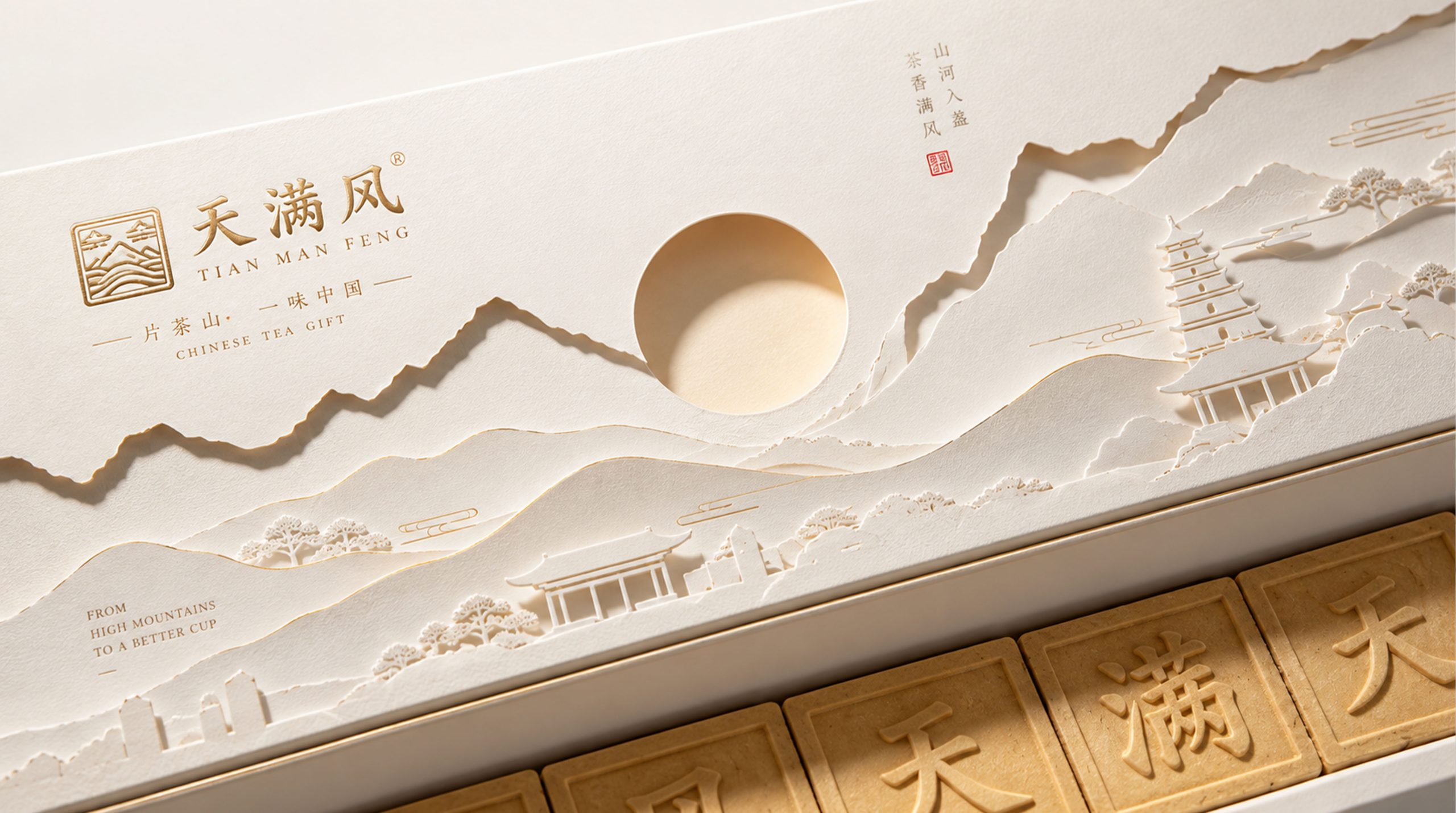
Pattern: The white rectangular window in the middle of the box is the core visual element of the entire packaging. In the window, a very light ink landscape image is used as the background - the pale shadow of the distant mountains, the outline of the ancient pagoda, and the blurred clouds and mist slowly appear on the white paper, like a freehand landscape that has just been inked and the ink has not yet completely faded. The image of the ancient pagoda coincides with the city symbol of "Chang'an" and also forms a cultural connection with the historical image of the Tang Dynasty pagoda and Kaiyuan architecture. On the left side of the window, a vertical row of ancient rhyme text presents a poetic phrase similar to "Mo Dao Tea Ceremony Golden Flower True". The text is presented in a traditional vertical arrangement, just like the poems in ancient books, and forms a classic oriental aesthetic relationship of "poem and painting in one" with the landscape. A vermilion seal is placed beside the text, completing the four-in-one classic composition of "poetry, calligraphy, painting and sealing". The box surface outside the window maintains a completely pure white space, just like the part of the scroll paper that has not yet been inked. The beauty of the white space is connected to the painting on the window, forming an exquisite visual rhythm of "the virtual and the real".
Font: The brand information is distributed in the three corners of the box, forming a stable triangular layout. In the upper left corner, a golden micro-logo (an antique building/city tower graphic) and the brand name "Chang'an Gongcha" are arranged horizontally. The font adopts a simple sans-serif font, with a small size and a light gold tone. It does not compete for the main visual position, but only serves as a quiet brand imprint in the upper left corner of the space. The four-character product name "Jin Hua Hei Cha" is printed horizontally in gold font on the lower left, and the pinyin of "Jin Hua Hei Cha" is marked in smaller fonts below it, providing a clear identity for the product. On the lower right side, a golden rectangular base plate carries the seven-character brand proposition "Chang'an tea style spreads all over the world". The font adopts a formal font with Song Dynasty charm, and the letter spacing is loose and breathable. The golden base plate provides a solemn visual base for this brand statement. The three groups of text are separated into triangles on the box surface, forming a spatial relationship of "three points arching one center" with the landscape window in the middle. The picture is both balanced, stable and agile.
Packaging Structure and Details
The Jinhua Black Tea gift box adopts a horizontally long and narrow rectangular box shape, the proportion is close to the classic hand-rolled banner ratio, wide but not bulky, long and narrow but not thin. This long and narrow ratio has a clear differentiation feature in the tea gift box market - most tea gift boxes adopt a square or close-to-square ratio, while Chang'an Gong Tea has established a unique visual identity with this long and narrow "scroll-style" box shape, and its unique styling language can be recognized at the first glance on the shelf. There is a white satin handle in the center of the top of the box. The color of the handle is consistent with the plain white color of the box surface. The satin material is soft yet structural, adding a sense of ceremony and dual functions of portability to the gift box.
The box structure is solid and solid, using a sky-and-ground cover structure. The box wall thickness is moderate but not bulky, and it has a tight and smooth damping feel when opening and closing. The coloring of the warm off-white color on the box is even and delicate, and the surface is covered with a subtle matte or semi-matte treatment. The warm off-white color has a warm and moist feel close to that of rice paper, avoiding the cheap reflection that may be caused by the glossy surface. The golden elements are presented using fine hot stamping or hot stamping techniques. The golden surface is delicate and moist. On the warm off-white background, it presents a gloss that is consistent with the background color but slightly brightened. It is not dazzling or ostentatious, just like light gold handwriting on paper.
The white landscape window in the middle is one of the most exquisite craftsmanship details of the entire package. The window is realized by a white cardboard or window structure mounted on the box surface. The connection between its edge and the box surface is clean and neat. The white window is like a precisely embedded Shoushan paper, maintaining a subtle color difference with the warm off-white background—— The white of the window is purer, brighter, and cleaner, while the warm off-white of the background is warmer, softer, and more plain. The juxtaposition of the two "whites" creates a fine layer separation effect visually, giving the window a real "floating" visual experience on the box surface. The landscape picture inside the window is presented in a very light watermark-style printing. The shadows of mountains and towers are difficult to see on the white paper and need to be fully displayed under a specific light angle. This "seemingly absent" printing effect greatly enhances the aesthetic level and playful space of the packaging. The vermilion seal is presented with a small hot stamping process. The vermilion is warm and full, providing the only warm color embellishment for the entire elegant box surface.
The matching handbag and gift box adopt the same warm beige color to form a complete gift visual system. The shape of the handbag is simple, and the bag surface maintains the same elegance and restraint as the gift box. It is only embellished with necessary brand logos, ensuring that the gift box and handbag present a highly unified visual language when juxtaposed, just like a complete gift set, maintaining a consistent aesthetic temperament from the inside out.
Tone of Voice
The text language of the Golden Flower Black Tea Gift Box takes "ancient Italian style and declarative style" as the core tone feature. The four characters of the brand name "Chang'an Tribute Tea" are the cornerstone of the entire language system - the word "Chang'an" has an extremely rich network of associations in the Chinese cultural context: it was the capital of the Tang Dynasty, a symbol of prosperity, the starting point of the Silk Road, the center for all nations to visit, and the auspicious meaning of "long-lasting peace." The word "tribute tea" defines the value level of the product in an extremely concise way - not "tea", not "famous tea", not "top grade", but "tribute" - dedicated to the highest level of the emperor. This single word elevates the product positioning to the top value range.
The four words "Golden Flower Black Tea" concisely and straightforwardly identify the product. "Golden Flower" refers to the golden fungus flowers (Fructus coronalis) naturally produced during the fermentation process of dark tea. It is the core quality symbol of high-quality dark tea. The word "Golden Flower" is both a technical symbol and a value signal. It conveys a clear quality level message to those who understand tea. "Dark tea" directly identifies the type of tea. The four-character combination is extremely concise in language, without modification or elaboration, and directly points to the essence of the product, replacing business rhetoric with expert precision.
"Chang'an tea style spreads all over the world" is the most bold and ambitious text expression in the entire packaging. These seven characters are presented in the rhythmic structure of a seven-character ancient poem, with a broad breath, high-pitched tone, and far-reaching artistic conception. The four characters "Chang'an Tea Style" weave together the cultural influence of the capital city of the Tang Dynasty and the elegance of tea culture, while the three characters "Man Tianxia" declare the brand's communication vision with a dynasty-style grandeur - this is not a commercial slogan, but more like a cultural declaration like a poet of the Tang Dynasty.
The vertical arrangement of ancient rhyme characters in the middle window of the box further strengthens the cultural temperament of the entire language - the vertical arrangement of writing, the "unity of poetry and painting" relationship juxtaposed with the landscape, and the "signing" ceremony with a vermilion seal, turn the entire window into a miniature work of calligraphy and painting, making the language of the packaging not only a transmitter of information, but also a carrier of culture. The overall tone completely integrates commercial information into cultural expression - not a single word is a pure advertising term, and each group of words has the dual function of transmitting brand information and creating cultural artistic conception. This is the most exquisite design in Chang'an Gongcha's language strategy - allowing business to speak in a cultural way and products to introduce themselves in a poetic way.
Brand Experience
The Jinhua Black Tea Gift Box builds a set of brand experience paths for consumers with a clear Tang-style literati temperament from three dimensions: visual, tactile and emotional:
Visual experience: The visual experience of the Golden Flower Black Tea Gift Box is a "penetrating" slow aesthetic. When consumers see the gift box for the first time, the first thing they perceive is an elegant warm off-white color with a few restrained golden embellishments - the picture is clean, sober and quiet. However, after the sight stayed for a moment, the white window in the middle began to attract attention - the pale shadow of the landscape was barely visible on the white paper, the outline of the ancient pagoda was vaguely distant in the clouds and mist, and the vertical row of ancient poems and vermilion seals injected the last trace of vividness into the picture - the entire visual experience was like slowly unfolding a scroll, and every detail takes time to discover and taste. When the gift box and handbag are juxtaposed, the unified warm beige color creates a complete sense of gift scene - elegant, unified and solemn, like a cultural gift from the ancient capital Chang'an.
Tactile experience: The matte surface treatment of the box surface gives the warm off-white color a warm touch close to that of rice paper - when your fingers slide over the box surface, you can feel a delicate temperature that is different from ordinary paper, just like touching the surface of a piece of carefully treated cotton. The golden hot stamping area creates a subtle tactile difference from the surrounding matte surface - the golden surface is slightly smooth and slightly raised, and the edges of the text and pattern can be delicately felt when fingertips slide over it. The smooth touch of the white satin handle adds a ceremonial tactile experience to the gift box - the moment you lift the satin, the smooth touch and the moderate weight of the box together convey a tactile signal that "this is a gift worthy of careful treatment."
Emotional experience: The emotional core of the Golden Flower Black Tea gift box is "cultural respect" and "grave gifting". The brand identity of "Chang'an" and "Tribute Tea" injects a cultural weight into the gift box that goes beyond the product itself - it is not just a box of tea, but a cultural gift that carries the image of the capital of the Tang Dynasty, tribute-level quality and the depth of Chinese tea culture. The four-in-one aesthetic composition of the "poetry, calligraphy and painting seals" on the landscape window adds an emotional layer of literati elegance to the gift box - the recipient not only receives tea, but also a visual beauty that embodies the beauty of calligraphy and painting. The elegance and restraint of the gift box adds an emotional label of "literary temperament" to the gift-giving behavior - it does not convey a signal of "expensiveness", but a signal of "elegance", implying that the gift-giver is a person who knows taste, appreciates culture, and pursues elegance rather than simply pursuing expensiveness. The brand proposition of "Chang'an Tea Style spreads all over the world" adds a layer of grand cultural narrative to the entire gifting experience - while tasting tea, the recipient is also experiencing a cultural connection that spans thousands of years - from the tribute tea method of the Tang Dynasty to the exquisite tea ceremony of the contemporary era, the cultural image of "Chang'an Tea Style" is most truly perceived when the aroma of tea arrives in the mouth.
Brand Statement
The scrolls are written with inscriptions, and they always carry the Tao. The Chang'an Gongcha Golden Flower Black Tea Gift Box uses a scroll-like long and narrow box shape and an elegant warm beige color as the visual base. It uses the four-in-one landscape window of "poetry, calligraphy and painting" as the narrative core, and uses restrained gold and large areas of white space as the aesthetic language to construct a high-end tea gift package that combines the depth of Tang style culture, literati aesthetic taste and contemporary sophistication. It is not only a container for a box of golden flower black tea, but also a simple and elegant tea note from the thousand-year-old ancient capital that the brand slowly unfolds in the shape of a scroll about "Chang'an", "tribute tea" and " golden flower".