










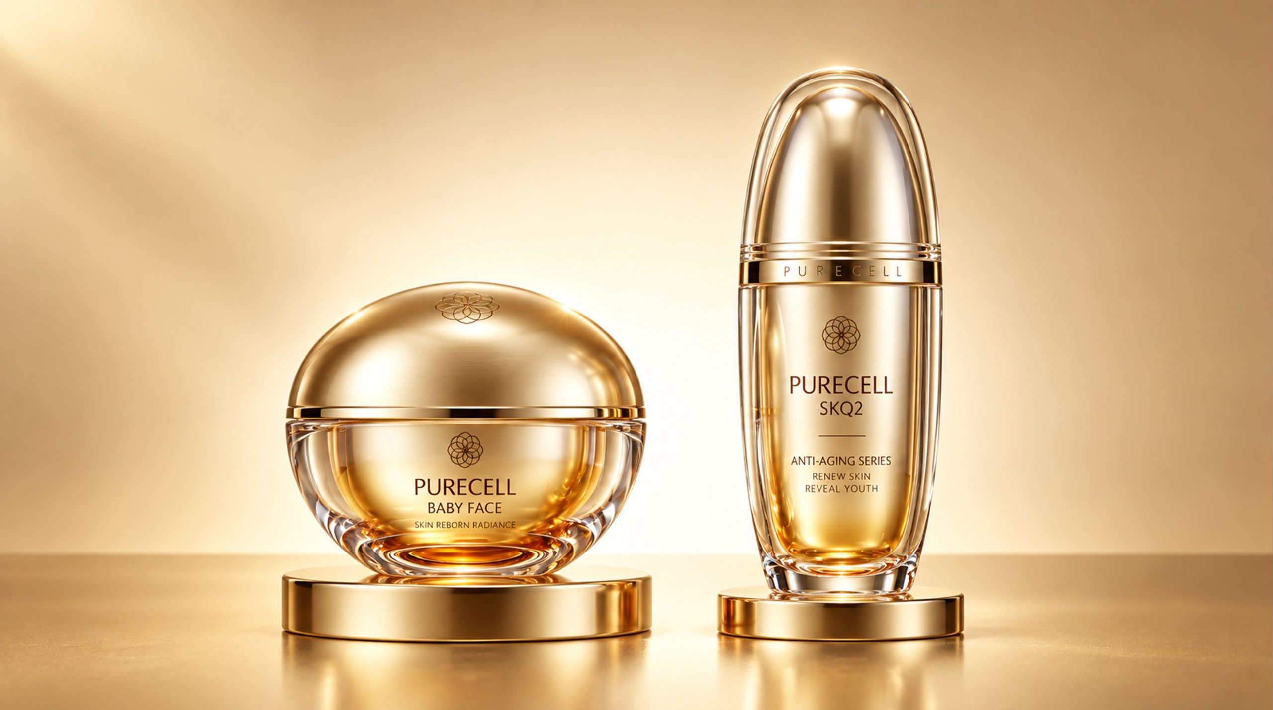
PURECELL is a high-end anti-aging skin care brand based on umbilical cord blood stem cell technology as its core ingredient. Its product line covers three categories: Baby Face Cream, SKQ2 Essence and Sublingual Troche Lozenges. In terms of packaging design, PURECELL has built a complete visual system with "white minimalist outer box × golden organic bottle" as a dual language: the outer box uses pure white and precise geometry to show scientific restraint, while the golden bottle inside uses a sculptural organic form to highlight the preciousness of life. The two languages are mutually reinforcing, and jointly interpret PURECELL's unique understanding of "regenerative luxury" - technology is the soul, and aesthetics is the skin.
Brand Essence
The core spirit of PURECELL packaging design can be summarized as:
Regeneration × Purity × Preciousness
Science × Organic × Ritual
"Regeneration" is the brand's most fundamental technological proposition. The raw material source of umbilical cord blood stem cells gives each product a life energy narrative that transcends ordinary skin care products; "purity" is reflected in the extreme restraint and no-decoration aesthetics of the white outer box series, conveying the highest quality trust with the least visual language; "precious" is condensed in every curve of the golden bottle series, and precious raw materials are carried in precious containers, forming a value echo from the inside to the outside. "Science" is the underlying logic hidden under the aesthetics of the entire package. The precise geometric structure, rigorous information hierarchy and laboratory-like white background together create a set of trustworthy professional perceptions; "Organic" is the morphological philosophy of the golden bottle. The spherical, oval and bullet shapes are all based on the most vital shapes in nature; "Ritual" is the emotional temperature carried by the way the outer box is opened - every time the box is opened, it is a carefully choreographed regeneration ceremony.
Brand Philosophy
PURECELL takes "the original shape of life" as its overall design concept. Umbilical cord blood is the original gift of life, and each of PURECELL’s packaging attempts to respond to this origin with styling language:
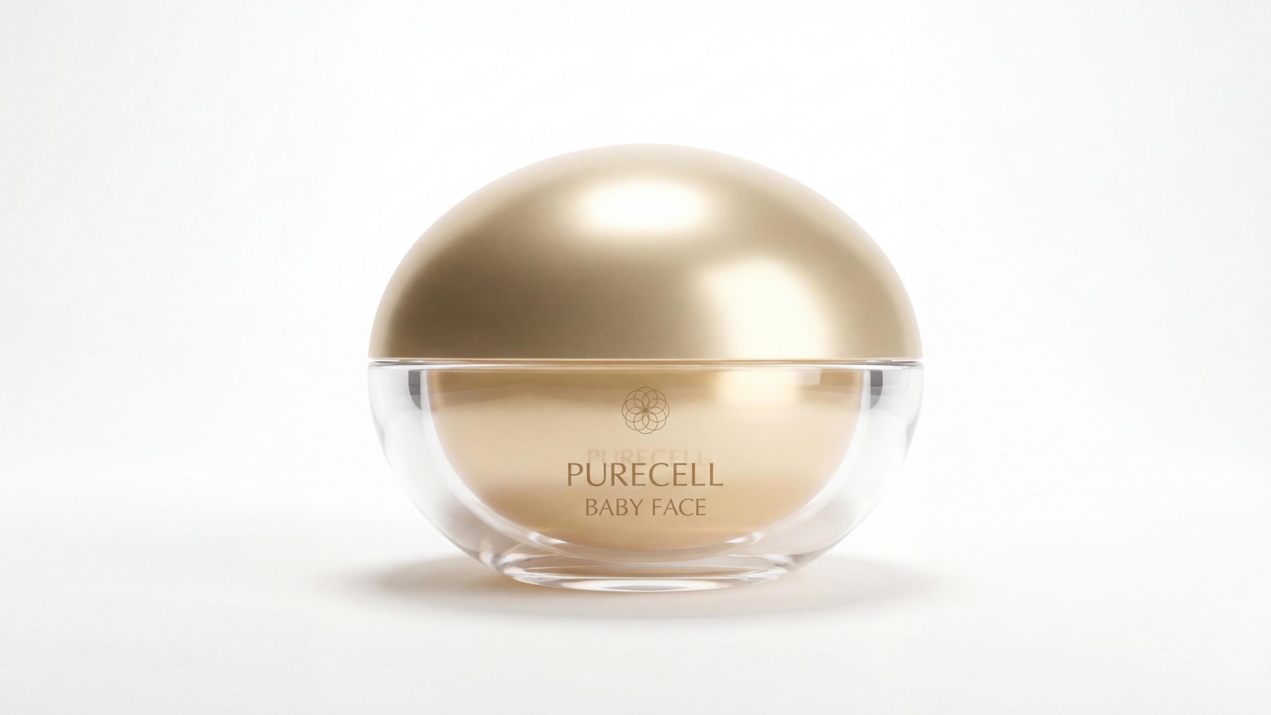
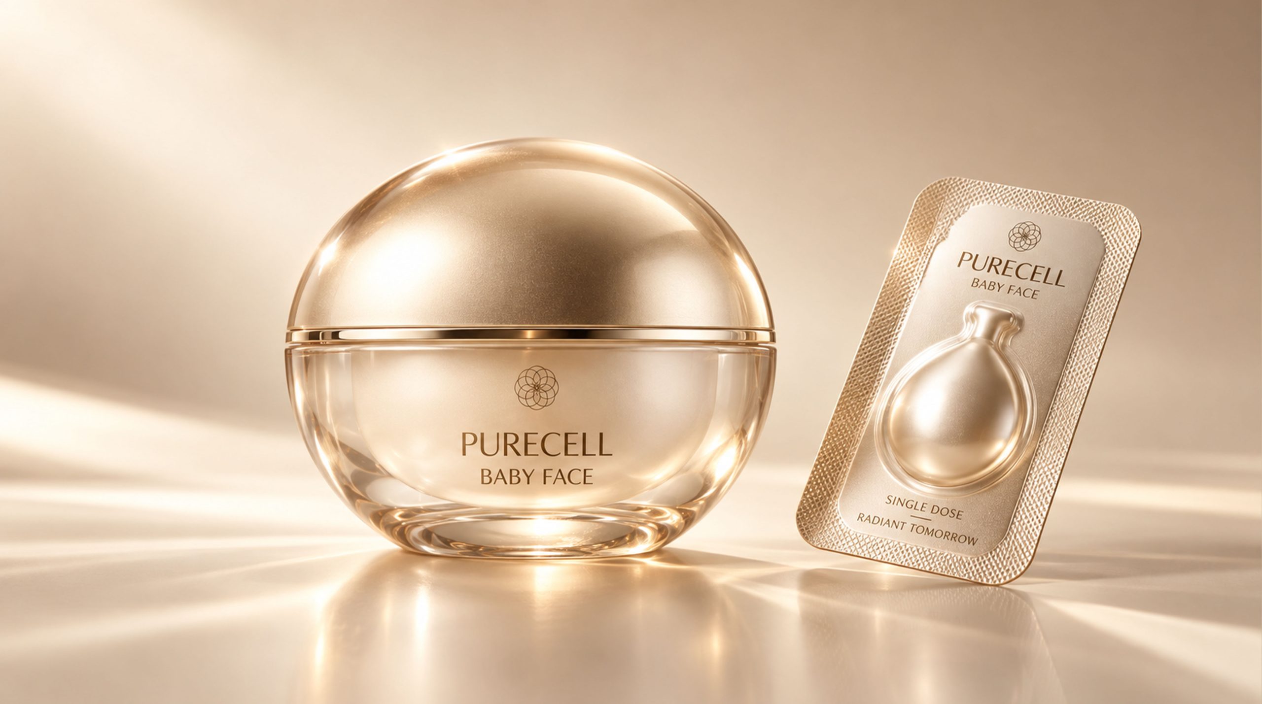
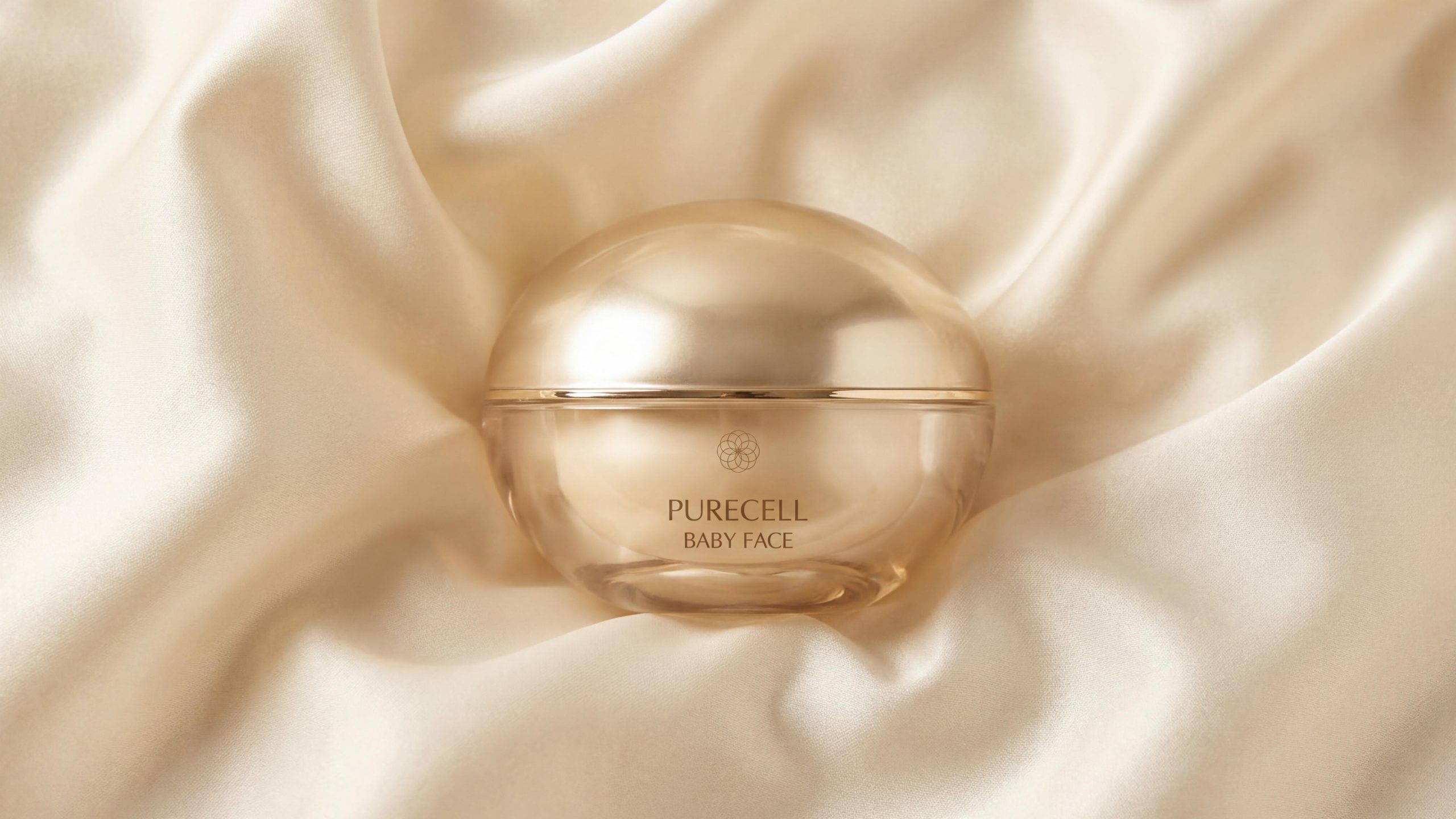
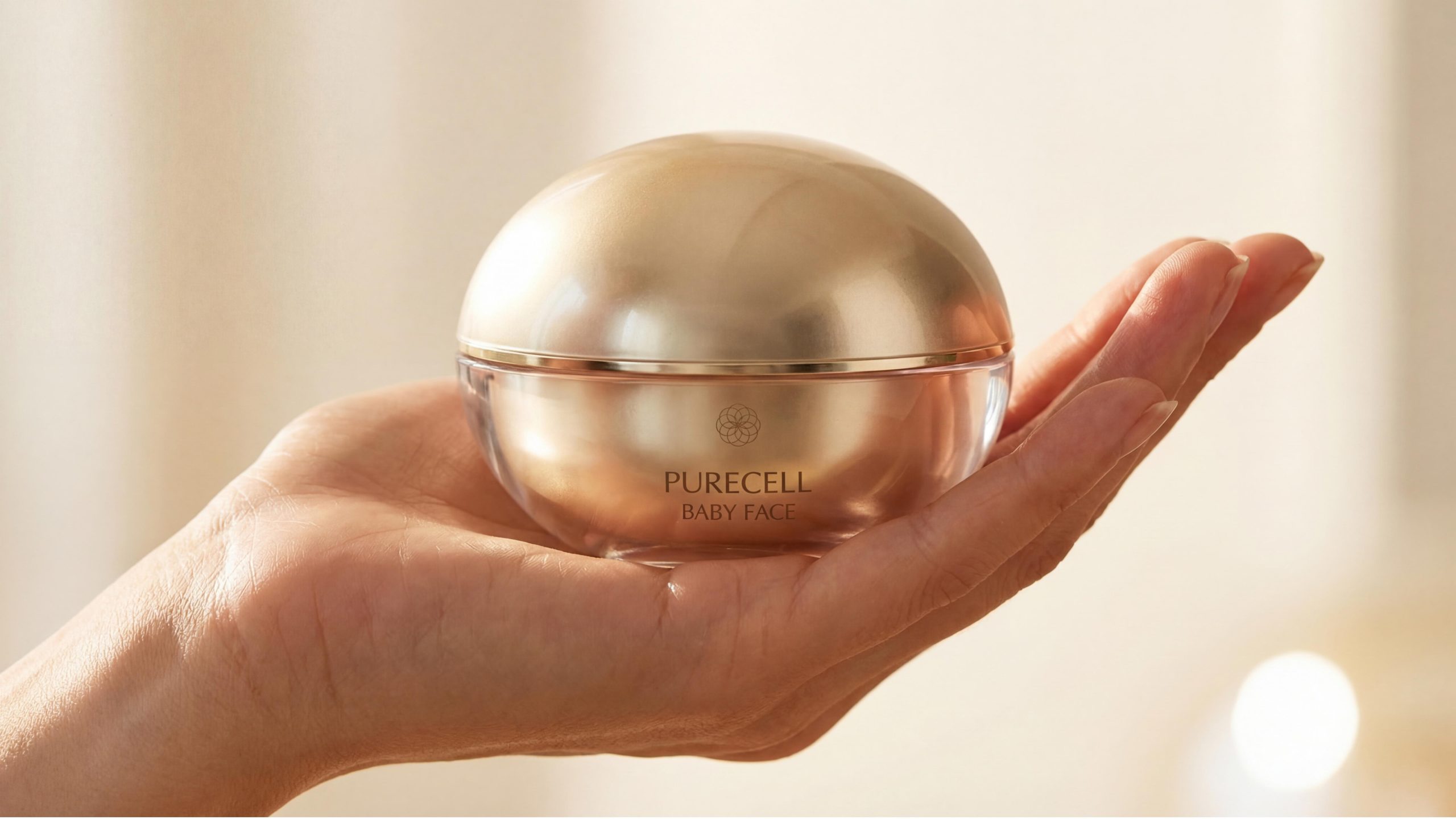
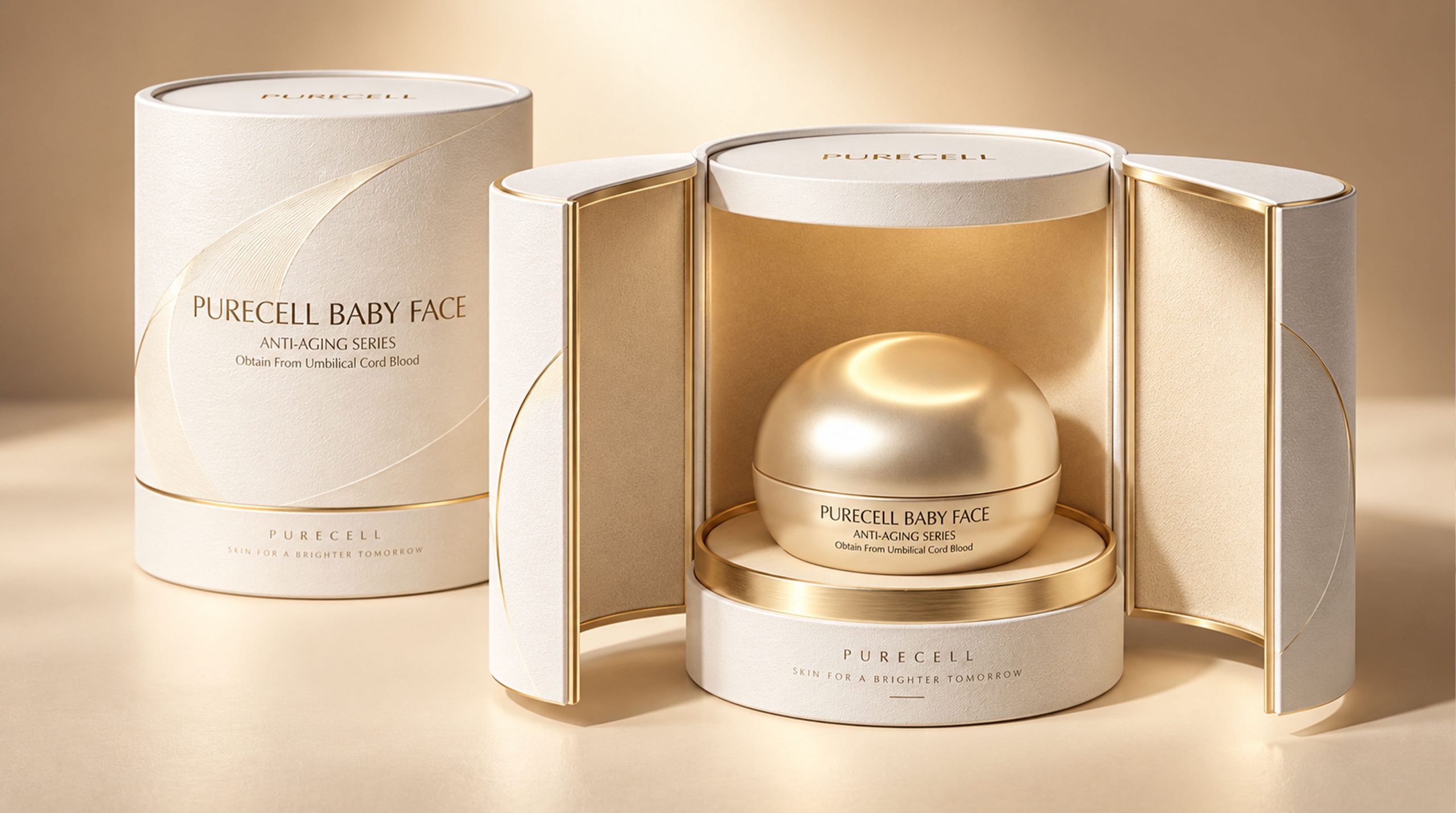
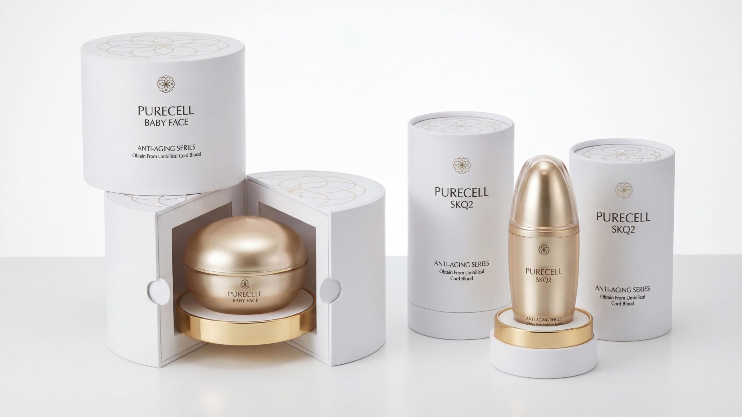
Baby Face Cream (Domed Golden Ball × White Petal Open Box): The bottle is made of transparent crystal glass as the base, and the top is covered with a full golden dome-shaped cover. The overall shape is like a carefully cared for cell, or a golden planet half submerged in the water. The outer box is pure white cylindrical, with an embossed pattern on the top cover. When the box is opened, the bottle unfolds in all directions along the petal cutting line, like a flower slowly blooming in the hand. The golden dome inside appears against the backdrop of white petals, giving both a sense of drama and a sense of surprise.
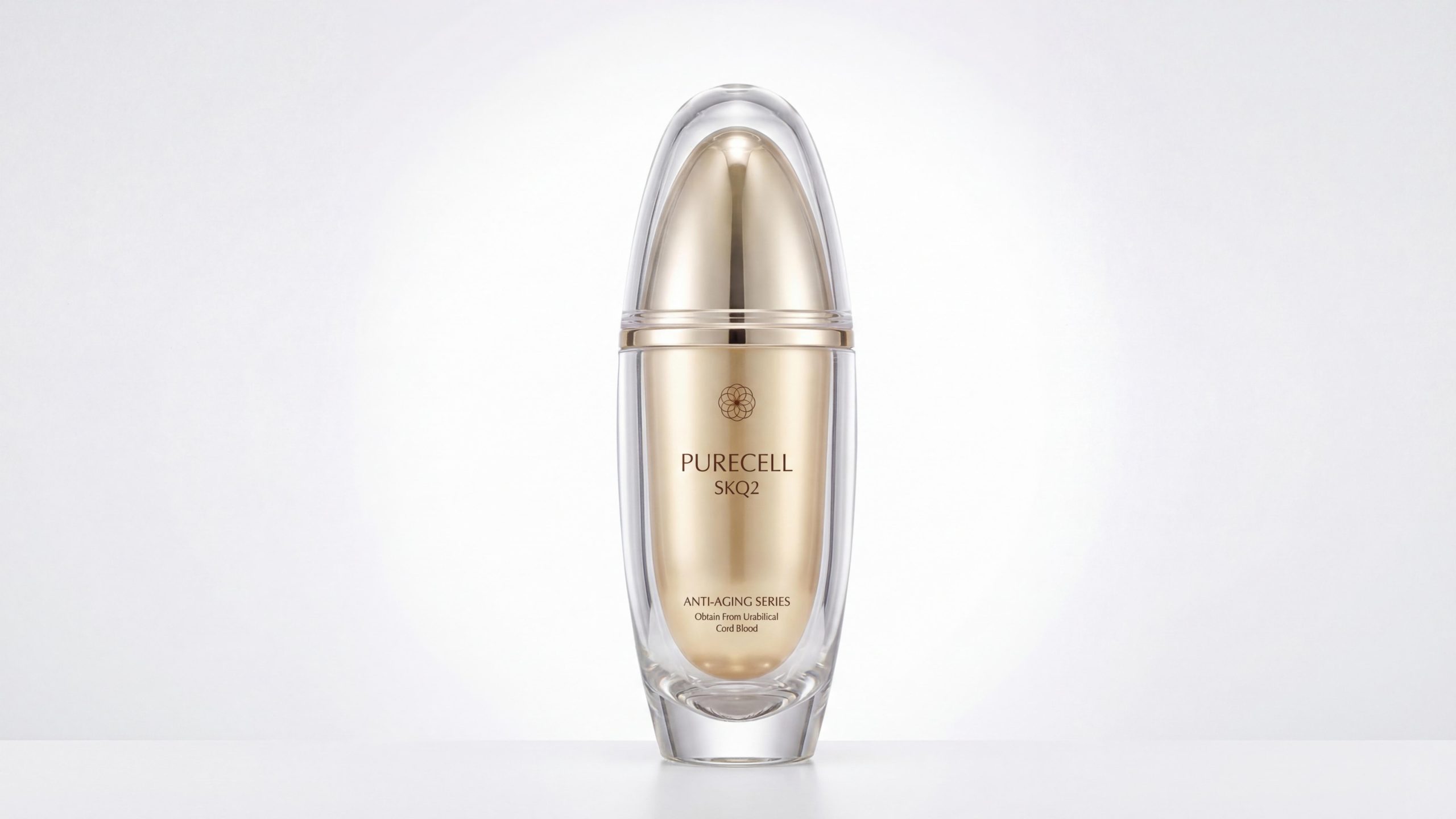
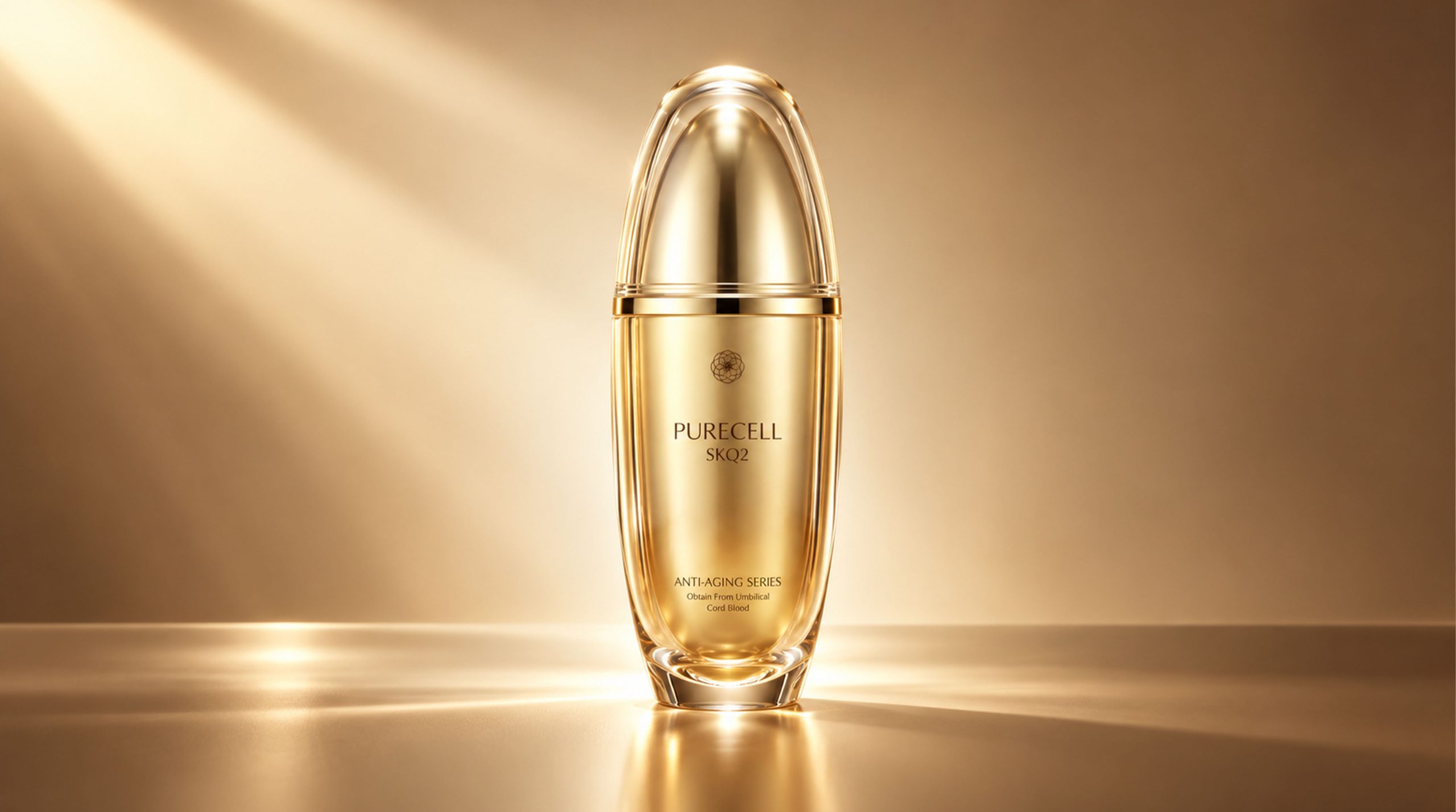
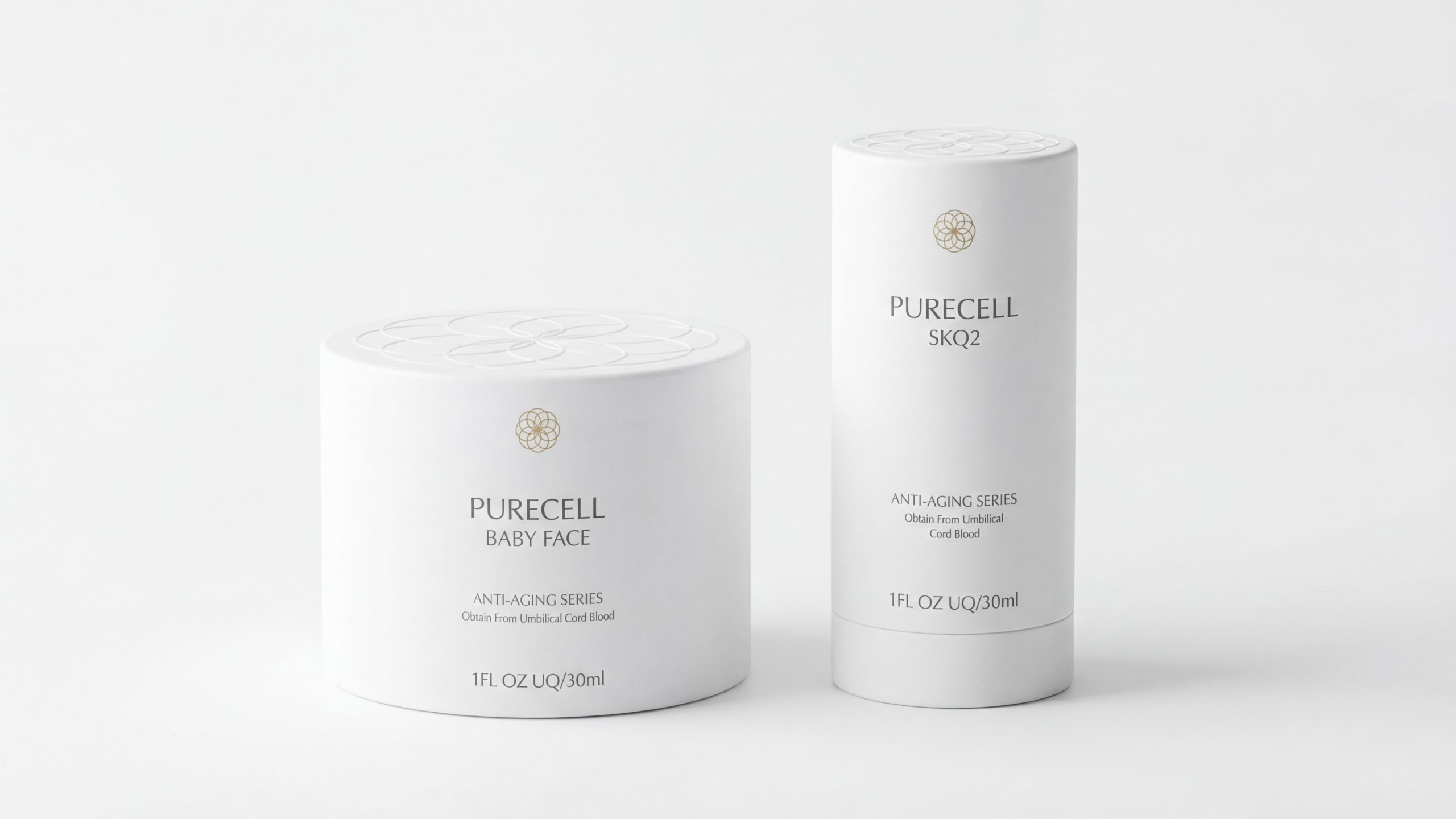
SKQ2 essence (bullet gold bottle × white silo outer box): The whole bottle adopts a slender bullet-shaped outline. The transparent crystal glass bottle supports a towering streamlined golden bottle cap. The top of the bottle cap ends with a rounded bullet. The whole is like a precision-cast gold bullet. When suspended above the golden background, it shows a sense of technology that transcends gravity. The outer box is a crisp white cylindrical paper tube, with the brand badge and minimalist text conveying information.
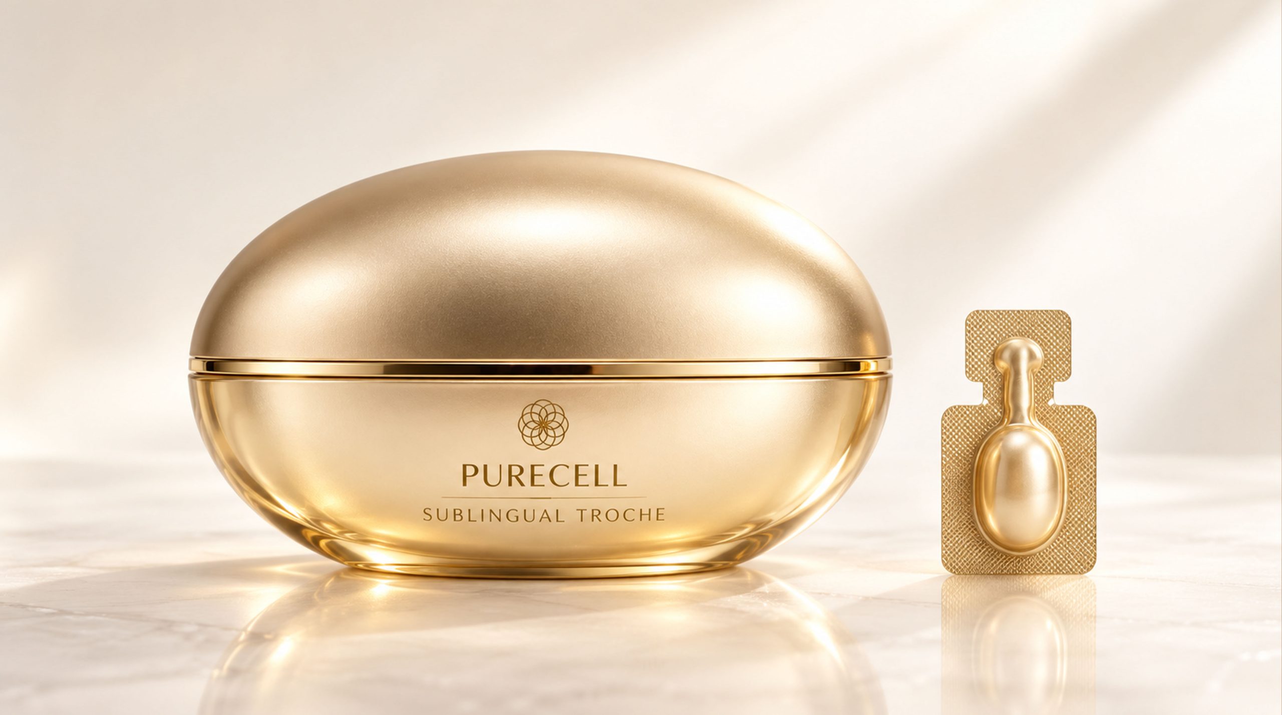
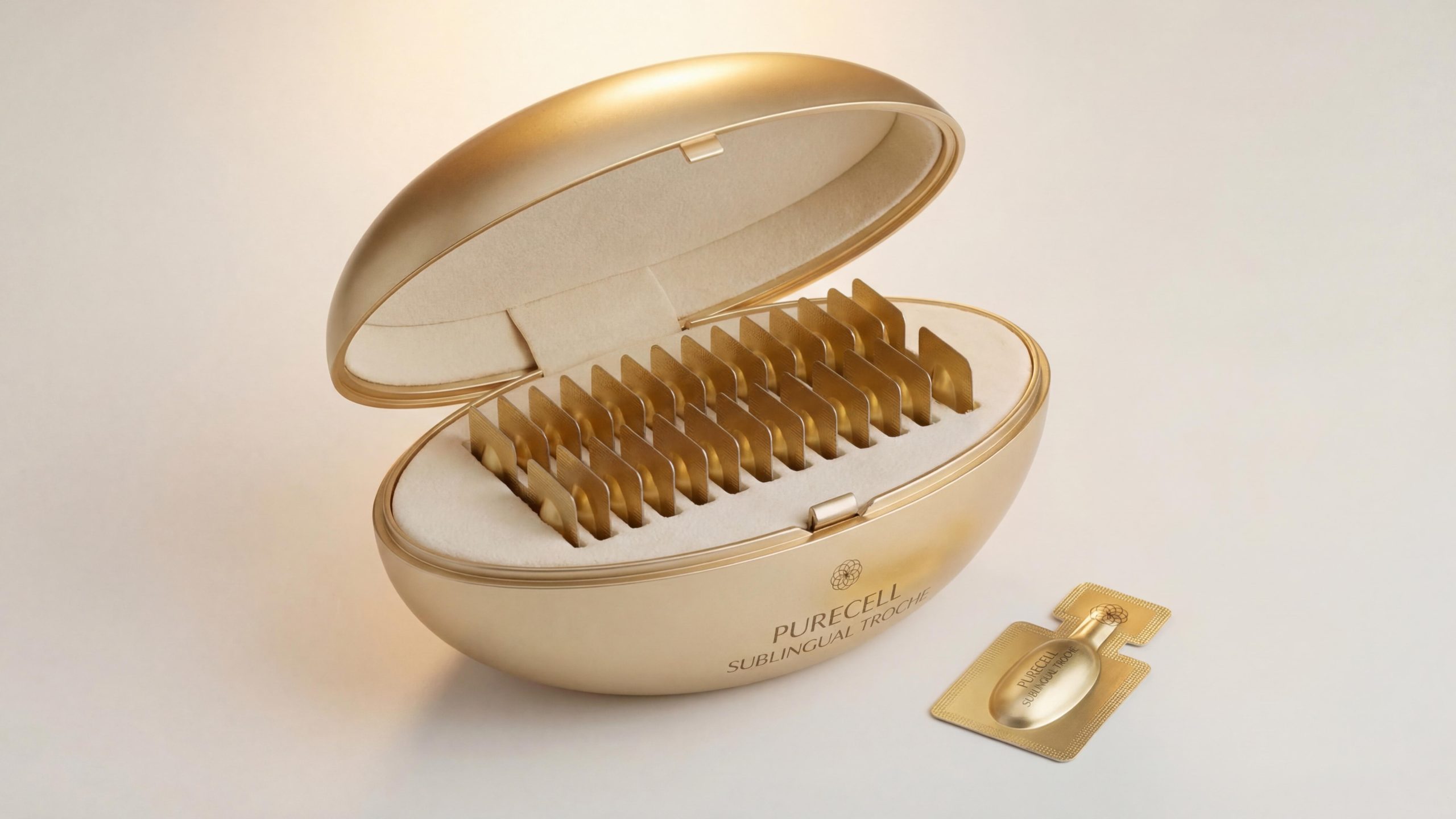
Sublingual Troche lozenges (gold oval box × single blister package): The packaging is presented in a complete golden oval metal box, which is smooth and without edges. A delicate parting line in the middle is like the seam during the birth of life. The accompanying single-capsule blister packaging uses a matte gold grid pattern to support a pearl-shaped capsule, forming a complete narrative of "whole × individual" with the large box.
Visual Language
PURECELL has constructed a “platinum dual-track” visual system that achieves a high degree of balance between restraint and luxury:
Color: The white outer box has a cool white base and no color printing on the surface. All information is presented using hot stamping logos and fine black sans-serif fonts. It is extremely pure and conveys a sense of professional trust close to medical aesthetics. The gold product bottles are mainly matte champagne gold, with bright gold parting lines to highlight the layers. They show completely different temperaments on the pure white background and the warm gold background. When the white background is lined with gold, it is elegant and precious, and when the gold background is floating gold, it is as hot and sacred as the core of the sun.
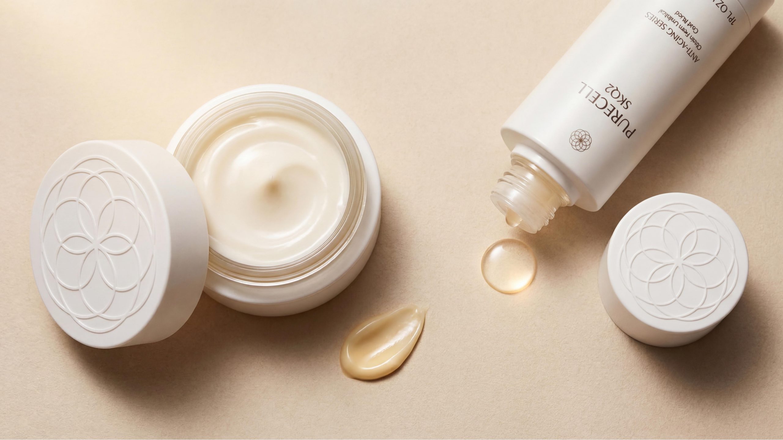
Pattern: The core logo of the brand is a geometric flower pattern with precise lines that combines natural organic feeling with scientific accuracy. It can be understood as the structural radiation of cells under a microscope or as a blooming flower of life. The logo is embossed on the top of the white outer box, stamped on the middle of the bottle, and embossed on the back of the single blister. It is the only constant visual anchor throughout the entire packaging system. The cylindrical surface of the white outer box is covered with delicate grid relief patterns, which are looming under diffuse light, adding a layer of touchable warmth to the minimalist white color.
Font: "PURECELL" is presented in medium-weight sans-serif capital letters, with loose spacing, and the font is upright yet refined; the product sub-lines "BABY FACE", "SKQ2" and "SUBLINGUAL TROCHE" follow it with slightly thinner font weight, and "ANTI-AGING SERIES / Obtain From Umbilical Cord Blood" uses the smallest font size for functional description. The information level is strictly controlled within three levels, and the overall layout has a great sense of breathing.
Tone of Voice
PURECELL's text language adopts the minimalist tone of "scientific statement" throughout, without emotional rendering or use of adjectives, and builds trust with the power of the facts themselves.
The six words "Obtain From Umbilical Cord Blood" are the most powerful copywriting in the entire package - it does not explain or exaggerate, it just calmly informs the source of the raw materials, but makes everyone who reads it feel the silent shock behind it. "ANTI-AGING SERIES" uses category language to anchor product positioning, which is accurate and restrained. The entire package contains no emotional marketing rhetoric, no over-promising words such as "miracle", "reverse aging" and "revolution". The brand leaves all the power of persuasion to the shape itself - the weight of gold, the purity of white and the amazement of opening the petals, have completed all emotional communication.
Brand Experience
PURECELL builds a complete luxury sensory experience for users from three dimensions: vision, touch and ritual:
Visual experience: When the white outer box and the gold bottle are juxtaposed, it is like a dialog between science and art - white is the rational language of the laboratory, and gold is the perceptual expression of life energy. The strong tonal contrast between the two makes the entire display highly visual. Whether a single product is displayed independently or a series is displayed side by side, it can form an unforgettable visual presence in any shelf environment.
Tactile experience: The weight of Baby Face's golden dome in the palm of your hand, the twisting damping of SKQ2 aluminum alloy bottle cap, the low-temperature heaviness of Sublingual Troche metal egg box - each product has a carefully tuned tactile design, and every detail in your hand silently conveys the brand's craftsmanship and value proposition. The grid relief of the white cylinder appears and disappears when fingertips flick it, like a tactile metaphor of the microstructure of the cell surface.
Ritual experience: Baby Face's petal opening box is the most emotionally charged design in the entire packaging experience - when the user puts his hands on both sides of the box and gently unfolds it outward for the first time, the process of petals slowly unfolding is like personally participating in the awakening and blooming of cells. This moment of surprise and participation transforms the product's technological proposition into a sensory event that can be remembered by the body, leaving an irreplaceable imprint of the brand in the user's memory.
Brand Statement
"The original gift of life, in its most precious form, gives back to the skin that deserves the most kindness." PURECELL takes umbilical cord blood stem cell technology as the core, uses the platinum dual-track visual system as the carrier, and uses the organic sculpture-like container shape as the ritual entrance to translate the life-level proposition of "regeneration" into a luxurious experience of daily skin care. The white restraint of the outer box and the golden richness of the bottle are not contradictory, but two expressions of the same brand philosophy - science makes people trust, aesthetics makes people tempted, and PURECELL has both. Every time you open the box and every time you take it, it is a solemn commitment to skin regeneration.