










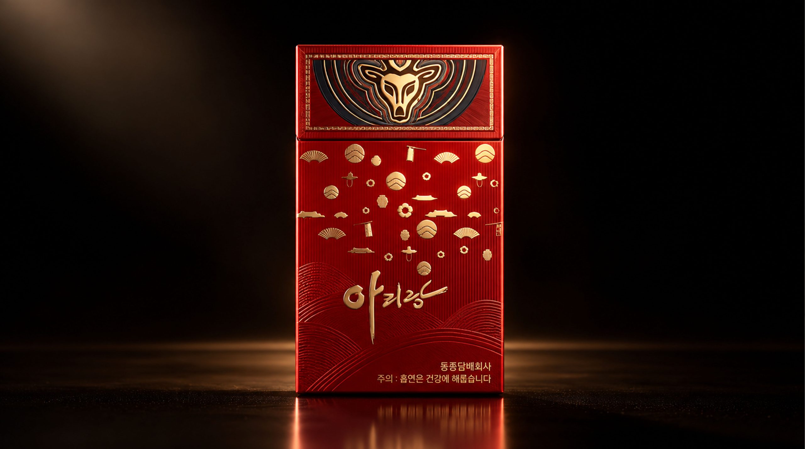
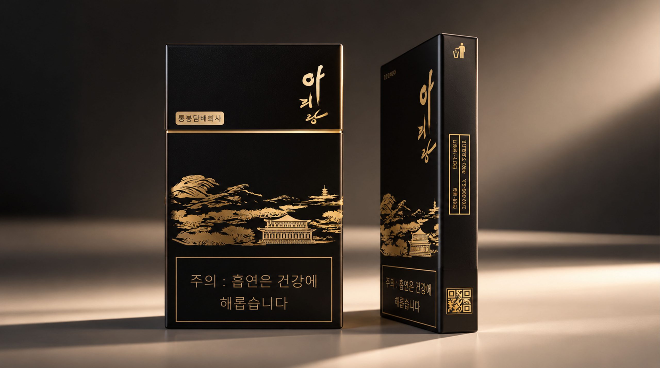
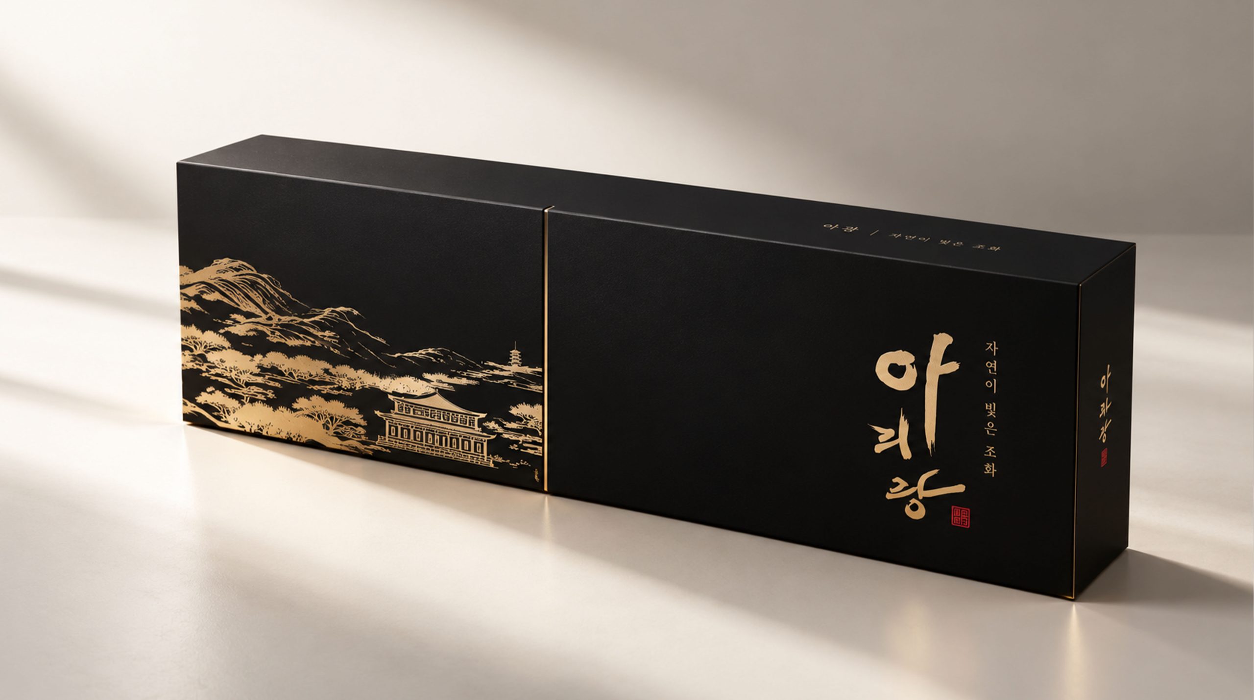
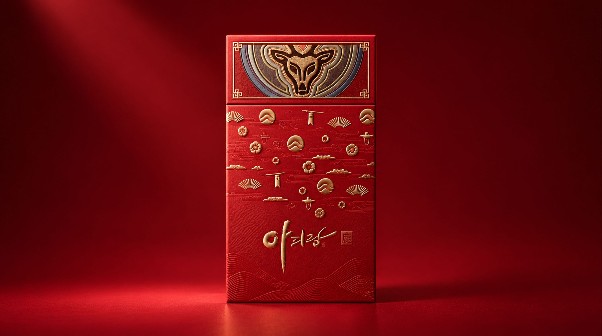
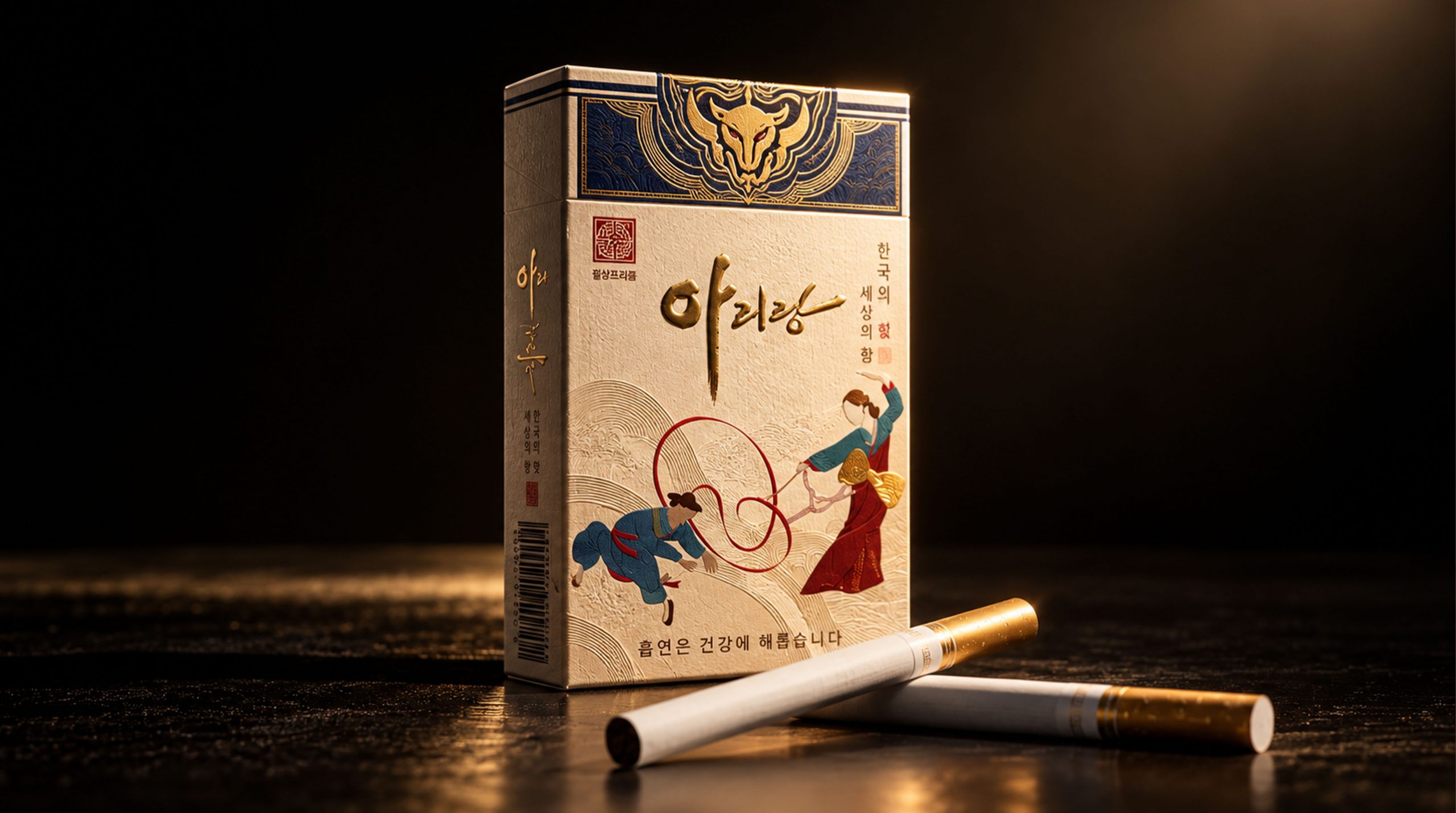
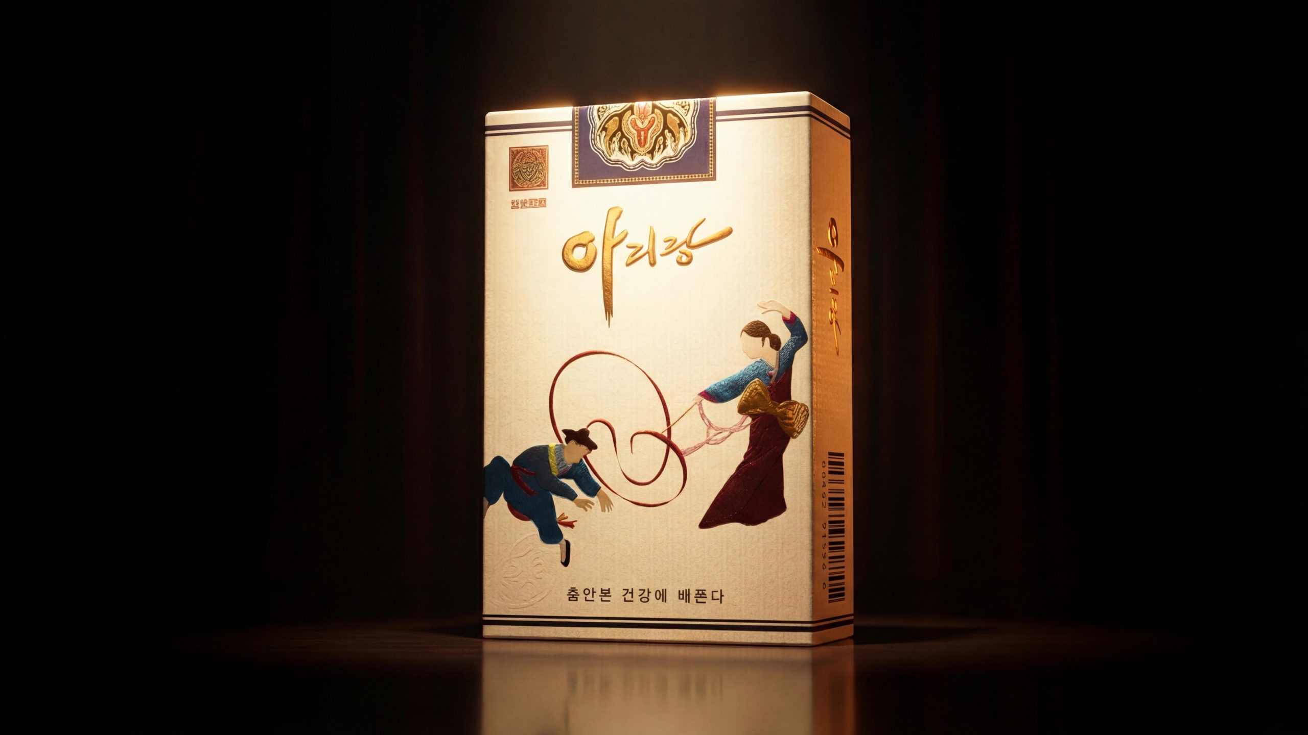
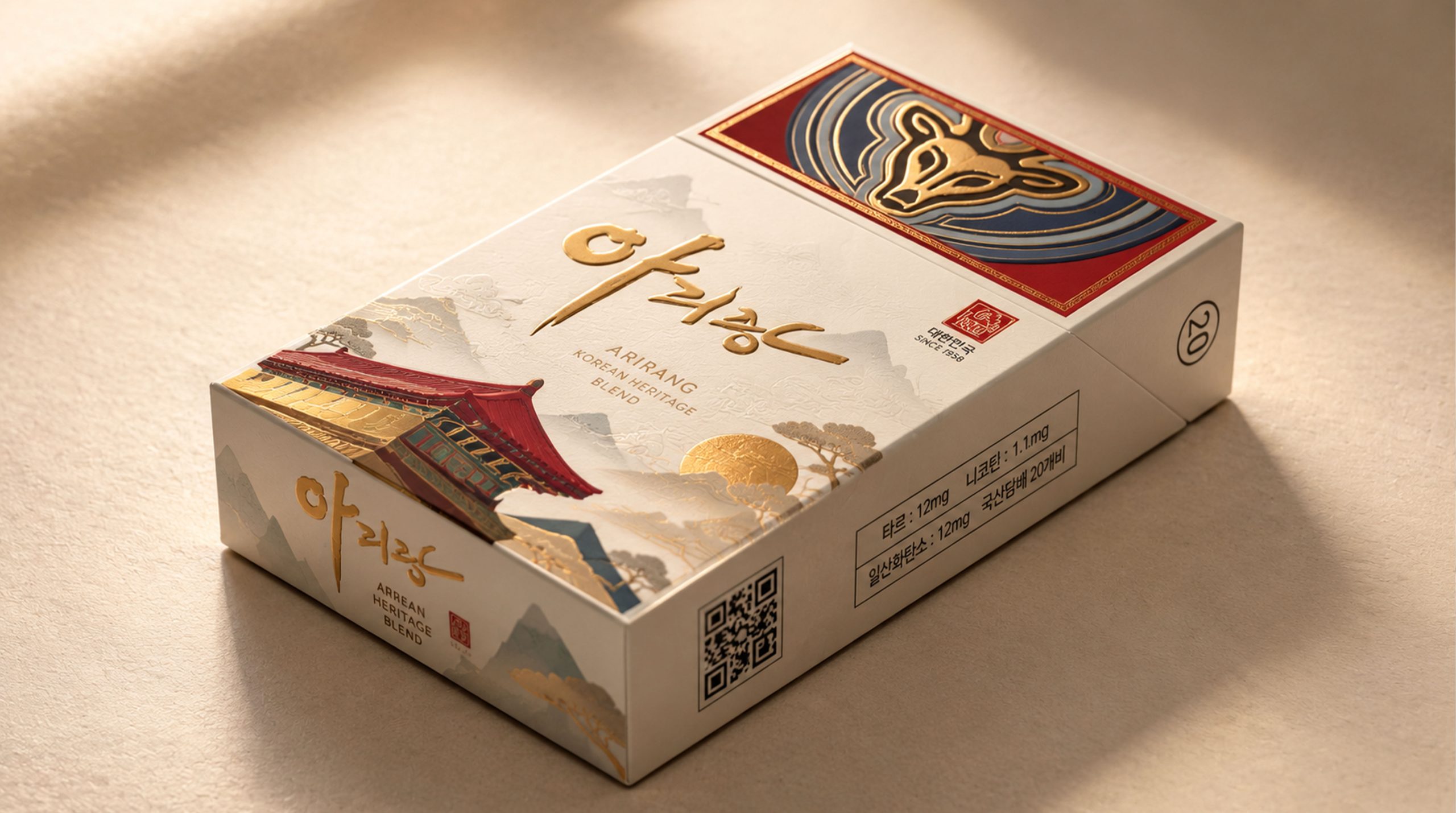
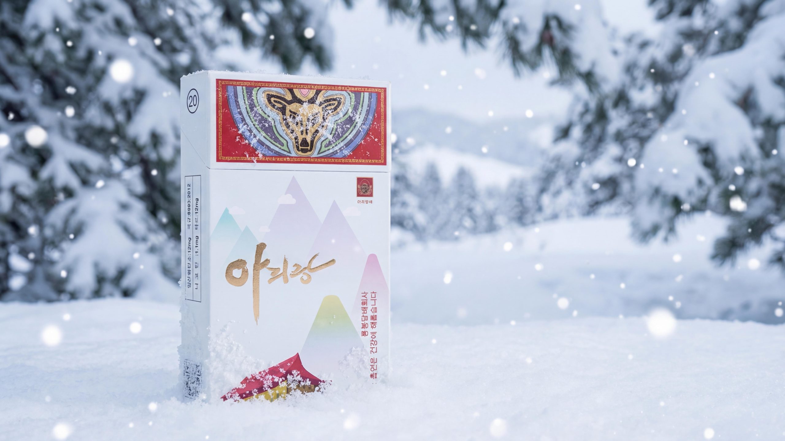
아리랑 (ARIRANG) is a classic cigarette brand owned by North Korea Yongbong Tobacco Company. The brand name is taken from the most nationally symbolic folk song "Arirang" on the Korean Peninsula. It uses a golden deer head badge as the brand totem, and uses four completely different visual styles - traditional dance embroidery system, modern ribbon art system, mountain watercolor system and festive red gold system - to build a complete packaging matrix that spans classical and contemporary. The four models share the same golden handwritten "아리랑" brand name and deer head circular badge, but present four completely different cultural expressions with their own independent color systems and pattern languages.
Brand Essence
Song x Deer x Four Seasons
Nationalxcontemporaryxceremony
"Song" is the most fundamental spiritual gene of the brand. O2 is not an invented commercial brand name, but a folk song that has been circulated for hundreds of years - carrying parting, homesickness, perseverance and affection. The three characters "O2|" in golden handwriting are presented on each package in smooth Korean cursive script. The shape of the characters undulates and swirls like a song, and the tail stroke extends downward like an endless rhyme. "Deer" is the brand's totem symbol. A golden deer head appears on the top of the lid of each package in a face-to-face posture, surrounded by a multi-layered concentric halo. The color gradually changes from gold to blue and gray-blue, just like a mythical spiritual beast emerging from the halo. Deer symbolizes longevity, auspiciousness and spirituality in Korean culture. Looking head-on gives the brand a solemn and mysterious sense of ritual. "Four Seasons" is the metaphorical structure of the product matrix. The four colors and temperaments coincide with the mood of the four seasons: the warm beige of the embroidery series is like late autumn, the colorful colors of the ribbon series are like midsummer, the light colors of the mountain series are like early spring, and the all-over red gold of the red gold series is like a midwinter celebration. "Ethnic" is the cultural base shared by the four models; "Contemporary" is the unique aesthetic statement of the ribbon series - using abstract colors that are completely divorced from traditional patterns to prove that O2| not only belongs to the past, but also belongs to the present; "Ritual" is the emotional core of the red gold series - a full version of red gold elevates a pack of cigarettes to the level of a ceremonial object.
Brand Philosophy
Taking "four ways of singing a song" as the overall design concept. The same Arirang can be performed with deep folk singing, reshaped with passionate rock music, presented with whispered poetry recitation, or arranged with a grand symphony.
Traditional dance embroidery series (warm beige base × embroidery illustration): the one with the most profound national narrative. The surface of the box is made of warm beige linen-textured paper, like aged Korean paper. The lower half shows a pair of traditional Korean dancers in the style of fine embroidery - the female dancer in a dark red dress holds her long sleeves high, with ribbons flowing like clouds and flowing water; the male dancer in blue hanbok bends down to dance, and the two are connected by red ribbons. The curves of the streamers form the dynamic core of the painting, just like the melody solidifying into a visible shape. The characters' clothing wrinkles and facial expressions are all presented with extremely high precision. The light golden traditional geometric pattern watermark is faintly visible on the bottom of the box. The bottom is marked with "춤안본 건강에 배쁜다" in small gold letters.
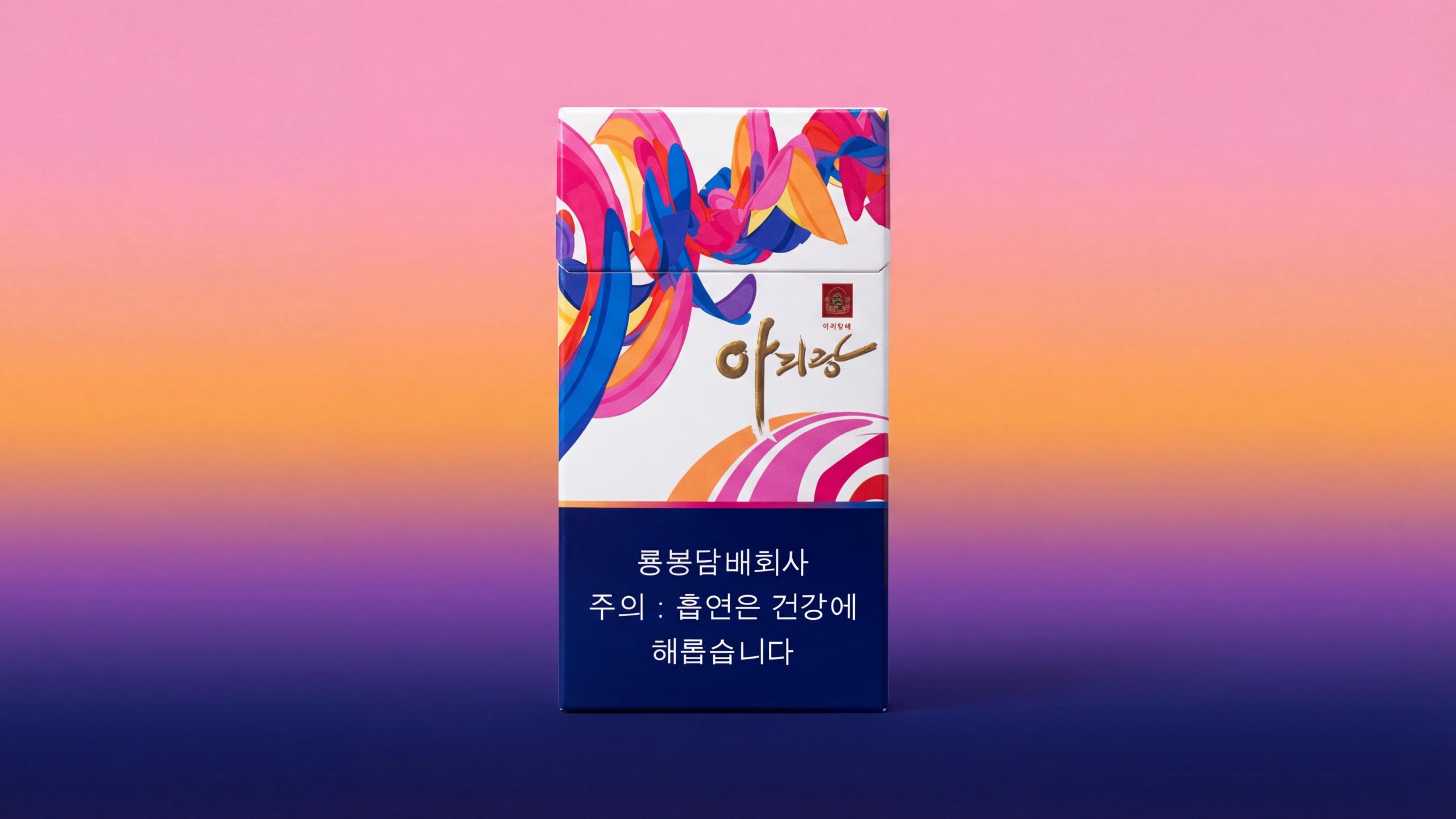
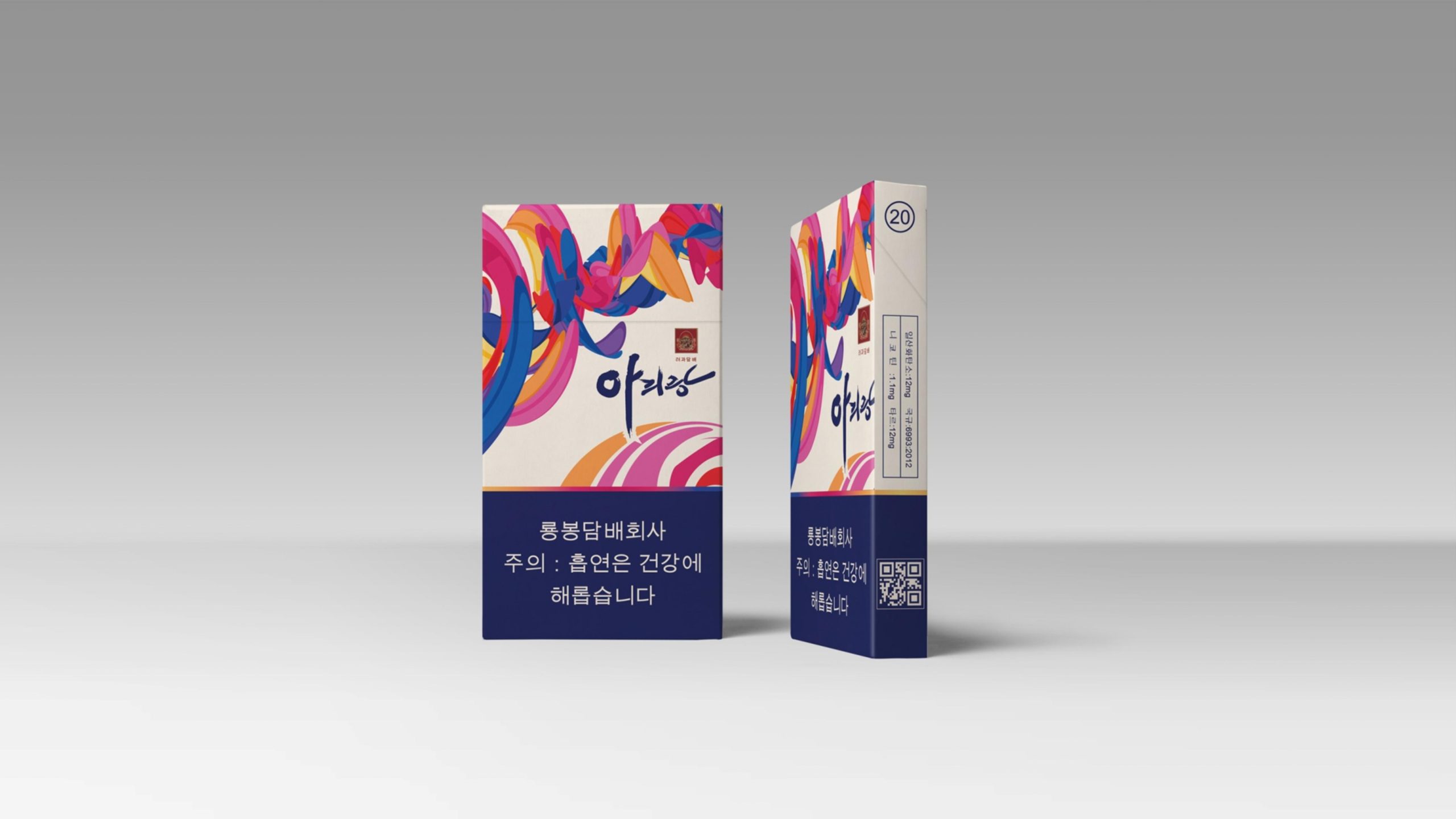
Modern ribbon art series (white background × abstract ribbon): the most contemporary art style. The box surface has a pure white base, and about one-third of the lower part is closed with a dark blue block. The white area is spread out with explosive colorful streamers - pink, sapphire blue, bright orange, magenta, cobalt blue and other high-saturation colors pour in from the left side, rolling, intertwining and flying, like a fireworks display of colors. The brushstrokes are somewhere between the strength of calligraphy and the freedom of painting, completely breaking away from traditional patterns. The manufacturer "룡봉담배회사" and the health warning "주의 : 흡연은 건강에 해롭습니다" are marked in white Korean on the dark blue bottom.
Mountain watercolor series (white background × geometric mountain watercolor): the one with the most oriental literati temperament. The box surface has a white base, and multiple triangular peaks are rendered in translucent watercolors of light gold, lavender, light cyan, and light pink. The outline of the mountain is simplified into neat geometric triangles, and the colors are layered like ink smudges. In the center left of the picture, a warm golden silhouette of a traditional Korean building is half-hidden behind the mountains, with the cornices clearly visible. The manufacturer's information and health warnings are marked in small dark letters on the lower right side of the box, and a QR code is attached next to it. Parameters such as tar amount 12mg, nicotine 1.1mg, tar 12mg and other parameters can be seen on the side of the box (국규 4863:2012).
Festive red and gold series (full version red × bronzing cultural icons): the one with the most ceremonial weight. The surface of the box is full-on red (warm) as the background color, with thin golden lines all around to outline the traditional pattern border. Dozens of golden traditional cultural miniature icons are scattered in the lower half - fans, lanterns, traditional hats (갓), drums, vases, wishful knots, traditional architectural silhouettes, cloud patterns, etc., each about 3–5mm in diameter, presented in gold stamping or relief, like scattered golden flowers. The golden handwriting of "아리랑" is located on the left side of the bottom of the box, and the font size is slightly larger than the other three. The manufacturer and health warnings are marked in small gold letters at the bottom.
Visual Language
With the core logic of "unified totem × four colors and four languages" - the deer head badge and the brand name in golden handwriting serve as the unified anchors across styles, four sets of completely different colors and patterns achieve the maximum division of style.
Color: Four completely independent color systems constitute the "Four Symbols of Color". The embroidery is based on warm beige (~Pantone 7527C), with deep red and indigo as the main colors of the characters. The overall tone is warm like an autumn afternoon. The ribbon series uses pure white as the base and deep navy blue (~Pantone 289C) as the bottom color block. The main body of the picture uses highly saturated colors such as pink, sapphire blue, and bright orange to create a bursting visual impact. It is the one with the highest color purity among the four. The Mountain series uses white as the base and low-saturated translucent watercolors such as light gold, lavender, and light cyan to form the picture. It is the lightest and most transparent of the four. The red and gold series uses full-color red (~Pantone 186C) as the base and gold as the only auxiliary color, forming the most classic and solemn two-color combination. Gold is the only color that runs through all four styles – a unifying thread in the form of the brand name, deer head emblem details and various decorative elements.
Pattern: Four completely different pattern languages constitute the "Four Languages of Patterns". The embroidery is "embroidery folk painting", and the characters are presented with a precision close to the actual embroidery. The ribbon system is "abstract expressionism" and is completely divorced from concrete graphics. The mountain system is "geometric watercolor", the mountains are simplified into triangular geometry, and the traditional buildings are integrated with warm golden silhouettes. The red gold series is a "miniature cultural icon", with dozens of traditional symbols scattered in gold relief. The deer's head circular badge is the only unified graphic element that runs through the four models, appearing on the top of each box lid in the same composition.
-Font: The three characters "아리랑" are presented in customized Korean golden handwritten cursive script. The strokes are smooth and convoluted, and the last stroke is like the aftertaste of a song. The color of the words is always golden, showing different luster on different background colors: warm and steady on the warm rice background, clear and bright on the white background, and solemn and luxurious on the red background. The manufacturer and health warnings are presented in standard Korean bold/bright font, with a small font size and a restrained and standardized tone.