











Xuezhu is a lifestyle consumer brand with bamboo fiber textiles as its core. It focuses on the R&D and sales of intimate fabrics such as underwear, home clothes, towels and bedding. It is committed to using natural bamboo fiber materials to bring consumers a smooth, skin-friendly, healthy and comfortable wearing and using experience.
The brand name "Snow Bamboo" has an elegant artistic conception - "Snow" means white and pure, symbolizing the quality of the product as pure and flawless as the first snow; "Bamboo" means bamboo fiber, which is directly related to the brand's core raw materials. At the same time, in Chinese culture, bamboo symbolizes integrity, purity and freshness. The purity of snow and the elegance of bamboo are combined into one, conveying the brand's product essence of "natural purity, suppleness and comfort". Qingmei Future was commissioned to lead the brand identity design.
The design goal of the brand logo is to convey the brand image of "smooth as snow and natural bamboo" through smooth texture, fashionable aesthetics and natural and pure visual language.
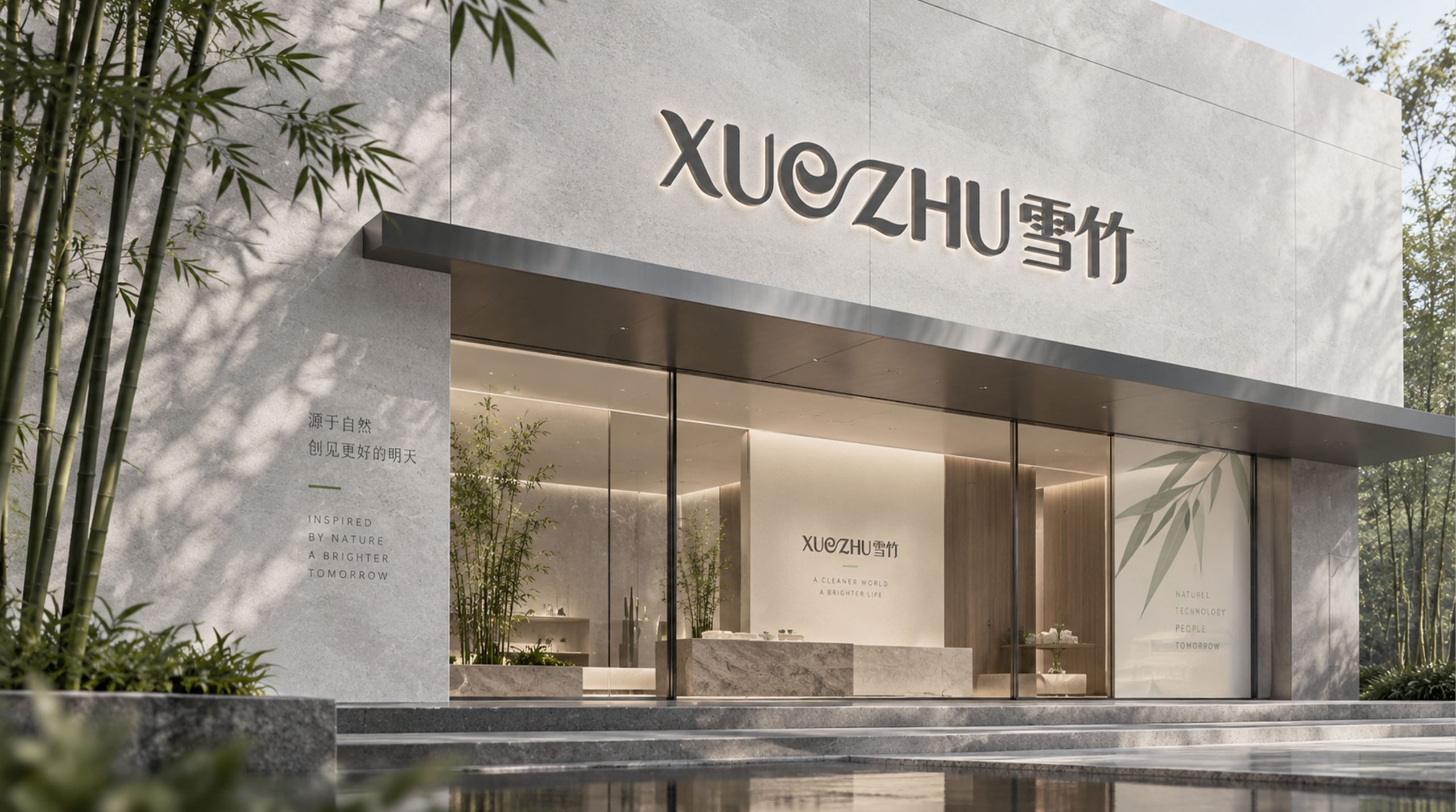
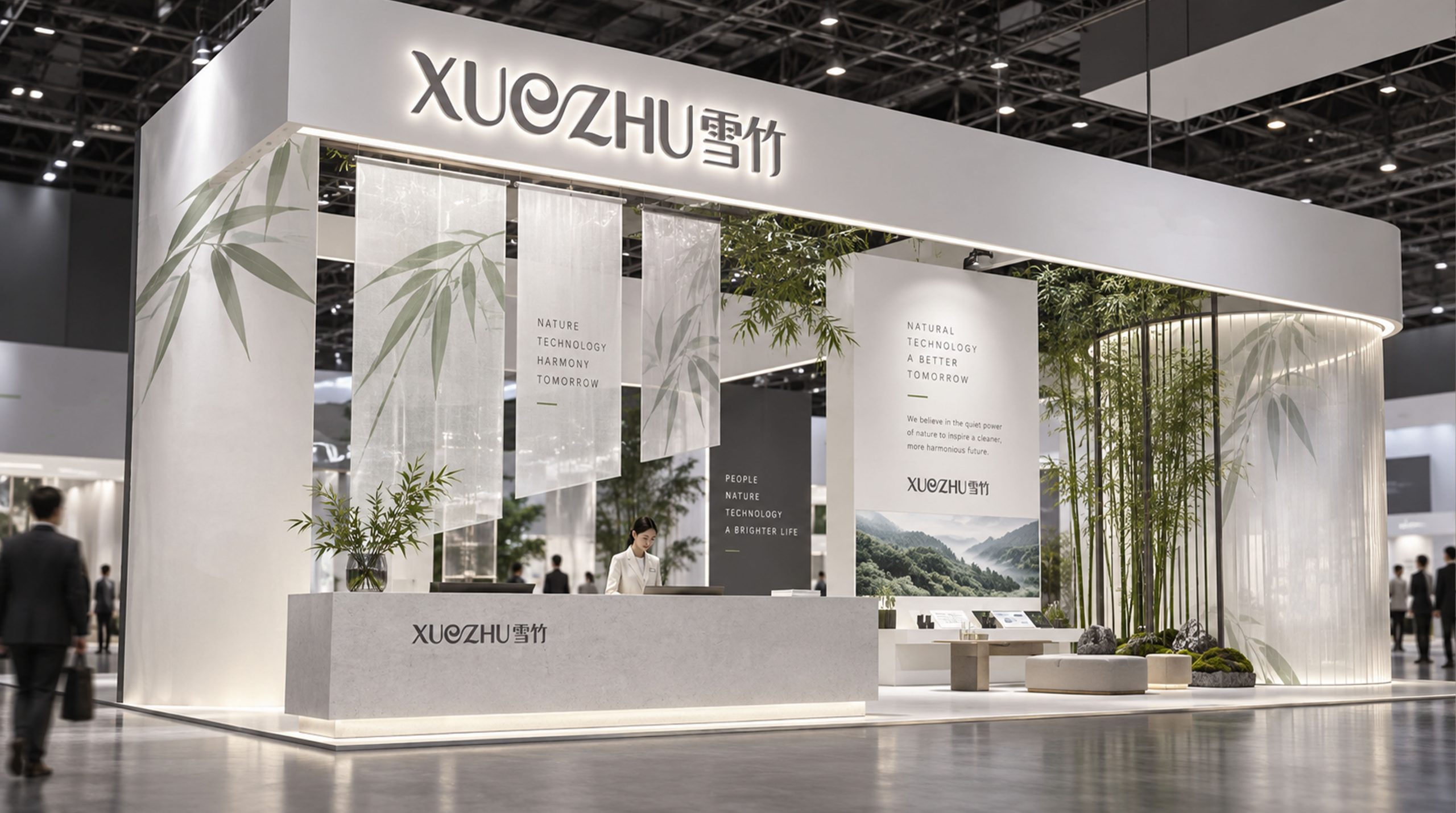
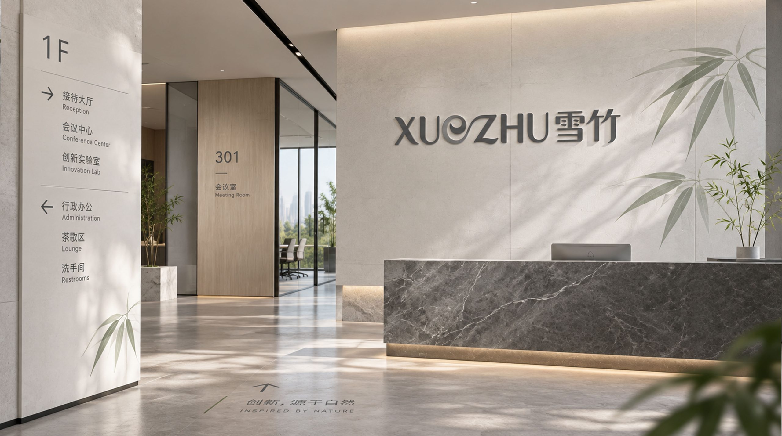
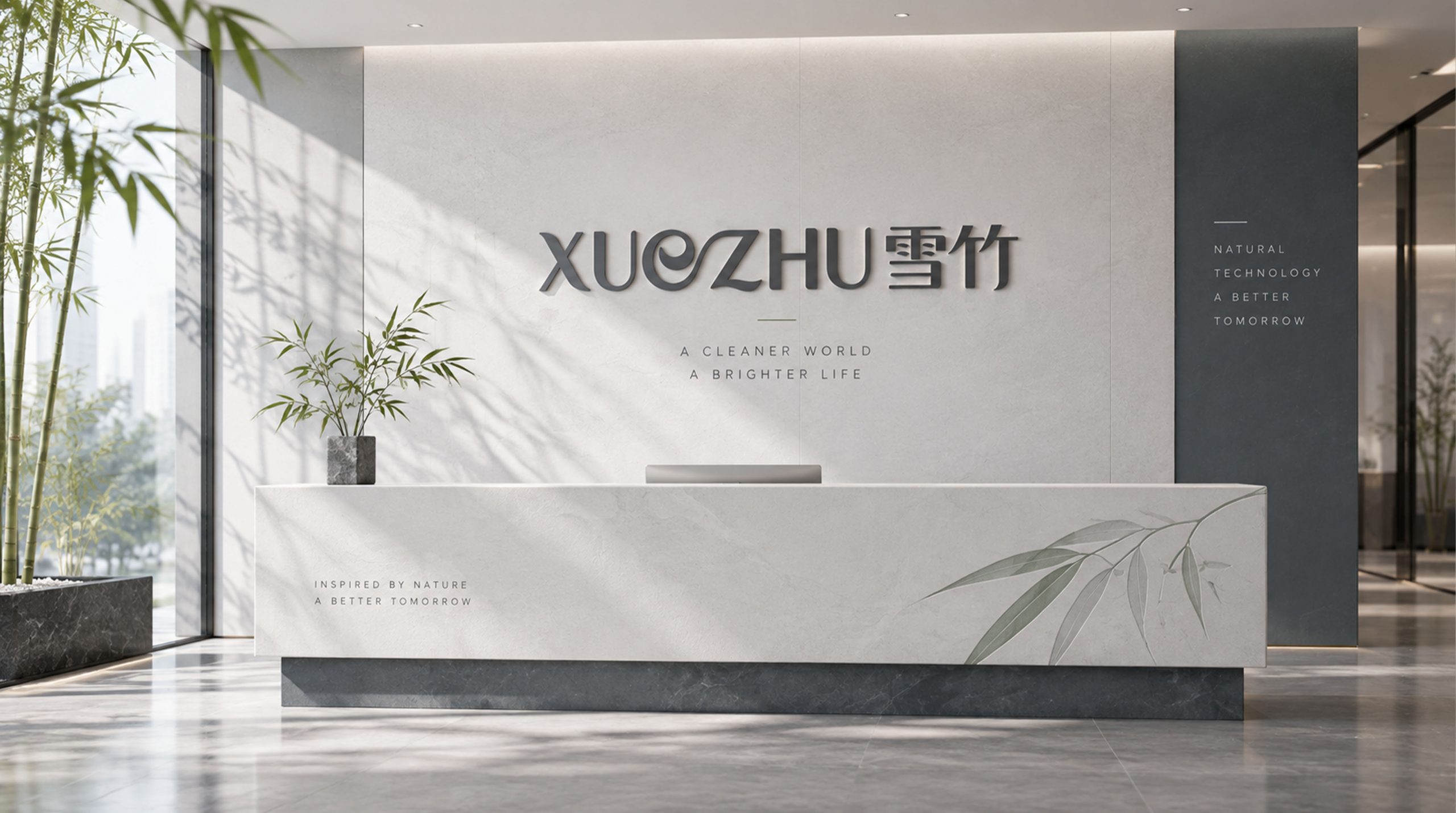
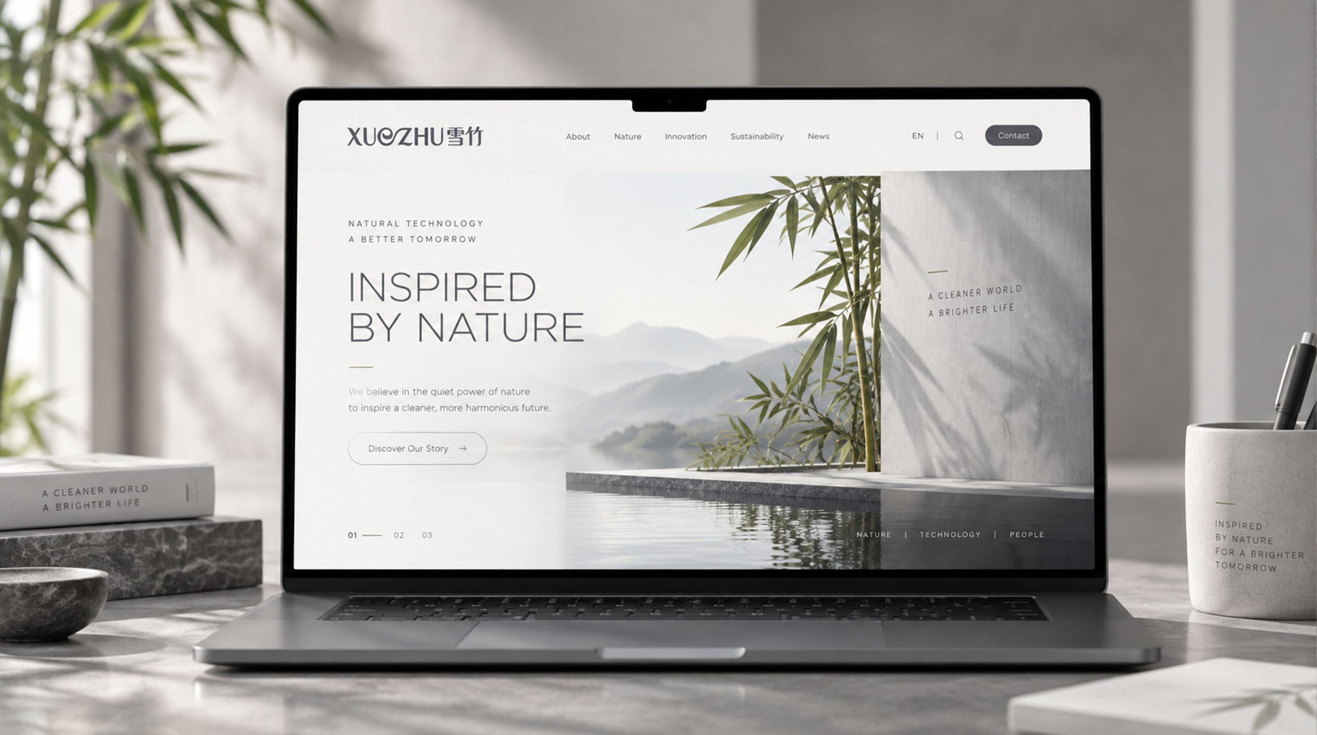
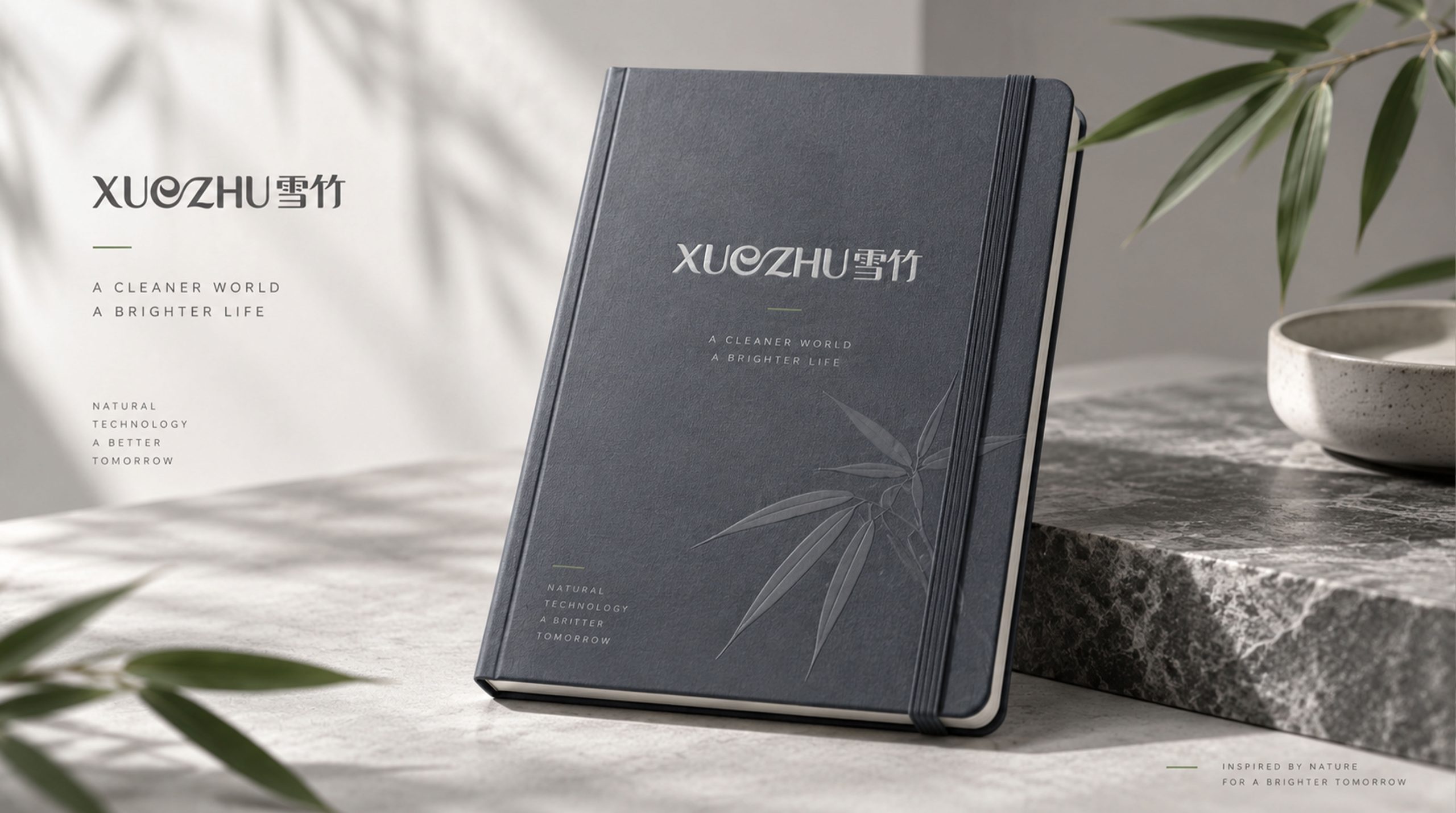
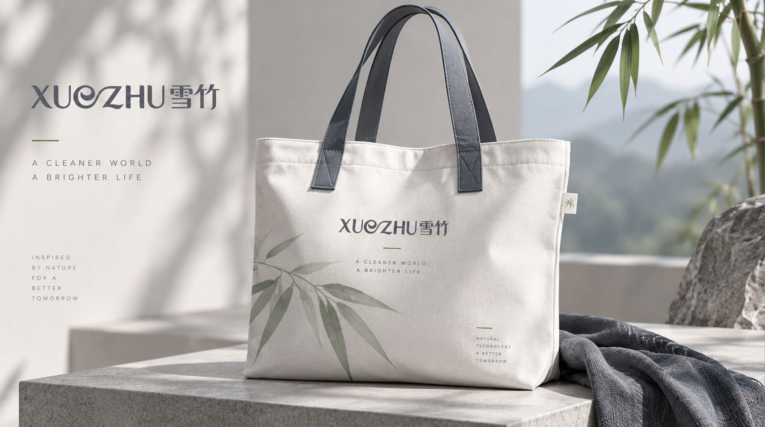
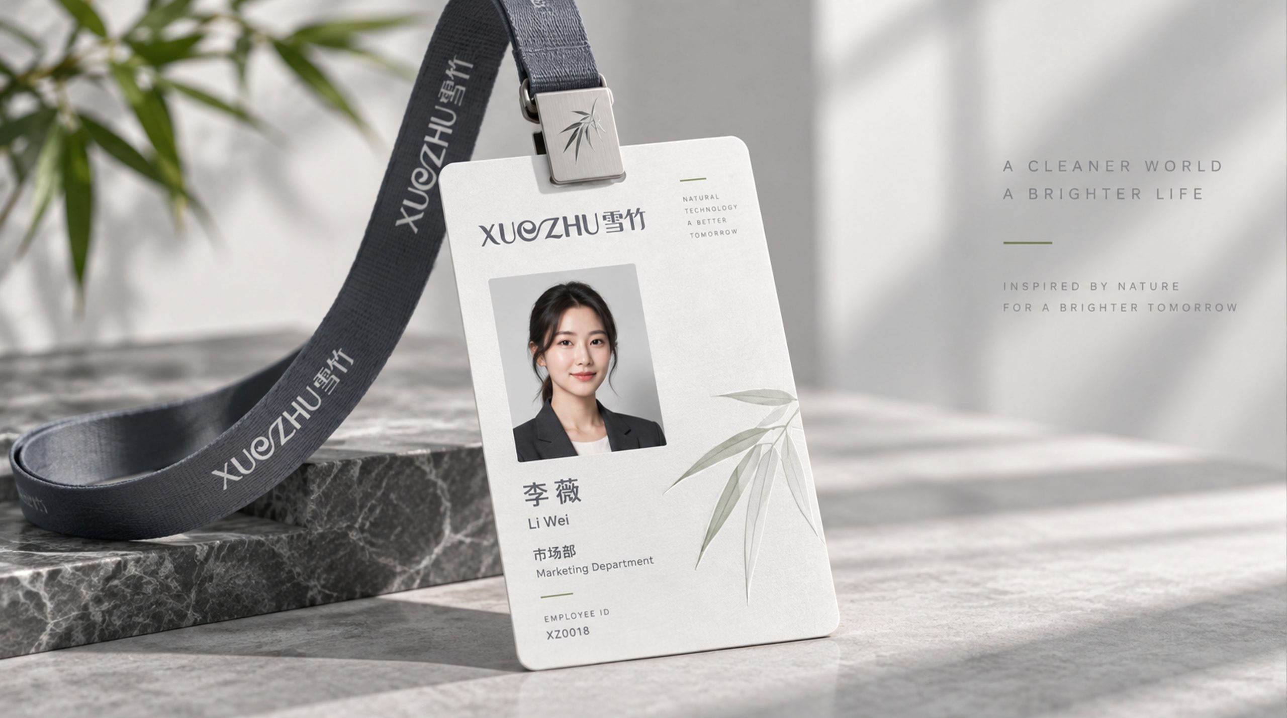
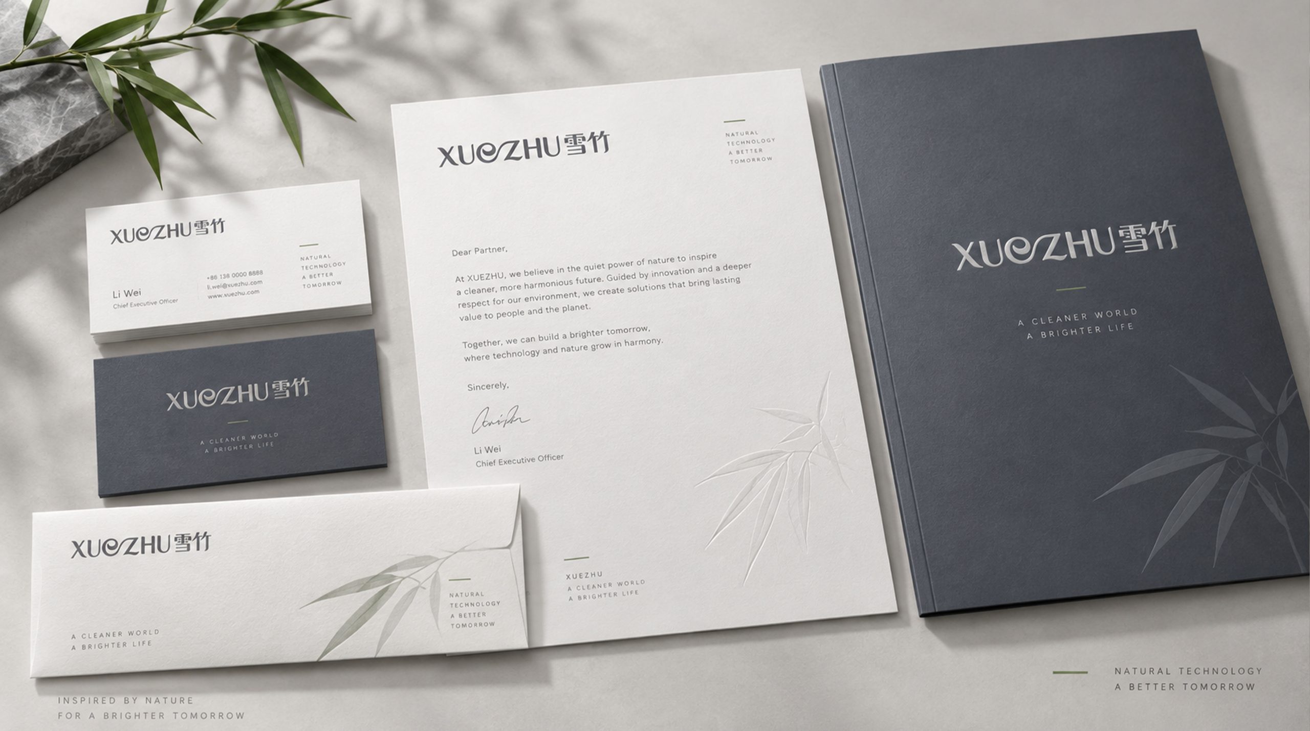

design results
This plan redesigns the word "Snow Bamboo" in artistic fonts, using smooth curves to reflect the product attributes of "Smooth, High-quality, Fashionable" Snow Bamboo products. The text is the logo, and the logo is the text - without the help of additional graphic symbols, only the beauty of the lines of the font itself conveys the entire temperament of the brand, achieving the most efficient and direct brand recognition.
graphic language
Each stroke of the word "Snow" is redrawn with a smooth curve, and all horizontal folds and turning points are transitioned with rounded arcs, eliminating all rigid right angles and edges - just like the smooth and unobstructed touch you feel when your fingers run over the surface of the snow bamboo product. The four dots at the beginning of the word "rain" are presented in the shape of round water droplets, like morning dew condensed on bamboo leaves, crystal clear. The strokes in the lower part flow in silk-like continuous arcs, like the folded curves of soft fabric fluttering gently in the breeze.
The design of the word "bamboo" retains the fresh and vigorous bones of bamboo while injecting soft curve genes. The two "pieces" at the beginning of the word bamboo are presented in a slightly outward arc, like two young bamboos swaying gently in the wind. The vertical brush retains a moderate sense of straightness to convey the integrity of the bamboo, but the start and end of the brush have a natural transition with a rounded arc, just like the round and smooth touch of the bamboo joints. The horizontal pen runs through a long and stretched arc, like a ribbon gently tied between bamboos, infusing the rigid bamboo with the softness and elegance of silk fabrics.
The spacing between the two characters has been carefully considered, and the last stroke of the character "Xue" and the first stroke of the character "bamboo" are connected with a vague charm, just like a silk thread pulling an invisible fiber between the two characters, conveying the core selling point of the Snow Bamboo product of "smoothness at the touch". The baseline of the overall word mark is presented in a subtle wavy arc, like the naturally spreading undulating outline of a piece of soft fabric, making the two words seem to float on a piece of silky fabric.
The stroke thickness of the overall artistic calligraphy is presented in uniform and slightly slender lines - not rough and powerful calligraphy, but as slender and tough as high-count cotton yarn, conveying the product's "light, breathable and delicate" fabric characteristics. The curvature of all curves is controlled within the range of elegance and fashion - not too complicated to avoid losing the modern sense, not too simple to avoid losing the supple product semantics.
Font composition
The artistic word mark "Snow Bamboo" itself is the core logo of the brand, and there will no longer be an additional auxiliary Chinese font. The English "XUEZHU" is arranged in a slender rounded sans-serif font that is consistent with the Chinese logo style. The turning points of the letters are also transitioned with arcs. The intersection of "X" is replaced by a straight line with a soft curve. The folded corner of "Z" is replaced by an arc instead of a sharp angle, so that the visual temperament of Chinese and English maintains a consistent smooth gene. English subtitles can be placed below or to the right of the Chinese subtitles to assist recognition.
color system
The main color, Snow Bamboo White #F8F6F2, represents purity, naturalness and the clean feeling of close-fitting fabrics. This is not a cold pure white, but a fabric white with a slightly warm tone - just like the original color of natural bamboo fiber fabrics before they are bleached and dyed, it is warm, soft and close to the skin. Auxiliary bamboo green #7BA68C is used to identify the natural attributes and bamboo fiber material in the brand system. The green color is like the fresh color of new bamboo leaves, conveying the natural raw material genes of the product. Auxiliary fashion gray purple #9B8EA8 is used in the brand system for fashion elements and high-end product lines for urban female consumers. Gray purple conveys the consumer aesthetic identity of "exquisite, fashionable and tasteful" in the textile industry. Auxiliary nude skin powder #E8CFC1 is used in intimate clothing and skin-friendly product elements in the brand system, just like the natural color of healthy skin. The overall color is based on soft tones with low saturation, reflecting the brand temperament of "natural, smooth, exquisite and fashionable".
Application extension
Logo can be widely used in product packaging, hang tags, washable labels and gift box envelopes; brand flagship store fronts, counter images and display props; official websites, e-commerce platform stores and social media images; textile industry exhibitions, lifestyle exhibitions and brand cross-border cooperation images. On the product hangtag, the Xuezhu artistic wordmark is presented on the surface of off-white special paper using an indentation process. When consumers look at the hangtag, their fingertips touch the recessed lines of the wordmark, which is like touching the delicate texture of the product itself - the smoothness of vision and the smoothness of touch are combined into one on a small hangtag. At the entrance of the brand flagship store, the artistic wordmark is suspended and installed on the light background wall with slender metal lines. The curved strokes cast soft light and shadow under side light, just like the luster of silk flowing in the light.
brand meaning
The logo contains three core images: Silky Softness - the smooth curves convey the core selling point of the product's soft touch and skin-friendly comfort; Natural Purity - the snow-like whiteness and bamboo elegance convey the natural and healthy nature of the bamboo fiber material; Fashion Aesthetics - the exquisite design of artistic fonts conveys the brand's fashion positioning of both quality and aesthetics. The overall design conveys the brand vision of "as soft as snow and as natural as bamboo".
Improper Usage (Protection Specification)
Do not replace the curved strokes of the artistic word mark with straight lines or sharp angles; do not change the spacing between the two words and the connection relationship between the charm; do not change the uniform and slender characteristics of the strokes or make them bold; do not change the hue of the main color of Snow Bamboo White or the auxiliary color of Bamboo Green; do not add strokes, hard shadows or industrial processing that is inconsistent with the fabric brand style; do not tilt, stretch or non-proportionally scale the word mark; keep the white space ≥ the height of the word mark 30%; the minimum display width shall not be less than 30mm.
design results
After the release of the logo, Xuezhu's brand recognition and consumer favorability in the field of bamboo fiber textiles and personal fabrics have significantly improved. The brand logo with artistic fonts as the core has become the core identification symbol of the brand system with its soft touch and fashionable aesthetics conveyed by its smooth curves. It is widely used in product packaging, terminal display and digital communication, showing the brand vision of "smooth as snow, with natural bamboo charm".