










Shanying Education is an education brand with youth quality development and outdoor growth education as its core. It is committed to cultivating youth's courage, perseverance and independent spirit through curriculum systems such as outdoor exploration, camp study, leadership training and teamwork.
The brand name "Mountain Eagle" is full of power - "Mountain" symbolizes climbing, challenge and natural lessons, and "Eagle" symbolizes courage, vision and the free spirit of soaring into the sky. The mountain is the stage for growth, and the eagle is the role model for growth - every child can bravely spread his wings and fly high like the mountain eagle. Qingmei Future was commissioned to lead the brand identity design.
The design goal of the brand logo is to convey the brand image of "eagle shooting into the sky and aiming high" through the visual language of courage, strength, natural exploration and growth.
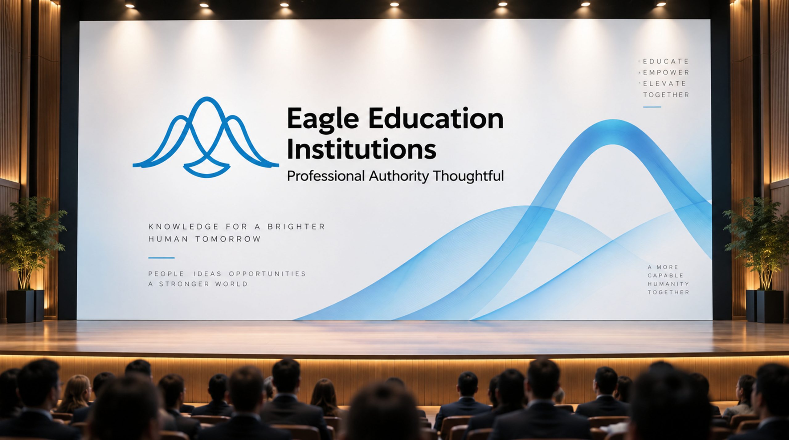
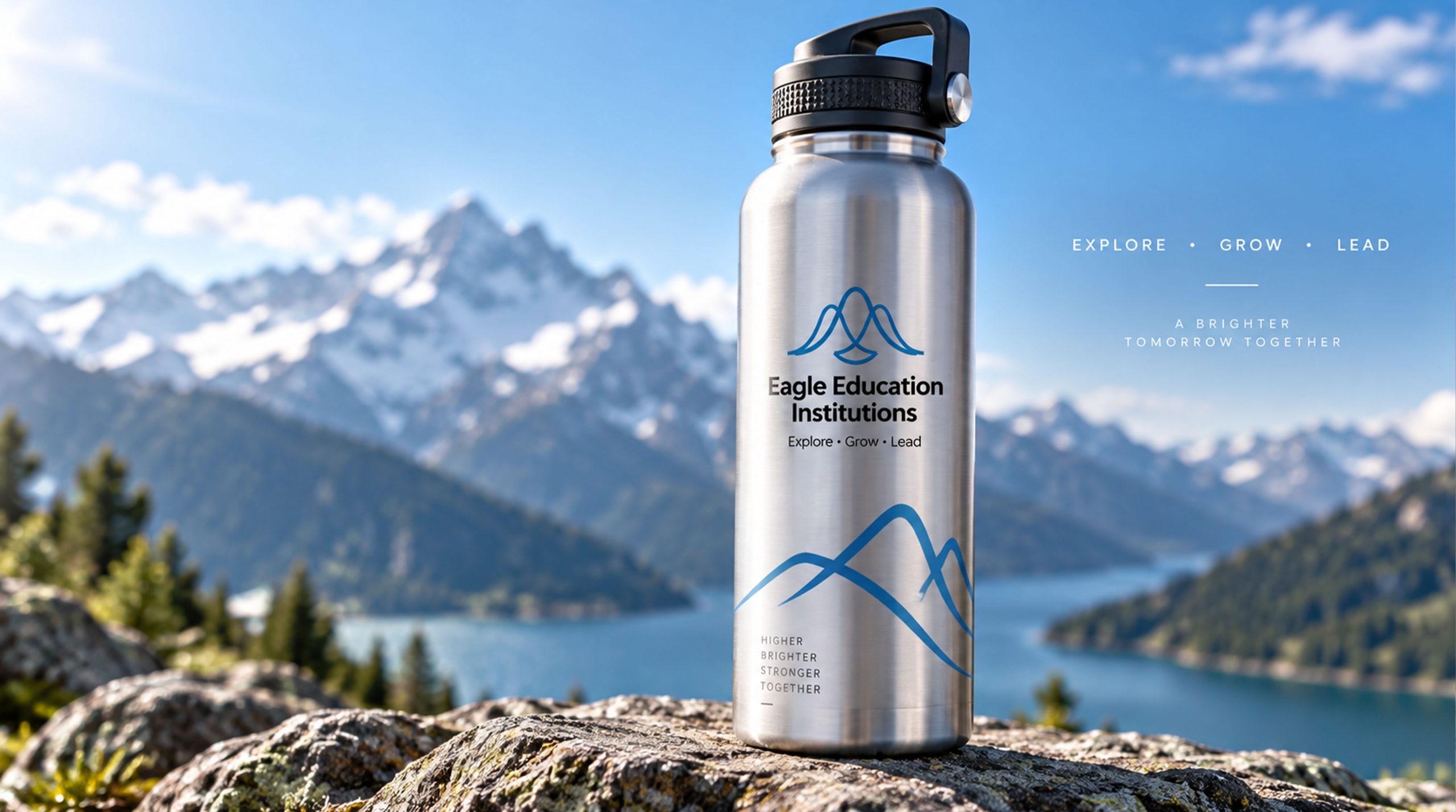
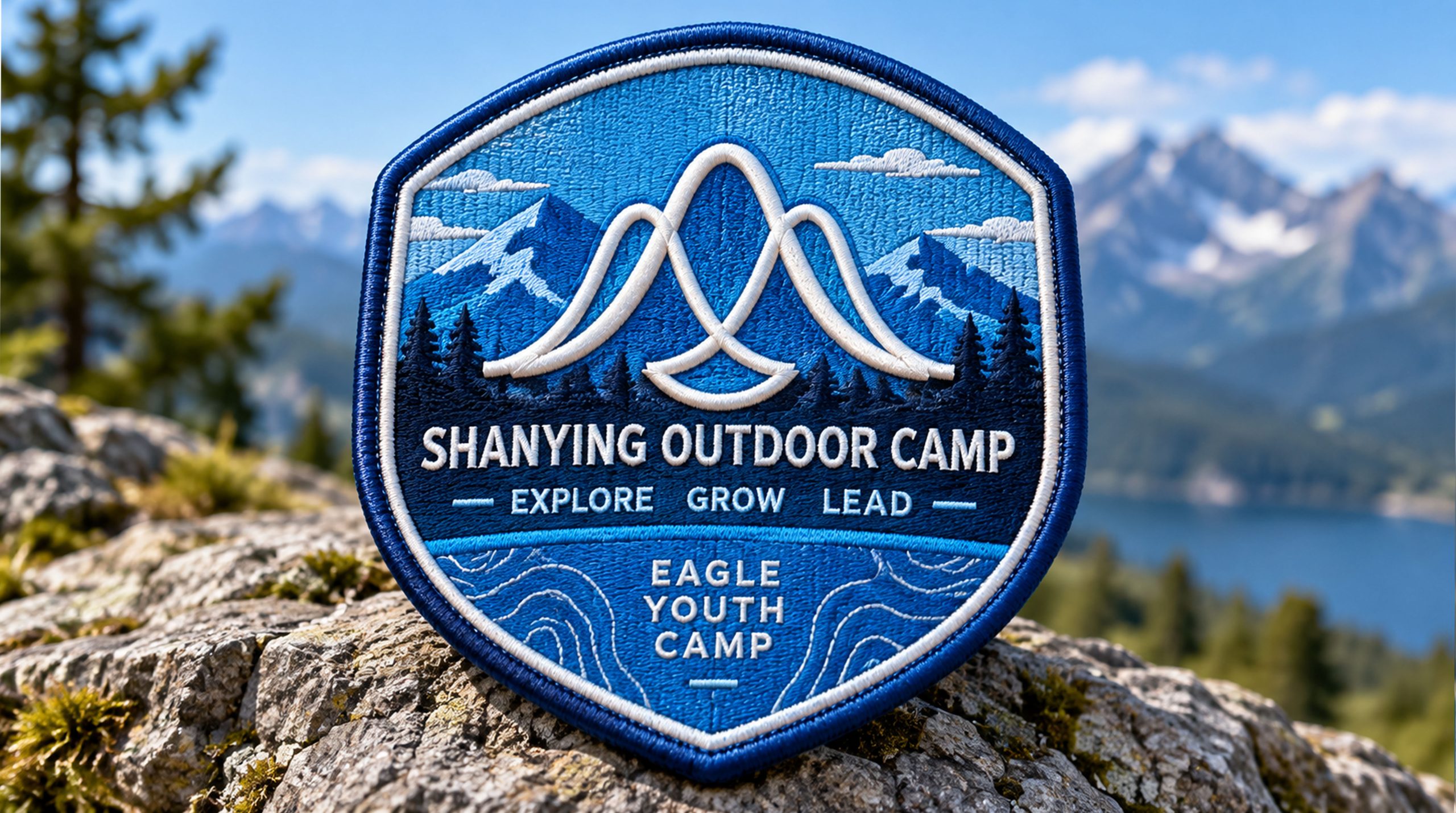
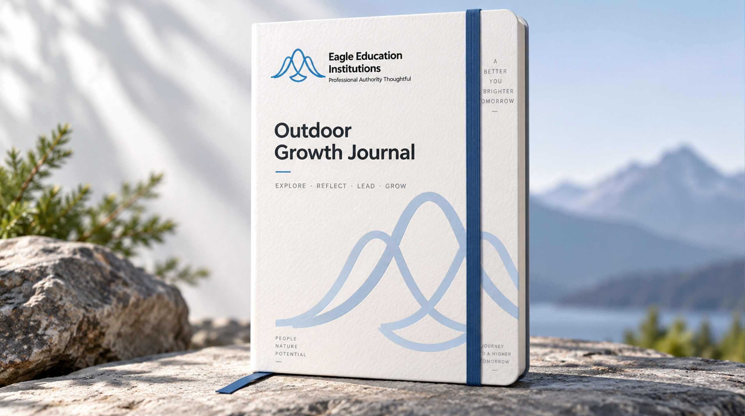
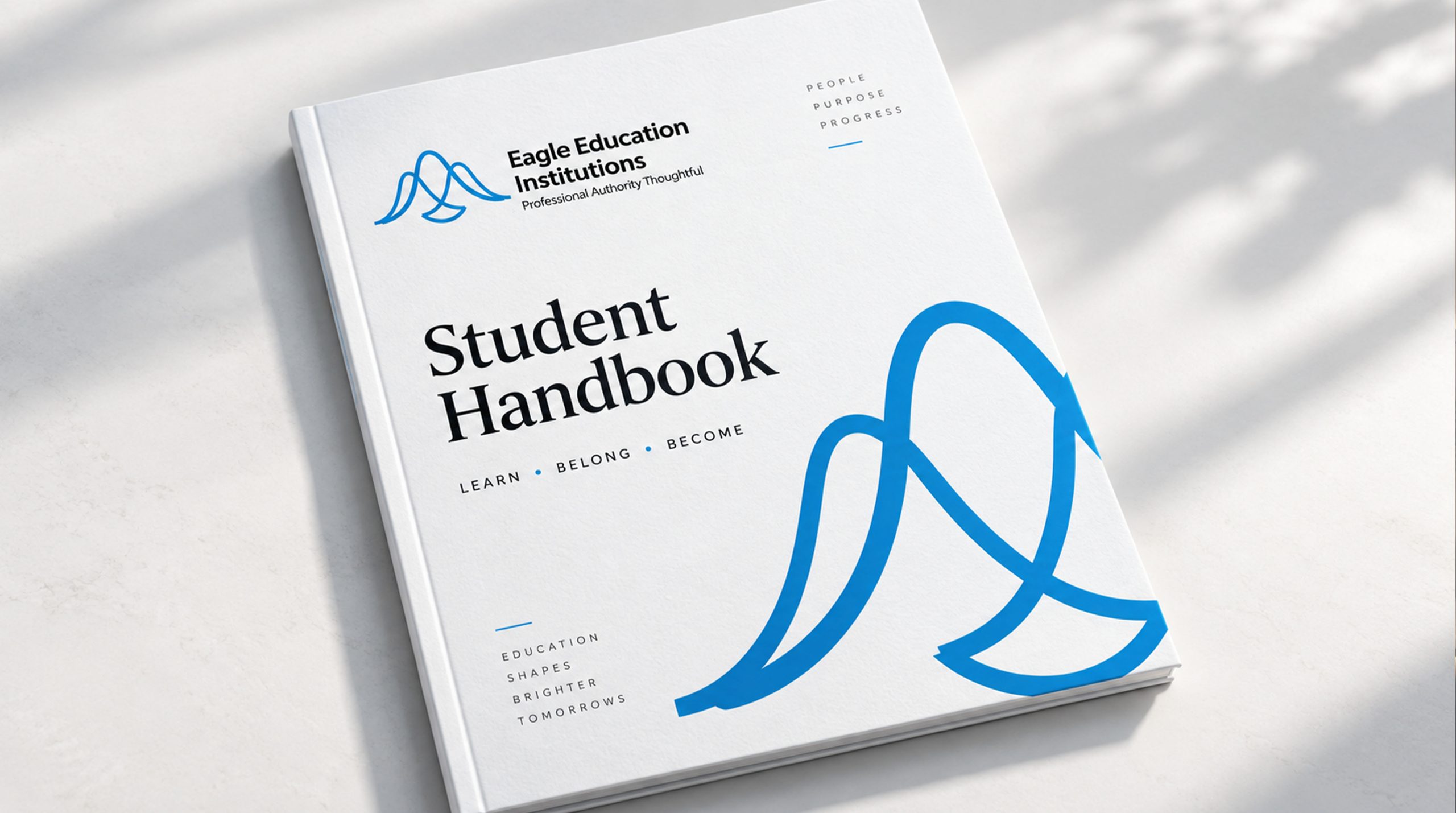
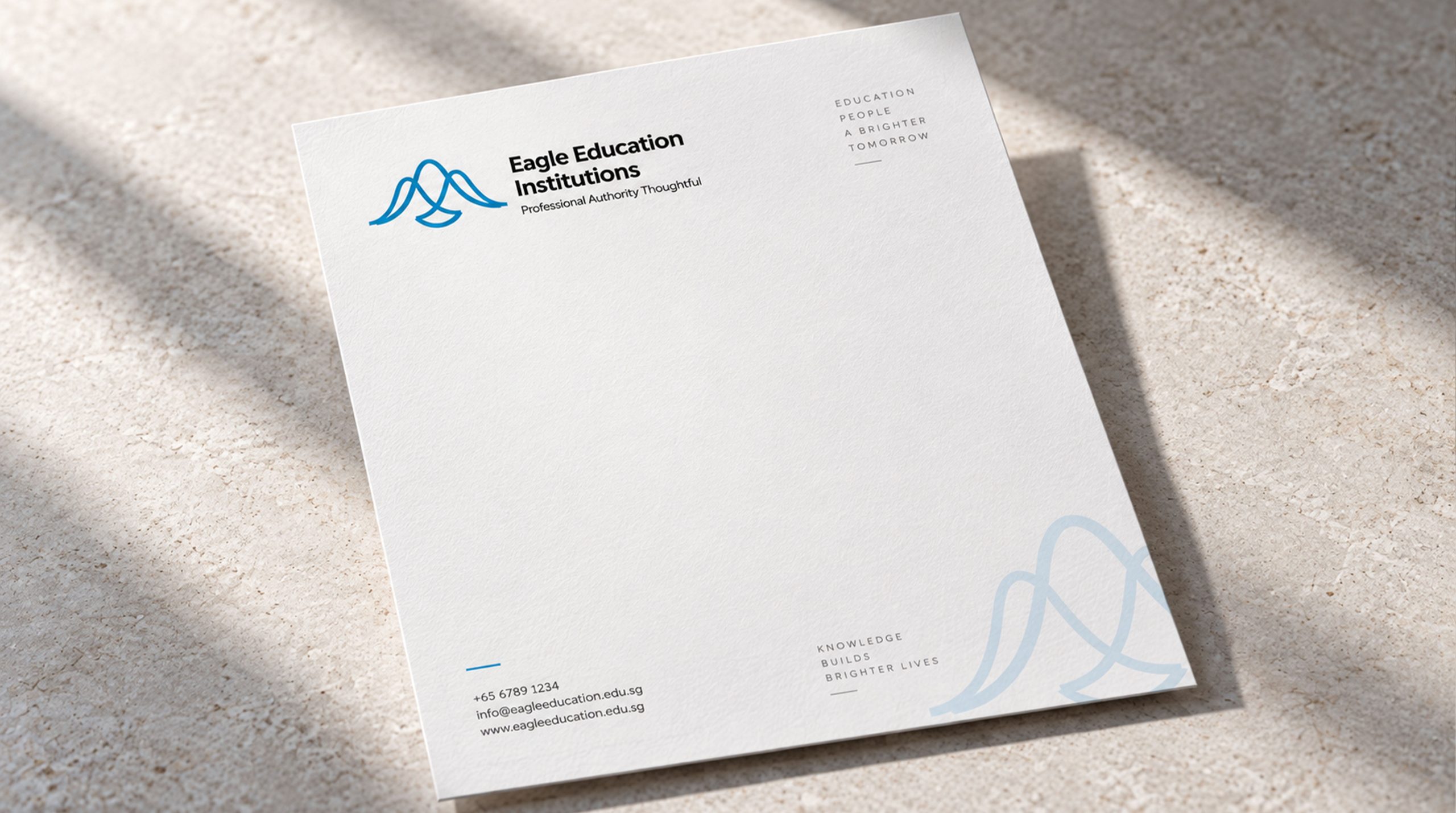
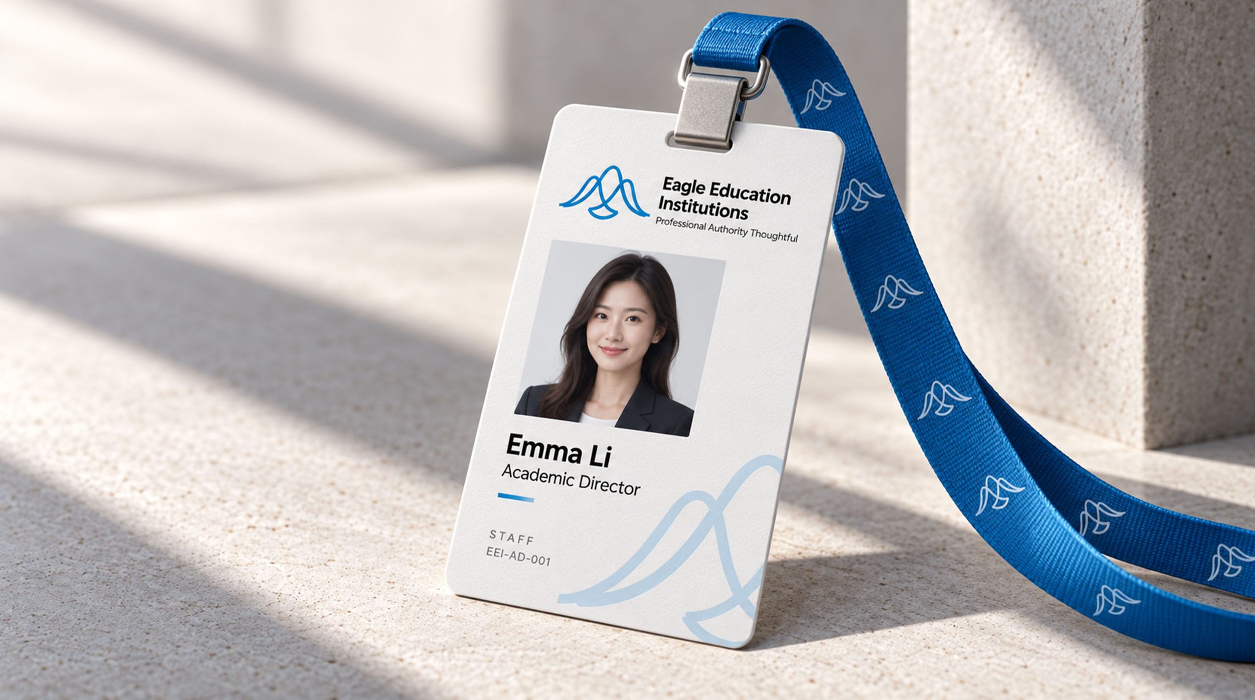
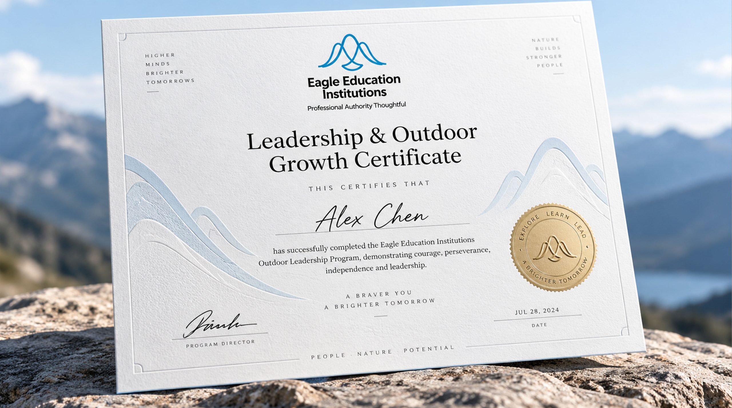

design concept
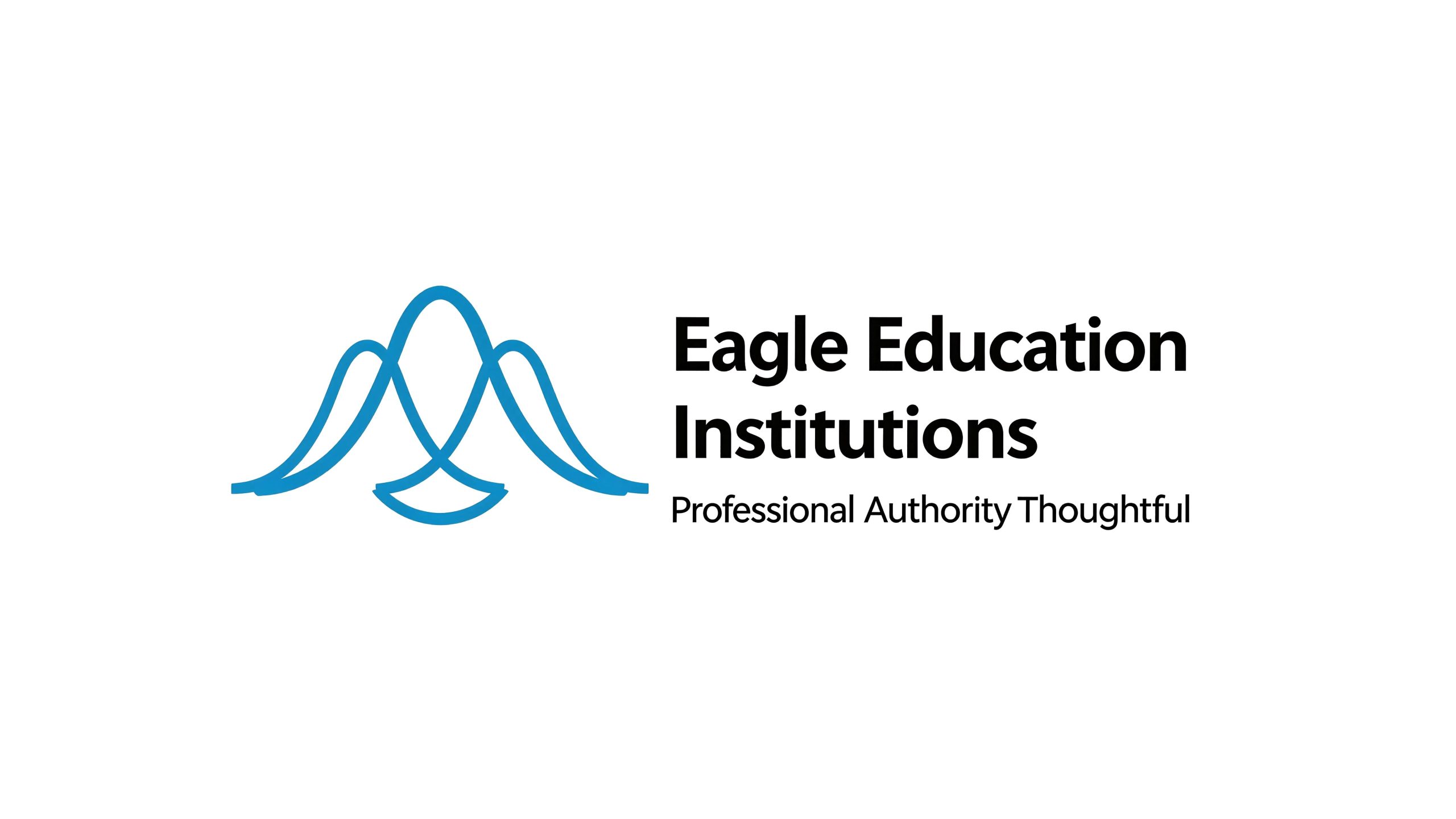
The logo takes "Soaring Eagle" as the core concept, integrating a soaring mountain eagle with the outline of the mountain peak, conveying the brand spirit of "standing on the mountains and soaring in the sky". The eagle is the raptor that symbolizes the most power and leadership in nature. With the eagle as the core of the logo, it directly inspires young people and parents' emotional associations with courage, vision and excellence.
graphic language
The main body of the graphic takes the side silhouette of a flying mountain eagle as the visual core. The wings spread out to both sides in two powerful arcs. The upward angle of the wings is full of power and upward momentum, just like a mountain eagle struggling to climb on the updraft of the valley. The tips of the wings are slightly upturned, conveying lightness and confidence - not a desperate struggle to flap the wings, but a calmness in controlling the airflow.
Several simple triangular fold lines form the outline of the mountain below the eagle's body. The mountain peaks are undulating and sharp. The eagle and the mountain are integrated in the graphic - the arc of the eagle's wings naturally connects with the ridgeline. The eagle soars above the mountain top and the mountain is supported by the eagle's wings, conveying the growth narrative of "the mountain is the starting point and the sky is the goal". The triangular structure of the mountain also gives the figure a solid bottom support, allowing the overall figure to maintain a stable visual center of gravity amidst the flying dynamics.
The overall composition is in the shape of an upward triangle, with the bottom as wide as a mountain base and the top as narrow as an eagle's head, conveying the education brand's value proposition of "solid foundation and high aspirations".
Font composition
The Chinese "Mountain Eagle Education" uses strong modern boldface, powerful strokes and tough structure, conveying the sense of strength and action of the outdoor education brand. The word "Shanying" is used in a slightly thicker font to highlight the brand's personality, while the word "education" is used in a regular font to clarify the industry attributes. The English "MOUNTAIN EAGLE EDUCATION" is arranged in standard uppercase sans serif font, and the font is stable and powerful.
color system
The main color, Eagle Blue #1B4F72, represents the sky, vision and perseverance, just like the soaring eagle in the high sky, conveying the depth and reliability of the education brand. Auxiliary mountain rock orange #D4752E is used for the dynamic elements in the brand system and the visuals of camp activities. Just like the warm color of the sunset reflecting on the mountain rocks, it injects the passion and sense of adventure of outdoor education into the calm blue. Auxiliary forest green #2D6A4F is used for natural ecology-related elements to convey the close connection between outdoor classrooms and nature. Pure white #FFFFFF as standard base color. The overall color uses blue and orange as the dual core, reflecting the brand temperament of "courage, calmness, vitality and exploration".
Application extension
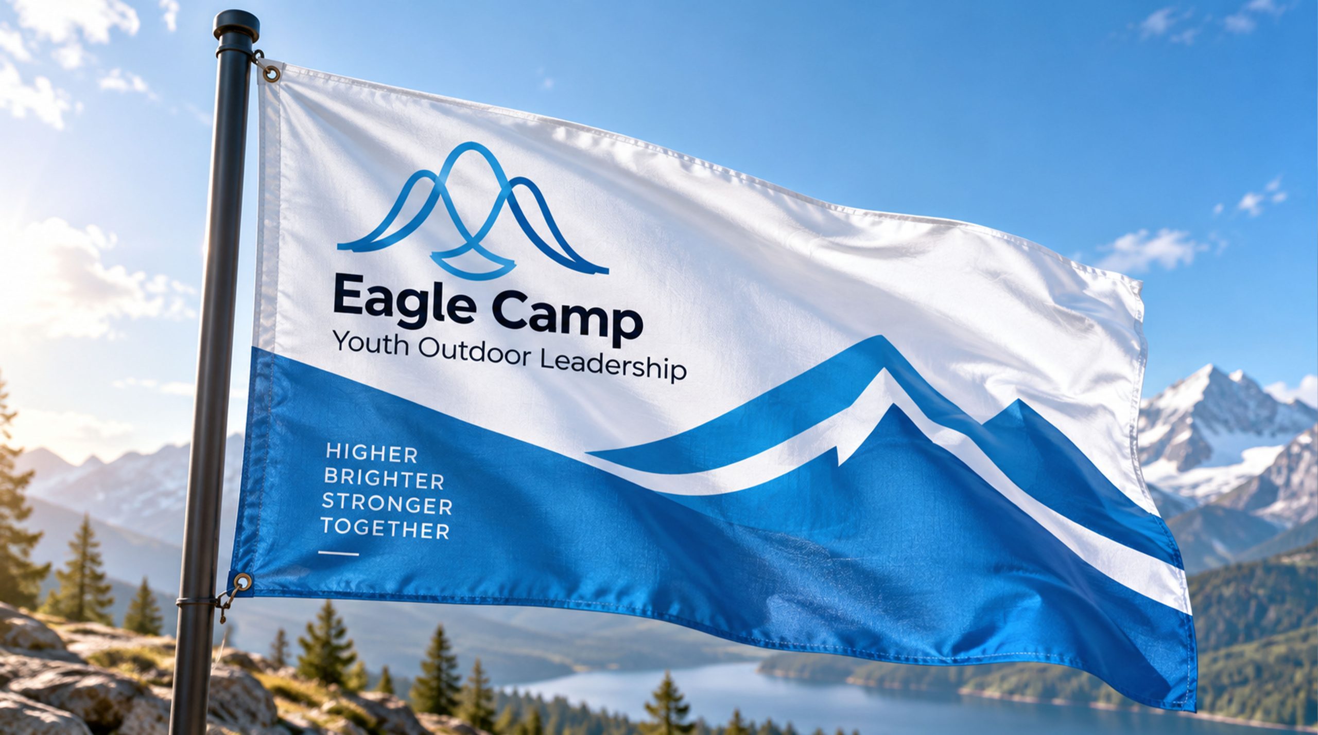
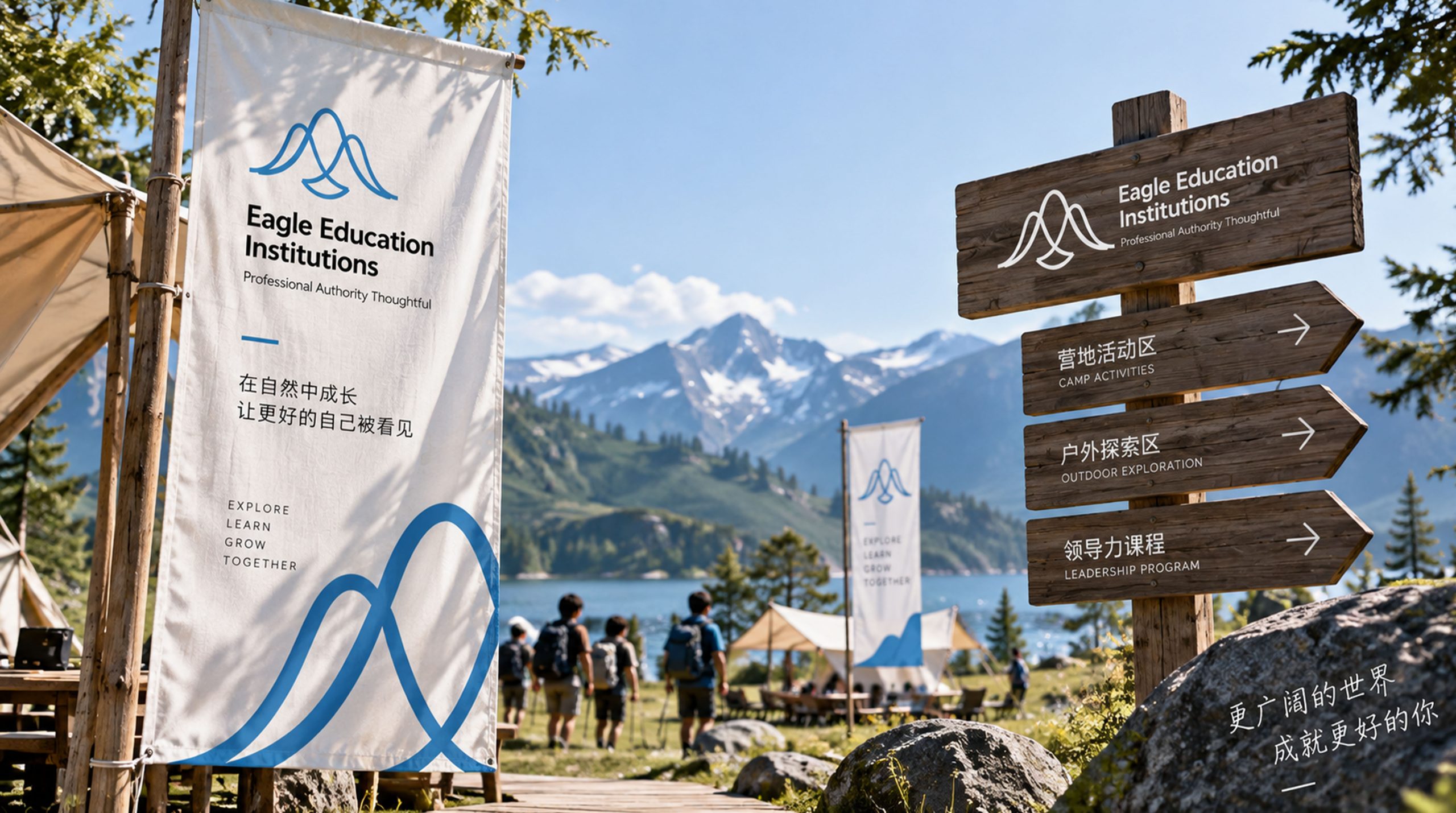
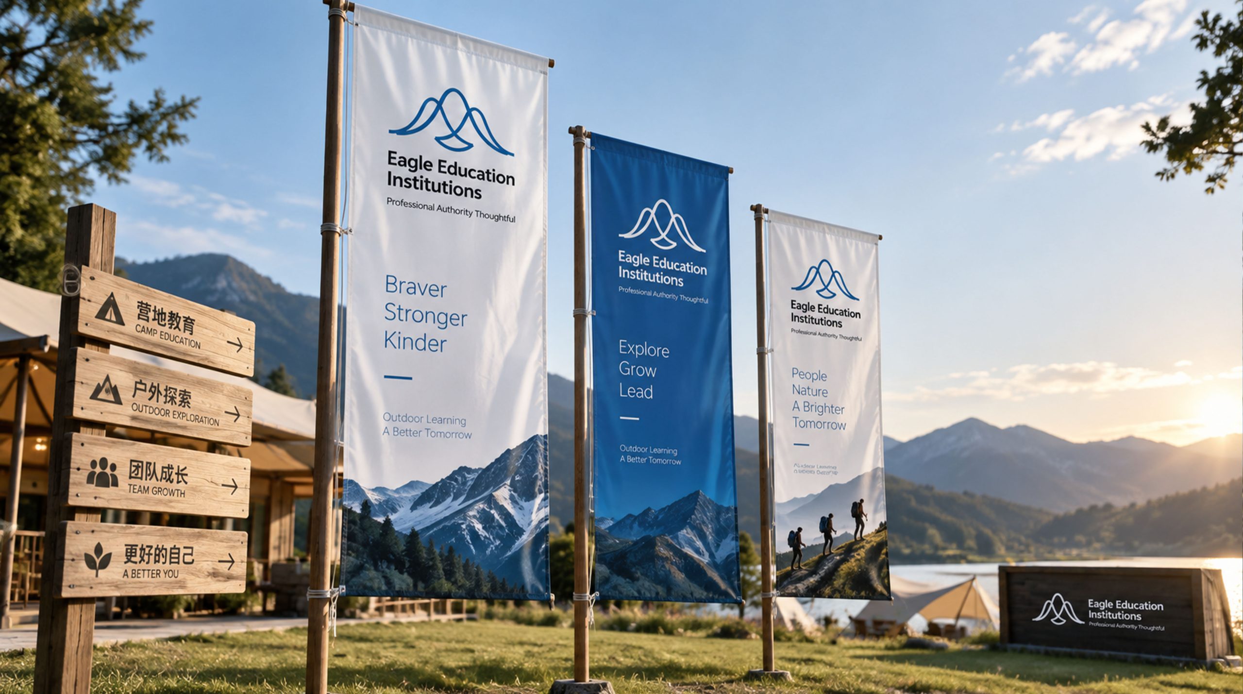
The logo can be widely used in doors of educational institutions, camp base entrances and outdoor activity site signs; course manuals, study certificates, student handbooks and parent communication materials; official websites, social media and online registration platforms; youth education forums, camp education expos and school cooperation promotion images; student clothing chest badges, backpack badges, medals and commemorative peripherals. In the dynamic visual, the outline of the mountain peak rises from the bottom of the screen, and the mountain eagle spreads its wings from the top of the mountain and flies across the sky with its powerful wings, symbolizing that every student takes off bravely under the training of Shanying Education.
brand meaning
The logo contains three core images: Courageous Flight - the spread-winged mountain eagle conveys courage, confidence and the spirit of growth that pursues excellence; Nature as Classroom - the outline of the mountain conveys the brand concept of outdoor exploration and nature as the best place for education; Aim High - the upward composition of the eagle flying on the top of the mountain conveys the brand mission of education to help young people constantly break through themselves and aspire high. The overall design conveys the brand vision of "eagle shooting into the sky and aiming high".
Improper Usage (Protection Specification)
Do not change the angle of the eagle's wings or the integration relationship with the mountain; do not change the hue of the main blue color of the mountain eagle; do not add gradients, shadows or decorative effects that are inconsistent with the outdoor education style; do not separate the eagle and the mountain for separate use; keep the white space ≥ 25% of the graphic height; the minimum display width must not be less than 25mm.
design results
After the release of the logo, Shanying Education's brand recognition in the fields of youth quality development and camp education has been significantly improved. "Soaring Eagle", with its visual language that combines courage, power and natural exploration, has become the core identification symbol of the brand system, showing the brand vision of "eagle shooting into the sky and aiming high".