










Sino-American Alliance is a comprehensive enterprise with cross-border business cooperation and Sino-US economic and trade services as its core. It is committed to building a business bridge between China and the United States and providing professional services such as trade docking, investment consulting, market expansion and cultural exchanges for enterprises of the two countries.
The three-character brand name "China-Meilian" is straightforward - "China" represents China, "Mei" represents the United States, and "Union" means unity and connectivity, conveying the brand's core mission of connecting the two major economies and promoting two-way cooperation. Qingmei Future was commissioned to lead the brand identity design.
The design goal of the brand logo is to convey the brand image of "connecting China and the United States, and win-win cooperation" through the visual language of international vision, win-win cooperation and professional trust.
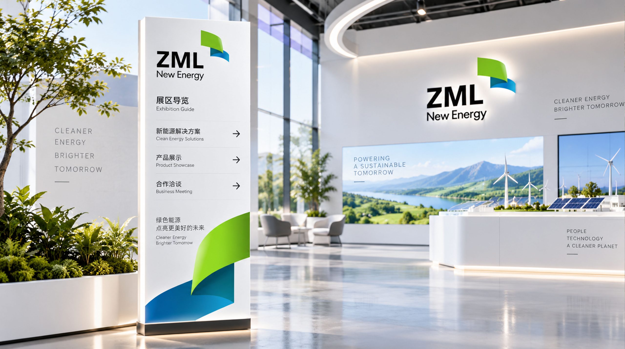
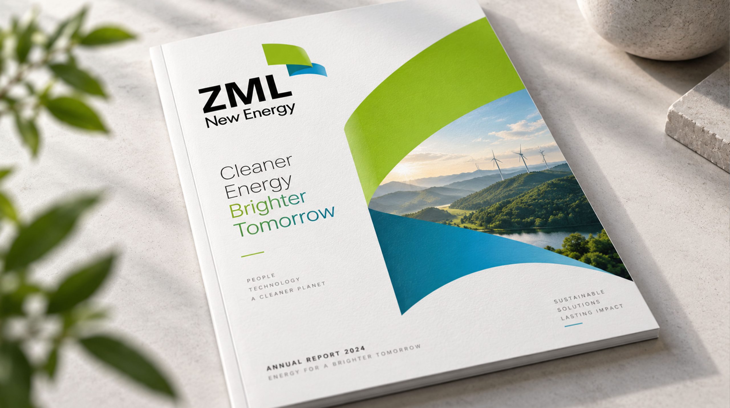
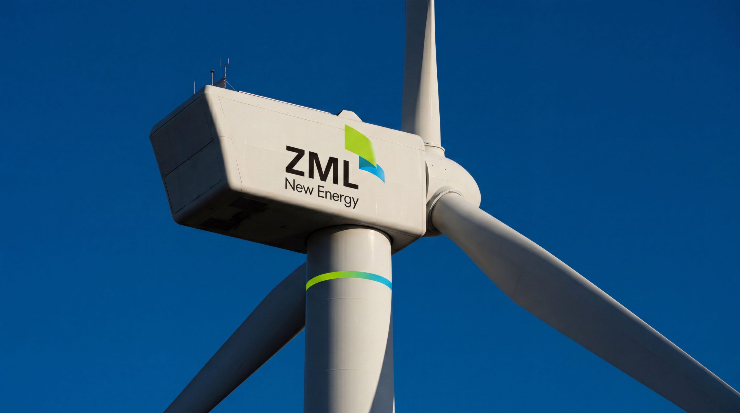
design concept
The logo takes "Bridge of Two Nations" as its core concept and condenses the intersection of two arcs into a brand symbol. The two arcs represent China and the United States respectively - each starting from different directions and intersecting in the middle, symbolizing business cooperation and cultural dialog across the Pacific.
graphic language
The main body of the graphic is composed of two smooth arcs. One arc starts from the left and extends to the right, representing the output of China's power; the other arc starts from the right and extends to the left, representing the docking of American resources. The two arcs cross and interlock in the center of the graphic, forming a closely connected interlocking structure - like a handshake between two palms across the ocean, conveying the sincerity of cooperation and the firmness of the alliance.
The interlocking relationship at the intersection has been carefully designed, and the two arcs are intertwined in an up and down manner to form an inseparable chain connection, conveying the "mutually beneficial, symbiotic and inseparable" partnership between China and the United States in business cooperation. After the intersection, the arcs each stretched outward, just like the results of cooperation radiating to the markets of the two countries. The overall graphic outline is a transverse oval, with horizontally stretched proportions suggesting the vast geographical span across the Pacific Ocean.
Font composition
The Chinese "Sino-American Union" uses a stable modern boldface with thick and correct strokes, conveying the professionalism and reliability of multinational business organizations. The English "ZHONGMEILIAN" is arranged in standard uppercase sans-serif font, and the font is regular and clear, ensuring the brand's recognition in business scenarios in China and the United States.
color system
The main color, Diplomatic Blue #1A3F7A, represents trust, professionalism and international cooperation. Blue is the most consensus color in global transnational business and diplomacy, conveying the brand’s professional credibility. Auxiliary Chinese Red #CC2233 is used in the brand system to represent the visual identity of Chinese elements and is directly related to China's national image. Auxiliary Stars and Stripes White #FFFFFF and Silver Gray #A0A8B0 are used for balance and auxiliary layers. The combination of blue and red also echoes the core colors of the national flags of China and the United States, establishing a visual identity of bilateral equality at the brand level.
Application extension
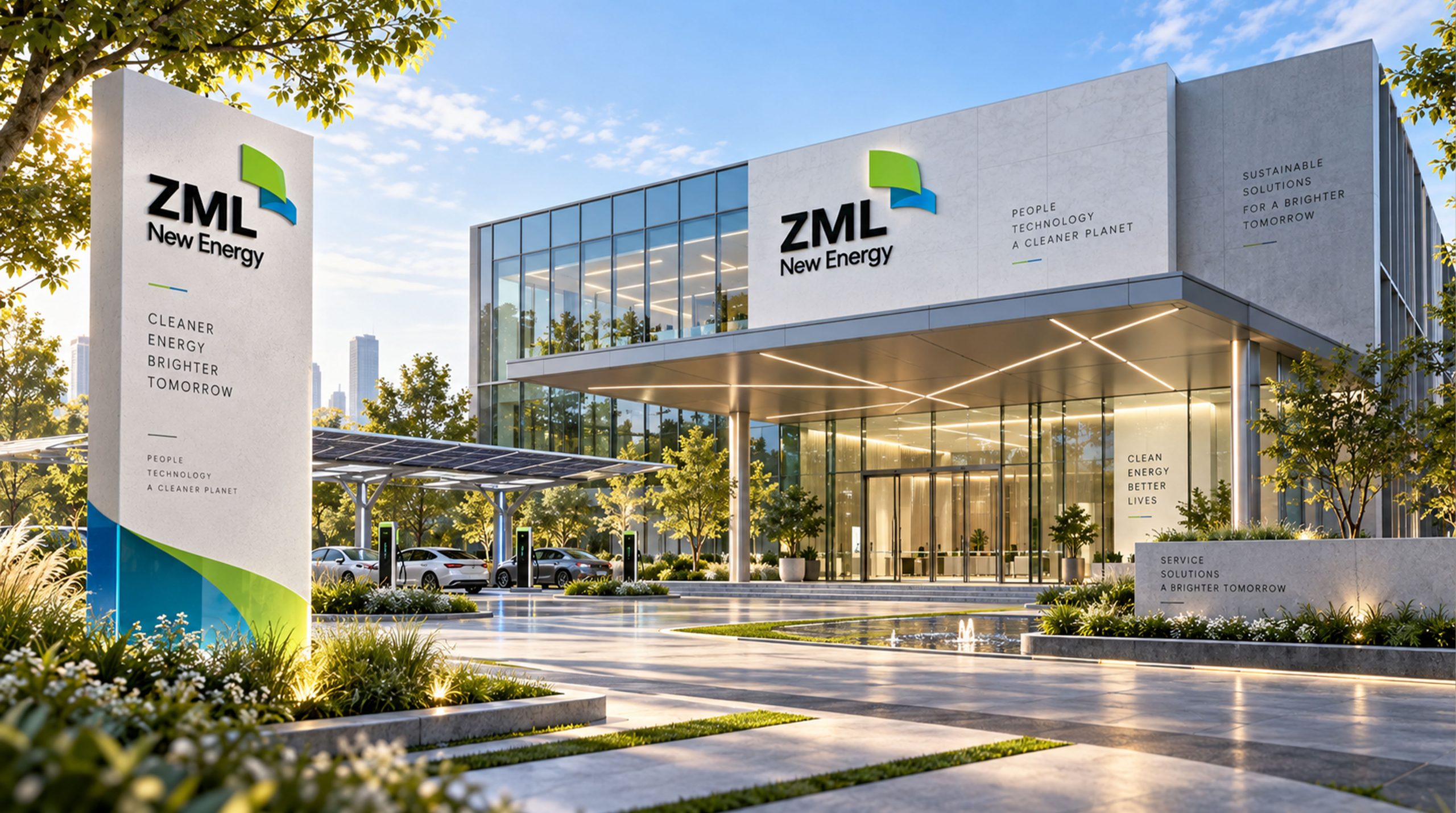
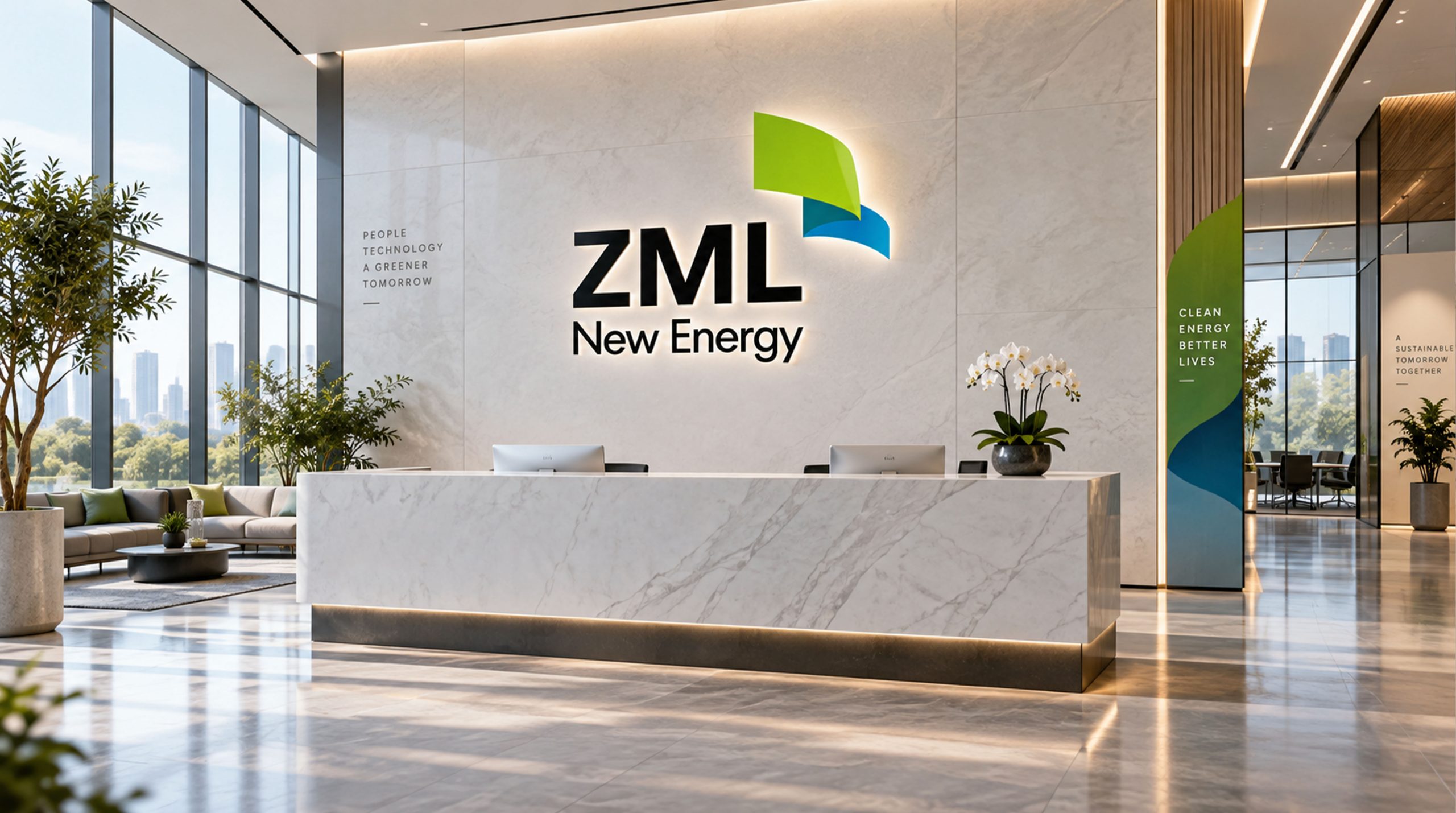
The logo can be widely used in corporate headquarters and overseas office logos; business cooperation plans, investment consulting reports and trade docking documents; official websites, bilingual service platforms and social media images; images of China-US Economic and Trade Forum, cross-border investment summits and business inspection activities. In the dynamic visual, two arcs extend from both sides of the screen to the center, intersecting and interlocking in the center, symbolizing the successful handshake of Chinese and American business forces across the Pacific.
brand meaning
The logo contains three core images: Bilateral Connection - the intersection of double arcs conveys the bridge mission of connecting the two major markets of China and the United States; Win-Win Partnership - the interlocking structure conveys a mutually beneficial and symbiotic partnership; Professional Trust - the calm blue color and rigorous composition convey the professional credibility of transnational business services. The overall design conveys the brand vision of "connecting China and the United States for win-win cooperation".
Improper Usage (Protection Specification)
Do not change the intersection or interlocking relationship of two arcs; do not change the hue of the main color of diplomatic blue; do not add gradients, shadows or decorative effects inconsistent with business style; do not split the double arcs and use them alone; keep the white space ≥ 25% of the graphic height; the minimum display width shall not be less than 25mm.
design results
After the release of the logo, China United's brand recognition in the fields of cross-border commerce and Sino-US economic and trade services has been significantly improved. "Double Bridge Internet", with its visual language that conveys sincerity in cooperation and international vision, has become the core identification symbol of the brand system, demonstrating the brand vision of "connecting China and the United States for win-win cooperation".