










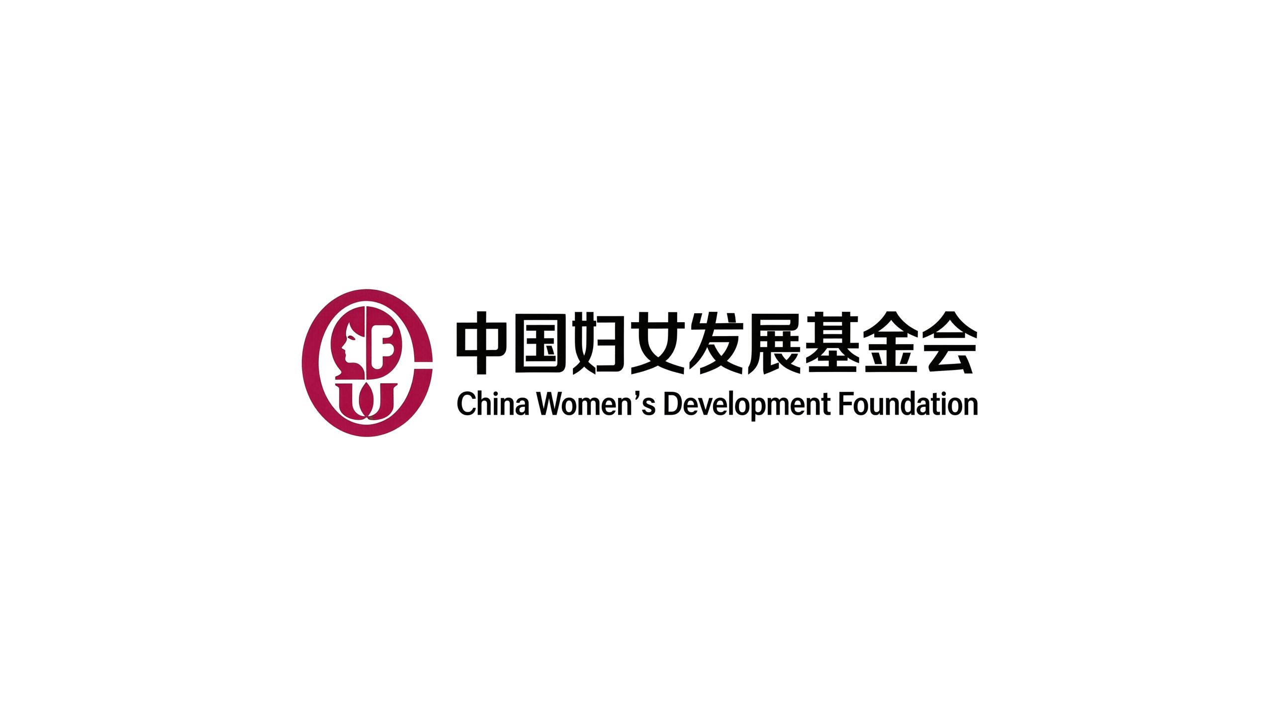
The China Women's Development Foundation is a national public foundation founded in 1988 and affiliated to the All-China Women's Federation. With the purpose of "safeguarding women's rights, promoting women's development, and promoting social progress," it has long been committed to public welfare undertakings such as poverty alleviation, health assistance, educational support, and women's empowerment. It is the most authoritative and influential national foundation in the field of Chinese women's public welfare.
The brand name directly carries the mission and service objects of the organization - "Chinese Women" clearly defines the service group and national positioning, "Development" conveys the core concept of promoting growth and empowerment, and "Foundation" indicates the attributes of a public welfare institution. Qingmei Future was commissioned to lead the brand identity design.
The design goal of the brand logo is to demonstrate the industry status of the China Women's Development Foundation as a national women's charity organization through the visual language of female power, charity warmth and national authority, and to convey the brand image of "caring for women, empowering development, and warming peers".
design concept
The logo takes "Blossom of Motherhood" as the core concept and integrates the image of a blooming flower with the mother's caring palm to create a brand symbol that not only conveys the power of women's beauty, but also carries the warm feelings of charity. Flowers are the world's most universal female imagery symbol - beauty, vitality and blooming. At the same time, the shape of a flower is naturally related to the core semantics of the word "development" - from bud to full bloom, it is the most intuitive visual expression of growth and development.
graphic language
The main body of the figure is surrounded by several petals arranged to form the outline of a blooming flower. The petals are outlined with soft and full arcs, and the shape of each petal is like a gentle palm - the palm is upward, the fingertips are slightly closed, and several "palms" surround and gather together, like multiple pairs of mother's hands holding up a warm center. The petals are the palms, and the palms are the petals - this dual interpretation makes the graphics naturally switch between "female beauty" and "warmth of care", conveying the foundation's charity spirit of "using the soft power of women to gather the warmth and care of society". The number of petals has been carefully designed, preferably five to six, and arranged around to form a centripetal circular composition, as if everyone is working together to lift the flower.
The center of the flower has a circle or heart shape as the core point. The circle symbolizes the seeds of perfection, unity and hope, while the heart shape symbolizes the original intention of love, care and public welfare. The center point is like the stamen of a flower - it is the core of life of the whole flower and the starting point for all charity actions of the foundation. The petals stretch and bloom outward from the center point, conveying the foundation's service pattern that starts from core care and radiates warmth to all areas of society. The flower blooms upward as a whole. The top petals are slightly higher, the petals on both sides are stretched, and the bottom petals are supported. It is like the confident posture of a woman standing tall with her head held high and her arms open to embrace the world. It conveys the spiritual outlook of Chinese women in the new era of self-confidence, self-reliance, and self-improvement. The overall composition constructs the "Flower of Mother's Love" with the dual image of "flowers blooming means development, and gathering hands means caring" to convey the foundation's public welfare mission and female power.
Font composition
The Chinese "China Women's Development Foundation" adopts a correct and modern boldface, with even and steady strokes and a square and solemn structure. The word "China" carries the authoritative identity of a national institution, the four words "women's development" convey the core service objects and mission direction, and the three words "foundation" clarify the attributes of a public welfare organization. The overall font is solemn but not cold, authoritative but not distant, striking a balance between the seriousness of national institutions and the affinity of public welfare organizations. The English "China Women's Development Foundation" is arranged in a standard uppercase sans-serif font with regular fonts and even spacing to ensure the organization's standardized recognition in international public welfare cooperation and transnational exchanges. The abbreviation "CWDF" can be used as an auxiliary identification mark in digital communication scenarios.
color system
The main color Chinese red #CC2233 represents China, warmth, love and charity power. Red is the core color symbol of China’s national image. Choosing this color directly establishes the foundation’s national identity. Red is also the most widely used "love color" in the global charity field - red cross, red heart, red ribbon. Red has become the international visual consensus of "care and assistance". The richness and solemnity of Chinese red are different from ordinary reds. Its restrained and deep color temperature simultaneously conveys the serious authority of national institutions and the passionate care of public welfare organizations. Auxiliary female powder #E88FAC is used in communication materials and event visuals for female beneficiaries in the brand system. Like the soft color of peach blossoms in spring, it conveys gentle attention and delicate understanding to the female group. Pink is used as an auxiliary color rather than the main color to avoid the stereotyped definition of female images and maintain the professionalism of the brand while conveying female care. Assisted growth green #4CAF6E is used for related elements of the "development" theme in the brand system - education projects, skills training, entrepreneurial support, etc., symbolizing growth, hope and empowering upward vitality. Auxiliary warm gold #C5A55A is used for honor recognition and major event logos in the brand system to convey the lofty value and social recognition of public welfare undertakings. Pure white #FFFFFF as standard base color. The overall color is with Chinese red as the core and pink, green and gold as the supplement, reflecting the brand temperament of "national public welfare, women's care, and empowered development".
Application extension
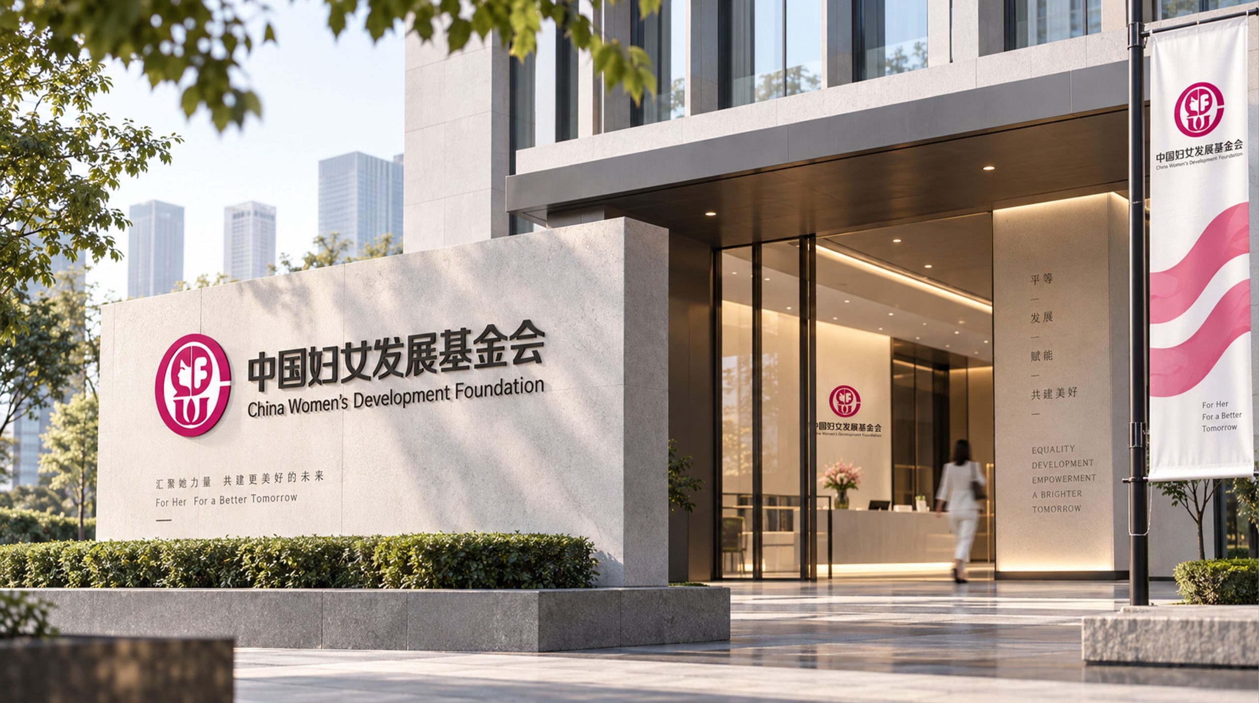
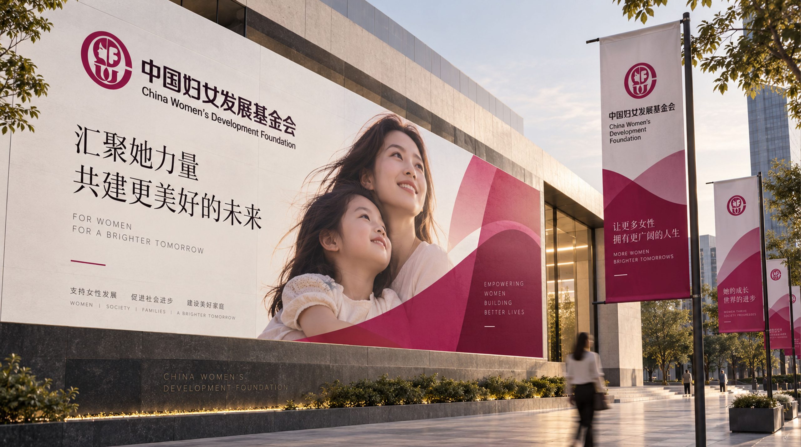
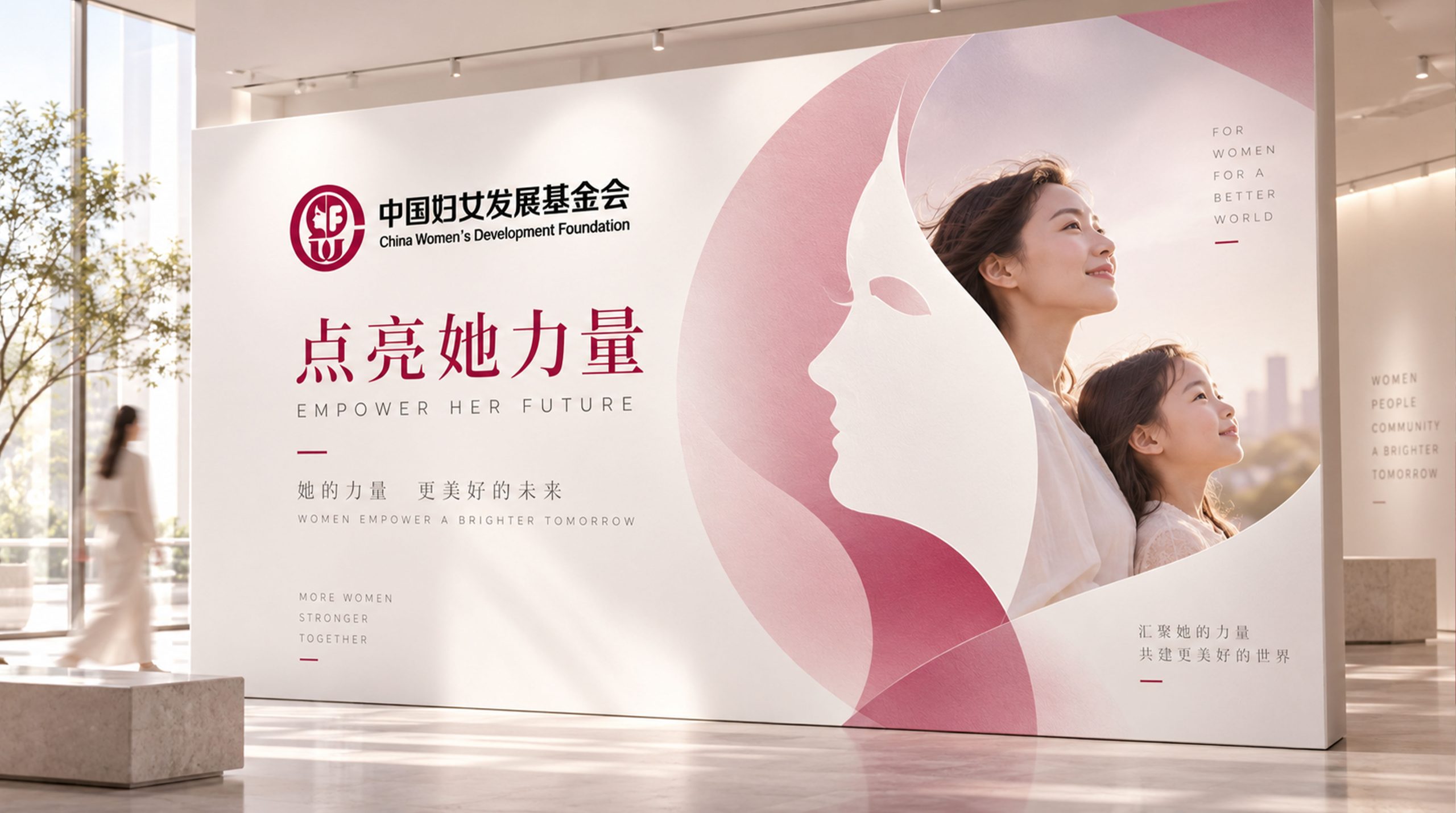
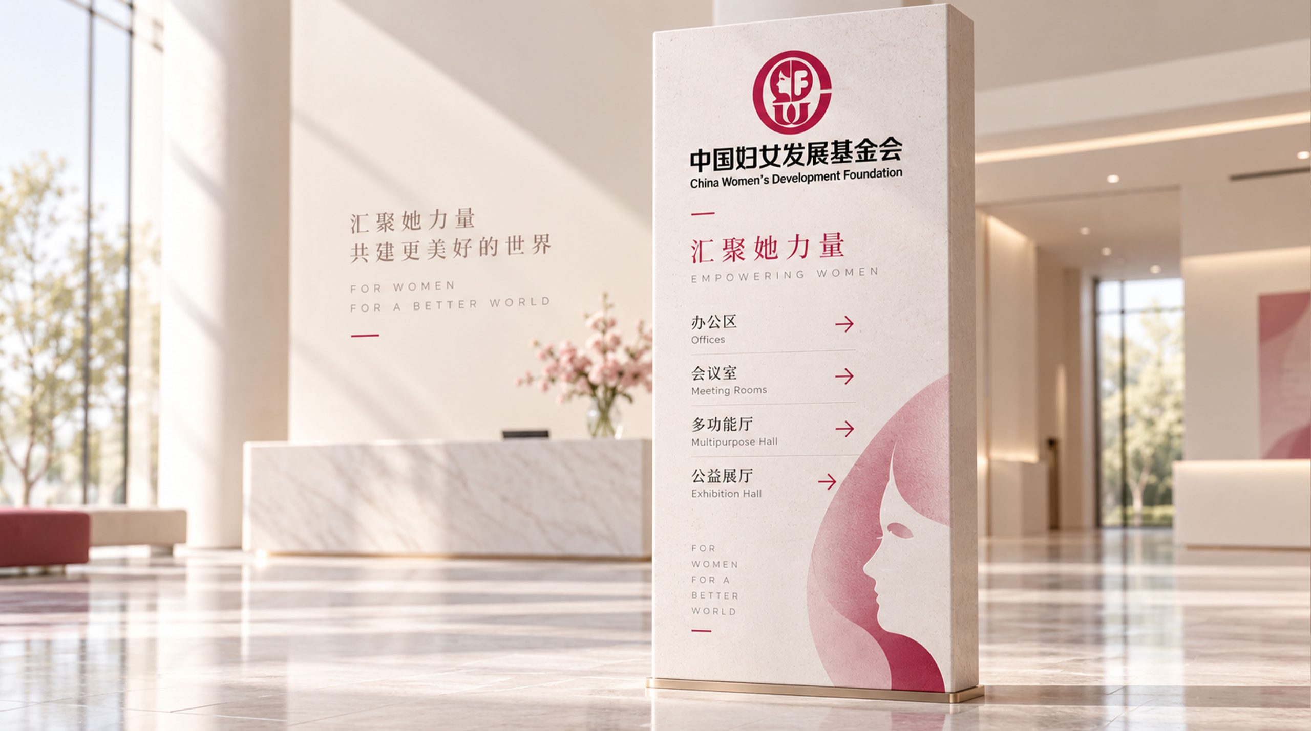
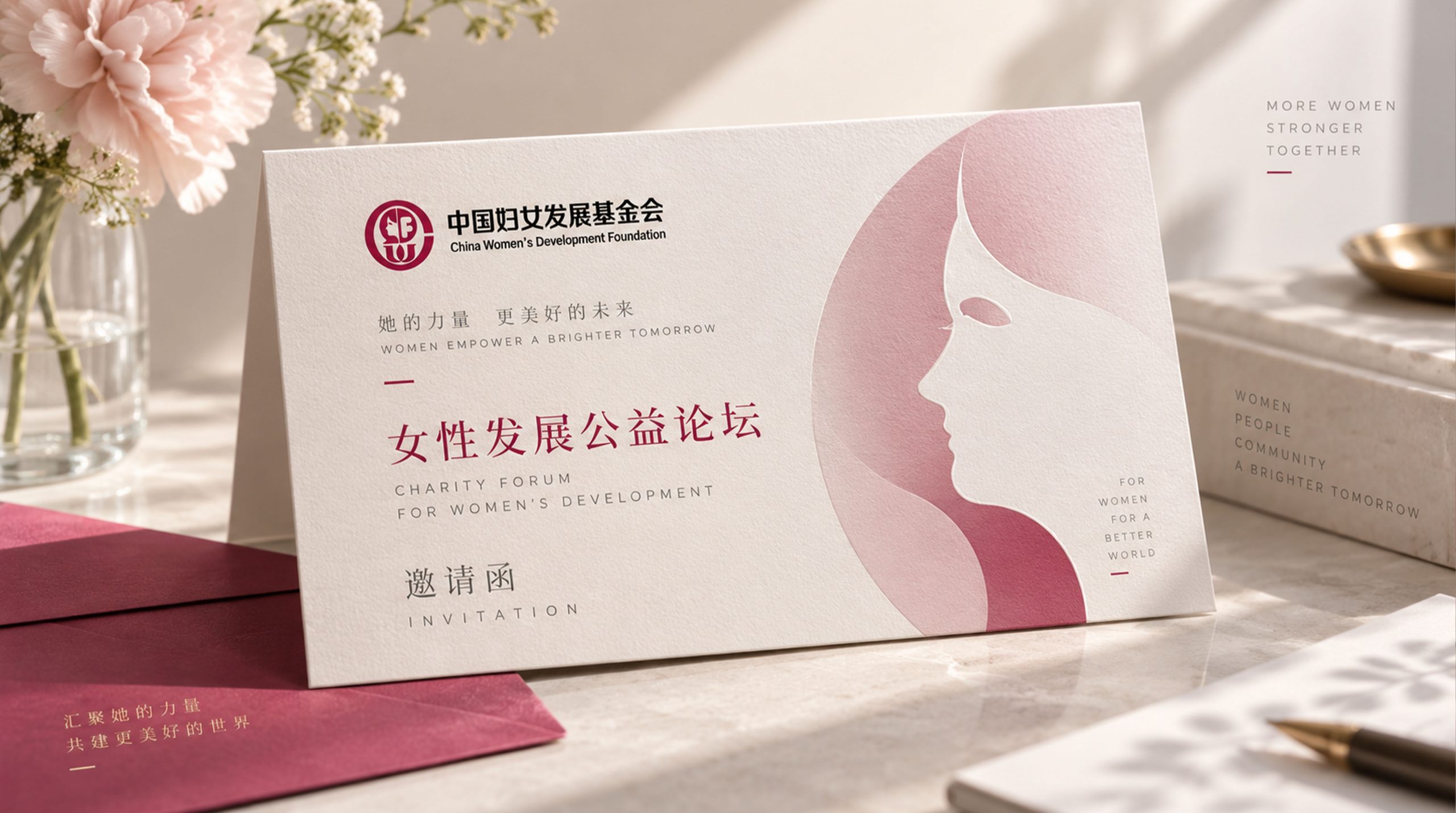
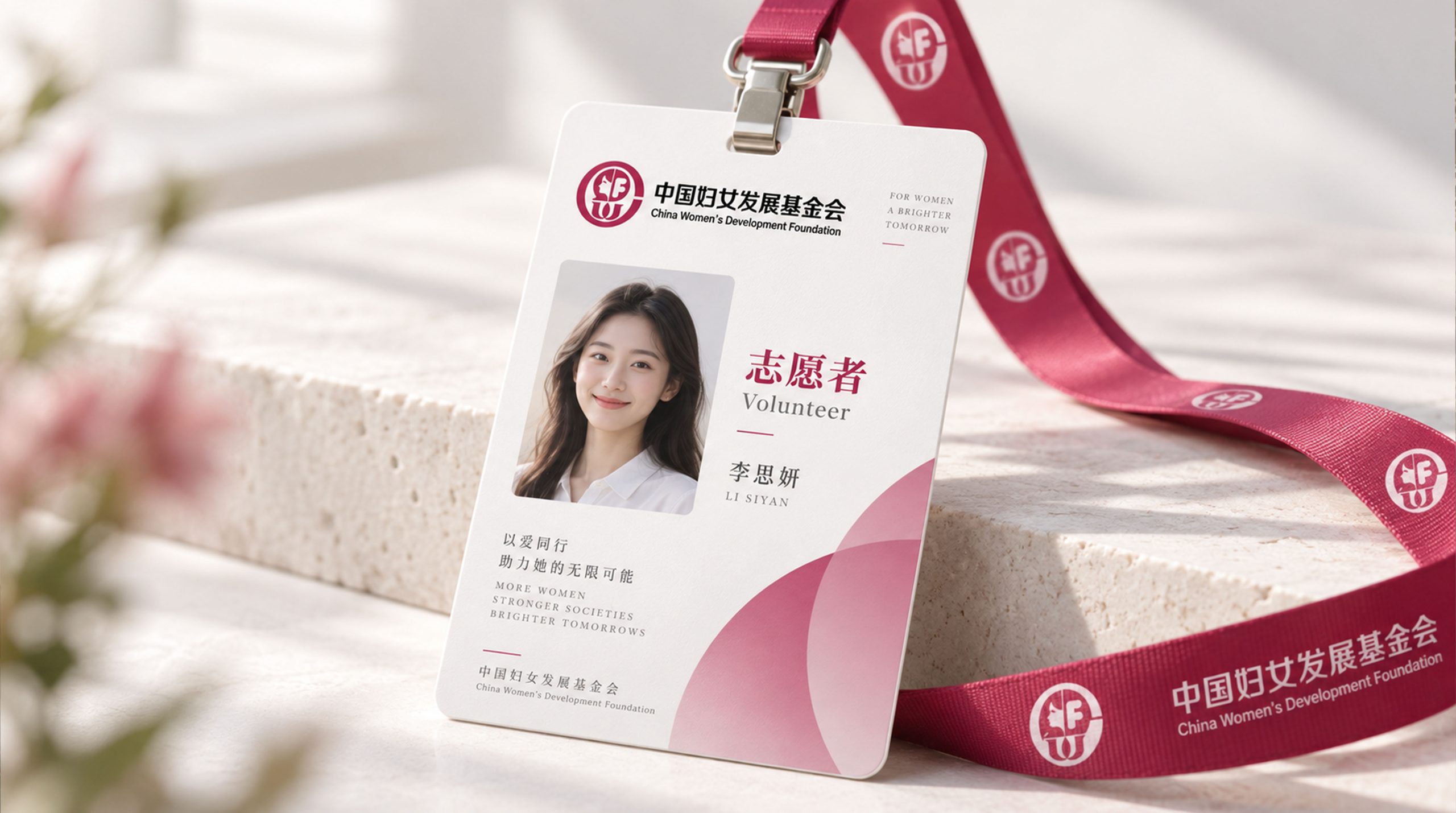
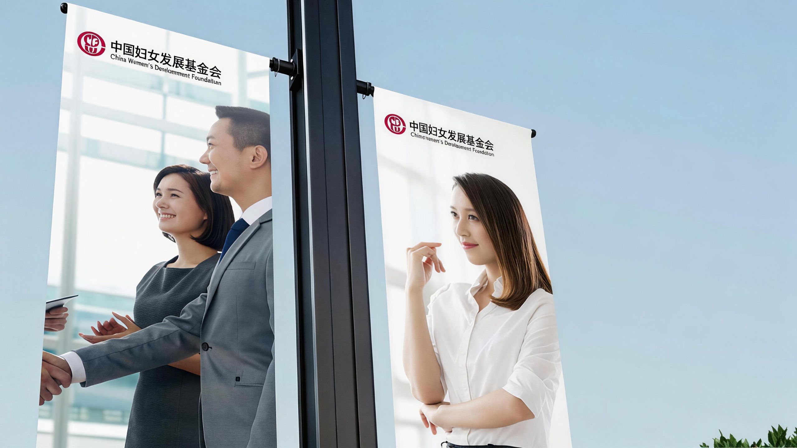
The logo can be widely used in the office space of the foundation's headquarters, nameplates of local offices and public welfare project site logos; public welfare project brochures, annual reports, donation certificates and letters of thanks; official websites, public welfare fundraising platforms, social media images and public welfare content marketing materials; National Women's Development Conference, International Women's Philanthropy Forum, public welfare award ceremonies and government cooperation project images; public welfare peripheral products, volunteer clothing logos, event materials and donated souvenirs. In the main visual of large-scale public welfare activities, the flower graphics can be enlarged into the core visual element of the stage background, and the petals are filled with pictures of the real stories of the women who have benefited, making the brand symbol directly related to the real public welfare results, conveying the moving narrative of "every petal is a woman's development story". In the dynamic visual, petals slowly gather from all directions like palms and bloom one by one around the central point, just like the loving power from all walks of life gathered on the foundation's public welfare platform to jointly support a bright future for the development of Chinese women.
brand meaning
The logo contains three core images: Women's Power - the blooming of flowers conveys Chinese women's self-confidence, self-reliance and self-improvement, as well as the soft and tenacious life force; Caring Hands - the image of palm-shaped petals holding up conveys the foundation's public welfare mission of gathering social love and protecting women's rights; Empowered Development Growth) - the blooming structure from stamens to petals conveys the foundation's core philosophy of promoting the all-round development of women through education, health, entrepreneurship and other diverse paths. The overall design conveys the China Women's Development Foundation's brand vision of "caring for women, empowering development, and warming peers".
Improper Usage (Protection Specification)
Do not change the number, arrangement or surrounding angle of the petals; do not modify the shape of the center point or the proportional relationship with the petals; do not change the hue or brightness of the main color of Chinese red; do not add strokes, hard shadows or commercial decorations that are inconsistent with the public welfare style to the logo; do not separate the flowers and wordmarks for separate use; keep the white space ≥ 25% of the graphic height; the minimum display width must not be less than 25mm.
design results
After the release of the logo, the China Women's Development Foundation's brand unity and public awareness in the field of national women's charity and social development have significantly improved. "Flower of Mother's Love", with its unique visual language that combines the soft power of women and the warm feelings of charity, has become the core identification symbol of the foundation's brand system. It is widely used in charity projects, social communication and international exchanges, showing the brand vision of "caring for women, empowering development, and warming peers".