










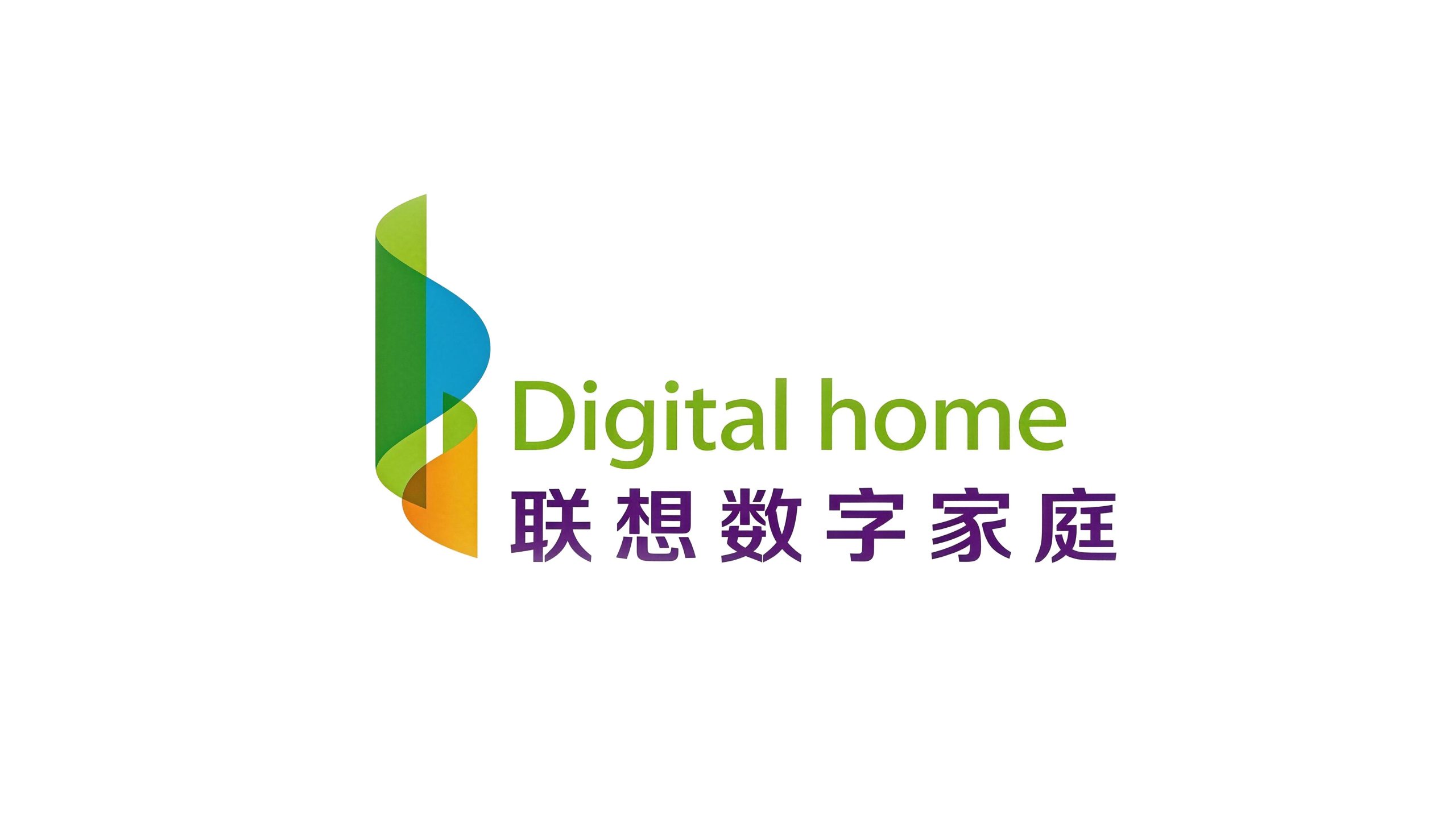
Lenovo Digital Home is Lenovo Group's strategic brand for home digital life scenarios. It is committed to building a full-scenario, fully-connected digital life experience for Chinese families with smart terminals, digital content and interconnection technologies.
The brand adheres to the core concept of "technology makes homes better" and extends Lenovo's technological accumulation in the field of PCs and smart devices to every corner of family life, opening up a new way of family life in the digital era. Qingmei Future was commissioned to lead the brand identity design.
The design goal of the brand logo is to demonstrate the innovative positioning of Lenovo Digital Home as a home digital life brand through the visual language of technological vitality, home warmth and digital future, and to convey the brand emotion of "the warm connection between technology and family".
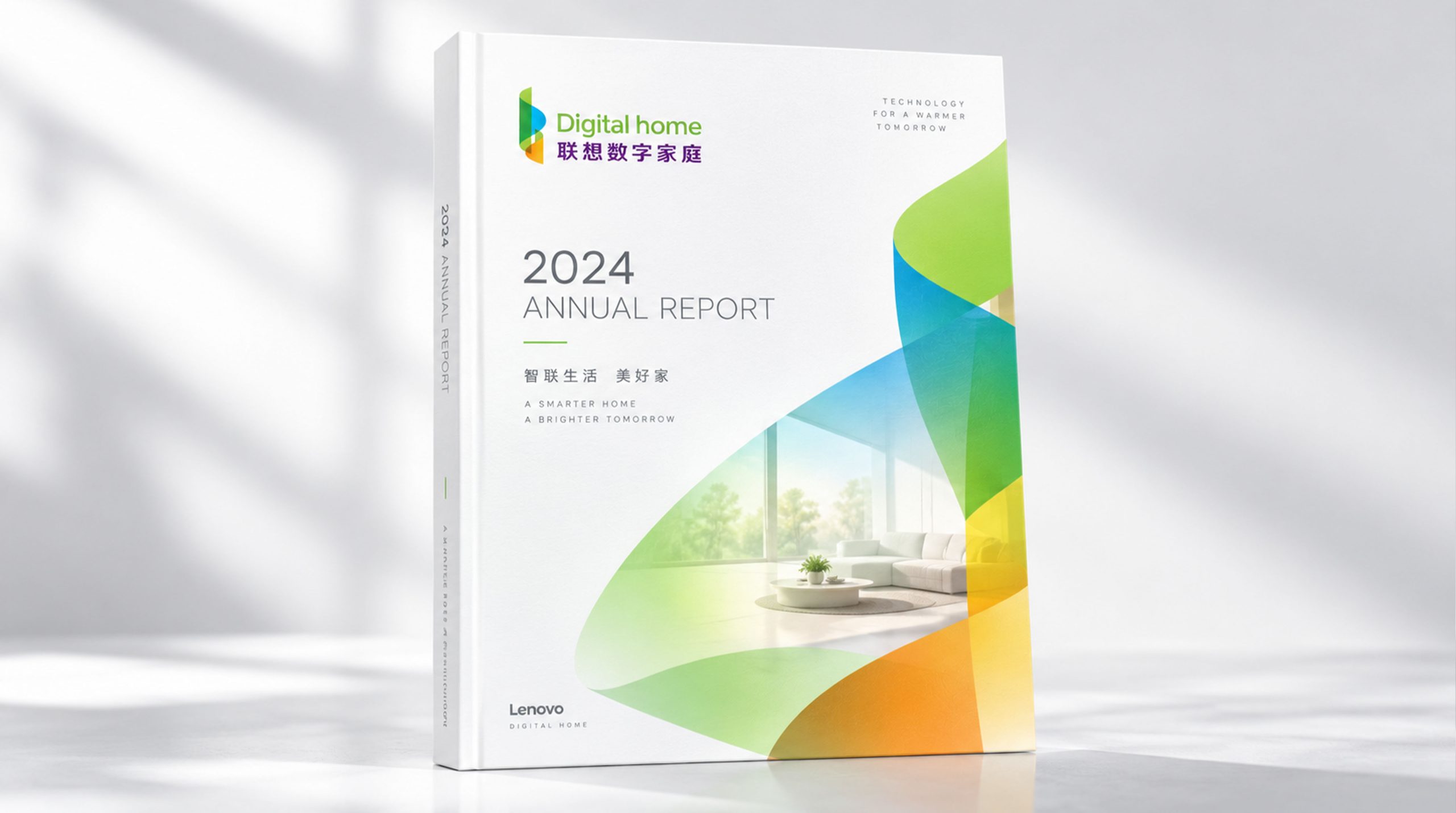
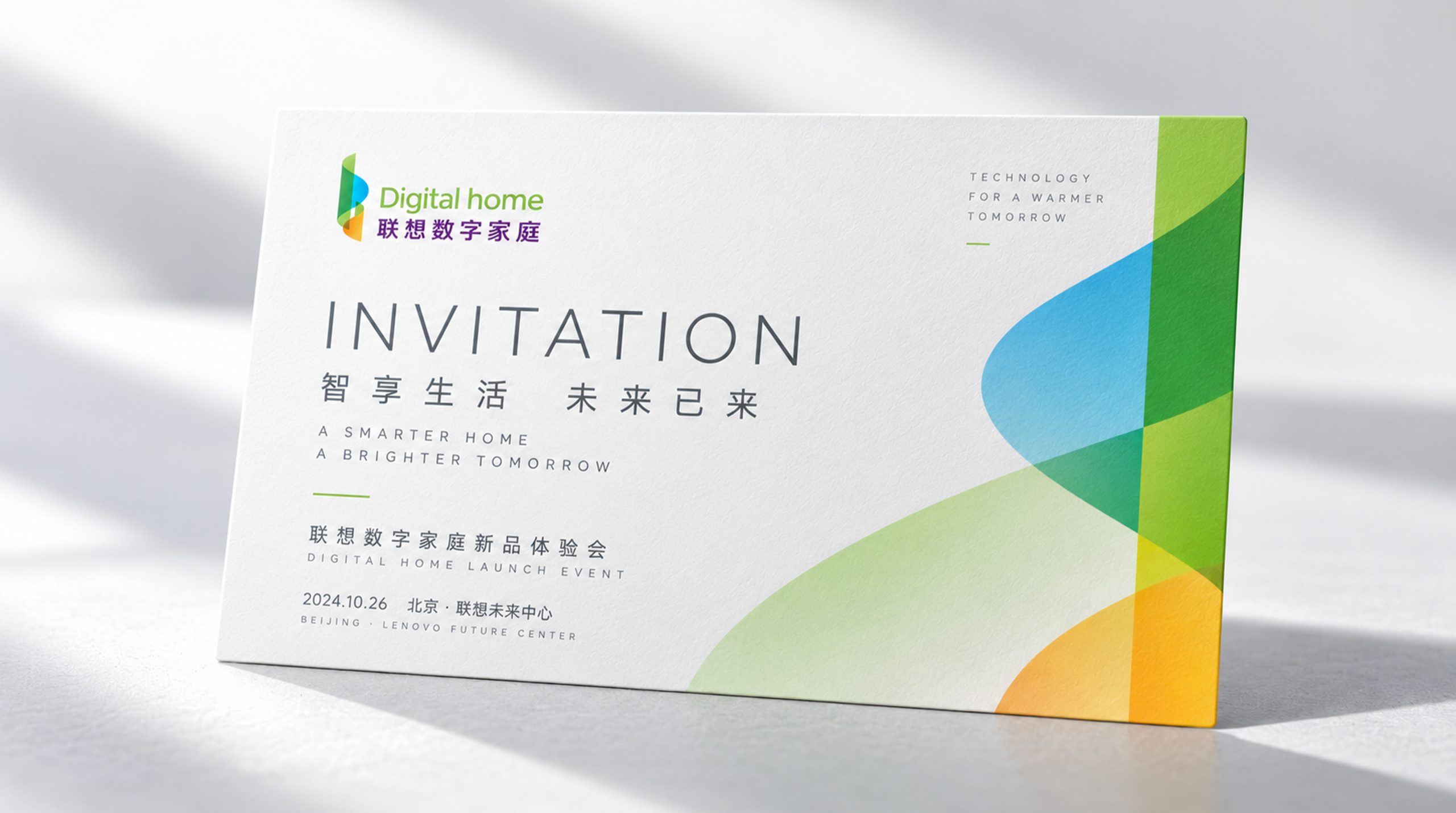
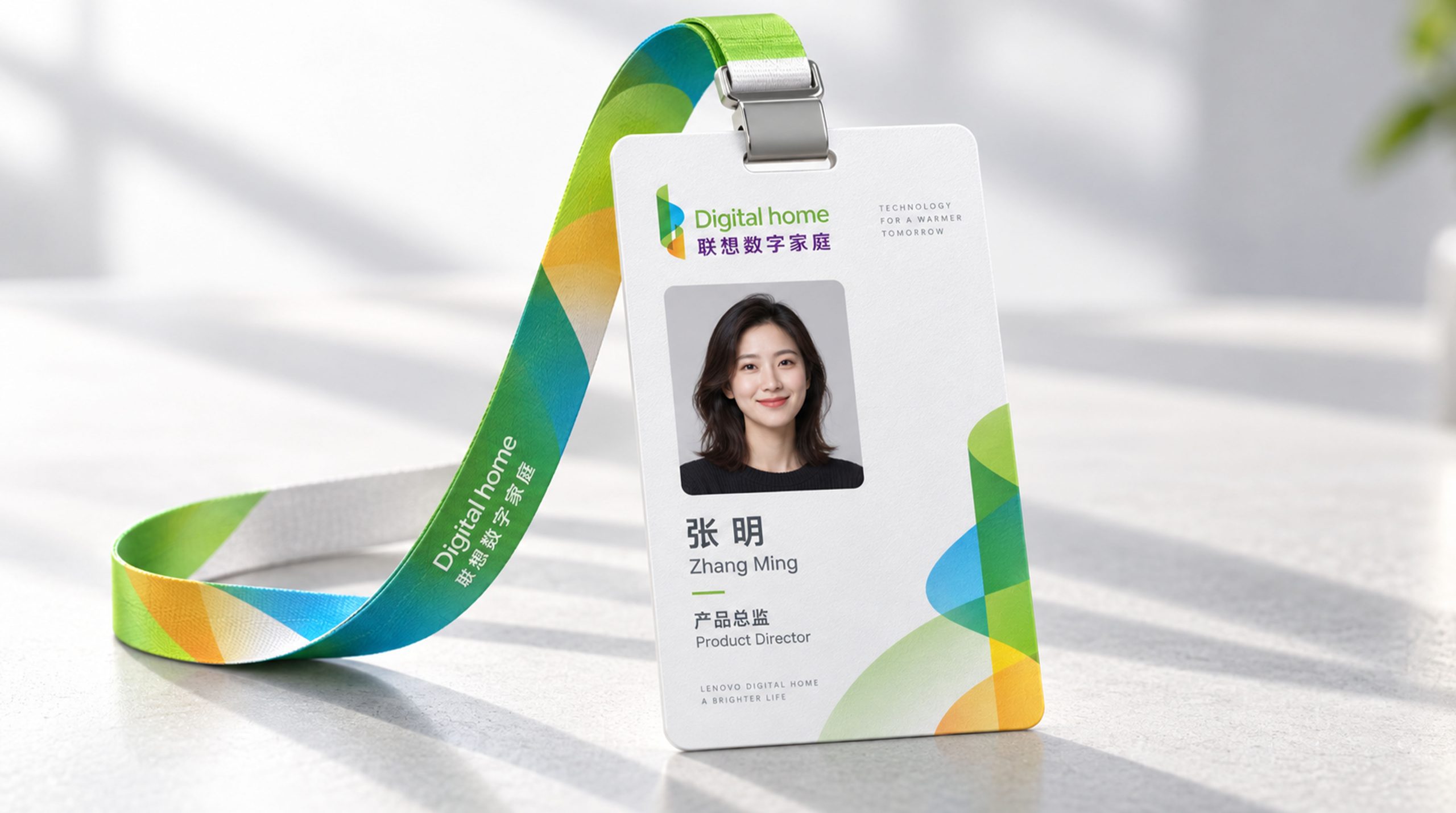
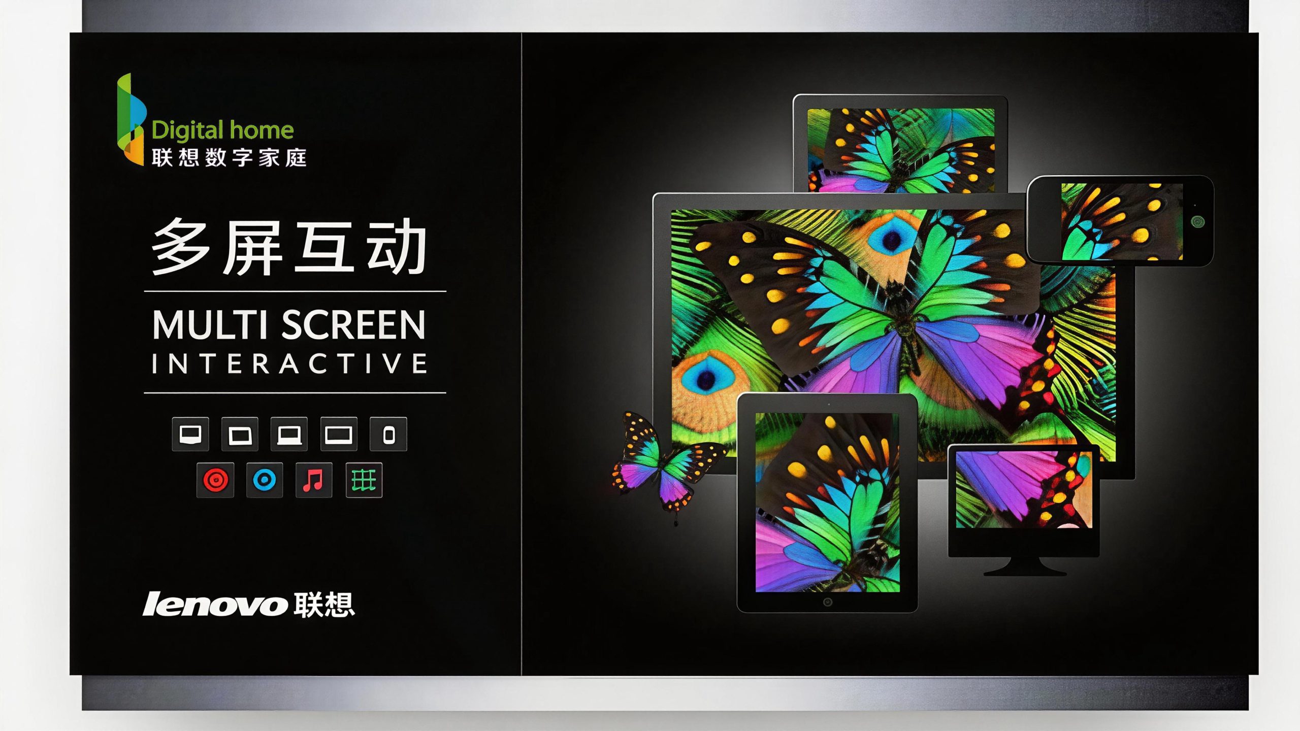
Design concept and graphic language
The logo takes "Digital Gateway" as its core concept and uses an abstract letter "d" made of multi-colored curved surfaces as its main graphic shape. It is shaped like a slightly open door, which means "open the entrance to the digital home and step into the future of smart life." The letter "d" is not only the abbreviation of "Digital", but also symbolizes the image of "door" - technology opens a door to the digital world for families. The overall graphic is composed of smooth S-shaped curves. The lines are soft, full and rhythmic. It abandons the tough edges and corners commonly seen in technology brands and uses friendly and warm curve language to convey the warmth of life that a family brand should have. The overall design reflects the dual attributes of Lenovo Digital Home between technological innovation and family care.
The graphic is composed of three overlapping curved color blocks, which unfold from top to bottom, like flower petals blooming or a door gently opening. The left curved surface is dominated by green, symbolizing the healthy concept of vitality, growth and natural life; the central curved surface is presented in sky blue, representing the core attributes of technology, digital and intelligent connection; the lower right curved surface is transitioned in warm orange to convey the warmth, companionship and happiness of the family. The three curved surfaces naturally merge at the intersection and the colors penetrate, forming a rich gradient layer and three-dimensional depth, symbolizing the organic integration of the three elements of digital technology, green life and family warmth in the Lenovo digital home brand. The curvature and turning points of the curved surface have been carefully considered. The overall outline not only maintains the recognizability of the letter "d", but also transcends the graphic category of a simple letter and becomes an independent brand symbol. The overall composition uses a smooth and organic curved surface order to build a "digital door", conveying the brand's technological vitality and family warmth.
Font composition and color system
The English "Digital home" uses a modern round sans-serif font with rounded and even strokes and an open and stretched font. The first letter of "Digital" is capitalized and the rest is lowercase. "Home" is all lowercase. It uses a relaxed and natural arrangement to eliminate the sense of distance between scientific and technological terms and convey the affinity and life-oriented temperament of the digital home brand. The Chinese "Lenovo Digital Home" is presented in modern boldface with straight and thick strokes and a balanced and robust structure. It maintains consistency with Lenovo Group's brand font system and ensures visual harmony when Chinese and English are mixed. Chinese and English are arranged up and down, aligned to the left, and the hierarchy is clear, ensuring high brand recognition in product packaging, terminal display and digital communication.
The main color, vibrant green #7AB800, is the main color of the English logo and the green surface of the graphics, representing the vitality of digital life and the concept of green technology. The freshness and vitality of green give technology brands a natural and friendly sense of life; digital blue #00A0E8 is used on the central surface of graphics, representing digital technology, smart connections and the vast space of the information world. The clarity and rationality of blue convey the professional background of technology brands; family orange #F5A623 It is used on the lower right curved surface of the graphic to symbolize the warmth, companionship and happy time of the family. The addition of warm orange breaks the cold tone convention of technology brands and injects the warmth of life into the logo. Brand purple #5B2D8E is used in the Chinese character logo, forming a connection with the Lenovo Group’s brand color system, conveying the brand’s matrix endorsement and collective sense of belonging. The overall color system uses the four colors of green, blue, orange and purple to coordinate, reflecting the brand proposition of "technology has warmth, digital has color, and family has future". It uses colorful but not cluttered color matching to convey the Lenovo Digital Home's brand emotion of "integrating technology into life".
Application extension and brand significance
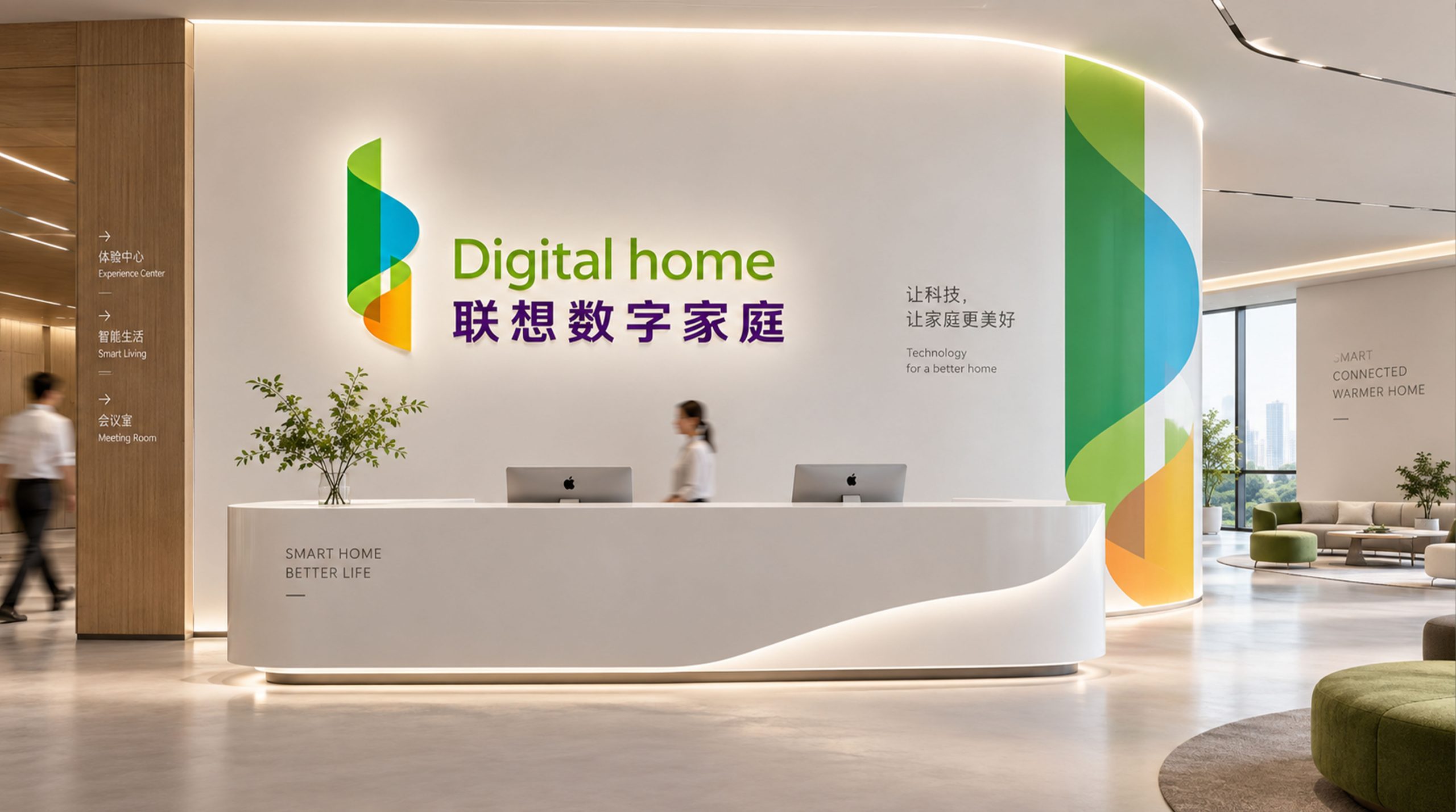
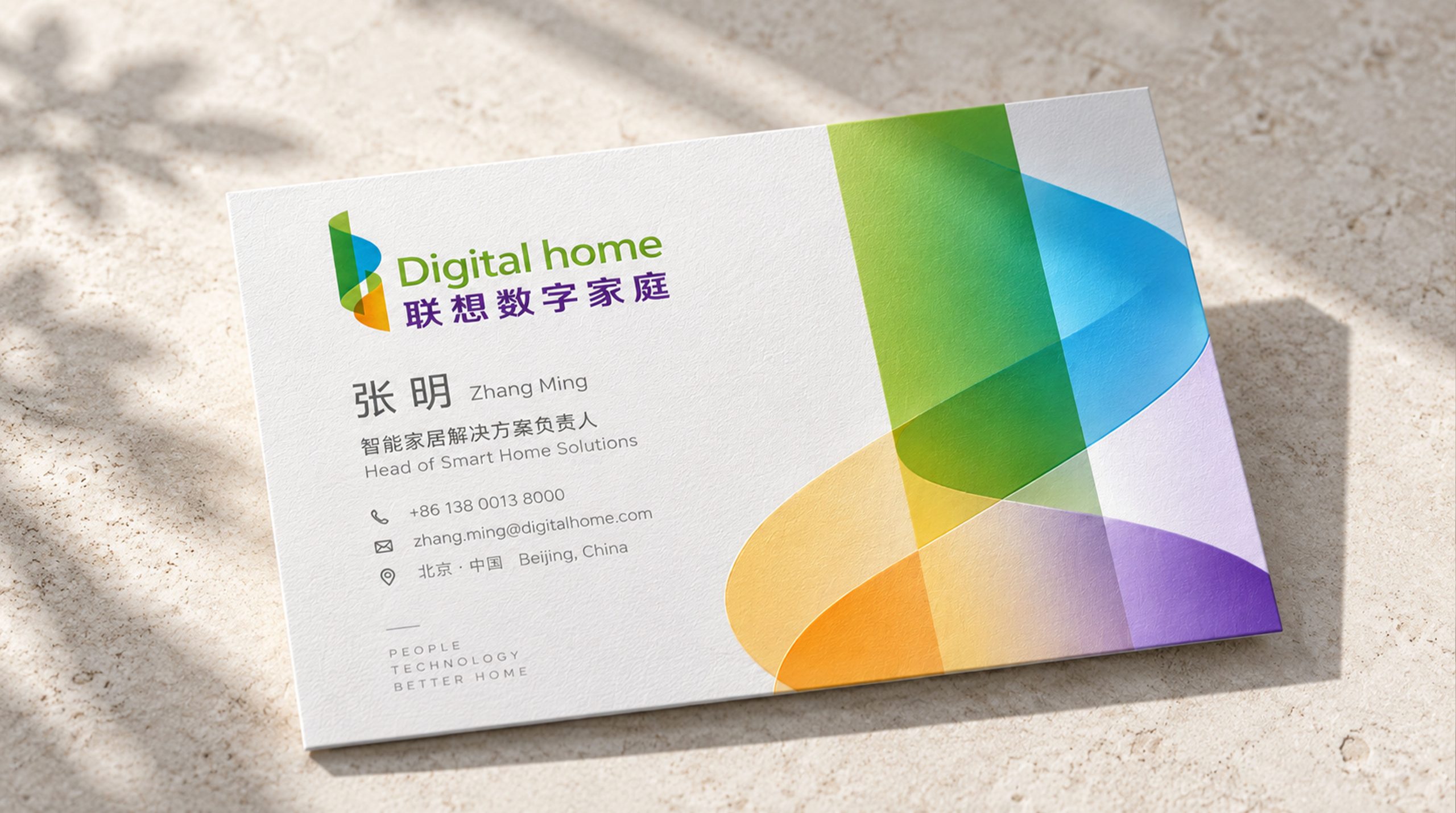
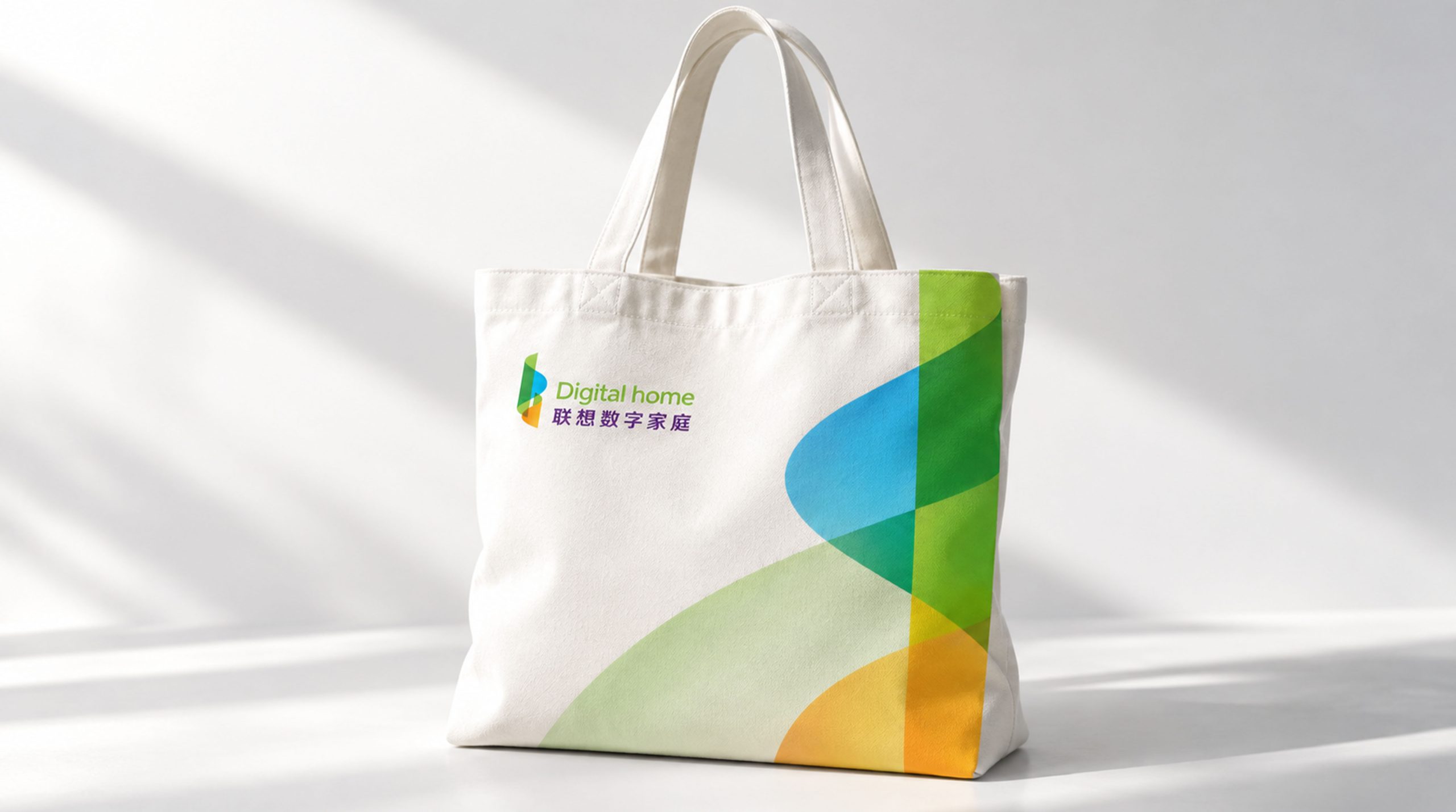
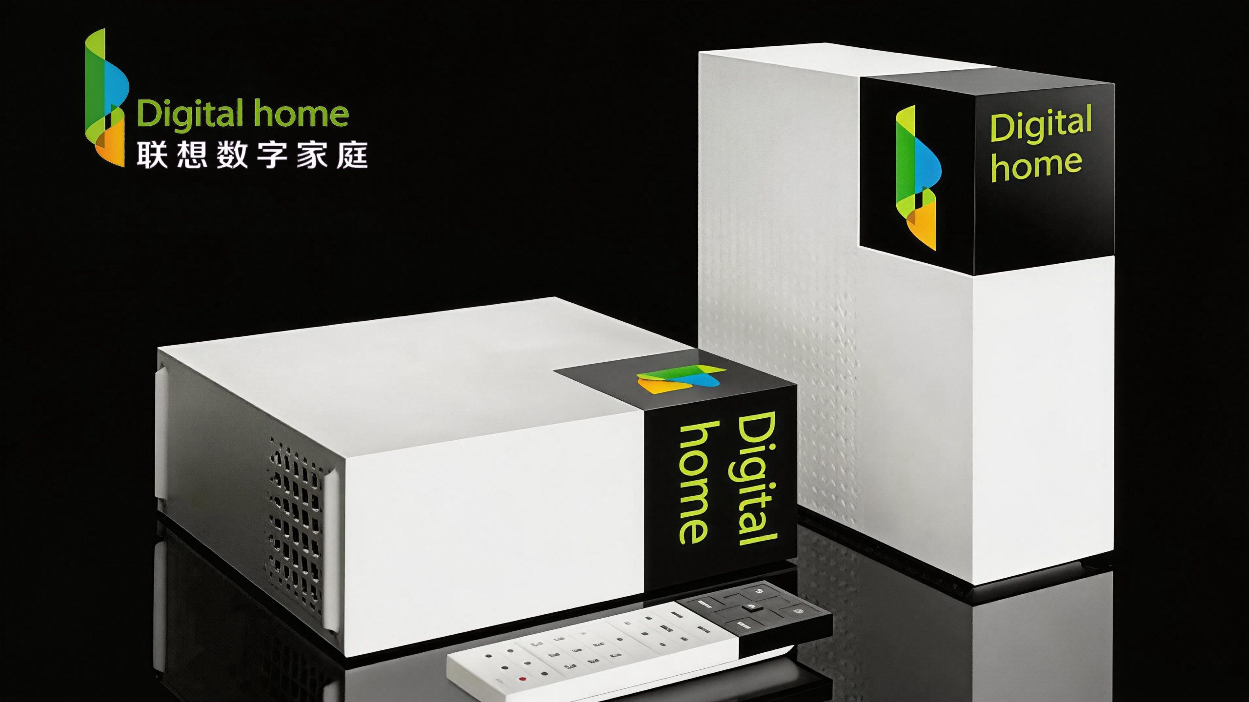
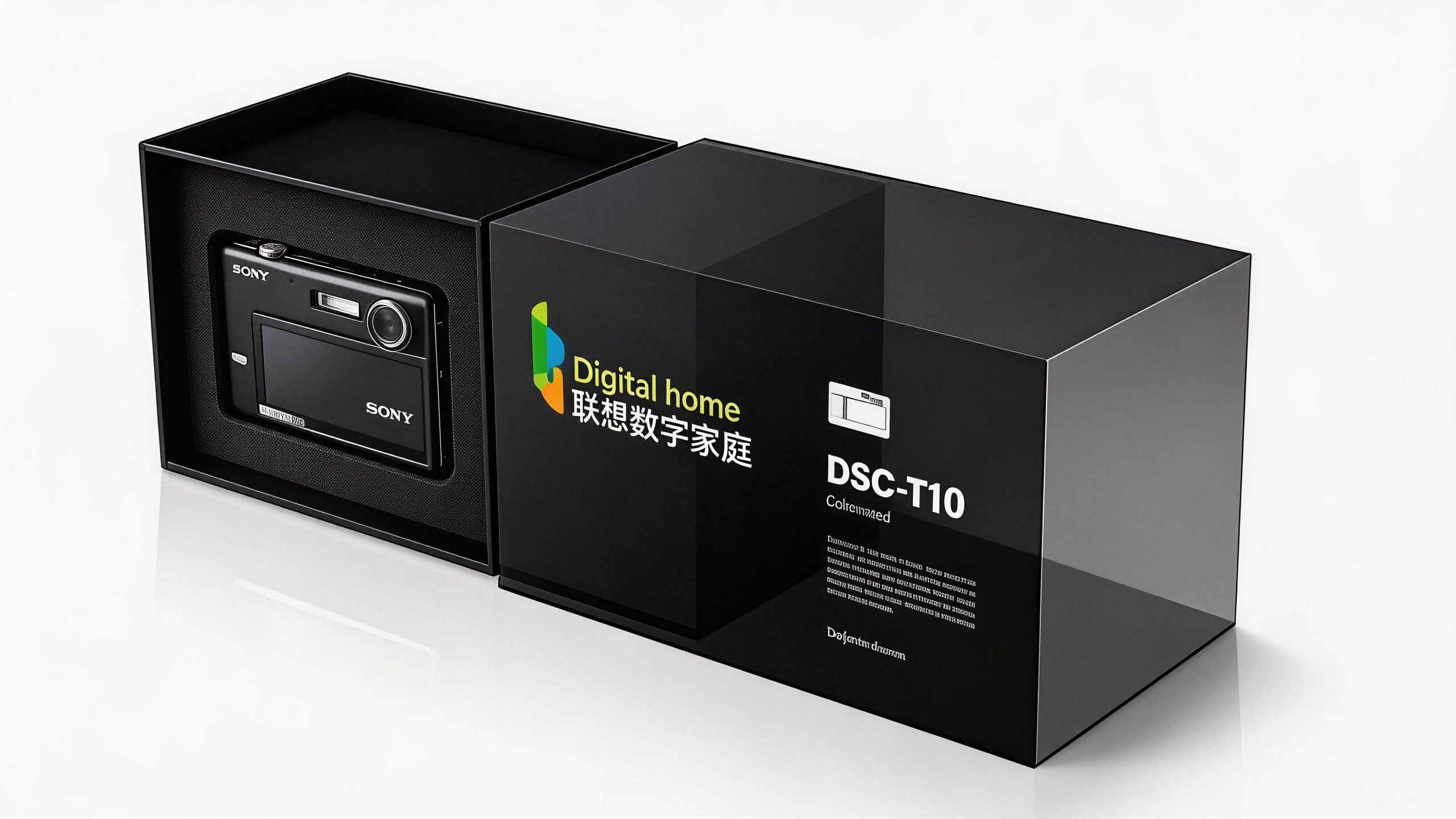
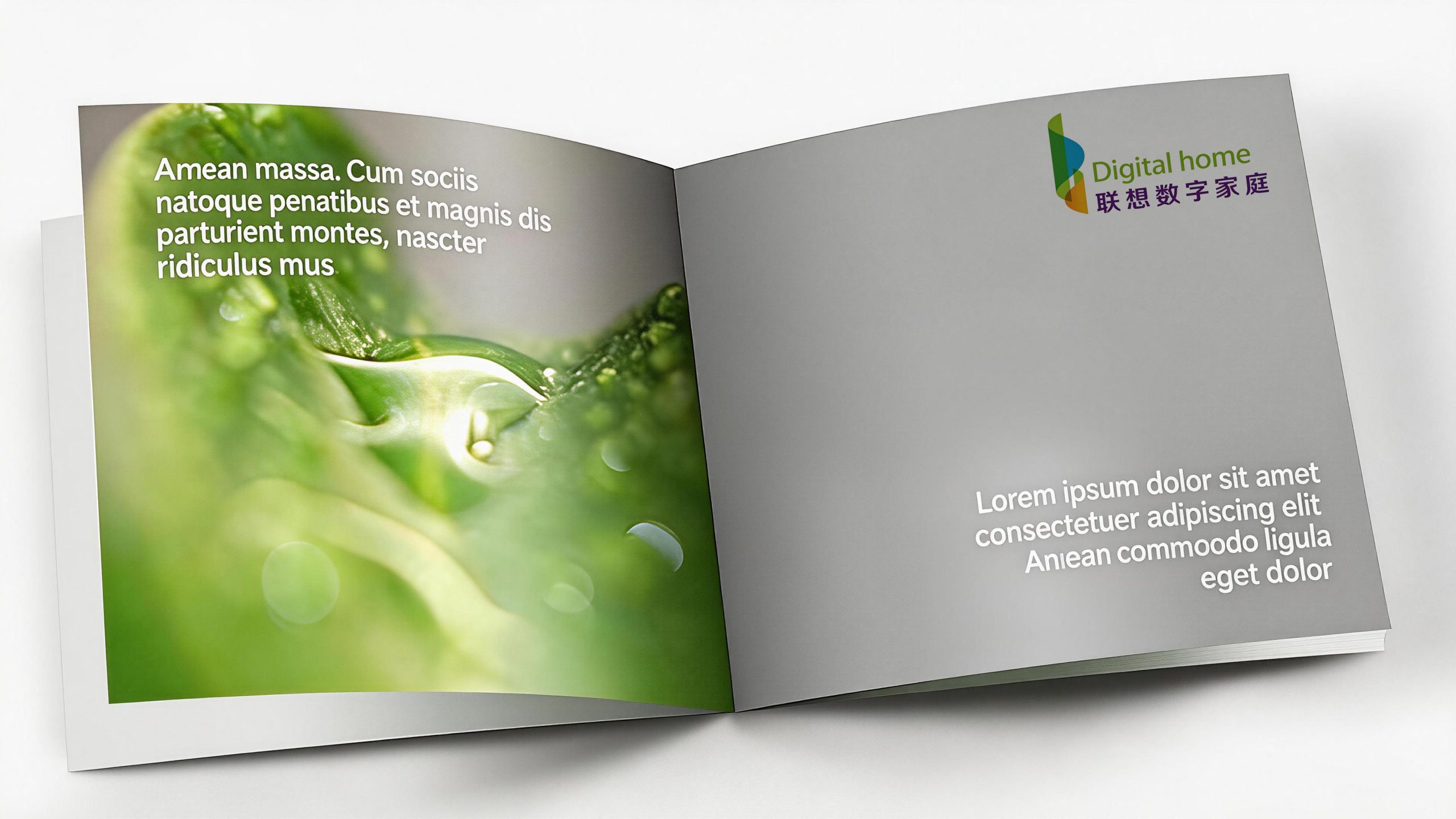
The logo has strong system scalability and can be widely used in the packaging, startup screen and product nameplate of Lenovo's digital home series of smart terminal products; the door, display, interactive screen and space guidance system of the digital home experience store; the official website, smart home APP interface, social media image and digital marketing materials; international consumer electronics exhibitions such as CES and MWC and Lenovo Group press conference images; brand brochures, joint promotions with partners and channel terminal materials. In the dynamic vision, three curved color blocks can rotate, expand and converge in sequence, just like a digital door slowly opening. The final wordmark emerges from the door, symbolizing the complete journey of a family from traditional life to the digital future. The arcs and gradient colors of the curved color blocks can be extended into visual parent elements for use in product UI interfaces, packaging pattern systems, environmental decoration and brand animations.
The logo contains the three core images of Lenovo's digital home brand: Digital Gateway - the "d"-shaped door symbolizes the entrance and infinite possibilities of digital life opened up by technology for families; Tech Vitality - the flow of colorful curved surfaces conveys the innovation vitality and development momentum of digital technology; Home Warmth - the warm orange tones and soft curves convey the technology brand's warm care and humanistic emotion for family life. The overall design conveys Lenovo's digital home brand vision of "opening the future of the home with technology".
Improper Usage (Protection Specification)
Do not change the superimposition order, radian or relative position of the three curved surface color blocks; do not modify the hue or gradient direction of each surface; do not replace the "d" shape graphics with complete letters or other geometric shapes; do not add strokes, shadows, outer glow or texture effects to the logo; do not change the color designation or font style of the Chinese and English logos; do not rotate, mirror or extract part of the surface separately for use as a whole; keep the white space around the logo not less than 25% of the height of the graphic; the minimum display width must not be less than 30mm.
design results
After the release of the logo, the brand recognition and emotional affinity of Lenovo Digital Home in the field of home smart terminals and digital life have been significantly improved. "Colorful Digital Door", with its unique visual language that combines technological vitality and family warmth, has become the core identification symbol of Lenovo's digital home brand system. It is widely used in product terminals, experience stores, international exhibitions and digital communications, demonstrating the brand vision of "technology makes the home better".