










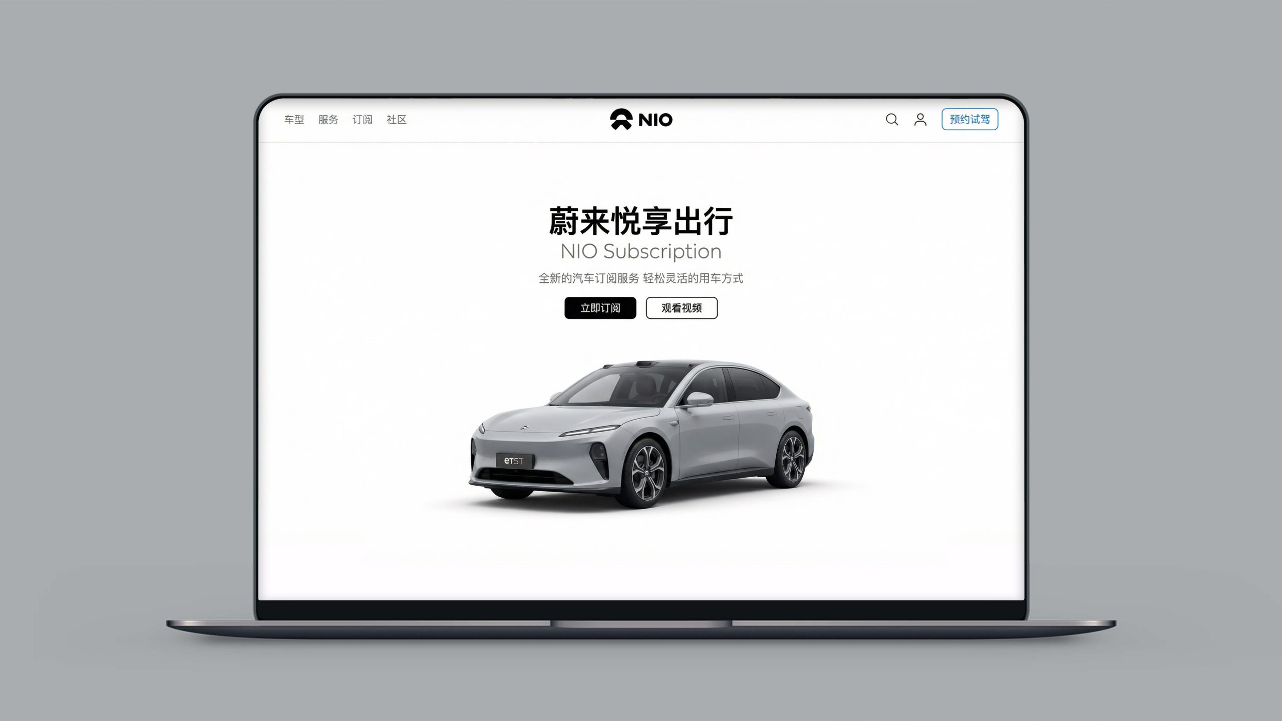
This project is to design a web-based and multi-terminal visual system for NIO, aiming to jointly build the brand's temperament with the technological strength of high-end smart electric vehicles and the community spirit of user companies.
The design goal is to present the brand characteristics of the brand "Blue Sky Coming" through systematic visual structure and brand narrative.
The overall theme is "Smart Electric Flagship·User Enterprise Vision", integrating the foresight of technology and the warmth of the community, demonstrating the product layout and user value proposition of NIO as a global high-end smart electric vehicle brand.
design challenge
NIO is not only the leader in high-end smart electric vehicles, but also the pioneer of the "user enterprise" concept. The design needs to achieve the following balance in the visual language: sense of technology × sense of temperature: it should not only reflect the cutting-edge innovation of smart cockpit and power swap technology, but also convey the belonging and connection of the user community; sense of high-end × sense of affinity: it should not only maintain the quality and tone of the luxury brand, but also show the openness and interaction of user enterprises; sense of the future × sense of the present: it should not only continue the vision expression of "Blue Sky Coming", but also integrate the experiential resonance of real car use scenes. The core challenge is - how to combine the foresight of technology and the warmth of community into the design, so that the brand has both high-end quality and user belonging.
Strategy and philosophy
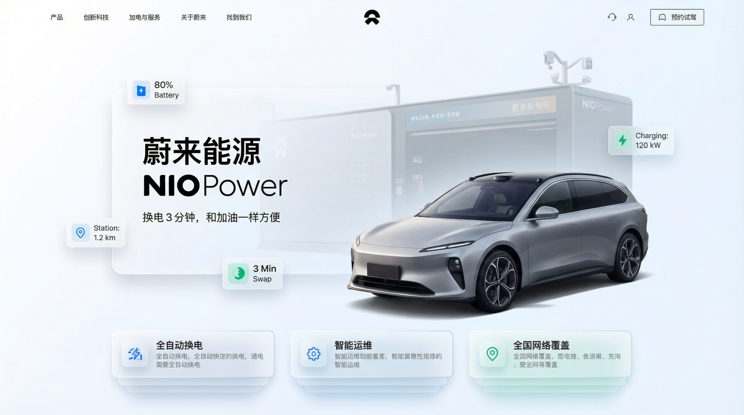
The project takes "Foresight of Technology and Belonging to the Community" as its core design concept. Visual philosophy: Taking the dual-line logic of "intelligence and users coexist" as the visual basis, reflecting product innovation and the warmth of the community; Structural logic: using a high-end car brand layout system to hierarchically organize brand values to form a multi-dimensional structure of "car models - technology - services - community"; color system: using Weilai blue + starry sky black + metallic silver as the main colors, supplemented by large car models and skyline logos, symbolizing forward-looking, technology and trust; graphic language: using car model renderings, battery swap stations, NIO House integrates with user activities to establish a "visual system under brand order"; interactive expression: introducing appointment test drive, vehicle configuration and community entrance, allowing the platform to combine brand display and user connection. Core concept: Use visual technology to present product strength, and use community entrance to continue user belonging.
Design presentation
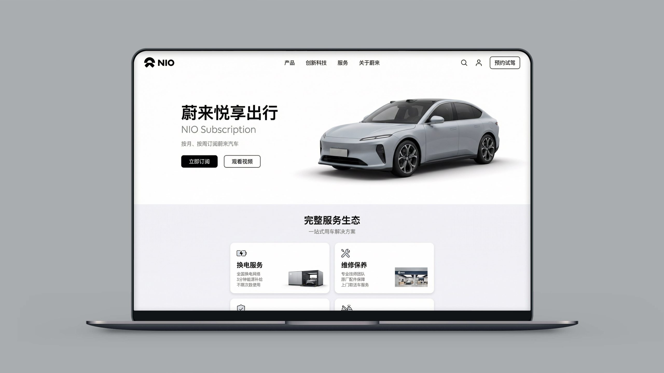
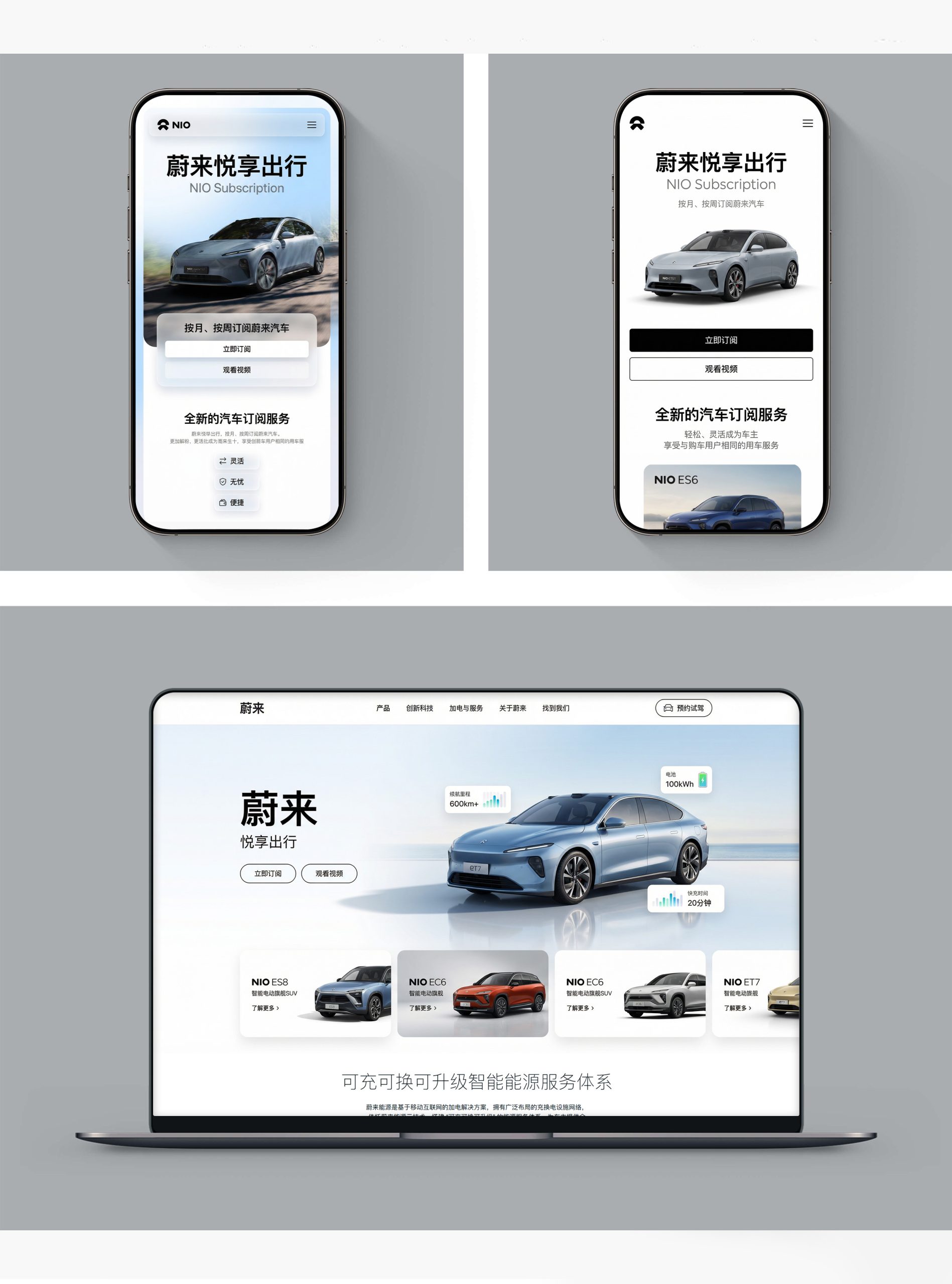
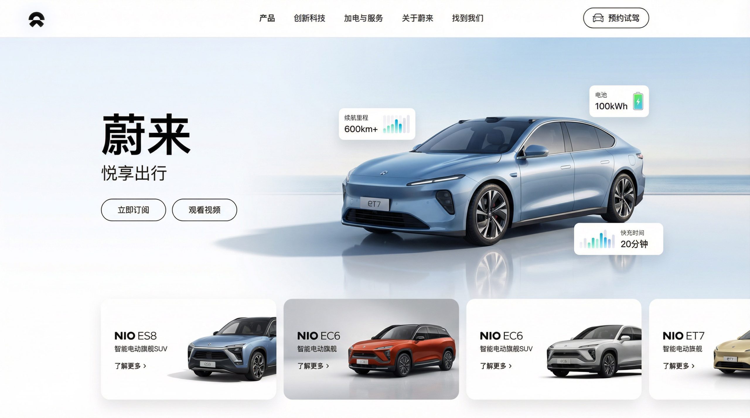
Home page design: The main color is a deep black background/pure white background and large pictures of car models, reflecting high-end and product focus; the top part uses the latest models (ET9/ES8/ET7/EC7, etc.) and core selling points as the visual focus, supplemented by price information and appointment test drive entrance; the navigation adopts functional categories such as car models, NIO Discovery, Energy, NIO Life, NIO App, etc. to convey a full ecological service pattern. Content logic: 1. Flagship model matrix; 2. NIO technology (power swapping, smart driving, chips); 3. Energy network (power swapping stations, charging piles, mobile charging vehicles); 4. NIO House/Space; 5. User community; 6. Appointment for test drive.
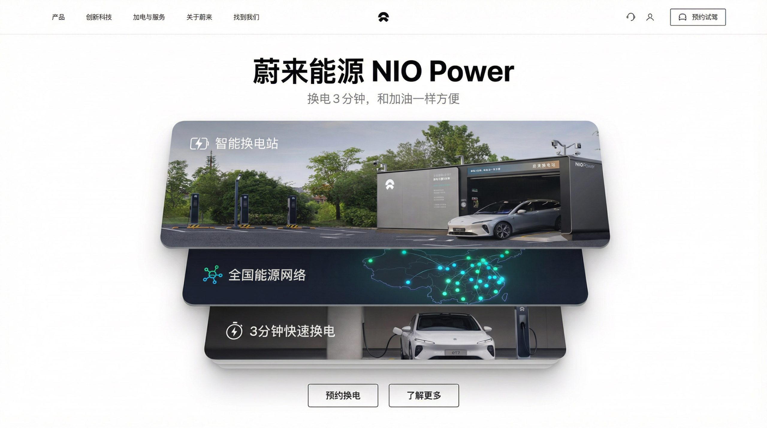
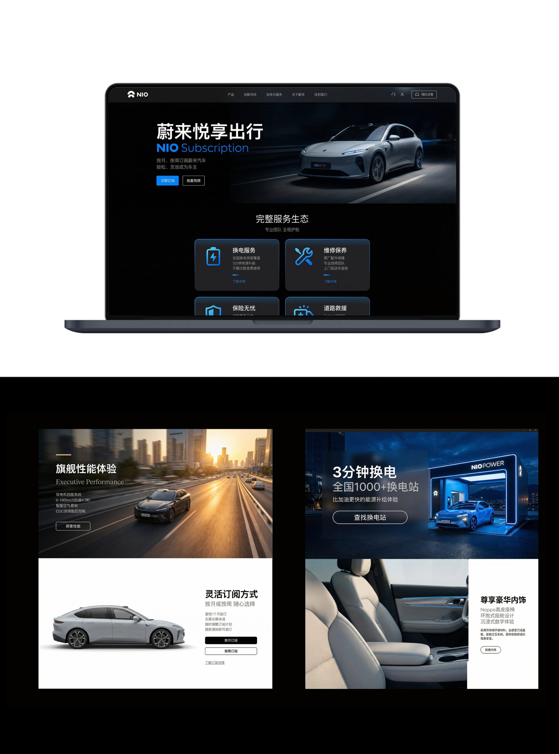
Multi-terminal design: Responsive structure: The brand official website, model details and NIO App are seamlessly connected, forming a rhythm of "understanding × experience × belonging"; product design: presenting product details with 360° model display, interior panorama, configuration comparison and BaaS battery rental plan; image language: using multi-style content presentation of vehicle model renderings, battery swap station scenes, NIO House space and user activities to convey technology and warmth; service page: introducing battery swap network, one-click power-up, lifetime free battery swap and NIO Service expresses full life cycle service value. Technology and experience: Online configuration + test drive appointment + order tracking + community interaction are adopted; the multi-terminal account system is unified to ensure a seamless user experience across devices. The overall style embodies "the foresight of technology × the warmth of the community × the comprehensive service".
Achievements and Impact
As the brand's official visual system, this design is widely used in the brand's official website, NIO Day releases and user communities. Through the integration of product logic × community narrative × brand order, the design successfully created the visual image of NIO that is "both technologically forward-looking and user-friendly". The project is considered by the brand owner to be "one of the automotive brand visual systems with the most brand height and user belonging", and has become the core blueprint for NIO's multi-terminal experience design.