










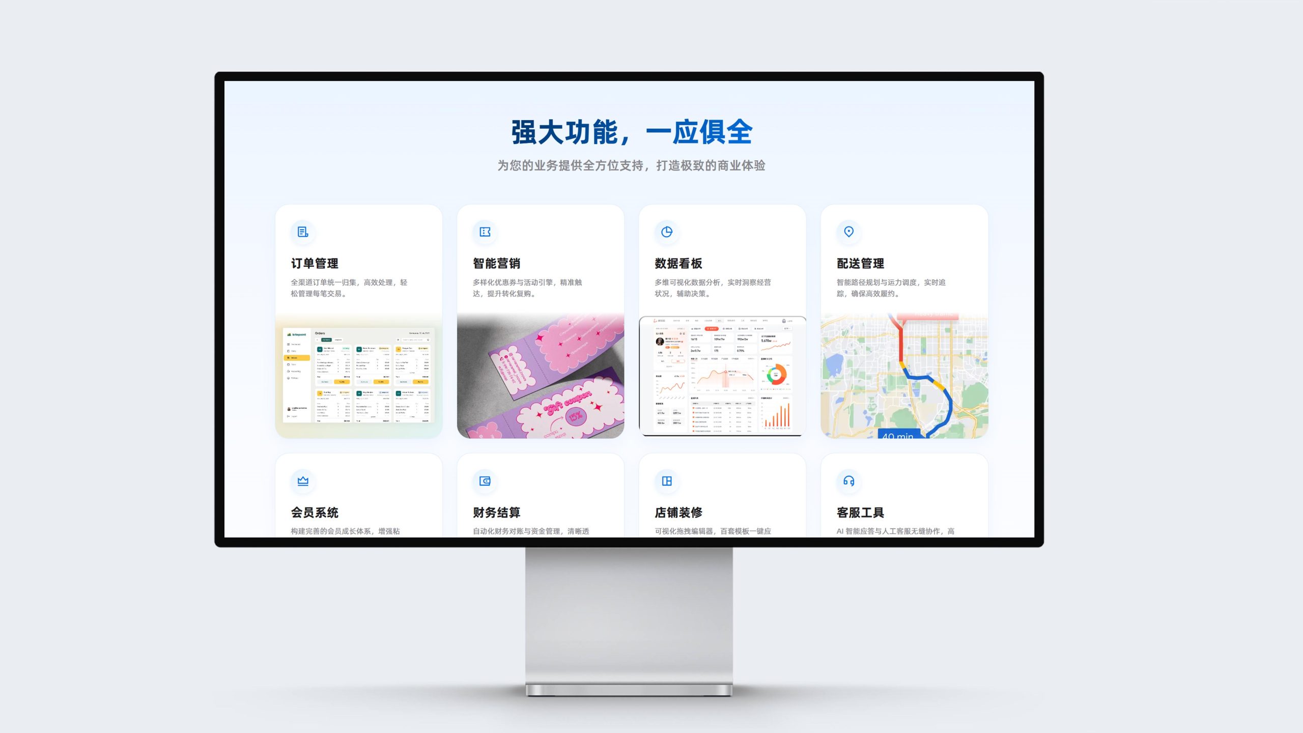
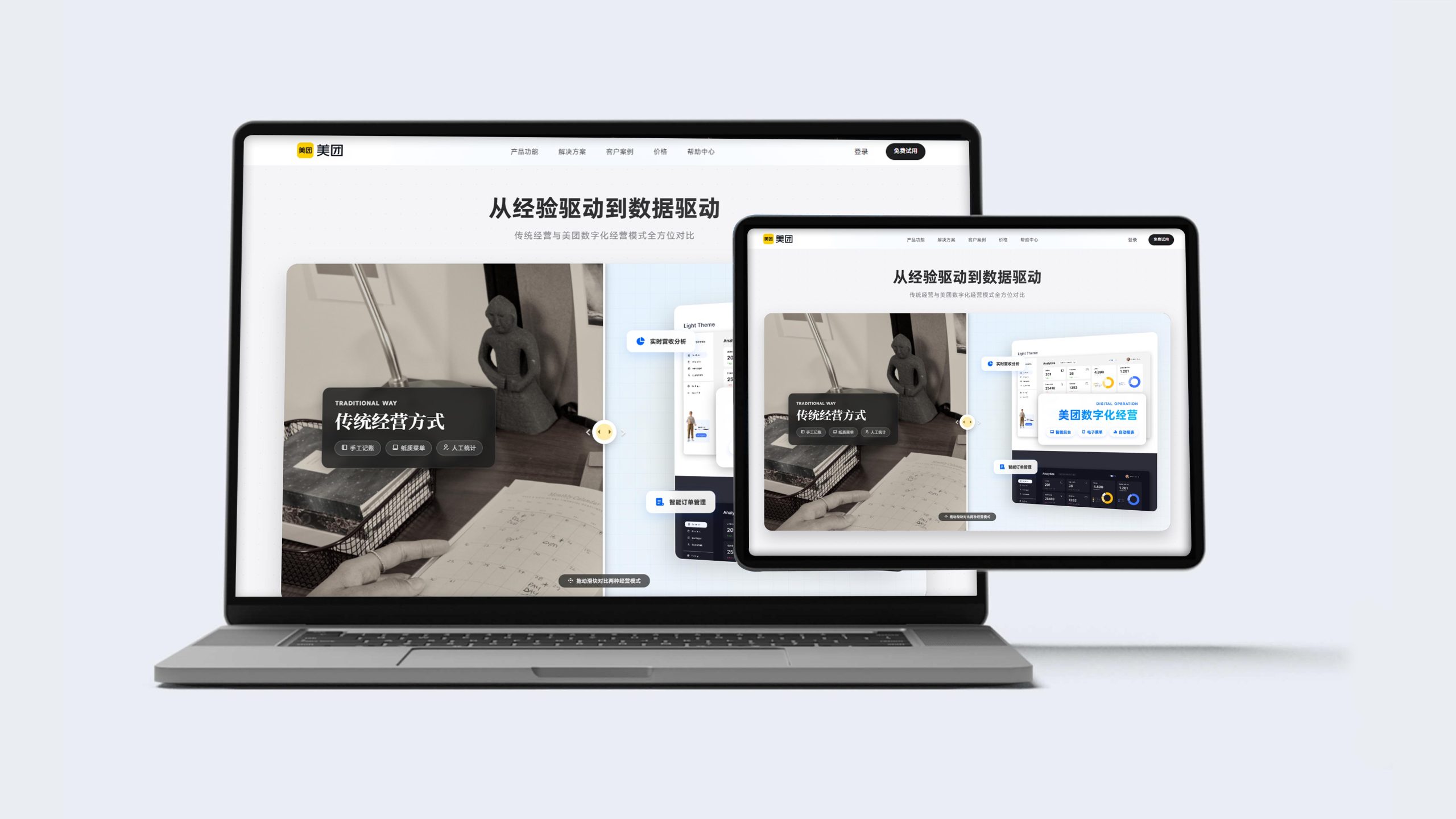
This project is to design the web page and multi-terminal visual system for Meituan for Business, aiming to jointly build the brand temperament of the platform with the business empowerment of local life and the intelligent tools of digital management.
The design goal is to present the platform's brand characteristics of "helping everyone eat better and live better" through systematic visual structure and commercial narrative.
The overall theme is "Better Business Better Together", integrating the efficiency of technology and the warmth of service, demonstrating the merchant empowerment pattern and digital operation value of Meituan Merchant Edition as China's leading local life service platform.
design challenge
Meituan Merchant Edition is not only a digital business portal for local merchants, but also an important business infrastructure for the Meituan ecosystem. The design needs to achieve the following balance in the visual language: Sense of Commerce × Sense of Affinity: It must not only reflect the business empowerment value of the platform, but also convey the service warmth to small and medium-sized merchants; Sense of Technology × Sense of Practicality: It must not only maintain the intelligence and efficiency of digital tools, but also show the simplicity of operation and use; Sense of Scale × Sense of Locality: It must not only continue the ecological breadth of the platform, but also integrate into the real business scenarios of local merchants. The core challenge is - how to make the design combine the platform's empowerment and the merchant's intimacy, so that the Meituan Merchant Edition has both commercial value and service warmth.
Strategy and philosophy
The project takes "operation efficiency·business growth" as its core design concept. Visual philosophy: based on the dual-line logic of "empowerment and growth" as the visual basis, reflecting the power of tools and considerate services; structural logic: using the merchant service platform layout system to organize product value in layers to form a multi-dimensional structure of "settlement-operation-marketing-data"; color system: Meituan Yellow + Business Blue + Pure white is the main color, supplemented by merchant scenes and data charts, symbolizing vitality, professionalism and trust; graphic language: integrating merchant backend interfaces, operating data, marketing tools and real store scenes to establish a "visual system under the commercial service order"; interactive expression: introducing immediate settlement, free trials and successful cases, so that the platform has both conversion efficiency and trust endorsement. The core of the concept: Present empowering value with visual expertise, and continue growth hopes with business stories.
Design presentation
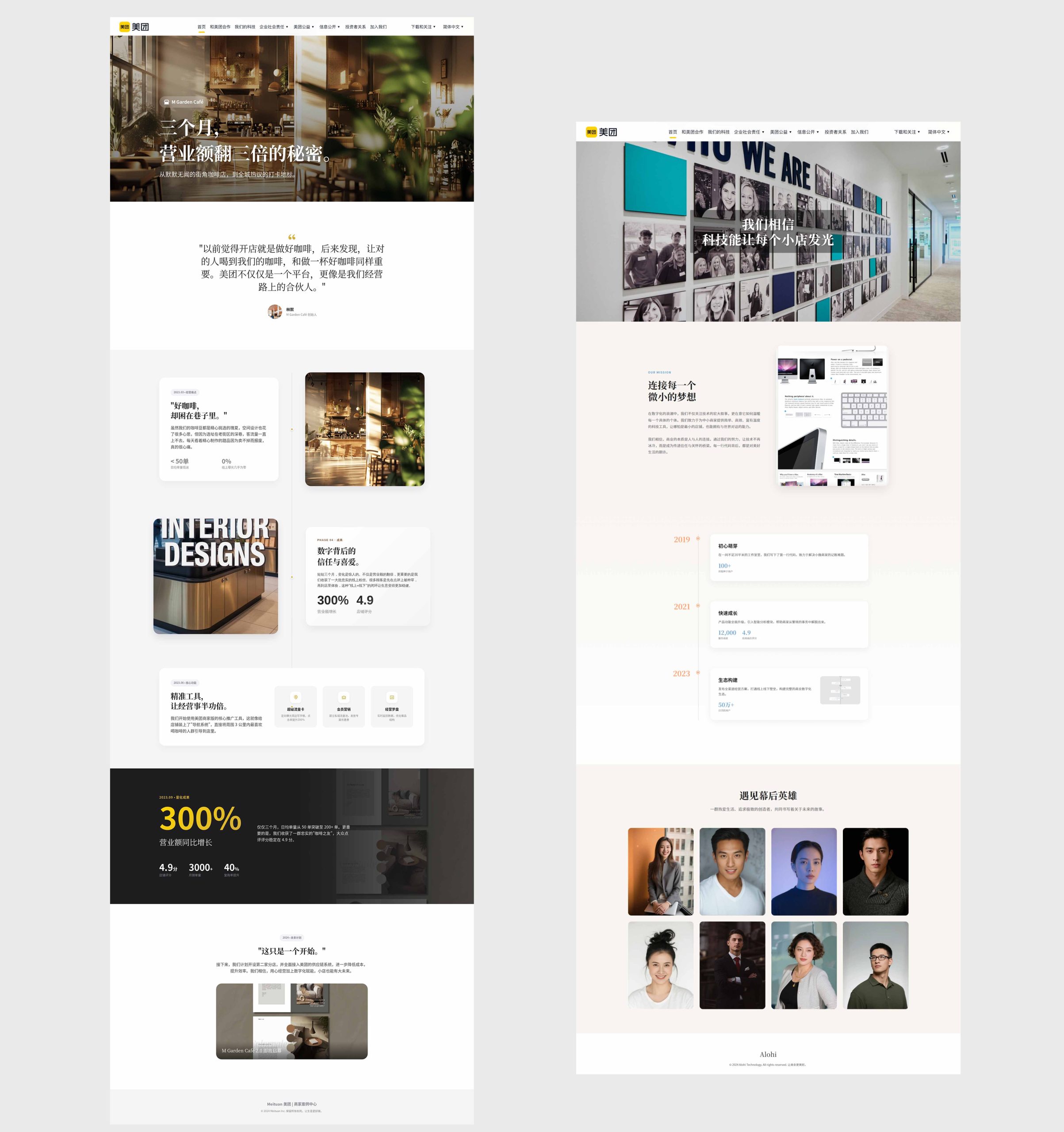
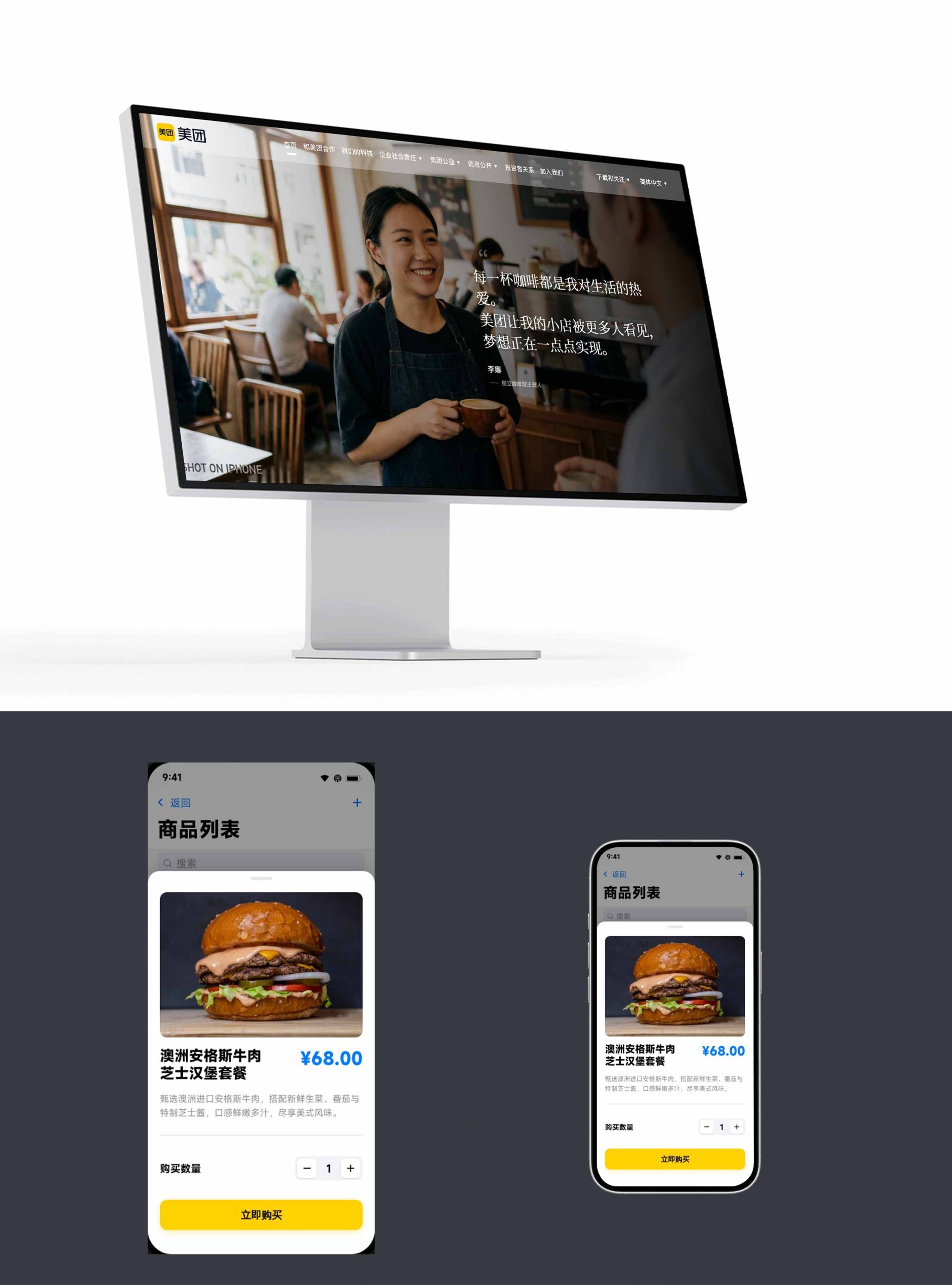
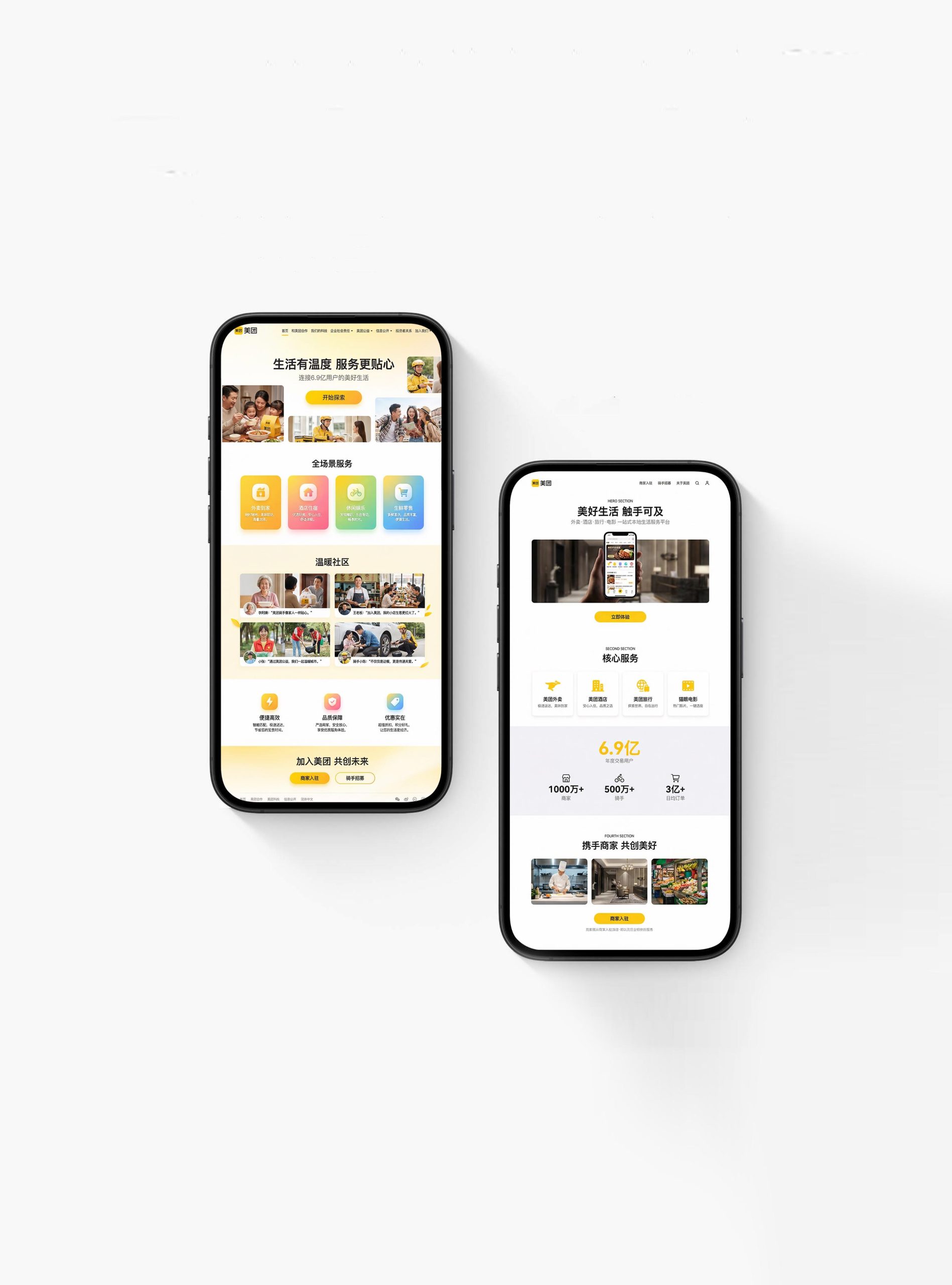
Home page design: The main colors are Meituan yellow and a pure white background, reflecting vitality and brand recognition; the top uses "Better Together" and merchant business scenes as the visual focus, supplemented by core data (covering the number of merchants, average daily order volume, cooperation cities) and entry buttons; the navigation adopts functional categories such as merchant entry, product services, business classes, successful cases, and help centers to convey a comprehensive merchant service pattern. Content logic: 1. Brand proposition; 2. Product matrix (takeaway, in-store, wine travel, Meituan delivery); 3. Business tools (order management, marketing promotion, data analysis); 4. Business success stories; 5. Business classes; 6. Settling in immediately.
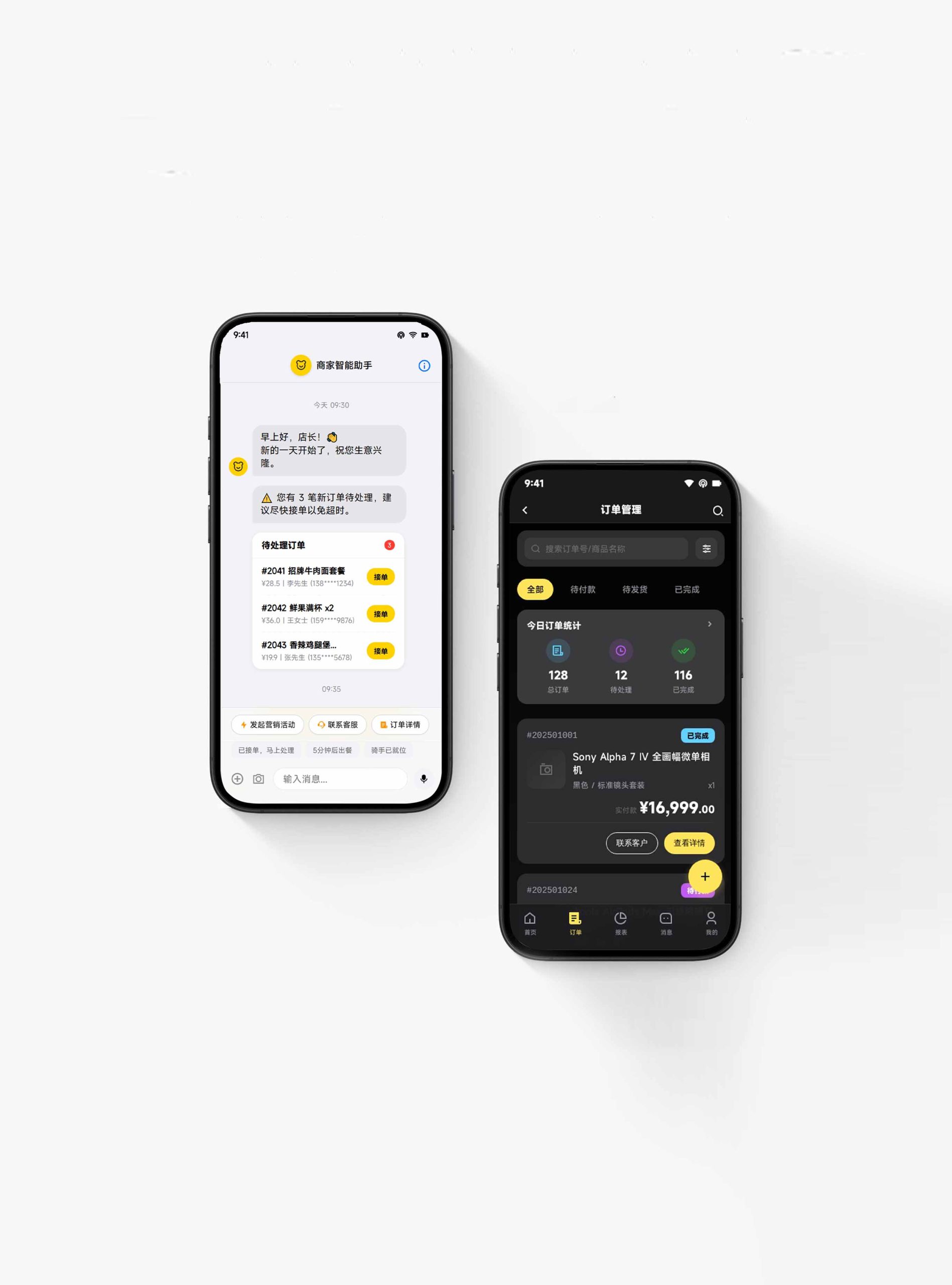
Multi-terminal design: Responsive structure: The official website of the merchant, the settlement area and the operation backend are seamlessly connected, forming a rhythm of "understanding × settlement × operation"; functional design: presenting classified entry paths through the four major business lines of takeout merchants, in-store merchants, hotel merchants, and distribution services; image language: multi-style content presentation using real merchant business scenarios, backend operation interfaces, and data growth charts to convey professionalism and growth; case page: introducing the success stories and operating data improvements of merchants in different categories to express the empowering value of the platform. Technology and experience: Use intelligent business suggestions + marketing tools + data dashboards; multi-end merchant backend synchronization to ensure business management anytime and anywhere. The overall style reflects "the empowerment of the platform × the efficiency of operations × the growth of business".
Achievements and Impact
As the official merchant visual system of the platform, this design is widely used in merchant access on merchant official websites, on-site promotions and operating backends. Through the integration of business logic × service narrative × brand order, the design successfully created the visual image of the Meituan merchant version that "has both platform strength and service warmth". The project is considered by the platform to be "one of the most commercially empowering and merchant-trusted visual systems" and has become the core blueprint for multi-terminal experience design for Meituan merchants.