










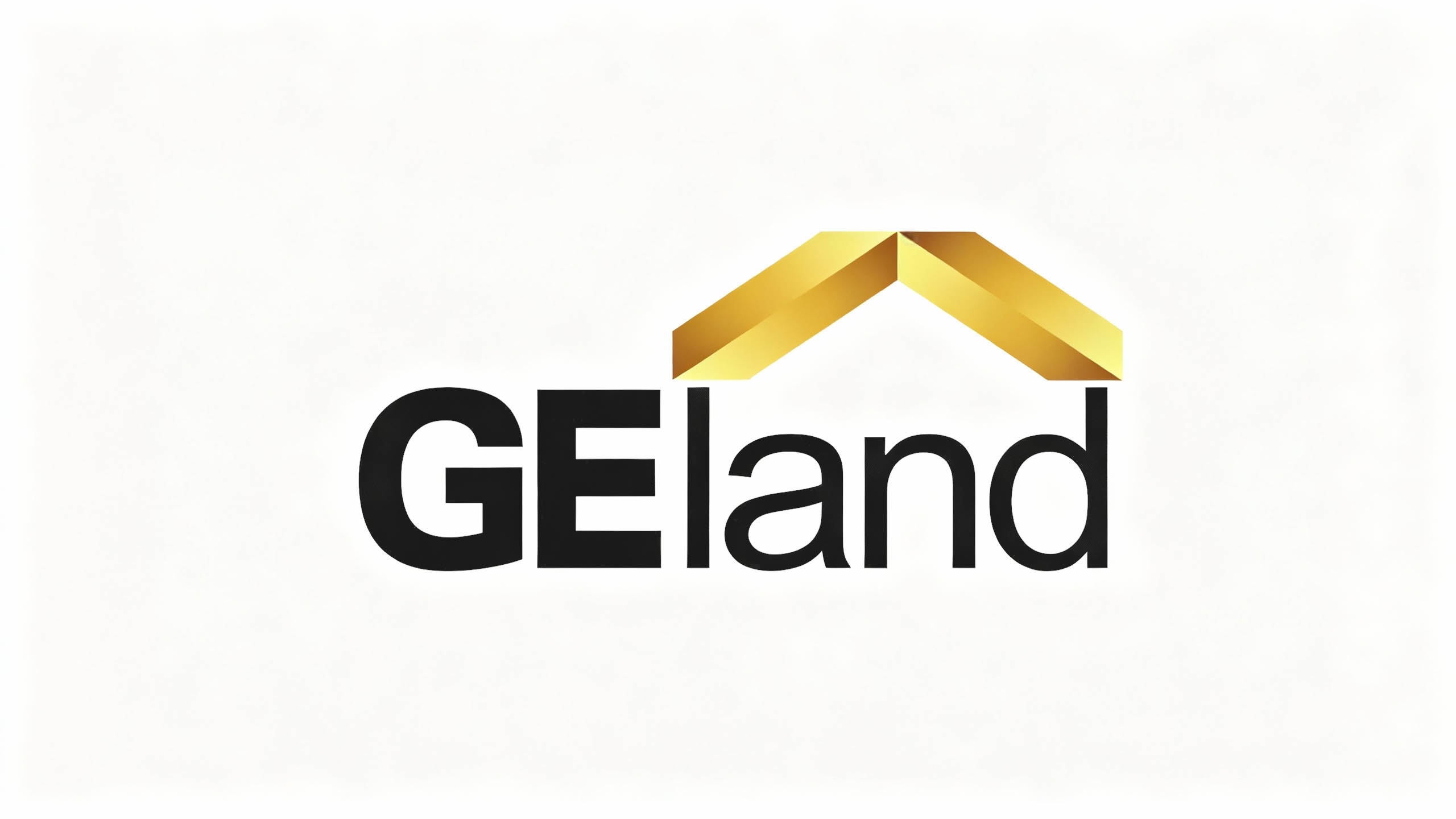
GEland is a real estate company that focuses on high-end real estate development and the creation of quality living spaces. It is committed to building ideal residences with ingenuity and connecting a better life to the future with quality.
The brand hopes to present a balanced state of "architectural rationality x home temperature" through a visual system that combines quality and industry attributes.
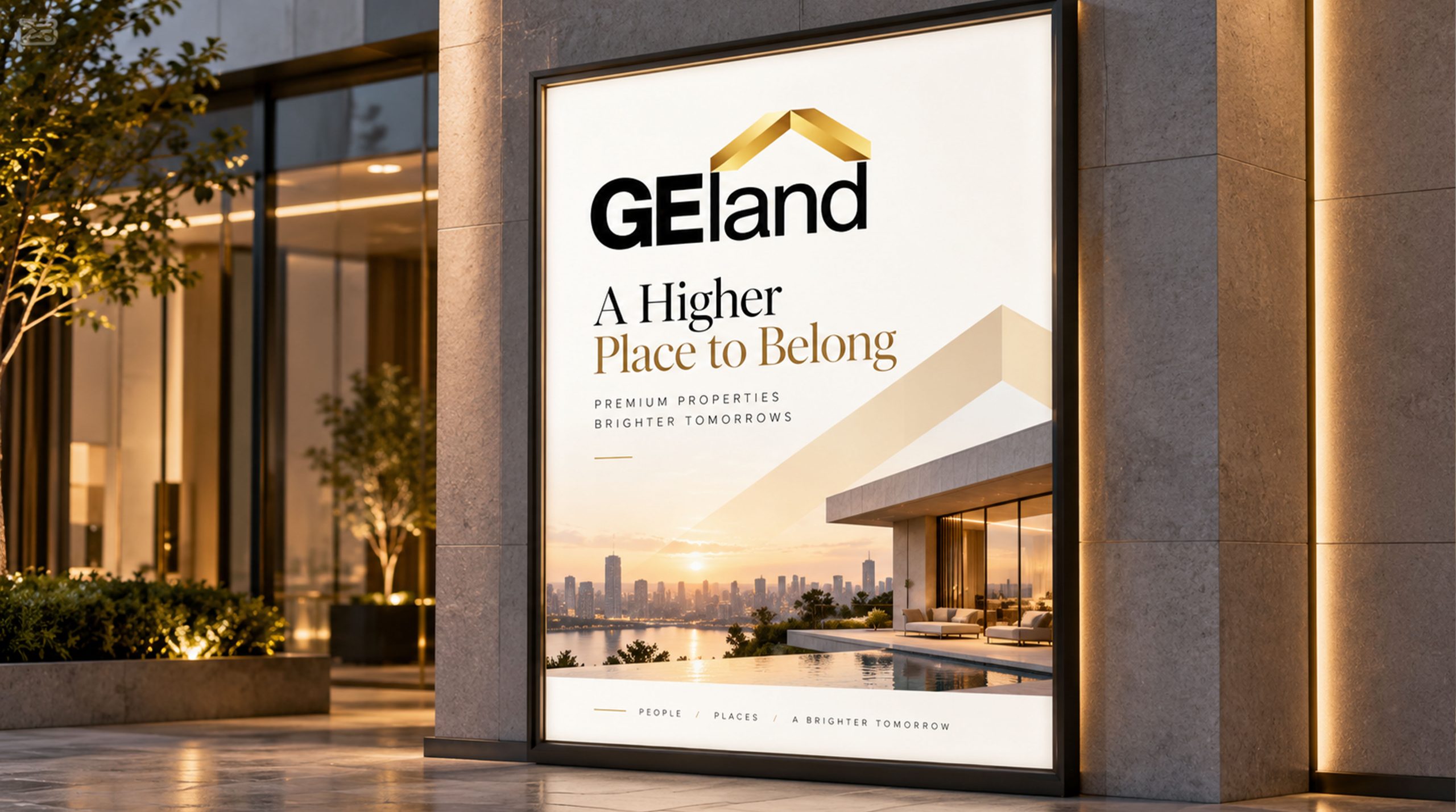
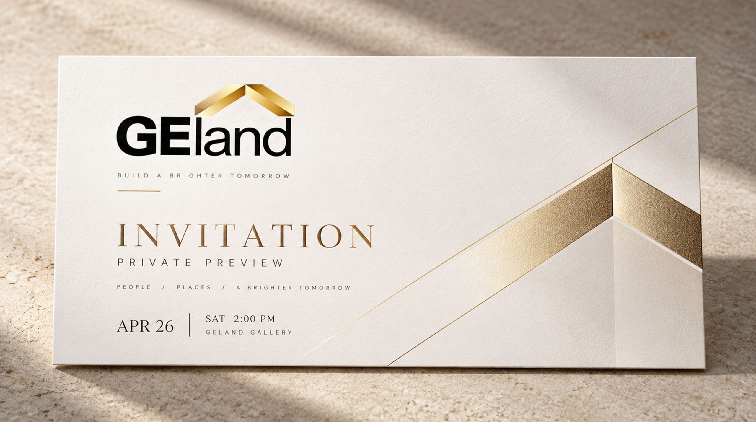
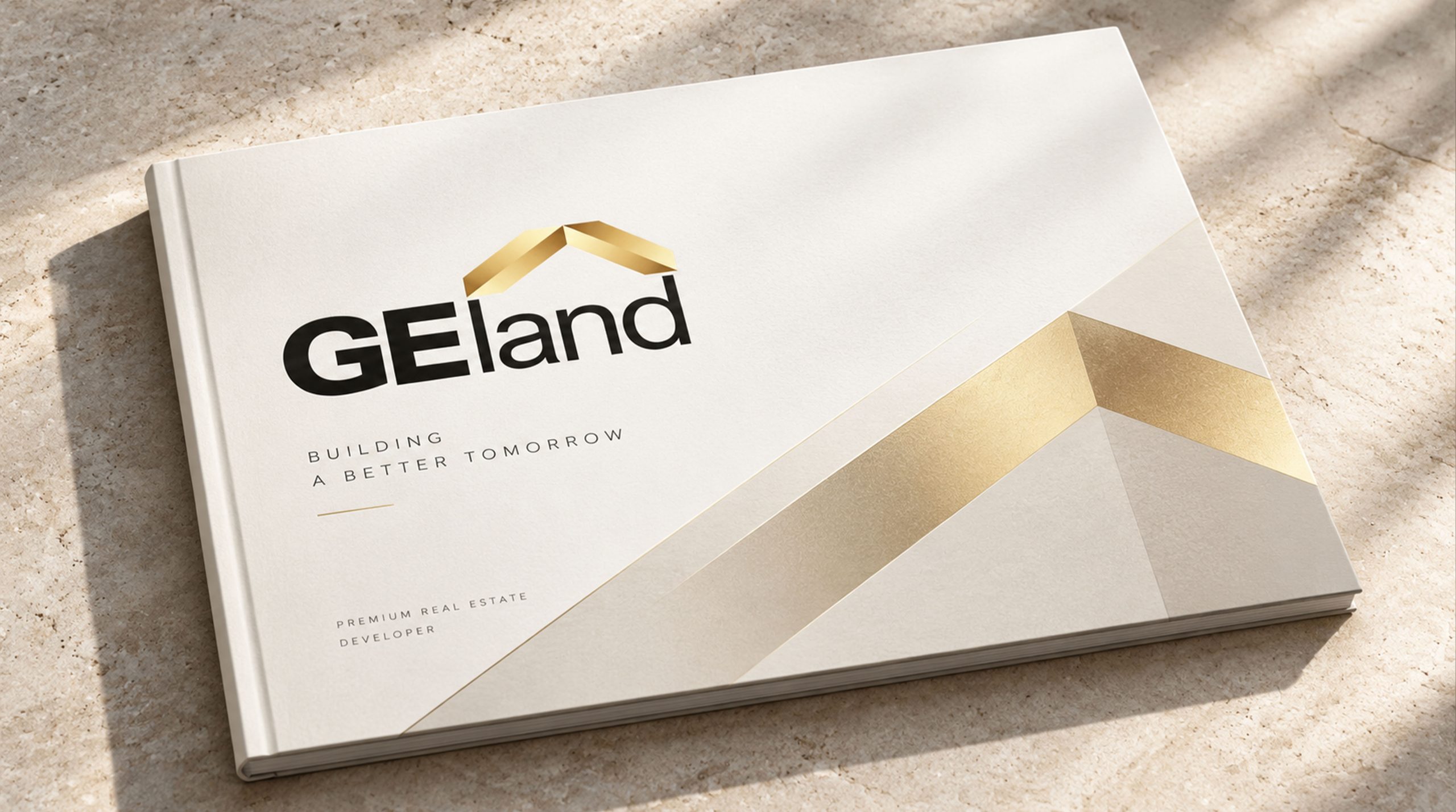
design concept
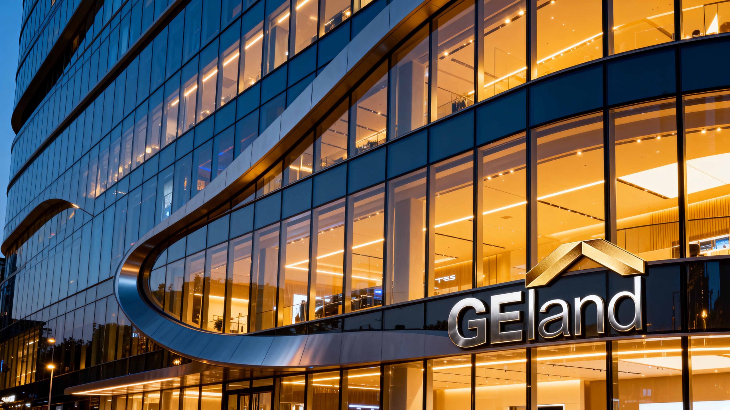
The core concept of the logo originates from the concept of "Quality Home". The design uses an abstract roof as the basic configuration, which symbolizes the core attributes of the real estate industry and the sense of belonging of home, representing stability and protection. The metallic roof shape reflects the "planar and three-dimensional" design quality, and the combination of the initials GE strengthens brand recognition and memory. The overall shape not only embodies the rational logic of architecture, but also is full of the warm temperament of home, implying the brand's mission of continuing to create high-quality living spaces. The geometric outline of the long roof presents the simple aesthetics of modern architecture, giving the real estate brand a more international vision.
Graphic composition and color system
The geometric structure of the roof: represents the core symbol of the real estate industry and the sheltering image of home; the three-dimensional metal texture: presents the volume and quality of the building with layers of light and shadow; the initial letter fit: GE is organically integrated with the roof form, strengthening the brand recognition and industry attributes; the three-dimensional plane: the two-dimensional graphics present a three-dimensional vision, representing the precision quality of the design.
The brand name GEland uses a modern geometric sans-serif font. The GE font is bold and proportionally thick, consistent with the iconic building structure. The slender strokes of the land font are designed to form a visual contrast and convey the brand's "steadiness and elegance". The overall horizontal arrangement strengthens visual stability and international communication attributes.
Noble gold #C9A227: Symbolizes quality, dignity and value commitment; Steady black #1A1A1A: Represents professionalism, stability and architectural strength; Gloss gradient: Symbolizes spatial hierarchy and quality light perception. Gold and black intersect in contrast to form a visual balance of "nobility and stability" and "quality and strength", building a high-end and professional brand impression.
Application extension and brand significance
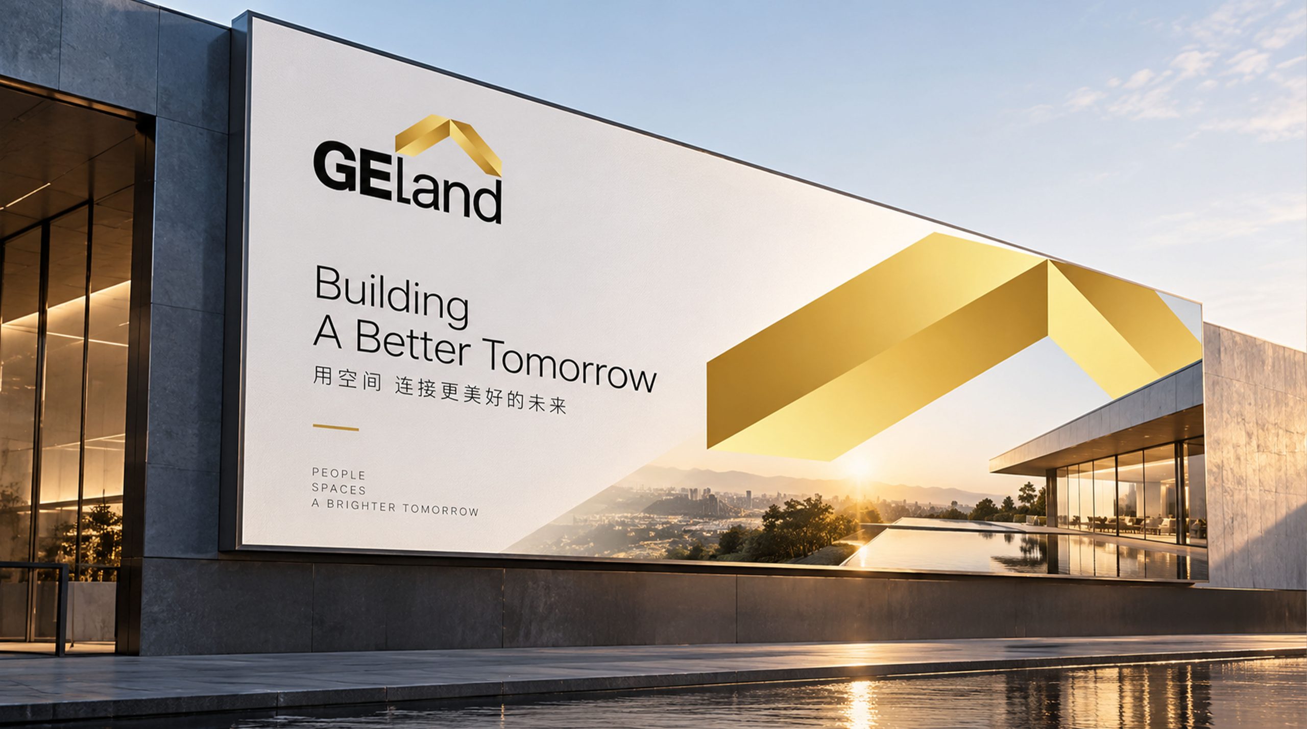
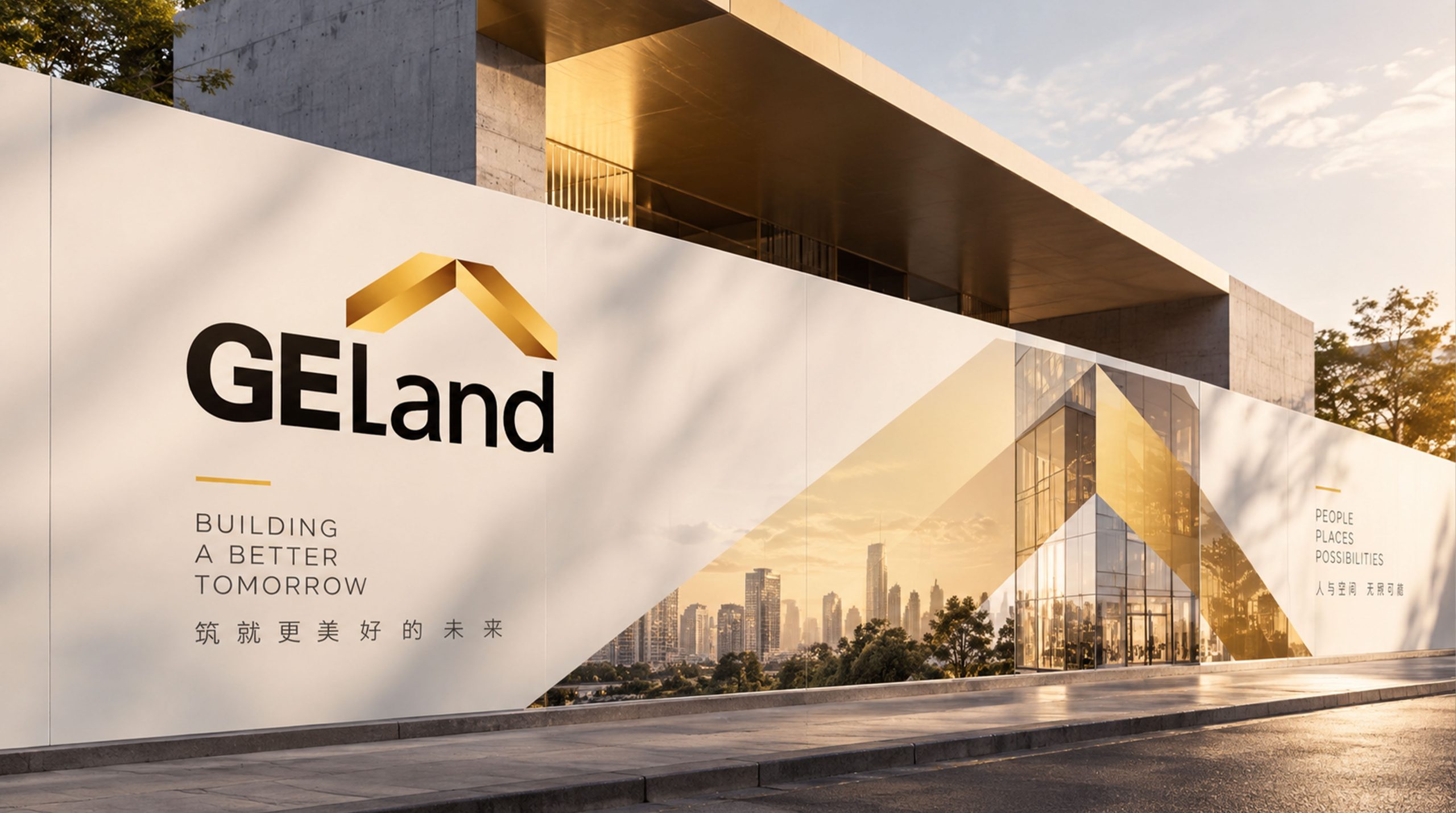
The logo has strong cross-field adaptability: corporate level: applied to real estate projects, marketing centers, annual reports and brand launches; product level: suitable for real estate logos, property services and fine decoration delivery signs; spatial level: forming a unified visual language in sales offices, wayfinding systems and building facades. In the dynamic version, the golden roof can be used as a "gloss flow" or architectural animation, symbolizing the continuous pursuit of quality construction.
The GEland logo embodies the dual value of "architectural rationality x home temperature"; the roof shape → the core symbol of the industry; gold → the value commitment of quality; black and gold contrast → the symbiosis of nobility and stability. This is not only a brand identification symbol, but also a visual expression of corporate philosophy to build an ideal residence with ingenuity and quality.
design results
After the release of the new visual system, GEland has become an iconic brand image in the domestic high-end real estate industry. The golden roof and black gold color scheme are widely used in real estate exhibitions, project releases, and brand communications. With the visual expression of "architectural structure × quality language", they have established a new aesthetic standard in the real estate field. This case represents the mature expression of the brand in the direction of high-end real estate, quality residences and systematic visual language design, achieving the unity from "architectural design" to "life philosophy".