











Suning Appliances (Suning) is a leading company focusing on smart home appliance retail and smart life services. It is committed to improving the quality of life with technological innovation and connecting a better home future with high-quality services.
The brand hopes to present a balanced state of "technological quality × living temperature" through a visual system that combines modernity and high-end temperament.
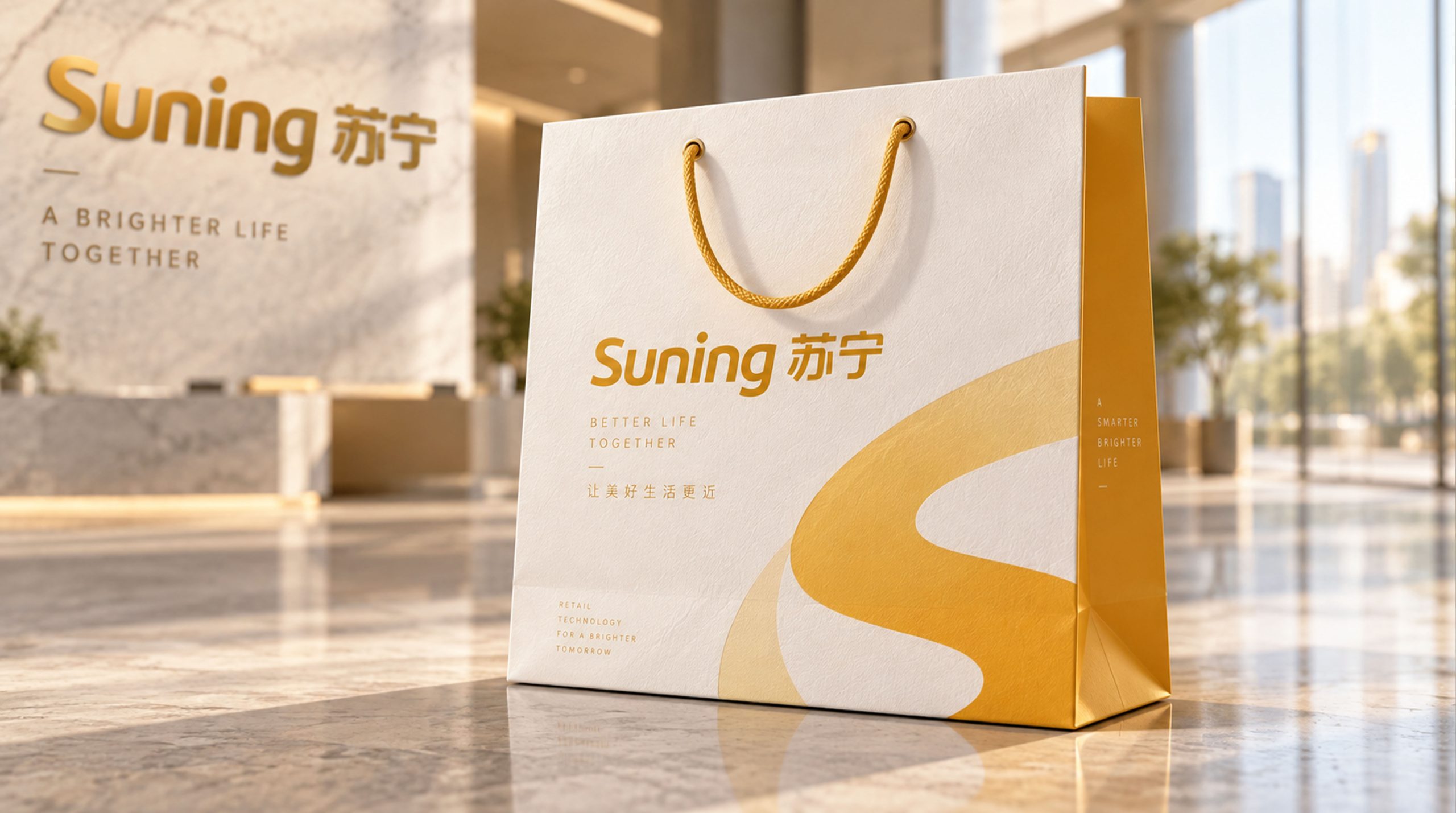
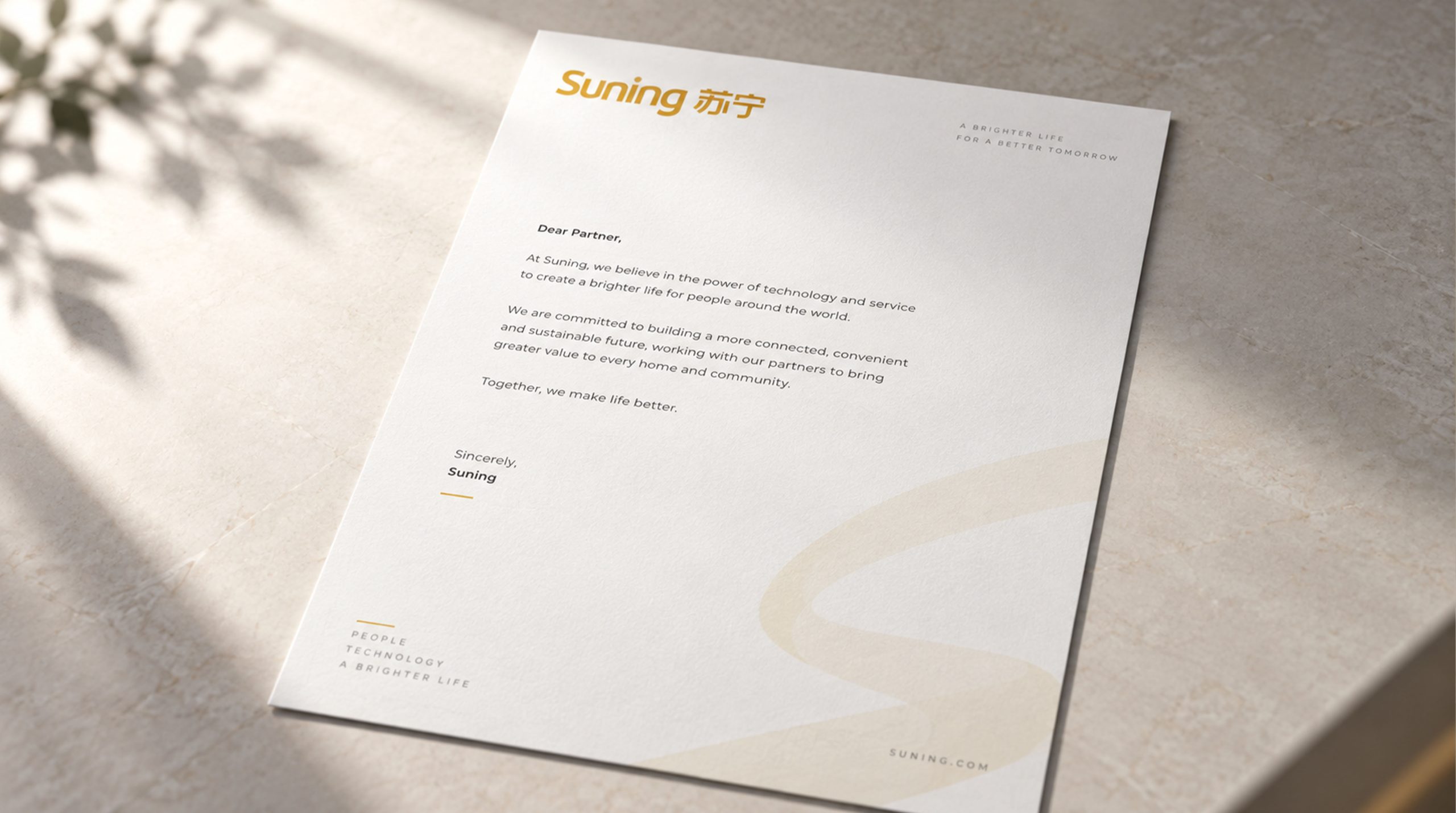
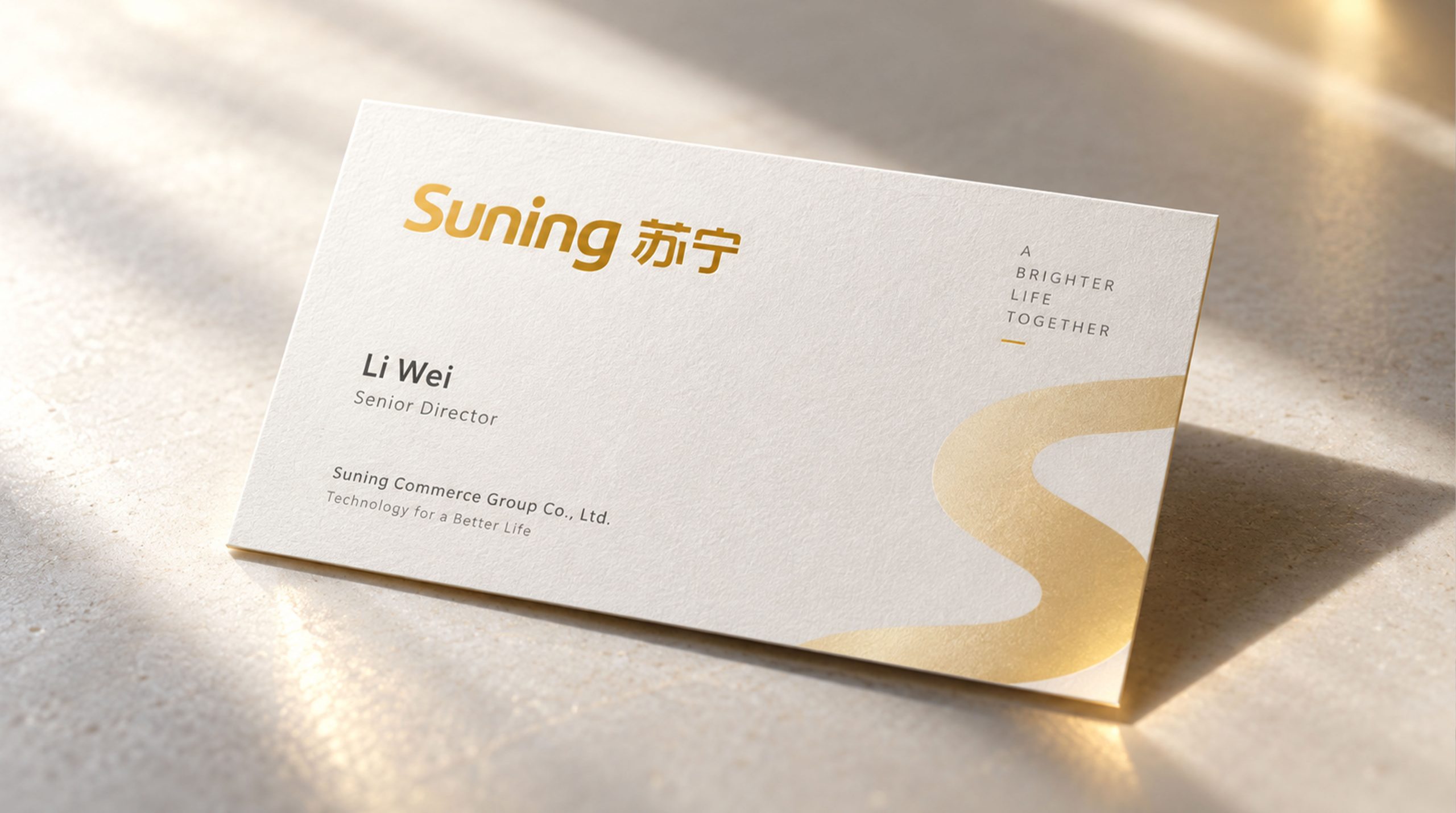
design concept
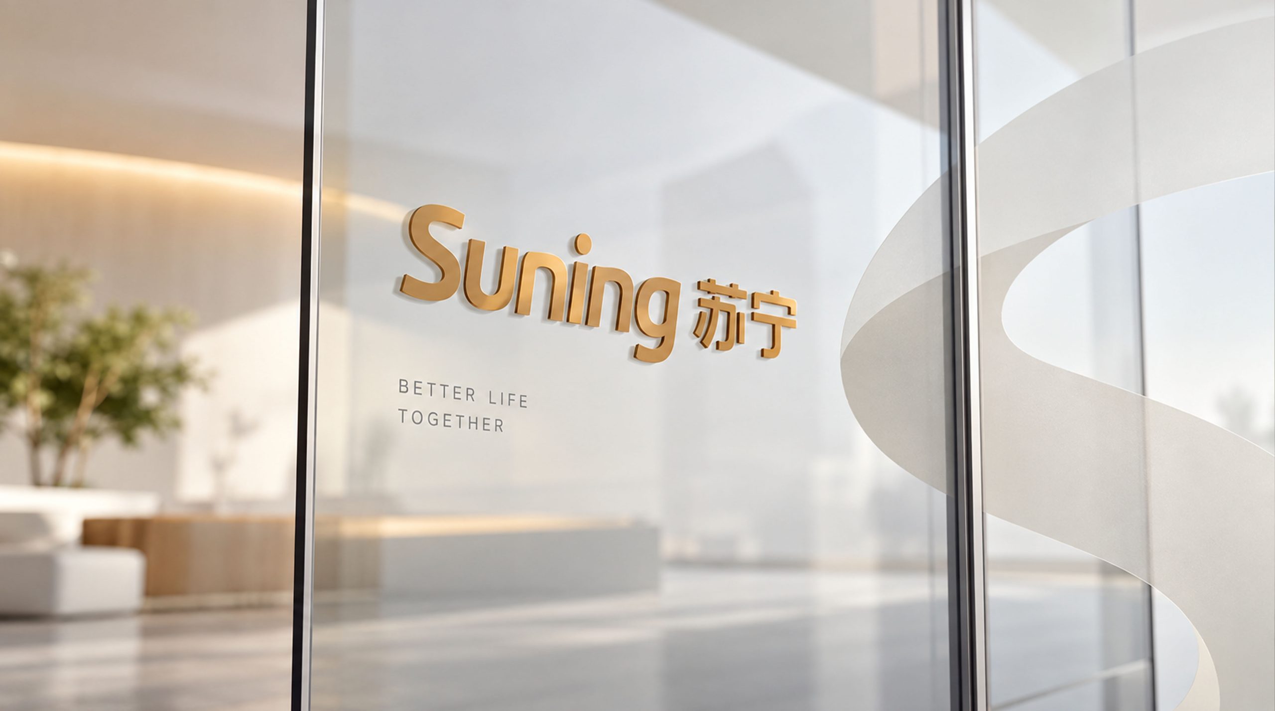
The core concept of the logo comes from the concept of "Quality Renewal". The design uses the Chinese and English brand names as the core carrier, presented in golden three-dimensional fonts, symbolizing the brand's high-end positioning and value commitment, and representing nobility and quality. The metallic font shape reflects the "planar and three-dimensional" design precision, and the glossy flow symbolizes the brand's continuous innovation and the vitality of the times. The overall shape not only embodies the rational aesthetics of modern technology, but also is full of warm life atmosphere, implying Suning Appliance’s mission of continuing to lead smart home appliances and quality life. The smooth font outline presents an international and modern vision, making the brand more contemporary and approachable.
Graphic composition and color system
Three-dimensional font structure: represents the brand's strong strength and industry leadership; metallic luster texture: presents the height of quality and value with light and shadow levels; Chinese and English integration: Suning and Suning are juxtaposed to strengthen the dual attributes of internationalization and localization; smooth curves: the font strokes are round and flowing, conveying the human touch of technological products.
The brand name "Suning" uses customized italic fonts with smooth fonts and elegant proportions, consistent with the brand's modern temperament. The dynamic design of English font strokes conveys the brand's "vitality in quality". The Chinese and English combinations are arranged horizontally and unified as a whole, strengthening visual recognition and international communication attributes.
Noble gold #D4A017: symbolizes quality, nobility and value upgrade; gloss gradient #F5C542#C9A227: represents renewal, vitality and the light of the times; high-gloss white: symbolizes the purity of technology and quality light. The gold flows in the gradient, forming the visual tension of "quality and vitality, tradition and innovation", and building a high-end and friendly brand impression.
Application extension and brand significance
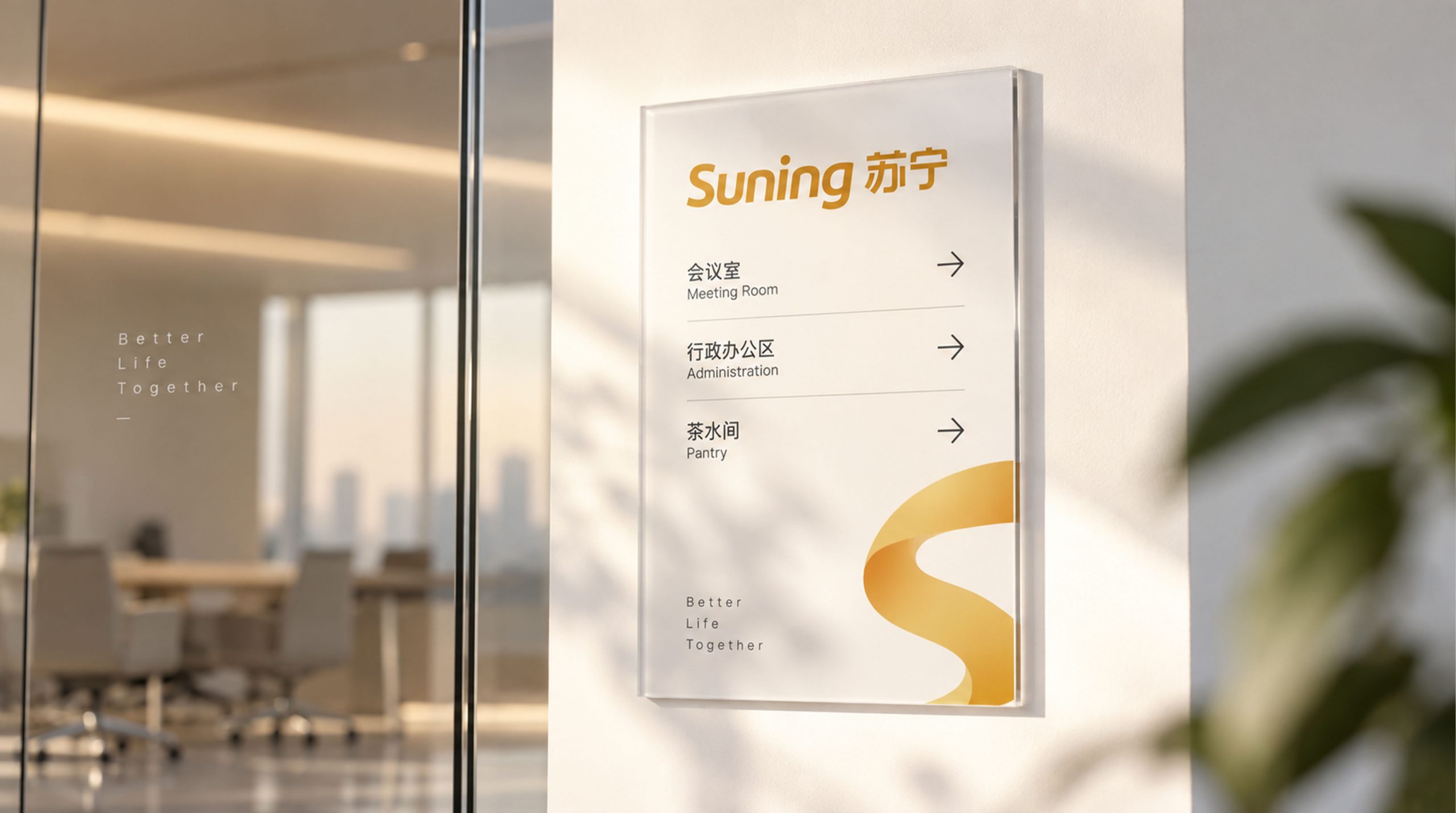
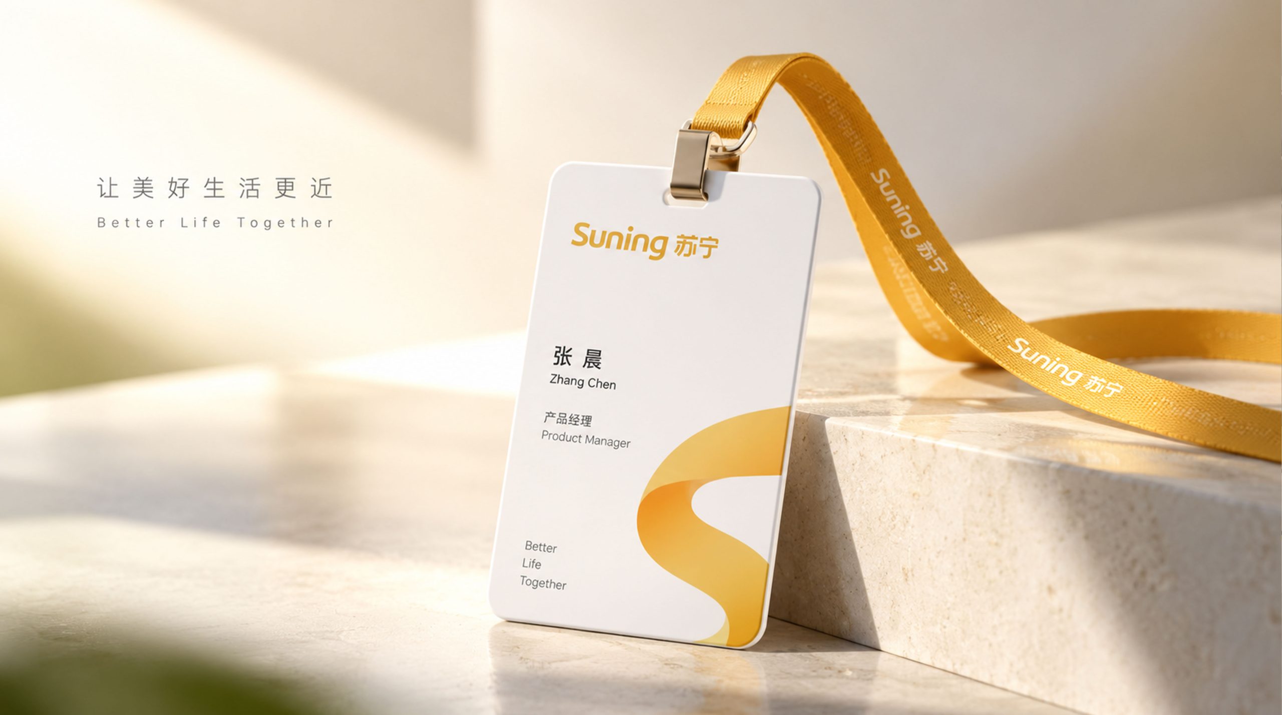
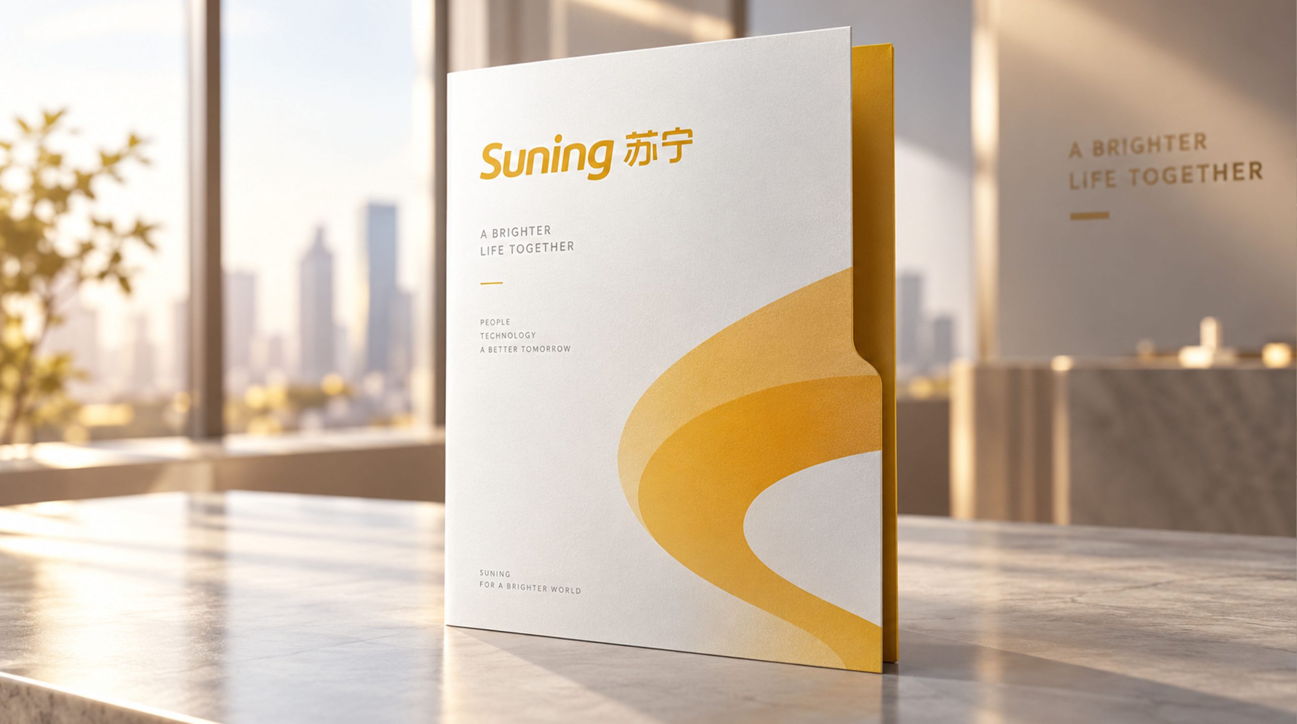
The logo has strong cross-field adaptability: corporate level: applied to store images, brand launches, annual reports and strategic cooperation; product level: suitable for smart home appliances, logistics packaging and after-sales service logos; spatial level: forming a unified visual language in retail stores, wayfinding systems and brand exhibition halls. In the dynamic version, the golden font can be used as a "gloss flow" or refreshed shining animation, symbolizing the continued vitality of brand upgrades.
Suning Appliance's logo embodies the dual value of "technological quality x life temperature": gold → the value commitment of font quality; three-dimensional texture → the heavy presentation of strength; smooth curve → the integration of technology and life. This is not only a brand identification symbol, but also a visual expression of corporate philosophy - renovating a better life with quality.
design results
After the release of the new visual system, Suning Appliance has become an iconic brand image in the domestic smart home appliances and retail industries. Golden three-dimensional glyphs are widely used in store images, advertising communications, and brand activities. With the visual expression of "quality structure × modern language", it has established a new aesthetic standard in the field of home appliance retail. This case represents the mature expression of the brand in the design direction of smart home appliances, quality life and system visual language, achieving the unification from "brand design" to "life philosophy".