











Huaxiang Auto is an automobile brand focusing on new energy vehicles and smart travel solutions. It is committed to driving green travel with technological innovation and connecting the future driving experience with excellent quality.
The brand hopes to present a balanced state of "speed and passion x free flying" through a visual system that combines dynamic tension and technological texture.
design concept
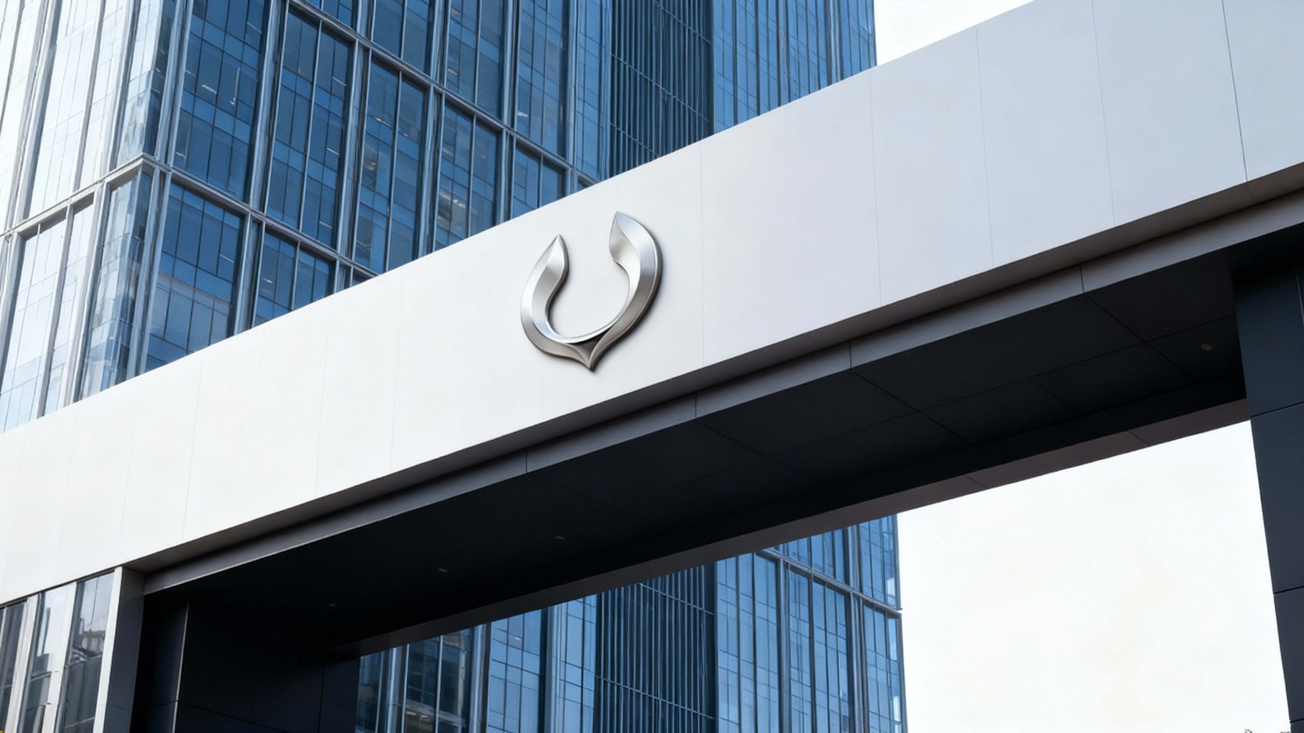
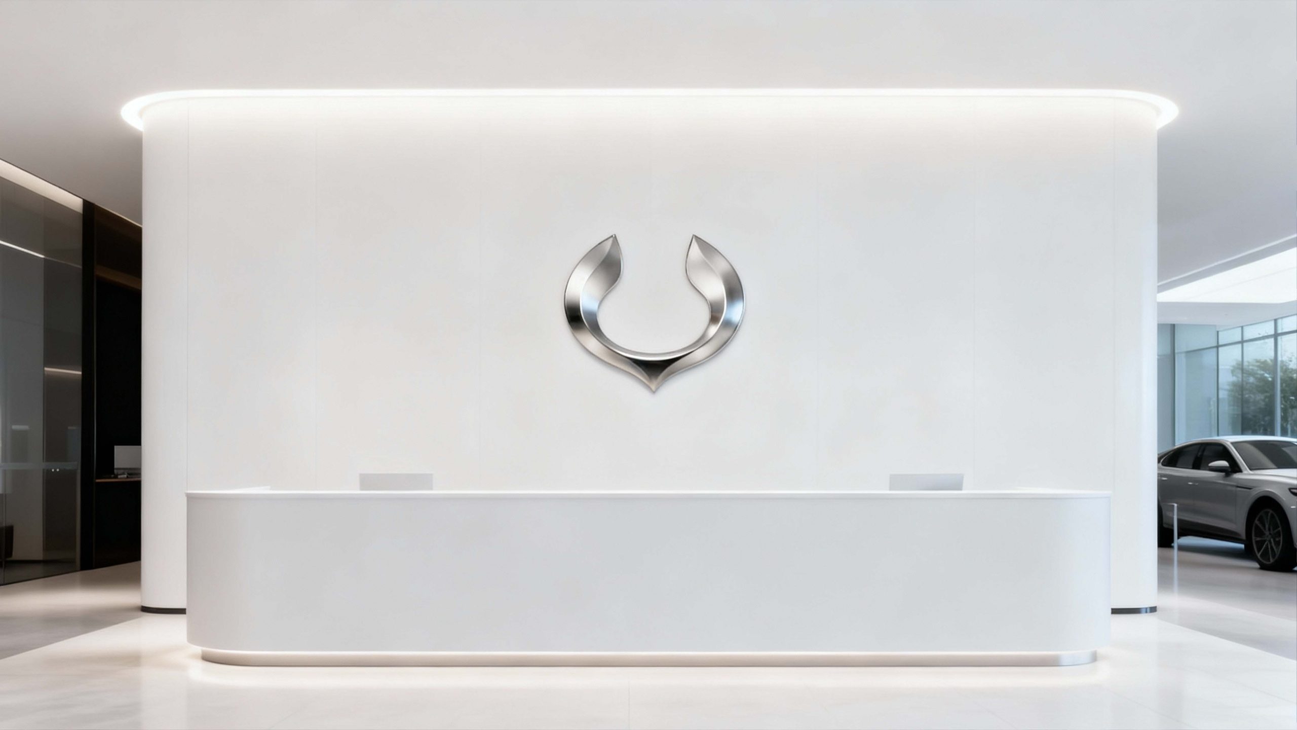
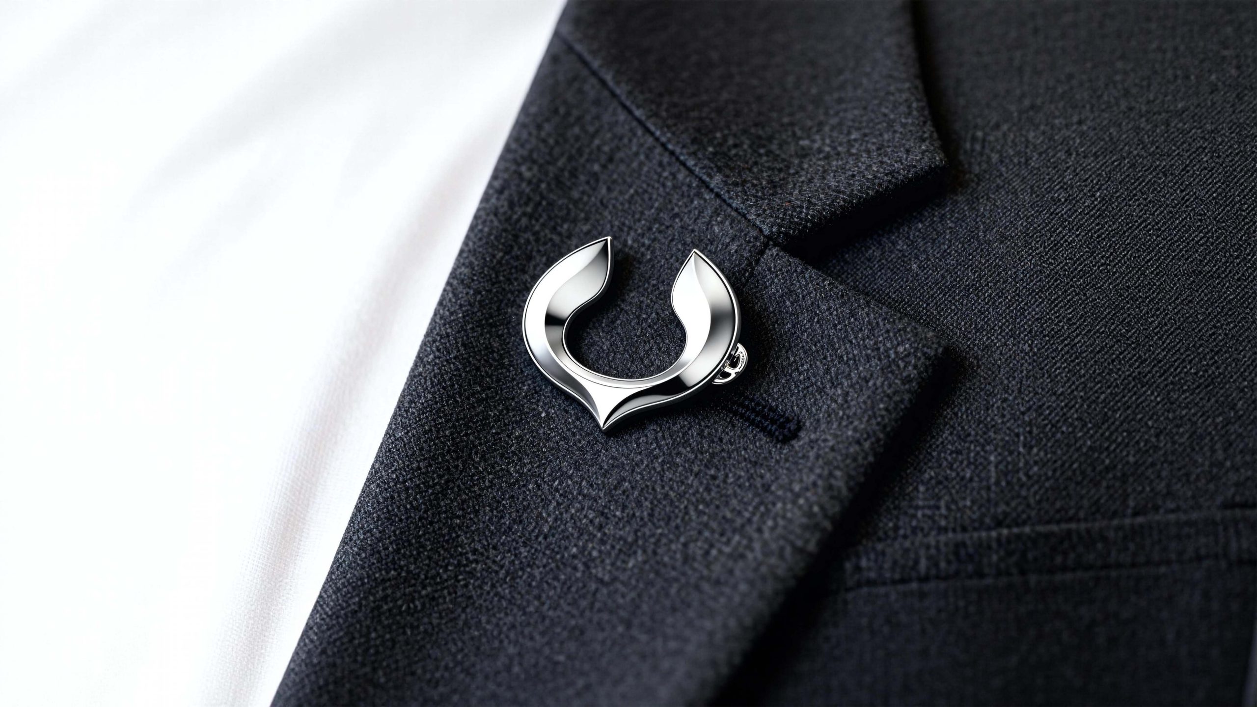
The core concept of the logo comes from the concept of "Soaring Glory". The design is based on the flying bird wings, which symbolizes the sense of speed and free spirit of the car brand, and represents breakthrough and transcendence. The three-dimensional shape with silver metallic texture reflects the design precision of "flat three-dimensional", and the streamlined outline symbolizes the ultimate pursuit of aerodynamics and the smooth driving experience. The overall shape has both the dynamic tension of speed and the elegant flying posture, implying Huaxiang Automobile’s mission of continuing to pursue excellent driving experience and leading intelligent travel. The shape of the two wings encircling the car shows the brand warmth of sharing and protection, making the car brand more emotionally connected and humanistic.
Graphic composition and color system
Flying wing spread structure: represents speed, freedom and the dynamic genes of the car brand; streamlined surface: uses aerodynamic curves to present the smoothness of driving and technological precision; embracing shape: the wings embrace each other to form a heart-shaped outline, symbolizing the brand's protection and care for users; three-dimensional metal texture: silver luster presents the height of industrial aesthetics and manufacturing quality.
The brand name "Hua Xiang Qi" adopts a modern geometric sans-serif font with a simple shape and balanced proportions, consistent with the streamlined structure of the logo. The English "Huaxiang" adopts a dynamic italic design to convey the brand's "sense of speed with stability". The Chinese and English combined version adopts bottom layout and is centered overall to enhance visual stability and international communication attributes.
Technological silver #C0C0C0: symbolizes technology, precision workmanship and industrial quality; gloss gradient #E8E8E8#A0A0A0: represents speed, flow and metallic brilliance; high-gloss white #FFFFFF: symbolizes purity, future and driving vision. The silver flows in the gradient, forming a visual balance of "speed and elegance", "power and temperature", and building a high-end and dynamic brand impression.
Application extension and brand significance
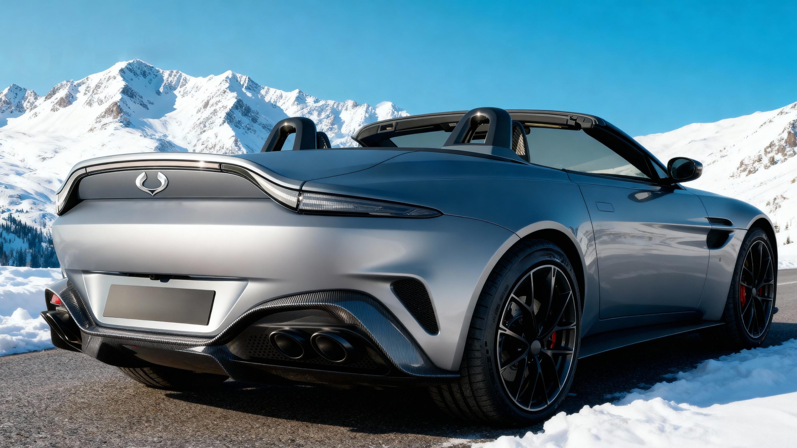
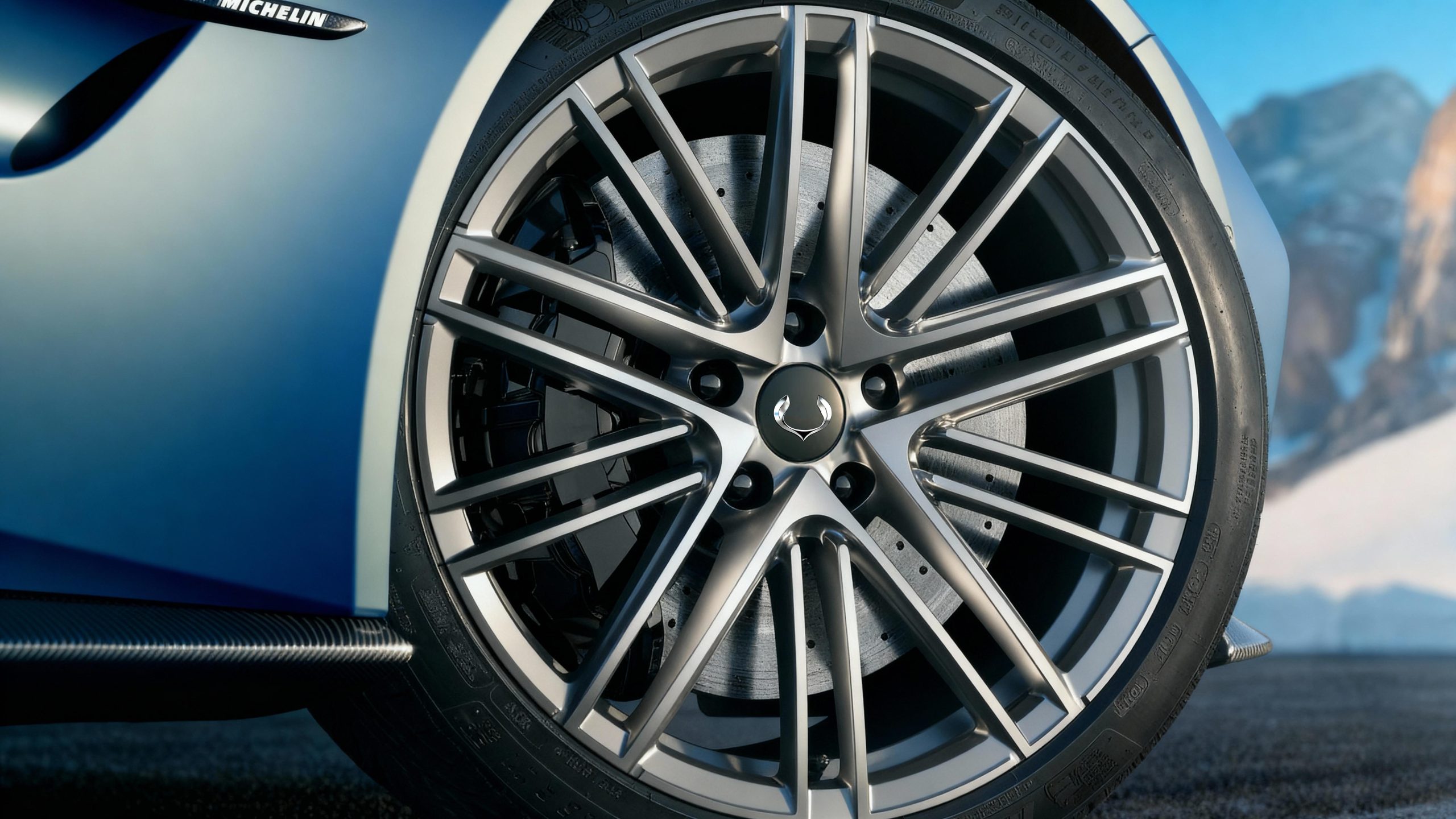
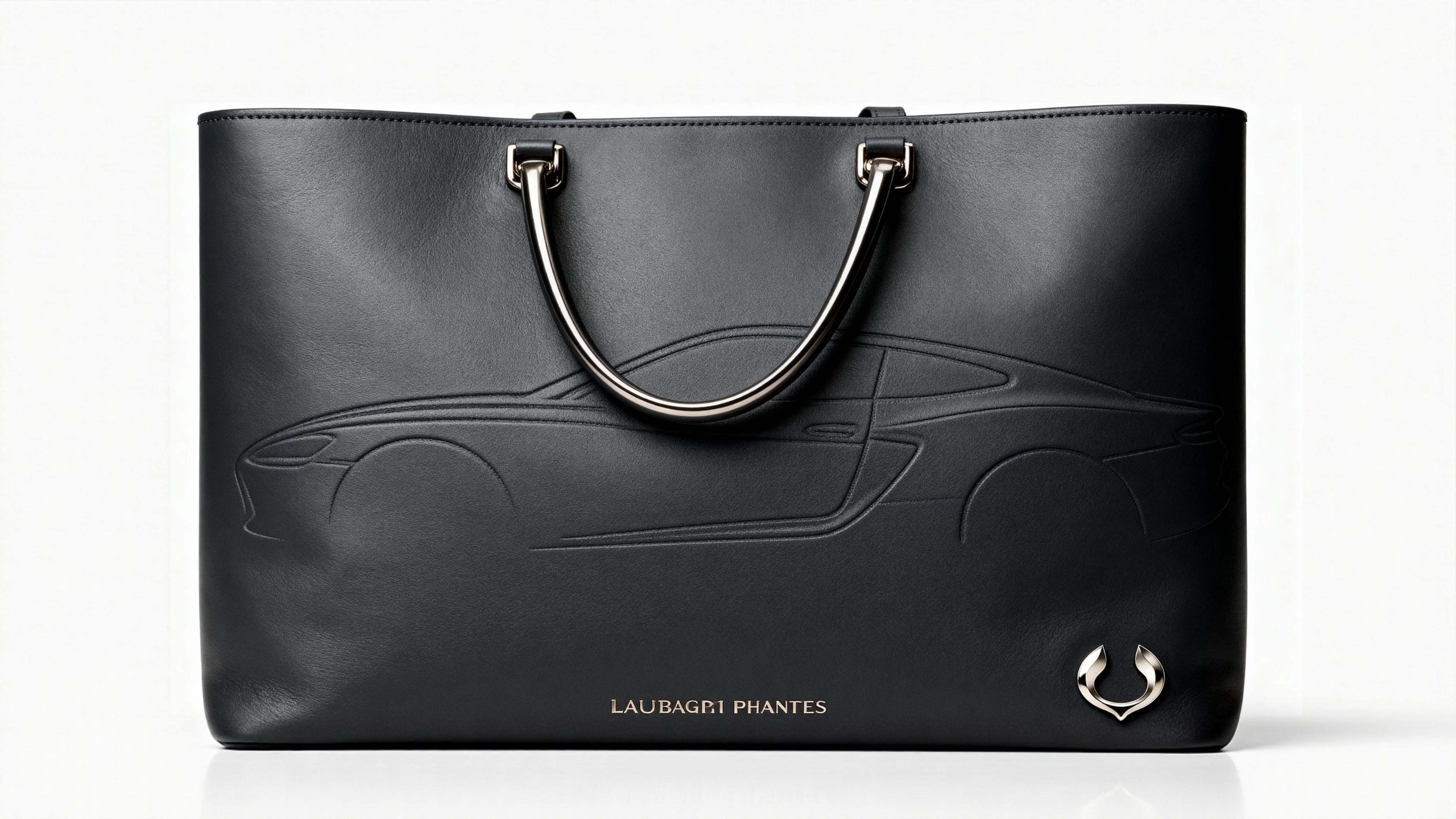
The logo has strong cross-field adaptability: corporate level: applied to brand launches, auto show images, annual reports and strategic cooperation; product level: suitable for car logos, steering wheel logos and smart cockpit interfaces; spatial level: in 4S stores, guidance systems and brand experience centers to form a unified visual language dynamic version, the wings can be used as a "wings-spreading animation" or glossy flowing animation, symbolizing the continuous pursuit of driving freedom.
The Huaxiang Automobile logo embodies the dual values of "speed passion x humanistic warmth": flying wing shape → the dynamic gene of speed; silver → the quality commitment of technology; and the surrounding outline → the symbiosis of protection and freedom. This is not only a brand identification symbol, but also a visual expression of automobile philosophy. It uses flying posture to see the future of travel.
design results
After the release of the new vision system, Huaxiang Automobile has become an iconic brand image in the domestic new energy vehicle field. The silver flying wing shape is widely used in auto shows, brand communication, and product releases. It has established a new aesthetic standard in the automotive industry with the visual expression of "dynamic structure × technological language". This case represents the brand's mature expression in the design direction of smart travel, new energy vehicles and system visual language, achieving the unification from "logo design" to "travel philosophy".